
Back by popular demand, we have another great tutorial on using R visuals. There are a number of amazing visuals that have been supplied with the PowerBI desktop tool. However, there are some limitations. For example you can’t merge a scatter plot with a bar chart or with a area chart. In some cases it may be applicable to display one graph with multiple plot types. Now, to be fair Power BI desktop does supply you with a bar chart and line chart, Kudos Microsoft, #Winning…. but, I want more.
This brings me to the need to learn R Visuals in PowerBI. I’ve been interested in learning R and working on understanding how to leverage the drawing capabilities of R inside PowerBI. Microsoft recently deployed the R Script Showcase, which has excellent examples of R scripts. I took it upon myself to start learning. Here is what I came up with.
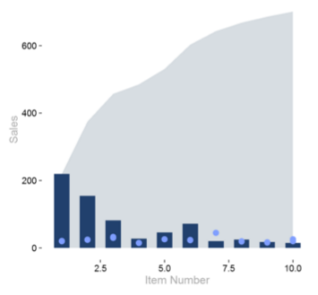
This is an area plot in the background, a bar chart as a middle layer and dots for each bar. The use case for this type of plot would be to plot sales by item number, sales are in the dark blue bars, and the price is shown as the light blue dots. The area behind the bars represent a running total of all sales for all items. Thus, when you reach item number 10, the area represents 100% of all sales for all items listed.
If you want to download my R visual script included in the sample pbix file you can do so here.
Great, lets start the tutorial.
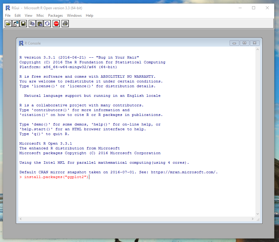
First you will need to make sure you have installed R on your computer. To see how to do this you can follow my earlier post about installing R from Microsoft Open R project. Once you’ve installed R open up the R console and enter the following code to install the ggplot2 package.
install.packages("ggplot2")
Once complete you can close the R console and enter PowerBI Desktop. First, we will acquire some data to work with. Click on the Home ribbon and then select Enter Data. You will be presented with the Create Table dialog box. Copy and paste the following table of information into the dialog box.
| Item | Sales | Price | Customer |
| 1 | 100 | 20 | Customer A |
| 2 | 75 | 25 | Customer A |
| 3 | 20 | 30 | Customer A |
| 4 | 18 | 15 | Customer A |
| 5 | 34 | 26 | Customer A |
| 6 | 12 | 23 | Customer A |
| 7 | 20 | 22 | Customer A |
| 8 | 15 | 19 | Customer A |
| 9 | 10 | 17 | Customer A |
| 10 | 8 | 26 | Customer A |
| 1 | 120 | 21 | Customer B |
| 2 | 80 | 24 | Customer B |
| 3 | 62 | 33 | Customer B |
| 4 | 10 | 15 | Customer B |
| 5 | 12 | 26 | Customer B |
| 6 | 60 | 24 | Customer B |
| 7 | 20 | 23 | Customer B |
| 8 | 10 | 20 | Customer B |
| 9 | 8 | 16 | Customer B |
| 10 | 7 | 20 | Customer B |
Rename your table to be titled Data Sample.
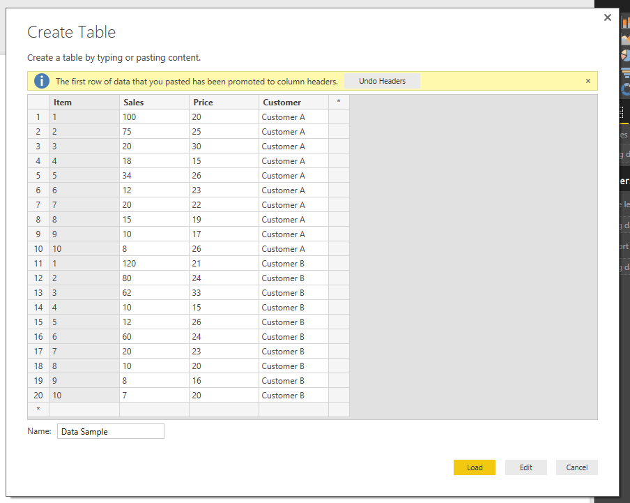
Click Load to bring in the data into PowerBI.
Next, we will need to create a cumulative calculated column measure using DAX. On the home ribbon click the New Measure button and enter the following DAX expression.
Cumulative = CALCULATE( sum('Data Sample'[Sales] ) , FILTERS( 'Data Sample'[Customer] ) , FILTER( all( 'Data Sample' ) , 'Data Sample'[Item] <= MAX( 'Data Sample'[Item] ) ) )
This creates column value that adds all the sales of the items below the selected row. For example if I’m calculating the cumulative total for item three, the sum() will add every item that is three and lower.
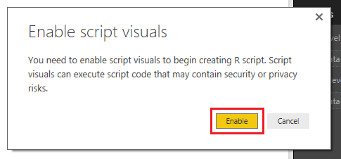
Now, add the R visual by clicking on the R icon in the Visualizations window.
Note: There will be an approval window that will require you to enable the R script visuals. Click Enable to proceed.
While selecting the R visual add the following columns to the Values field in the Visualization window.
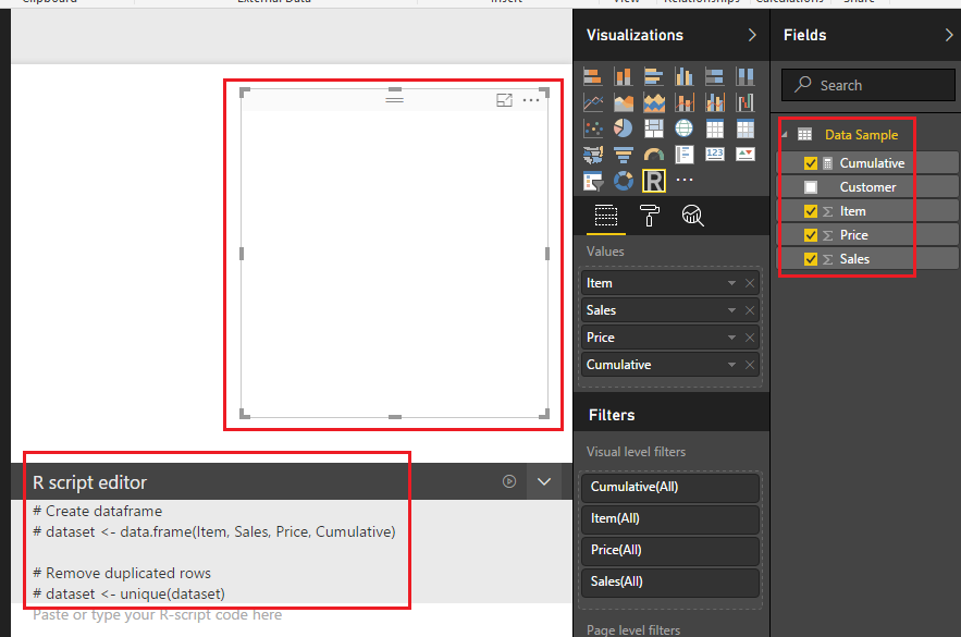
Note: After you add the columns to the Values the R visual renders a blank image. Additionally, there is automatic comments entered into the R Script Editor (the # sign is a designation that denotes a text phrase).
Next, enter the following R code into the script editor.
library(ggplot2)   # include this package to use Graphing functions below

ggplot(dataset, aes(xmin=1, x=Item)) +    # Initialize ggplot function, define the x axis with Item data
 geom_ribbon(fill=c("#D7DDE2"),           # Set the color of the Area Plot,
 aes( ymin=0, ymax=Cumulative )) +        # Define the Y-Axis data
 geom_bar(fill=c("#21406D") ,             # Define the color of the Bars
 stat = "identity" ,      # Define the Statatics property of the bars - This is a required field
 width=.6 ,               # Change the bar width to 60% - 1 would be full bar width
 aes( x=Item, y=Sales )) +          # Define the X and Y axis for bars
 geom_point( color=c("#809FFF"),    # Define the color of the dots
 size=4,                  # Define the dot size
 aes( x=Item, y=Price )) +          # Define the X and Y axis values
 theme_classic(base_size=18) +      # Remove unwanted items from plot area such as grid lines and X and Y axis lines, Change font size to 18
 theme( axis.title.x = element_text(colour = "dark grey"),     # Define the X axis text color
 axis.title.y = element_text(colour = "dark grey")) +          # Define the Y axis text color
 labs( x="Item Number", y="Sales")                             # Define the labels of the X and Y Axis
Press the execute R Script button which is located on the right side of the R Script Editor bar.

The R Script will execute and the plot will be generated.
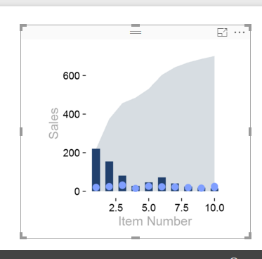
Great, we have completed a R visual. So what, why is this such a big deal. Well, it is because the R Script will execute every time a filter is applied or changed. Lets see it in action.
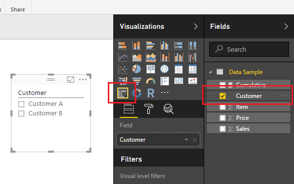
Add a slicer with the Customer column.
Notice when you select the different customers, either A or B the R script Visual will change to reflect the selected customer.
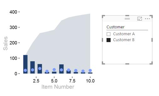
Now you can write the R script code once and use the filtering that is native in PowerBI to quickly change the data frame supporting the R Visuals.
As always, thanks for following along. Don’t forget to share if you liked this tutorial.
Want to learn more about PowerBI and Using DAX. Check out this great book from Rob Collie talking the power of DAX. The book covers topics applicable for both PowerBI and Power Pivot inside excel. I’ve personally read it and Rob has a great way of interjecting some fun humor while teaching you the essentials of DAX.


hey a great library of blog postings here….
how can we subscribe and get updates ?
Here is the RSS feed for my site (RSS Feed) If you have a RSS feed reader such as Feedly or via Microsoft Outlook, you can add the RSS feed there. Personally I use feedly as it is a light weight site that works well in your browser or on your iphone as an app.
Very good, thank you
The interesting thing that the article does not cover is how to use R viz on the server. If you go to publish this, it cannot be seen. How do I solve this problem? On the desktop is brilliant, but how can I share??
R visuals are now supported on the PowerBI.com service.. However, R is not available on the Power BI on-prem Report server. Thus, if you want to share reports with R scripts embedded in them you will have to use the PowerBI.com service for this.