
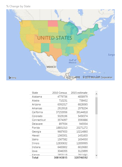
Alright to start this Tutorial off right we are going to incorporate the new feature released this spring from Power BI, called publish to web. Below you can view last weeks tutorial and interact with the data. Feel free to click around to see how the visualization works (you can click the shaded states or on the state names at the bottom.
For this tutorial we will build upon the last tutorial, From Wikipedia to Colorful Map. If you want to follow along in this tutorial click on the link and complete the previous tutorial.
Materials:
- Power BI Desktop (I’m using the March 2016 version, 2.33.4337.281) download the latest version from Microsoft Here.
- Mapping PBIX file from last tutorial download Maps Tutorial to get a jump start.
Picking up where we left off we have data by state with data from the 2010 Census and 2015 Census.
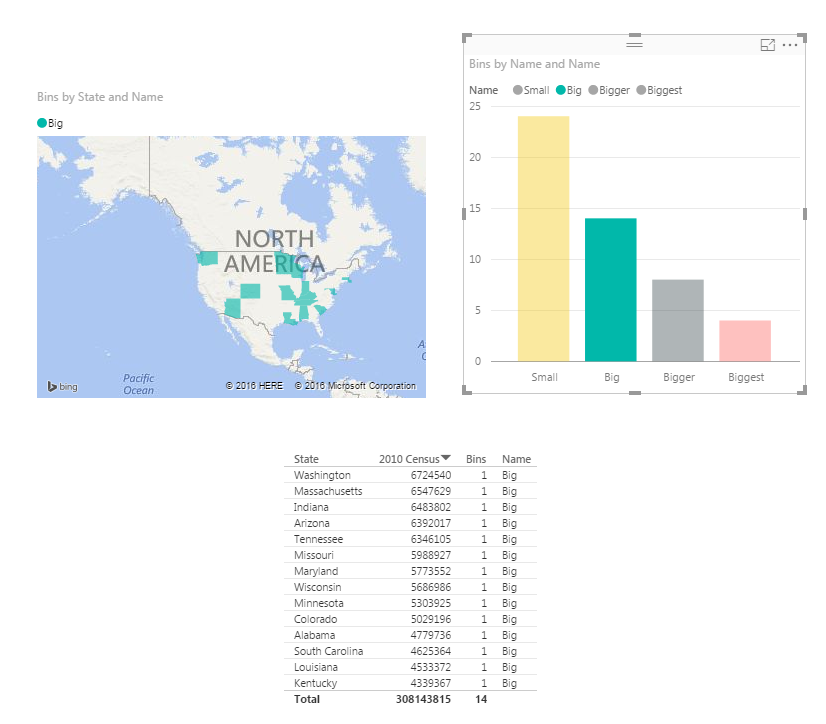
What we would like to identify is how many states are within a given population range. Say I wanted to see on the map, or in a table all the states that had 4 million or less in population in 2010.
To do this we will create bins for our data. Enter custom data in this format. For the tutorial on entering custom data into Power BI Desktop check out this tutorial on Manually Enter Data. Click on the Enter Data button on the Home ribbon. Enter the data as following:
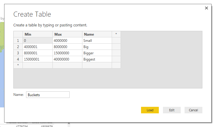
Note: Make sure you name the new table Buckets as shown in the image above.
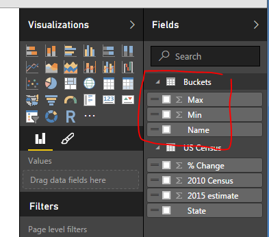
Click Load to bring the data into the data model. Notice we now have a new table in the Field column on the right.
Next we will create a measure to evaluate the state level data into our newly created buckets. This will be produced using DAX (Data Analysis Expressions). DAX is an extremely powerful language which is used in SQL applications and Analysis Services. More information can be found on DAX here. Since DAX is so complex we won’t go into a full explanation here. However, we will have many more topics in the future working on and building DAX equations.
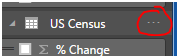
Click the Ellipsis next to the table labeled US Census. Then click the first item in the list labeled New Measure.
Note: Ellipsis is the term used for those triple dots found in newer Microsoft applications.
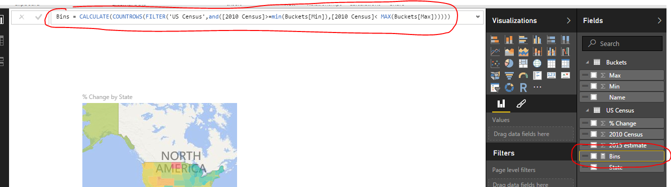
A formula bar opens up underneath the ribbons bar. Here is where we will name and type in the new measure. The equation we will need to add is the following.
Bins = CALCULATE(COUNTROWS(FILTER('US Census',and([2010 Census] >= min(Buckets[Min]),[2010 Census] <= MAX(Buckets[Max])))))
Press Enter to enter the measure into PowerBI.
Explanation of Equation: All text before the equal sign is the name of the measure. All the data behind the equal sign is the DAX expression. Essentially this equation is calculating the number of rows where we have data between the Buckets “Min” value and Buckets “Max” value. This is the magic that is DAX. In this simple expression we can compare all our data against our buckets ranges we made earlier.
Finally our new Bin measure should look like the following.
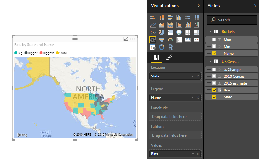
Now lets modify our visuals to incorporate the new Bins measure. Click on the existing map on the page. Remove the % Change item from the Values selection. Add the Bins Measure to the Values section. Notice the map changes color. Next, add the Name field from the table called Buckets into the Legend field. Our map should look similar to the following:
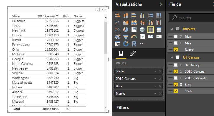
Next Click on State, 2010 Census, Bins, and Name (from Buckets table) and make a table. It should look like the following:
Lastly, we will build a bar chart using our Bins Measure. Click on the Stacked Column Chart Visual and add the following items to the corresponding categories: Axis = Name (from the Buckets table), Legend = Name, and Value = Bins (from US Census table). This will yield the following visual.
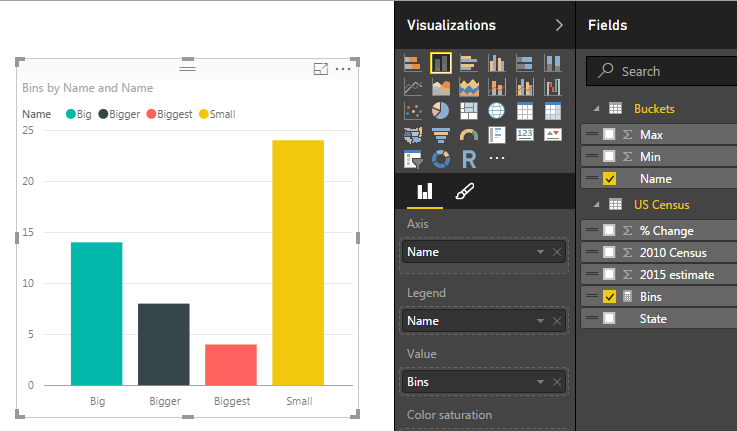
Click on the Ellipsis of the bar chart and then click Sort By, finally click Bins. This will order the items in descending order by the count of the items found in each bin.
Now have fun with your new data. Click on each of the bars in the bar chart and watch your data transform between the table, and the map.
Here is the final product if you want to engage with the data.
I have to give credit where credit is due. Below is the page from Power Pivot Pro that I used to create binning in the tutorial chart. The binning shown on PowerPivotPro is for Power Pivot but the functionality is the same. Enjoy.
Want to learn more about PowerBI and Using DAX. Check out this great book from Rob Collie talking the power of DAX. The book covers topics applicable for both PowerBI and Power Pivot inside excel. I’ve personally read it and Rob has a great way of interjecting some fun humor while teaching you the essentials of DAX.

what if the states were repeating ,how to modify the dax syntax for that case.
Great question. In this data set we have each state represented with one data point. I believe what your asking is what if you have a data set where each state had multiple entries. There are two ways to solve this. 1st being, you would make a summary table of the multiple inputs using the function summarize. The summarize function is found in this tutorial. This will compile each state into one data point, and therefore all the subsequent steps would work as described in this tutorial. However, there is a downside to this because the summarize function will only refresh when the data sources are refreshed. Thus, if you need to use a page filter or slicer to dynamically change the items for each state, the summarize will not update accordingly. The second option would be create a measure that will total the 2010 Census, something like the following 2010 Census Total = SUM(‘US Census'[2010 Census]) Then change the bin measure to use the new total measure to the following, Bins = CALCULATE(COUNTROWS(FILTER(‘US Census’,and([2010 Census Total]>=min(Buckets[Min]),[2010 Census Total]< MAX(Buckets[Max]))))). Removing the field [2010 Census] and replacing it with the measure [2010 Census Total]. This will sum all the items for each state.