
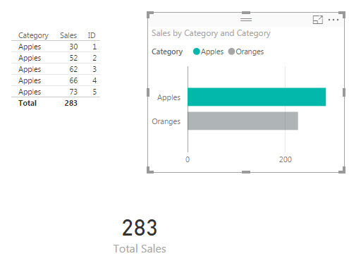
Often there are times when you will want to display a totals. Using measures to calculate a total are extremely easy to use. The power of using a measure is when you are slicing and selecting different data points on a page. As you select different data points the sum will change to reflect the selected data. See sample of what we will be building today below.
Materials for this Tutorial are:
- Power BI Desktop (I’m using the April 2016 version, 2.34.4372.322) download the latest version from Microsoft Here.
- CSV file with data, download SampleData in CSV format.
To load the CSV file into Power BI Desktop you can follow along in this tutorial, Import CSV File into PowerBI Desktop.
Once you’ve loaded the CSV file into Power BI Desktop your fields items should resemble the following:

Add the Table visual from the visualizations bar into the Page area. Drag the following items into the newly created table visualization, Category, Sales, and ID. Your table should look like the following:
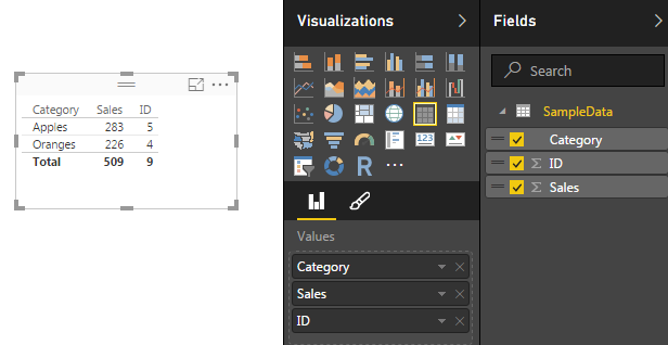
Click the Triangle next to the ID column under the Values section in the Visualization bar. A menu will appear, select the top item labeled Don’t Summarize.
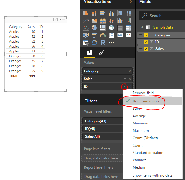
This reveal all the unique items in our table of data. Now, we will create our measures for calculating totals. On the Home ribbon click the New Measure button. Enter in the following DAX expression.
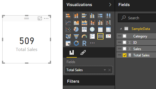
Total Sales = SUM(SampleData[Sales])
Note: In the equation above everything before the equals sign is the name of the measure. All items after the equation sign is the DAX expression. In this case we are taking a SUM of all the items in the Table SampleData from the column labeled Sales.
This will total all the items in the sales column. Click on the Card visual and add the Total Sales measure to the card. Your new card should look like the following.
Next we will add a bar chart to show how the data changes when the user selects various items on the page to filter down to different results. Add the Stacked Bar Chart to the page. In the Axis & Legend selectors add the Category column, and add the Sales column to the Value selector. This will yield the following bar chart.
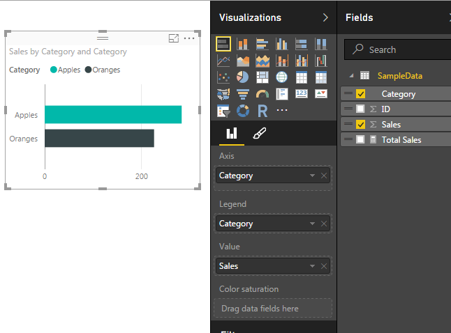
Now we can click on items in the bar chart to see how the table of data and the Total Sales changes for each selection. Clicking on the bar labeled Apples provides a total sales of 283, and clicking on the Oranges shows a total of 226.
Our measure is complete. Now we can select different visualizations and each time we do PowerBI is filtering the table of available data down to a smaller subset.
Pro Tip: When building different visuals and measures often it is helpful to have a table showing what data is being filtered when you interact with the different visuals. Sometimes the filters that you are applying by clicking on a visual interact in non-expected ways. The table helps you see these changes.
We have now completed a measure that is calculating a total of all the numeric values in one column.
Want to learn more about PowerBI and Using DAX. Check out this great book from Rob Collie talking the power of DAX. The book covers topics applicable for both PowerBI and Power Pivot inside excel. I’ve personally read it and Rob has a great way of interjecting some fun humor while teaching you the essentials of DAX.


Hi Michael:
Can you please send me step by step Instructions on how to create a folder where all Measures can be saved.
Thanks for the request. I have just finished this tutorial and will release it next week. I will update this comment when I’ve officially released the tutorial.
The post is now live. You can read through how to create a Measure Table here.