Data Sources
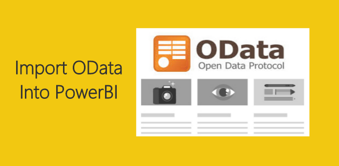
Get Your OData Here
For those of you who are following my tutorials, you are most likely to understand that each tutorial comes with it’s own data source. This has been intentional so we can both walk through the […]
For those of you who are following my tutorials, you are most likely to understand that each tutorial comes with it’s own data source. This has been intentional so we can both walk through the […]
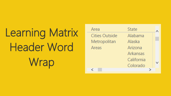
Power BI has been an continually evolving tool over the last year. The Matrix visual is powerful and mimics much of the functionality of a Pivot Table within Excel. I will admit, the Matrix visual […]
The long awaited PowerBI Desktop release is here. I’d like to point out a couple of key features that will help you improve your reports. First, the addition of word wrap on row headers. The […]

This past week I was talking with the big guy up north, jolly old fella, and the discussion came up about his toy production levels. Santa was complaining about how hard it was to measure […]
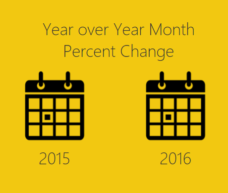
This tutorial is a variation on the month to month percent change tutorial. This specific exploration in year over year performance was born out of reviewing my google analytics information. The specific analysis question I […]
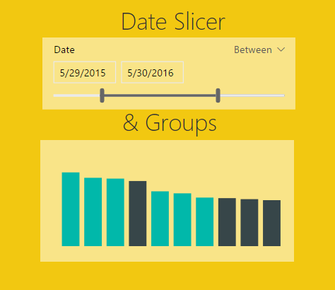
In the October update of PowerBI Desktop we were given a number of really useful features, ranging from a new Date Slicer, Grid lines, Grouping, Binning, Top N Filters, and R-powered custom visuals. For the […]
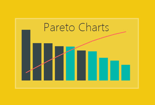
The Pareto chart is a handy visual, but is not so easy to build in either excel or PowerBI. In a Pareto chart, information is provided about an individual product or category as a bar, and […]
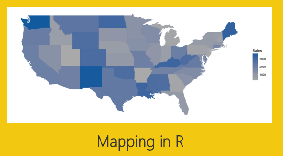
Mapping is one of the better features of PowerBI. It is one of the more distinguishing feature differences between Excel and PowerBI. You can produce a map inside an excel document using Bing maps, however, the […]
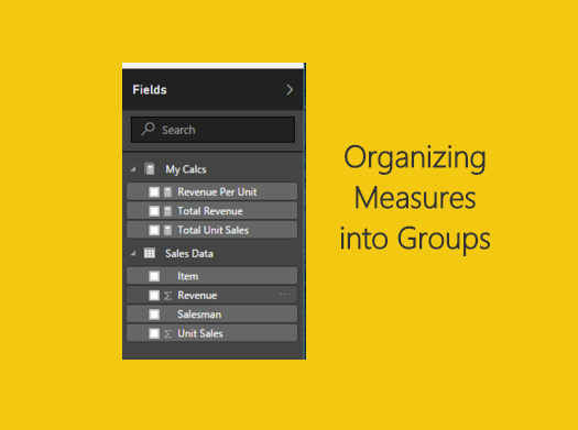
Often times when you’re working with large data models you will have multiple tables with many relationships. It could be complex maybe you’ve seen something like the following: Once all the tables have been loaded […]

Kicking off my video series for PowerBI.Tips I have to give incredible props to Adam Saxton. Adam is a Microsoft Employee who creates THE BEST content for PowerBI. There are a lot of videos out […]
Copyright © 2024 | MH Magazine WordPress Theme by MH Themes