Year: 2024

  • Overcoming Challenges in the Center of Excellence

    Overcoming Challenges in the Center of Excellence

    Starting a center of excellence (COE) can feel daunting. We face political challenges. This article pushes to explore the challenges of a COE and some recommendations to handle these challenges.

    The Importance of Attention to Detail

    Microsoft does a great job in outlining the key aspects of COE. For more details on this topic check out the Fabric adoption roadmap found here. A summary of those items are in the list below:

    I strongly feel that documenting the result of these conversations is a huge win. The documentation can be used to show leadership that you have a solid plan. Discussing these topics pushes towards a health data culture. Lastly, when you bring documentation to leadership you show thought of aspects that drive success.

    Foundational Attributes for Success

    The optics of the COE matter. COE performance and leadership are crucial, as they can impact the entire organization. Don’t underestimate the value of setting clear goals. Taking time to identify pain points with your current organization structure help with planning process for the COE.

    • Setting clear goals
    • Addressing pain points that you see, plan to solve those pain points
    • Just start, don’t worry about making the COE perfect, plan for adjustments

    Sometimes I feel that people try to over plan. Therefore, read up on the best practices provided by Microsoft’s documentation, write down your decisions then get moving! I have observed just by communicating and developing the plan really creates some momentum. Bear in mind it won’t be perfect in the first iteration. Plan on being flexible to adjust the COE to the organizations needs.

    Recommendations for Overcoming Challenges

    • Attention to Detail: Paying attention to aspect you can control of the COE’s performance. Engage leadership so they support the development of the COE. Remember the COE is a vote in the direction of better data culture for your company.
    • Setting Clear Goals: Defining clear goals helps the team align towards a unified direction. Address pain points that could derail or distract from the creation of the COE. Connect the success of the COE to Objectives and Key Results (OKRs) outlined by the leadership team.
    • Regular Communication with Executives: Regular communication with the executive team helps remove mis-aligned expectations. When you win let leadership know, they can promote your success. Success means more buy-in from the company.
    • Feedback: Gathering feedback and pivot. Have empath for the process and be willing to adjust. If something is not working within the COE try something new. Ask others involved in the COE for recommendations, some of the smartest people are the ones you already work with.

    For more thoughts on the COE and overcoming those challenges check out our episode on the explicit measures podcast.


  • Exploring the Power of Semantic Link

    Exploring the Power of Semantic Link

    Semantic link is one of the most promising technologies coming from the Microsoft Power BI and Fabric team. Semantic link has the potential to automate so many redundant tasks and tedious work. Automating and using code enables BI developers to free up time for more value-added work. Join Stephanie Bruno and Mike Carlo as they do a thorough demo of using Semantic Link.

    Semantic link is a powerful tool that allows direct access and manipulation of data within semantic models using code and notebooks. It offers automation, streamlined data extraction, and centralized data management within models. Throughout this workshop, we’ll delve into the diverse functionalities of semantic link and its potential benefits for data scientists, analysts, engineers, and fabric admins.

    This demo covers a range of topics, including:

    • Accessing and visualizing a Power BI report within a notebook
    • Exploring the list of reports in a workspace
    • Retrieving insights about tables and columns in a semantic model
    • Listing and comprehending measures within a semantic model
    • Visualizing and understanding table relationships
    • Utilizing semantic link for data access and manipulation

    Live Demos and Practical Demonstrations

    Our expert presenter, Stephanie Bruno, will lead live demonstrations and hands-on exercises to illustrate the practical applications of semantic link. The demos will encompass:

    • Creating a new notebook and connecting it to a workspace
    • Retrieving and visualizing reports within the notebook
    • Exploring tables, columns, and measures within a semantic model
    • Understanding and visualizing table relationships
    • Accessing and manipulating data using semantic link
    • Employing DAX magic to write and evaluate DAX expressions

    Throughout the workshop, we’ll showcase how semantic link empowers data scientists to access and utilize measures without the need to reconstruct complex logic. Additionally, we’ll highlight the seamless integration of semantic link with Python, facilitating efficient data manipulation and analysis.

    More where that came from

    If you like this type of training and content, join us over at Training.tips for 60+ hours of additional training.

  • Tips+ Designer and Theme Generator Tutorial: Automatic Visual Objects with AI

    Tips+ Designer and Theme Generator Tutorial: Automatic Visual Objects with AI

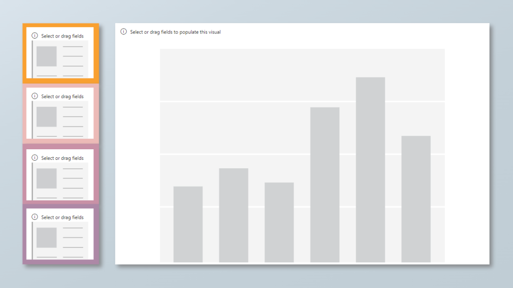
    Welcome to today’s tutorial where we’ll explore an exciting feature implemented to streamline your background creation process in Power BI. If you’ve ever found yourself spending too much time tweaking and aligning visual elements, this AI-powered solution will be a game-changer for you. This new feature continues to simplify the report visualization experience and open doors for other teams to decide on the visualizations, develop the look & feel, and pass off a pbip object to Data Engineers or BI Developers to easily add data into.

    If you prefer to follow along via video, you can check out the full walkthrough on the PowerBI.tips YouTube video here:

    Background

    Designing the look & feel of a report typically begins with tools like PowerPoint, Adobe XD, Illustrator, or Figma, where we craft our initial background designs. Whether simple boxes or intricate layouts, these designs serve as the canvas for our data stories. We decide what visuals we want, how many objects we want on a page, and how much real estate to assign. A lot of time is spent doing this. However, once you have this background image, you still have to create all the visual objects and nudge them into place.

    Introducing Visual Auto-Layout AI Feature

    Now, with the Power BI Tips+ Theme Generator you now have a tool that can recognize these design elements and automatically generate visual objects, saving you precious time and effort!

    Step 1: Access the Power BI Theme Generator

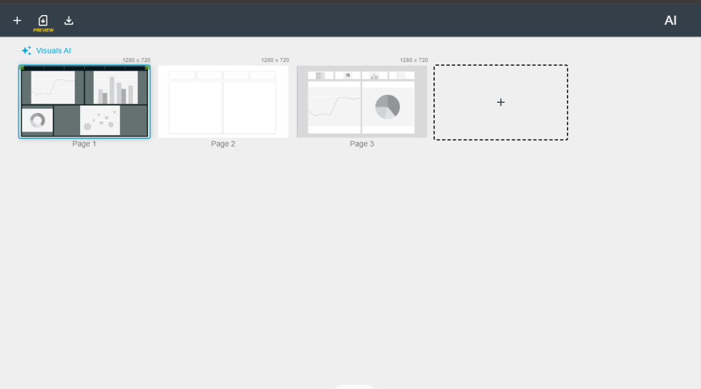
    Navigate to the Power BI Theme Generator, where you can upload your background images. Its extremely easy to generate new pages, and quickly upload your image to each page.

    Step 2: Let AI Do the Heavy Lifting

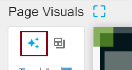
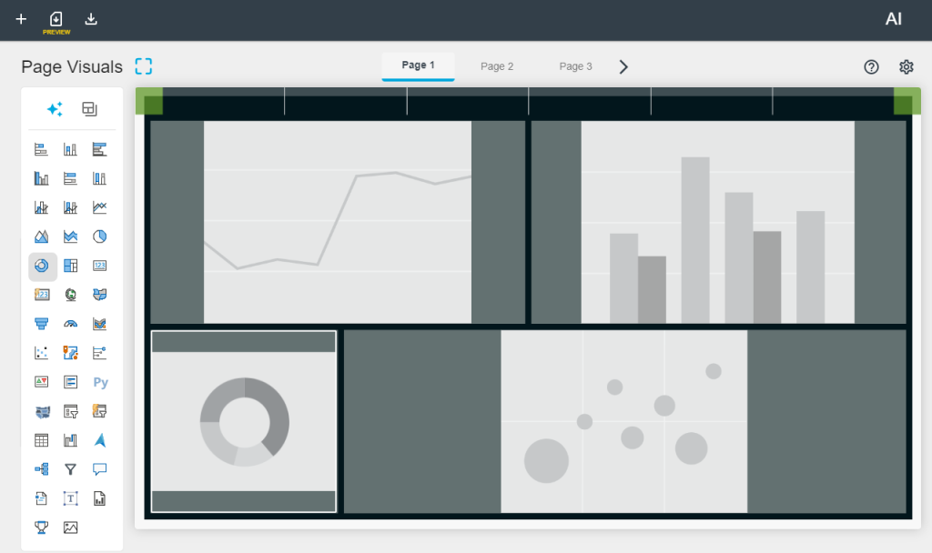
    With a click of a button our AI auto-layout feature identifies the background elements and aligns visual objects accordingly. This means no more manual adjustments or tedious alignment tasks. You can do this on a page by page level OR have the Visuals AI generate all images on all pages with just a click of a button!

    Step 3: Customize Your Visualizations

    Once the visual objects are generated, all that’s left to do is select the visualizations you want to insert into each space. Enjoy the flexibility to choose the perfect visual representation for your data insights.

    Step 4: Download and Implement

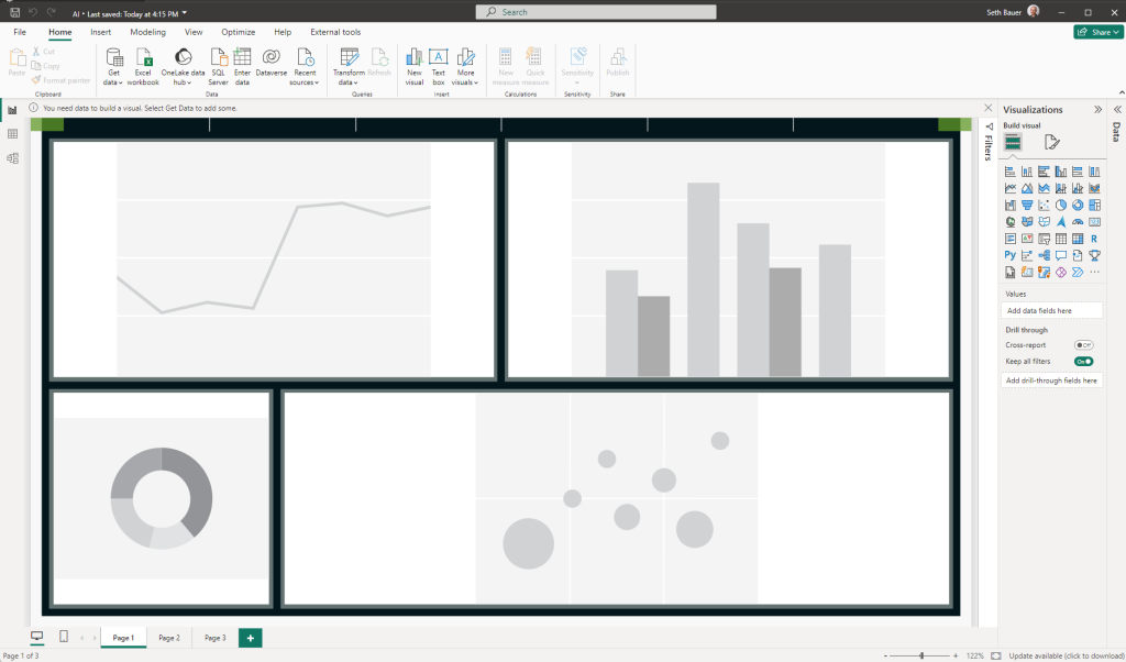
    Getting this into a Power BI report is as easily as downloading the PBIX file. This file will contain all your customized background and visualizations. And as always, you can enhance your Theme file with any preconfigured setting just by adding that to your Theme Generator file. After that, just extract the files and open your Power BI report by opening the .pbip file. Voila! Your professionally designed background with perfectly aligned visuals is ready to add data to!

    Conclusion

    By leveraging the power of AI, you’ve not only saved valuable time but also unlocked new possibilities for creativity and efficiency in your data visualization journey. With this streamlined process, you can focus more on crafting compelling data stories and less on manual design tasks.

    I hope you found today’s tutorial insightful. Stay tuned for our next tutorial, where we’ll explore another exciting feature that enhances your Power BI experience. Until then, happy visualizing!

  • Tips+ Designer and Theme Generator Tutorial: Gallery Project Copy & Edit

    Tips+ Designer and Theme Generator Tutorial: Gallery Project Copy & Edit

    Introduction

    Welcome to today’s tutorial where we dive into the powerful capabilities of the Power BI Tips+ Theme Generator. In this post, we won’t just download a project from the Gallery; instead, we’ll guide you through the process of copying and editing a project file using the Power BI Tips+ Theme Generator. Today, we’ll focus on the Framed Orange theme to showcase the flexibility and customization options available.

    If you prefer to follow along via video, you can check out the full walkthrough on the PowerBI.tips YouTube video here:

    Step 1: Copy and Edit Project File

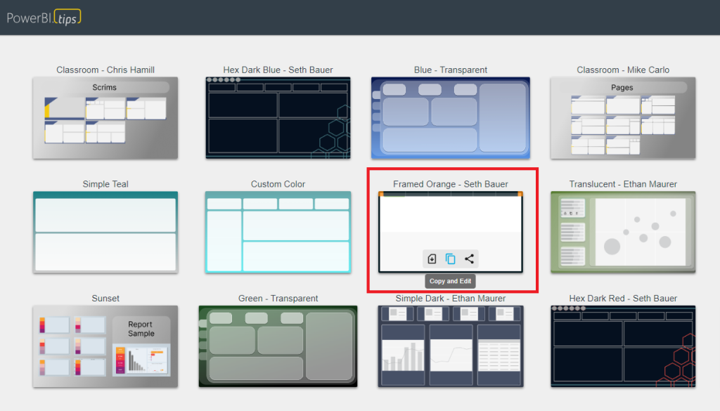
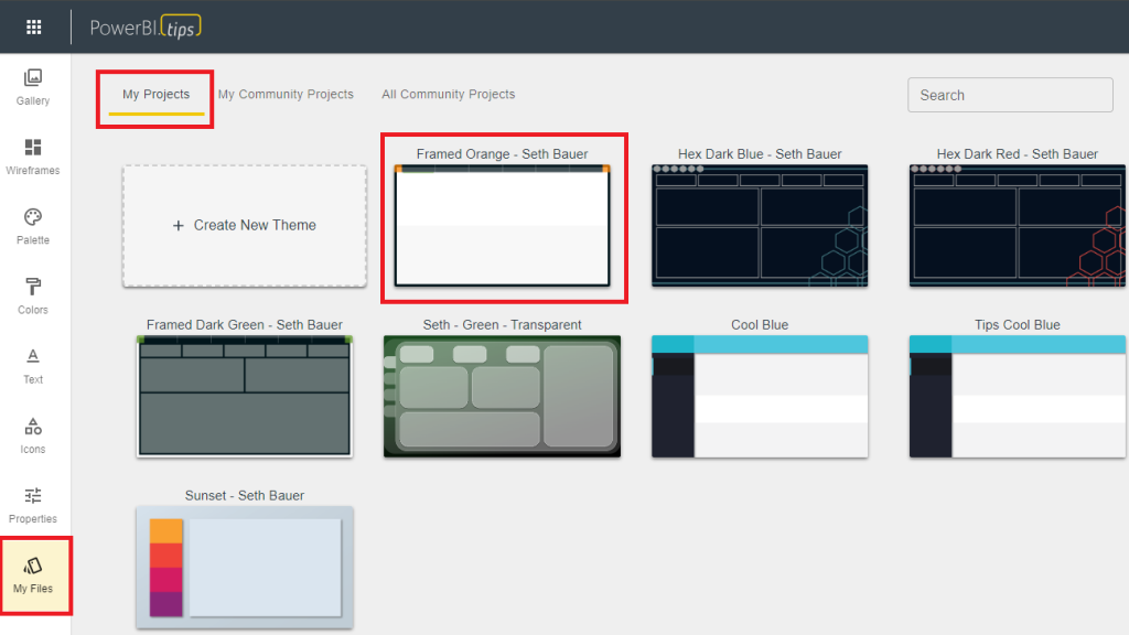
    Start by selecting the Framed Orange theme in the Power BI Tips+ Gallery. Click on “Copy and Edit” to open the project file. The Gallery project will open this project in your workspace and show you all the pages and visualizations in the Wireframe area.

    Step 2: Customizing Project

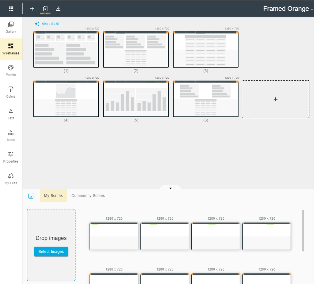
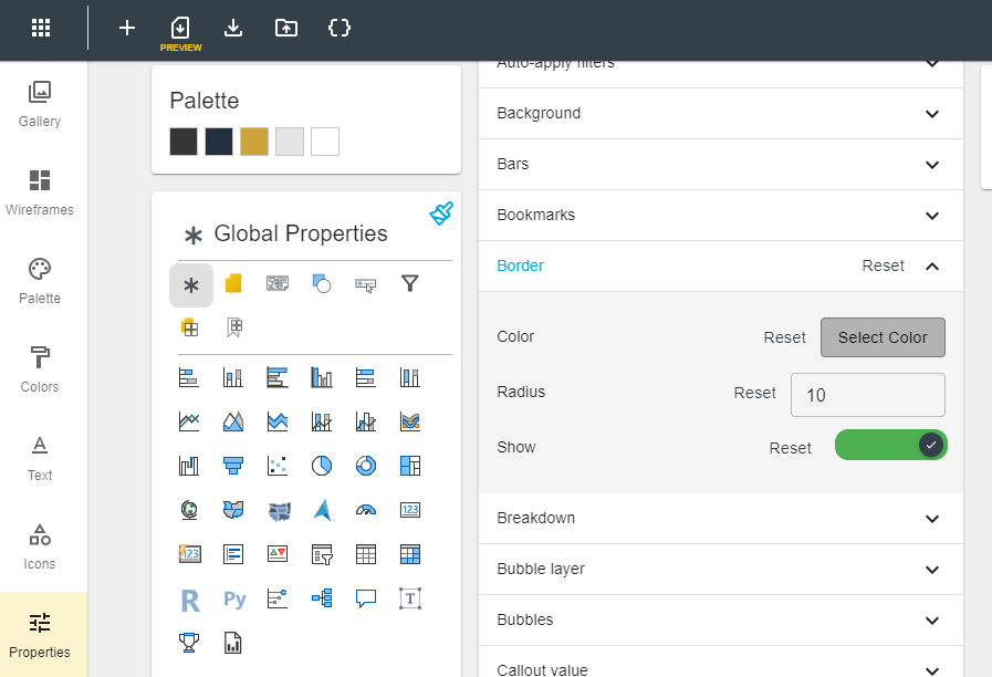
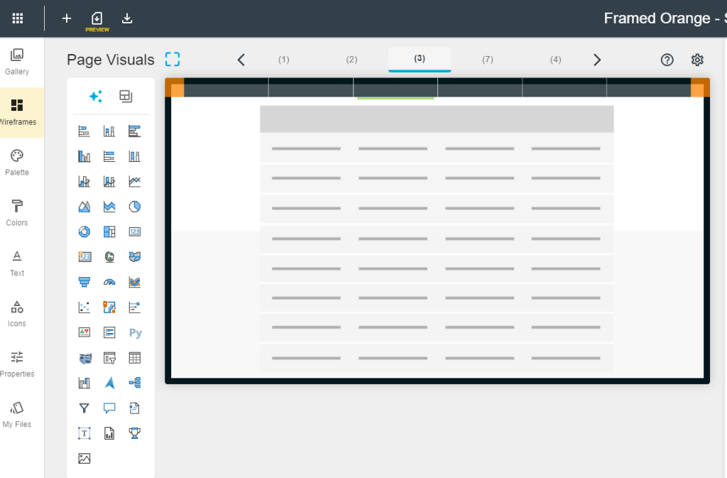
    Upon opening the file, you’ll notice wireframes representing the background and areas where visualizations will go. These project files contain all of the backgrounds, visuals and theme properties. In this case we have a palette and visualization properties set, so they are also imported. In our example, a gray border is applied to all visuals and a suite of colors is found in the palette.

    Step 3: Applying Changes

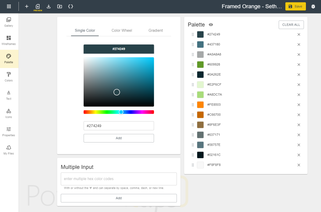
    Make changes to the project file as needed. In this tutorial, we’ll curve the edges of visualizations in the properties area, and bring in our own custom color palette. Easily add hex codes of your preferred colors to personalize the project.

    Step 4: Preselecting Visualizations

    As you navigate back to the Wireframes section you can see how easy it is to add the visuals to the predefined visual objects. You aren’t locked into these though and you can easily change the size and position. We’ve thought of that too! On Page 3 of this project, for instance, the project file has a large table.

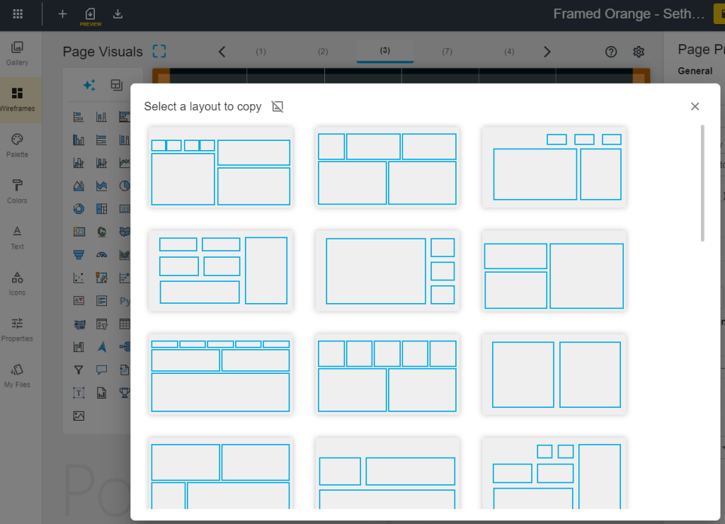
    Instead of using that, you can choose from predefined templates of visual objects to easily apply to the background. This feature makes it easy to align and space visualizations appropriately.

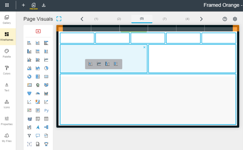
    Pick the one that suites you best, and apply it to your background. Now that we have that, we can choose which visuals we want to add for easily dropping our data into.

    Setting up a background, and perfectly aligned visuals to create beautiful reports has never been easier!

    Step 5: Downloading the Modified pbip File

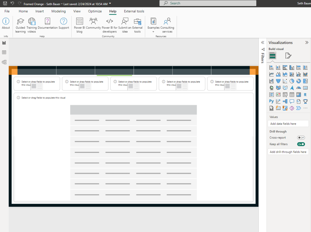
    Download the modified project file (pbip) file to your computer. Extract the files and open the PBI file in Power BI Desktop. You will see that all of our properties, new theme, and background are all applied to the report.

    Step 6: Adding Data

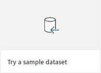
    Load your data or use a sample dataset to see the visualizations populated. Drag and drop or select visualizations to add your data into the pre-configured fields.

    Step 7: Exploring My Files Section

    Did you realize you missed a few properties or colors, or maybe wanted to add one more page? Not a problem, you can go back and tweak the project file any time you want, because its yours! Discover the My Files section in the Power BI Tips+ Theme Generator, where you can explore and update all settings and properties for your current and future projects.

    Conclusion:

    With the Power BI Tips+ Theme Generator, you can effortlessly customize and enhance your Power BI reports without spending large amounts of time tweaking all the visualization settings for every report you create. Use the Tips+ Theme Generator to create amazing templates to use over and over again!

    Stay tuned for our next tutorial, where we’ll delve into the exciting new AI features within the Power BI Tips+ Gallery. Elevate your reporting game with simplicity and efficiency!

  • Tips+ Designer and Theme Generator Tutorial: Gallery Project Download for Easy Theme Solutions

    Tips+ Designer and Theme Generator Tutorial: Gallery Project Download for Easy Theme Solutions

    Welcome to today’s tutorial where we’ll explore the Power BI Tips+ Theme Generator and its incredible features designed to streamline your Power BI report building experience. In this walkthrough, we’ll guide you through the process of getting started with the Power BI Tips+ Gallery, focusing on the Sunset theme. By the end of this tutorial, you’ll be able to effortlessly integrate our pre-configured Gallery Projects into your Power BI reports. It doesn’t get easier than this!

    If you prefer to follow along via video, you can check out the full walkthrough on the PowerBI.tips YouTube video here:

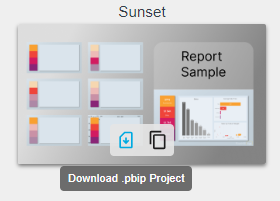
    Step 1: To begin, head over to powerbi.tips and navigate to Tools > “Themes New” section. Select the “Gallery” and you will notice the collection of Gallery Projects (A Gallery Project is comprised of a background, theme, and Power BI visuals all in one package). Highlight the Sunset theme for today’s demonstration, and select the “download .pbip Project”

    This file includes everything you need to create or alter your Power BI report visual aesthetics. After the download is complete, extract all files to your directory of choice.

    Extract & Open the Project in Power BI Desktop

    Step 2: Open the .pbip File by double-clicking on it. This will automatically launch Power BI Desktop! Ready to start working on adding data to your report?

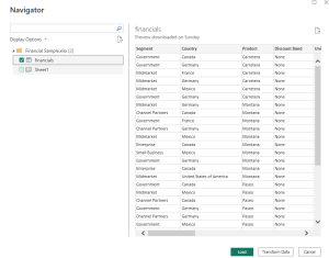
    Step 3: Load Data in Power BI Desktop. For this tutorial, we’ll use the financials dataset. Simply click on the desired dataset and load it into the report.

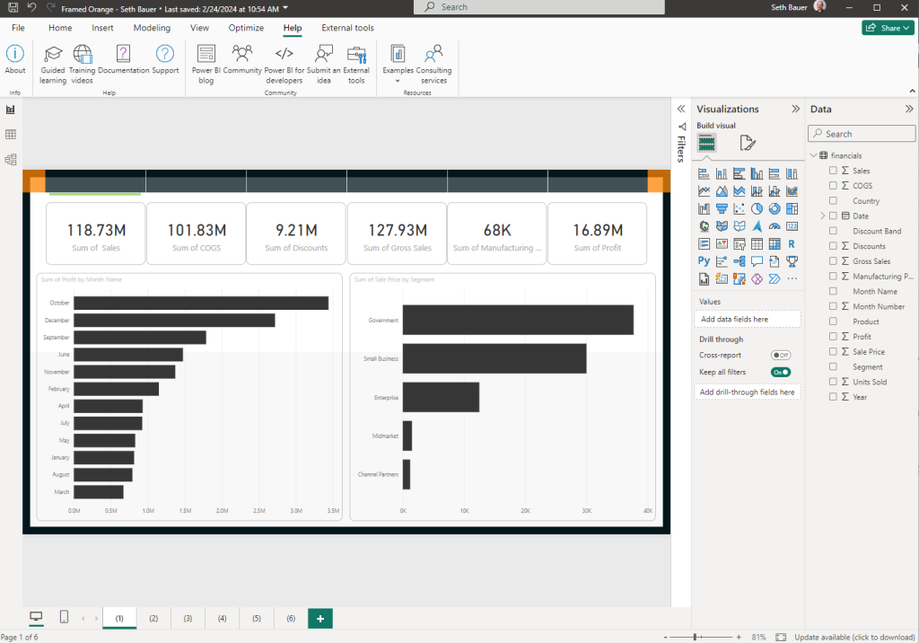
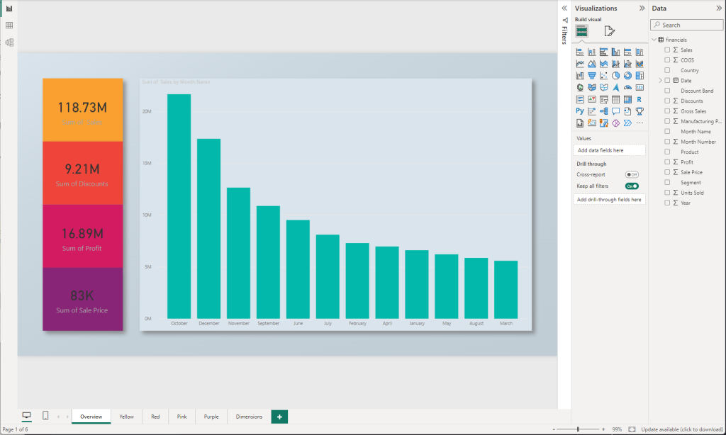
    Once we have the data loaded we can navigate to any of the pages. You will see that you already have a pre-configured background, visuals on the page, and a theme of colors that were created using the Tips+ Theme Generator!

    Apply Your Data

    Step 4: The report consists of overview tabs in yellow, red, pink, and purple, along with a dimensions tab. You can easily remove the initial description page to focus on your data. Because you already have visualizations aligned and on the report canvas, all you need to do is select the visual and click on the columns you want to add!

    Step 5: If a specific visualization doesn’t suit your needs, feel free to change its type as these are the standard Power BI visualizations. If something doesn’t align directly to your expectations, you can always adjust the properties, or change the theme itself in the Tips+ Theme Generator! We’ll walk through how to customize these pre-configured packages in our next tutorial. “Gallery – Customized Projects”

    Conclusion

    Congratulations! You’ve successfully integrated pre-configured Tips+ Gallery Project into your Power BI report using the Power BI Tips+ Theme Generator Gallery. This powerful tool simplifies the report-building process, saving you time and effort. Explore all the features available in the Tips+ Theme Generator to enhance the visual appeal of your reports effortlessly. Stay tuned for more tips and features in our upcoming tutorials. Happy reporting!

  • Creative Thinking in Fabric & Power BI

    Creative Thinking in Fabric & Power BI

    In podcast #286 we take the time to review an older video of John Cleese giving a talk about the Creative Process in Management. We thought this would be an outstanding conversation to draw parallels to the Business Intelligence world. There are so many different areas we can apply creative thinking in implementing Fabric & Power BI solutions.

    You can check out that video by John Cleese here -> https://youtu.be/Pb5oIIPO62g?si=66KNV2I8p5ZlESzz

    Episode 286 – Creativity in Power BI

    Talking Points:

    • What is Creativity, and what strategies can we use to be more creative?
    • Discussion centered around the concept of being creative in handling data, building reports and fostering a data culture.
    • Emphasize that creativity is not a talent but a mode of operation and discussed its relevance in the field of Business Intelligence.

    Key Topics:

    Where does creativity lie:

    • Discussed the distinction between open and closed states.
    • Strategies to foster creativity and measure its benefits.
    • Dedicated time for creative thinking, challenging the conventional to-do list approach.
    • Creating an oasis of quiet for pondering and problem-solving.
    • Embracing humor as a catalyst for transitioning from closed to open thinking.

    Overcoming Barriers:

    • Identifying common obstacles to creativity within organizations dealing with technology and data.
    • Evaluating the balance between analytical rigor and creative exploration in Power BI.

    Applications and Tips:

    • Exploring creativity in the adoption of BI practices, report building, and its application in day-to-day operations.
    • Building reports with an open mindset.
    • Allowing time for pondering before making decisions.
    • Encouraging positive collaboration within a community.
    • Applying the “art of the possible” by exploring new ideas.

    Meeting Creativity:

    • Examining the impact and value of injecting creativity into BI processes for organizational growth.
    • Introducing humor in meetings to foster creativity.
    • Building on ideas without fear of right or wrong.
    • Utilizing random connections for innovative solutions.
    • Creating a positive environment by avoiding negativity.

    Report Building Process:

    • Front-loading creativity in requirements gathering.
    • Incorporating creative thinking in model design and building calculations for visuals.

    This podcast episode is a treasure trove of insights for BI professionals looking to infuse creativity into their work, ultimately contributing to more innovative and effective business intelligence solutions. You can listen to the full conversation on the Explicit Measures podcast here:

    As a special add-on for your enjoyment Tommy came up with a whole slew of jokes in the same vein that John Cleese told in the presentation. Feel free to use them in your next creative meeting!

    Jokes Created by Tommy Puglia:

    How many data scientists does it take to change a light bulb?
    Three. One to replace the bulb, and two to model whether it was the most cost-effective light bulb choice.

    How many machine learning experts does it take to change a light bulb?
    Just one, but it will take thousands of tries to learn how to do it properly.

    How many business analysts does it take to screw in a light bulb?
    Two. One to assure everyone that everything is going according to the plan while the other screws the bulb into the water faucet.

    How many BI consultants does it take to screw in a light bulb?
    Only one, but they’ll first conduct a cost-benefit analysis to determine if the light bulb change will add value.

    How many marketing analysts does it take to change a light bulb?
    One, but they’ll also rebrand the room to make it look brighter.

    How many sales analysts does it take to change a light bulb?
    Just one, but they’ll convince you to upgrade to a smart bulb with a subscription plan.

    How many data warehouse architects does it take to change a light bulb?
    Two: one to change the bulb and another to ensure it integrates seamlessly with the existing lighting infrastructure.

    How many AI developers does it take to change a light bulb?
    They won’t. They’ll train a neural network to predict when the bulb will burn out and preemptively send a drone to replace it.

    How many cloud storage experts does it take to change a light bulb?
    None. They’ll just store light in the cloud and access it as needed.

    How many Business Analysts does it take to screw in a light bulb?
    Just one, but they will first interview everyone in the room to define the requirements for the ‘ideal light’ experience.

    How many Data Analysts does it take to change a light bulb?
    Two. One to replace the bulb, and the other to tell everyone how much brighter it could be with just a few more data points.

    How many stakeholders does it take to change a light bulb?
    Four. One to ask for a greener bulb, one to demand a cost-effective solution, one to insist on a smart bulb, and one to question why the bulb needs changing at all.

    How many report requesters does it take to change a light bulb?
    None. They’ll just ask for a daily report on the status of the light bulb but never actually replace it.

    How many Data Analysts does it take to screw in a light bulb?
    One, but by the time they’ve finished analyzing the best method, the technology for light bulbs has already changed.

    How many stakeholders does it take to change a light bulb?
    Five. One to change it and four to form a committee that debates whether it was better the old way.

    How many report requesters does it take to change a light bulb?
    None. They just keep requesting status updates on the darkness.

    How many BI Consultants does it take to screw in a light bulb?
    Two. One to assure the client that they’re leveraging cutting-edge lightbulb technology, and the other to outsource the actual screwing in to an intern.

    How many BI Consultants does it take to change a light bulb at a large corporation?
    An entire team, but the project will take three years and by the end, they’ll switch to a completely different kind of bulb.