
KPIs are a key visualization type used to convey high level metrics to the end users. They provide an at-a-glance metric that allows business users to know whether they are on track or off-track. Over the course of time that single metric number has been enhanced to include lines to showcase trends, date stamps, variance and many other metrics to convey key metrics in a compact and concise way. There are a number of different takes on what a KPI can or should look like. If you would like to take a look at all the different KPI visuals you can download from AppSource you can find those here there.
I’ve used several of the visuals from AppSource before, and what I would recommend is that you always verify that the visual has the blue “Certified” label if you plan on just using it. That means that the custom visual has met certain code and verification criteria and the visual is not accessing or using external resources. That is not to say that you can’t use the other visuals, but I would recommend looking at them closer and potentially reaching out to the owner of the custom visual to see if there are any extraction or third party interactions that would not be acceptable risk for your company.
That being said, one of the great things about having custom visuals is that they typically offer more enhanced visual options or settings that you cannot find in the default visual set in Power BI. KPIs have been one of those visuals that needed a bit more enhancement. I’m happy to say in the latest December release of the Desktop it received it. If you’ve been looking elsewhere for your KPI visual, it might be high time to give the latest default version a little bit of a test run as it offers some of the key features that are plenty enough for me.
Basic Updates
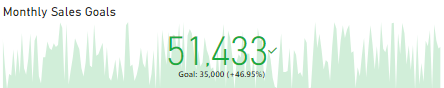
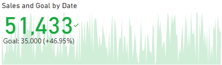
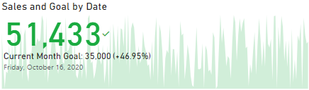
Prior to the December update the KPI visual was a bit standard. An example of what that looks like is here.
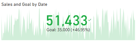
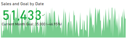
However, if you look at the below example of the new one, there have been several key updates that pop this KPI now by default and extend it to make it look more pleasing. The first change is obvious, the Font is DIN and brings a bold pop to the overall number. We’re off to a good start! We can also now change the Font family of the larger metric which will allow us to mirror the overall fonts we’ve selected within our other visuals.
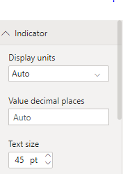
The Indicator and Goal properties have received the most prominent updates, but there are also some key changes that allow us to now set the font colors both statically and conditionally.
Indicator Properties
Let’s see how these changes impact things overall. First, lets take a look at the Indicator. The options went from this:
To this:
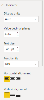
What does that do for our KPI? Aside from what we outlined above, it gives us a simple two click option to adjust where we want the number (Top & Left), which makes our trend seem a bit more trendy?
Another option we now have is to increase or decrease the transparency of the trend.
Goal Properties
The second property area that received a bunch of changes is the Goals area. That looked like this:
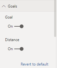
While the new properties pane looks like this:
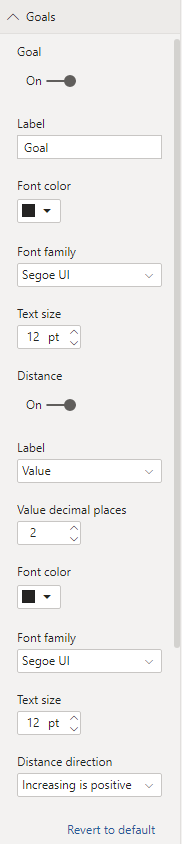
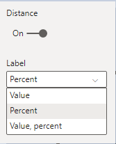
This change is almost like the difference between the Edison bamboo filament light bulb and the latest LED that lets you pick between millions of colors… Ok, maybe that’s a bit extreme, but you get the point. This property is now extremely useful. Note: the Goal label name can be changed and the metric returned for the distance value can be updated to show the percentage, value or both.
The color and font family for both Goal and Distance are updateable now as well along with a new property for the Distance direction.
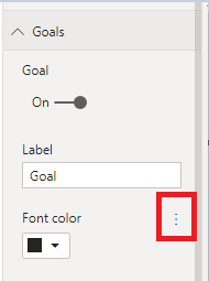
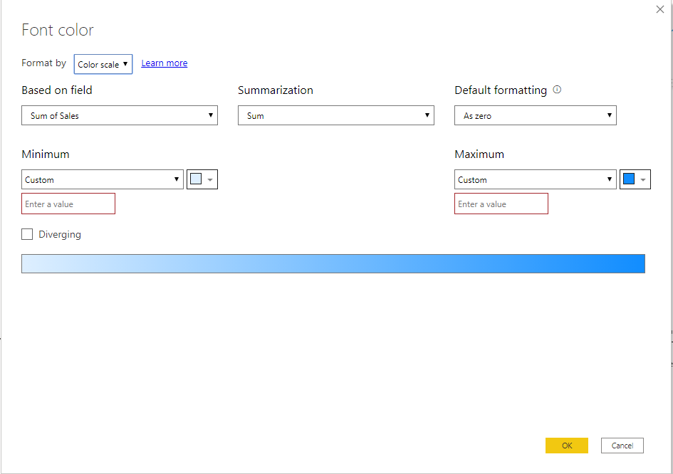
Conditional Formatting
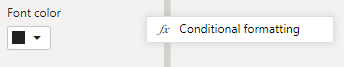
One of the “hidden” things to be aware of is that the above screen shots are the default view of all properties. To see if you can use a conditional setting you need to hover the mouse over the Font color area. Doing so will illuminate the “…”
Clicking that gives us :
And one more click opens the dialogue where we can set our conditions.
One final key property is the addition of the top level “Date” property. This is a great addition in that it takes away any doubt about what the current KPI context is without having to look at filters.
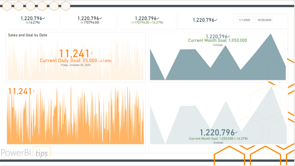
Showcase
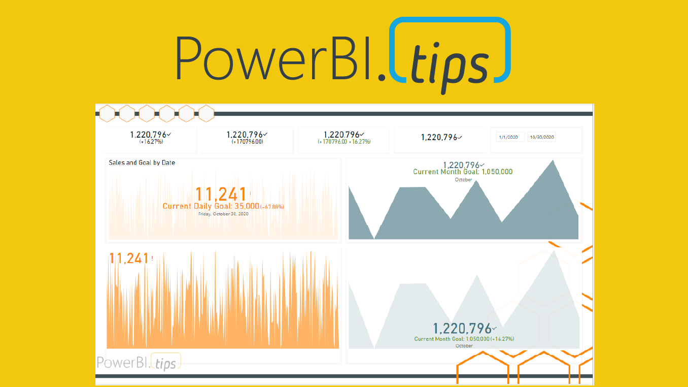
Utilizing all the capabilities now given, we can create a series of KPIs that carry the vast majority of all our needs in the out of the box visual. Below is just an example of a bunch of different ways to format the KPI visual. The goal here is to show how many different ways we can see these metrics using the same KPI visual now that we have all these new properties at our disposal.
Sometimes the features we want to have added to visuals in Power BI aren’t being worked on. It isn’t for lack of effort on the Power BI team, believe me. But there are only a finite number of resources, and a backlog a mile long. Check out ideas.powerbi.com to see all the ideas being requested. I believe that is why they opened up a program to work with Power BI experts to engage with the Power BI team directly. These KPI features are a result of that program. The individual we can all shower with our thanks is James Dales. You can check out what James is up to on his blog – https://powerbi.jamesdales.com/, and be sure to hit him up on twitter and offer up a bit of thanks – @jamesdales
If you like the content from PowerBI.Tips, please follow us on all the social outlets to stay up to date on all the latest features and free tutorials. Subscribe to our YouTube Channel, and follow us on Twitter where we will post all the announcements for new tutorials and content. Alternatively, you can catch us on LinkedIn (Seth) LinkedIn (Mike) where we will post all the announcements for new tutorials and content.
As always, you’ll find the coolest PowerBI.tips SWAG in our store. Check out all the fun PowerBI.tips clothing and products: