Category: Report Visualization Tips

  • Power BI Bookmarks Tips, Tricks, and Best Practices

    Power BI Bookmarks Tips, Tricks, and Best Practices

    This article describes Power BI Bookmarks tips, tricks, and best practices. Bookmarks are a powerful feature that can greatly improve the reader’s experience. However, there are several settings you should be aware of. Used incorrectly, they can become hard to maintain and often not display the intended functionality.

    Power BI Bookmarks

    This article will assume some basic knowledge on how to record or apply bookmarks. Please see this. If you are new to Bookmarks, you may want to watch this helpful video by Adam Saxton from Guy In A Cube.

    It will run through an example of using a switch visuals bookmark group. If you have not seen this before, I suggest you watch this video, also by Guy In A Cube.

    You should be familiar with:

    The rest of the article will focus on some tricks and tips using bookmarks, while walking through an example of a visual switch between a map and a graph.

    Tips Covered


    Change Power BI Bookmark Settings

    You should always update the bookmark settings when creating them. This should always be as specific as possible to the action they are trying to achieve.

    Here is a quick breakdown of the settings:

    Data: This captures items including filters and sort order. It does not capture if the item is visible or not.

    Display: This captures whether an item is visible or not, without modifying filters or sort order.

    Current Page: This will switch to the current page view if you apply the bookmark from a different page. If unselected, it will still apply the bookmark, but it will stay on the page you apply it from.

    All Visuals: If this option is selected, it captures every setting on the page. This can include items in the filter pane, or even if the filter pane is open. I would recommend to never use this setting.

    Selected Visuals: Selected visuals still only apply bookmarks to the visuals you had selected when you record the bookmark. You can select items by holding control and clicking on them in the selection pane.

    In general, I try not to use both Data and Display together, as most cases bookmarks are just changing one of these fields. Previously, it was required to use bookmarks to navigate pages. However, this is no longer needed after new functionality allows this to be done with buttons directly. Therefore, I rarely use this feature.

    One of the best Power BI Bookmarks tips – use selected visuals only. Recording bookmarks on all visuals often has unintended consequences and can be difficult to manage. Rarely is this needed and can become very hard when adding more visuals to the page.


    Rename Your Visuals

    The first tip is to rename your visuals. Each visual is given a name, which can be viewed in the Selection Pane. By default, the name is usually the type of visual it is. This means if you have several slicers on a page, you might get a list of several visuals with the same name. While this is not an end user feature, it can make it difficult to identify the correct visual when developing.

    We recommend renaming each visual when you add it. First, open the selection pane. Next, double click on the visual you have just added in the selection pane. Rename the visual to something that calls out what it is. Our recommended naming strategy is the following.

    Visual - Description
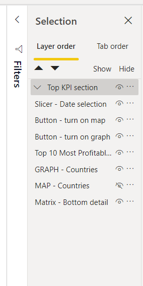
    The selection pane
    Example of renamed visuals in a selection pane

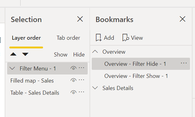
    Pro Tip: When a page contains multiple bookmarks it’s difficult to know what Bookmark touches which Visuals or Groups. Thus, when you are planning multiple bookmarks on a single page add an ID at the end of the Visual or Group. This will correspond to a number listed at the end of the Bookmark.


    Record Power BI Bookmarks on Groups

    Using groups has huge benefits for Power BI bookmarks. If you record bookmarks on groups instead of individual visuals. Now, any edits made on the content of the groups will flow through, without the need to re-record bookmarks.

    For example, let’s say I want a bookmark that switches a visual from a table to a map.

    First, I’m going to make the groups. Open the selection pane. Whilst holding control, click on each visual that should be in the group. Right-Click on one of the selected visuals, then click the list option named Group then in the sub menu Group. You should also rename the group, so you know what it contains.
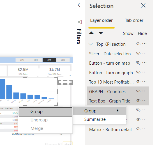
    Visual image showing how to group visuals, as described in the text above.

    Note that to set up a group, you need at least two visuals. In my example, I have a graph visual and a title. If you have just one, you can still set up a group. Simply add a blank text box or shape and group it with your visual. You can then delete the blank text box or shape and the group will persist.

    HINT: Elements can be difficult to move or select after grouping. If you want to modify a visual, use the selection pane to select it easily. If you want to move it, click and drag the ellipsis to move it.


    Add Placeholder Groups to Easily add More Visuals

    Next, I will set up the remaining groups. Aside from the map group, I’m also going to add some placeholder groups. To do this, I will add a blank visual and a blank text box.
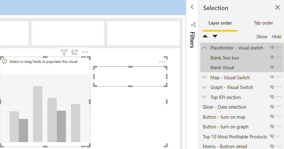
    Power BI Bookmark tips: Grouping visuals

    Next, I’m going to select the new group. Then I’m going to copy and paste using Control-C and Control-V to create three placeholders.

    Now that all the groups are set up, it is time to record the bookmarks! For each group follow these steps:

    1. Using control, select all visual groups including the placeholders.
    2. Using the eye, hide all visual groups except the Map – Visual Switch.
    3. Rename the bookmark in the bookmark pane by double clicking it.
    4. Click the ellipsis to open the bookmark settings.
    5. Deselect Data and Current Page. Change to Selected Visuals. The settings should look like the picture above.
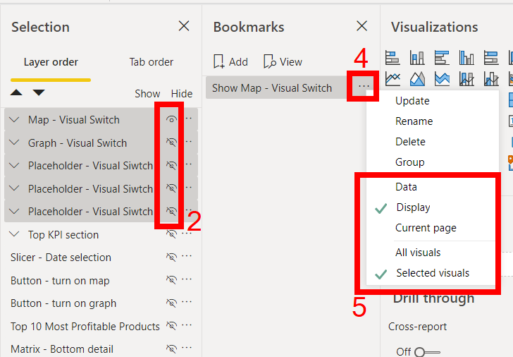
    Power BI Bookmark tips: Adding the bookmark and changing the settings

    Rename and Group Bookmarks

    Two more Power BI Bookmarks Tips are to rename the bookmarks and to group them. In addition to renaming your visuals when adding them, you should also rename your bookmarks. For the bookmarks themselves, I do action name – function.
    Secondly, you should group similar bookmarks together. For example, the bookmarks in the visual switch should be put in the same group. This group can also be renamed. I often like to include the page name in the group and then its function.
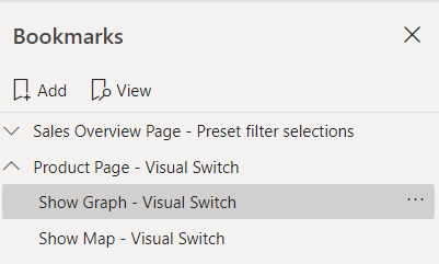
    Image showing renamed Power BI bookmarks. The names read Sales Overview - Preset filter selections, Product - Visual Switch, Show Graph - Visual Switch, Show Map - Visual Switch
    Example of Power BI bookmark groups and names

    Pro Tip: You will want to provide a connection between the bookmarks and the visual elements on the page. By adding an ID at the end of the Visual or Group and the Bookmark you can create a traceable link. This is especially important when you have multiple repot developers working on the same report. Adding an ID signals to the next report developer that these bookmarks are influencing the associated items on the Selection pane.

    Layers

    For this section, you should be familiar with the selection pane. Remember that objects at the top of the selection pane are in front of those below it.

    Now that we have our groups, it makes it simpler to have buttons. In my example, I will create a button that says Graph, plus a button that says Map. If we are switching visuals, it is useful to have highlighted what visual is presented. I will highlight with a blue background and bold text.

    One way of doing this, is to layer text boxes behind the buttons. First, create the buttons at the that will contain the bookmark action. This button will be see-through and slightly larger than the text boxes.

    Next, create the middle text boxes that formatted for the selected button name.

    Finally, create the back text boxes that are formatted for the unselected button name.
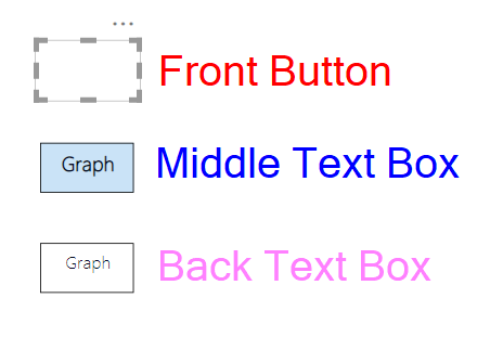
    Visual description of the layer order described above
    Example of the button elements

    Keep it Tidy

    Once we have repeated for all buttons, we can tidy it up. First, place all button elements in the same position on the page. You can do this easily using the align function.

    Then, place the middle text box inside the group it relates to. This means when the bookmark is applied, the selected format will be visible for the correct visual. The trick is that we will layer the elements, so this text box will appear in front of the unselected text box. The buttons will always be on top, so the functionality will always remain the same.

    Group the front buttons together, and make sure they are in front of the text boxes. These control the functionality of the Power BI Bookmarks.

    Group the back text boxes together, and make sure they are at the back.
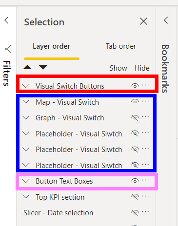
    Example of Power BI Bookmark groups

    The layer sets:
    Visual Switch Buttons
    : These are the buttons that apply the bookmarks. This is the top layer and always visible. This contains the Front Buttons.

    Visual Switch Groups: This is the groups we set up earlier. This contains the text box that shows the highlighted button name. As the text boxes are part of the groups, only the selected one is visible. The is the middle layer. This contains the middle text boxes.

    Button Text Boxes: This contains the text boxes that go at the back and show the unselected value. This contains the Back Text Boxes.


    Final Words

    Out of all the Power BI Bookmarks tips, the one I would stress the most is: use the selected visuals setting. It will make your reports much easier to maintain!

    If you are not convinced to use bookmark groups, it was recently announced at MBAS 2021 some extra functionality. This will allow users to apply whole bookmark groups to a page, automatically adding buttons when you add extra bookmarks.

    I also described a similar tip using buttons almost two years ago. This uses slightly more advanced technique, and some functionality was not out then that is now. However, it is still valid and a viable option.

    If you like the content from PowerBI.Tips please follow us on all the social outlets. Stay up to date on all the latest features and free tutorials.  Subscribe to our YouTube Channel.  Or follow us on the social channels, Twitter and LinkedIn where we will post all the announcements for new tutorials and content.

    Introducing our PowerBI.tips SWAG store. Check out all the fun PowerBI.tips clothing and products:

    Check out the new Merch!

    Hasta La Vista Data
    Go Ahead Make My Data
    PBIX Hat


  • HTML Content Custom Visual

    HTML Content Custom Visual

    Daniel Marsh-Patrick is a custom visual developer who recently released the HTML Content, a custom visual. This month we go over this visual in detail with it’s creator himself.

    While this visual is currently at V1, Daniel shows us a preview of V2 and trust me you will absolutely love it. I’m so looking forward to using this visual in my daily workflow. As well as V2 is going to be amazing.

    Watch the Webinar

    Follow Daniel

    Blog: https://coacervo.co/
    LinkedIn: https://www.linkedin.com/in/daniel-m-p/
    GitHub: https://github.com/dm-p

    If you like Daniel’s work please consider sponsoring him. This way we can continue to get amazing visuals: https://github.com/sponsors/dm-p

    If you like the content from PowerBI.Tips please follow us on all the social outlets. Stay up to date on all the latest features and free tutorials.  Subscribe to our YouTube Channel.  Or follow us on the social channels, Twitter and LinkedIn where we will post all the announcements for new tutorials and content.

    Introducing our PowerBI.tips SWAG store. Check out all the fun PowerBI.tips clothing and products:

    Check out the new Merch!
    Hasta La Vista Data
    Go Ahead Make My Data
    PBIX Hat


  • Designing a Great Power BI Report

    Designing a Great Power BI Report

    What does it take to design and create a great looking report in Power BI? Do you have a clear understanding of what tools and techniques you should use every time? Recently the owners of PowerBI.Tips had the pleasure of speaking with Reza Rad’s user group on the fundamentals we use to build great looking reports every day.

    This presentation focuses on the basic concepts and things we do for every report. This one isn’t about all the unique features we love talking about leveraging, but rather the nuts and bolts that you can use to make every report shine.

    Key Concepts

    We’d invite you to join us by watching the video where we cover these fundementals in depth.

    1. Discover insights. Who is your audience and what questions can you ask to drive into those key metrics
    2. Define and outline the process for developing key visuals based on those insights
    3. How can you create and use a background to enhance the look & feel of your report
    4. Creating a consistent theme that you can re-use again and again
    5. Using tools like Themes, Scrims or Layouts to help you make this experience more achievable

    Designing a Great Power BI Report

    If you like the content from PowerBI.Tips please follow us on all the social outlets. Stay up to date on all the latest features and free tutorials.  Subscribe to our YouTube Channel.  Or follow us on the social channels, Twitter and LinkedIn where we will post all the announcements for new tutorials and content.

    Introducing our PowerBI.tips SWAG store. Check out all the fun PowerBI.tips clothing and products:

    Check out the new Merch!

    Hasta La Vista Data
    Go Ahead Make My Data
    PBIX Hat


  • Create Custom Mapbox Styles

    Create Custom Mapbox Styles

    If you’ve played around with MapBox in Power BI – you’ll know that it has loads of great features to create really rich and beautiful maps, including some great ‘out of the box’ map styles (i.e. base maps).   However, you might not be aware that it also gives you the ability to design custom Mapbox styles with your own spatial layers. I discovered this feature on a recent project where my client wanted to include Victoria’s Catchment Management Authority (or CMA) boundaries on their base-map to provide greater context to help interpret their data. Up until this point, the only option I knew of was to purchase an expensive ArcGIS Online licence to create custom map styles. So, you can imagine just how excited I was when I discovered that I could also do this in MapBox – for FREE!!!

    Reasons to Design Your Own Style

    There are plenty of reasons to design your own map styles, including:  

    1. Provide Context: I touched on this above, but the ability to add your own layers to the backgrounds on your maps goes a long way to providing additional context to help your report users understand and interpret their data.  
    2. Simplify: Sometimes you need to peel back the complexity to help your data stand out. Customizing base maps allows you to remove unnecessary elements which may distract your users from the data, and dynamically add back complexity at different zoom intervals (watch Step 4 of the Video to see how this works!) 
    3. Consistency, Branding, and Themes:  Customizing the style allows you to design your maps with a similar ‘look and feel’ to other visuals in your report, as well as corporate branding and color themes. For the passionate Power BI designers out there – you’ll LOVE this feature (we’re always on the hunt for new formatting options in Power BI!) 

    I’m not going to lie, there are a couple of steps involved in designing your own custom styles for MapBox in Power BI, but believe me – it’s totally worth it! I walk through the key steps in this short video, which include:

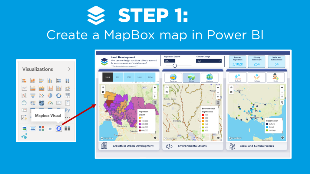
    1. Create a MapBox map in Power BI (check out the video on MapBox 101 if you’re new to MapBox, or need a refresher).  
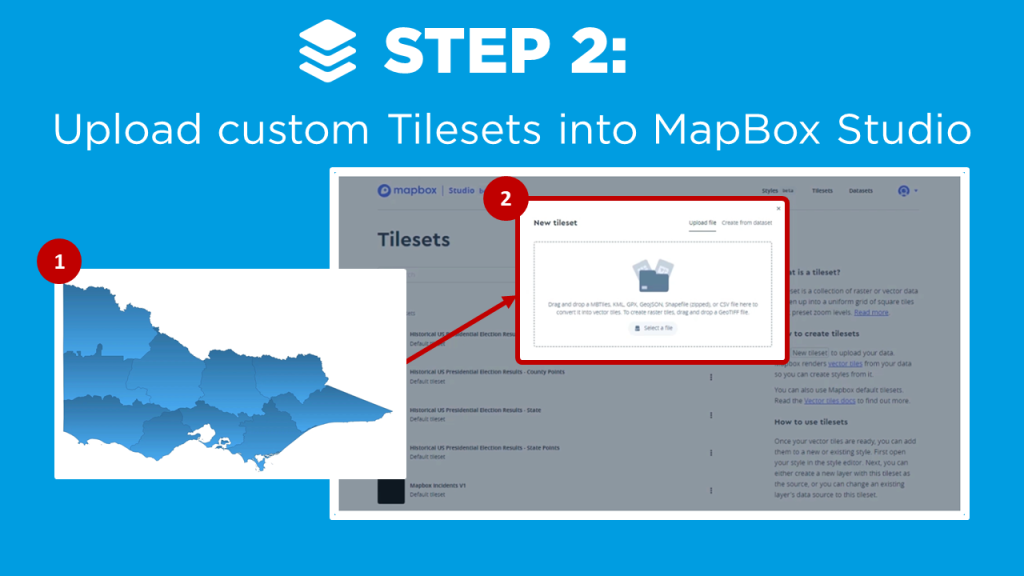
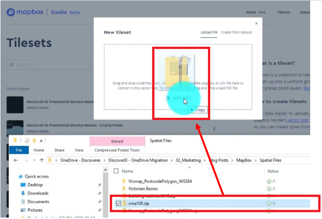
    2. Upload your custom tilesets into MapBox Studio
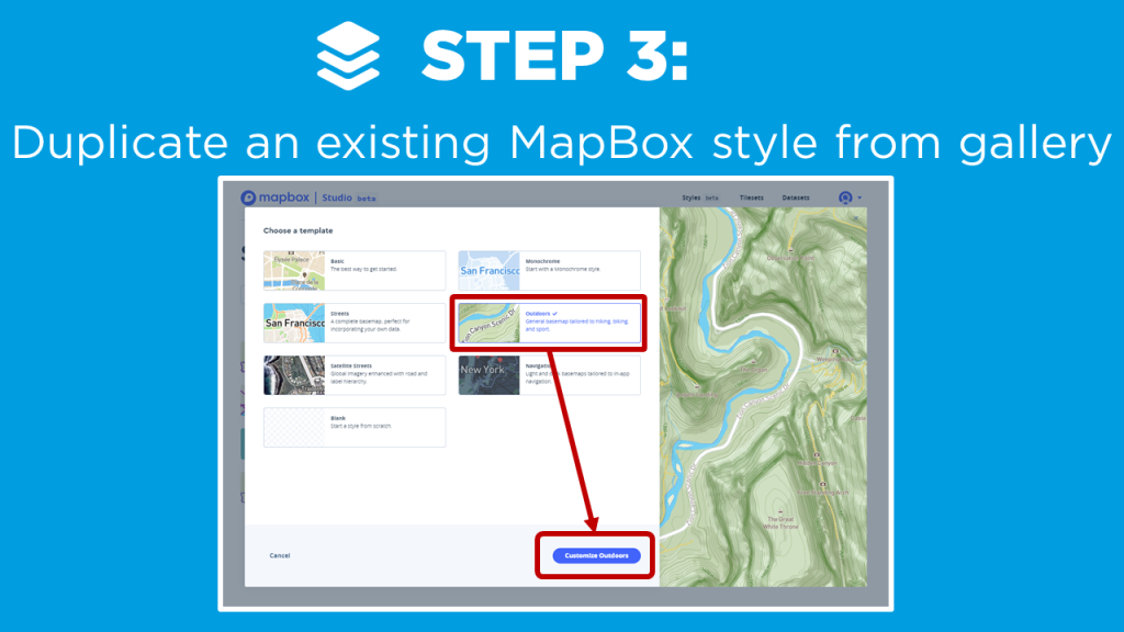
    3. Duplicate an existing MapBox style from gallery
    4. Customise your own map style
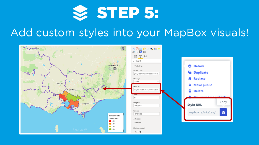
    5. Add your custom style into your MapBox visual in Power BI!

    First, you can leverage the base choropleth map you created in the Mapbox 101 tutorial to get a starting point. The following steps describe how to enhance the style of the map to make it pop even more!

    In this tutorial we want to add a boundry onto the base map. This will help us outline the specific areas around the rivers that we added as a layer in our Drill Down tutorial. A shape file was created and the zip loaded into Mapbox as a new tileset.

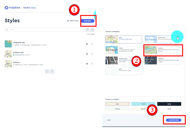
    The next step is to duplicate an existing map style.
    1) Select New style
    2) Choose a template
    3) Click Customize Basic

    Rename your Mapbox style (upper left side of page)

    Create your own custom layers and features to the map. Here are the changes made to this example.

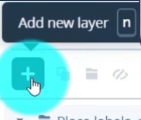
    Click Add new layer

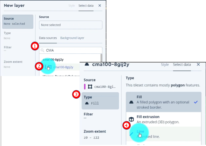
    Search for tileset. (Our example uses the new boundry layer we created.)
    1) Search for the tileset (ex. “CMA”)
    2) Select tileset
    This will add the tileset to the base style we selected.
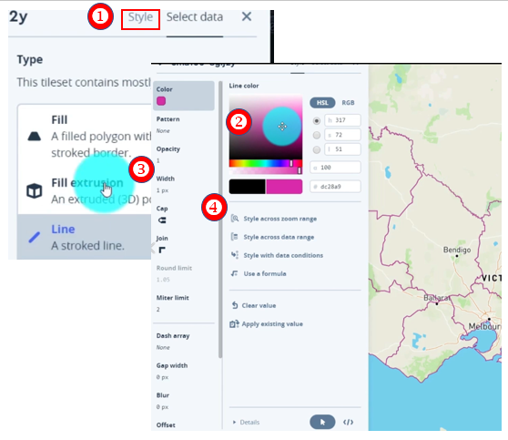
    3) Click Type
    4) Select Line to change the setting

    1. Select Style
    2. Choose Color
    3. Adjust width by clicking on the Width field
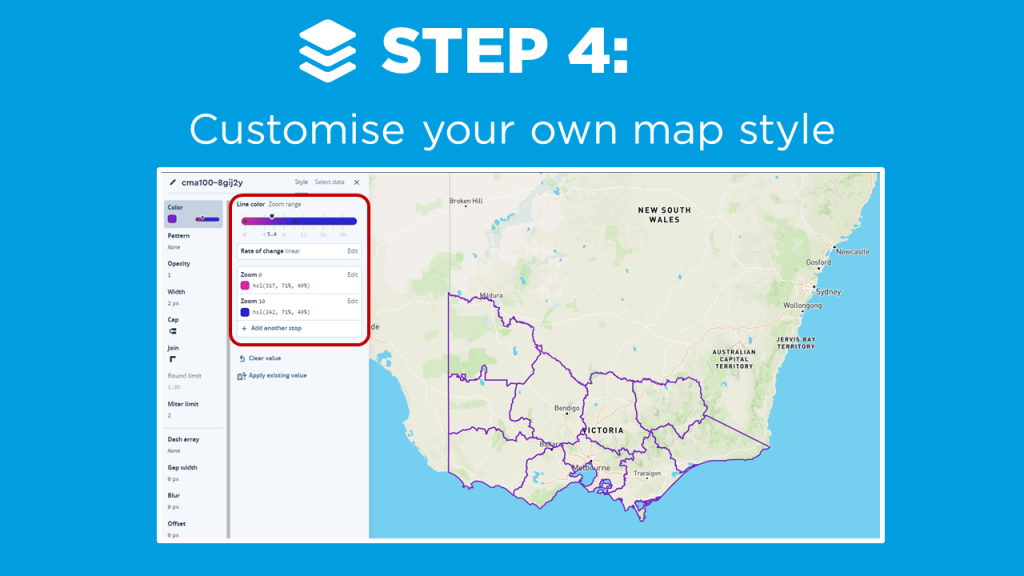
    4. Style the color based on a zoom range. Select Style across zoom range to adjust the slider.
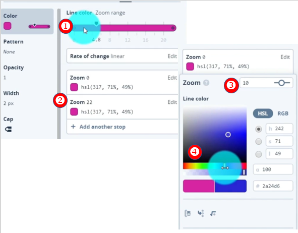
    1. Add new Zoom Range by Clicking on the Zoom Range bar
    2. Select second zoom range field (Zoom 22)
    3. Adjust zoom range to different value (10)
    4. Change the color (Blue)
    5. Scroll down and Click Done

    Great! Now as you zoom in and out of the map you can see the boundaries change color from pink to a blue. You can imagine how powerful this visual change can be in directing the attention in different map visuals.

    The final step is to take our new style and apply it to the Mapbox visual!

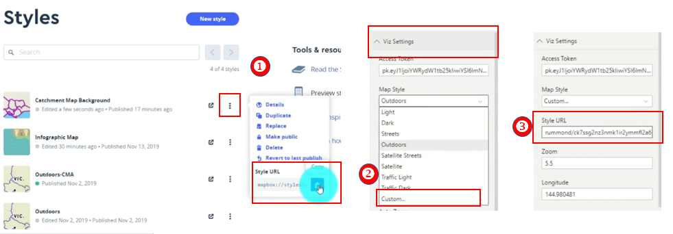
    1. Select the ellipses of our style
    2. Copy the Style URL
    3. Jump back into the Power BI Desktop. Under Viz Setting and the Map Style Property, Select Custom.
    4. Paste the copied URL from step 2 into the Style URL

    Final Custom Mapbox Style

    The case study I present is a Power BI report with three maps to help design our future cities to account for population growth, while also considering our environmental and social values (created using ‘synthetic’ datasets for demonstration purposes only). I modify the default ‘Outdoor’ MapBox style to include my own custom tileset, and show how to create dynamic color gradients based on different zoom intervals.

    If you’re keen to learn how to create really cool customized maps for your Power BI reports, then make sure to check out the other blogs in this 4-part MapBox series, where we provide an introductory MapBox 101, explore how to create 3D maps, and how to design drill down maps!

    And if you want to learn how you can create really beautiful and engaging Power BI reports, get in touch with one of the DiscoverEI team to register for our brand-new online training courses:

    • Power BI Designer Masterclass
    • Power BI for the Environmental Industry
    • Power BI for the Water Industry

    Take a look here for more details (https://www.discoverei.com/training)

    If you like the content from PowerBI.Tips please follow us on all the social outlets. Stay up to date on all the latest features and free tutorials.  Subscribe to our YouTube Channel.  Or follow us on the social channels, Twitter and LinkedIn where we will post all the announcements for new tutorials and content.

    Introducing our PowerBI.tips SWAG store. Check out all the fun PowerBI.tips clothing and products:

    Check out the new Merch!

    Hasta La Vista Data
    Go Ahead Make My Data
    PBIX Hat


  • Drill Down Maps in Power BI with MapBox

    Drill Down Maps in Power BI with MapBox

    If you’ve played around with MapBox in Power BI – you’ll know that it has loads of great features to create really rich and beautiful maps! One feature I love is the ability to ‘drill down’ to dynamically uncover different layers of your spatial data hierarchy, just in the same way that you can drill down on a standard column chart or matrix in Power BI.

    Why Drill Down on a Map?

    1. See the big picture: Using drill down, we can visualize the data set at the ‘big picture’ scale, and then explore finer details for areas of interest (just think of the classic spatial hierarchy of Country -> State -> City -> Suburb)
    2. Save on real estate: We can also display multiple datasets at different levels in the same map – which goes a long way to conserving your precious report page real estate by reducing the number of visuals in your report!  
    3. Performance: Following on from above, less visuals almost always equates to better report performance! And this is especially true when using MapBox, which is at the slower end of the Power BI performance scale at the best of times – so using drill down to reduce the number of maps combined with filtering your datasets goes a long way to speeding up your reports!

    Create a Drill Down Map in MapBox

    Setting up a drill down map in MapBox is pretty simple once you get the hang of configuring Choropleth maps, and in this video blog I walk through the key steps:

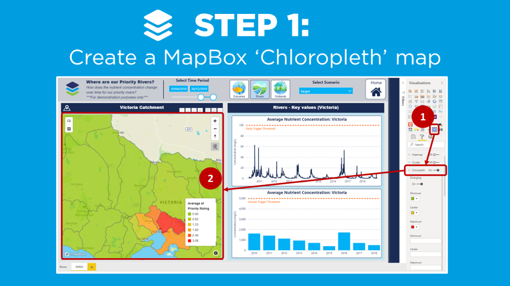
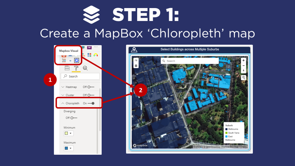
    1. Create a MapBox ‘Choropleth’ map (check out the video on MapBox 101 if you’re new to MapBox, or need a refresher on creating Choropleth maps).
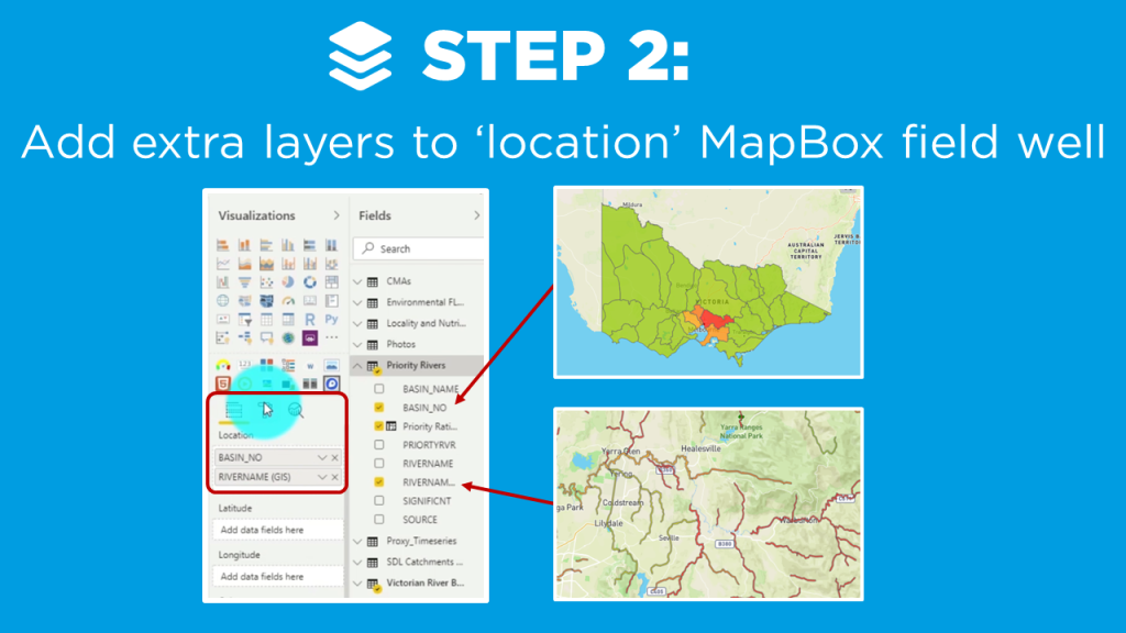
    2. Add hierarchy layers to the  ‘location’ MapBox field well
    3. Enter the vector layer properties from the MapBox Studio for the additional map levels

    In my example, I create a drill down map of priority Catchments and Rivers across Victoria using ‘synthetic’ data, which I created to visualize the nutrient concentration over time (for demonstration purposes only!).

    Instructions

    ps://powerbi.tips/2020/04/mapbox-101-for-power-bi/

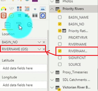
    Locate the RIVERNAME field and Drag & Drop it into the second position in the Location field well under BASIN_NO.

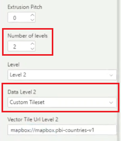
    Now navigate to the Format area and select the Choropleth section again. Increase the Number of levels to 2, and Select the Custom Tileset in the Data Level 2 section.

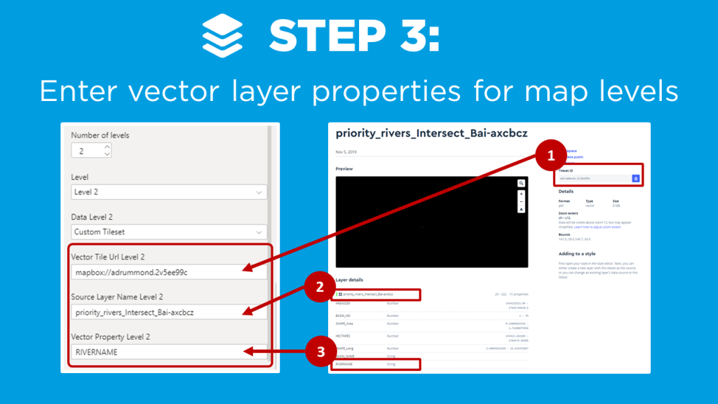
    After you set the above you need to jump out of the Power BI Desktop and head over to the mapbox studio. Here you would take the second layer of the map that you created by choosing another tileset. (For details on how to do that watch the Mapbox 101 tutorial.)

    1. Copy the Tileset ID from Mapbox and insert that value into the PBI Desktop Vector Tile Url Level 2 property still under the Choropleth section.
    2. Copy the layer name from Mapbox and Paste into the Source Layer Name Level 2 property.
    3. Copy the field you want from the attribute list in Mapbox and Paste into the Vector Property Level 2.

    Mapbox Drill Down Results

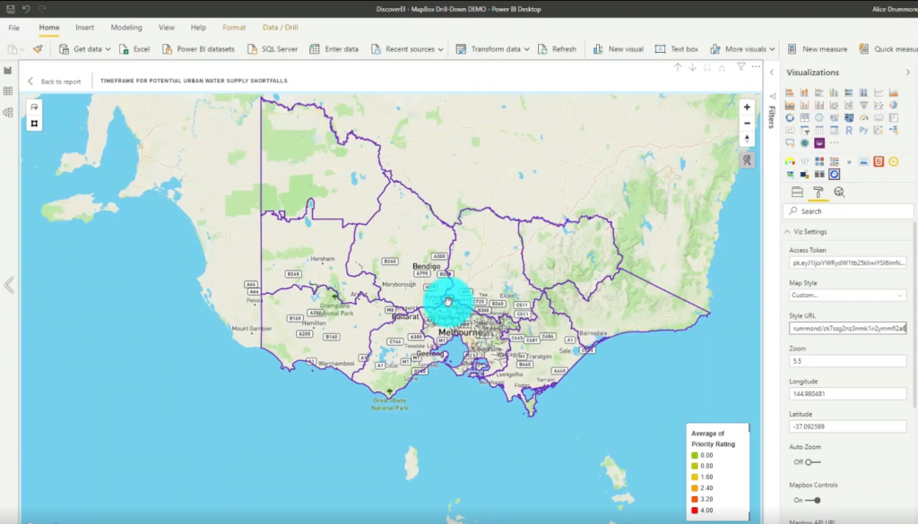
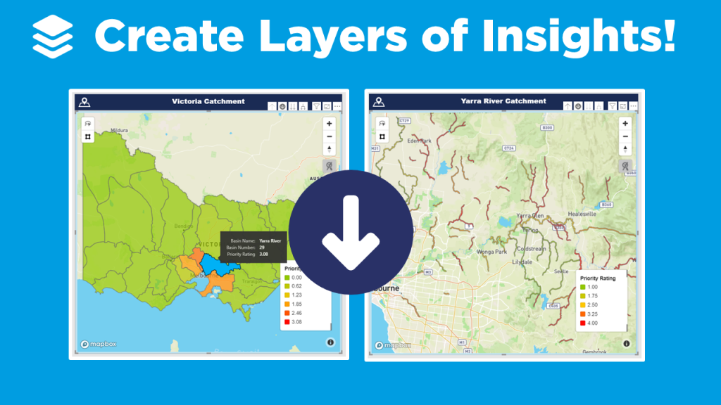
    We now have the ability to select our map area and drill down into the second layer. In our example, the rivers are now shown under each catchment.

    If you’re keen to learn how to create really cool customized maps for your Power BI reports, then make sure to check out the other blogs in this 4-part MapBox series, where we provide an introductory MapBox 101, explore how to create 3D maps, and how to design your own styles!

    And if you want to learn how you can create really beautiful and engaging Power BI reports, get in touch with one of the DiscoverEI team to register for our brand-new online training courses:

    • Power BI Designer Masterclass
    • Power BI for the Environmental Industry
    • Power BI for the Water Industry

    Take a look here for more details (https://www.discoverei.com/training)

    If you like the content from PowerBI.Tips please follow us on all the social outlets. Stay up to date on all the latest features and free tutorials.  Subscribe to our YouTube Channel.  Or follow us on the social channels, Twitter and LinkedIn where we will post all the announcements for new tutorials and content.

    Introducing our PowerBI.tips SWAG store. Check out all the fun PowerBI.tips clothing and products:

    Check out the new Merch!

    Hasta La Vista Data
    Go Ahead Make My Data
    PBIX Hat


  • Create 3D Maps in Power BI with MapBox

    Create 3D Maps in Power BI with MapBox

    If you’ve played around with MapBox in Power BI – you’ll know that it has loads of great features to create really rich and beautiful maps! And one of my favorite ways to get a new client excited about Power BI is to create an awesome 3D map of their city. Now, I know that 3D features get a bit of a bad wrap in traditional data viz circles (don’t even think about creating a 3D pie chart!!!), so why then are 3D maps different?

    Why use 3D maps?

    1. Greater context: We see our world in 3D, so when we transform a flat 2D map of our cities or mountains into a 3D map, it immediately creates greater connection and a sense of perspective.
    2. Another dimension: 3D maps don’t just have to be based on ‘relative’ heights, you can use the 3D effect to add a new dimension to your visualisation, such as population per town, to communicate key insights at a glance.  
    3. They just look really fancy: Sometimes half our battle as data analysts revolves around getting people within our (or our clients) organisations engaged and connected to their data. Creating 3D maps can go a long way to get that ‘wow’ factor which gets people excited and interested in the data!  

    Get started with MapBox

    There are a couple of tricks to getting the 3D features working in MapBox, so in this video blog I walk through the key steps to help you create your own 3D maps using MapBox:

    1. Create a MapBox ‘Choropleth’ map (check out the video on MapBox 101 if you’re new to MapBox, or need a refresher on creating Choropleth maps).
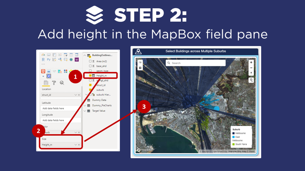
    2. Add height in the MapBox field pane
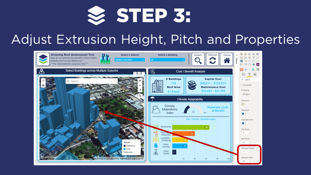
    3. Adjust Extrusion Height, Pitch and Properties

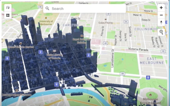
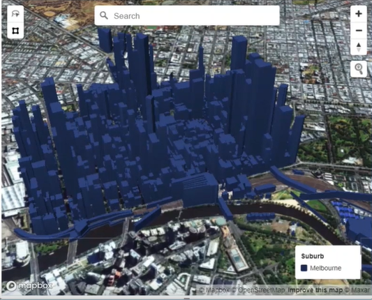
    In my example, I create a 3D map of buildings across Melbourne as part of a ‘Green Roof’ assessment tool to help optimize the benefits of blue-green infrastructure across Melbourne. Note that I have anonymized this  data and the calculations so that I can share it with the Power BI community (for demonstration purposes only!).

    Instructions

    ps://powerbi.tips/2020/04/mapbox-101-for-power-bi/

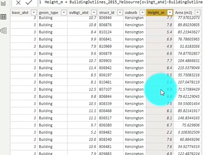
    Create a data set that includes the height of the objects, in this case the height of buildings.

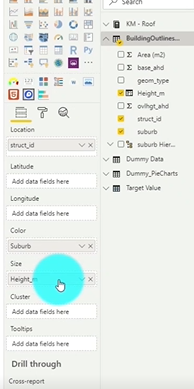
    Drag the Height column from your data set into the Size field well.

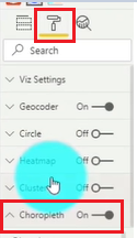
    Click on the Format section of the visual and select the Choropleth toggle.

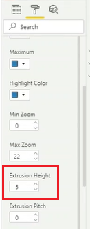
    Scroll till you find the Extrusion Height. You will likely need to Adjust the value to a lower value. In our case, we take it from 500 to 5. The Extrusion Height is a multiplier of the Height value from our data set.

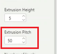
    Now, we can look one option below and we see Extrusion Pitch. We are going to Adjust this from 0 to 30. This will provide an angled view of the map which provides a clearer picture of the dimensions.

    Adjust MapBox Properties

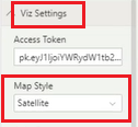
    Under the Viz Settings we want to Select the Map Style and change it to Satellite

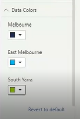
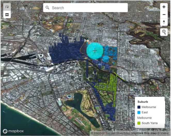
    Add Color to the different suburbs. Select the Data Colors header and Click to open up the options. Now you can Set the colors of the different areas to visually separate them.

    If you’re keen to learn how to create really cool customized maps for your Power BI reports, then make sure to check out the other blogs in this 4-part MapBox series, where we provide an introductory MapBox 101, explore how to create multi-layer drill down maps, and how to design your own styles!

    And if you want to learn how you can create really beautiful and engaging Power BI reports, get in touch with one of the DiscoverEI team to register for our brand-new online training courses:

    • Power BI Designer Masterclass
    • Power BI for the Environmental Industry
    • Power BI for the Water Industry

    Take a look here for more details (https://www.discoverei.com/training)

    If you like the content from PowerBI.Tips please follow us on all the social outlets. Stay up to date on all the latest features and free tutorials.  Subscribe to our YouTube Channel.  Or follow us on the social channels, Twitter and LinkedIn where we will post all the announcements for new tutorials and content.

    Introducing our PowerBI.tips SWAG store. Check out all the fun PowerBI.tips clothing and products:

    Check out the new Merch!

    Hasta La Vista Data
    Go Ahead Make My Data
    PBIX Hat


  • Using Lasso with New Shortcuts

    Using Lasso with New Shortcuts

    The April 2020 Power BI desktop release is an amazing release. This month the Power BI team has released a new lasso feature to enable users to select multiple visuals at a time. For me working in reports with lots of strategically placed visuals, this is HUGE!! How many times have I struggled to select a visual. Or, better yet needed to open up the visualization pane to select visuals from a list. The Lasso feature is a very welcome addition to the Power BI toolkit.

    New Shortcuts

    Another interesting feature that I found this month is the ability for Grouping visuals using key commands.

    You can Group Visuals using CTRL + G

    Then you can Un-Group them using SHIFT + CTRL + G

    Like all visual editing programs and even in power point these commands are very common. Thus, seeing these commands in Desktop is amazing. Power BI Team, thanks so much for your wonderful work!!!

    Video Tutorial

    Download PowerBI Desktop

    Want to use these features. Head on over to the PowerBI.com site and download the latest release. Download Here

    If you like the content from PowerBI.Tips please follow us on all the social outlets. Stay up to date on all the latest features and free tutorials.  Subscribe to our YouTube Channel.  Or follow us on the social channels, Twitter and LinkedIn where we will post all the announcements for new tutorials and content.

    Introducing our PowerBI.tips SWAG store. Check out all the fun PowerBI.tips clothing and products:

    Check out the new Merch!

    Hasta La Vista Data
    Go Ahead Make My Data
    PBIX Hat


  • MapBox 101 for Power BI

    MapBox 101 for Power BI

    Maps are a fantastic way to communicate spatial data – and lucky for us Power BI has loads of awesome mapping visuals to choose from. However, the MapBox Custom Visual is definitely my favorite!

    This Tutorial will walk you through the basics of getting started with MapBox.

    Why do I love MapBox?

    1. It’s versatile: You can create pretty much any type of map you’d like, whether it be Circle, Heatmaps, Clusters, Chloropleths, Rasters…there’s plenty of options to chose from all in the one visual.
    2. Ability to customise: Using the MapBox Studio, you can design and host your own spatial datasets, create custom base maps, and visualise them in Power BI.
    3. But best of all… It’s free: Unlike the ArcGIS custom visual, where to unlock most of the cool features you need a paid ArcGIS online licence, you have access to all of MapBox’s amazing features with their free account.

    MapBox is Feature Rich

    With so many features available in MapBox, I know that I was pretty overwhelmed when I was first getting started. So, in this video blog I walk through the key steps to help you get started on your MapBox journey, including how to:

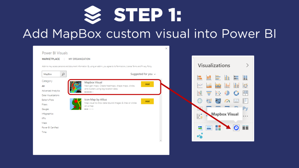
    1. Add the MapBox custom visual into Power BI
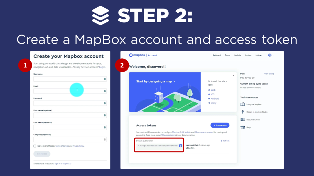
    2. Create a MapBox account and access token
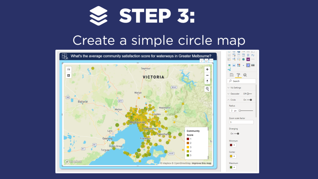
    3. Create a simple circle map
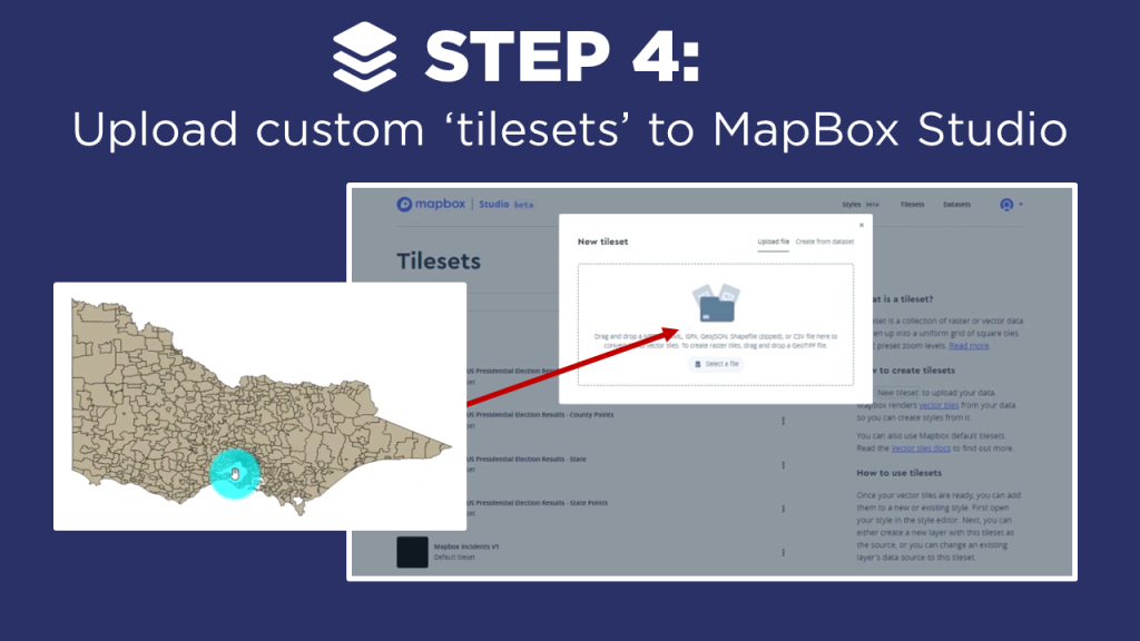
    4. Upload custom ‘tilesets’ to the MapBox Studio
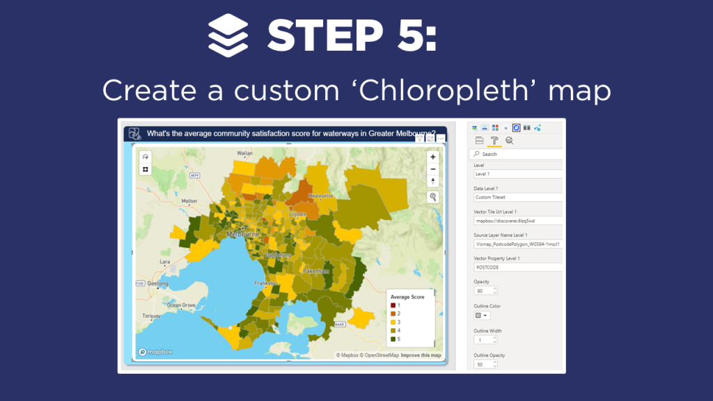
    5. Create a custom ‘Chloropleth’ map (just a fancy name for an area map…)

    In my example, I create both a circle and chloropleth map using ‘synthetic data’ which I created to visualise community satisfaction scores for priority waterways across Melbourne (my hometown!).

    Instructions

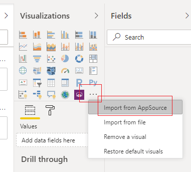
    Click on the ellipsis in the Visualizations window and Select the option Import from AppSource in the drop down menu.

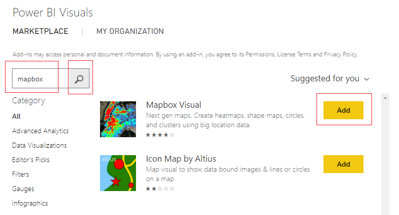
    Enter in the search window the words mapbox. Click on the Search Glass icon. Then Click on the Add button next to the Mapbox Visual.

    Visit the website mapbox.com and Sign In. If you don’t already have an account you will need to create one. An account can be created here.

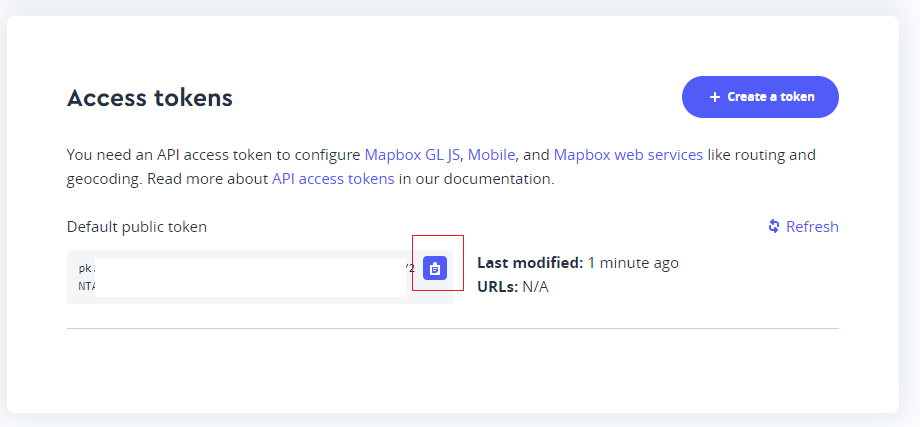
    Once you login you can see the public access token on the main login screen. To copy the token to your clip board, Click on the Clipboard in the Default public token window toward the bottom of the screen.

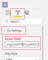
    Take the copied token and place it in the mapbox visual inside the Properties pane, under the Viz Settings for the field labeled Access Token.

    Now, add fields from your data model into the map visual to create a map.

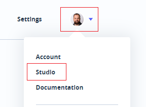
    Return to your account within mapbox.com. Click on your account icon, then Click on the Studio option in the drop down menu.

    Click on the option on the main header bar labeled Tilesets.

    Click on the button labeled New Tileset.

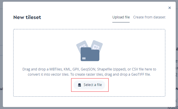
    Next, upload your shape file into mapbox by clicking Select a file.

    You will need three pieces of data to add the Chloropleth map.

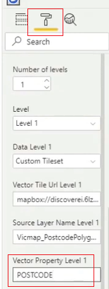
    • You need the Vector Tile Url Level 1 or the Tileset ID from mapbox.com. Obtain this by clicking on one of the tilesets in mapbox.com and copying the Tileset ID by clicking on the clipboard icon in the Tileset ID window. Paste this value into the field labeled Vector Tile Url Level 1. Note: The final URL needs to contain the mapbox:// beginning URL. Thus, your final URL should look similar to the following mapbox://mapbox.mapbox-terrain-v2
    • You will need the layer you will be visualizing. This is found under the Tileset Layer Details. Copy the name of the Layer you will use in your mapbox visual. Paste this property into the Source Layer Name Level 1 input box.
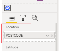
    • Finally, add the data layer of the Tileset into the Vector Property Level 1. This must be a column of data that resides inside your Power BI data model. In the video example our column name was POSTCODE. This column was also added to the Location field settings of the mapbox visual.

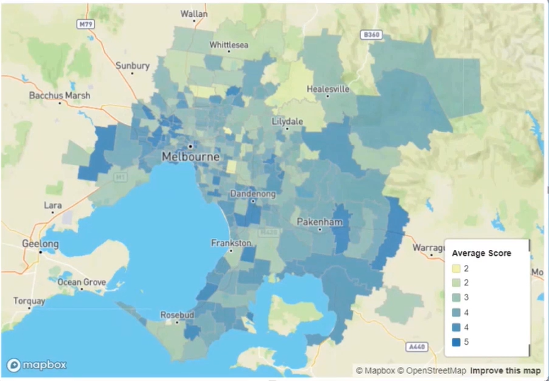
    With these settings in place we can now see a Cloropleth map of our data. Continue styling the visual to suit your needs.

    If you’re keen to learn how to create really cool customized maps for your Power BI reports, then make sure to check out the other video blogs in this 4-part MapBox series. Additional videos will cover how to create 3-D maps, multi-layer drill downs, and design your own styles!

    And if you want to learn how you can create really beautiful and engaging Power BI reports, get in touch with one of the DiscoverEI team to register for our brand-new online training courses:

    Take a look here for more details (https://www.discoverei.com/training)

    If you like the content from PowerBI.Tips please follow us on all the social outlets. Stay up to date on all the latest features and free tutorials.  Subscribe to our YouTube Channel.  Or follow us on the social channels, Twitter and LinkedIn where we will post all the announcements for new tutorials and content.

    Introducing our PowerBI.tips SWAG store. Check out all the fun PowerBI.tips clothing and products:

    Check out the new Merch!

    Hasta La Vista Data
    Go Ahead Make My Data
    PBIX Hat


  • Keeping it Versatile

    Keeping it Versatile

    I was recently working on some new ideas for a Scrim when I stumbled upon something interesting. A scrim is pretty specific in its layout, and this one is no different. The images are set so that the report author can easily snap the visual sizes into the space. This makes the most sense as it is easy and delivers great looking results. However, I believe that some designs will allow us to get much more mileage out of a single Scrim. In this Scrim I have changed the shape of visual spaces and this has led to some interesting outcomes. I’ll be interested if my excitement around the possible use cases for this Scrim are as significant as I think they are. With that said here are some of the biggest highlights of my latest Scrim – Versatile.

    • Gradient background to add depth
    • Transparent background – allows report author to use any background color
    • Visual shapes are curved on two edges
      • Use unique visual shape
      • Use normal square
      • Use area for title
      • Use area for context

    Downloads

    Download this Scrim here:  https://powerbi.tips/product/scrims-versatile/

    For additional details, and how you can implement all the above in this Scrim check out the video below.

    See how to use this Scrim

    If you like the content from PowerBI.Tips, please follow us on all the social outlets to stay up to date on all the latest features and free tutorials.  Subscribe to our YouTube Channel, and follow us on Twitter where we will post all the announcements for new tutorials and content. Alternatively, you can catch us on LinkedIn (Seth) LinkedIn (Mike) where we will post all the announcements for new tutorials and content.

    As always, you’ll find the coolest PowerBI.tips SWAG in our store. Check out all the fun PowerBI.tips clothing and products:
    Store Merchandise

  • Adding Contextual Help for End Users

    Adding Contextual Help for End Users

    As a report author it is important that you build the necessary context for your end users. The main areas most often needing context either relate to the data or functionality contained within the report. The battle of space, usability and design all impact the choices we have. Lucky for us, Power BI has many different options and we have plenty of choices. This video will walk through the following options and explain methods on how to use them.

    • Text on Page
    • Visual Header Tooltip
    • Button or Image for
      • The Overlay
      • A Different Page
      • A Different Report

    If you like the content from PowerBI.Tips, please follow us on all the social outlets to stay up to date on all the latest features and free tutorials.  Subscribe to our YouTube Channel, and follow us on Twitter where we will post all the announcements for new tutorials and content. Alternatively, you can catch us on LinkedIn (Seth) LinkedIn (Mike) where we will post all the announcements for new tutorials and content.

    As always, you’ll find the coolest PowerBI.tips SWAG in our store. Check out all the fun PowerBI.tips clothing and products:
    Store Merchandise