
MapBox 101 for Power BI

Maps are a fantastic way to communicate spatial data – and lucky for us Power BI has loads of awesome mapping visuals to choose from. However, the MapBox Custom Visual is definitely my favorite!
This Tutorial will walk you through the basics of getting started with MapBox.
Why do I love MapBox?
- It’s versatile: You can create pretty much any type of map you’d like, whether it be Circle, Heatmaps, Clusters, Chloropleths, Rasters…there’s plenty of options to chose from all in the one visual.
- Ability to customise: Using the MapBox Studio, you can design and host your own spatial datasets, create custom base maps, and visualise them in Power BI.
- But best of all… It’s free: Unlike the ArcGIS custom visual, where to unlock most of the cool features you need a paid ArcGIS online licence, you have access to all of MapBox’s amazing features with their free account.
MapBox is Feature Rich
With so many features available in MapBox, I know that I was pretty overwhelmed when I was first getting started. So, in this video blog I walk through the key steps to help you get started on your MapBox journey, including how to:
- Add the MapBox custom visual into Power BI
- Create a MapBox account and access token
- Create a simple circle map
- Upload custom ‘tilesets’ to the MapBox Studio
- Create a custom ‘Chloropleth’ map (just a fancy name for an area map…)
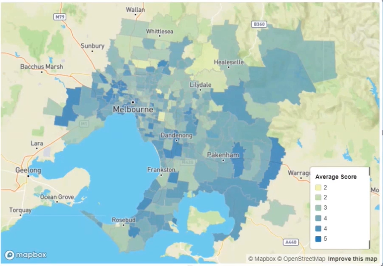
In my example, I create both a circle and chloropleth map using ‘synthetic data’ which I created to visualise community satisfaction scores for priority waterways across Melbourne (my hometown!).
Instructions
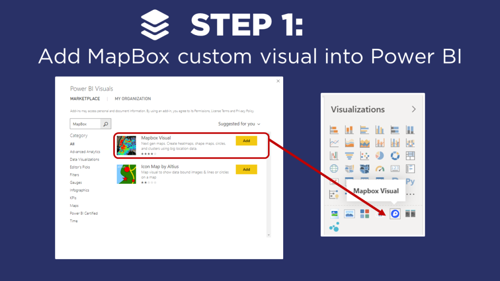
Click on the ellipsis in the Visualizations window and Select the option Import from AppSource in the drop down menu.
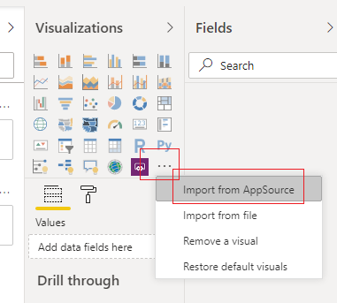
Enter in the search window the words mapbox. Click on the Search Glass icon. Then Click on the Add button next to the Mapbox Visual.
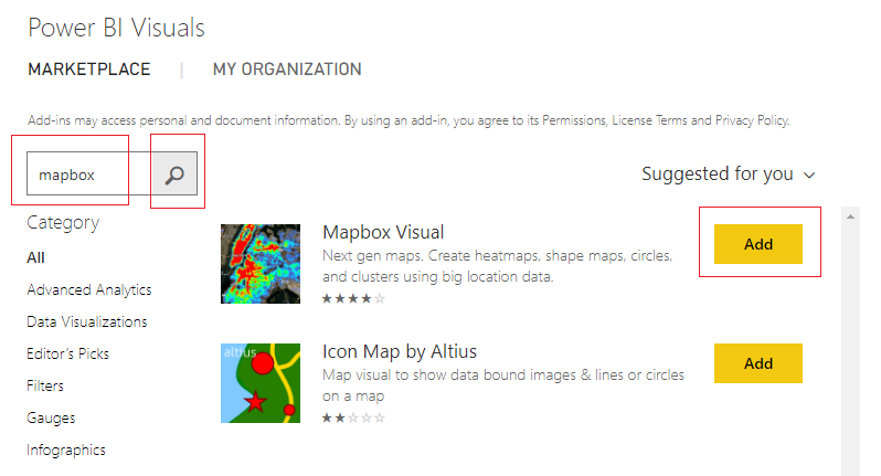
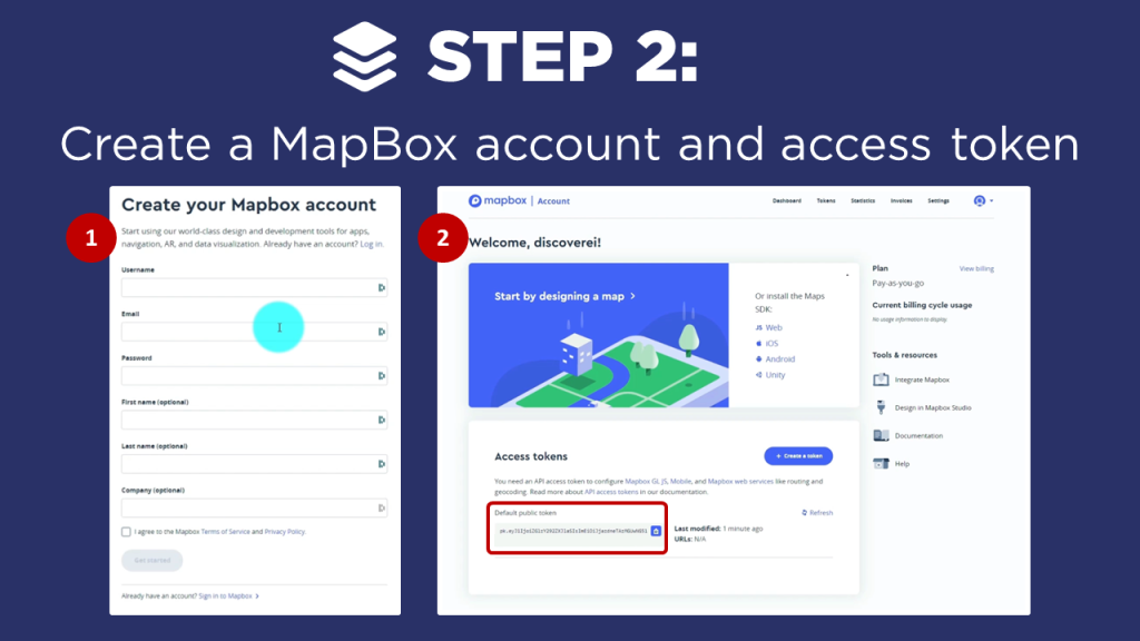
Visit the website mapbox.com and Sign In. If you don’t already have an account you will need to create one. An account can be created here.
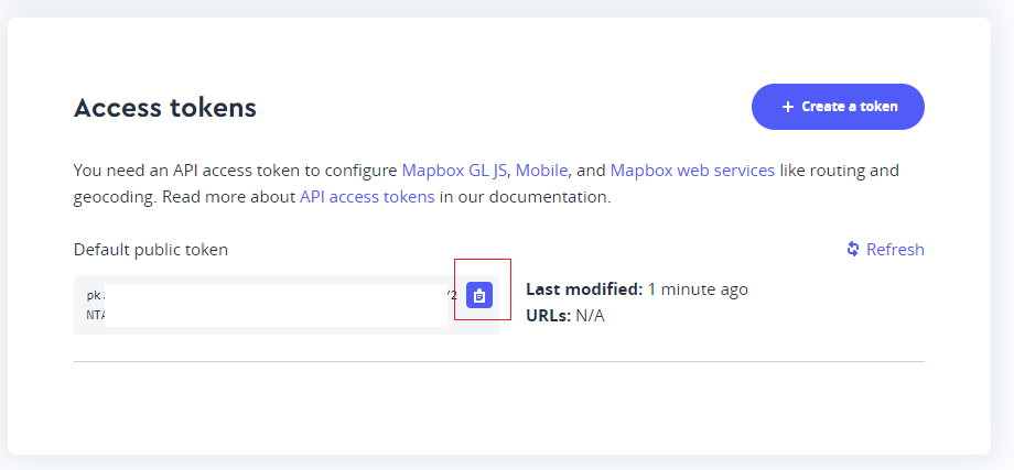
Once you login you can see the public access token on the main login screen. To copy the token to your clip board, Click on the Clipboard in the Default public token window toward the bottom of the screen.
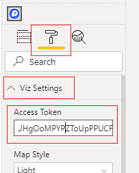
Take the copied token and place it in the mapbox visual inside the Properties pane, under the Viz Settings for the field labeled Access Token.
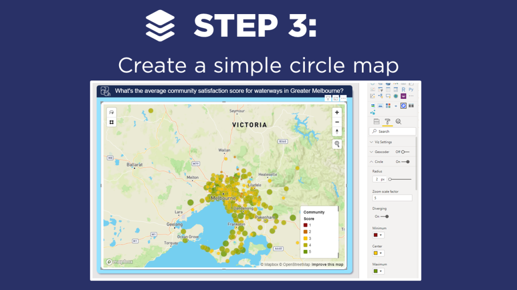
Now, add fields from your data model into the map visual to create a map.
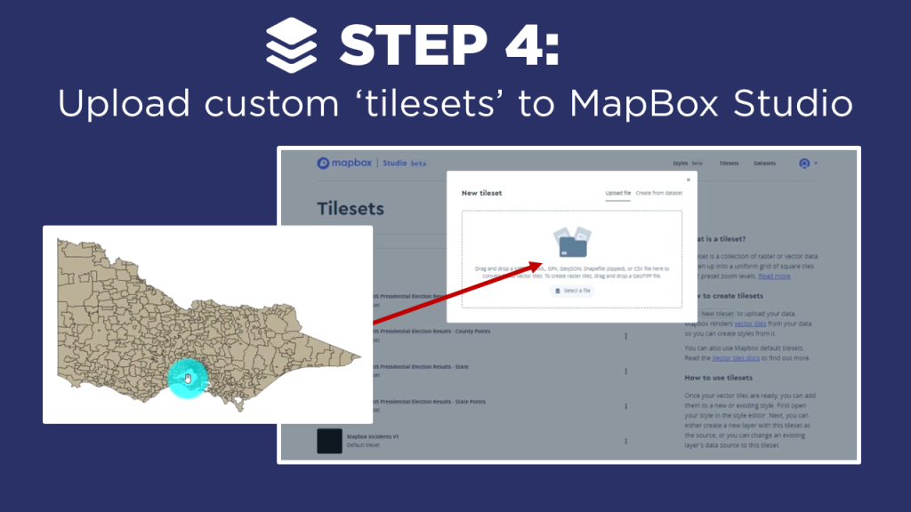
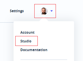
Return to your account within mapbox.com. Click on your account icon, then Click on the Studio option in the drop down menu.
Click on the option on the main header bar labeled Tilesets.

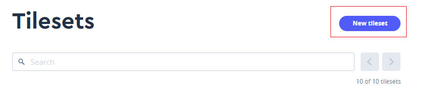
Click on the button labeled New Tileset.
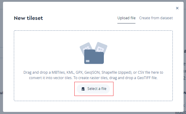
Next, upload your shape file into mapbox by clicking Select a file.
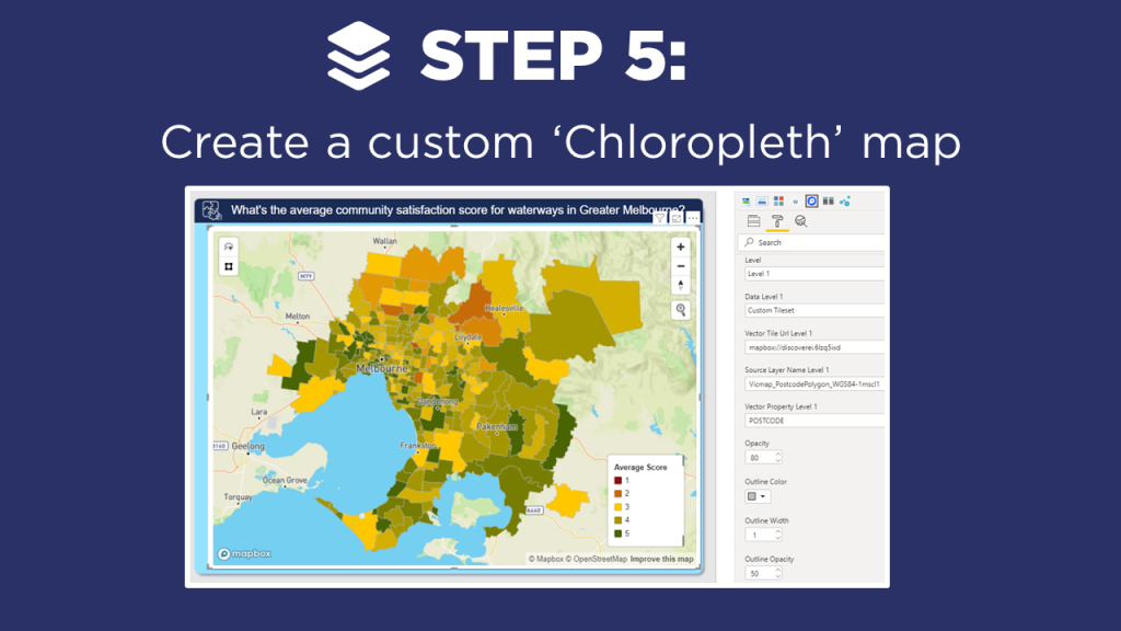
You will need three pieces of data to add the Chloropleth map.
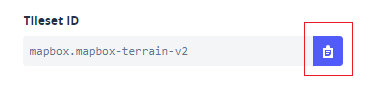
- You need the Vector Tile Url Level 1 or the Tileset ID from mapbox.com. Obtain this by clicking on one of the tilesets in mapbox.com and copying the Tileset ID by clicking on the clipboard icon in the Tileset ID window. Paste this value into the field labeled Vector Tile Url Level 1. Note: The final URL needs to contain the mapbox:// beginning URL. Thus, your final URL should look similar to the following mapbox://mapbox.mapbox-terrain-v2
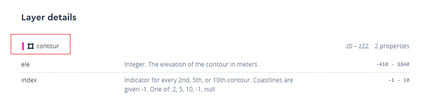
- You will need the layer you will be visualizing. This is found under the Tileset Layer Details. Copy the name of the Layer you will use in your mapbox visual. Paste this property into the Source Layer Name Level 1 input box.
- Finally, add the data layer of the Tileset into the Vector Property Level 1. This must be a column of data that resides inside your Power BI data model. In the video example our column name was POSTCODE. This column was also added to the Location field settings of the mapbox visual.
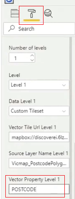
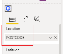
With these settings in place we can now see a Cloropleth map of our data. Continue styling the visual to suit your needs.
If you’re keen to learn how to create really cool customized maps for your Power BI reports, then make sure to check out the other video blogs in this 4-part MapBox series. Additional videos will cover how to create 3-D maps, multi-layer drill downs, and design your own styles!
And if you want to learn how you can create really beautiful and engaging Power BI reports, get in touch with one of the DiscoverEI team to register for our brand-new online training courses:
- Power BI Designer Masterclass
- Power BI for the Environmental Industry
- Power BI for the Water Industry
Take a look here for more details (https://www.discoverei.com/training)