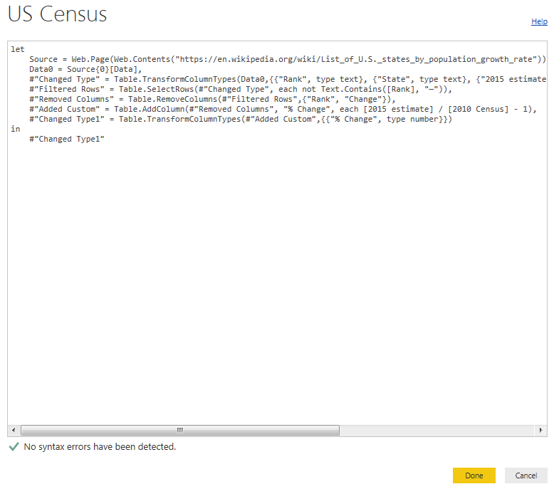
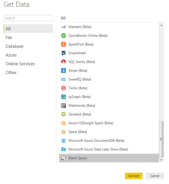
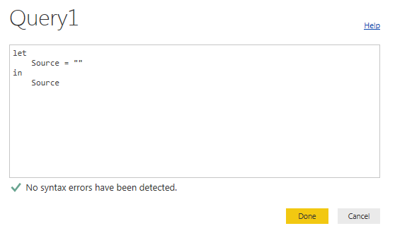
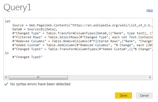
There are often times when you need a small data set in order to make a visual behave exactly how you want it to. This may mean you need a small table to represent a range of numbers or text values.
Here are the Resources for this tutorial:
Power BI Desktop (I’m using the March 2016 version, 2.33.4337.281) download the latest version from Microsoft Here.
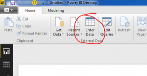
To enter your own data Click the Enter Data button on the Home ribbon.
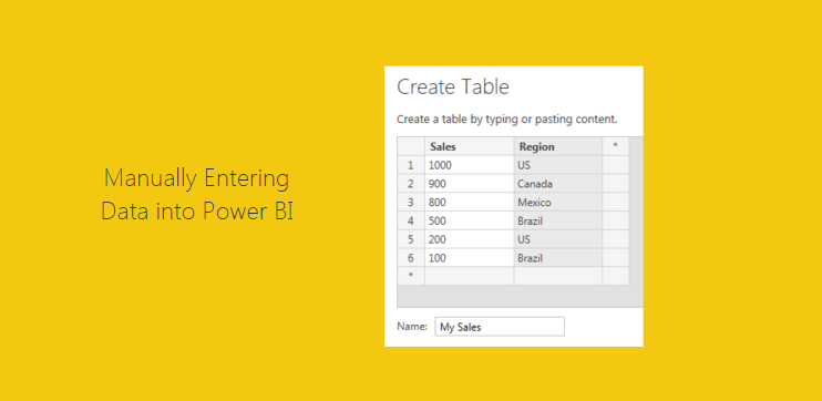
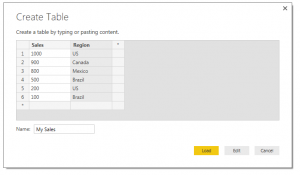
Next you are prompted with the Create Table window. In this window you are given the layout of a unfilled table. To begin entering data you can click in the first cell in Column one and start entering data. By pressing enter a new cell will populate below. You can Rename the column by double clicking the column name. To add a second column you Click on the * symbol next to your existing column. Finally to edit the table name you can type in the desired table name in the Name input box in the bottom left hand portion of the window.
Finally, you can either to choose to Load the data as is or Edit the data to make additional changes (this can be useful to edit the data types of each column or to populate equations in subsequent columns). For the sake of this tutorial we will simply load the data. Click Load to load the data into the data model.
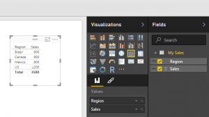
Now drag over the columns into the page view to begin generating visuals. By default PowerBI makes a table of data to show you the values you just entered.
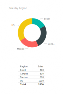
Select the table visual (you know it is highlighted when it has the trim boarder as shown above) and Click the Doughnut Visual. This transforms the data into a doughnut, and who doesn’t like a nice data doughnut? Click anywhere in the page to de-select the new doughnut visual. Add a second table by dragging over he Region and Sales columns. We can now see the pretty graphic and the numbers supporting that visual.
I bet you didn’t notice that something changed here. Look closely at the data we see now vs. what we entered earlier. Go ahead, scroll up, I’ll wait… Did you catch it?
We now have 5 rows of data but we entered 6 before. That is because the Sales column is a number column and can be aggregated. Look in the fields column and you see there is a little sum symbol in front of the Sales column. This means that this column has a default summarization associated. To see what is the default summarization highlight Sales by clicking on the column name in the grey area. Then Click the ribbon titled Modeling, and there it is in the properties section the Default Summarization is Sum. Every time you use the Sales column it will be summarized in the tables and visuals views. Our visual table shows Brazil with a total sales of 600, because we had two Regions labeled as Brazil 500 and 100.
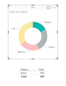
Now you can click on any of the data points in the doughnut. Notice the table automatically filters down to only show the areas you selected.
ProTip: you can select multiple selections by holding down CTRL and selecting multiple items in the visual. You can only do this inside of one visual. As soon as you click another visual all filtering will disappear.
Again, I hope you enjoyed this quick tutorial. If you liked it make sure you share it below.
One of the most important concepts to learn within Power BI Desktop is how to build a Data Model.
Note: In simple terms the Data Model is data that is collected from the get data function. In your data model you can build multiple queries. This data is stored in the file. The data storage is very efficient as the data compressed down to approximately a 4:1 ratio. 1000 KB file will compact down to approximately 250 KB when loaded into Power BI. From my current understanding all data is loaded into the memory of the computer. Thus, if you are having performance issues it could be in part due to the RAM of your computer.
As you begin to craft more data models you will learn little tips and tricks along the way to make an efficient Data Model for your visualizations. I have found that the most challenging part of building the data model is structuring the data in a way that will make your selected visual make sense. This may mean you need to add a measure or a calculated column or a ranking to a data set. Alright lets get started.
Here are the Resources for this tutorial:
Power BI Desktop (I’m using the March 2016 version, 2.33.4337.281) download the latest version from Microsoft Here.
We are going to work through the Power BI Desktop file that we built in the Loading Excel Files Into Power BI Tutorial. You can follow the link to create the Power BI Desktop (pbix) file in the tutorial. For convenience, the completed file can be downloaded here: Import Excel Tutorial.
I’m going to start off by extracting the Import Excel Tutorial.zip file to my desktop. Once the file has been extracted we can open the containing folder. In this folder there are two files the source data in the excel file and the Power BI Desktop file.
Note: A Power BI Desktop file has a .pbix file format ending.
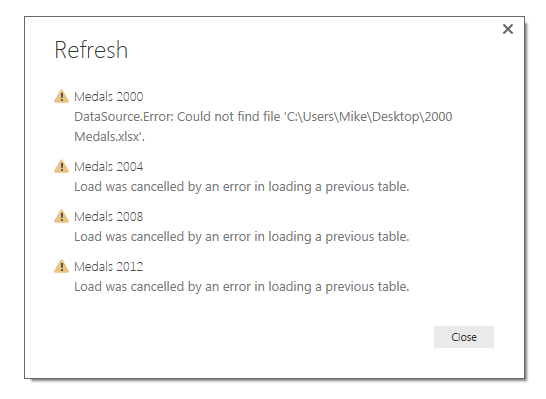
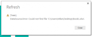
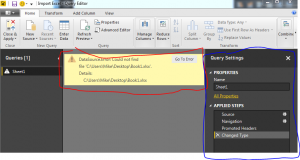
Open the Import Excel.pbix file. First click the Home ribbon and then click the Refresh button. Most likely there will be an error similar to the following message.
This type of message occurs when you refresh a query and the file is missing or can’t be found. This is because when i originally built the Power BI Desktop tutorial the excel file that is supply the information was located on my desktop. This is a common problem when you build connections to local files stored on your computer. If you move a file into a different folder then the connection will break.
To resolve this close the message window by clicking Close. on the Home ribbon click the Edit Queries button. The Query Editor window will be presented. In a large yellow bar in the data view portion of the window (circled in red) is the error message.
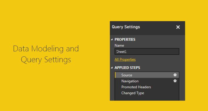
Note: Circled in blue is the Query Settings window. This window is the window for all the applied steps to transform the data. You can change the name of the query in the name box. From the view we have selected we can see that the step entitled Changed Type is currently selected (seen circled in blue).
Click the grey button labeled Go To Error which is found in the yellow error box.
Upon clicking the Go To Error button the selection in the Query Settings button to the Source Step. This is where the query has failed. More information about the failure is shown in another yellow error box. This time click Edit Settings in the error box.
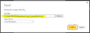
Now we have the Load Excel file window prompt open. In this window Click Browse, navigate to where you extracted all the files downloaded earlier in the tutorial and select the excel document entitled Book1. Click Open and the new file location will be loaded into the Load Excl Window. Click OK to complete the settings change.
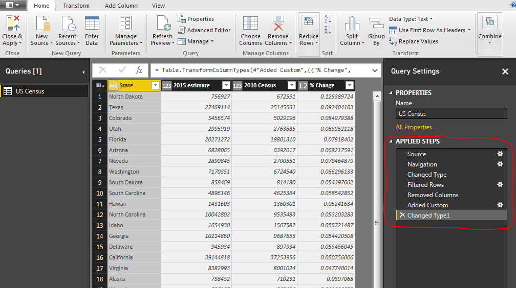
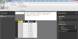
Now the data is correctly loaded into the data model. Notice we are still on the step called Source. Take some time to click through each step, Source – Navigation – Promoted Headers – Changed Type. As you click on each step you can see how the data is transforming.
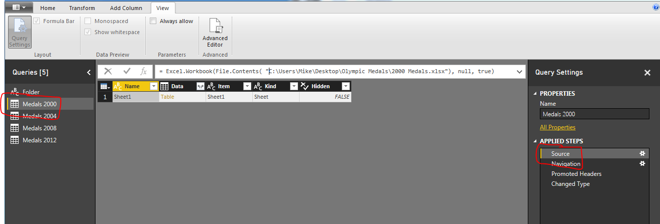
To see the code that is being used to make each step click the View ribbon and check the little box entitled Formula Bar. This will make a formula bar appear. When you click on a step the formula bar will reveal the code needed to complete the selected step.
We can now see the equation, which is similar to how you would write an equation in excel. The code in the Changed Type step is here:
= Table.TransformColumnTypes(#"Promoted Headers",{{"ID", Int64.Type}, {"Sales", Int64.Type}, {"Category", type text}})
The equation is using the M language to transform the data. More information on the usage of the M language can be found here.
Note: Couple of pointers about the data shown in the formula. The function is called Table.TranformColumnTypes. The source of the data is a variable called #”Promoted Headers”. The pound sign and the words following in quotations is how the M language passes variables that have a space contained in the language. Since the prior step has the name “Promoted (space) Headers” the program has to add the pound sign and the quotation marks. If there is no space in the naming convention such as “PromotedHeaders” then only the PromotedHeaders would be seen in the code and the pound sign and quotes will be gone. See modify coded when I remove the space from the Promoted Headers applied step.
= Table.TransformColumnTypes(PromotedHeaders,{{"ID", Int64.Type}, {"Sales", Int64.Type}, {"Category", type text}})
Notice the the pound sign and quotations are missing.
The second part of the formula is an array which has been written out in curly brackets:
{
{"ID", Int64.Type},
{"Sales", Int64.Type},
{"Category", type text}
}
I changed the code by adding line returns to make it easier to read. The coded array has beginning bracket and an ending bracket. Each parameter is contained in it’s own curly brackets and separated with a comma. The array is a 2 x 3 array, it has 3 rows and two data points on each row, just like a matrix. The first data point is the column name. In the first row the column that is being address is called ID. The data transformation parameter is called Int64.Type. This means that the data is an integer type 64 bit. This repeats for each row until all parameters have been addressed.
So there you go, we have opened up a query repaired it and learned a little about the formula bar.
As a side note, as you build queries each button press that you make on the various ribbons in the Query Editor will make a minimum of one step the in the Query Editor.
Hope you enjoyed this short tutorial about the Query Editor. Make sure you share below if you liked it.
Manage Consent
To provide the best experiences, we use technologies like cookies to store and/or access device information. Consenting to these technologies will allow us to process data such as browsing behavior or unique IDs on this site. Not consenting or withdrawing consent, may adversely affect certain features and functions.
Functional
Always active
The technical storage or access is strictly necessary for the legitimate purpose of enabling the use of a specific service explicitly requested by the subscriber or user, or for the sole purpose of carrying out the transmission of a communication over an electronic communications network.
Preferences
The technical storage or access is necessary for the legitimate purpose of storing preferences that are not requested by the subscriber or user.
Statistics
The technical storage or access that is used exclusively for statistical purposes.The technical storage or access that is used exclusively for anonymous statistical purposes. Without a subpoena, voluntary compliance on the part of your Internet Service Provider, or additional records from a third party, information stored or retrieved for this purpose alone cannot usually be used to identify you.
Marketing
The technical storage or access is required to create user profiles to send advertising, or to track the user on a website or across several websites for similar marketing purposes.