
Manually Enter Data
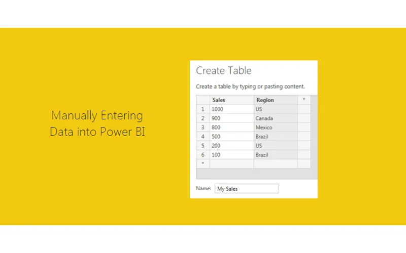
There are often times when you need a small data set in order to make a visual behave exactly how you want it to. This may mean you need a small table to represent a range of numbers or text values.
Resources for this Tutorial
- Power BI Desktop (I’m using the March 2016 version, 2.33.4337.281) download the latest version from Microsoft Here
Using Enter Data
To enter your own data Click the Enter Data button on the Home ribbon.
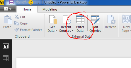
Next you are prompted with the Create Table window. In this window you are given the layout of an unfilled table. To begin entering data you can click in the first cell in Column one and start entering data. By pressing enter a new cell will populate below. You can Rename the column by double clicking the column name. To add a second column you Click on the * symbol next to your existing column. Finally to edit the table name you can type in the desired table name in the Name input box in the bottom left hand portion of the window.
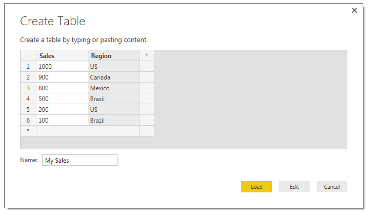
Finally, you can either choose to Load the data as is or Edit the data to make additional changes (this can be useful to edit the data types of each column or to populate equations in subsequent columns). For the sake of this tutorial we will simply load the data. Click Load to load the data into the data model.
Building Visuals
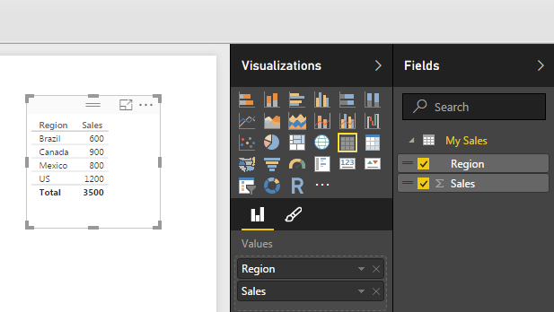
Now drag over the columns into the page view to begin generating visuals. By default PowerBI makes a table of data to show you the values you just entered.
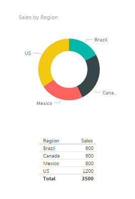
Select the table visual (you know it is highlighted when it has the trim border as shown above) and Click the Doughnut Visual. This transforms the data into a doughnut, and who doesn’t like a nice data doughnut? Click anywhere in the page to de-select the new doughnut visual. Add a second table by dragging over the Region and Sales columns. We can now see the pretty graphic and the numbers supporting that visual.
Understanding Data Aggregation
I bet you didn’t notice that something changed here. Look closely at the data we see now vs. what we entered earlier. Go ahead, scroll up, I’ll wait… Did you catch it?
We now have 5 rows of data but we entered 6 before. That is because the Sales column is a number column and can be aggregated. Look in the fields column and you see there is a little sum symbol in front of the Sales column. This means that this column has a default summarization associated.
To see what is the default summarization highlight Sales by clicking on the column name in the grey area. Then Click the ribbon titled Modeling, and there it is in the properties section the Default Summarization is Sum. Every time you use the Sales column it will be summarized in the tables and visuals views. Our visual table shows Brazil with a total sales of 600, because we had two Regions labeled as Brazil 500 and 100.
Interactive Filtering
Now you can click on any of the data points in the doughnut. Notice the table automatically filters down to only show the areas you selected.
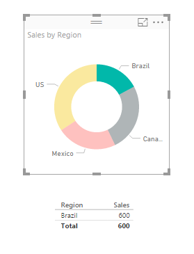
Pro Tip: You can select multiple selections by holding down CTRL and selecting multiple items in the visual. You can only do this inside of one visual. As soon as you click another visual all filtering will disappear.
Again, I hope you enjoyed this quick tutorial. If you liked it make sure you share it below.