Tag: Add Column

  • Adding Data Types Within Query Editor

    Adding Data Types Within Query Editor

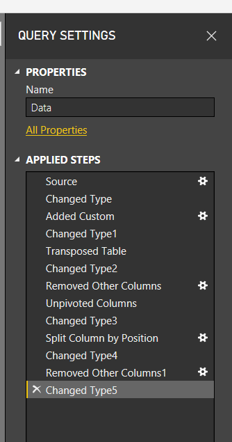
    If you have spent any time working in Power BI, your very first step is to, wait for it… Get Data.  Using Get Data will start loading your data into the Query Editor for Extracting, Transforming and Loading (ETL).  When you start out in Power BI it is likely that you don’t spend much time in the Query Editor.  However, the longer you use Power BI desktop, and the more you learn, you find that the Query Editor is highly under-rated.  There are so many amazing transformations that you can perform on your data.  After some time getting comfortable you’ll be building larger queries with many, many, steps.  Eventually, it may look something like this:
    Multiple Query Transformations
    Multiple Query Transformations

    Perhaps your queries are already long, or may be even longer.  Wouldn’t it be nice to shorten the number of steps?  It would make it easier to read.  In this tutorial we are going to talk through how we can combine several steps when you create a new column.  This is achieved by modifying the M scripts or equations slightly when new columns are created.

    While doing this won’t cut down every query in half, but it will remove a couple of additional steps per query.  This makes your queries easier to read and maintain.  Also, using this best practice, will save you headaches in the future.  At some point you will run into a data type error.  This is seen when you try to join multiple tables on columns with different data types, or when you need a measure to create a SUM but the column data type is still text.

    Let’s get to the tutorial.

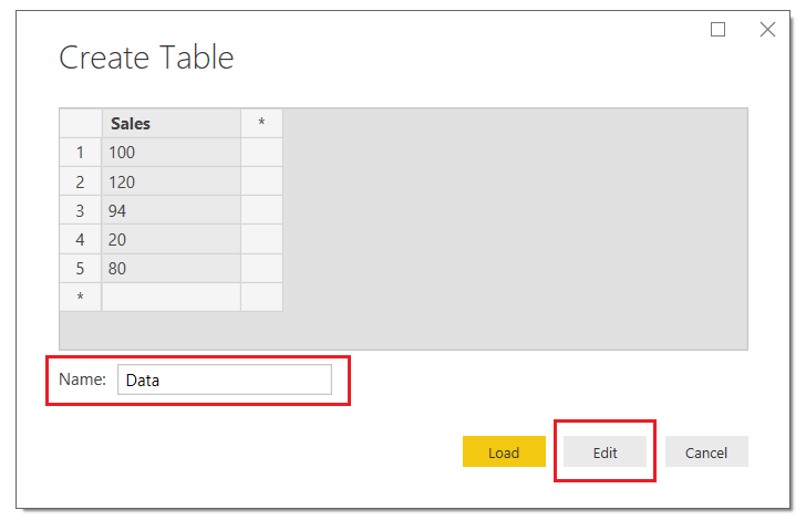
    Open up your Power BI Desktop program and on the Home ribbon click Enter Data.  Using the dialog box for entering data enter the following table of data:

    Sales
    100
    120
    94
    20
    80

    Once you’ve entered your data the Create Table screen should look like the following.  Be sure to name your table, in this case I named my data table Data…. yea, feeling a lack of creativity today.  Next, click Edit to modify the query before loading the data into Power BI.
     

    Create Table
    Create Table

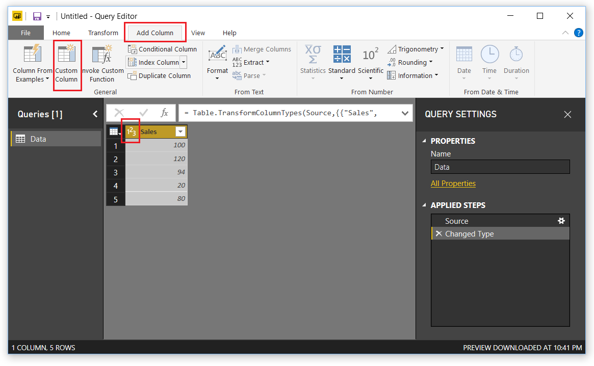
    This will open the query editor.  Click on the Add Column ribbon, then select Custom Column.  The Custom Column dialog box will open.

    Note: When you bring in the created table that the Sales column already has the data transformed into a whole number. Also note in the right under Applied steps we have two steps, one for the source and one for Changed Type.  This is because not every M equation (M language is the language used to perform the ETL in the query editor) can handle data types.  
    Add Custom Column
    Add Custom Column

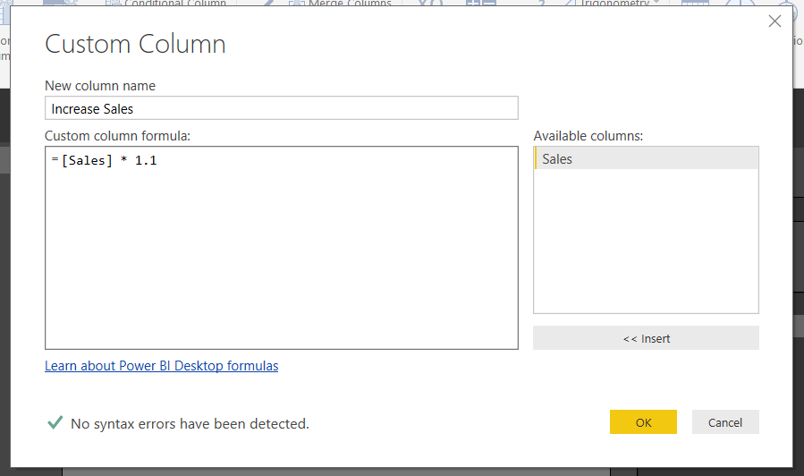
    In the Custom Column dialog box enter the following, the column name, the equation below.  Click OK to add the column.
    Insert Custom Column
    Insert Custom Column

    Note: It is good practice to name the new column something meaningful.  This helps when you are working in the query editor.  When you come back to your query months later and wondered what you were creating, the column names will help!  Trust me I learned this lesson the hard way… 

    Great, now we have our new column.  Notice the image in front of our column named Increase Sales.  This means Power BI thinks that the data type of this column could be Text or a Number.  Let’s change it.  Click on the ABC123 icon and select Whole Number.  Now the column data type has changed to numbers only.
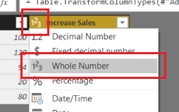
    Change Column Type to Whole Number
    Change Column Type to Whole Number

    If we glance at the Query Setting under the Applied Steps, we now have 4 steps.  Two were added, one for the added column and the second for the data type of the column.  This is not what we want.  Instead we would like the column to be added with the appropriate data type right from the beginning.

    Let’s remove the very last step labeled Changed Type1.  To do this we will click on the little X next to the step.  This will remove the step.  While highlighting the Added Custom step click in the formula bar and modify the equation to include the following statement in RED.  Press the Enter to execute the new formula.

    = Table.AddColumn(#"Changed Type", "Increase Sales", each [Sales] * 1.1, Int64.Type)

    Note: if you don’t see the formula bar it can be toggled on or off in the View ribbon in the check box titled Formula Bar.

    The query editor should now look like the following:
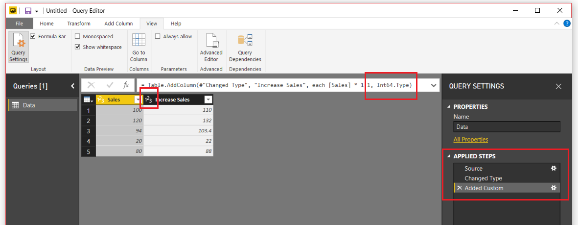
    Desired Data Type
    Desired Data Type

    Without adding an extra step on the Query Settings, we have changed the data type.  I know this might seem trivial, but when you are creating large queries, they can get difficult to read.  For me, I find this technique quite useful, and it doesn’t only support whole numbers.  This technique also supports the following data types:

    Data Type Syntax
    Whole Number Int64.Type
    Decimal Number Number.Type
    Dates Date.Type
    Text Text.Type

    Thanks for following along.  If you liked this tutorial, please share it with someone else who might find this valuable.  Be sure to follow me in LinkedIn an Twitter for posts about new tutorials and great content from PowerBI.Tips

    Linkedin Twitter
  • From Wikipedia to a Colorful Map

    From Wikipedia to a Colorful Map

    For this tutorial we are going to get some real data from the web.  One of the easiest sources to acquire information from is Wikipedia.  I will caveat this by saying, it is easy to get data from Wikipedia, but I don’t know if you can always trust the reliability.  That being said, we are going to acquire the U.S. population and growth rate from 2010 to 2015 from the Wikipedia Web page.

    Materials:

    • Power BI Desktop (I’m using the March 2016 version, 2.33.4337.281) download the latest version from Microsoft Here.
    • Link to the data from Wikipedia, Here.  ( https://en.wikipedia.org/wiki/List_of_U.S._states_by_population_growth_rate )

    Let’s begin.

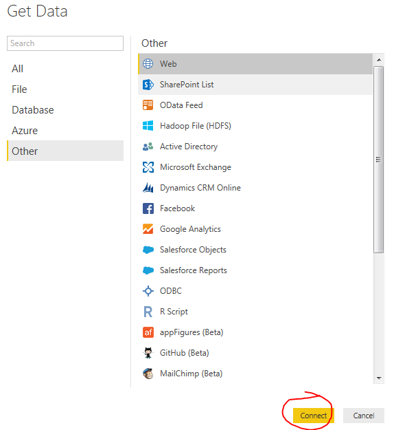
    Open up Power BI Desktop.  Click on the Get Data button.  On the left of the Get Data menu click Other then select the first item titled Web.  Click Connect to continue.

    Get Data from Web
    Get Data from Web

    In the From Web window enter in the following web address.  You can copy and paste it from below.

    https://en.wikipedia.org/wiki/List_of_U.S._states_by_population_growth_rate

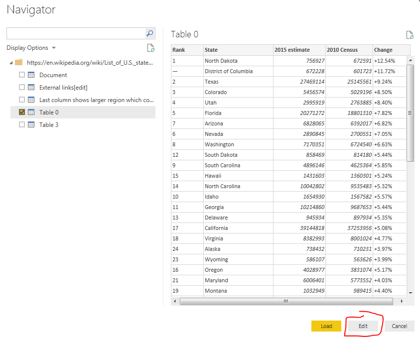
    Click OK to move to the next menu.  After a bit of thinking the Power BI will present the Navigator window.  This is what Power BI has found at that specific web address.  On the left side of the screen there is a folder.  This is the web page folder location that we loaded earlier.  Power BI then intelligently looks through the website code for tables it can distinguish.  By clicking on each table you can see a preview of the data returned on the right side of the window.

    Try clicking on the various tables such as Document, External links, or Table 0.  For our example lets click on Table 0.  Click on the button at the right hand corner labeled Edit.  We are going to slightly modify this data before we load it to the data model.

    Navigator Window
    Navigator Window

    You’ll notice once we load the data there are some items we’d like to remove.  In row #2 the label is District of Columbia, which technically isn’t a state.  Also further down we see in row #25, the entire U.S. population is shown.  Again, we don’t want these values to show, we only want the 50 states.  To remove this data we will use a text filter to remove any item in the Rank column that has a “–” (which is called an em-dash, see note below for more details on how to select this text character).

    Note: There are two kinds of dashes that your computer uses.  One is called the en-dash(-), the second being the em-dash(–).  It is very hard to distinguish the difference between the two dashes.  The image below shows a better contrast when used in Microsoft Word.

    Em-Dash vs. En-Dash
    Em-Dash vs. En-Dash

    The en-dash is shorter than the Em-dash. The Key for the en-dash is next to the number 0 on your keyboard.  To select the em-dash you need to use a bit of Microsoft trickery.  The Em-dash will be presented when you hold the Alt key and type 0151 on a keypad.  This selects the specific ASCII character for the em-dash.  For more information on selecting the em-dash visit here.

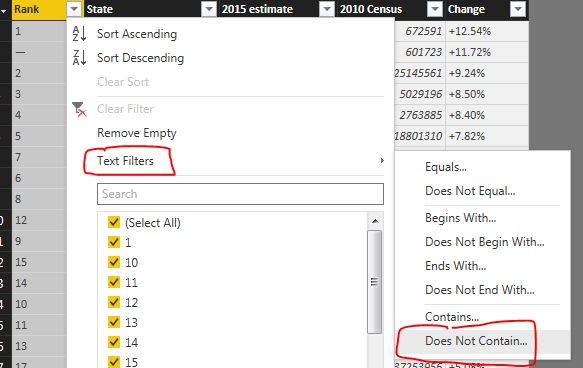
    Click the drown down button in the column labeled Rank.  Select the item labeled Text Filters, and then Click Does Not Contain…

    Text Filter on Rank Column
    Text Filter on Rank Column

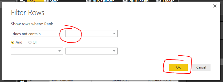
    Enter in the em-dash code by using Alt 0151 to enter in the correct dash into the Filter Rows dialog box.  Click OK to proceed.

    Enter EM-Dash in Filter Rows Dialog
    Enter EM-Dash in Filter Rows Dialog

    If we entered the correct em-dash we will now be presented with a cleaned list of U.S. states with only numbered items in the Rank column.

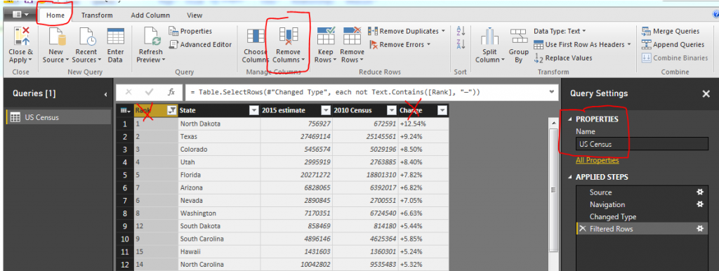
    Next we will clean up the query slightly to make it easier to deal with.  Delete the column labeled Rank, and Change.  Rename the query to something a little more meaning full such as US Census.

    Remove Columns
    Remove Columns & Rename Query

    Note:  You can delete a column by pressing the Remove Columns button on the Home ribbon.  A second method is to right click with your mouse on the column you want to remove and selecting Remove.

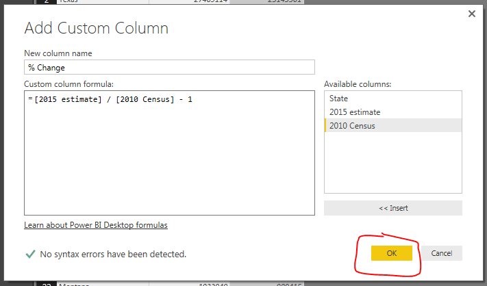
    Next we will add our own calculated column which will calculate the 2010 to 2015 percent change.  Click the ribbon labeled Add Column and select the first icon on the far left labeled Add Custom Column.  The Add Custom Column dialog box will open. Enter the name for the new column, then by clicking on the columns in the available columns on the right you can build an equation.  For this example we are using the percent change calculation which is the following:

    Percent Change = [New Value / Old Value ]- 1

    Using the columns we imported from Wikipedia we will have the following equation:

    = [2015 estimate] / [2010 Census] - 1
    
    Update: this formula has now changed to 2016 estimate as time has progressed since this first tutorial was posted.
    The new column should have this following formula: = [2016 estimate] / [2010 Census] - 1


    This inserts a new column with the calculated percent change between the 2010 census and the 2015 census.  Click OK to proceed.

    Add Custom Column
    Add Custom Column

    Finally we want to change the type of data in the % Change column so our data model will operate as expected when producing visuals.  Click the Home ribbon, then click the % Change column.  Change the Data Type: from Any to Decimal Number.  This informs the data Model how to treat the data held the % Change column.  We are finished data modeling and now click Close & Apply on the Home ribbon.

    Now we have all our data loaded into the data model ready to build a map.

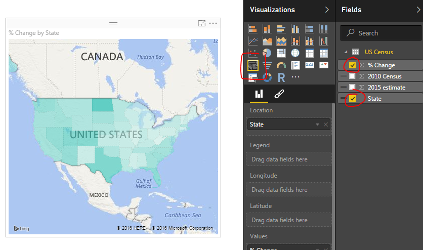
    Click the Column labeled State and then click % Change.  This yields a map with circles on it.  Change the visual to a filled map by selecting a different visual, the Filled Map icon (circled in red below).  Doing so produces a shaded map of the US, where each state is colored according to the % Change.

    Filled Map Selection
    Filled Map Selection

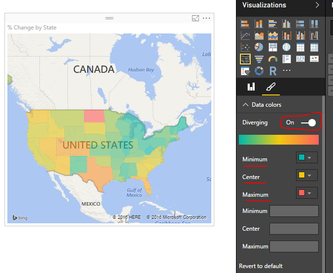
    Finally lets add some color to the data. Click the visual’s Format properties (the little paint brush in the visuals window). Expand the Data Colors section by clicking on the title Data colors. Diverging is set to off.  Change it to On. Change the Minimum color to Green, the Center color to Yellow, and the Maximum color to Red.

    Colored Map
    Colored Map

    The states with the largest population change are in Red, while all the states with the smallest population change.

    Please share if you liked this tutorial.  Thanks.