
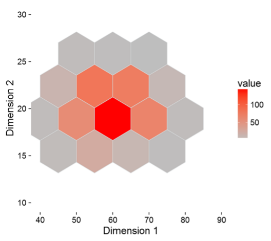
Continuing on the theme with R this month, this week tutorial will be to design a hexagonal bin plot. At first you may say what in the world is a hexagonal bin plot. I’m glad you asked, behold a sweet honey comb of data:
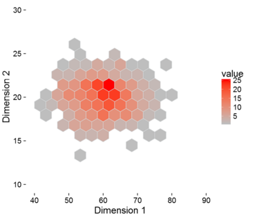
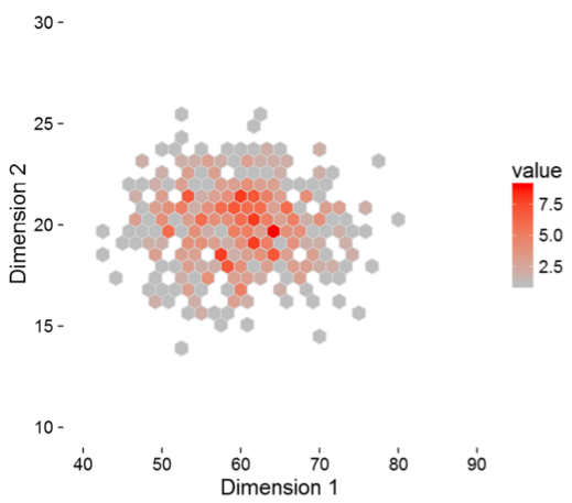
The hexagonal bin plot looks just like a honey comb with different shading. In this plot we have a number of data points with are graphed in two dimensions (Dimension 1, x-axis and Dimension 2, y-axis). Each hexagon square represents a collection of points. Now, if we plot only the points on the same graph we have the following.
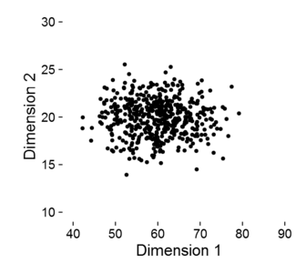
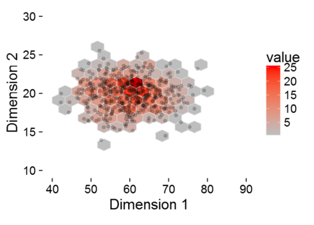
In the scatter plot, it’s difficult to see the concentration of points and if there is any correlation between the first dimension and the second dimension. By comparison, the hex bin plot counts all the points and plots a heat map. And, if you ask me the hexagonal bin plot just looks better visually. To bring this all together, if we overlay the scatter plot on top of the hexagonal bin plot you can see that the higher concentration of dots are in the shaded areas with darker red.
Cool, now lets build some visuals. Lets begin. Tutorial <- Hexagonal Bin Plot (sorry had to interject a bit of R humor here, ignore if you don’t like code humor)
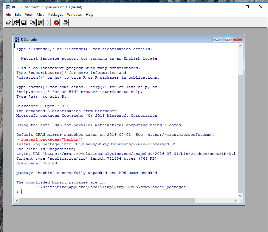
The very first step will be to open the R console and to install a new library called HexBin. Run the following code in the Mircosoft RGui.
install.packages("hexbin")
This will load the correct library for use within PowerBI.
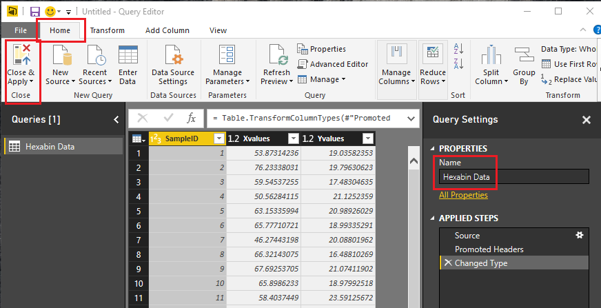
Start by opening up PowerBI. Click on the Get Data button on the home ribbon, then select Blank Query. In the Query editor click on the View ribbon and click on the Advanced Editor. Enter the following query into the Advanced Editor:
let
 Source = Csv.Document(Web.Contents("https://powerbitips03.blob.core.windows.net/blobpowerbitips03/wp-content/uploads/2016/09/Hexabin-Data.csv"),[Delimiter=",", Columns=3, Encoding=1252, QuoteStyle=QuoteStyle.None]),
 #"Promoted Headers" = Table.PromoteHeaders(Source),
 #"Changed Type" = Table.TransformColumnTypes(#"Promoted Headers",{{"SampleID", Int64.Type}, {"Xvalues", type number}, {"Yvalues", type number}})
in
 #"Changed Type"
This query loads a csv file of data into PowerBI.
Note: For more information on how to open and copy and paste M language into the Advanced Editor you can follow this tutorial, which will walk you though the steps.
After the clicking Done in the Advanced Editor the data will load. Next rename the query to Hexabin Data and then on the Home ribbon click Close & Apply.
Next click on the R visual in the Visualizations bar on the right side of the screen. There will likely be a pop up warning you about enabling R Scripts. Click Enable to activate the R script editor. With the R script visual selected on the page add the following columns to the Values field selector.
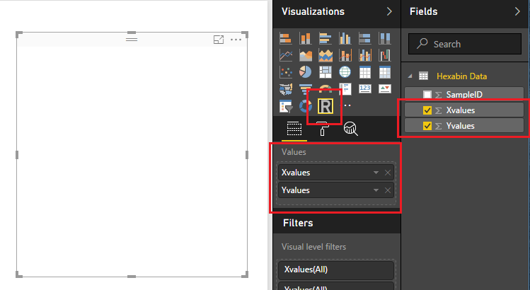
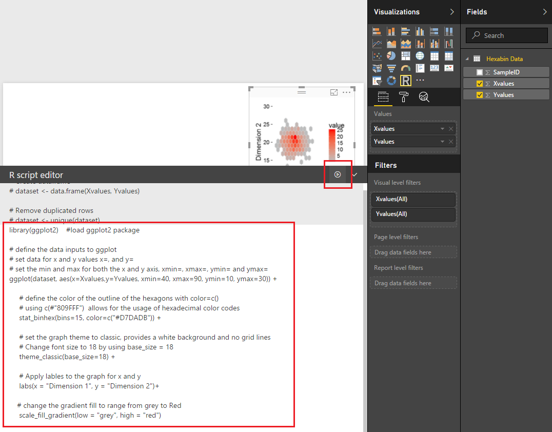
Notice that the R visual is blank at this time. Next add the following R code in the R script editor window. This will tell PowerBI Desktop to load the ggplot2 library and define all the parameters for the plot. I’ve added comments to the code using # symbols.
library(ggplot2) #load ggplot2 package

# define the data inputs to ggplot
 # set data for x and y values x=, and y=
 # set the min and max for both the x and y axis, xmin=, xmax=, ymin= and ymax=
 ggplot(dataset, aes(x=Xvalues,y=Yvalues, xmin=40, xmax=90, ymin=10, ymax=30)) +

# define the color of the outline of the hexagons with color=c()
 # using c(#"809FFF") allows for the usage of hexadecimal color codes
 stat_binhex(bins=15, color=c("#D7DADB")) +

# set the graph theme to classic, provides a white background and no grid lines
 # Change font size to 18 by using base_size = 18
 theme_classic(base_size=18) +

# Apply lables to the graph for x and y
 labs(x = "Dimension 1", y = "Dimension 2")+

# change the gradient fill to range from grey to Red
 scale_fill_gradient(low = "grey", high = "red")
Click the run button and the code will execute revealing our new plot.
One area of the code that is interesting to change is the section talking about the number of bins. In the code pasted above the code states there are 15 bins.
stat_binhex(bins=15, color=c("#D7DADB")) +
Try increasing this number and decreasing this number to see what happens with the plot.
stat_binhex(bins=5, color=c("#D7DADB")) +
stat_binhex(bins=30, color=c("#D7DADB")) +
Well that is it. Thanks for reading through another tutorial. I hope you had fun.
Want to see more R checkout the Microsoft R Script Showcase. If you want to download the PBIX file used to create this visual you can download the file here.
If you want to learn more about R and the different visuals you can build within R check out this great book which helped me learn plotting with R.