


This past week I was talking with the big guy up north, jolly old fella, and the discussion came up about his toy production levels. Santa was complaining about how hard it was to measure the performance of all his elves. Naturally I started babbling about how much I enjoy Power BI and that I use it on all kinds of sources of data, google analytics, excel sheets, sharepoint, and SQL data warehouses just to name a few. Now by this point most people would have wandered off looking for another conversation, but I must have struck a chord with Santa. He jumped right in the conversation and told me how he had just moved all his local data centers into Azure and more specifically SQL data warehouses. It was saving him loads of money in addition it has freed up all his I.T. elves to move to more important tasks, building the NES Classic for Nintendo, they are way behind in production. To make a long story longer, I was able to convince Santa to give me a small sample of data so I could show him how to use R to visualize his data in PowerBI. Here is what I came up with:
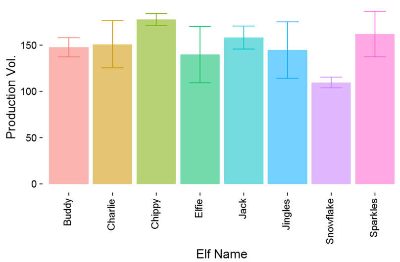
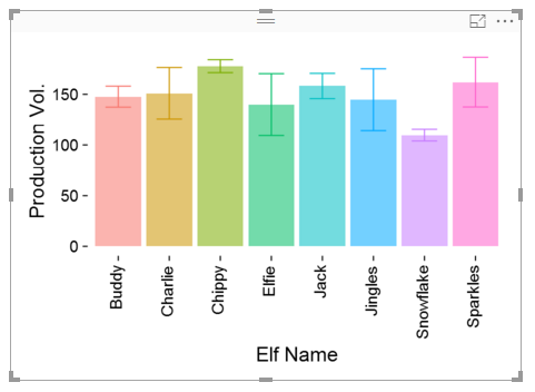
Needless to say he was very pleased. I explained the chart to Santa, each bar represents the average production volume for each elf. Then the whiskers at the end of the bar represent the +1 and -1 standard deviation away from that mean. It essentially tells you how consistent each elf is able to produce products and what is the average production rate. For example, Buddy the Elf can produce an average 148 items in a day, he has a daily variance of 10 items. Charlie can produce on average more items but has a wider daily variance. Snowflake has the lowest average production level but is one of the more consistent producers. Santa gave me a big smile and said “nice job.”
Let’s walk through how I did this.
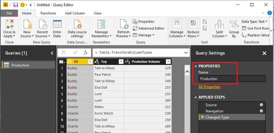
Open up PowerBI Desktop, Click the Get Data button on the Home ribbon and select Blank Query. Click Connect to open the Query Editor. Click Advanced Editor on the View ribbon. While in the Advanced Editor paste the following code into the editor window, click Done to complete the data load.
Note: If you need some more help loading the data follow this tutorial about loading data using the Advanced Query Editor. This tutorial teaches you how to copy and paste M code into the Advanced Editor.
let
    Source = Excel.Workbook(Web.Contents("http://powerbi.tips/wp-content/uploads/2016/12/Santa-Production.xlsx"), null, true),
    Production_Table = Source{[Item="Production",Kind="Table"]}[Data],
    #"Changed Type" = Table.TransformColumnTypes(Production_Table,{{"Elf", type text}, {"Toy", type text}, {"Prodution Volume", Int64.Type}})
in
    #"Changed Type"
Before you exit the query editor Rename the query to Production. It should look similar to the following:
Click Close & Apply on the home ribbon.
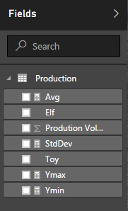
Add the following measures by click on the New Measure button on the Home ribbon.
Avg = AVERAGE(Production[Prodution Volume])
The Avg measure will determine the height of each bar in the bar chart.
StdDev = STDEV.P('Production'[Prodution Volume])
The StdDev will calculate the standard deviation for each elf.
Ymax = [Avg]+ [StdDev]
The Ymax calculation adds the Avg measure value to the standard deviation for production. This produces the upper arm of the whisker.
Ymin = [Avg]-[StdDev]
The Ymin calculation is subtracts the standard deviation from the Avg measure value. This produces the lower arm of the whisker.
Once you have completed making all the measures you should have a Production table with the following fields:
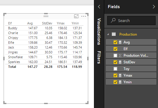
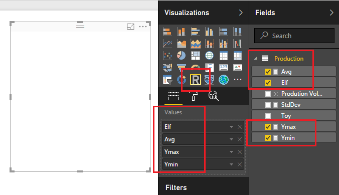
Add the table visual by click on the Table visual in the Visualizations pane. Add the Fields which are shown below. Your table should look identical to this:
Next, add the R Visual from the visualization Pane. When you click on this you will get a message stating “Enable Script Visuals” click Enable to proceed.
Note: If you have not installed R or enabled the preview features of R in Power BI you should follow this tutorial which helps you get everything set up. For this particular visual we are using ggplot2. This is a package for R and should be installed in the R environment. You can follow this tutorial on how to install ggplot2.
Add the following fields into the R visual:
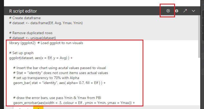
Next in the R Script Editor add the following code to generate the R Script.
library (ggplot2) # Load ggplot to run visuals
# Set up graph
ggplot(dataset, aes(x = Elf, y = Avg) ) +
# Insert the bar chart using acutal values passed to visual
# Stat = “identity” does not count items uses actual values
# set up transparency to 70% with Alpha
geom_bar( stat = “identity”, aes( alpha= 0.7, fill = Elf ) ) +
# draw the error bars, use pass Ymin & Ymax from PBI
geom_errorbar(aes(width = .5, colour = Elf , ymin = Ymin, ymax = Ymax)) +
# Change the Labels
labs(x = “Elf Name”, y = “Production Vol.” ) +
# Make the theme simple and remove gridlines
# Change the font size to 14
theme_classic( base_size = 18 ) +
# Remove the legend
theme( legend.position = “none”) +
# Change elements of the Axis, Angle, horizontal & Vertical position
theme( axis.text.x = element_text(angle = 90, hjust = 1, vjust = 0.3),
axis.text = element_text(colour = “black”),
axis.ticks = element_line(colour = “black”),
axis.title = element_text(colour = “black”),
plot.background = element_rect(colour = NA) )
Note: This code uses the R package ggplot2. It will error out if you don’t have ggplot2 installed.
Click the run icon to execute the R script.
When the script runs you will have a beautiful production chart.
Thanks for following along. Like always be sure to share if you liked this content. I am always, looking for feedback and possible topics so make sure you leave a comment below.
If you want to download a similar example already completed you can download this example from the R Script Showcase (don’t forget to give me a thumbs up).
Merry Christmas!