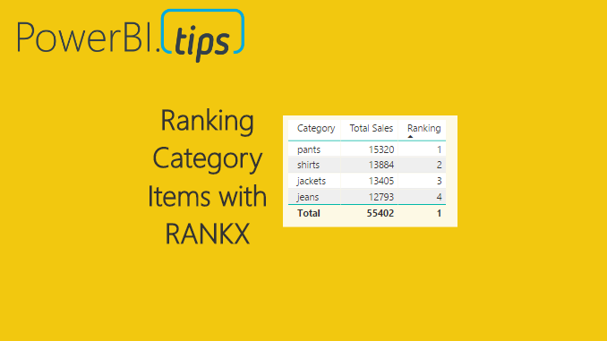
In many reports we produce we often need a method to score or rank data. For example, we may need to list the sales totals for the sales team and rank them from highest sales to lowest sales. Ranking can be done as a calculated column, or as a measure. When using a measure, the ranking becomes dynamic and takes on the filter context of the table, or visual, that is showing the data. Calculating a rank as a measure can be useful if you want to allow the user to select different categorical values such as product type and then have the report automatically rank the selected items. When the report filter context changes the items are automatically re-ranked.
Alright, let’s jump into the data!
Open PowerBI Desktop, Click the Get Data button on the Home ribbon and select Blank Query. Click Connect to open the Query Editor. On the View ribbon click the Advanced Editor button. While in the Advanced Editor paste the following code into the editor window, click Done to complete the data load.
Note: If you need some more help loading the data follow this tutorial about loading data using the Advanced Query Editor. This tutorial teaches you how to copy and paste M code into the Advanced Editor.
let
  Source = Excel.Workbook(Web.Contents("https://powerbitips03.blob.core.windows.net/blobpowerbitips03/wp-content/uploads/2017/05/Clothing-Sales.xlsx"), null, true),
  ClothingSales_Table = Source{[Item="ClothingSales",Kind="Table"]}[Data],
  #"Changed Type" = Table.TransformColumnTypes(ClothingSales_Table,{{"Date", type date}, {"Category", type text}, {"Sales", Int64.Type}})
in
  #"Changed Type"
Once you have copied the m code above into the query editor click Done.
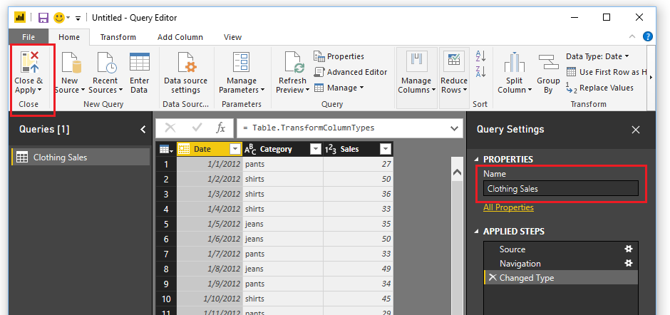
Be sure to name your query Clothing Sales. Then on the Home ribbon click Close & Apply to load the data into the data model.
To understand how the ranking will work we must first understand the DAX function ALLSELECTED. You can read more about the Microsoft documentation on this function here.
To illustrate how the ALLSELECTED() function works we will make two measures and place them in a simple table.
Begin by creating a sum of the Sales in the Clothing Sales table. Click New Measure on the Home ribbon. Enter in the following measure equation:
Total Sales = SUM ( ‘Clothing Sales'[Sales] )
Now, create a Table visual with the selected columns shown in the image below.
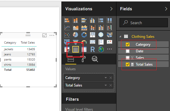
Sweet, we can see that all the categorical items have been added together forming totals. Add the Slicer visual for the Category column, see example below.
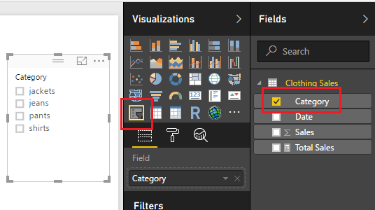
Once the slicer is added we can select various items and see our table filter correctly.
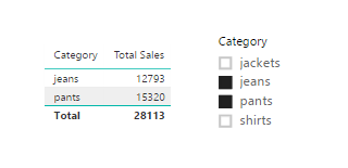
Note: if you want to select multiple items in the slicer, hold the ctrl key and click on the multiple items that you want to select. This is how I selected the multiple items in the image above.
Now, let us make a measure doing the same calculation but this time we will apply the ALLSELECTED() DAX function. Click on New Measure on the Home ribbon and enter the following DAX formula.
Total Sales ALLSELECTED = CALCULATE( sum( ‘Clothing Sales'[Sales] ) , ALLSELECTED( ‘Clothing Sales’ ) )
Add this new measure into our existing table.
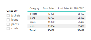
In this new formula we are calculating the sum of all the clothing sales but using the filter context of all the items selected from our filters. Notice with nothing selected in our slicers that the sum of all Total Sales 55k, is the same for each row of the table for the column Total Sales ALLSELECTED. This is due to the fact that we changed the filter context for the sum calculation.
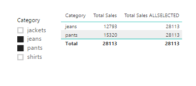
Select Jeans and Pants from the slicer. Notice we have the same results but with different totals. The totals calculated using ALLSELECTED ignored the filter context of jeans and pants and calculated the total of all the selected sales.
Finally, we will now add the Ranking. To calculate the rank we use the DAX function RANKX(). More documentation can be found on RANKX here.
Create a new measure and add the following:
Ranking = RANKX( ALLSELECTED( 'Clothing Sales'[Category] ) , CALCULATE( SUM( 'Clothing Sales'[Sales] ) ) )
Add the new measure, Ranking, to the table visual. Ta Da, automatic ranking based on information that was selected from our slicer visual.

Note: when we used the RANKX function we called out a specific column the Category column from our Clothing Sales table. If you only specify the table name this measure will not work. We are using the filter context of the categories to conduct the ranking operation.

