

When I teach Power BI to new users, there are typically questions about how to get Power BI to act more like Pivot Tables in Excel. Through my discussions, two key pieces of functionality stand out to me that people want.
- They would like to select a categorical property to adjust the table. In this scenario a user would want to select the State, Sales Territory, or something else that describes a breakdown of the data. This is similar to adding a field of data into the Rows selection for Pivot Tables.
- They want the ability to rank a column and select only the top N number of items in a given column. Imagine that you have Sales Units, Revenue, or some other numerical column. Then based on a selected column such as Sales Units, I want to see the top 3 or 4 sales items. This would be a similar in the excel experience when you modify the filters for a given pivot table column.
Disclaimer: This is quite a large topic and therefore I have broken this up into three segments for read-ability. Thus, to poke your curiosity below is the final example of the report. We will walk through reach phase of this report, so you can produce this dynamic table.
This series of blogs will be broken up into three parts.
Part 1: Build a Table or Matrix visual that can dynamically change based on a slicer
Part 2: Build supporting tables & measures
Part 3: Bring it all together for the final report
OK, hold on tight, here we go!
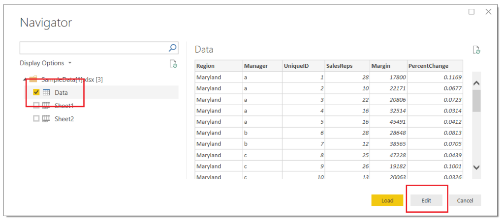
Let’s begin with acquiring our data. Open Power BI Desktop. Click Get Data on the Home ribbon and select Excel. When the Open dialog box opens enter the following file name, and click Open:
https://powerbitips.blob.core.windows.net/powerbitipsdatas/SampleData.xlsx
The Navigator window will open showing you the contents of the file. Select the Data Table by clicking in the square next to the word labeled Data, click Edit to load the data and enter the Query Editor.
Next, Right Click on the table labeled Data in the Queries pane, from the drop-down menu select Reference.
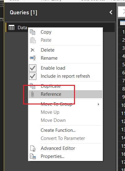
This will produce a second table labeled Data (2). In the Properties pane on the right side of the screen edit the name of the query to Pivoted Data. Select the columns UniqueID, SalesReps, Margin, and PercentChange by holding Ctrl and clicking on each column. While keeping all four (4) columns selected right click on the last column and select Unpivot Other Columns.
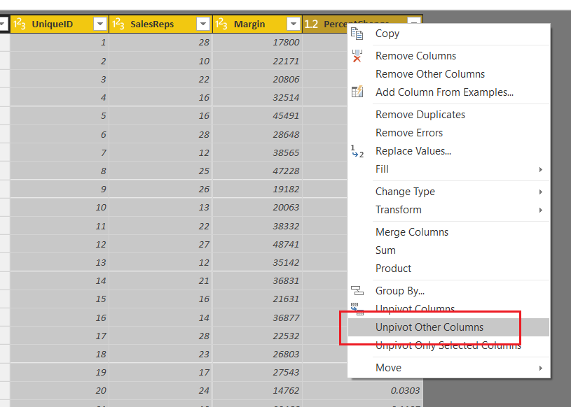
Note: It is important to notice that we selected Unpivot Other Columns instead of selecting the Region and Manager columns and selected Unpivot Columns. Selecting Region and Manager and selecting Unpivot Columns will achieve the same results, but if our excel file or underlying data set adds more Categorical columns our query will break. Using this technique creates a flexible query that can handle any number of new categorical columns. You know your data the best, and how it will change over time. It is important to consider these aspects when loading data via the Query Editor.
We have completed our data load. On the Home ribbon click Close & Apply to complete the data load for our two tables, Data and Pivoted Data.
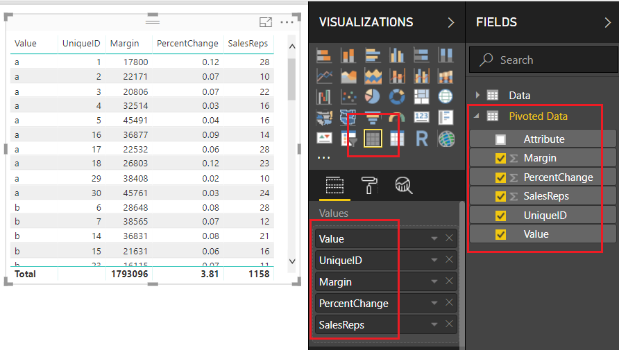
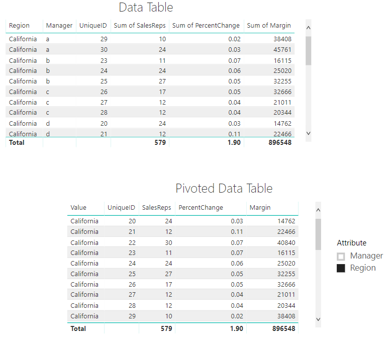
Load the Fields from the Data table into a Table Visual, as shown below:
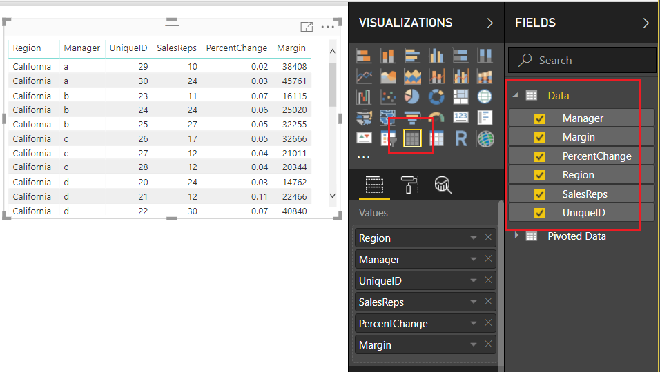
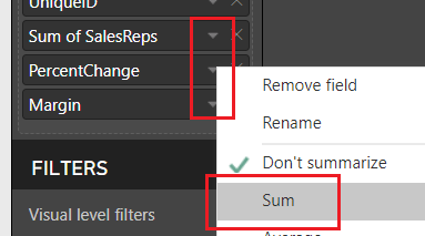
For the following fields SalesReps, PercentChange, and Margin change the Fields to SUM by clicking on the Triangle next to each field’s name. We will use this information to confirm that our Pivoted table is providing the correct data.
Add a second Table visual and bring over the fields from the second data set, our Pivoted Data table. Be sure to leave off the Attribute column as this will not be needed in this second table.
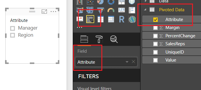
Add a Slicer to the report layout and add the column labeled Attribute from the Pivoted Data table.
Notice we now have the ability to select either the Manager Column or the Region column. By doing so, we are able to change the columns within our table to only show the items relevant to our slicer selection. Pretty cool.
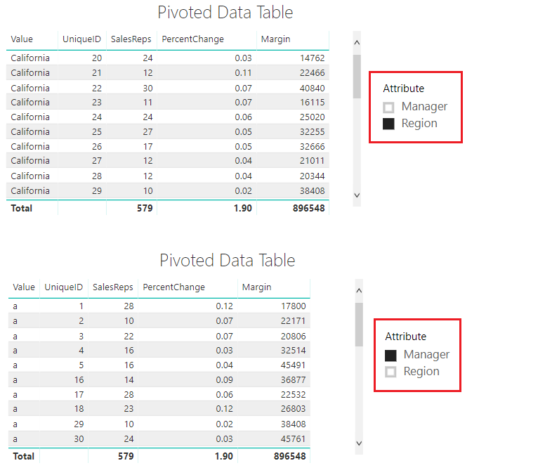
It’s also important to note here that in our Pivoted Data Table, we can only acquire the correct totals with a single attribute selected. When the slicer has no selection our totals for SalesReps, PercentChange and Margin are all twice the amount they should be. Later on, in part 2 of this tutorial, we will fix this using measures.
Thanks for reading along. Stay tuned for part 2 where we will build supporting data tables to aid the user experience on the report page. If you like what you learned, please forward this on to someone else who would enjoy these free tutorials. Also, follow me on Twitter and Linkedin where I will post all the announcements for new tutorials and content.
 |
 |