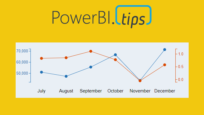
Ever need two different scales on the Y-Axis of a line chart? If so, then this tutorial is for you. While creating a dual y-axis line chart is pretty common in excel, it is not as easy in power BI. The only standard chart that comes with Power BI Desktop that enables dual y-axis is the Column and line combo chart types.
For this particular visual I needed to show correlation between two time series with different Y-axis scales. The Y-axis on the left of the chart had data elements in the thousands, but the right side needed percentages. The tutorial below illustrates how to accomplish by building a custom visual using the Charts.PowerBI.Tips tool.
Video Tutorial
note: there are a bunch of really good custom visuals that can be downloaded from the Microsoft App Source store. However, this article will not review all third party visuals that are able to produce a dual Y-axis line chart.
Source files
All files used to create this visual are located here on GitHub.
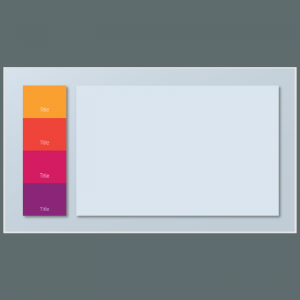
Layout file
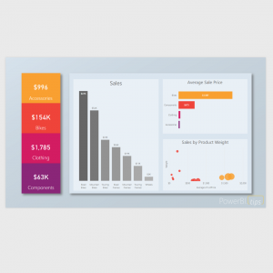
The file used in this tutorial was a derivation of the Sunset layout from PowerBI.Tips. If you like this file, you can download it here:
-
 Layouts – Sunset$100.00
 -
 Layouts – Sunset – Free$0.00

If you like the content from PowerBI.Tips please follow us on all the social outlets. Stay up to date on all the latest features and free tutorials. Subscribe to our YouTube Channel. Or follow us on the social channels, Twitter and LinkedIn where we will post all the announcements for new tutorials and content.
Introducing our PowerBI.tips SWAG store. Check out all the fun PowerBI.tips clothing and products:
Check out the new Merch!