Grouping with Style
The release of grouping visuals was an extremely welcomed feature. As one who builds lots of reports grouping elements together is essential to stay organized and to increase report building speed. Since I’ve been using this great new, I found an interesting design element to style groupings for reporting impact. The grouped visuals feature enables a new property, background color. This can be applied for the entire group of visuals.
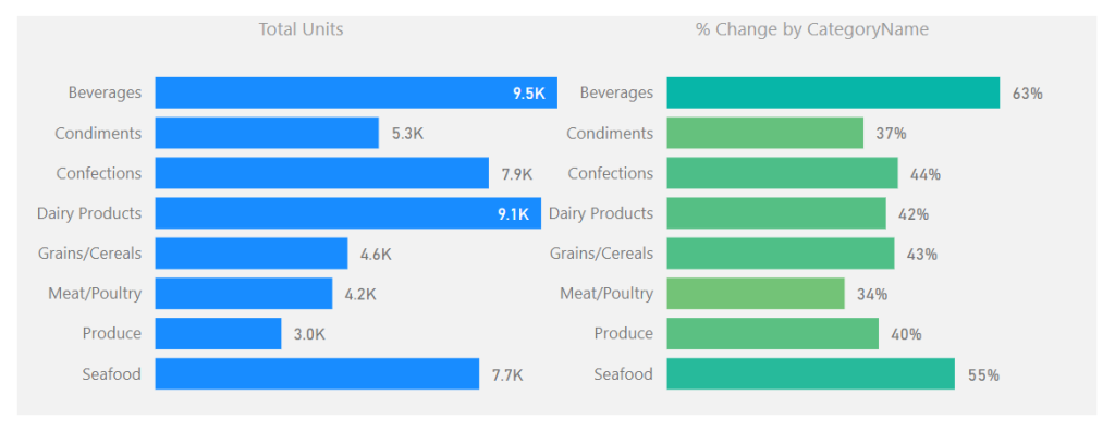
See the following example of setting a background around two visuals.
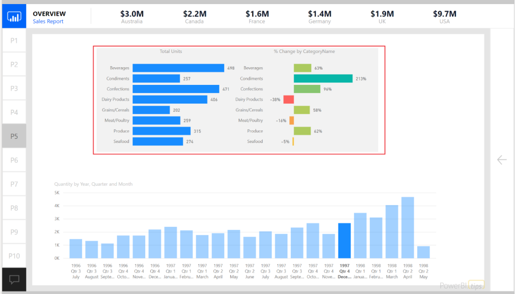
In this example the intent is to show the user that these two visuals are related. The graph on the left shows the number of units sold for a selected time period. The bar chart on the right shows the relative sales over time represented as a percent change. This illustrates the principle of position and direction. The number of units sold is what happened right now. It is my place in time with respect to sales. However, this does not show any context to performance. The percent change provides the directional context. Since the position and direction are an important insight as a paired visual, we use the grouping to visually bind the two.
For those who have done some research around design principals inevitably you will stumble across the Gestalt Principals of design. Grouping visuals with a common background falls into the Law of Common Region or Law of Proximity.
Alright let’s walk through how to use grouping with backgrounds colors.
Once you have created the visuals which will be grouped together; select each visual by holding CTRL and Selecting each visual.
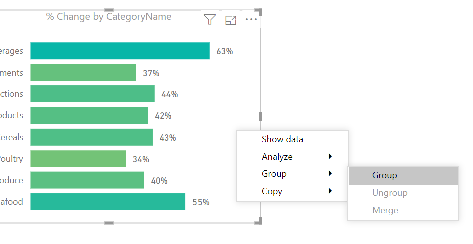
Right Click on one of the visuals and select the menu item labeled Group, in the flyout menu select the option called Group.
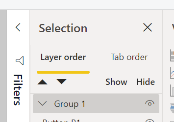
A grouped element will be created in the Selection Pane.
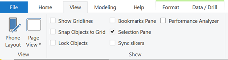
Note: If you don’t see the Selection Pane, you will need to turn this on. The setting to turn the Selection Pane is found in the View ribbon with the check box for Selection Pane. See below for reference.
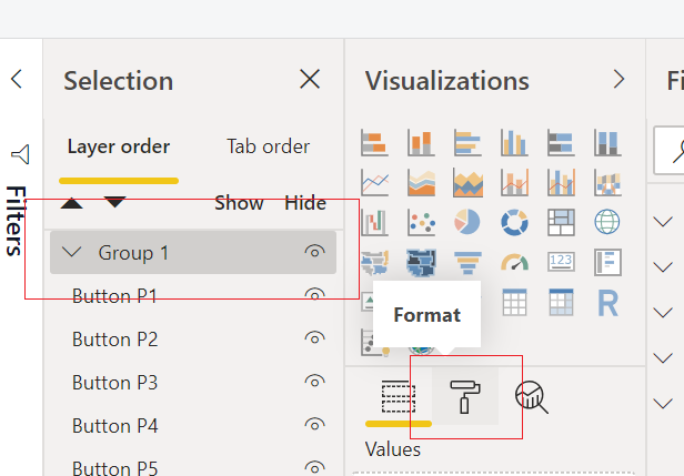
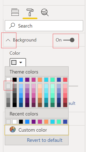
With the newly created group being selected, Click on the Paint Roller (Format) icon in the Visualizations Pane.
Expand the property section called Background. Toggle the background to be On and select a Color from the drop-down menu. For this example, I selected the very first shade of grey in the first column of colors.
The final product will be a grouped arrangement of visuals with a shaded background.
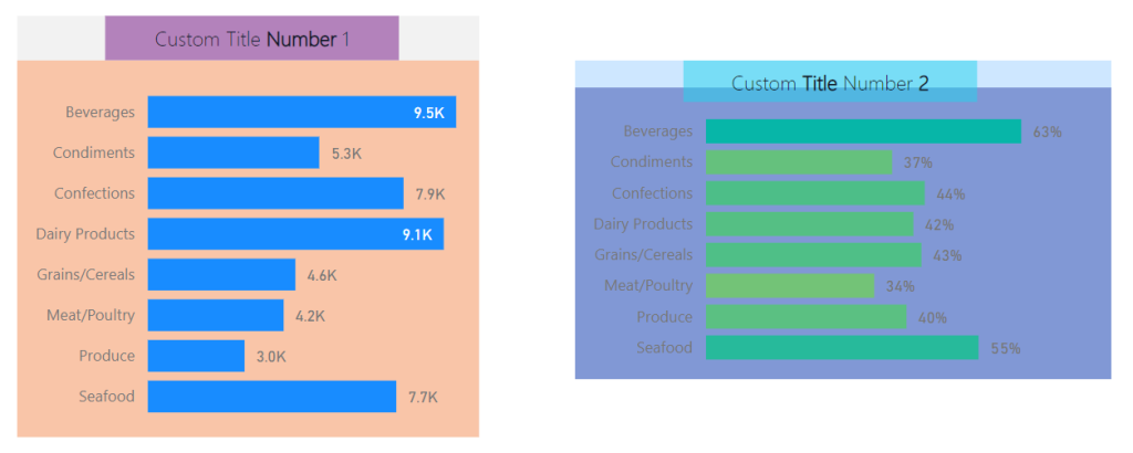
To extend this idea further we can take the same approach when working with Text boxes and Visuals. Often, I find I need more style for applying a Text box or header to a visual. In these cases, I will use two visual elements to create one visual. See this example of two visuals with custom titles created with a textbox.
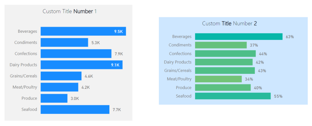
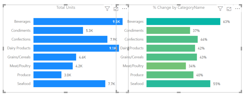
Note: Backgrounds are colored differently to illustrate that each background for the grouped visuals is different.
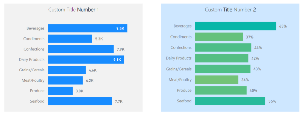
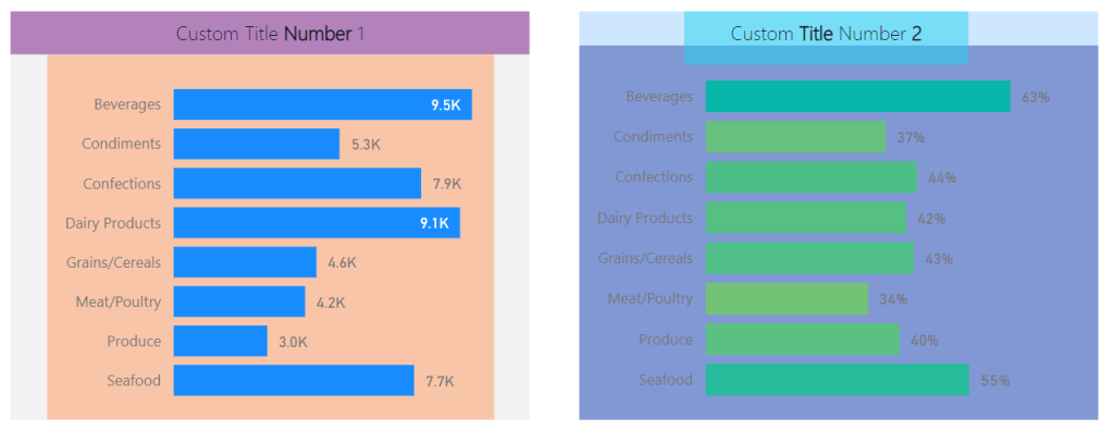
While this meets the need the boxes are not identical in size. This violates yet another Gestalt Principle, symmetry. The bounding regions of the elements inside the grouping define the outer perimeter of the background shading. Knowing this we can modify the visuals within the groups to provide a symmetrical background shape.
Here are the same before and after images with each visual object colored to see the adjustments in size for each visual type. This creates the proper background sizes.
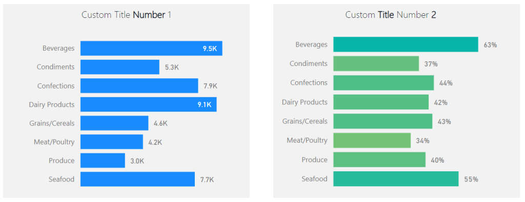
Before:
After:
The visual on the left required an increase of the text box at the top to get the desired width of the background shape. By contrast the visual on the right required an extension of the bar chart in length to acquire the desired length of the background. The result provides a symmetric view of both visual groups.
If you like the content from PowerBI.Tips please follow us on all the social outlets. Stay up to date on all the latest features and free tutorials. Subscribe to our YouTube Channel. Or follow us on the social channels, Twitter and LinkedIn where we will post all the announcements for new tutorials and content.
Introducing our PowerBI.tips SWAG store. Check out all the fun PowerBI.tips clothing and products:
Check out the new Merch!