
This article follows from Episode 5 of the new Explicit Measures Podcast, a whole new way to talk about Power BI. If this article strikes you as relevant, subscribe to the podcast on Spotify, Apple, or wherever you listen. You can also watch live at 7:30am CST every Tuesday and Thursday morning on YouTube.
On the latest Explicit Measures Podcast (Episode 5), the team dived into what should a BI Team focus on for their own KPI’s. One theme was consistent across each host however: Any KPI for a BI Team starts with the question: how do you evaluate and define success? This idea of success and the value for a Power BI pro can fall into many different opinions, depending on the size, team, and current culture at an organization. We wanted to share an initial template of KPI’s that any BI Team or Pro should start using and integrating in their own workflow.
Evaluating Success for Power BI
How can you properly gauge whether reports and data is satisfying the role in a company? At least from the opinion of the Explicit Measures Podcast, the basis starts with the ability to provide value, trust, and insights to an organization through their data. Starting with this as the end-goal, a BI Team can and must strategize on translating success into measurable targets. Let’s break this out into three distinct elements of success, with examples of KPIs for a BI Team.
Elements of Success
Adoption
Adoption has become a buzz word in our industry over the past few years, and with good reason. One could make the argument that the ability to drive adoption should take higher precedent than some of the reports themselves. For reference, we are defining adoption as the maturity, growth, and reliance an organization has on their data via Power BI.
Value / Time
While most BI professionals do not directly create revenue, there is no question that there is a cost. With an ever increasing workload and requests for our time, the ability to validate and choose to work on impactful and value-added reports is essential. If a pro is working on one report, there are five others that are being ignored. Further, are the reports that are being developed and deployed providing the expected insights and information to an organization?
Data Quality
Anyone who has worked in Business Intelligence can tell you – once teams lose trust in the data, it is an awfully long and difficult road to gain it back. If users cannot trust the data in Power BI reports, that both reverts adoption and users will find other means to get their data. BI teams must be able to monitor how up-to-date published reports are, and ensure that the content that is available is current and accurate.
Examples of Success KPI’s
The following are examples of what a Power BI team or Pro can use to evaluate their own success based the pillars of Adoption, Value, and Quality. This is by no means an exhaustive list – this is an amazing community that consistently contributes new and innovate ideas – however there is no current standard for a BI Team success KPIs.
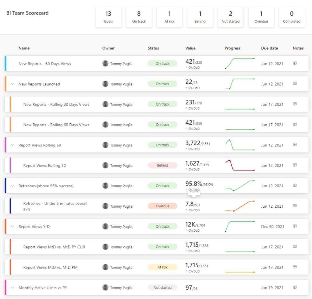
Adoption – KPI’s
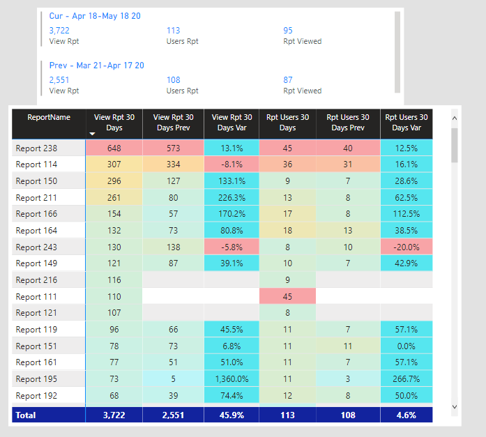
Rolling 14 Days / 30 Days Report Views
Just with a basic department metric, simply looking at the aggregate does not create a KPI. While Report Views are important, giving context to the current performance transforms how you view this. This KPI not only shows you your top reports on a 2 week and month period, but also compare with the previous 14 / 30 day period.
Active Users (Weekly, Monthly)
The relationship between the number of Report Views and Users may not be as straightforward as you think. Keeping watch of engaged consumers should occur on a weekly and monthly timeframe. For this, you can simply use a filter on a minimum of X reports viewed per week or month. Depending on your data, you can gauge the current state.
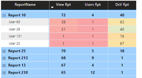
User Distribution by Report
Do not be fooled by high usage numbers in your reports alone! By this, make sure you can identify power users who are hoarding the majority of views for a given report. For example, a great technique to understand this is using the Pareto Principle, or the 80/20 rule in your report views. For example, for your top report, try to track the 20% users, and how much of total views they make up for an entire user base.
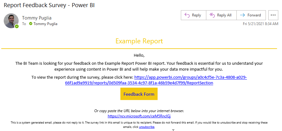
SAT Scores, Feedback
The majority of the KPIs in this article focus on quantitative metrics. However, there should attention to create subjective feedback in Power BI. For example, creating a Power BI Feedback Survey can create high value. In regard to when to send out a Survey, the following scenarios are suggested:
- 45 Days after New Reports Launched (per-Report Feedback)
- Quarterly Feedback Surveys (Overall experience using Power BI)
Collecting this data via Power Automate and integrating into Power BI becomes a powerful tool.
Value / Time – KPI’s
New Reports Launched
Like Supply Chain Management, ensure you can track newly published reports. Bear in mind, this is not a growth target. There should be some range depending on the size of the BI Team that should aimed for. For example, a consistent small number may show a backlog. However, to high of a number may be saturating the overall experience for users.
New Report Usage
In parallel with tracking newly published reports, keep an eye on the immediate interest from consumers for these new reports. Like with the New Reports Launched KPI, depending on your team and size, decide on a sweet spot regarding range of views you expect. Likewise, have a filter on this based on the date the report was launched, looking at 30 to 45 days forward. The only usage metrics that should be included are ones based on the date the report was published.
Report Lifespan
This is a favorite. Too many times has a BI Author worked on what was deemed an urgent report, imperative to the business. These types of projects involve stress, pressure, and most importantly time taken to get right. Despite this, some of these reports seem to lose their luster once completed, not to be heard from again.
In short, the ability to understand the durability and longevity of reports is essential. This can be taken both from viewing at an individual report level or an aggregate of newly launched reports. Are the reports being built showing value to consumers, not just once, but giving them a reason to return to the report on a consistent basis?
Data Quality – KPI’s
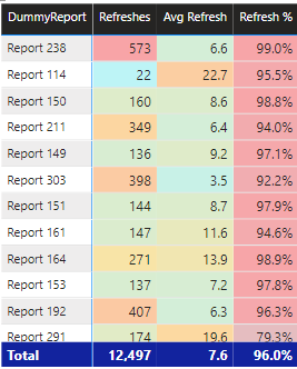
Report Refresh Rate
An obvious choice when referring to Data Quality, if your reports are consistently failing that causes multiple problems. For one, consumers are not receiving the most current data. Secondly, this should trigger within the BI Team an alert that a data model may need to be reviewed for best practice standards.
What is the target rate? While there is no current industry standard, targeting anything near the 95% rate should not be over achievable.
Days Since Report Views
From a bird’s eye view of all the reports in an organization, flagging unused report becomes an actionable KPI. In addition, mapping this to also track duration on a per-user basis provides a wholistic scorecard to future decisions. Firstly, Reports with consistent low Days Since Views should be treated with extra care if any updates are needed. On the other hand, Reports that have not been viewed in over 2 weeks may indicate loss of interest. Depending on the report, a BI Team can decide either to re-promote a report or assess if a report is not providing the value it should.
From the User perspective, tracking Days Since Views by User can provide value in multiple ways. For instance, Users who are “top customers” (i.e. those who overall and per-report have low Days Since Views) tell Authors who to reach out to or who knows what can enhance reports in the future. By contrast, Users with high Days Since Views provide the ability for push-back for requests for new builds. For example, any colleague that may be requesting the most report builds but do not return to their reports give support to Project Managers that this may not be worth the value.
Reports Retired
As we discussed monitoring how many Reports have been launched, what about Reports on their way out? That is to say, how many reports have been removed from the service and from the “public” view. The importance of keeping track of this KPI is all about quality for the consumer experience.
Ensuring that any data published for an organization is current, has a clear objective, and provides clarity is paramount. Above all, this grows the trust and reliance on using Power BI for users. From a discovery standpoint, there is no confusion on reliable data.
Taking the previous KPI (Days Since Views) into account, a BI Team can create a view to monitor “at-risk” reports. For example, any Report with over 45 Days Since Views should be strongly considered to be retired. Any report that meets the threshold should alert users on a pending retirement date. If there are no objections, then these reports should be moved to an Archived workspace.
Getting the Data from Power BI
This may be obvious, but a prerequisite of creating and using KPI’s is having the data. So where is this data coming from? If you are a Power BI Administrator in your tenant, you can import the data via PowerShell. Install the Power BI Module in PowerShell using the following command:
Install-Module -Name MicrosoftPowerBIMgmtOnce you installed the cmdlet, you can use the following script to pull in usage day (by day) into a specified folder on your PC.
Login-PowerBI
## $a is the starting Day. Start with the you want it run and subtract 1
$a = 17
Do {
    "Starting Run $a"
    $a
    $a++
    $ab = "{0:00}" -f $a
    "Running Day $a"
    $daytype = "$ab"
    ## Update monthly the 05 for start date for the current month
    $startdate = '2021-05-' + $daytype + 'T00:00:00'
    ## Update monthly the 05 for end date for the current month
    $enddate = '2021-05-' + $daytype + 'T23:59:59'
    $activities = Get-PowerBIActivityEvent -StartDateTime $startdate -EndDateTime $enddate | ConvertFrom-Json
    ## Update the 05 with the current month
    $FileName = '2021' + '05' + $daytype + 'Export.csv'
    ## Add where you want the files to go
    $FolderLocation = 'C:\Users\PBIActivity\'
    $FullPath = Join-Path $FolderLocation $FileName
    $activities | Export-Csv -Path $FullPath -NoTypeInformation
    ## Change the number for what day of the month you want it to run until
} Until ($a -gt 19)
The script above collects activity data from your tenant and creates a CSV file per day. Note that this can only go back 30 days – make sure you run this on a weekly basis and change the variables. To learn more about what else you can do with the PowerShell cmdlets for Power BI, read the announcement from the Power Blog here.
To collect refresh statistics, Marc Lelijveld (Data-Marc) has a great tutorial here.
Conclusion
The KPIs outlined should serve as a starting point to monitor performance. Power BI Pros without insight into their own performance are stunting their own growth. Not only are metrics for Pros essential for an organization, but it alters the way new reports are built in the future.
Like the content here? Then you will love the Explicit Measures Podcast! Subscribe to the Podcast on Spotify, Apple or multiple platforms on Anchor. Want to join us live? We stream every episode on YouTube Tuesdays and Thursdays at 7:30 am CST. You can also subscribe to new events on the PowerBI.tips LinkedIn Page
If you like the content from PowerBI.Tips please follow us on all the social outlets. Stay up to date on all the latest features and free tutorials. Subscribe to our YouTube Channel. Or follow us on the social channels, Twitter and LinkedIn where we will post all the announcements for new tutorials and content.
Introducing our PowerBI.tips SWAG store. Check out all the fun PowerBI.tips clothing and products:
Check out the new Merch!