In the October 2020 release of Power BI desktop you have the ability to load a dataset from the splash page. For this tutorial we dig in on how Microsoft enables a default dataset. Additionally we show you how to customize the default dataset for your needs.
Quite often I need to prototype a visual, or work on some sample data to design a report. The very first step is always loading some sample data. Now that Power BI desktop comes with a default dataset, we leverage this feature to speed up our development process.
Watch the YouTube Video
Additional Thoughts
In this video I explain that the dataset does not auto load with datatypes enabled. This was due to my default setting within Power BI desktop. If you’d like you can make Power BI Desktop auto detect your datatypes for you.
This setting can be changed by the following steps:
Click on the File button
In the drop down menu, Click on the Options and Settings
In the menu on the right Click the button labeled Options
Under the Global section in the Options menu Select the item labeled Data Load
Change the Type Detection for loading data
If you like the content from PowerBI.Tips please follow us on all the social outlets. Stay up to date on all the latest features and free tutorials. Subscribe to our YouTube Channel. Or follow us on the social channels, Twitter and LinkedIn where we will post all the announcements for new tutorials and content.
Introducing our PowerBI.tips SWAG store. Check out all the fun PowerBI.tips clothing and products:
The Monkey Tools add-in for excel is really amazing. As a developer for Power BI for many years I’ve learn a ton of tips and tricks while working with Power Query. Watching Ken demo the high level of automation that Monkey Tools really blew my mind. How did I not know about this tool earlier?! My development patterns have now forever changed.
This presentation for Monkey Tools is presented by it’s developer MVP Ken Puls. Ken is a staple and expert in the Excel community. Not to mention, he is an incredible presenter. You will enjoy this session from Ken.
What are Monkey Tools?
Monkey tools in short is a simple way to automate data modeling within Excel. There are some incredibly helpful portions such as making date calendars, changing how data is handled during Power Query loading process and many more.
Ken gives us a great overview and starts digging into the amazing features of this tool in this two part series about this tool.
If you like the content from PowerBI.Tips please follow us on all the social outlets. Stay up to date on all the latest features and free tutorials. Subscribe to our YouTube Channel. Or follow us on the social channels, Twitter and LinkedIn where we will post all the announcements for new tutorials and content.
Introducing our PowerBI.tips SWAG store. Check out all the fun PowerBI.tips clothing and products:
A common ask from users is the ability to view data related to visuals in excel. While there is an option to export data, the format is often unfriendly and has limitations. What’s more, this data becomes disconnected and is not updated if a user looks at after the data is refreshed.
This post will explore a way to add a pre-built excel report that can be designed in advance with company branding and advanced features or VBA. Additionally, it will be linked to the report’s data model via live connect. This means it will continue updating if reopened, as well as maintaining Row Level Security.
End Result
The end result will be a download button that can open a well designed excel report.
Video
This content was demonstrated at the Milwaukee Brew City User Group in February 2020. You can watch the video recording and see the steps detailed below.
Step 1 – Connect to Excel
There are two ways to connect:
Option 1: This option may not be available to you depending on your office license.
Open Excel and navigate to the data tab. Click Get Data the select “From Power BI dataset”. From the list, select the report that contains the model.
Option 2:
The other way is to navigate to the service (app.powerbi.com) and open the report that contains the model. Click the ellipsis and select Analyze in Excel.
This will download a file which has the extension “ODC”, which stands for Office Data Connection. This file contains information that will tell excel how to connect to the dataset on the service.
Click on the file to open in excel. Once opened, Excel will present you with an empty PivotTable. If you check the PivotTable fields you will notice that you can now see the fields and measures. The same ones which were created in your Power BI model.
We have now live connected to the model we have published in Power BI service. This works the same as using a live connection in Power BI. Your Excel file has access to all the logic and data is updated as soon as the model is updated. Refreshing the data source in Excel pulls the latest data directly from the Power BI model.
Step 2 – Develop a report
The PivotTable in the report is an OLAP (Online Analytical Processing) PivotTable and has a few differences from standard PivotTable made from flat data.
Just like Power BI, dimensions from multiple tables can be used in the same PivotTable. The relationships set up in the model will be observed.
Only explicit measures may be used in the VALUES section of the PivotTable. This means that unlike Power BI, you cannot drag a numeric column into VALUES and select a summarization (also known as an implicit measure). All values must have a specific measure written in the model file (or use an extension OLAP pivot table tools).
The PivotTable sends a new query each time some element in Excel is changed. For example, if you apply a filter, Excel will send a new query to the model. This works similar to the Direct Query mode in Power BI.
Now we have a connection set up, you can make a pre-defined
report that you can give directly to your end users.
You can add a slicer by clicking on the PivotTable, click on the PivotTable Analyze tab and select Insert Slicer (or use Timeline for dates).
There are many advantages of using a live connection.
The Excel file can be branded with company logos
Pre set filters can be added.
More advanced features such as Data Solver, VBA and macros can be added.
In addition, the data can be updated inside the workbook, or set to be refreshed on open. Users will also be prompted to sign in and authenticated through their Office account. Features such as Row Level Security will continue to work.
Keep it FRESH
You can set the report to refresh every time it is opened. Navigate to the Data tab and click “Queries and Connections”.
There will be one query, usually starting with pbiazue://. Right click this query and select properties.
From here you can enable “Refresh data when opening the file”.
Step 3 – Upload the excel
Now, that the excel is created, you can distribute it to end users. A helpful way is to create a download link directly in the report.
A good place to host this would be SharePoint – you can link
a SharePoint site directly to the Power BI workspace. It is secured through
Active Directory, plus if users are already logged into Power BI they do not
need to sign in again.
First, navigate to the online SharePoint location where you wish to host and upload your excel file.
Next, right click the file, and select download. This will download the file back to your local machine.
Now, navigate to your browser’s Downloads page. You can access through the settings of the browser, or if you are on a Windows machine, most browsers you can use the shortcut Ctrl-J. From here you will see the file you just downloaded. Right click the link and select what resembles “Copy link”. This may vary depending on the browser:
Chrome:
Edge:
Firefox:
Save the link you have copied to be used later.
Step 4 – Adding to the Report
For my download button, I am just using a down arrow image which I downloaded from an open license image site
In Power BI Desktop, open the Insert tab and select Image. Select the image you wish to insert.
After it has been added, select the image and open the visualizations pane. Turn on Action and change type to web URL. Then paste in the URL (the direct download from SharePoint) you saved earlier.
To tidy it up, I will add it next to the related visual. My visual has a text box above it. I have left some white space for a download button.
Step 5 – Using the button
Now, users can navigate to the report and click the download button. This will download the pre-built excel file. Users will be required to sign in and Row Level Security will still apply. In addition, users can use the “Refresh” button in the data tab to refresh data directly from the connected report.
Due to this being a Live Connection users will be required to enable content. In addition, they will need to sign into excel so that they can authenticate to the data model.
Tips and Tricks
Large tables will still need to send DAX queries
for each value, so make sure the DAX is efficient.
If using CUBE formulas, these are sent as
individual queries to the model. Try to use a single pivot table rather than
multiple formulas where possible.
Slicers are useful, but can slow down reports, especially if you have many. One way you could speed it up is by right clicking on the slicer and going to slicer settings. Then untick “Visually indicate items with no data”. This will now always show all items in the slicer – even if there is no data associated with it. While this is less helpful, it can often dramatically speed up reports.’
Download OLAP PivotTable Extensions (https://olappivottableextensions.github.io). This is an amazing extension that can help see information about OLAP PivotTables. The functions are detailed on the website, but two features which are worth calling out:
Ability to see MDX query – this shows the query that is sent to the cube for the PivotTable
Ability to add calculations – you can add measures (written in MDX) to the specific PivotTable without having to add it to the cube
If you like the content from PowerBI.Tips please follow us on all the social outlets. Stay up to date on all the latest features and free tutorials. Subscribe to our YouTube Channel. Or follow us on the social channels, Twitter and LinkedIn where we will post all the announcements for new tutorials and content.
Introducing our PowerBI.tips SWAG store. Check out all the fun PowerBI.tips clothing and products:
The Milwaukee Brew City PUG for February had tons of rich demo content. Steve Campbell delivered quite a session for an hour and a half. We were able to record this session and are happy to announce all the videos are now up on YouTube.
If you like the content from PowerBI.Tips please follow us on all the social outlets. Stay up to date on all the latest features and free tutorials. Subscribe to our YouTube Channel. Or follow us on the social channels, Twitter and LinkedIn where we will post all the announcements for new tutorials and content.
Introducing our PowerBI.tips SWAG store. Check out all the fun PowerBI.tips clothing and products:
The Pareto chart is a handy visual, but is not so easy to build in either excel or PowerBI. In a Pareto chart, information is provided about an individual product or category as a bar, and a cumulative scale as a line which compairs all bars. This type of visual can be extremely helpful when conducting failure mode analysis, causes of a problem, or even product portfolio balances. For some more information on Pareto charts you can learn more here or here. If you’re interested in building a Pareto chart in excel, I have found this post from Excel Easy to be helpful.
To give you a little teaser of what we will be building today, below you will see an image of the final Pareto chart. On the left side we have sales of units, and on the right is the cumulative percent of all sales. Using the Pareto chart a user has the ability to see which products comprise the majority of your sales. For example, the first 4 bars total approximately 50% of all sales.
Alright, let’s get started.
Open up PowerBI Desktop, Click the Get Data button on the Home ribbon and select Blank Query. Click Connect to open the Query Editor. ClickAdvancedEditor on the View ribbon. While in the Advanced Editor paste the following code into the editor window.
Note: If you need some more help loading the data follow this tutorial about loading data using the Advanced Query Editor. This tutorial teaches you how to copy and paste M code into the Advanced Editor.
let
Source = Excel.Workbook(Web.Contents("https://powerbitips03.blob.core.windows.net/blobpowerbitips03/wp-content/uploads/2016/10/Sample-Data.xlsx"), null, true),
Table1_Table = Source{[Item="Table1",Kind="Table"]}[Data],
#"Changed Type" = Table.TransformColumnTypes(Table1_Table,{{"Item", type text}, {"Sales", Int64.Type}, {"Segment", type text}})
in
#"Changed Type"
Rename the Query to Data. Once you’ve completed the data load your data should look like the following.
On the Home ribbon click Close & Apply to complete the data load.
Let’s begin with a little exploration of our data.
Pro Tip: When I am building reports I often load the data and then immediately start building a couple of tables and slicers. It helps me understand how my data reacts to the slicers and helps me determine how to shape the data so that the visuals will work properly. For this example, we only have one table, but when loading data things can get rather complex due to loading multiple tables with multiple relationships.
Add a Slicer for the Segment. Enhance the look of the slicer by changing it from a vertical to a horizontal slicer. While the slicer is highlighted, click the Paint Roller expand the General section and change the orientation from vertical to Horizontal.
Repeat the same process to add a Slicer for the item field.
Next, add a table view of all the fields. Start with Segment, then Item and finally add Sales to the Table Visual.
Notice, now that we added all the Fields, there are a number of repeating values. We have Category 1 and Item 1 repeated 9 times. In some cases, it will be necessary to have this level of data brought into the data model within PowerBI. A common reason is that this level of granularity is required for other report pages, or visuals. It is OK to bring large amounts of data, but as a method of best practice it is recommended that you bring in the data required to support the visuals.
Now, to address these multiple items that we see in our data. In the sample Pareto image provided at the beginning of this Tutorial we only had one bar for Category 2 Item 3. Thus, we need to summarize each grouping of every Category and Item combination. To do this we will construct a summary table.
First, we will create a unique Key that will be used to summarize each combination of Category and Item pair. Click the bottom half of the New Measure button located on the Home ribbon.
Enter the following DAX expression. This new column titled Blend will be the unique Key that is utilized to summarize the data.
Blend = Data[Segment] & "-" & Data[Item]
Select the Modeling ribbon and then click on the New Table button. Enter the following DAX expression.
For more information on the SUMMARIZE function you can visit the Mircosoft Summarize documentation page. In this equation we first select the table and in this case it is ‘Data’. Then the column we want to summarize or group by is the Segment column noted as Data[Blend]. The next field is the title of the summarized field column, noted as “Sum Sales”. Then DAX function that calculates the Sum of the column labeled Data[Sales], noted as SUM(Data[Sales]). It is relevant to point out here that the SUMMARIZE function will only work with building a new table and not as a calculated column or measure.
Add a new Table visual to the report and include the two newly created fields from the Summary table.
We have a field titled Blend which is our Key for all the summarized groupings. Next, we will want to parse out the Segments and Items from this blend column. We will want to use Category 1 & 2 in a slicer and the same for Items 1 to 5. Highlight the summary table by clicking the grey space next to the word Summary. Click the New Column button on the Modeling ribbon and enter the following DAX expression.
In this expression the Substitute function replaced the dash “-” with a “|” character. Then the PATHITEM function can then parse the text into segments. By entering a 1 we select the first item in the sequence. For our example we only have two items, but when you’re working with file paths you can have multiple items in the path such as “\users\mike\my documents\my folder\”, which would equate to users = position 1, mike = position 2, my documents = position 3, etc..
Add another new column with the following DAX expression for the item column.
Note: We changed the PATHITEM position from 1 to 2.
Next add the newly created Segment and Item columns to our summary table visual that we created earlier.
Nice job so far. Now we have to modify our slicers to point to the new Item and Segment fields we created in the Summary table. Select the Segment Slicer Visual and add the Segment Field from the Summary table.
Now that we have updated the slicers, we can now can control the table visual made from the Summary table.
Pro Tip: To select multiple items in a slicer you can hold down the Ctrl button on the key board and click multiple slicer items. This is how I was able to select Items 1 to 3.
Now we are ready to build the measures that will support the Pareto chart. Click on the bottom half of the New Measure button on the Home ribbon and select New Column. Add the following DAX expression to rank all the items in the Summary table.
Ranking = RANKX( 'Summary', 'Summary'[Sum Sales])
Add a measure for the Cumulative total according to the new ranking column we created. Click the top half of the New Measure button on the Home ribbon. Add the following DAX expression.
Repeat the add measure process and add a Total measure which will total only the items from the summary table that have been selected in the report view. Add the following DAX expression.
The Cumulative Percent measure is a calculated as a percentage, thus we need to change this measure’s formatting to percentage. Click the measure labeled Cumulative Percent then change the Format to Percentage which is found on the Modeling ribbon.
Your Summary table should now look like the following.
To see all the calculations that we just created add all the fields from the Summary table to the Summary table visual we created earlier.
At last, we are ready to add the Pareto chart. Add the following fields to the line and stacked column chart.
Order the data in descending order by the number of sales by click the visual’s Ellipsis and selecting Sort By Sum Sales.
This changes the order of the items to make a Pareto chart.
Thanks for following along. Share if you enjoyed this tutorial.
Previously we’ve done a tutorial on loading multiple text files within one query. This is nice, however we will also need to import multiple Excel files. First, to understand the procedure of querying multiple excel files you have to understand the basics between the CSV (comma separated values) file and an excel (.xls or .xlsx) files. In a CSV file you have only one data set. The beginning of the file starts with values and separates each file with a “,” a carriage return starts a new row of data. This is an easy and efficient way to store millions of rows of data. By contrast the excel file is way more complicated. Excel files can have multiple sheets of tables of data. Think of this as a stack of CSV type files. For example if you have an excel workbook with three sheets of data, Sheet 1, Sheet 2, Sheet 3. You can think of those three sheets as grid of data, similar to the CSV file. The multiple sheet aspects of an excel file makes the data ingestion into PowerBI a little bit more complicated. To add to the complication, when you loading data from either multiple sheets, or selecting a specific out of many sheets of data. For illustration purposes imagine working with two excel files with three sheets each, 2 x 3 = 6, a total of 6 sheets of data, or what I will call “pages” of data. This is why it is more complex to load excel files than CSV files.
Note: If you want to learn how to load multiple CSV files visit this tutorial.
Not only do you have to figure out what data you want to ingest on the page you must all tell PowerBI which sheets do you want to look at, and from which excel file. If that was to many words think of loading the following data sample:
Workbook 1 – Year 2000 Olympic Medals
Sheet 1
Olympic Medals Table
Rank
Country
Gold
Silver
Bronze
Total
Sheet 2
Sheet 3
WorkBook 2 – Year 2004 Olympic Medals
Sheet 1
Olympic Medals Table
Rank
Country
Gold
Silver
Bronze
Total
Sheet 2
Sheet 3
The data structure for both workbook 1 and 2 are similar but the names of the files are different and there can be multiple pages.
To resolve this we will have to write a M language function that will load each file as a function. This will be done in later in the tutorial.
Here is the data source information for Olympic medals won by each country from 2000 to 2012, download here. Inside the Medal Count zip file are four xlsx files, extract them to your desktop. Move the files into a folder on your desktop labeled Medals.
Now, open up PowerBI, We will begin shaping our data to load all the excel files. On the Home ribbon click on the Get Data button. Select Folder on the right side and click Connect.
Next select the folder path that you want acquire the files from, Click OK to continue.
Next we are presented with the loaded files within our selected folder. Click Edit at the bottom of the screen to proceed. The Query Editor window will now open. Select the first two columns labeled Content, and Name. With those two columns selected right click on the header and select Remove Other Columns. This will remove all the useless data associated with the files.
Click the Add Column ribbon and press the Add Custom Column on the left side of the ribbon.
Name the new column ExcelFileLoad and enter the following equation.
Note: Once you type “Excel.Workbook(” you can click on the column labeled Content on the right side of the screen to have the name automatically added. This is useful when you have many many columns to choose from or if there naming of those columns becomes complex. This way you won’t type in the column name incorrectly.
Click OK to proceed. Notice we now have a new column called ExcelFileLoad. Next click the Expand button (the one with the arrows) located at the right of our newly added column. Click OK to proceed.
Now we have a new column labeled ExcelFileLoad.Data, which is the data contained in our excel files. Now click in the Grey Area next to the word labeled Table. This will open up the file and reveal the information present in the file. Notice that we can see the headers and the data in our file. Row 1 contains the headers of each column. Rows after row 1 contains the medal data.
Next select the columns labeled Name and ExcelFileLoad.Data and right click on the column header, then select Remove Other Columns
On the Add Column ribbon click Add CustomColumn again. Name the column PromoteHeaders and enter the following formula. Click OK to proceed.
Clicking again on the grey area in our newly created column reveals our tables with promoted headers.
Next click the Expand Button, un-check the Use original column name as prefix and click the OK button to proceed.
Remove the following columns, ExcelFileLoad.Data, Rank, and Total, bu right selecting the columns and right clicking on the header and selecting Remove Columns. Now we want to parse out the year name from the Name column. To do this click on Name Column. Then click the Transform ribbon and click the Extract button, then select First Characters from the drop down menu.
In the Extract First Characters menu enter the number 4 and click OK to proceed.
Change the following columns to whole numbers: Name, Gold, Silver, Bronze. Do this on the Transform ribbon in the Data Type drop down.
We are now ready to load all the data. Rename the Query to Medals, click the Home ribbon and select Close & Apply.
And there you have it. We have successfully loaded four excel files into one query.
Bonus: for added flare add the following measure.
Total Medal Count = sum(Medals[Gold]) + sum(Medals[Silver]) + sum(Medals[Bronze])
This week I encountered an issue when working with multiple queries in my data model. Here is the source files in case you want to follow along.
Here’s what happened. I had a PBIX file that had four queries in it, one file for the summer the Olympic metal count for the following years, 2000, 2004, 2008, and 2012.
After a bit of working I figured that my desktop screen was going to get to cluttered if I continued to collect Olympic metal data. Thus, I moved my excel files which were my source data into a folder called Olympic Medals.
By doing this I broke all the links for all four files. This was discovered when I tried to refresh my queries and noticed that all the queries failed. Power BI gave me a nice little message notifying me that there was a data source error.
DataSource.Error: Could not fine the file:
To fix this I had to open the query editor and change each file’s location to the new folder that I just made. Seeing that this is not an efficient use of my time, I decided to spend more time to figure out a way to make a variable that would be my file location for all my queries.
Lets begin by making a new blank query by clicking on the bottom half of the New Source button on the Home ribbon. Then click the item labeled Blank Query.
With the new query open type in the file location where you will obtain all your working files. For me my file location was on my desktop, thus the file location is listed below. Rename the new query to Folder.
Note: Since we are working on building a file structure for Power BI to load the excel files you will want to be extra careful to add a “\” back slash at the end of the file location.
Next on the query for Medals 2000, we click the Source under the applied steps window on the right. This will expose the code in the formula bar at the top of the window.
Note: If you don’t see the formula bar as I have illustrated in the image above, you can turn this feature on by click the View ribbon and checking the box next to the words Formula Bar. This will expose the formula bar so you can edit the source step.
This is where the magic happens. We can now insert our new blank query into this step. Our current file contents looks like the following:
Not only does this shorten our equation, it now uses the folder location we identified earlier and then we can pick up the file name 2000 Medals.xlsx. This makes is very easy to add additional queries with the same steps. Also, if you move your files to a new folder location, you only have to change the Folder query to reflect the new file location. To test this make a new folder on your desktop called New Folder. Move all the Olympic medal files to the new folder. Now in Power BI Desktop press the Refresh on the Home ribbon. This should result in the Data.Source.Error that we saw earlier. To fix this click the Edit Queries on the Home ribbon, select the Folder query and change the file directory to the new folder that you made on your desktop. It should look similar to the following:
Once you’ve modified the Folder query, click Close & Apply on the Home ribbon and all your queries will now reload. Success!!
Hope this tutorial helps and solves some of the problems when moving data files and storing information for Power BI desktop. Please Share if you like the tutorials. Thanks.
We are going to kick this blog off with a simple example of how to load data from excel into Power BI Desktop.
Note: I’m a firm believer of always understanding your data. If you are receiving data files or extracts from an automated system or from an individual, trust me it will make a difference. So, make sure you understand the source of the data and how the structure of your data may change over time. For example, you have have a column that has both text values and number values; or the data may add additional columns in the future. Thus, the data load into Power BI Desktop (PBID) will need to be flexible.
Lets start off with some simple data in excel:
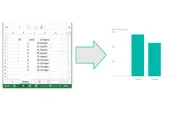
We have three columns of data, two have number in it and one has text values.
For now we will close out of excel and jump over to Power BI Desktop. Once the program loads we will click the Home ribbon then select the Get Data button.
After pressing the button a new menu will pop up showing us all the sources where data can be ingested from. The very first item in the list is Excel. Click the Excel then click the Connect button in the lower right hand corner.
After clicking Connect a new window will pop up asking for the location of the Excel file. Navigate to our sample data called Book1.xlsx you can down load the actual file I used here: Book1 I saved my Book1.xlsx file on the desktop of my computer. Select Book1 and then Click Open.
Next we are presented with the Navigator screen that reveals what is inside the workbook. There are two sheets. For now we are only interested in the data on Sheet1. Select Sheet1 and then click Load. This will load our data from Sheet1 into the Power BI Desktop data model.
Now our data has been added to the Power BI Desktop data model. The data and the various columns we loaded can be found in the tool bar at the far right of PBI called Fields.
Tech Tip: Power BI Desktop (PBI) opening the file and loading the relevant data into the memory of the computer. This has an approximate 4 to 1 compression ratio. In practical terms this means that a 100MB file will only consume 25MB of file size in PBI when it is saved. This is extremely useful as the data model can be quite large when loading multiple data files but the PBI file will compress down to a manageable size.
Finally, the Sheet1 data table can be expanded into is respective columns by clicking the triangle next to the table icon. Finally you can drag and drop the column names into the visualization page to begin making visualizations. For this demo I used the Category Column and the Sales column to make a table.
By selecting a different visualization in the visualizations bar you can change your data table into a Bar Chart.
Well that is it for the first tutorial. Share your thoughts and comments below. Let me know if you have any suggestions on what you would like to see next.
Manage Consent
To provide the best experiences, we use technologies like cookies to store and/or access device information. Consenting to these technologies will allow us to process data such as browsing behavior or unique IDs on this site. Not consenting or withdrawing consent, may adversely affect certain features and functions.
Functional
Always active
The technical storage or access is strictly necessary for the legitimate purpose of enabling the use of a specific service explicitly requested by the subscriber or user, or for the sole purpose of carrying out the transmission of a communication over an electronic communications network.
Preferences
The technical storage or access is necessary for the legitimate purpose of storing preferences that are not requested by the subscriber or user.
Statistics
The technical storage or access that is used exclusively for statistical purposes.The technical storage or access that is used exclusively for anonymous statistical purposes. Without a subpoena, voluntary compliance on the part of your Internet Service Provider, or additional records from a third party, information stored or retrieved for this purpose alone cannot usually be used to identify you.
Marketing
The technical storage or access is required to create user profiles to send advertising, or to track the user on a website or across several websites for similar marketing purposes.