October 10, 2016
Map with Data Labels in R
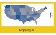
Create a US map in Power BI with state labels and year-over-year change indicators using R and ggplot2. Color-coded labels show positive and negative trends.
Tag
4 posts
October 10, 2016
Create a US map in Power BI with state labels and year-over-year change indicators using R and ggplot2. Color-coded labels show positive and negative trends.
September 27, 2016
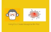
Create beautiful hexagonal bin plots in Power BI using R and ggplot2. Visualize data density with heat map style honeycomb patterns.
September 21, 2016
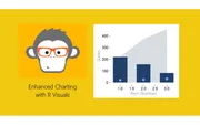
Create advanced R visuals in Power BI combining area plots, bar charts, and scatter points using ggplot2. Learn how R scripts respond to slicer selections.

September 15, 2016
Get started with R visuals in Power BI Desktop. Install Microsoft R Open, configure Power BI, and create your first correlation plot using the corrplot package.