

For this tutorial we are going to get some real data from the web. One of the easiest sources to acquire information from is Wikipedia. I will caveat this by saying, it is easy to get data from Wikipedia, but I don’t know if you can always trust the reliability. That being said, we are going to acquire the U.S. population and growth rate from 2010 to 2015 from the Wikipedia Web page.
Materials:
- Power BI Desktop (I’m using the March 2016 version, 2.33.4337.281) download the latest version from Microsoft Here.
- Link to the data from Wikipedia, Here. ( https://en.wikipedia.org/wiki/List_of_U.S._states_by_population_growth_rate )
Let’s begin.
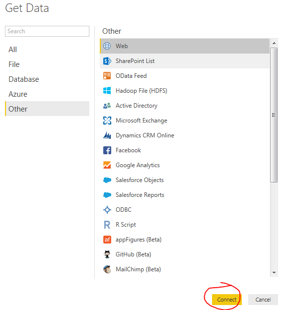
Open up Power BI Desktop. Click on the Get Data button. On the left of the Get Data menu click Other then select the first item titled Web. Click Connect to continue.
In the From Web window enter in the following web address. You can copy and paste it from below.
https://en.wikipedia.org/wiki/List_of_U.S._states_by_population_growth_rate
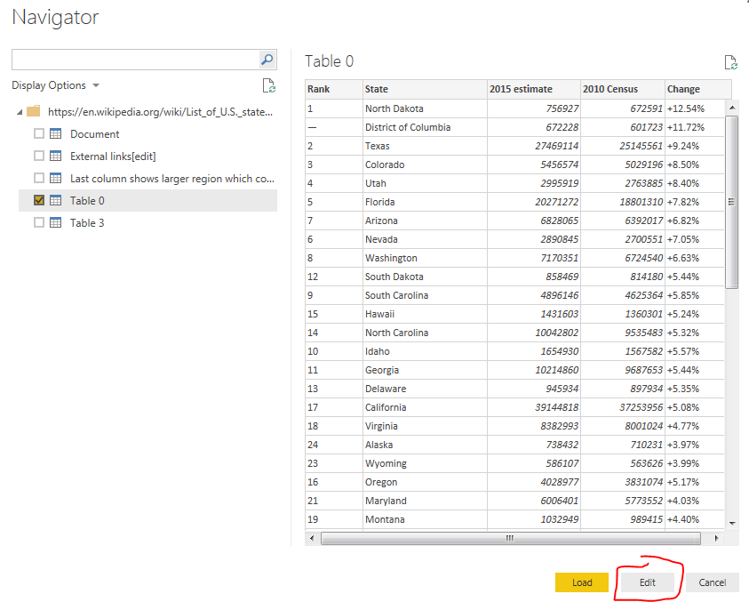
Click OK to move to the next menu. After a bit of thinking the Power BI will present the Navigator window. This is what Power BI has found at that specific web address. On the left side of the screen there is a folder. This is the web page folder location that we loaded earlier. Power BI then intelligently looks through the website code for tables it can distinguish. By clicking on each table you can see a preview of the data returned on the right side of the window.
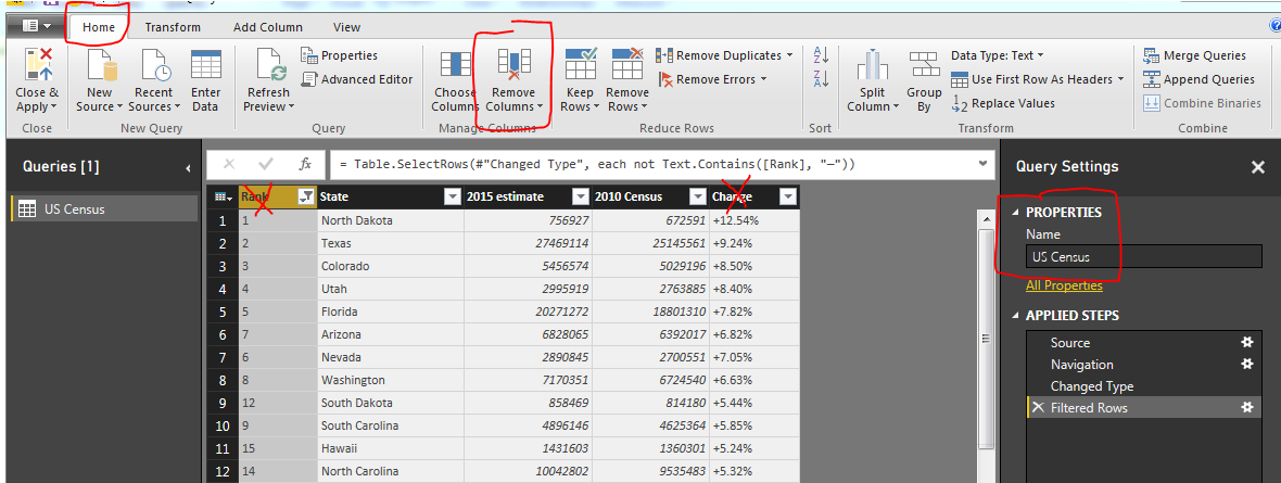
Try clicking on the various tables such as Document, External links, or Table 0. For our example lets click on Table 0. Click on the button at the right hand corner labeled Edit. We are going to slightly modify this data before we load it to the data model.
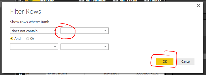
You’ll notice once we load the data there are some items we’d like to remove. In row #2 the label is District of Columbia, which technically isn’t a state. Also further down we see in row #25, the entire U.S. population is shown. Again, we don’t want these values to show, we only want the 50 states. To remove this data we will use a text filter to remove any item in the Rank column that has a “–” (which is called an em-dash, see note below for more details on how to select this text character).
Note: There are two kinds of dashes that your computer uses. One is called the en-dash(-), the second being the em-dash(–). It is very hard to distinguish the difference between the two dashes. The image below shows a better contrast when used in Microsoft Word.
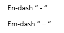
The en-dash is shorter than the Em-dash. The Key for the en-dash is next to the number 0 on your keyboard. To select the em-dash you need to use a bit of Microsoft trickery. The Em-dash will be presented when you hold the Alt key and type 0151 on a keypad. This selects the specific ASCII character for the em-dash. For more information on selecting the em-dash visit here.
Click the drown down button in the column labeled Rank. Select the item labeled Text Filters, and then Click Does Not Contain…
Enter in the em-dash code by using Alt 0151 to enter in the correct dash into the Filter Rows dialog box. Click OK to proceed.
If we entered the correct em-dash we will now be presented with a cleaned list of U.S. states with only numbered items in the Rank column.
Next we will clean up the query slightly to make it easier to deal with. Delete the column labeled Rank, and Change. Rename the query to something a little more meaning full such as US Census.
Note: You can delete a column by pressing the Remove Columns button on the Home ribbon. A second method is to right click with your mouse on the column you want to remove and selecting Remove.
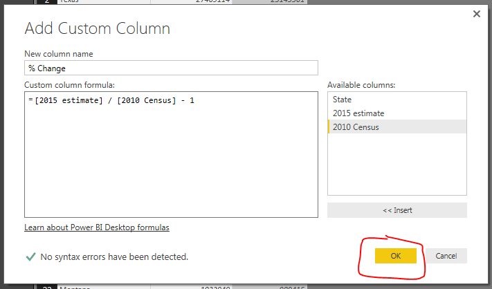
Next we will add our own calculated column which will calculate the 2010 to 2015 percent change. Click the ribbon labeled Add Column and select the first icon on the far left labeled Add Custom Column. The Add Custom Column dialog box will open. Enter the name for the new column, then by clicking on the columns in the available columns on the right you can build an equation. For this example we are using the percent change calculation which is the following:
Percent Change = [New Value / Old Value ]- 1
Using the columns we imported from Wikipedia we will have the following equation:
= [2015 estimate] / [2010 Census] - 1

Update: this formula has now changed to 2016 estimate as time has progressed since this first tutorial was posted.
The new column should have this following formula: = [2016 estimate] / [2010 Census] - 1
This inserts a new column with the calculated percent change between the 2010 census and the 2015 census. Click OK to proceed.
Finally we want to change the type of data in the % Change column so our data model will operate as expected when producing visuals. Click the Home ribbon, then click the % Change column. Change the Data Type: from Any to Decimal Number. This informs the data Model how to treat the data held the % Change column. We are finished data modeling and now click Close & Apply on the Home ribbon.
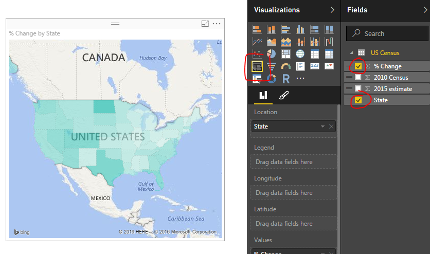
Now we have all our data loaded into the data model ready to build a map.
Click the Column labeled State and then click % Change. This yields a map with circles on it. Change the visual to a filled map by selecting a different visual, the Filled Map icon (circled in red below). Doing so produces a shaded map of the US, where each state is colored according to the % Change.
Finally lets add some color to the data. Click the visual’s Format properties (the little paint brush in the visuals window). Expand the Data Colors section by clicking on the title Data colors. Diverging is set to off. Change it to On. Change the Minimum color to Green, the Center color to Yellow, and the Maximum color to Red.
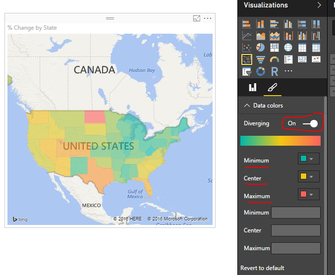
The states with the largest population change are in Red, while all the states with the smallest population change.
Please share if you liked this tutorial. Thanks.