Using R Visuals in Power BI

For those of you who have been hanging around PowerBI for a while you have likely heard about integration with R visuals. No, this isn’t a twisted dream where Power BI now ships with Pirates… Rather, this has been a highly untapped feature.
What is R?
In a brief summary R, or as it is known on its site R Project for Statistical Computing, is a statistical open source software package that enables mathematicians, statisticians, or data scientists to quickly calculate complex analysis. It is the tool of us super nerds.
Now R by itself isn’t super powerful, it’s the numerous packages that have been developed by people way smarter than me that can do very amazing functions. Packages include functions for forecasting, math functions, statistic functions and best of all charting functions.
R and Microsoft Integration
Microsoft has chosen to integrate and support various releases of R into its tools. For example R can now be leveraged within SQL Server 2016, and now visuals built in R can be leveraged in Power BI Desktop and PowerBI.com. R can also be used to transform and prepare data during a data set load.
The important note here is that Microsoft has released its own open version of R. This distribution is called MRAN, and can be found at this site. The MRAN has been slightly tweaked from the R Project. In the Microsoft version of R there has been stability fixes and improved performance (added Multi-threaded Performance).
Installing Microsoft R Open
First you will need to install the latest version of MRAN.
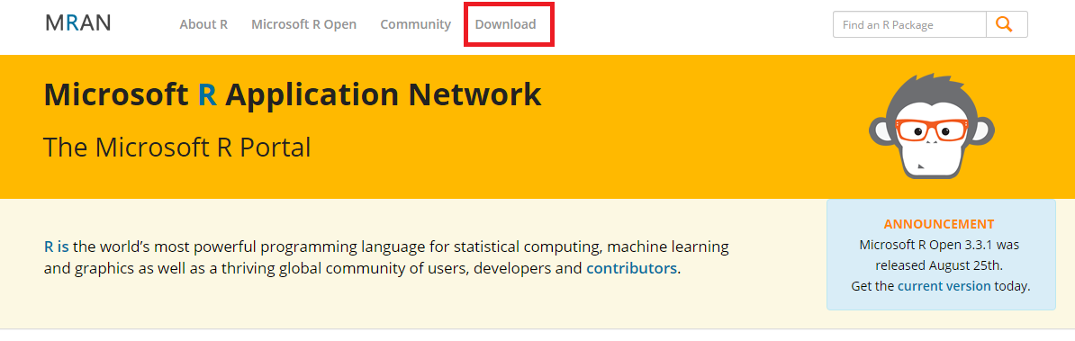
Navigate to the following address https://mran.microsoft.com/ Click the Download button found at the top middle of the page.
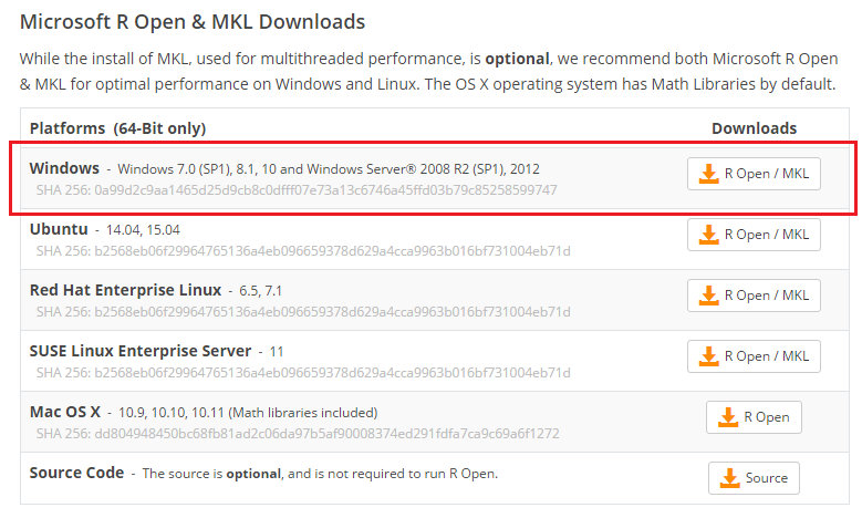
Select the platform that you will be using to install MRAN on. I’m using Windows, thus I’ll be downloading and installing the top installation version.
Note: If you need additional installation help you can follow/read the documentation provided by Microsoft here.
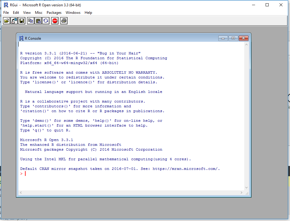
Once installed you should have the following program installed in your start menu.

Installing the corrplot Package
Run the new installation of R. The R installation will open up a console window.
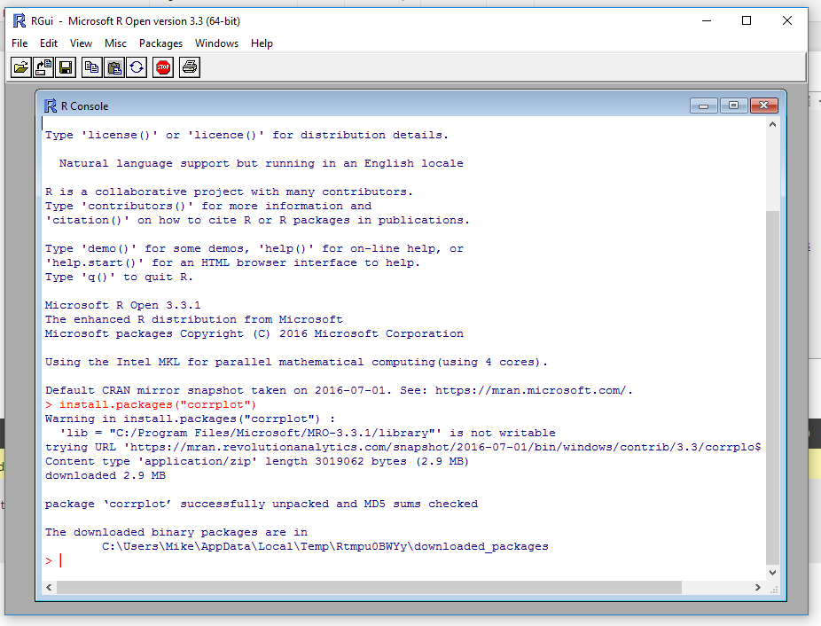
At the bottom of the console window is a red line where you enter commands. Enter the following code and press enter.
install.packages("corrplot")This will install the proper R package that we will use later in PowerBI. After running this line of code the console will download the correct package and install it on your computer.
At this time you can close the R console program.
Configuring Power BI for R
Now, open up PowerBI Desktop. Once in PowerBI desktop click on the File Button at the top left hand part of the screen. Next, Click Options and Settings.
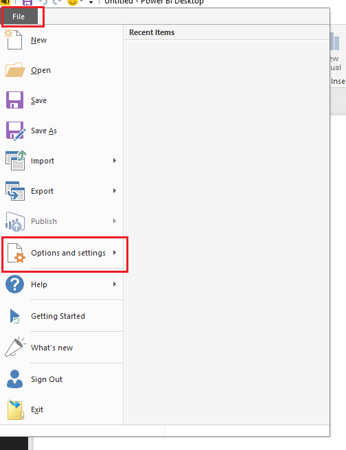
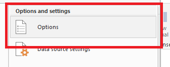
Then click on the Options button.
Under the Global options menu on the left verify that your new installation of MRAN is listed. PowerBI should automatically detect the installation and show the installation with the current version number in the home directory:
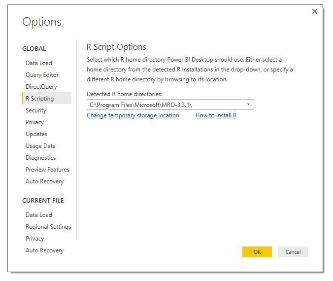
Seeing the listed installation in the Home Directory verifies that R has been properly installed on your computer. Clicking OK will close the window.
Loading Sample Data
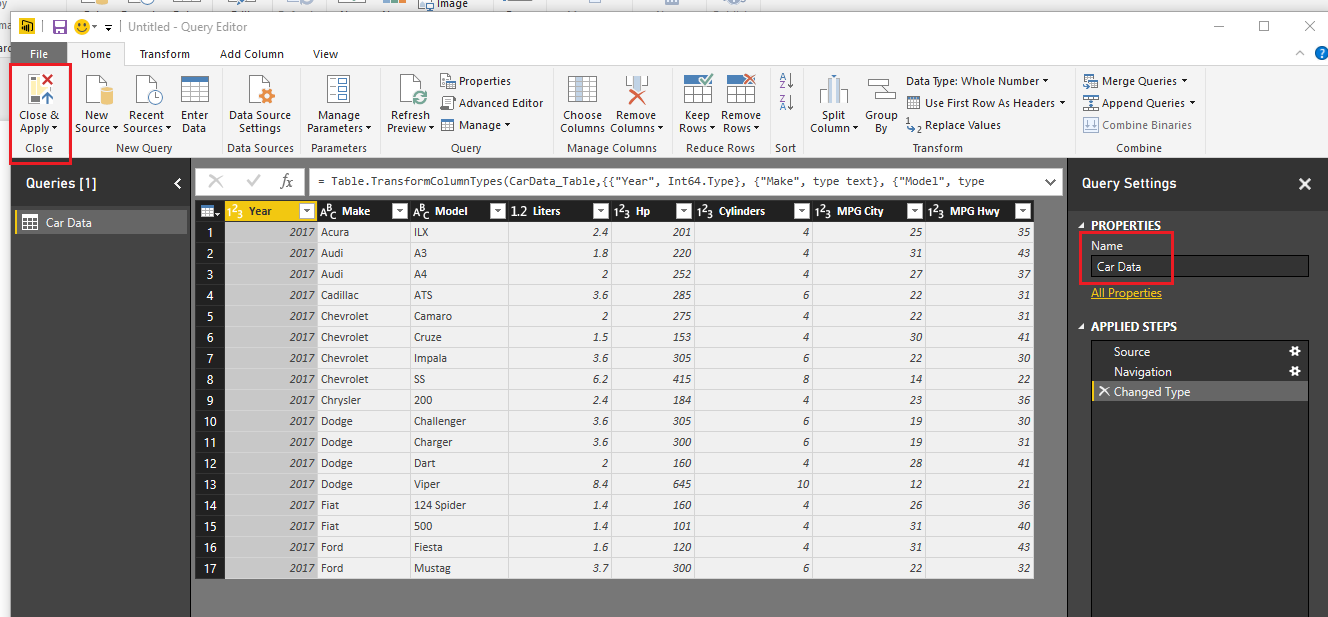
Below is the M Language that can be used in your Query Editor. Copy the code below and enter it into the Advanced Editor found in the Query Editor.
let
 Source = Excel.Workbook(Web.Contents("https://powerbitips03.blob.core.windows.net/blobpowerbitips03/wp-content/uploads/2016/09/CarDetails.xlsx"), null, true),
 CarData_Table = Source{[Item="CarData",Kind="Table"]}[Data],
 #"Changed Type" = Table.TransformColumnTypes(CarData_Table,{{"Year", Int64.Type}, {"Make", type text}, {"Model", type text}, {"Liters", type number}, {"Hp", Int64.Type}, {"Cylinders", Int64.Type}, {"MPG City", Int64.Type}, {"MPG Hwy", Int64.Type}})
in
 #"Changed Type"
Note: If you want to learn how to enter M language code into the Query Editor follow this Tutorial.
Once you have pasted the code above into the Query Editor it should look like the following:
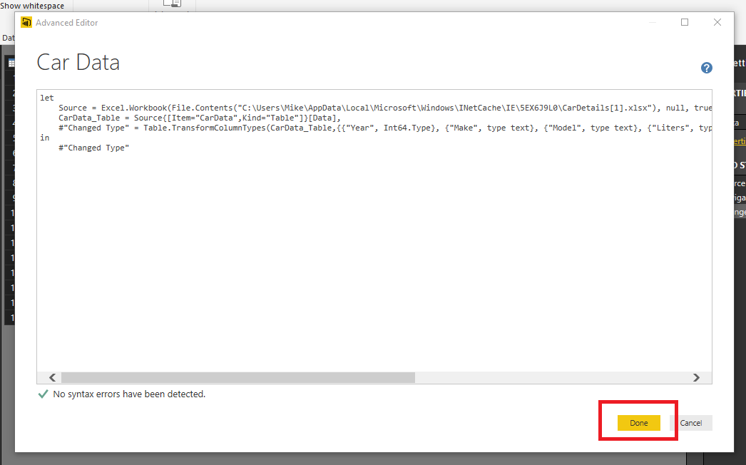
Clicking Done will close the Advanced Editor and you will have data loaded into the Query Editor. You must have an internet connection to connect to this data. Rename your query to Car Data. Then on the Home ribbon click Close & Apply to load the data into the data model.
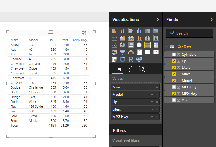
Generate a simple table visual to see our data in table form:
Creating the R Visual
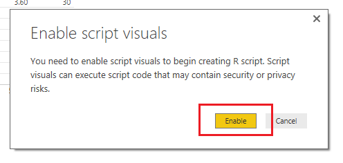
Add an R visual by clicking the R inside the Visualizations bar. When you click on the R visual you will see a pop-up, click Enable to proceed.
Doing this will open up a visual pane on the page and reveal an R script editor at the bottom of the page window.
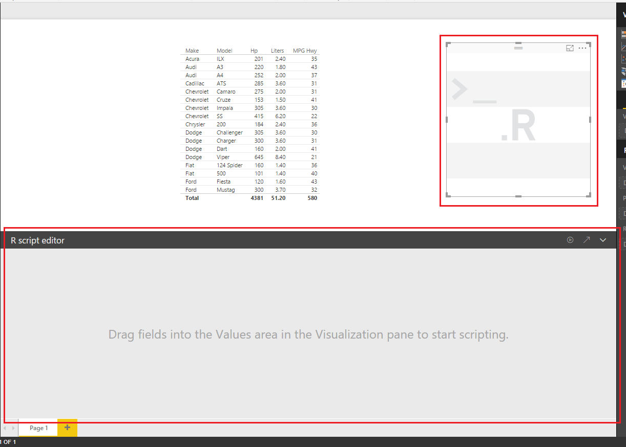
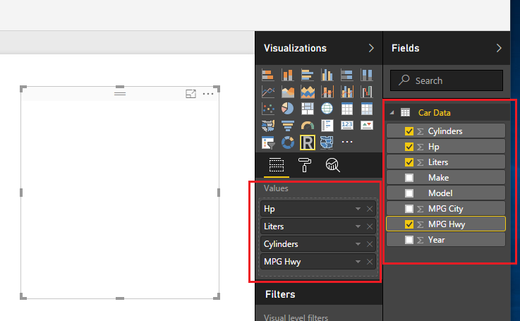
While keeping the R visual selected add the following fields to the visual under the Values field:
- Cylinders
- Hp
- Liters
- MPG City
- MPG Hwy
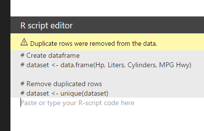
After adding these fields the R Script Editor will update and reveal code which informs you that your data from the selected columns will be added to a dataset.
Writing the R Script
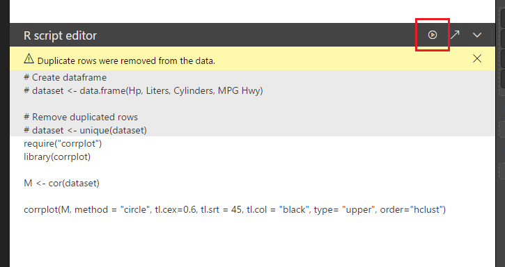
Next add the following code into the white area below the #dataset <- unique(dataset) statement.
require("corrplot")

library(corrplot)

M <- cor(dataset)

corrplot(M, method = "circle", tl.cex=0.6, tl.srt = 45, tl.col = "black", type= "upper", order="hclust")
This loads a package called corrplot which allows you to apply a graph that has a correlation plot between metrics. The M <- cor(dataset) takes your data, runs a function called cor and then saves the results into a new variable called M.
Next click the Play button icon found on the right of the grey bar on the R Script Editor.
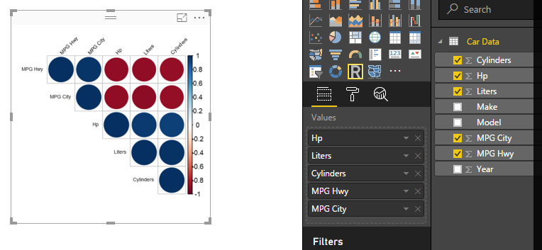
Success! You have completed a correlation plot using R within PowerBI. Nice job.
Bonus: Numerical Correlation Values
If you want to get fancy with this correlation plot you can change the circles to the actual correlation values. Change the last line of the R Script Editor code to the following and press the run script button:
corrplot(M, method = "number", tl.cex=0.6, tl.srt = 45, tl.col = "black", type= "upper", order="hclust")This removes the circles and then populates the correlation plot with numerical values representing the correlation between the various data features.
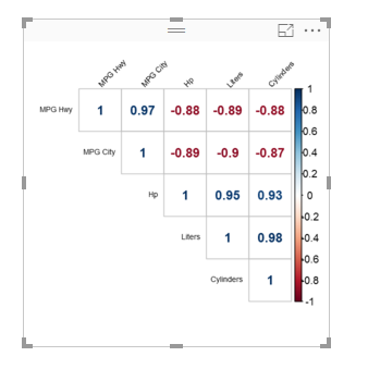
The blue numbers represent values that have a positive correlation, while the red numbers represent a negative correlation. In practical terms the higher the Horsepower (HP) of the vehicle the lower the Miles per Gallon (MPG) that are realized.