Using Advanced Mapping in ArcGIS Preview
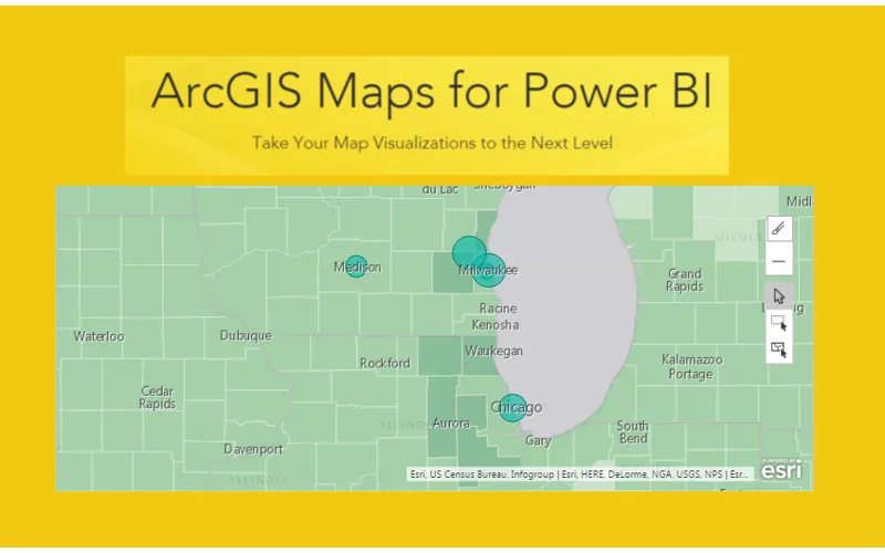
In the September 2016 release of PowerBI, Microsoft introduced a new visual called the ArcGIS Maps preview. For more information on the maps integration you can read the following post from Microsoft. This tutorial will review how to load data using Latitude and Longitude data and map those points on the ArcGIS map.
Getting Started
First, we need to open PowerBI Desktop and then we will load some data. The version of PowerBI Desktop for this tutorial is 2.39.4526.362 64-bit (September, 2016). You can download the latest version of the software here.
On the Home ribbon click on the Get Data button and from the Get Data window select Blank Query. Click Connect to proceed.
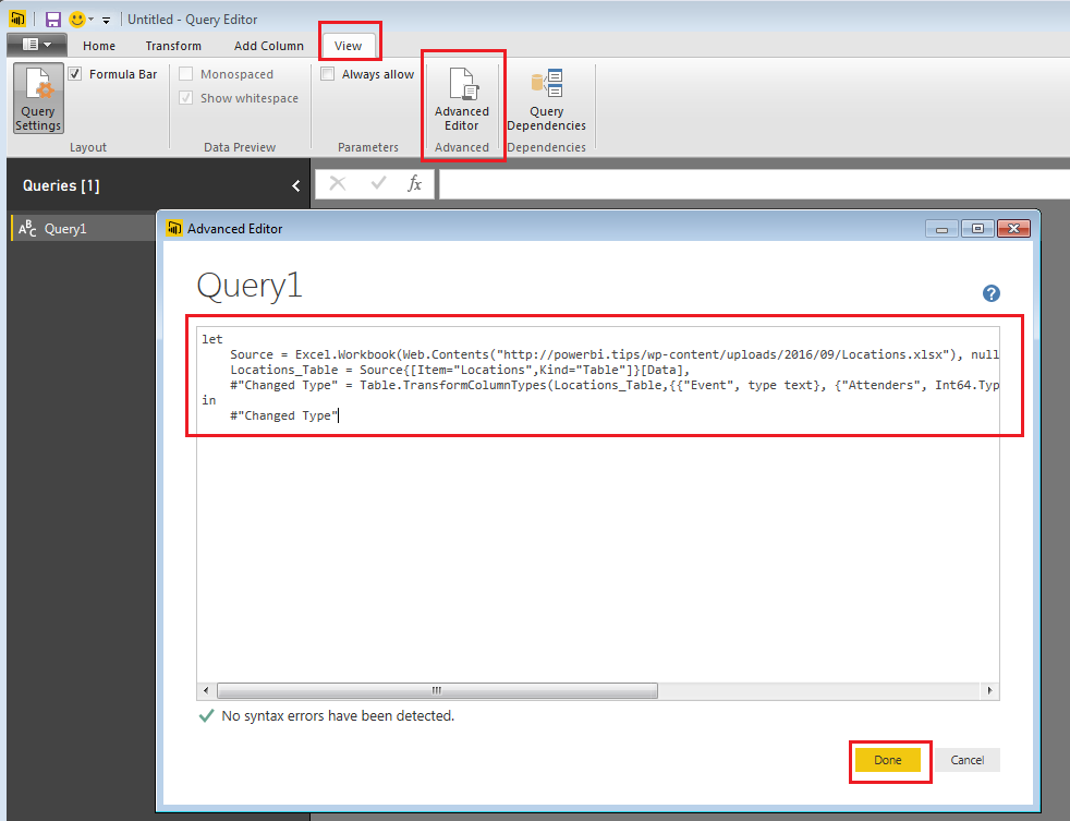
Now you will be in the Query Editor, click on the View ribbon and select the Advanced Editor button. The Advanced Editor will now open.
Enter the following code into the Advanced Editor (you can copy and paste the code directly from this site). Click Done to load the data.
let
 Source = Excel.Workbook(Web.Contents("https://powerbitips03.blob.core.windows.net/blobpowerbitips03/wp-content/uploads/2016/09/Locations.xlsx"), null, true),
 Locations_Table = Source{[Item="Locations",Kind="Table"]}[Data],
 #"Changed Type" = Table.TransformColumnTypes(Locations_Table,{{"Event", type text}, {"Attenders", Int64.Type}, {"Zip", Int64.Type}, {"Latitude", type number}, {"Longitude", type number}})
in
 #"Changed Type"
Note: This will load an excel file that is hosted on PowerBI.Tips, so make sure you have an internet connection.
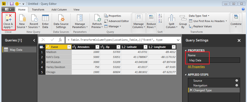
Rename your query to Map Data and then on the Home ribbon click Close & Apply.
Enabling ArcGIS Maps Preview
Before working on this tutorial, you will want to make sure you have enabled the ArcGIS map which is in preview.
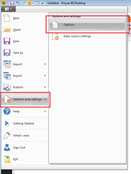
Click the Menu button to open up the menu options.
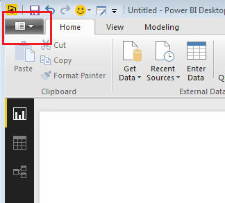
This will expose the menu. With the menu open click on Options and Settings and then click on Options.
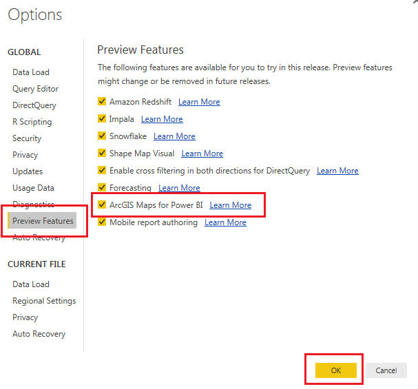
Once the Options menu is open, click on Preview Features and then make sure the ArcGIS Maps for PowerBI preview feature is checked. Then click OK to close the options menu.
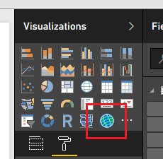
You should now see a new bright blue icon listed in the Visualizations window.
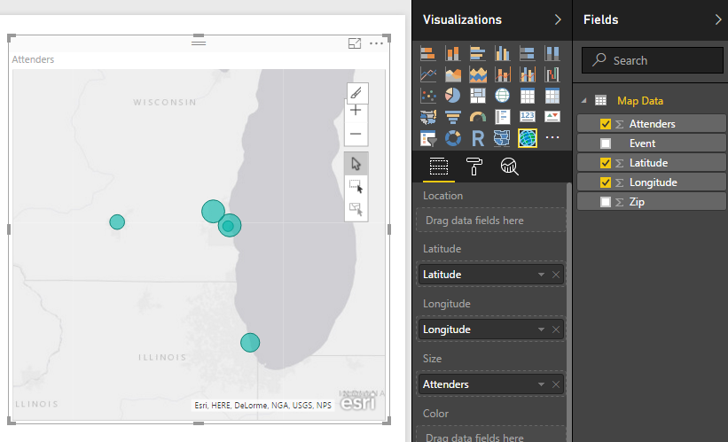
Creating the Map Visual
Click on the ArcGIS visualization and then add the following columns of data from the Fields window into the visual:
- Location: Latitude, Longitude
- Size: Attenders
Multi-Select Feature
OK, Wow, seems like a normal map. So, why all the hype? Well, unlike other mapping visualizations, this map enhances the selection methods for points on a map.
By clicking on the square with the black mouse arrow you can then click-drag a red box across the map to select multiple geographical points on the map.
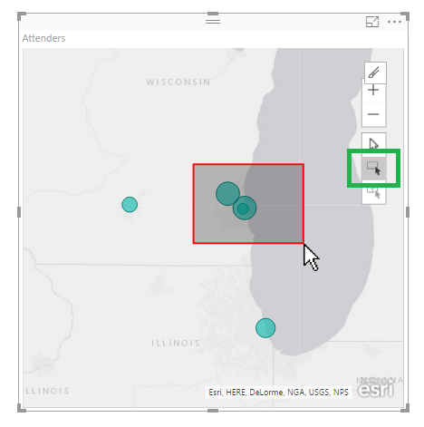
Selecting points on the map will filter other visuals on the page.
Add a Table visual with the following fields:
- Event
- Attenders
- Zip
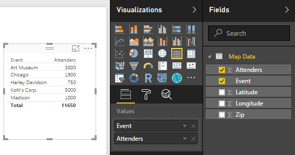
Now click the Multi-Select button and highlight some points on the map.
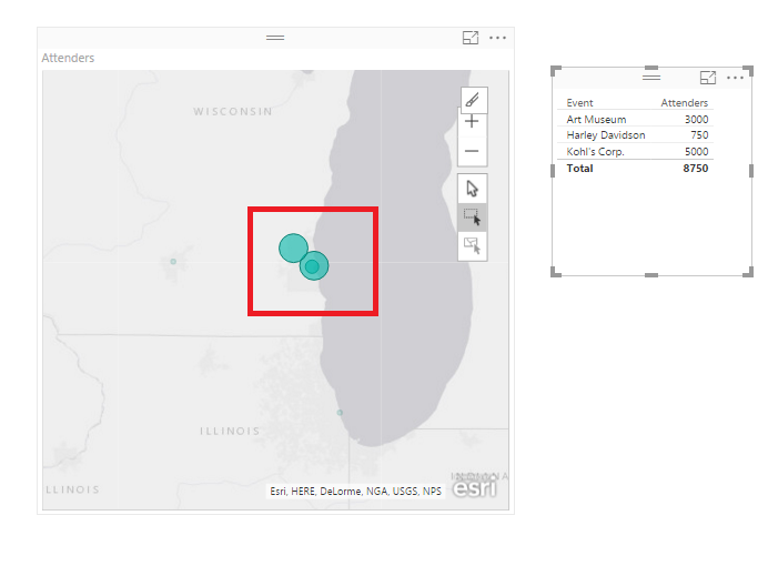
Notice how only the selected points are highlighted on the map and the table filters to only those points.
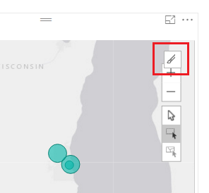
In-Focus Edit Mode
To enhance the map further click the In-Focus Edit Mode button.
Now, the map editor opens. This allows you to change the basemap view, the theme of the map, symbols on the map and adds other data to enhance the coloring of the map.
Changing the Basemap
Click on the Basemap button and then select the Dark Gray Canvas. We have turned the map into a sort of night mode.
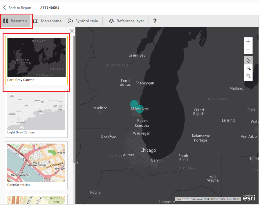
Have fun here and explore a couple of the other map types.
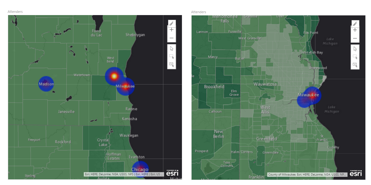
Heat Map Theme
Next Click on the Map Theme then click on the Heat Map. Alright, this is getting pretty cool.
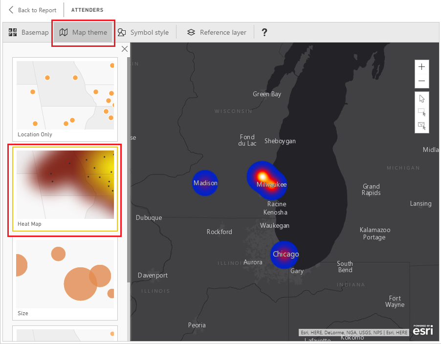
In the Symbol Style section you can change the properties of the points on the map. For the heat map you can change the Transparency and the Area of Influence of the points. Each map theme (Location, Heat Map, Size, and Clustering) has different Symbol Style properties. So you might want to select a couple different Map Themes and try adjusting the Symbol Styles to see how they change.
Reference Layers - The Best Feature
Now finally, the best part of the ArcGIS mapping - the Reference Layer. This will blow your mind!
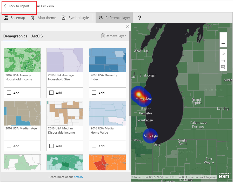
Click the Reference layer button then select a layer to add from the Demographics tab. For this example, I chose the USA Average Household Income.
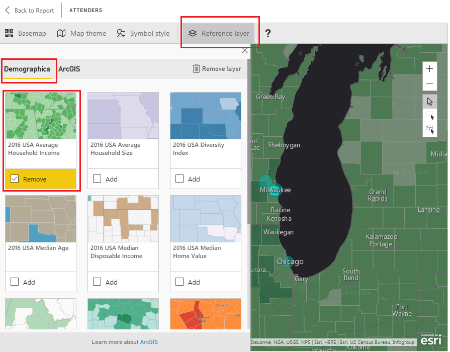
To return to the Report click the Back to Report button in the upper left hand corner of the page view.
The layer feature is by far the most helpful part of this tool. Imagine the time required to collect all that regional demographics data, model it and then to apply it to the mapping visual. The ArcGIS mapping tool is quite impressive.
Zoom and Detail Levels
One other note before we leave. Now that you are back on the report level view, use your mouse scrolling wheel and zoom in and out on the map visual. Notice the closer you zoom into the data points the more detailed the regional views become.
Thanks for following along. Remember to share if you liked this tutorial. See you next week.