
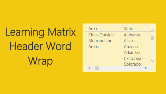
Power BI has been an continually evolving tool over the last year. The Matrix visual is powerful and mimics much of the functionality of a Pivot Table within Excel. I will admit, the Matrix visual has some features that are left to be desired. One such feature, the ability to word wrap row headers, has been resolved in the February 2017 update of PowerBI. See the official release notes for details. In my company we have traditionally been an excel driven business. All you other heavy analytics people you know what I’m talking about. Emails upon emails about an excel analysis, then power point presentations of those excel documents. Inevitably a pivot table or table will end up on a power point slide. Icky, if you ask me, especially when you have to “refresh” the data… I digress, Power BI fills a great gap in this area where the Analytics leaders within your company can make reports that easily refresh, and look dang sexy.
The Matrix is one of those visuals that I would say is a comfortable way for non-analytical people to review data. The Pivot Table aka Matrix in Power BI, is how people have been used to looking at data for years. This has been quite a sticking point for many business leaders when reviewing Power BI dashboards. I’ll present some data using a map or bar chart and I’ll usually get the, “Where’s the table of data?” This will prompt an additional tab inside the Power BI document with a large data table. Presenting headers in that large table or matrix has always been a challenge because the headers don’t word wrap. Seeing Microsoft listening to people’s feedback and implementing header word wrap and other features is refreshing.
For this tutorial we will be working with a dataset that I found from the FBI titled Crime in the United States. I chose this data set based on the flurry of media talking about the current President’s comments about crime. Before we move on, let me assure you this will not have any politics in this tutorial. Therefore, it will be safe to read on.
Open up PowerBI Desktop, Click the Get Data button on the Home ribbon and select Blank Query. Click Connect to open the Query Editor. On the View ribbon click the Advanced Editor button. While in the Advanced Editor paste the following code into the editor window, click Done to complete the data load.
Note: If you need some more help loading the data follow this tutorial about loading data using the Advanced Query Editor. This tutorial teaches you how to copy and paste M code into the Advanced Editor.
let
    Source = Excel.Workbook(Web.Contents("https://powerbitips03.blob.core.windows.net/blobpowerbitips03/wp-content/uploads/2017/02/US-Crime-Data.xlsx"), null, true),
    #"US Crime Data_Sheet" = Source{[Item="US Crime Data",Kind="Sheet"]}[Data],
    #"Promoted Headers" = Table.PromoteHeaders(#"US Crime Data_Sheet", [PromoteAllScalars=true]),
    #"Changed Type" = Table.TransformColumnTypes(#"Promoted Headers",{{"State", type text}, {"Area", type text}, {"Violent Crime", Int64.Type}, {"Murder and Non-negligent Manslaughter", Int64.Type}, {"Robbery", Int64.Type}, {"Aggravated Assault", Int64.Type}, {"Property Crime", Int64.Type}, {"Burglary", Int64.Type}, {"Larceny Theft", Int64.Type}, {"Motor Vehicle Theft", Int64.Type}}),
    #"Unpivoted Other Columns" = Table.UnpivotOtherColumns(#"Changed Type", {"State", "Area"}, "Attribute", "Value")
in
   #"Unpivoted Other Columns"
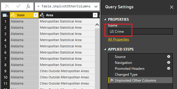
Before you exit the query editor Rename the query to US Crime. It should look similar to the following:
On the Home ribbon click Close & Apply to load the data into the data model.
Lets add a little color to the Page in the form of a map. Inside the Visualizations pane click on the Shape Map visual. Add the appropriate fields as shown in the image below.
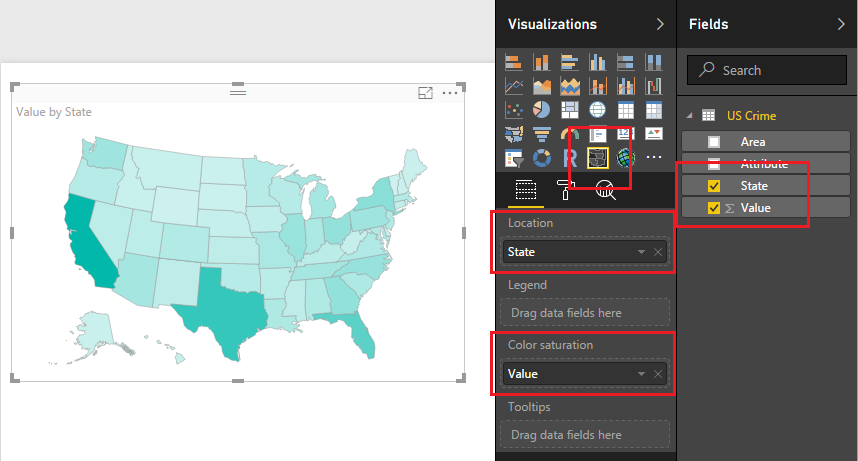
We added this map as to make our page look pretty as well as, we can now click on each state and use this as a filtering mechanism.
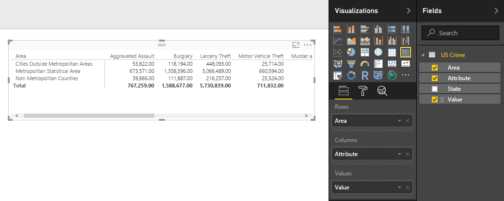
Next, add the Matrix visualization which is found on the Visualizations pane. Add the fields shown in the image below.
To illustrate the wrapped row headers as described in the Power BI blog simply hover your mouse over the header until a double arrow appears. Then left click on the mouse to select the edge of the Area column.
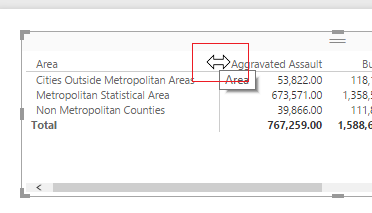
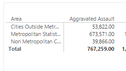
Drag the edge of the Area column left until it covers some of the text of the row labels, see below for example.
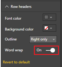
Next, in the Visualizations pane click on the Paint Roller and expand the section labeled Row headers. In the Row headers section toggle the Word wrap switch to On.
After turning the Word wrap on you’ll notice that row headers did not word wrap. This is because the row headers have a caveat. The word wrap in rows will only work if row grouping is long enough to accommodate the word wrap. To illustrate this, add the State field underneath the Area field in the Rows section in the Visualizations pane.
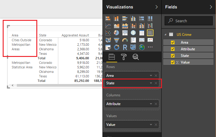
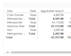
We can now see by adding the States after the Area field that the Area Cities Outside Metropolitan Areas now has enough room to word wrap. An important observation with the row headers word wrap is that the word wrap will be affected by other filtering selections on the visual page. For example if I only select the state of Texas the row header for Area does not have enough room and therefore it is shortened and the “…” appears.
When I was first exploring the Matrix row Headers Wrap I was quite confused on how I was able to actually make the headers wrap. After playing around with the feature a while I was able to figure out the functionality. Thanks for following along, see that wasn’t so political. Now you can take this wonderful knowledge back to your workplace and make promises you can keep (OK, there it was, insert political jab).
If you liked this tutorial please be sure to share. Also if you want to know more about me you can visit my About page and follow me on twitter or Linkedin for updates.