

One of the really cool features contained within the PowerBI.com service is the ability to monitor how often your dashboard or report is being viewed. You’ll find this feature by opening up either a Dashboard or a Report, then clicking the button called Usage Metrics. Clicking this button will generate a custom usage report. For more details on Report Usage Metrics see the following article from Microsoft.
Note: In order to see the usage metrics report you must be able to edit the report and have a minimum of a Power BI Pro license. Also, the usage metric report only captures the last 90 days of report usage.
The sad thing is that this report is only the usage metrics for the Dashboard or Report that you opened. This report is also read only and cannot be modified. However, there is a way to fix this, and see all the usage on all the Dashboards or Reports within a workspace.
Let us begin.
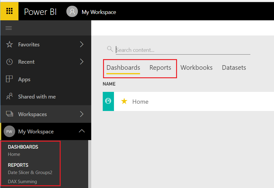
You will first need to log into PowerBI.com, once you have logged in navigate to either a Dashboard or Report. To open a dashboard or report start by opening a workspace in the left navigation bar. If you are already in a workspace you can open a Report or Dashboard by clicking on the Dashboards or Reports headers in the main selection area of the workspace.
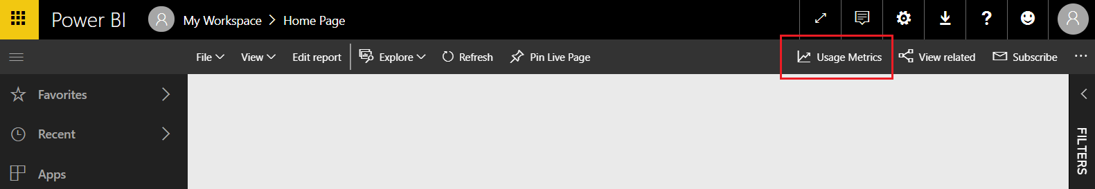
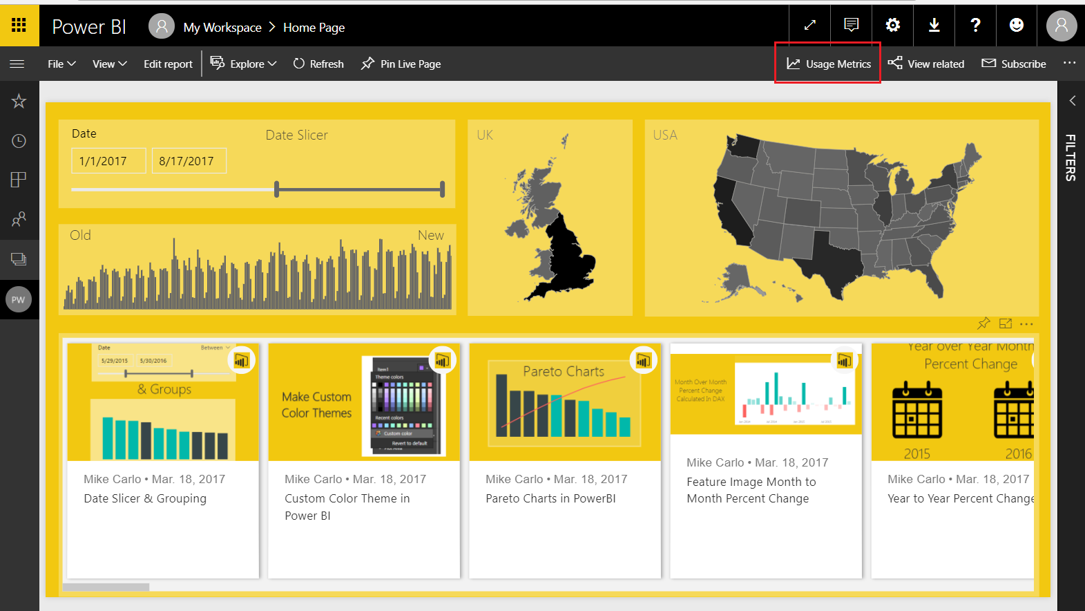
For this tutorial I will use a report but the same steps will work for both the Dashboard and Report usage metric reports. Open up the report that your interested in viewing the metrics. I am using my report called Home for this example, this report is used on PowerBI.Tips, and you can view the report here if your interested. Now that we have opened the report, click on the Usage Metrics link on the top navigation bar. This will open up a usage metrics report. This report is read only and does not allow changes.
Here is where we get sneaky… If you observe the URL for the usage metrics report it looks like the following:
https://app.powerbi.com/groups/me/reports/c6....26/ReportSection?filter=Reports~2FReportGuid%20eq%20%27....ca%27
Notice the middle of the report where it states “?filter=Reports” this means the Usage Metrics report has been filtered for only one report in the workspace. The report filter context is passing the Globally Unique Identifier (GUID) of the selected report down to the Report Metrics. This is good news because knowing this we can modify the report and remove the filter, thus allowing visibility to all the reports in a workspace.
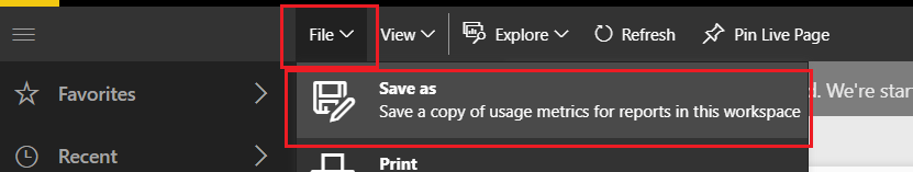
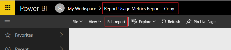
First we will need to save a copy of the report so we can make changes. With the Usage Metrics report open click File then in the drop down click Save As.
This will save a copy of the report into the workspace. Notice we now see in the Power BI header bar that the report has been named Report Usage Metrics Report – Copy. Also we can now see an Edit report button.
Click on Edit report to start changing the report. As soon as you open the report you can see in the visualizations pane that there is a Report filter applied. Remove this filter by Clicking the little Grey X for the ReportGUID in the Report level filters section of the visualizations pane.
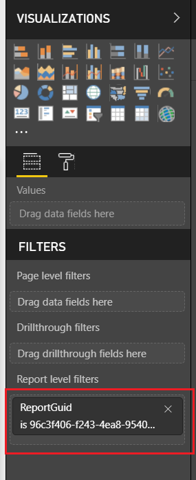
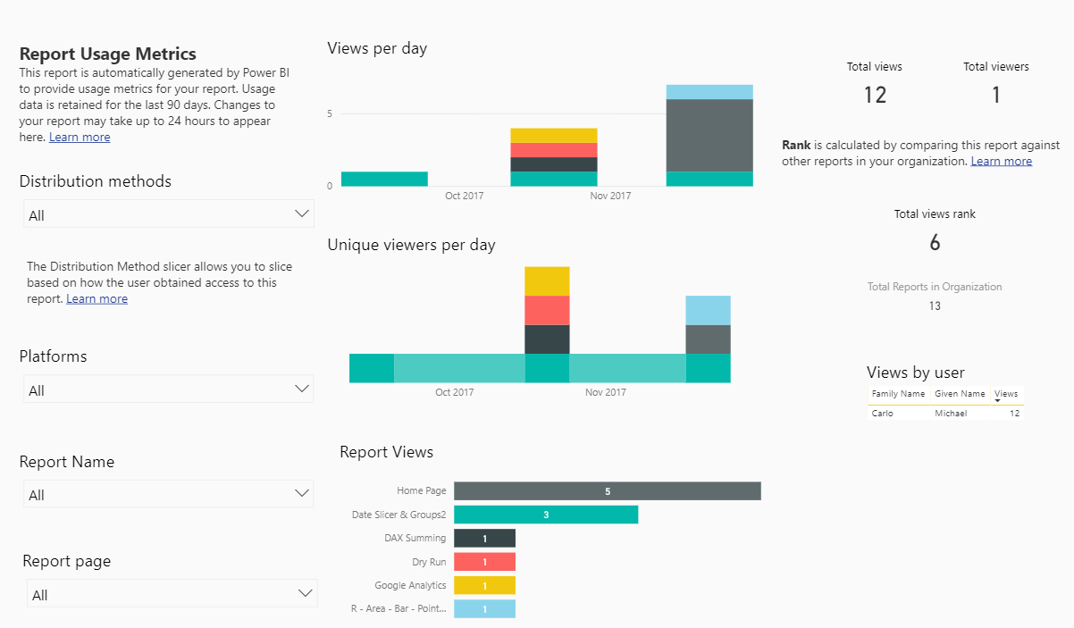
After removing the report filters, we can see all the data from all reports.
Let the modifications begin.
On the left of the report we have a report page slicer. This allows you to see the activity on one page of a report. Now that we can see all the reports across the workspace filtering only pages of each report doesn’t make sense. We need to add an additional slicer to select reports we are interested in.
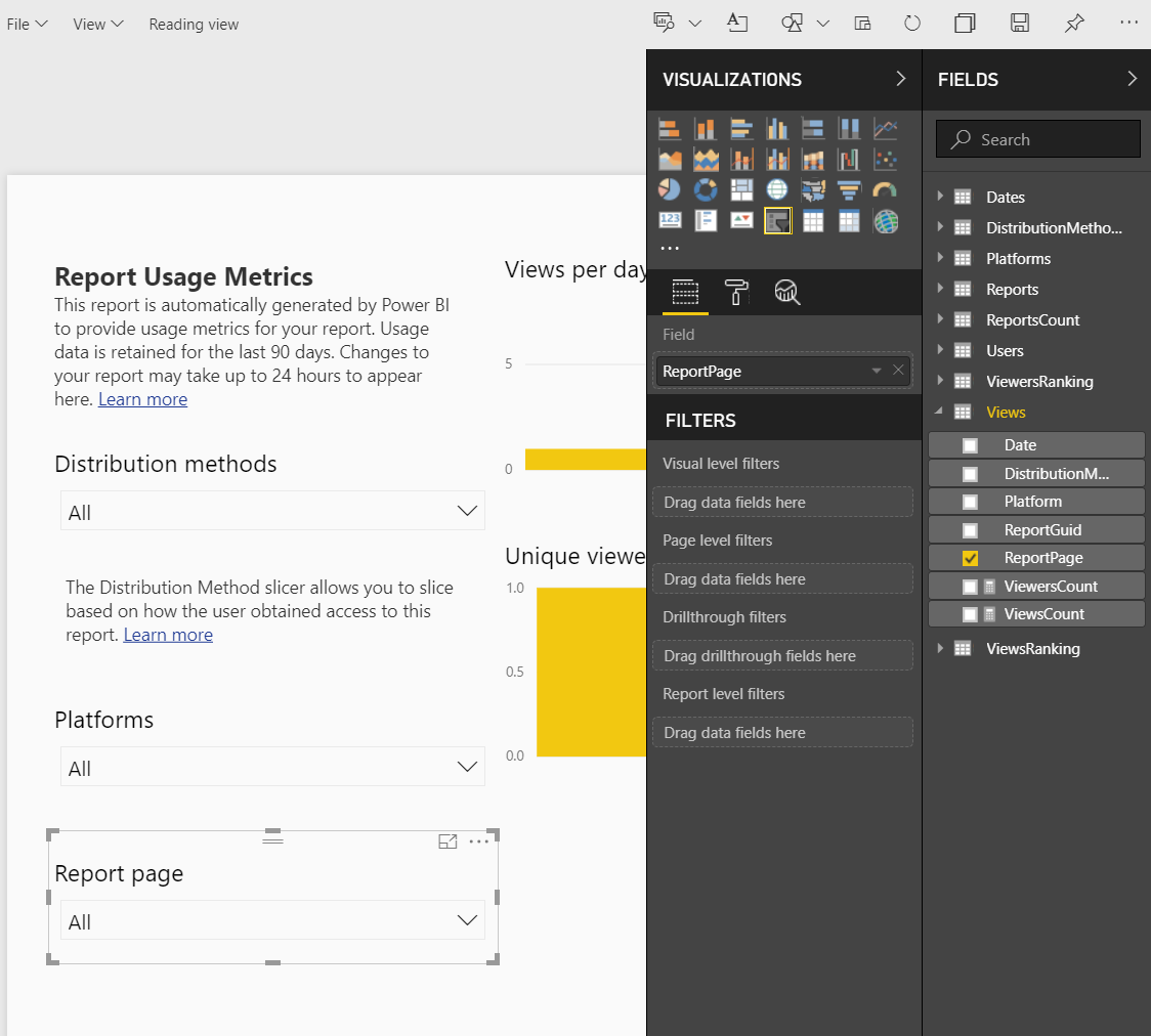
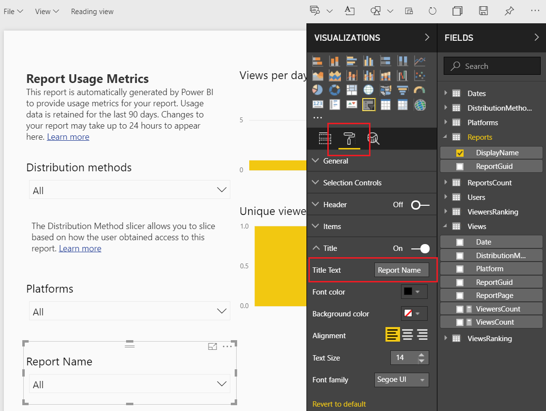
Select the Report Page Slicer the using Ctrl C copy the slicer, then paste it using Ctrl V. We should now have two slicers on the page. Select the top slicer named Report page. Change the field of the top slicer from ReportPage to DisplayName. The DisplayName is found under the Reports table in the Fields pane.
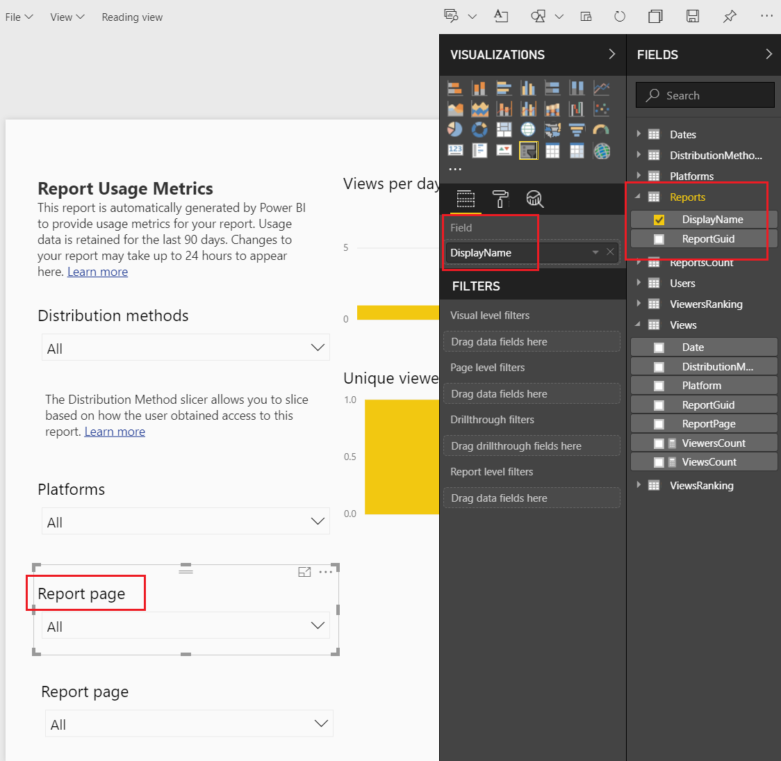
Notice even though we changed the slicer information that the slicer title did not change. We have to manually change the title description in the display settings. Click the Paint Roller to open the display settings. Expand the Title section and change the Title Text to Report Name.
The title of the slicer visuals is now changed. Sweet!
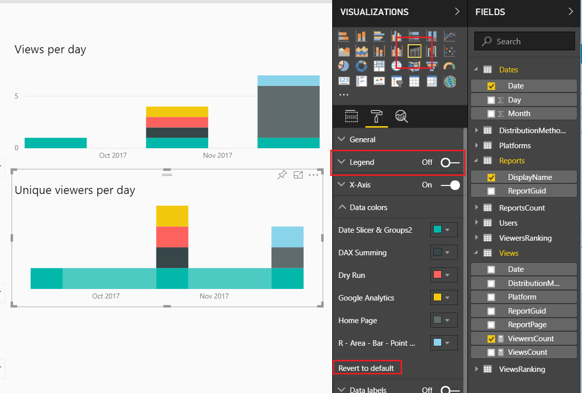
Let’s move on to modify some of the standard visuals. Select the report titled Views per day and change it to the following settings:
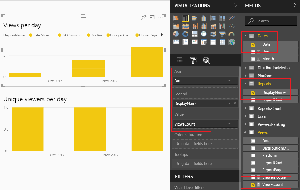
Note: We changed the Axis Date column field. We removed the date field from the views table and added the date from the Dates table.
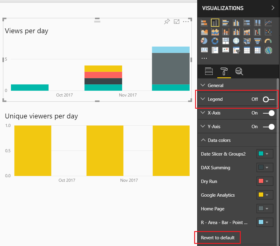
This allows us to see over time the number of views per report. Lets clean this up a bit. Change the settings of this visual by Clicking on the Paint Roller ribbon. Start by Turning Off the Legend, then open up the Data Colors, and Click the Revert to default to return the visual to it’s normal colors.
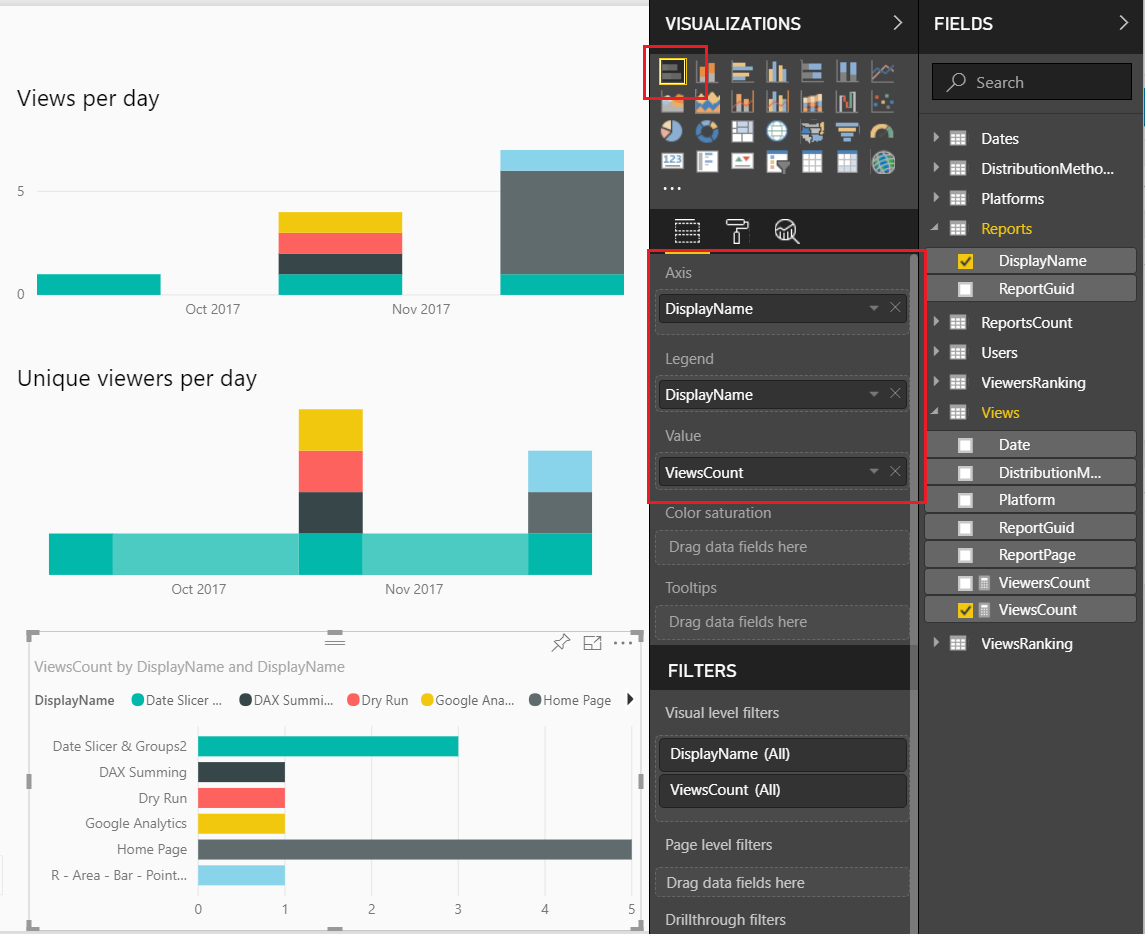
Now, lets modify the Unique viewers per day.
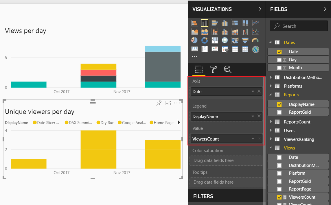
Again, the formatting of this visual isn’t great so let’s modify it. Click on the Paint Roller again and Turning Off the Legend, then open up the Data Colors, Click the Revert to default to return the visual to it’s normal colors. Finally, change the visual type from Stacked Column Chart to the Ribbon Chart. Your visual should look like the following:
This visual will show you which report has largest viewing audience.
You might have noticed that in both of these visuals I’ve been removing the legends. Which means, you don’t know which report is represented by each color. We will fix that by adding a final visual. Add the Bar Chart visual from the visualization pane. Add the following field names to the visual, as shown below:
Next, we will format the visual to clean it up. Make the following changes, Toggle the Legend to Off, Toggle the X-Axis to Off, Toggle the Data labels to On, Toggle the Title to On and change the Title Text to Report Views, finally change the Font color to Black and Text Size to 14.
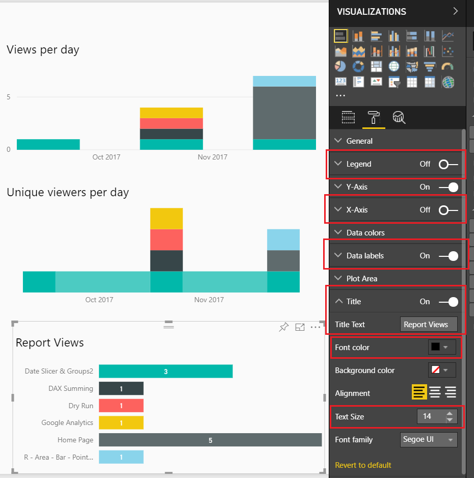
We want to sort the reports not by name but by how often they are viewed. To do this, Click on the ellipsis and from the drop down Select sort by ViewsCount.
Now we have a custom Usage Metrics Report.
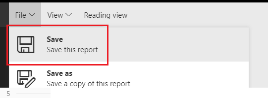
Be sure to save the file. Click on File then in the drop down Click the Save button.
You will notice that our modified Usage Metrics Report will be saved in the Workspace.
Thanks for following along. If you found this tutorial helpful please share it with someone who will find this valuable.