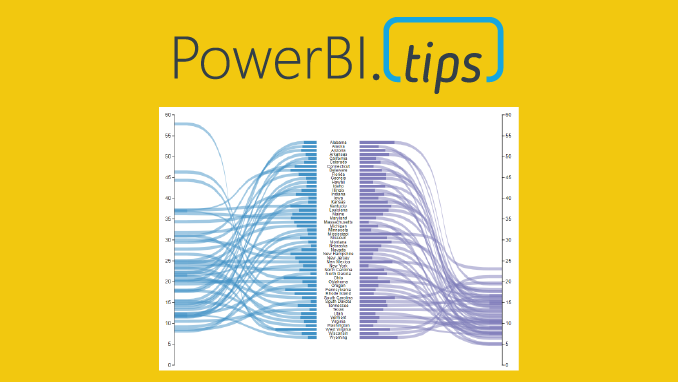
Welcome to another installment of building custom visuals with the Charts tool from PowerBI.Tips. In this edition we make the following custom visual.

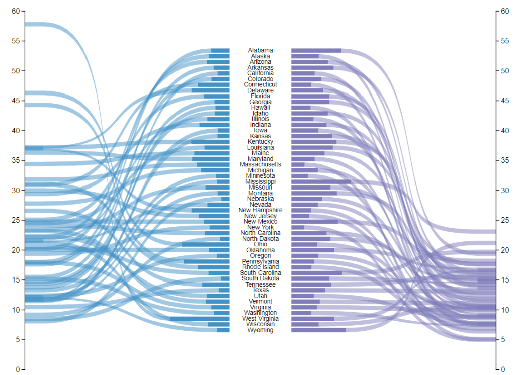
This chart comes to us from the sharp mind of Nick Snapp, Check out is work on Charts.PowerBI.Tips within our custom visual gallery. This chart combines the ability to see both the relative size of values between states as well as distributions of data with adjacent number lines. Pretty cool don’t you think?
Below is the walk through video on how to build this custom chart.
If you want some other help making custom visuals check out this other tutorial building a simple bar chart.
If you like the content from PowerBI.Tips please follow us on all the social outlets. Stay up to date on all the latest features and free tutorials. Subscribe to our YouTube Channel. Or follow us on the social channels, Twitter and LinkedIn where we will post all the announcements for new tutorials and content.
Introducing our PowerBI.tips SWAG store. Check out all the fun PowerBI.tips clothing and products:
Check out the new Merch!