Welcome to another installment of building custom visuals with the Charts tool from PowerBI.Tips. In this edition we make the following custom visual.
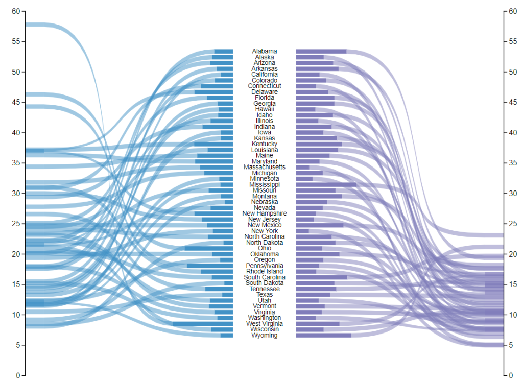
This chart comes to us from the sharp mind of Nick Snapp, Check out is work on Charts.PowerBI.Tips within our custom visual gallery. This chart combines the ability to see both the relative size of values between states as well as distributions of data with adjacent number lines. Pretty cool don’t you think?
Below is the walk through video on how to build this custom chart.
If you want some other help making custom visuals check out this other tutorial building a simple bar chart.
If you like the content from PowerBI.Tips please follow us on all the social outlets. Stay up to date on all the latest features and free tutorials. Subscribe to our YouTube Channel. Or follow us on the social channels, Twitter and LinkedIn where we will post all the announcements for new tutorials and content.
Introducing our PowerBI.tips SWAG store. Check out all the fun PowerBI.tips clothing and products:
Check out the new Merch!
Awesome!!!! Really useful, thank you.
Hi, do you think your tool will be able to produce a 3D chart like what the OP requests? https://community.powerbi.com/t5/Desktop/3d-chart/td-p/453715
I have tried the Sanddance custom visual, and although it does the x, y & z axis, it doesn’t show the height of the z axis just a data point.
Thanks Tony
The custom visual (charts builder) will not be able to make a 3d plot.
You should be able to build a custom R visual to do this.
I would agree with you, but this requires you to install R locally on your machine. Not every Power BI user would be interested in taking the time to learn R for this type of visual. I have also been speaking with another MVP and the number of hours required to develop R visuals is considerably longer. She worked on a custom R visual for 2 weeks roughly, but was able to make the same visual within a couple of hours using the Charts builder. The Charts builder has it’s limitations but it is a really good catch all. I think some business users will be able to find value from this tool.
This is awesome. So many possibilities
Hi. Awesome work!
I have created a Custom Visual of a Population Pyramid with “PowerBi.Tips -charts” but my visualization is not updating with the PowerBI applied filters, what should I do?
double check that the fields in the custom visual are able to change when you use filters. To do this you would want to make a table with the data fields you want to filter. Then add a slicer or filter to the page. Then check that the filters / slicers are changing the data inside the table. If this is working, then your data model is set up correctly. If not, there might be an issue with your data model. Once you have confirmed that the table is working then you can use those same fields in the custom visual chart.
I am starting to discover your tool and I find it very interesting and useful, however, I have been trying to make a visualization using links, and I am getting the error message: oops! Something went wrong here. This must be a software bug. As a last resort, you can undo the previous change and try again.
I find it weird because I have an ‘id’ column in my original data as well as ‘source_id’ and ‘target_id’ in my link data. I have tested many different things and I still get the same error message. I wanted to know if this is a bug or if there might be something that I am doing wrong.
Thank you very much for your support.
sounds like a bug, Please describe your issue here:
https://github.com/microsoft/charticulator/issues
Microsoft is managing the code base for major bugs.