Filled Donut Chart, Yumm..
We are starting today off with a fun chart. We will be making a filled donut chart. Typically, I don’t use donut charts but in this case I think we have a good reason, and it’s delicious…
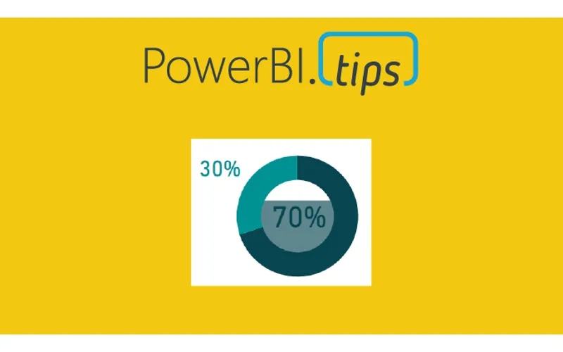
The data being used in this visual varies from o to 100%. This could be something like a test score or a compliance number. Thus, we will be using the donut chart to represent a completion of 100% or some variant below.
Video on how to build this chart.
During this video we used a couple measures. They are the following:
Measures
Average Product Score = AVERAGE( ‘Product Scores’[Score] ) / 100
Average Product Score Inverse = 1 - [Average Product Score]
Where the value of the Score comes from the Product Scores table. The Score column ranges from 0 to 100%. If you like this visual and want to download a sample file visit my GitHub page.