Month: May 2020

  • Hot Swap Power BI Report Connections

    Hot Swap Power BI Report Connections

    Let’s say you have a Power BI file connected to an Analysis Services machine. Then you want to change the data source to PowerBI.com using a Live Connection. Well, you are out of luck. Until NOW!!

    This post describes how to remove a connection from a report using a PowerShell Script. This means any source you can just delete the data source and then re-point your report.

    Note: that this script is not officially supported by Microsoft. This code is provided as is without any guarantees. The code will alter the internal files, so please keep a backup if you are unsure of anything.

    Use Cases

    Image the following diagram. Here we have a Power BI Report Connected to an analysis services model. Now, you wish to re-point the model to a Power BI dataset.
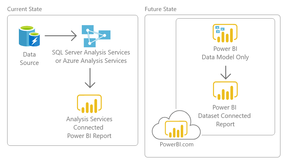
    Note: we assume the analysis services model and the Power BI dataset model have the same definition. Meaning all the columns and measures are the same.

    The below script removes connections Power BI Report.

    Download Script

    Download the Power Shell Script here

    Note: Running it on a file without a live connection will not have an effect on the file.

    Running the code

    Download the PowerShell file and save it to your local machine.

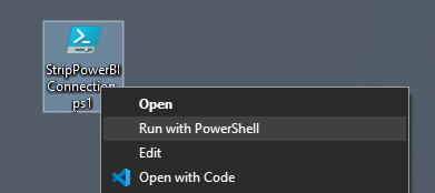
    Right click and select the option Run with PowerShell in the menu.
    A menu will open up. Select the power bi file that you wish to remove the connection from.
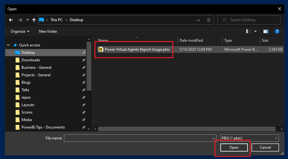
    Click the button OPEN to allow the script to modify your file.

    The script will leave all visualizations and report features intact. But, all connections will be removed. When you open the report again in power bi desktop, all visuals will appear broken:

    This is because you have removed all data from the report. Select a new data source to connect the report to. If the new source matches the names of the columns and measures used in the visuals, they will all repopulate.

    How the Code Works

    Internally, PBIX files contain a selection of metadata and media files. The files are zipped and packaged into a pbix file.

    The PowerShell script will alter these internal files, removing the Connections file which holds the information to the live connection.

    It then removes a security file, SecurityBindings, that is necessary to remove in order to not corrupt the file. SecurityBindings will be repopulated the next time you edit and save the file.

    Script

    #This script was designed by Steve Campbell and provided by PowerBI.tips
    #BE WARNED this will alter Power BI files so please make sure you know what you are doing, and always back up your files!
    #This is not supported by Microsoft and changes to future file structures could cause this code to break
    
    #--------------- Released 5/28/2020 ---------------
    #--- By Steve Campbell provided by PowerBI.tips ---
    
    
    #Choose pbix funtion
    Function Get-FileName($initialDirectory)
    {
        [System.Reflection.Assembly]::LoadWithPartialName("System.windows.forms") | Out-Null
        
        $OpenFileDialog = New-Object System.Windows.Forms.OpenFileDialog
        $OpenFileDialog.initialDirectory = $initialDirectory
        $OpenFileDialog.filter = "PBIX (*.pbix)| *.pbix"
        $OpenFileDialog.ShowDialog() | Out-Null
        $OpenFileDialog.filename
    }
    #Error check function
    function IsFileLocked([string]$filePath){
        Rename-Item $filePath $filePath -ErrorVariable errs -ErrorAction SilentlyContinue
        return ($errs.Count -ne 0)
    }
    
    
    #Choose file
    try {$pathn = Get-FileName}
    catch { "Incompatible File" }
    
    
    #Check for errors
    If([string]::IsNullOrEmpty($pathn )){            
        exit } 
    
    elseif ( IsFileLocked($pathn) ){
        exit } 
    
    #Run Script
    else{    
       
        #Unzip pbix
        [Reflection.Assembly]::LoadWithPartialName('System.IO.Compression')
        $zipfile = $pathn.Substring(0,$pathn.Length-4) + "zip"
        Rename-Item -Path $pathn -NewName  $zipfile
    
        #Delete files
        $files   = 'Connections', 'SecurityBindings'
        $stream = New-Object IO.FileStream($zipfile, [IO.FileMode]::Open)
        $mode   = [IO.Compression.ZipArchiveMode]::Update
        $zip    = New-Object IO.Compression.ZipArchive($stream, $mode)
        ($zip.Entries | ? { $files -contains $_.Name }) | % { $_.Delete() }
    
        #Close zip
        $zip.Dispose()
        $stream.Close()
        $stream.Dispose()
    
        #Repackage and open
        Rename-Item -Path $zipfile -NewName $pathn 
        Invoke-Item $pathn 
    }

    Editing the Code

    The code runs on PowerShell. PowerShell is a cross-platform task automation and configuration management framework, consisting of a command-line shell and scripting language.

    If you want to view or edit the code, first open PowerShell ISE. We recommended to run as administrator. Afterwards, you can paste the code below into the editor.

    Other Considerations

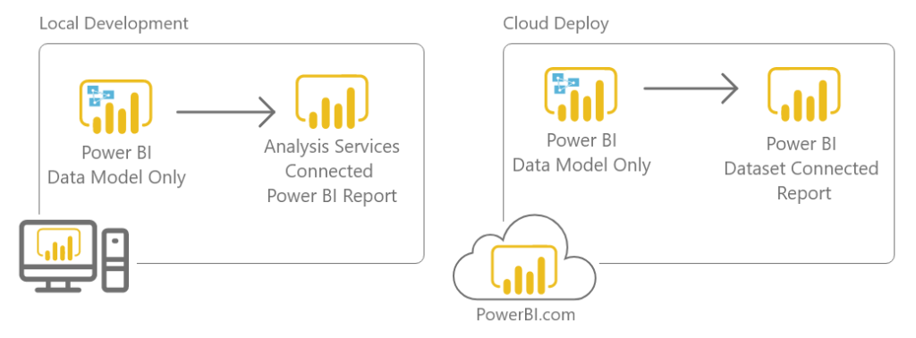
    The script can be useful when using two power bi files for development and deployment to the PowerBI.com service. In this use case you will have one Power BI that is the bifurcated model and one report that has just report pages. To speed up development you can Open both the Model file and the Report file. The Report file can point to a LocalHost version of the running Analysis Services.

    Here is an example of what this architecture would look like.
    Script Usage License

    Permission is hereby granted, free of charge, to any person obtaining a copy of this software and associated documentation files (the “Software”), to deal in the Software without restriction, including without limitation the rights to use, copy, modify, merge, publish, distribute, sublicense, and/or sell copies of the Software, and to permit persons to whom the Software is furnished to do so, subject to the following conditions:

    The above copyright notice and this permission notice shall be included in all copies or substantial portions of the Software.

    THE SOFTWARE IS PROVIDED “AS IS”, WITHOUT WARRANTY OF ANY KIND, EXPRESS OR IMPLIED, INCLUDING BUT NOT LIMITED TO THE WARRANTIES OF MERCHANTABILITY, FITNESS FOR A PARTICULAR PURPOSE AND NONINFRINGEMENT. IN NO EVENT SHALL THE AUTHORS OR COPYRIGHT HOLDERS BE LIABLE FOR ANY CLAIM, DAMAGES OR OTHER LIABILITY, WHETHER IN AN ACTION OF CONTRACT, TORT OR OTHERWISE, ARISING FROM, OUT OF OR IN CONNECTION WITH THE SOFTWARE OR THE USE OR OTHER DEALINGS IN THE SOFTWARE.

    If you like the content from PowerBI.Tips please follow us on all the social outlets. Stay up to date on all the latest features and free tutorials.  Subscribe to our YouTube Channel.  Or follow us on the social channels, Twitter and LinkedIn where we will post all the announcements for new tutorials and content.

    Introducing our PowerBI.tips SWAG store. Check out all the fun PowerBI.tips clothing and products:

    Check out the new Merch!

    Hasta La Vista Data
    Go Ahead Make My Data
    PBIX Hat


  • Create Custom Mapbox Styles

    Create Custom Mapbox Styles

    If you’ve played around with MapBox in Power BI – you’ll know that it has loads of great features to create really rich and beautiful maps, including some great ‘out of the box’ map styles (i.e. base maps).   However, you might not be aware that it also gives you the ability to design custom Mapbox styles with your own spatial layers. I discovered this feature on a recent project where my client wanted to include Victoria’s Catchment Management Authority (or CMA) boundaries on their base-map to provide greater context to help interpret their data. Up until this point, the only option I knew of was to purchase an expensive ArcGIS Online licence to create custom map styles. So, you can imagine just how excited I was when I discovered that I could also do this in MapBox – for FREE!!!

    Reasons to Design Your Own Style

    There are plenty of reasons to design your own map styles, including:  

    1. Provide Context: I touched on this above, but the ability to add your own layers to the backgrounds on your maps goes a long way to providing additional context to help your report users understand and interpret their data.  
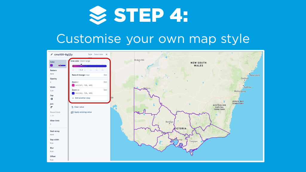
    2. Simplify: Sometimes you need to peel back the complexity to help your data stand out. Customizing base maps allows you to remove unnecessary elements which may distract your users from the data, and dynamically add back complexity at different zoom intervals (watch Step 4 of the Video to see how this works!) 
    3. Consistency, Branding, and Themes:  Customizing the style allows you to design your maps with a similar ‘look and feel’ to other visuals in your report, as well as corporate branding and color themes. For the passionate Power BI designers out there – you’ll LOVE this feature (we’re always on the hunt for new formatting options in Power BI!) 

    I’m not going to lie, there are a couple of steps involved in designing your own custom styles for MapBox in Power BI, but believe me – it’s totally worth it! I walk through the key steps in this short video, which include:

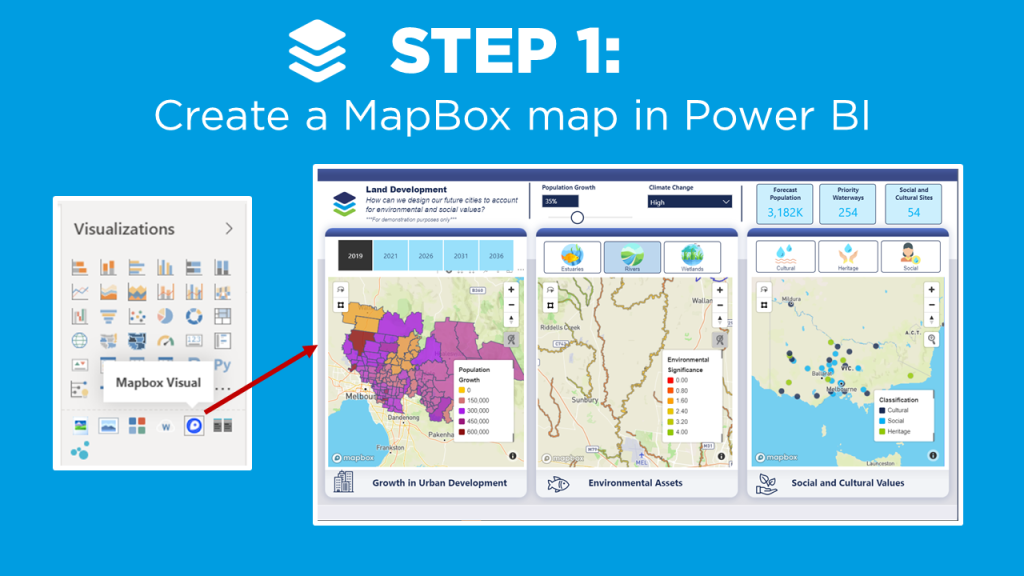
    1. Create a MapBox map in Power BI (check out the video on MapBox 101 if you’re new to MapBox, or need a refresher).  
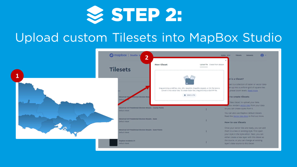
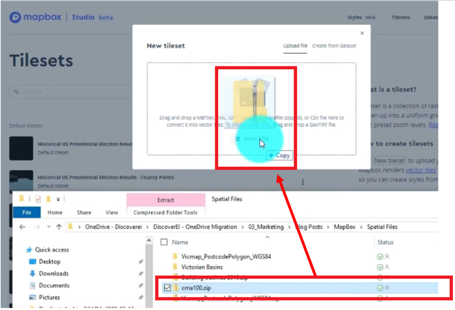
    2. Upload your custom tilesets into MapBox Studio
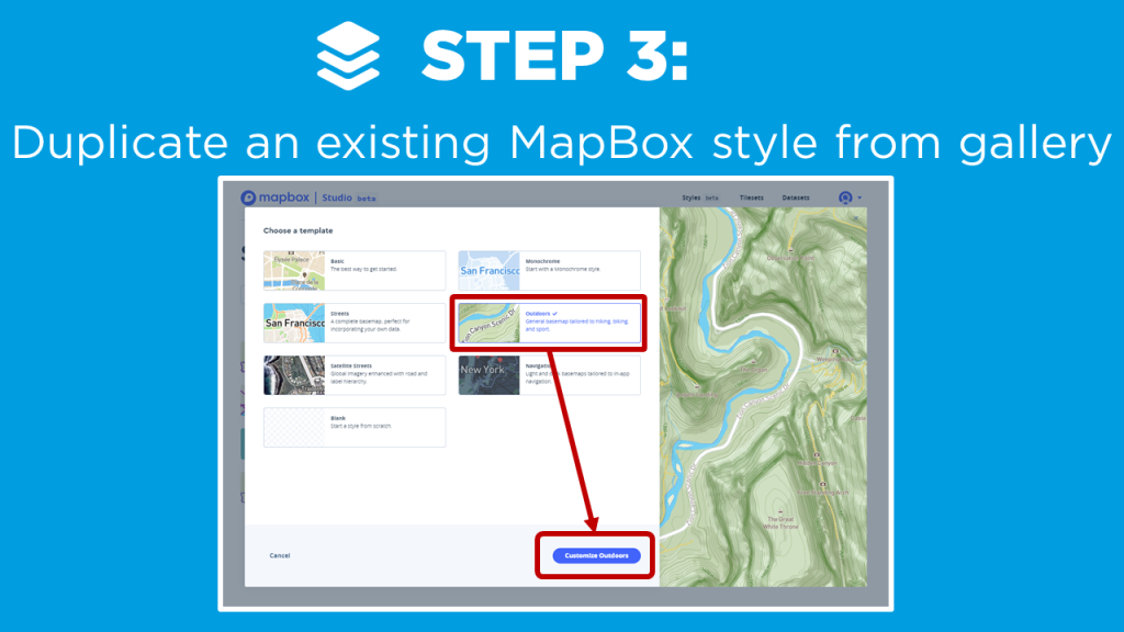
    3. Duplicate an existing MapBox style from gallery
    4. Customise your own map style
    5. Add your custom style into your MapBox visual in Power BI!

    First, you can leverage the base choropleth map you created in the Mapbox 101 tutorial to get a starting point. The following steps describe how to enhance the style of the map to make it pop even more!

    In this tutorial we want to add a boundry onto the base map. This will help us outline the specific areas around the rivers that we added as a layer in our Drill Down tutorial. A shape file was created and the zip loaded into Mapbox as a new tileset.

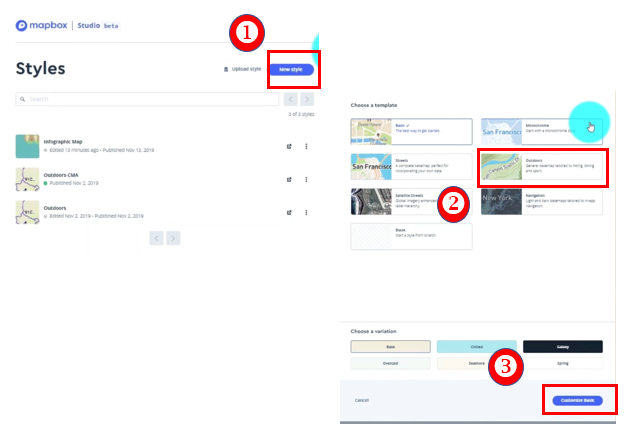
    The next step is to duplicate an existing map style.
    1) Select New style
    2) Choose a template
    3) Click Customize Basic

    Rename your Mapbox style (upper left side of page)

    Create your own custom layers and features to the map. Here are the changes made to this example.

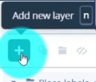
    Click Add new layer

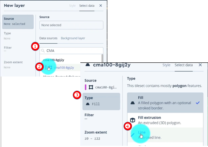
    Search for tileset. (Our example uses the new boundry layer we created.)
    1) Search for the tileset (ex. “CMA”)
    2) Select tileset
    This will add the tileset to the base style we selected.
    3) Click Type
    4) Select Line to change the setting

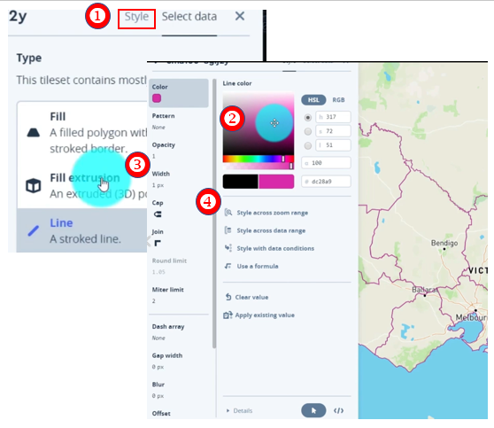
    1. Select Style
    2. Choose Color
    3. Adjust width by clicking on the Width field
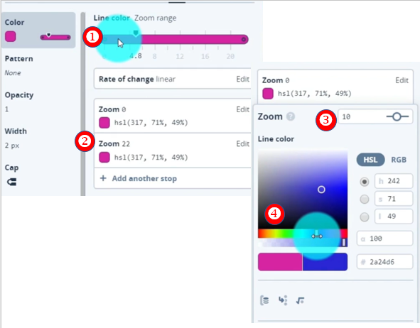
    4. Style the color based on a zoom range. Select Style across zoom range to adjust the slider.
    1. Add new Zoom Range by Clicking on the Zoom Range bar
    2. Select second zoom range field (Zoom 22)
    3. Adjust zoom range to different value (10)
    4. Change the color (Blue)
    5. Scroll down and Click Done

    Great! Now as you zoom in and out of the map you can see the boundaries change color from pink to a blue. You can imagine how powerful this visual change can be in directing the attention in different map visuals.

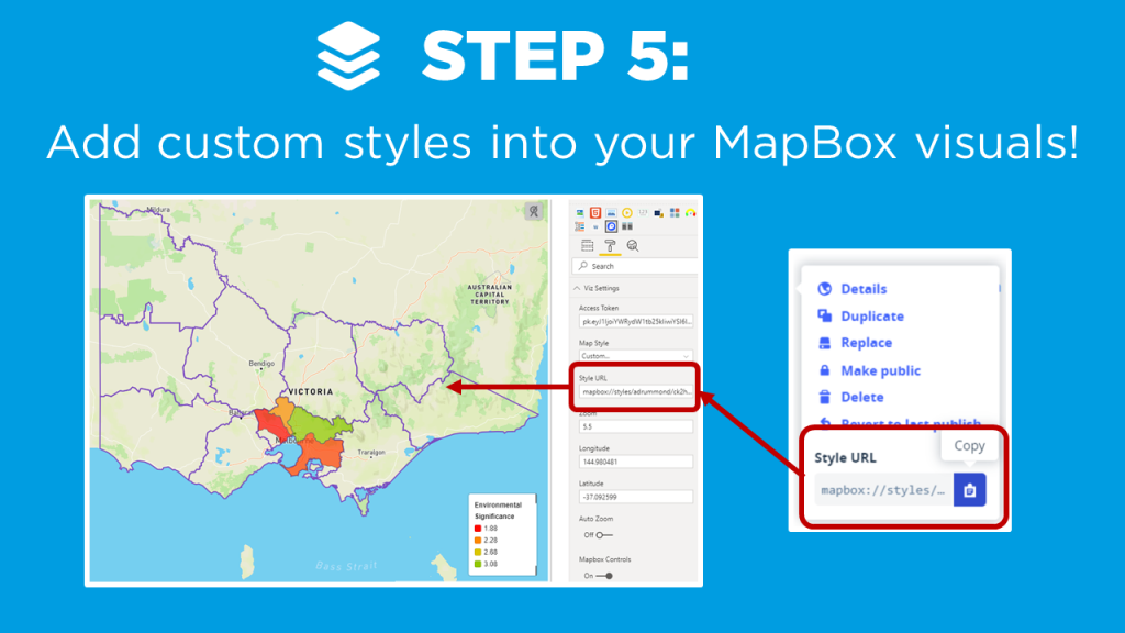
    The final step is to take our new style and apply it to the Mapbox visual!

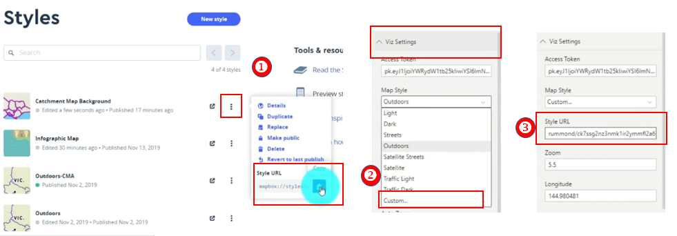
    1. Select the ellipses of our style
    2. Copy the Style URL
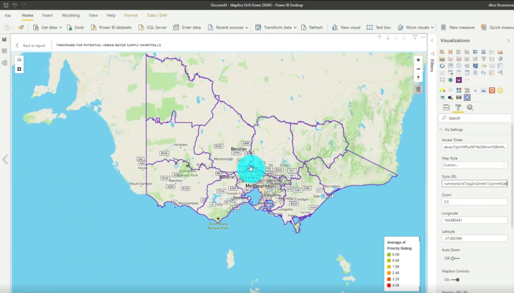
    3. Jump back into the Power BI Desktop. Under Viz Setting and the Map Style Property, Select Custom.
    4. Paste the copied URL from step 2 into the Style URL

    Final Custom Mapbox Style

    The case study I present is a Power BI report with three maps to help design our future cities to account for population growth, while also considering our environmental and social values (created using ‘synthetic’ datasets for demonstration purposes only). I modify the default ‘Outdoor’ MapBox style to include my own custom tileset, and show how to create dynamic color gradients based on different zoom intervals.

    If you’re keen to learn how to create really cool customized maps for your Power BI reports, then make sure to check out the other blogs in this 4-part MapBox series, where we provide an introductory MapBox 101, explore how to create 3D maps, and how to design drill down maps!

    And if you want to learn how you can create really beautiful and engaging Power BI reports, get in touch with one of the DiscoverEI team to register for our brand-new online training courses:

    • Power BI Designer Masterclass
    • Power BI for the Environmental Industry
    • Power BI for the Water Industry

    Take a look here for more details (https://www.discoverei.com/training)

    If you like the content from PowerBI.Tips please follow us on all the social outlets. Stay up to date on all the latest features and free tutorials.  Subscribe to our YouTube Channel.  Or follow us on the social channels, Twitter and LinkedIn where we will post all the announcements for new tutorials and content.

    Introducing our PowerBI.tips SWAG store. Check out all the fun PowerBI.tips clothing and products:

    Check out the new Merch!
    Hasta La Vista Data
    Go Ahead Make My Data
    PBIX Hat


  • Drill Down Maps in Power BI with MapBox

    Drill Down Maps in Power BI with MapBox

    If you’ve played around with MapBox in Power BI – you’ll know that it has loads of great features to create really rich and beautiful maps! One feature I love is the ability to ‘drill down’ to dynamically uncover different layers of your spatial data hierarchy, just in the same way that you can drill down on a standard column chart or matrix in Power BI.

    Why Drill Down on a Map?

    1. See the big picture: Using drill down, we can visualize the data set at the ‘big picture’ scale, and then explore finer details for areas of interest (just think of the classic spatial hierarchy of Country -> State -> City -> Suburb)
    2. Save on real estate: We can also display multiple datasets at different levels in the same map – which goes a long way to conserving your precious report page real estate by reducing the number of visuals in your report!  
    3. Performance: Following on from above, less visuals almost always equates to better report performance! And this is especially true when using MapBox, which is at the slower end of the Power BI performance scale at the best of times – so using drill down to reduce the number of maps combined with filtering your datasets goes a long way to speeding up your reports!

    Create a Drill Down Map in MapBox

    Setting up a drill down map in MapBox is pretty simple once you get the hang of configuring Choropleth maps, and in this video blog I walk through the key steps:

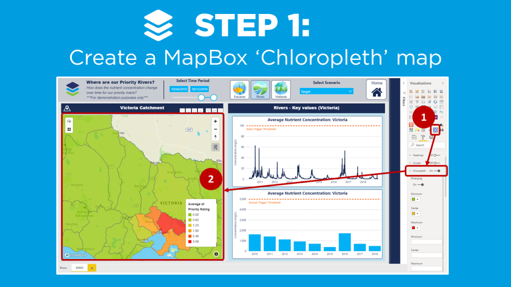
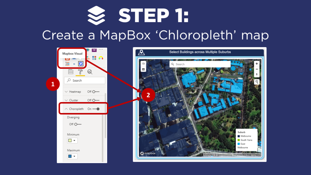
    1. Create a MapBox ‘Choropleth’ map (check out the video on MapBox 101 if you’re new to MapBox, or need a refresher on creating Choropleth maps).
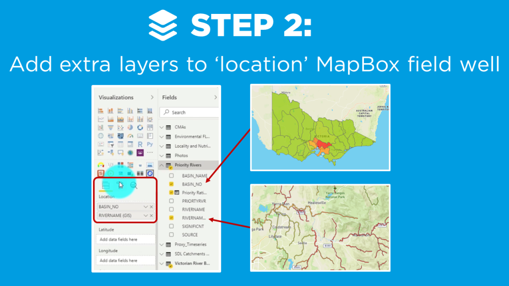
    2. Add hierarchy layers to the  ‘location’ MapBox field well
    3. Enter the vector layer properties from the MapBox Studio for the additional map levels

    In my example, I create a drill down map of priority Catchments and Rivers across Victoria using ‘synthetic’ data, which I created to visualize the nutrient concentration over time (for demonstration purposes only!).

    Instructions

    ps://powerbi.tips/2020/04/mapbox-101-for-power-bi/

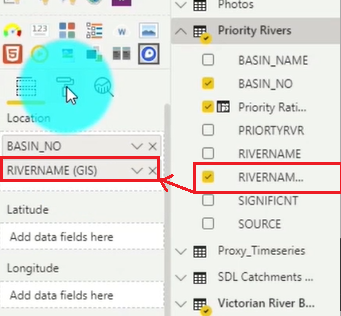
    Locate the RIVERNAME field and Drag & Drop it into the second position in the Location field well under BASIN_NO.

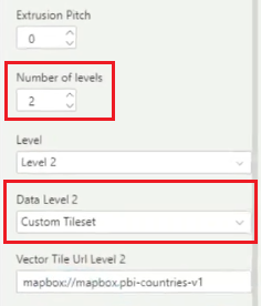
    Now navigate to the Format area and select the Choropleth section again. Increase the Number of levels to 2, and Select the Custom Tileset in the Data Level 2 section.

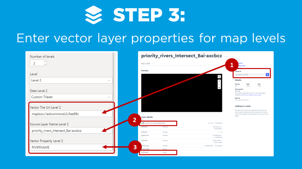
    After you set the above you need to jump out of the Power BI Desktop and head over to the mapbox studio. Here you would take the second layer of the map that you created by choosing another tileset. (For details on how to do that watch the Mapbox 101 tutorial.)

    1. Copy the Tileset ID from Mapbox and insert that value into the PBI Desktop Vector Tile Url Level 2 property still under the Choropleth section.
    2. Copy the layer name from Mapbox and Paste into the Source Layer Name Level 2 property.
    3. Copy the field you want from the attribute list in Mapbox and Paste into the Vector Property Level 2.

    Mapbox Drill Down Results

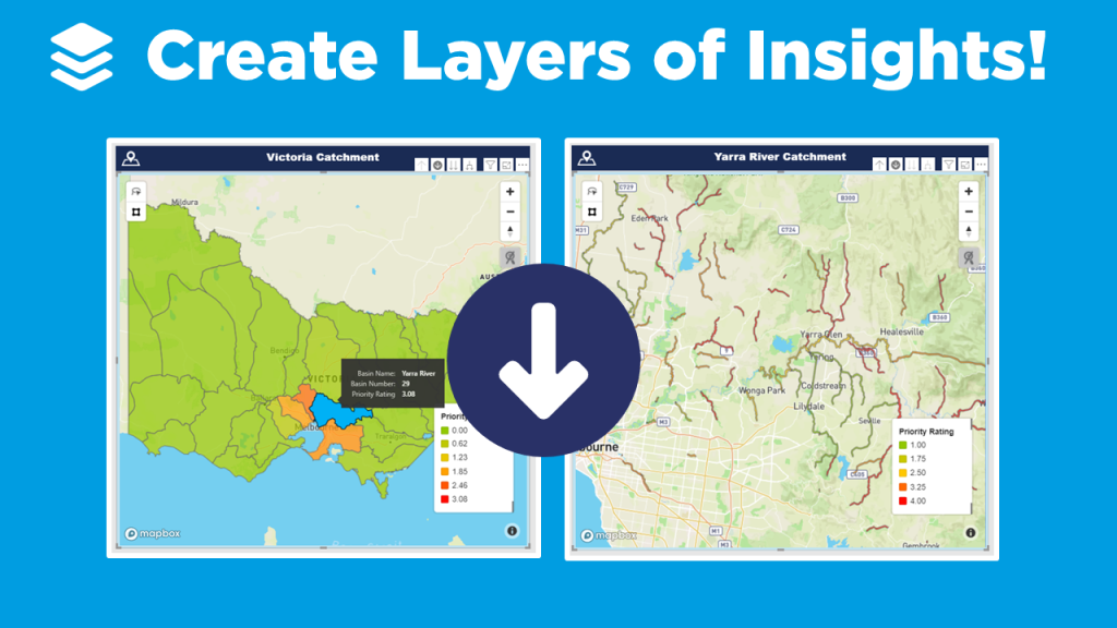
    We now have the ability to select our map area and drill down into the second layer. In our example, the rivers are now shown under each catchment.

    If you’re keen to learn how to create really cool customized maps for your Power BI reports, then make sure to check out the other blogs in this 4-part MapBox series, where we provide an introductory MapBox 101, explore how to create 3D maps, and how to design your own styles!

    And if you want to learn how you can create really beautiful and engaging Power BI reports, get in touch with one of the DiscoverEI team to register for our brand-new online training courses:

    • Power BI Designer Masterclass
    • Power BI for the Environmental Industry
    • Power BI for the Water Industry

    Take a look here for more details (https://www.discoverei.com/training)

    If you like the content from PowerBI.Tips please follow us on all the social outlets. Stay up to date on all the latest features and free tutorials.  Subscribe to our YouTube Channel.  Or follow us on the social channels, Twitter and LinkedIn where we will post all the announcements for new tutorials and content.

    Introducing our PowerBI.tips SWAG store. Check out all the fun PowerBI.tips clothing and products:

    Check out the new Merch!

    Hasta La Vista Data
    Go Ahead Make My Data
    PBIX Hat


  • Introduction to DAX Studio

    Introduction to DAX Studio

    Darren Gosbell & Marco Russo join PowerBI.Tips in a 4 part series on how and why to use DAX Studio! They show us why DAX Studio is the ultimate tool for working with DAX queries!

    In this first session we are joined by Darren who gives us a little history on DAX Studio and how we can get started with downloading the tool and getting it up and running. He covers many different areas of the tool including connecting to our various models, the basic functions of the tool, how you can output the results, and everything you need to know to get started.
    Be sure to check out this video and all the rest in the series.

    If you like the content from PowerBI.Tips please follow us on all the social outlets. Stay up to date on all the latest features and free tutorials.  Subscribe to our YouTube Channel.  Or follow us on the social channels, Twitter and LinkedIn where we will post all the announcements for new tutorials and content.

    Introducing our PowerBI.tips SWAG store. Check out all the fun PowerBI.tips clothing and products:

    Check out the new Merch!

    Hasta La Vista Data
    Go Ahead Make My Data
    PBIX Hat


  • Create 3D Maps in Power BI with MapBox

    Create 3D Maps in Power BI with MapBox

    If you’ve played around with MapBox in Power BI – you’ll know that it has loads of great features to create really rich and beautiful maps! And one of my favorite ways to get a new client excited about Power BI is to create an awesome 3D map of their city. Now, I know that 3D features get a bit of a bad wrap in traditional data viz circles (don’t even think about creating a 3D pie chart!!!), so why then are 3D maps different?

    Why use 3D maps?

    1. Greater context: We see our world in 3D, so when we transform a flat 2D map of our cities or mountains into a 3D map, it immediately creates greater connection and a sense of perspective.
    2. Another dimension: 3D maps don’t just have to be based on ‘relative’ heights, you can use the 3D effect to add a new dimension to your visualisation, such as population per town, to communicate key insights at a glance.  
    3. They just look really fancy: Sometimes half our battle as data analysts revolves around getting people within our (or our clients) organisations engaged and connected to their data. Creating 3D maps can go a long way to get that ‘wow’ factor which gets people excited and interested in the data!  

    Get started with MapBox

    There are a couple of tricks to getting the 3D features working in MapBox, so in this video blog I walk through the key steps to help you create your own 3D maps using MapBox:

    1. Create a MapBox ‘Choropleth’ map (check out the video on MapBox 101 if you’re new to MapBox, or need a refresher on creating Choropleth maps).
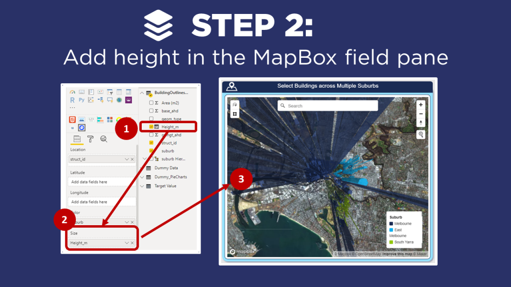
    2. Add height in the MapBox field pane
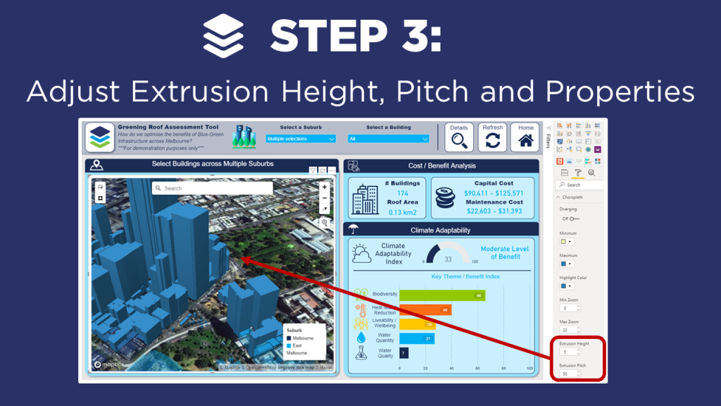
    3. Adjust Extrusion Height, Pitch and Properties

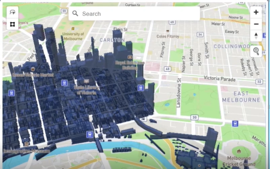
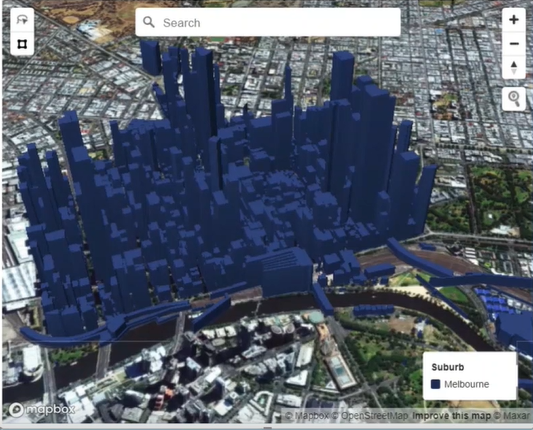
    In my example, I create a 3D map of buildings across Melbourne as part of a ‘Green Roof’ assessment tool to help optimize the benefits of blue-green infrastructure across Melbourne. Note that I have anonymized this  data and the calculations so that I can share it with the Power BI community (for demonstration purposes only!).

    Instructions

    ps://powerbi.tips/2020/04/mapbox-101-for-power-bi/

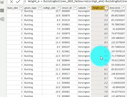
    Create a data set that includes the height of the objects, in this case the height of buildings.

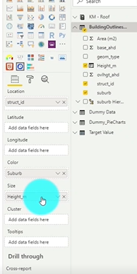
    Drag the Height column from your data set into the Size field well.

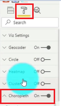
    Click on the Format section of the visual and select the Choropleth toggle.

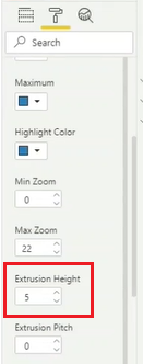
    Scroll till you find the Extrusion Height. You will likely need to Adjust the value to a lower value. In our case, we take it from 500 to 5. The Extrusion Height is a multiplier of the Height value from our data set.

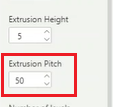
    Now, we can look one option below and we see Extrusion Pitch. We are going to Adjust this from 0 to 30. This will provide an angled view of the map which provides a clearer picture of the dimensions.

    Adjust MapBox Properties

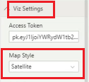
    Under the Viz Settings we want to Select the Map Style and change it to Satellite

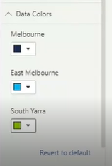
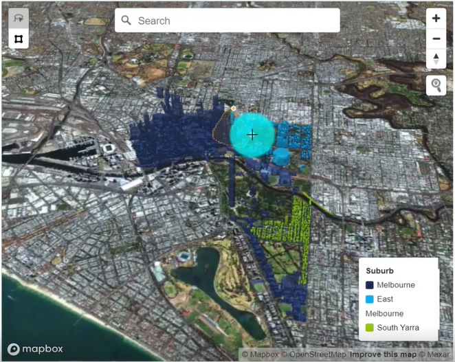
    Add Color to the different suburbs. Select the Data Colors header and Click to open up the options. Now you can Set the colors of the different areas to visually separate them.

    If you’re keen to learn how to create really cool customized maps for your Power BI reports, then make sure to check out the other blogs in this 4-part MapBox series, where we provide an introductory MapBox 101, explore how to create multi-layer drill down maps, and how to design your own styles!

    And if you want to learn how you can create really beautiful and engaging Power BI reports, get in touch with one of the DiscoverEI team to register for our brand-new online training courses:

    • Power BI Designer Masterclass
    • Power BI for the Environmental Industry
    • Power BI for the Water Industry

    Take a look here for more details (https://www.discoverei.com/training)

    If you like the content from PowerBI.Tips please follow us on all the social outlets. Stay up to date on all the latest features and free tutorials.  Subscribe to our YouTube Channel.  Or follow us on the social channels, Twitter and LinkedIn where we will post all the announcements for new tutorials and content.

    Introducing our PowerBI.tips SWAG store. Check out all the fun PowerBI.tips clothing and products:

    Check out the new Merch!

    Hasta La Vista Data
    Go Ahead Make My Data
    PBIX Hat


  • Milwaukee Brew City PUG – April 2020

    Milwaukee Brew City PUG – April 2020

    The Milwaukee Brew City PUG for April kicks off with some quick updates and highlights of upcoming events. We spend a quick minute on why we’re so excited about the fantastic line up of webinars that we were able to do recently. They highlight the top 3rd party tools to get the most our of your Power BI experience. We were excited to welcome a brand new Microsoft MVP – Chris Wagner to speak to us in this April PUG. He walks through How to Build a World Class Center of Excellence for Power BI. We also had some great conversation around a myriad of topics at the latter half of the meeting, so be sure to stick around to catch some of that at the end.

    Enjoy the Meeting!

    If you like the content from PowerBI.Tips, please follow us on all the social outlets to stay up to date on all the latest features and free tutorials.  Subscribe to our YouTube Channel, and follow us on Twitter where we will post all the announcements for new tutorials and content. Alternatively, you can catch us on LinkedIn (Seth) LinkedIn (Mike) where we will post all the announcements for new tutorials and content.

    As always, you’ll find the coolest PowerBI.tips SWAG in our store. Check out all the fun PowerBI.tips clothing and products:
    Store Merchandise

  • Using Lasso with New Shortcuts

    Using Lasso with New Shortcuts

    The April 2020 Power BI desktop release is an amazing release. This month the Power BI team has released a new lasso feature to enable users to select multiple visuals at a time. For me working in reports with lots of strategically placed visuals, this is HUGE!! How many times have I struggled to select a visual. Or, better yet needed to open up the visualization pane to select visuals from a list. The Lasso feature is a very welcome addition to the Power BI toolkit.

    New Shortcuts

    Another interesting feature that I found this month is the ability for Grouping visuals using key commands.

    You can Group Visuals using CTRL + G

    Then you can Un-Group them using SHIFT + CTRL + G

    Like all visual editing programs and even in power point these commands are very common. Thus, seeing these commands in Desktop is amazing. Power BI Team, thanks so much for your wonderful work!!!

    Video Tutorial

    Download PowerBI Desktop

    Want to use these features. Head on over to the PowerBI.com site and download the latest release. Download Here

    If you like the content from PowerBI.Tips please follow us on all the social outlets. Stay up to date on all the latest features and free tutorials.  Subscribe to our YouTube Channel.  Or follow us on the social channels, Twitter and LinkedIn where we will post all the announcements for new tutorials and content.

    Introducing our PowerBI.tips SWAG store. Check out all the fun PowerBI.tips clothing and products:

    Check out the new Merch!

    Hasta La Vista Data
    Go Ahead Make My Data
    PBIX Hat