Tag: Using Data Models

  • Building Date Table from Scratch

    Building Date Table from Scratch

    Recently at work I’ve been working with a number of large data warehouses with time series data.  Often when working on such data you need to incorporate a data calendar to compute date ranges.  So, for this tutorial we will build a custom date table directly inside PowerBI.

    Start by opening up power BI and clicking Get Data on the home ribbon, then select Blank Query.  Like always make sure you start by re-naming the query into something meaningful.  Change the name of the Query to Date List.  Next enter the following equation into the formula bar:

    List.Dates( #date(2016,1,1), 10, #duration(1,0,0,0))

    Note:  For more information on the M language you can visit here.  Also, here is the link to the List.Dates function found here.

    Once we enter the formula into the formula bar the list of dates will appear below.
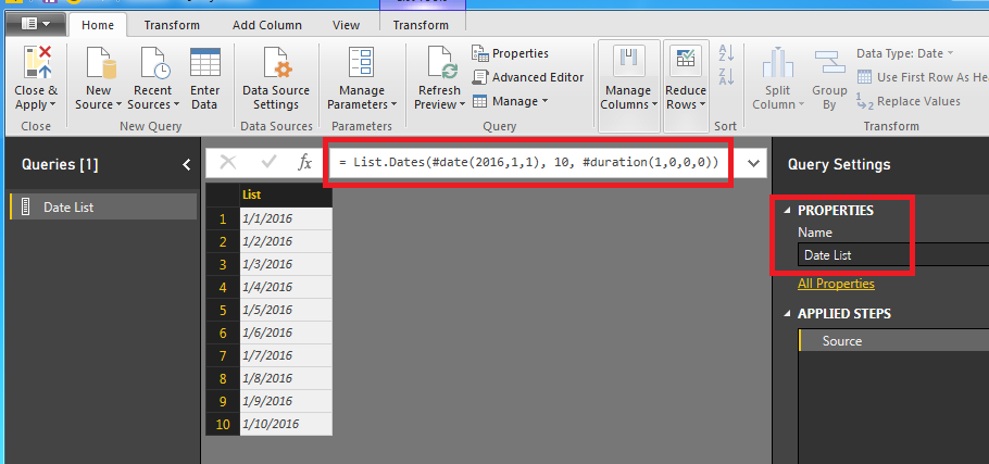
    Date List
    Date List

    The quick explanation about the List.Dates function is below.  I’ve simplified the variables below:

    List.Dates(  Start Date  ,   Number of intervals   ,  Type of interval  )

    While this is interesting it does not help us make a report that updates the date range dynamically.  The real world use case for this would be you have a report with data that is being generated daily, say for example a website.  Maybe you want a custom date range that automatically changes every day you log into PowerBI.  For example if today is 08-20-2016, I want the first date to be today and then list the dates that previous 10 days.

    Now change the formula to the following formula:

    = List.Dates(  DateTime.Date(  DateTime.FixedLocalNow() ) ,  10 ,  #duration(-1,0,0,0)  )

    Note:  In this equation we have changed the duration to -1.  This is important to note because now our date table returns older dates.  In our previous equation we used a positive 1 and we return future dates.

    In this new equation we have defined the Start Date to the following statement : DateTime.Date(  DateTime.FixedLocalNow() )  This is tricky because if you only use DateTime.FixedLocalNow() the statement will error out.  The error occurs because the DateTime.FixedLoaclNow() is a date and time.  The List.Dates function is expecting a Date only value.  Hence why we use the DateTime.Date() function to remove the time stamp and only return today’s date.
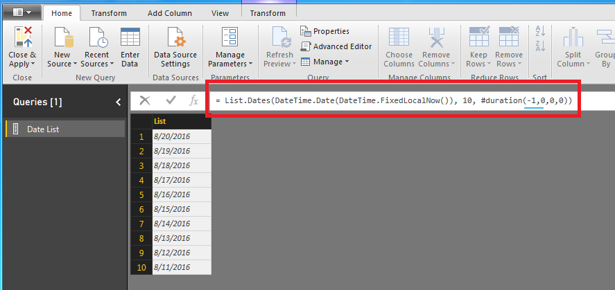
    Date List Using Date of Today
    Date List Using Date of Today

    It is most likely your date ranges will be different than the ones in the example because the DateTime.FixedLocalNow() function will be pulling in your computer’s current date.

    Next modify the equation to now pull the last 90 days (highlighted in red below)

    List.Dates(DateTime.Date(DateTime.FixedLocalNow()), 90, #duration(-1,0,0,0))

    The list of dates is just that a list.  We really can’t do to many other enhancements to our data with only a list of dates.  Now transform the list into a table.  Click on the Transform ribbon and select To Table.  Notice now that we have a new column and a new applied step.

    New Column
    New Column

    The code for the new applied steps is as follows:

    Table.FromList(Source , Splitter.SplitByNothing() , null , null , ExtraValues.Error)

    I colored the first null in the equation.  This is actually a parameter that you can use to name the new column we just made.  Tricky, Tricky, PowerBI.  Modify the equation to the following:

    Table.FromList(Source , Splitter.SplitByNothing() , {"Date"} , null, ExtraValues.Error)

    Our table is updated and now has the name Date.  Nice work!

    Now lets make our date list useful.  Click on the ribbon labeled Add Column and then the button labeled Add Custom Column.  Add the following equation to the new column and name it Week #, then click OK, to continue.

    Number.RoundDown( Number.From(Date.AddDays( List.Max( Table.Column(#"Converted to Table", "Date" ) ) , -1 * Number.From( List.Max( Table.Column(#"Converted to Table", "Date" ) ) - Date.StartOfWeek( List.Max( Table.Column( #"Converted to Table", "Date" ) ) , Day.Saturday ) ) ) -[Date] ) / 7 + 1 , 0)

    This equation defines the start of the week highlighted in RED.  Since today is Tuesday 8/30/16, then the days 8/30 (Tues), 8/29 (Mon), 8/27 (Sunday) are considered week 0 or the current week.  All dates prior will start with weekly increment.
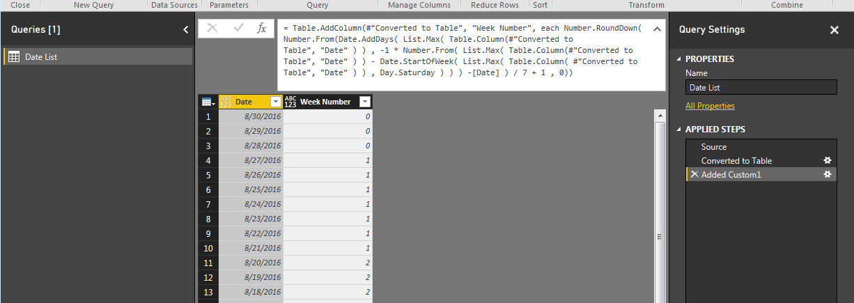
    Date List
    Date List

    Now we can add some logic to define week variables.  Click on the Add Column ribbon and select the Conditional Column button.  Using the drop downs in Column Name, Operator, Value and Output enter the following:
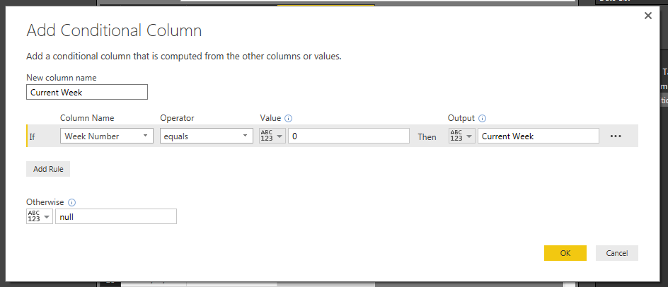
    Current Week Logic
    Current Week Logic

    Click OK to proceed.  We have now added an additional column with a text description of the week.
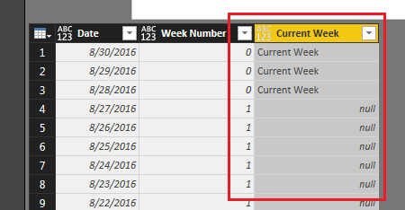
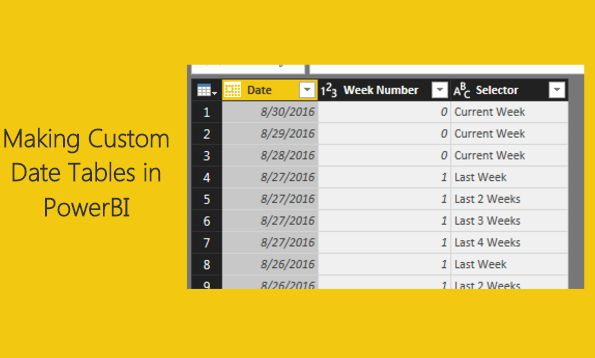
    Current Week Column
    Current Week Column

    Following the add column steps mentioned above we will now add more week descriptions.  Add the following conditional column for Last Week:
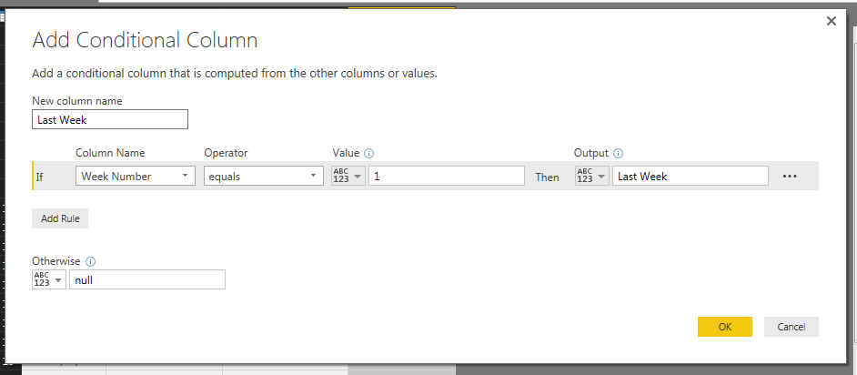
    Last Week Logic
    Last Week Logic

    From here you can make custom columns for how you want to describe your data.  In this example we will build last 2 weeks, 3 weeks and last 4 weeks.  See the add conditional column logic for each of those respective weeks.

    Conditional Column Logic for last 2 weeks:
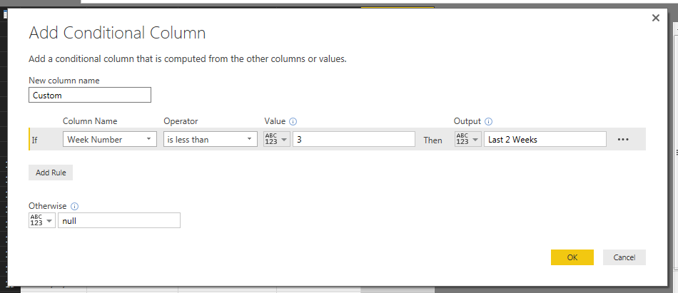
    Last 2 Weeks Logic
    Last 2 Weeks Logic

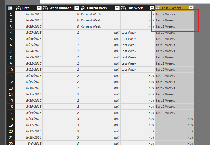
    Note: When we added this conditional column we label week 0 as last 2 weeks.  See image below as an example:
    Last 2 Weeks Column
    Last 2 Weeks Column

    To fix this we modify the code that generated this column.  The code initially states the following:

    = Table.AddColumn(#"Added Conditional Column1", "Last 2 Weeks", each if [Week Number] < 3 then "Last 2 Weeks" else null )

    We modify this code to the following: (changes highlighted in bold)

    = Table.AddColumn(#"Added Conditional Column1", "Last 2 Weeks", each if [Week Number] < 3 and [Week Number] > 0 then "Last 2 Weeks" else null )

    This now removes the first three days from our Last 2 Weeks column reflecting a more accurate picture of our time ranges.
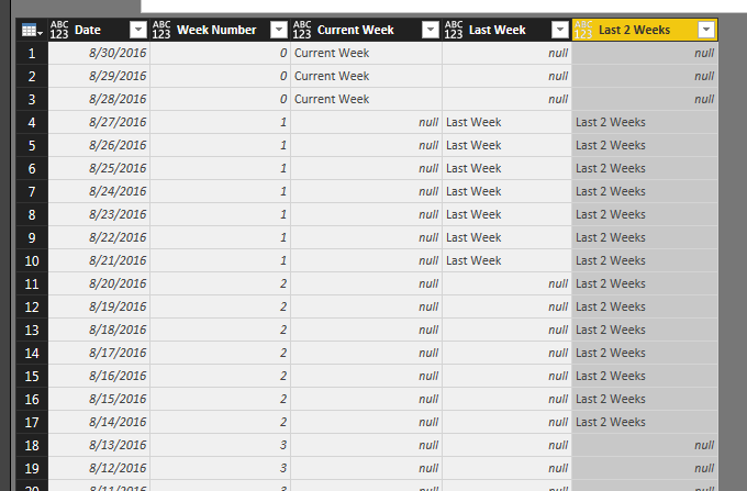
    Corrected Last 2 Weeks Column
    Corrected Last 2 Weeks Column

    Next we will add the Last 3 Weeks column and the Last 4 weeks column.  Each time we will modify the add column code to remove the first three dates of the current week.
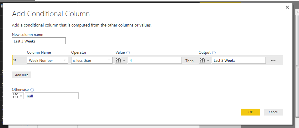
    Last 3 Weeks Logic
    Last 3 Weeks Logic

    Last 3 Weeks auto generated code:

    = Table.AddColumn(#"Added Conditional Column2", "Last 3 Weeks", each if [Week Number] < 4 then "Last 3 Weeks" else null )

    We modify to the following to achieve the correct Last 3 Weeks data range: (changes highlighted in bold)

    = Table.AddColumn(#"Added Conditional Column2", "Last 3 Weeks", each if [Week Number] < 4 and [Week Number] > 0 then "Last 3 Weeks" else null )

    Add the Last 4 Weeks column:
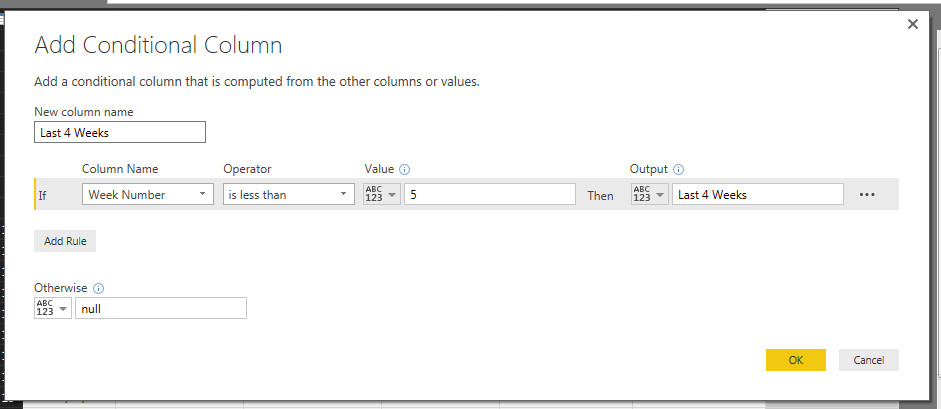
    Last 4 Weeks Logic
    Last 4 Weeks Logic

    Last 4 Weeks auto generated code:

    = Table.AddColumn(#"Added Conditional Column3", "Last 4 Weeks", each if [Week Number] < 5 then "Last 4 Weeks" else null )

    Modify the code the following to correct the column: (changes highlighted in bold)

    = Table.AddColumn(#"Added Conditional Column3", "Last 4 Weeks", each if [Week Number] < 5 and [Week Number] > 0 then "Last 4 Weeks" else null )

    Nice job so far.  We are almost to the end now.  After all those additional columns you should have something that looks similar to the following:
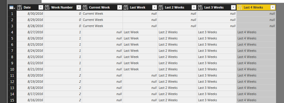
    Date Table
    Date Table

    Next we will pivot all the data down to one column.  This will enable us to select a time period and automatically have our date table update to the specific range.

    First, shift select the following columns, Current Week, Last Week, Last 2 Weeks, Last 3 Weeks, and Last 4 Weeks.  Then on the Transform ribbon click the Unpivot Columns button.
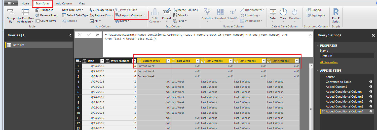
    Unpivot Columns Command
    Unpivot Columns Command

    Next delete the Attribute column using a right click on the Attribute column and selecting Remove Columns.
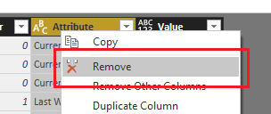
    Remove Attribute Column
    Remove Attribute Column

    Rename the Value column to Selector by right clicking on the Value column.
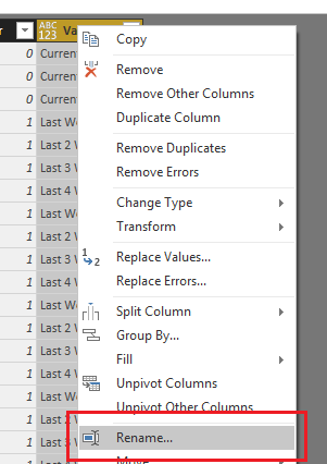
    Rename the Value Column
    Rename the Value Column

    Modify each column to have the correct Data Type on the Home ribbon.

    Date column data type should be Date

    Week Number column data type should be Whole Number

    Selector column data type should be Text

    Note: It is important to always check your data types for each column before you leave the Query Editor.  If you don’t you’ll find that the visuals that your trying to build later on on the page view will not work as expected.

    Next, click the Home ribbon and select Close & Apply.  You can now build the following visuals:

    A slicer for the Selector column:
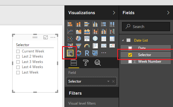
    Selector Column as a Slicer
    Selector Column as a Slicer

    Table visual for the Date column:

    Note: When you use the Date Column as the data source for the Table Visual the data will automatically be added as a Date Hierachy.  This does not work well with our data so you will need to change the date from a Date Hierarchy to a standard Date.  To do this click the little triangle next to the Date in the Values box.  Then select Date.
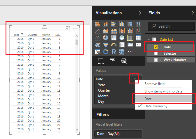
    Date Table
    Date Table

    Now you can finally play around with your data and by selecting different items in the Selector slicer you can filter down to different date ranges.  Below I selected the Last Week item, which filters down my dates to only the 7 days from last week.
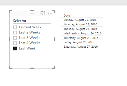
    Last Week Slicer Selected
    Last Week Slicer Selected

    Nice job making a custom date table in PowerBI.  The nice part about this table is that it will always refresh with the latest dates whenever the queries are refreshed for this PowerBI file.

    Bonus:  For those of you who want to cheat and just have the M code to generate this custom date table it can be used from here:

    let
     Source = List.Dates(DateTime.Date(DateTime.FixedLocalNow()), 90, #duration(-1,0,0,0)),
     #"Converted to Table" = Table.FromList(Source, Splitter.SplitByNothing(), {"Date"}, null, ExtraValues.Error),
     #"Added Custom1" = Table.AddColumn(#"Converted to Table", "Week Number", each Number.RoundDown( Number.From(Date.AddDays( List.Max( Table.Column(#"Converted to Table", "Date" ) ) , -1 * Number.From( List.Max( Table.Column(#"Converted to Table", "Date" ) ) - Date.StartOfWeek( List.Max( Table.Column( #"Converted to Table", "Date" ) ) , Day.Saturday ) ) ) -[Date] ) / 7 + 1 , 0)),
     #"Added Conditional Column" = Table.AddColumn(#"Added Custom1", "Current Week ", each if [Week Number] = 0 then "Current Week" else null ),
     #"Added Conditional Column1" = Table.AddColumn(#"Added Conditional Column", "Last Week", each if [Week Number] = 1 then "Last Week" else null ),
     #"Added Conditional Column2" = Table.AddColumn(#"Added Conditional Column1", "Last 2 Weeks", each if [Week Number] < 3 and [Week Number] > 0 then "Last 2 Weeks" else null ),
     #"Added Conditional Column3" = Table.AddColumn(#"Added Conditional Column2", "Last 3 Weeks", each if [Week Number] < 4 and [Week Number] >0 then "Last 3 Weeks" else null ),
     #"Added Conditional Column4" = Table.AddColumn(#"Added Conditional Column3", "Last 4 Weeks", each if [Week Number] < 5 and [Week Number] > 0 then "Last 4 Weeks" else null ),
     #"Unpivoted Columns" = Table.UnpivotOtherColumns(#"Added Conditional Column4", {"Date", "Week Number"}, "Attribute", "Value"),
     #"Removed Columns" = Table.RemoveColumns(#"Unpivoted Columns",{"Attribute"}),
     #"Renamed Columns" = Table.RenameColumns(#"Removed Columns",{{"Value", "Selector"}}),
     #"Changed Type" = Table.TransformColumnTypes(#"Renamed Columns",{{"Date", type date}, {"Week Number", Int64.Type}, {"Selector", type text}})
    in
     #"Changed Type"
  • Loading Data From Folder

    Loading Data From Folder

    Let me setup a scenario for you.  You get a data file from an automated system, it has the same number of columns but the data changes for every new file.  Being the data savvy person that you are you’ve spent some time working in excel to make a template where you can copy your new data into and then automatically all your equations and graphs magically work.  You pat your self on the back and happily send out your fantastic report to everyone you know.  Then tomorrow when the data comes to you again you repeat the same process over again.  Still enamored by your awesome report, you send it out again knowing you have saved your self so much time not having to do the analysis or creation of your reports over and over again.  Now, fast forward 3 months.  That stupid report shows up again, and now you have to lug all that data from file to file and begrudgingly you sent out your report.  Thus, is the store of the analyst.  You love data, but you hate it as well.  Well in this tutorial I’ll show you how to remove some of the pain of that continual data loading process by loading new data from a folder.

    My previous post (found here) talks about loading data from a folder.  In this tutorial we will add some logic to this method that will look at a folder but only load the most recently added item from that folder.

    Data for this tutorial is located this link Monthly Data Zip File.  This data in the ZIP file is a monthly data sample from Feb 2016 to April of 2016.

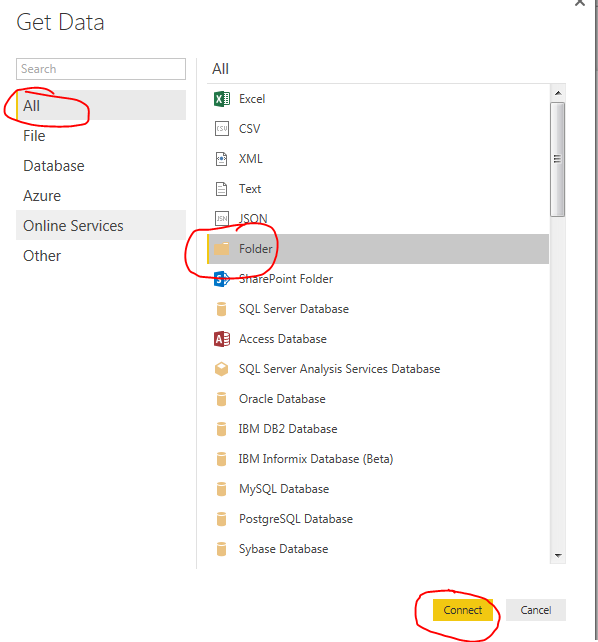
    Download the zip file mentioned above and extract the Monthly Data folder down to your desktop.  Open up PowerBI Desktop and click on the Get Data button and select All on the left side.  Click on the item labeled Folder and click Connect to continue.

    Get Data from Folder
    Get Data from Folder


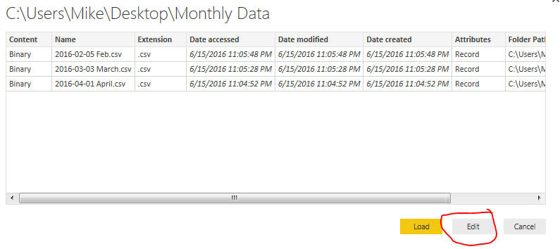
    Select the newly unzipped Monthly Data folder that should be on your desktop.  Click OK to continue. Upon opening that folder location you will be presented with the multiple files.  Click Edit to edit the query.

    Edit Query for Folder Load
    Edit Query for Folder Load

    Now you are in the Query Editor.  This is where the fancy query editing will work to our advantage.  We could load all the data into one large query.  However, depending on the size of your data sets or how you want to report your data this may not always be desirable.  Instead you may only want data from April, then May when the new data is sent next month.

    Thus, our first step to start pairing down the data will be to first filter the files in sequential order.  In this case because I have named the files with a Year-Month-Day format I can sort the files according to their names.

    Note:  When using PowerBI desktop it is a good practice to name the files  beginning with a YYYY-MM-DD file name.  This makes it really easy when sorting and ingesting information into PowerBI.  I have used other columns of information such as Date Accessed or Date Created before but have gotten inconsistent results as these dates can change depending on when a file was moved or copied from one place to another.

    Click the drop down next to Name and sort the files in Sort Descending.

    Name in Descending Sort
    Name in Sort Descending

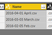
    This places the files with the most recent file at the top of the list.

    File List in Descending Order
    File List in Descending Order

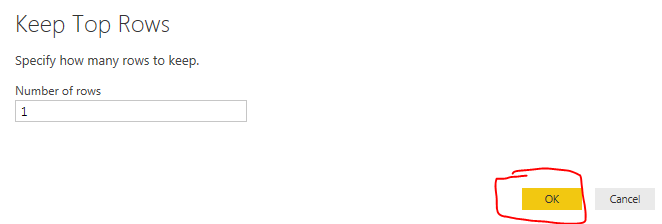
    Next click on the Keep Rows button on the Home ribbon, select Keep Top Rows.

    Keep Top Rows
    Keep Top Rows

    Enter the number when the popup appears.  Click OK to continue.

    Keep Top Rows Menu
    Keep Top Rows Menu

    Now you’ll notice you have only one file selected which is our latest file from April.  Click the Load File button found in the Content column.

    Load File Button
    Load File Button

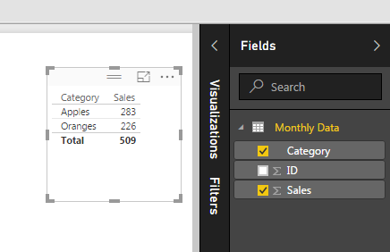
    We have completed the activities in the Query Editor and can now load the data.  Click Close & Apply found on the Home ribbon.  All our April data has loaded.  by making a simple table we can now see all the data that was just loaded.

    Loaded Data from April
    Loaded Data from April

    Now we will remove some data from our desktop folder labeled monthly data.  Open the folder on the desktop labeled Monthly Data and delete the filed labeled 2016-04-01 April.  You should now have a folder labeled Monthly Data with only two files in it, one for Feb and one for March.

    Two Files Left
    Two Files Left

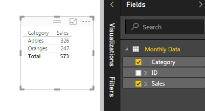
    Return back to Power BI Desktop and click the Refresh button on the Home ribbon.  Notice now how all our data has changed.  We are now looking at the March data because it is the most recent file in our folder based on the file name.

    March Data Load
    March Data Load

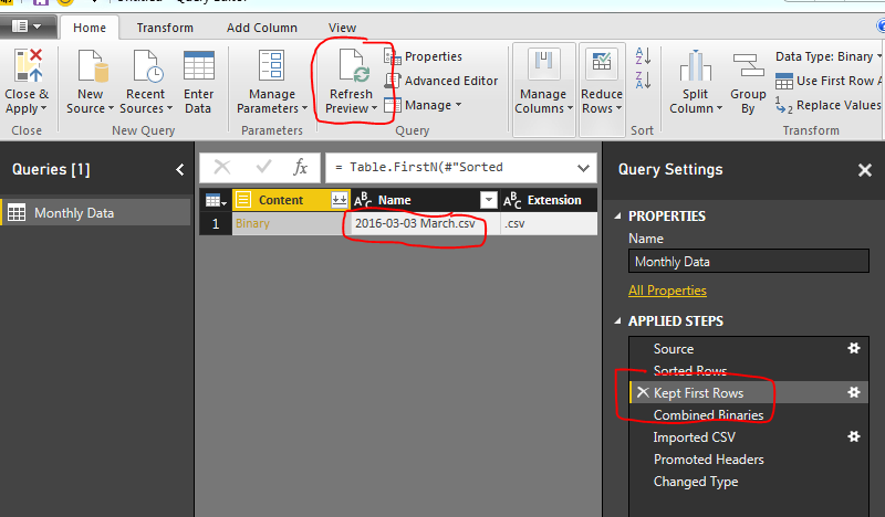
    To verify this we open the query editor (Click the Edit Queries on the Home ribbon).  Click Refresh Preview on the Home ribbon and finally select the Applied Step called Kept First Rows.  This will reveal the month of March as our data source.

    Month of March Loaded
    Month of March Loaded

    Now, every time you add a new file to our folder and refresh PowerBI the latest file (based on the naming convention we talked about earlier) will always be loaded.

    Note: This method works great when your data source is coming from an automated system.  The file format must always be the same for this to work reliability.  If the file naming convention changes, or the number of columns or location of those columns changes then the query will most likely fail.

    Good luck and thanks for following along.

  • Query Editor – Editing M Code

    Query Editor – Editing M Code

    In this tutorial we’ll learn how to copy and paste queries to and from the Query Editor.  When your working in Power BI Desktop often you will need to share and model the data before it can be applied to the visual.  In my experience you’ll need to add a calculated column or break out a date such as 1/5/2016 into the the Year 2016 or Month 01, components to properly display a visual.

    We will start off with from a prior example where we build a shaded region map.  The tutorial to create this Power BI Desktop file is located here.

    If you want to cheat and download the final PBIX file you can download and open the zipped file here: Regional Filled Map Example

    This file was made in Power BI Desktop April 2016 version, 2.34.4372.322, download the latest version from Microsoft Here.

    Open the zip file that you downloaded and extract the file inside labeled Regional Filled Map Example.  Open the file.  Once you’ve opened the file on page 1 of the you see a map of the united states that looks similar to the following.

    Opened File with Map
    Opened File with Map

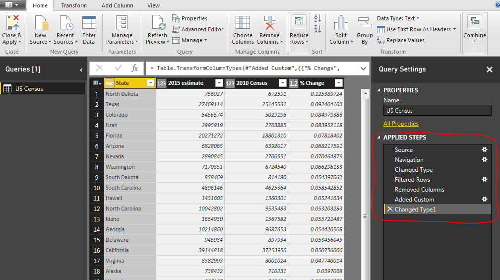
    Now we well enter the query editor.  Click on the Edit Queries on the Home ribbon.  You opened the Query Editor.  In this window we shape and model the data so we can properly visualize it on the pages.  Couple of things to notice here.  Every time you press a button on the ribbon, the query editor generates an Applied Step.  Each step writes a line of M code which transforms the data as it is loaded into the computer’s memory.   In this case we have (7) seven steps starting at Source  and ending with Changed Type1.

    Query Editor Revealing Applied Steps
    Query Editor Revealing Applied Steps

    We want to expose the code that is begin generated at every step behind the scenes.  Click on the View ribbon and then click on the button called Advanced Editor.

    Query Editor - Advanced Editor
    Query Editor – Advanced Editor

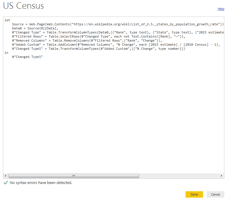
    Opening this window reveals the M language code that is generating each Applied Step we saw earlier.

    Note: some of the steps we saw earlier such as Filtered Rows had a space in it. In the query editor any applied step had a space in the name gets the added #”” around the applied step name.  Thus, in the query editor Filter Rows would be #”Filtered Rows”.  The hashtag and the quotations define the complete variable.  If you changed the name of the applied step to FilteredRows, with no space.  In the Advanced Editor you’d only see the step labeled as FilterRows, no hastag or quotations needed. 

    Now that the M language is revealed you can made modifications to the code.  In cases where you want to make a function you would do so in the Advanced Editor.  For our example today select all the code and copy it to the clipboard using the keyboard shortcut CTRL+C.  Click Done to close the window.

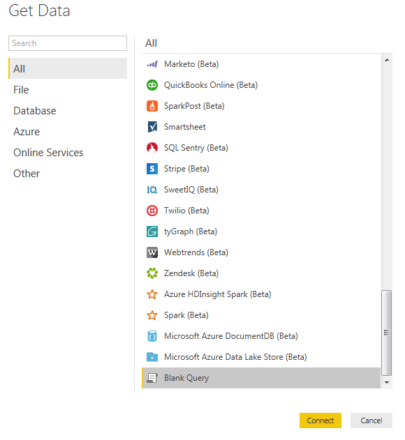
    Now lets copy that code into a brand new query.  Click the Home ribbon, then click New Source, scroll all the way to the bottom of the list and select Blank Query. Click Connect to start a blank query.

    Get Data - Blank Query
    Get Data – Blank Query

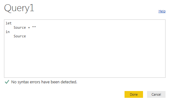
    A new Query will now open up.  Click the View ribbon, then click Advanced Editor.  A blank editor window will open.

    Blank Query
    Blank Query

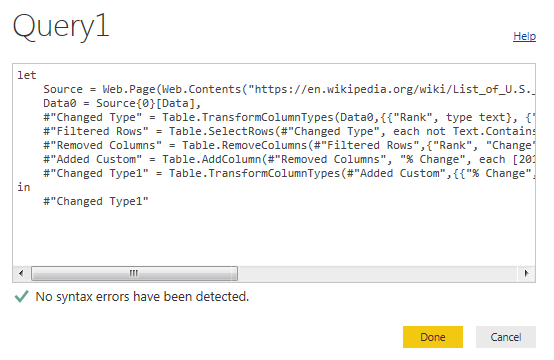
    Paste the code we copied earlier into this window.  Now the new Query1 should look like the following:

    Paste Code in to Advance Editor
    Paste Code in to Advance Editor

    Click Done and the new query will now load.  It is that simple, now we have two identical queries.

  • From Wikipedia to a Colorful Map

    From Wikipedia to a Colorful Map

    For this tutorial we are going to get some real data from the web.  One of the easiest sources to acquire information from is Wikipedia.  I will caveat this by saying, it is easy to get data from Wikipedia, but I don’t know if you can always trust the reliability.  That being said, we are going to acquire the U.S. population and growth rate from 2010 to 2015 from the Wikipedia Web page.

    Materials:

    • Power BI Desktop (I’m using the March 2016 version, 2.33.4337.281) download the latest version from Microsoft Here.
    • Link to the data from Wikipedia, Here.  ( https://en.wikipedia.org/wiki/List_of_U.S._states_by_population_growth_rate )

    Let’s begin.

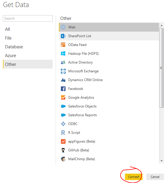
    Open up Power BI Desktop.  Click on the Get Data button.  On the left of the Get Data menu click Other then select the first item titled Web.  Click Connect to continue.

    Get Data from Web
    Get Data from Web

    In the From Web window enter in the following web address.  You can copy and paste it from below.

    https://en.wikipedia.org/wiki/List_of_U.S._states_by_population_growth_rate

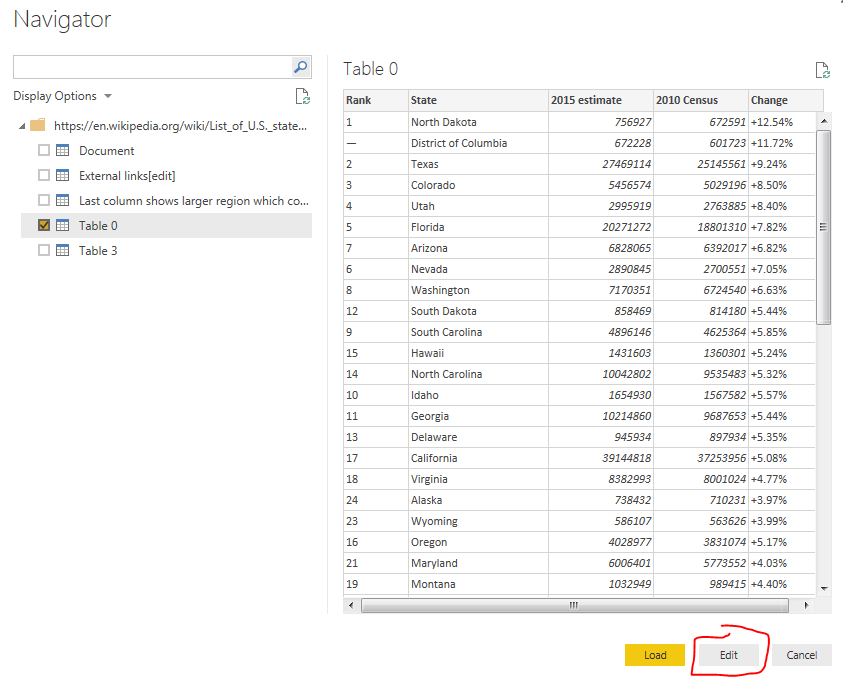
    Click OK to move to the next menu.  After a bit of thinking the Power BI will present the Navigator window.  This is what Power BI has found at that specific web address.  On the left side of the screen there is a folder.  This is the web page folder location that we loaded earlier.  Power BI then intelligently looks through the website code for tables it can distinguish.  By clicking on each table you can see a preview of the data returned on the right side of the window.

    Try clicking on the various tables such as Document, External links, or Table 0.  For our example lets click on Table 0.  Click on the button at the right hand corner labeled Edit.  We are going to slightly modify this data before we load it to the data model.

    Navigator Window
    Navigator Window

    You’ll notice once we load the data there are some items we’d like to remove.  In row #2 the label is District of Columbia, which technically isn’t a state.  Also further down we see in row #25, the entire U.S. population is shown.  Again, we don’t want these values to show, we only want the 50 states.  To remove this data we will use a text filter to remove any item in the Rank column that has a “–” (which is called an em-dash, see note below for more details on how to select this text character).

    Note: There are two kinds of dashes that your computer uses.  One is called the en-dash(-), the second being the em-dash(–).  It is very hard to distinguish the difference between the two dashes.  The image below shows a better contrast when used in Microsoft Word.

    Em-Dash vs. En-Dash
    Em-Dash vs. En-Dash

    The en-dash is shorter than the Em-dash. The Key for the en-dash is next to the number 0 on your keyboard.  To select the em-dash you need to use a bit of Microsoft trickery.  The Em-dash will be presented when you hold the Alt key and type 0151 on a keypad.  This selects the specific ASCII character for the em-dash.  For more information on selecting the em-dash visit here.

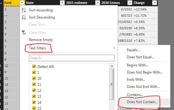
    Click the drown down button in the column labeled Rank.  Select the item labeled Text Filters, and then Click Does Not Contain…

    Text Filter on Rank Column
    Text Filter on Rank Column

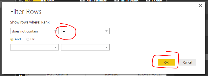
    Enter in the em-dash code by using Alt 0151 to enter in the correct dash into the Filter Rows dialog box.  Click OK to proceed.

    Enter EM-Dash in Filter Rows Dialog
    Enter EM-Dash in Filter Rows Dialog

    If we entered the correct em-dash we will now be presented with a cleaned list of U.S. states with only numbered items in the Rank column.

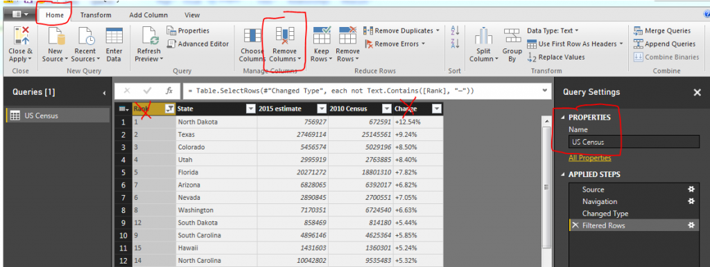
    Next we will clean up the query slightly to make it easier to deal with.  Delete the column labeled Rank, and Change.  Rename the query to something a little more meaning full such as US Census.

    Remove Columns
    Remove Columns & Rename Query

    Note:  You can delete a column by pressing the Remove Columns button on the Home ribbon.  A second method is to right click with your mouse on the column you want to remove and selecting Remove.

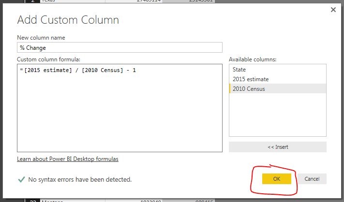
    Next we will add our own calculated column which will calculate the 2010 to 2015 percent change.  Click the ribbon labeled Add Column and select the first icon on the far left labeled Add Custom Column.  The Add Custom Column dialog box will open. Enter the name for the new column, then by clicking on the columns in the available columns on the right you can build an equation.  For this example we are using the percent change calculation which is the following:

    Percent Change = [New Value / Old Value ]- 1

    Using the columns we imported from Wikipedia we will have the following equation:

    = [2015 estimate] / [2010 Census] - 1
    
    Update: this formula has now changed to 2016 estimate as time has progressed since this first tutorial was posted.
    The new column should have this following formula: = [2016 estimate] / [2010 Census] - 1


    This inserts a new column with the calculated percent change between the 2010 census and the 2015 census.  Click OK to proceed.

    Add Custom Column
    Add Custom Column

    Finally we want to change the type of data in the % Change column so our data model will operate as expected when producing visuals.  Click the Home ribbon, then click the % Change column.  Change the Data Type: from Any to Decimal Number.  This informs the data Model how to treat the data held the % Change column.  We are finished data modeling and now click Close & Apply on the Home ribbon.

    Now we have all our data loaded into the data model ready to build a map.

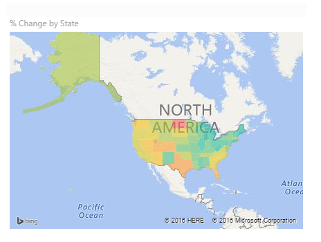
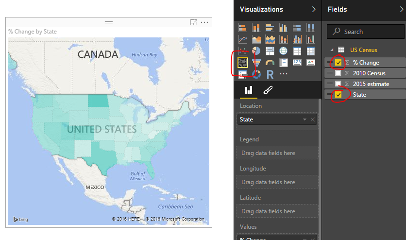
    Click the Column labeled State and then click % Change.  This yields a map with circles on it.  Change the visual to a filled map by selecting a different visual, the Filled Map icon (circled in red below).  Doing so produces a shaded map of the US, where each state is colored according to the % Change.

    Filled Map Selection
    Filled Map Selection

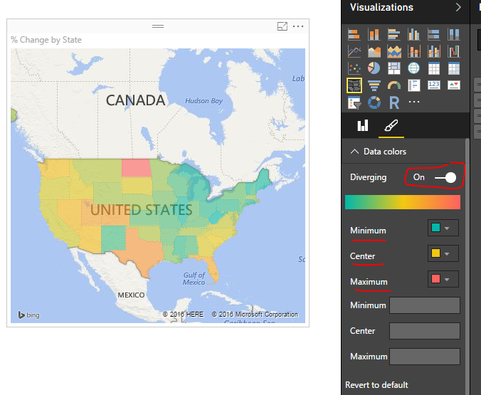
    Finally lets add some color to the data. Click the visual’s Format properties (the little paint brush in the visuals window). Expand the Data Colors section by clicking on the title Data colors. Diverging is set to off.  Change it to On. Change the Minimum color to Green, the Center color to Yellow, and the Maximum color to Red.

    Colored Map
    Colored Map

    The states with the largest population change are in Red, while all the states with the smallest population change.

    Please share if you liked this tutorial.  Thanks.

  • Manually Enter Data

    Manually Enter Data

    There are often times when you need a small data set in order to make a visual behave exactly how you want it to.  This may mean you need a small table to represent a range of numbers or text values.

    Here are the Resources for this tutorial:

    • Power BI Desktop (I’m using the March 2016 version, 2.33.4337.281) download the latest version from Microsoft Here.

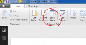
    To enter your own data Click the Enter Data button on the Home ribbon.

    Enter Data
    Enter Data Button

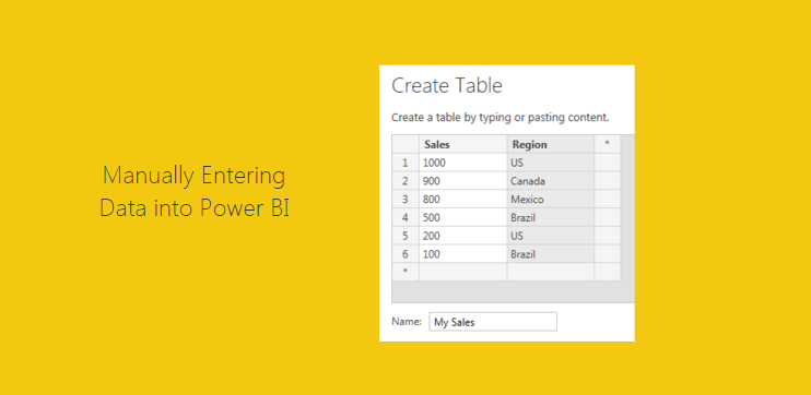
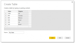
    Next you are prompted with the Create Table window.  In this window you are given the layout of a unfilled table.  To begin entering data you can click in the first cell in Column one and start entering data.  By pressing enter a new cell will populate below.  You can Rename the column by double clicking the column name.  To add a second column you Click on the symbol next to your existing column.  Finally to edit the table name you can type in the desired table name in the Name input box in the bottom left hand portion of the window.

    Create Table
    Create Table Window

    Finally, you can either to choose to Load the data as is or Edit the data to make additional changes (this can be useful to edit the data types of each column or to populate equations in subsequent columns).  For the sake of this tutorial we will simply load the data.  Click Load to load the data into the data model.

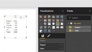
    Now drag over the columns into the page view to begin generating visuals.  By default PowerBI makes a table of data to show you the values you just entered.

    Sales Table
    Visual of Sales Table

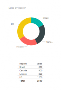
    Select the table visual (you know it is highlighted when it has the trim boarder as shown above) and Click the Doughnut Visual.  This transforms the data into a doughnut, and who doesn’t like a nice data doughnut?  Click anywhere in the page to de-select the new doughnut visual.  Add a second table by dragging over he Region and Sales columns.  We can now see the pretty graphic and the numbers supporting that visual.

    Visuals
    Visuals Made with our Custom Data

    I bet you didn’t notice that something changed here.   Look closely at the data we see now vs. what we entered earlier.  Go ahead, scroll up, I’ll wait…  Did you catch it?

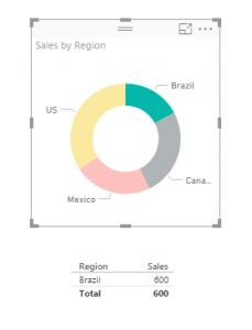
    We now have 5 rows of data but we entered 6 before.  That is because the Sales column is a number column and can be aggregated.  Look in the fields column and you see there is a little sum symbol in front of the Sales column.  This means that this column has a default summarization associated.  To see what is the default summarization highlight Sales by clicking on the column name in the grey area.  Then Click the ribbon titled Modeling, and there it is in the properties section the Default Summarization is Sum.  Every time you use the Sales column it will be summarized in the tables and visuals views.  Our visual table shows Brazil with a total sales of 600, because we had two Regions labeled as Brazil 500 and 100.

    Now you can click on any of the data points in the doughnut.  Notice the table automatically filters down to only show the areas you selected.

    Brazil Data
    Data Filtered to only Brazil

    ProTip: you can select multiple selections by holding down CTRL and selecting multiple items in the visual.  You can only do this inside of one visual.  As soon as you click another visual all filtering will disappear.

    Again, I hope you enjoyed this quick tutorial. If you liked it make sure you share it below.

  • Query Settings – Fixing a Missing File

    Query Settings – Fixing a Missing File

    One of the most important concepts to learn within Power BI Desktop is how to build a Data Model.

    Note: In simple terms the Data Model is data that is collected from the get data function.  In your data model you can build multiple queries.  This data is stored in the file.  The data storage is very efficient as the data compressed down to approximately a 4:1 ratio.  1000 KB file will compact down to approximately 250 KB when loaded into Power BI.  From my current understanding all data is loaded into the memory of the computer.  Thus, if you are having performance issues it could be in part due to the RAM of your computer.  

    As you begin to craft more data models you will learn little tips and tricks along the way to make an efficient Data Model for your visualizations.  I have found that the most challenging part of building the data model is structuring the data in a way that will make your selected visual make sense.  This may mean you need to add a measure or a calculated column or a ranking to a data set. Alright lets get started.

    Here are the Resources for this tutorial:

    • Power BI Desktop (I’m using the March 2016 version, 2.33.4337.281) download the latest version from Microsoft Here.
    • We are going to work through the Power BI Desktop file that we built in the Loading Excel Files Into Power BI Tutorial.  You can follow the link to create the Power BI Desktop (pbix) file in the tutorial.  For convenience, the completed file can be downloaded here: Import Excel Tutorial.

    I’m going to start off by extracting the Import Excel Tutorial.zip file to my desktop.  Once the file has been extracted we can open the containing folder.  In this folder there are two files the source data in the excel file and the Power BI Desktop file.

    Note: A Power BI Desktop file has a .pbix file format ending.

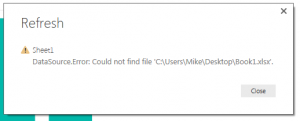
    Open the Import Excel.pbix file.  First click the Home ribbon and then click the Refresh button.  Most likely there will be an error similar to the following message.

    Can't find file
    Message box when file can’t be found

    This type of message occurs when you refresh a query and the file is missing or can’t be found.  This is because when i originally built the Power BI Desktop tutorial the excel file that is supply the information was located on my desktop.  This is a common problem when you build connections to local files stored on your computer.  If you move a file into a different folder then the connection will break.

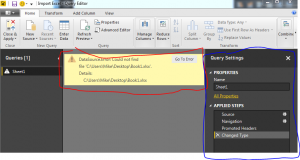
    To resolve this close the message window by clicking Close. on the Home ribbon click the Edit Queries button.  The Query Editor window will be presented.  In a large yellow bar in the data view portion of the window (circled in red) is the error message.

    Note: Circled in blue is the Query Settings window.  This window is the window for all the applied steps to transform the data.  You can change the name of the query in the name box.  From the view we have selected we can see that the step entitled Changed Type is currently selected (seen circled in blue).

    Click the grey button labeled Go To Error which is found in the yellow error box.

    Go To Error
    Error seen inside Query Editor

    Upon clicking the Go To Error button the selection in the Query Settings button to the Source Step.  This is where the query has failed.  More information about the failure is shown in another yellow error box.  This time click Edit Settings in the error box.

    Edit Settings
    Edit Settings in Error window

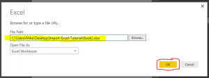
    Now we have the Load Excel file window prompt open.  In this window Click Browse, navigate to where you extracted all the files downloaded earlier in the tutorial and select the excel document entitled Book1.  Click Open and the new file location will be loaded into the Load Excl Window.  Click OK to complete the settings change.

    New File Location
    New File Location

    Now the data is correctly loaded into the data model.  Notice we are still on the step called Source.  Take some time to click through each step, Source – Navigation – Promoted Headers – Changed Type.  As you click on each step you can see how the data is transforming.

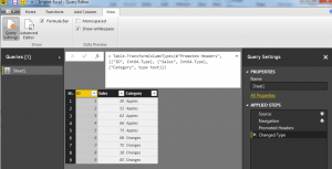
    To see the code that is being used to make each step click the View ribbon and check the little box entitled Formula Bar.  This will make a formula bar appear.  When you click on a step the formula bar will reveal the code needed to complete the selected step.

    Toggle the Formula Bar
    Toggling on the Formula Bar

    We can now see the equation, which is similar to how you would write an equation in excel.  The code in the Changed Type step is here:

    = Table.TransformColumnTypes(#"Promoted Headers",{{"ID", Int64.Type}, {"Sales", Int64.Type}, {"Category", type text}})

    The equation is using the M language to transform the data.  More information on the usage of the M language can be found here.

    Note: Couple of pointers about the data shown in the formula.  The function is called Table.TranformColumnTypes.  The source of the data is a variable called #”Promoted Headers”.  The pound sign and the words following in quotations is how the M language passes variables that have a space contained in the language.  Since the prior step has the name “Promoted (space) Headers” the program has to add the pound sign and the quotation marks.  If there is no space in the naming convention such as “PromotedHeaders” then only the PromotedHeaders would be seen in the code and the pound sign and quotes will be gone. See modify coded when I remove the space from the Promoted Headers applied step.

    = Table.TransformColumnTypes(PromotedHeaders,{{"ID", Int64.Type}, {"Sales", Int64.Type}, {"Category", type text}})

    Notice the the pound sign and quotations are missing.

    The second part of the formula is an array which has been written out in curly brackets:

    {
    {"ID", Int64.Type}, 
    {"Sales", Int64.Type}, 
    {"Category", type text}
    }

    I changed the code by adding line returns to make it easier to read.  The coded array has beginning bracket and an ending bracket.  Each parameter is contained in it’s own curly brackets and separated with a comma.  The array is a 2 x 3 array, it has 3 rows and two data points on each row, just like a matrix.  The first data point is the column name.  In the first row the column that is being address is called ID.  The data transformation parameter is called Int64.Type.  This means that the data is an integer type 64 bit.  This repeats for each row until all parameters have been addressed.

    So there you go, we have opened up a query repaired it and learned a little about the formula bar.

    As a side note, as you build queries each button press that you make on the various ribbons in the Query Editor will make a minimum of one step the in the Query Editor.

    Hope you enjoyed this short tutorial about the Query Editor.  Make sure you share below if you liked it.