Fixing Measure Madness
Often times when you’re working with large data models you will have multiple tables with many relationships. It could be complex - maybe you’ve seen something like the following:
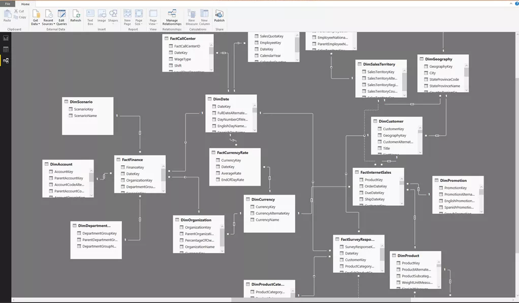 Photo Credit: www.biinsight.com
The Problem
Once all the tables have been loaded the manic measure building begins to support all the different visuals. A couple of sums here, a number of calculates over there, and boom, a beautiful report. You stand back and survey the work and realize you’ve built measures all over the place, in different tables, maybe even stuck a couple of measures in the wrong place. Whoops.
Maybe we should think about cleaning things up a bit, if only there was a way to group the measures. How do I group my measures? I’m glad you asked. With a little trickery we can make a measure table. Let’s begin.
Loading Sample Data
First we will load a little data. For this tutorial we will simply copy and paste in some data.
Note: For the full tutorial on manually entering in data visit this page.
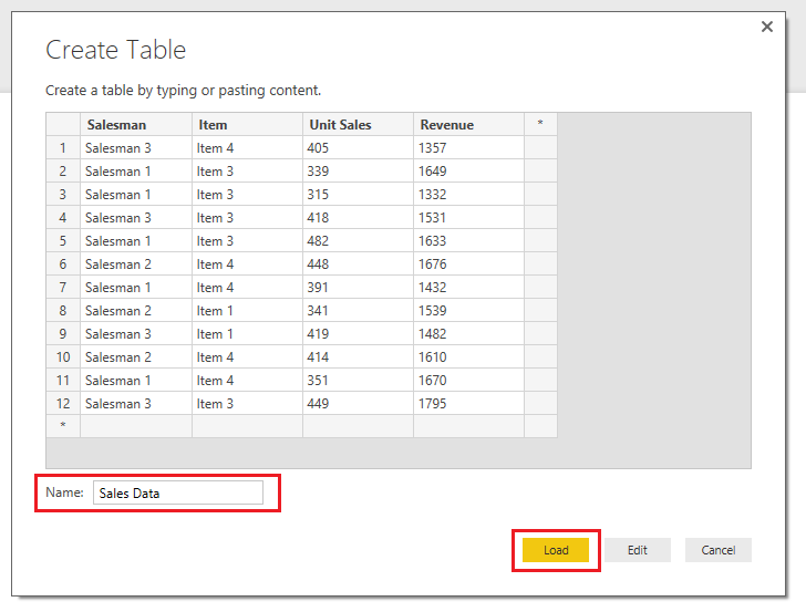
On the Home ribbon click the Enter Data button. Copy in the table below into the Create Table window. Rename the table Sales Data and click Load to exit.
| Salesman | Item | Unit Sales | Revenue |
|---|---|---|---|
| Salesman 3 | Item 4 | 405 | 1357 |
| Salesman 1 | Item 3 | 339 | 1649 |
| Salesman 1 | Item 3 | 315 | 1332 |
| Salesman 3 | Item 3 | 418 | 1531 |
| Salesman 1 | Item 3 | 482 | 1633 |
| Salesman 2 | Item 4 | 448 | 1676 |
| Salesman 1 | Item 4 | 391 | 1432 |
| Salesman 2 | Item 1 | 341 | 1539 |
| Salesman 3 | Item 1 | 419 | 1482 |
| Salesman 2 | Item 4 | 414 | 1610 |
| Salesman 1 | Item 4 | 351 | 1670 |
| Salesman 3 | Item 3 | 449 | 1795 |
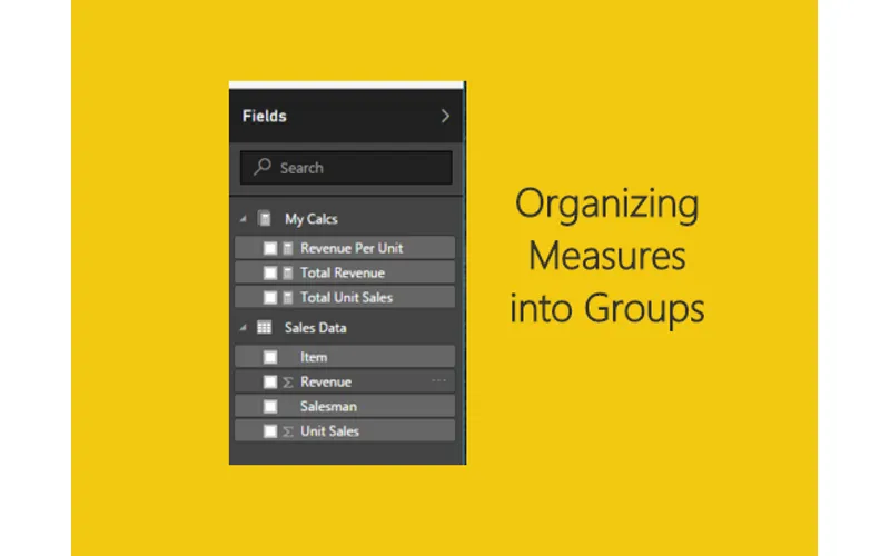
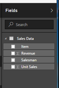
Upon loading our data table we now have the following fields.
Creating a Sample Measure
Now, let’s make a measure that calculates the revenue per unit. On the Home ribbon click the New Measure button and enter the following DAX measure.
Revenue Per Unit = SUM('Sales Data'[Revenue]) / SUM('Sales Data'[Unit Sales])Next, make a table with the following fields: Salesman, Item, Unit Sales, Revenue, and Revenue Per Unit.
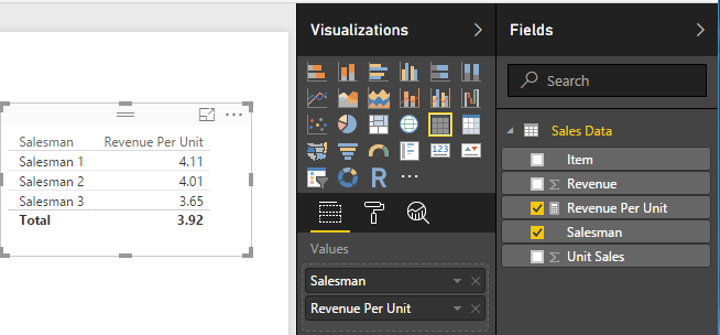
Great! But, as we all know this is how the measure madness begins. From here we refine and finesse the data to craft the data story, and end up with tons of additional tables and measures.
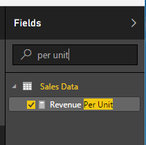
Pro Tip: You can use the search window at the top of the Fields window to help you find buried measures or fields of data.
Creating the Measure Table
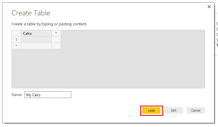
Let’s make the measure table. Start by clicking Enter Data on the Home ribbon. Rename the new table to My Calcs, and rename Column1 to Calcs. You don’t have to rename Column1, but since I’m OCD about my data I like to rename the column to the same name as the table. Then click Load to exit the screen.
We now have a new table labeled My Calcs with one column labeled Calcs.
Moving Measures to the New Table
Next highlight the measure we created Revenue Per Unit. Then on the Modeling ribbon change the home table from Sales Data to My Calcs. This will move the measure.
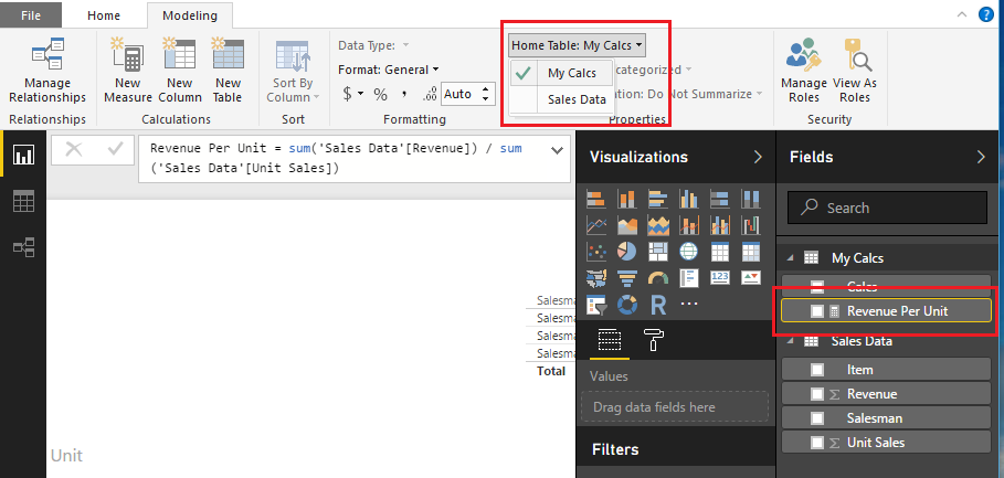
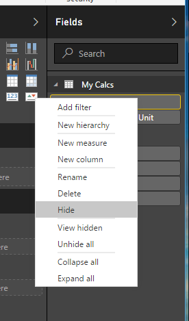
Right click on the Calcs column in the My Calcs table and then select Hide.
The Final Result
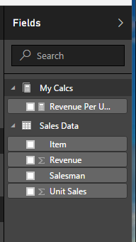
Next Save and then reopen the document (it’s a Microsoft thing I guess). After the document has reopened the My Calcs table has changed its icon from a table to a Measure icon.
For kicks and giggles add the following measure to the My Calcs table.
Total Revenue = SUM('Sales Data'[Revenue])Ok, one more.
Total Unit Sales = SUM('Sales Data'[Unit Sales])Conclusion
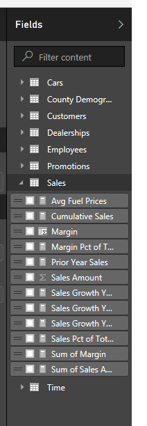
There you go. A very straightforward approach to cleaning up all the random measures in your data model. I have found that when other team members are working with your data model this helps other people understand which fields have been calculated and which ones were imported via a query. This also helps you group logical calculations, further creating clarity within your data model.
If you want to read up more on making measure tables check out this great site. In addition to walking you through creating a measure table it also explains how to make a measure table when using direct query mode. As the article explains, while you are in direct query mode you are unable to manually enter data. Nice job, Soheil Bakhshi, well done.
If you liked this tutorial make sure you share. See you next week!