
Mapping is one of the better features of PowerBI. It is one of the more distinguishing feature differences between Excel and PowerBI. You can produce a map inside an excel document using Bing maps, however, the experience has always felt a little like an after-thought. Mapping within PowerBI has a planned, and thoughtful integration. While the mapping functionalities within PowerBI Desktop are far improved when compared to excel, there are still some limitations to the mapping visuals. This past week I encountered such an example. We wanted to draw a map of the United States, add state name labels and some dimensional property like year over year percent change.
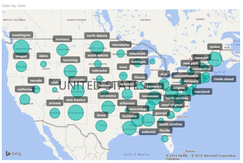
I started with the standard map visual, but this didn’t work because there is no ability to shade each state individually. This just looked like a bubbled mess.
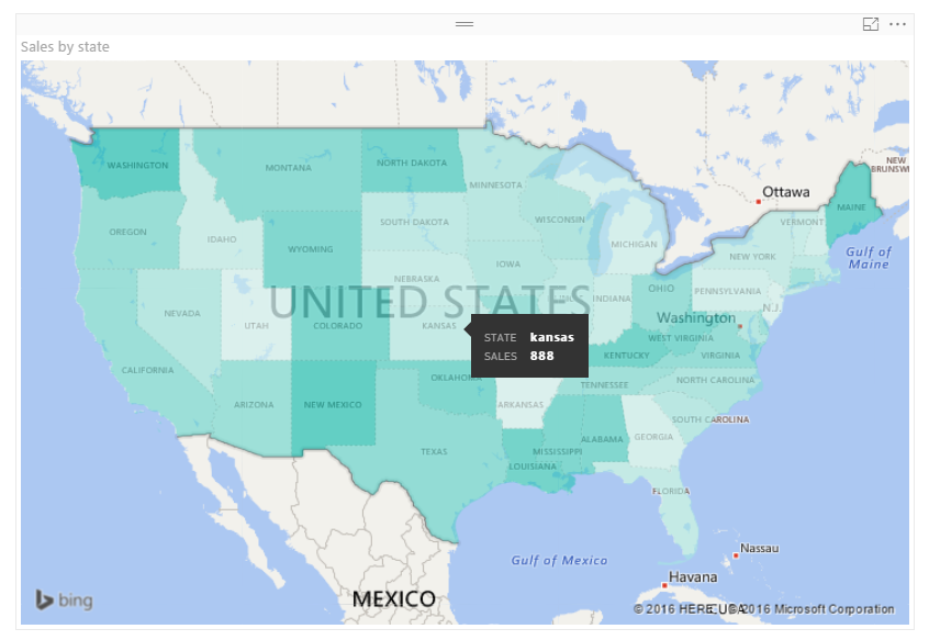
Next, I tried the Filled Map visual. While this mapping visual provides the colored states it lacks the ability to add data labels onto the map. Clicking on the map would filter down to the selected state, which could show a numerical value. Alternatively, you can place your mouse over a state and the resulting tag will show the details of the state (hovering example provided below).
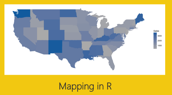
Still this did not quite meet my visual requirements. I finally decided to build the visual in R which provided the correct amount of flexibility. See below for final result. You can download the pbix file from the Microsoft R Script Showcase.
In this visual, each state is shaded with a gradient color scale. The states with the lowest sales are grey and the states with higher sales numbers transition to dark blue. The darker the blue the more sales the state saw. Each state has an applied label. The color of the label denotes the percent change in sales. If the color is green then the sales this year were higher than last year, red means that the state sales were lower this year. The state name is listed in the label as well as the calculation for the year over year percent change.
Alright, let’s start the tutorial.
First, before we open PowerBI we need to load the appropriate packages for R. For this visual you will need to load both the maps and the ggplot2 packages from Microsoft R Open.
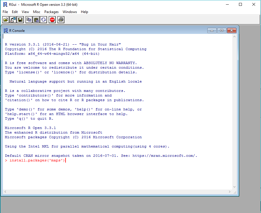
Open the R console and use the following code to install maps.
install.packages('maps')
Repeat this process for installing ggplot2.
install.packages('ggplot2')
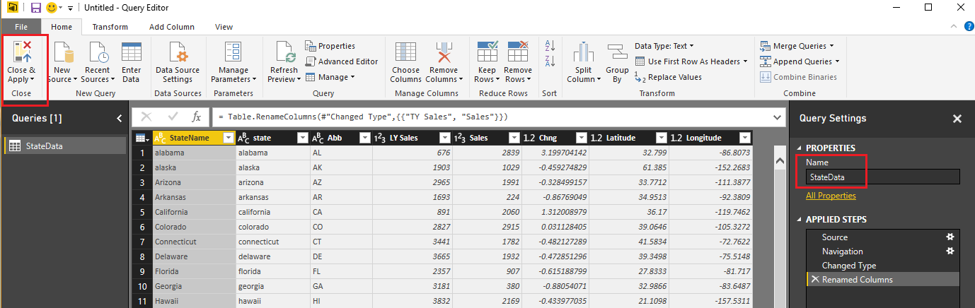
After installing the R packages we are ready to work in PowerBI Desktop. First, we need to load our sample data. Open up PowerBI Desktop and start a blank query. On the View ribbon in the query editor open the Advanced Editor and enter the following M code.
Note: If you need some more help loading the data follow this tutorial about loading data using the Advanced Query Editor. This tutorial teaches you how to copy and paste M code into the Advanced Editor.
let
  Source = Excel.Workbook(Web.Contents("https://powerbitips03.blob.core.windows.net/blobpowerbitips03/wp-content/uploads/2016/10/State-Data.xlsx"), null, true),
  StateData_Table = Source{[Item="StateData",Kind="Table"]}[Data],
  #"Changed Type" = Table.TransformColumnTypes(StateData_Table,{{"StateName", type text}, {"Abb", type text}, {"TY Sales", Int64.Type}, {"state", type text}, {"Latitude", type number}, {"Longitude", type number}, {"LY Sales", Int64.Type}, {"Chng", type number}}),
  #"Renamed Columns" = Table.RenameColumns(#"Changed Type",{{"TY Sales", "Sales"}})
in
  #"Renamed Columns"
After pasting the code into the Advanced Editor click Done to load the data. While in the Query Editor, rename the query to be StateData, then click Close & Apply on the Home ribbon.
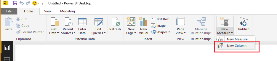
We still need to prepare the data further by adding two calculated columns. Click the bottom half of the New Measure button on the Home ribbon and select New Column.
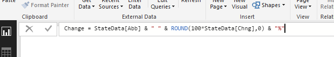
Enter the following code into the formula bar that appears after clicking New Column.
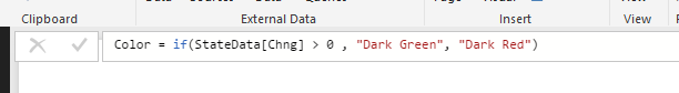
Change = StateData[Abb] & " " & ROUND(100*StateData[Chng],0) & "%"
Again, click on the New Column button found on the Home ribbon and add the code for a color column.
Color = if(StateData[Chng] > 0 , "Dark Green", "Dark Red")
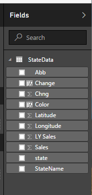
The Fields list should now look like the following.
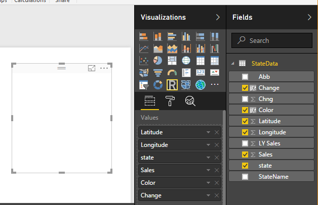
Add the R visual with the following fields.
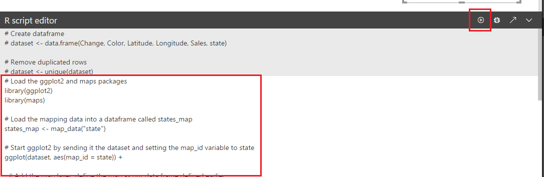
Add the following R script into the R Script Editor.
# Load the ggplot2 and maps packages
 library(ggplot2)
 library(maps)

# Load the mapping data into a dataframe called states_map
 states_map <- map_data("state")

# Start ggplot2 by sending it the dataset and setting the map_id variable to state
 ggplot(dataset, aes(map_id = state)) +

# Add the map layer, define the map as our data frame defined earlier
 # as states_map, and define the fill for those states as the Sales data
 geom_map(map = states_map, aes(fill=Sales)) +

# Add the data for the labels
 # the aes defines the x and y cordinates for longitude and latitude
 # colour = white defines the text color of the labels
 # fill = dataset$Color defines the label color according to the column labeled Color
 # label = dataset$Change defines the text wording of the label
 # size = 3 defines the size of the label text
 geom_label( aes(x=Longitude, y=Latitude),
  colour="white",
  fill=dataset$Color,
  label=dataset$Change, size=3
  ) +

# define the x and y limits for the map
 expand_limits(x = states_map$long, y = states_map$lat) +

# define the color gradient for the state images
 scale_fill_gradient( low = "dark grey", high = "#115a9e") +

# remove all x and y axis labels
 labs(x=NULL, y=NULL) +

# remove all grid lines
 theme_classic() +

# remove other elements of the graph
 theme(
  panel.border = element_blank(),
  panel.background = element_blank(),
  axis.ticks = element_blank(),
  axis.text = element_blank()
  )
After adding the R script press the execute button to reveal the map.
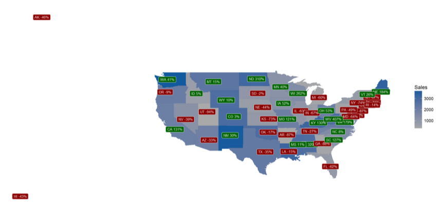
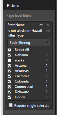
Notice how we have data included for Alaska and Hawaii but those states are not drawn. We want to remove the Alaska and Hawaii data points. Add the StateName field to the Page Level Filters and then click Select All. Now, un-check the boxes next to Alaska and Hawaii. The data is now clean and the map correctly displays only the continental United States.
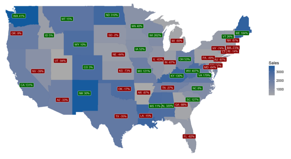
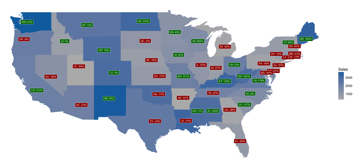
Here is the filtered final map product.
Thanks for following along. I hope you enjoyed this tutorial. Please share if you liked this content. See you next week.