Fixing the Truncating Bar Chart
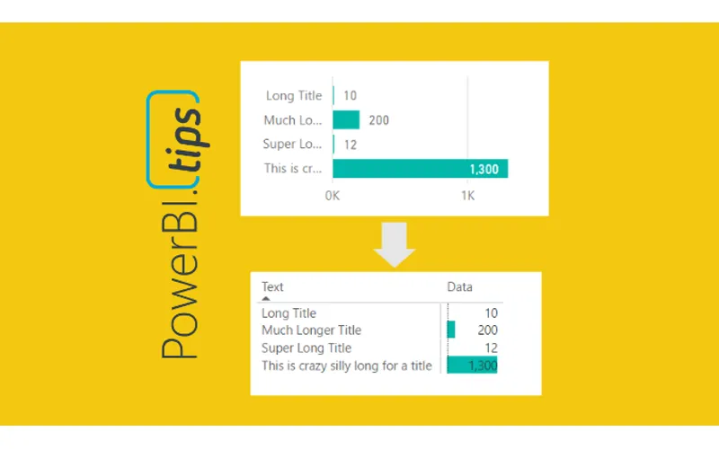
The more you work with Power BI Desktop it is more than likely you will find some tool limitations that impact your overall design pursuits. As I have worked with data visualization software, I find there is always a balance between what I want to make and what is possible. The more you become familiar with your visualization tool, the better you think of report designs that are both beautiful and feasible. One such design style that I use is to limit the use of slicers on the report page as much as possible. My solution for removing slicers is adding a stacked bar chart or a stacked column chart. The chart can be used as a slicer because you can click on the data bars and filter the page of data. One of the visualization limitations I’ve had to work around was the ability to make a stacked bar chart with long y-axis titles. In order to overcome this limitation we need to fire up our creativity to figure out another way to more accurately control the y-axis labels and the associated bar chart.
There are two main issues we will need to solve:
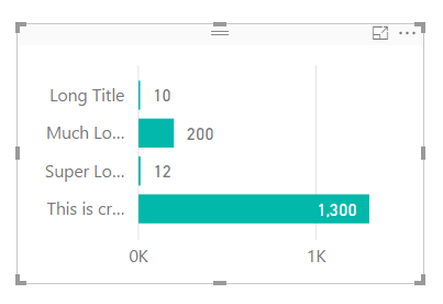
First issue, when you have text along the y-axis in the stacked bar chart, the text becomes truncated. See below.
Stacked Bar Chart
Note: All the text next to each bar is truncated if the text is to long. This can be fixed by extending the visual to a ridiculous length, as illustrated by the following picture. While this solves the text issue, this totally defeats the purpose of this visual, provide a “slicer” that can be used to filter the report page with minimal space consumption.
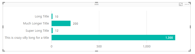
Super Long Stacked Bar Chart
Second issue, when there are super small values next to large values, it is almost nearly impossible to click on the bar to enable the filtering. In the example image above, it’s easy to click on the value of 1,300 but almost impossible to click on the value of 10. Womp, Womp, and clicking on the bar text value does not enable filtering, insert ridiculous horn sound, or other familiar but annoying horn sound (as recommended by one of our readers Terence).
After some playing around with various visuals here is what I came up with. First, you must change the visual from a stacked bar chart to the matrix visual. On the Visualizations pane click on the Matrix visual.
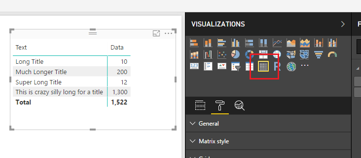
Matrix Visual
This will change the visual to a matrix. It’s a little busy so we will clean it up a bit. On the Visualizations pane change the Matrix style to None, then open up the Subtotals section and set Row subtotals to Off. Your visual should now look similar to the following:
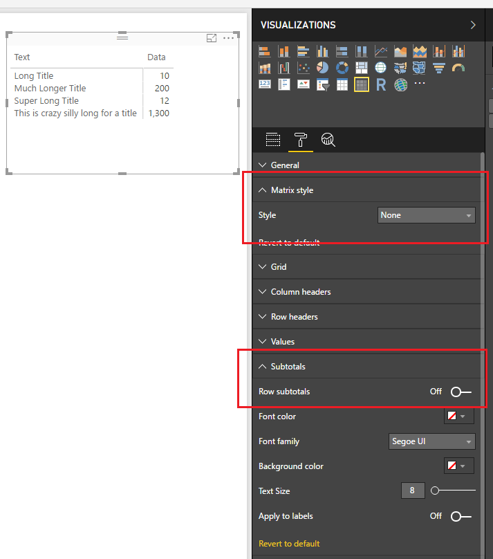
Change Matrix Style
Next we will add the “bars” to the visual. Open the Conditional formatting section and turn Data bars to On.
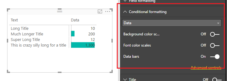
Turn on Data Bars
Short and sweet. Now we can properly resize the “text labels” of the y-axis and when we try to select small values such as 10, we are presented with a little grey selector bar, enabling us to select very small values.
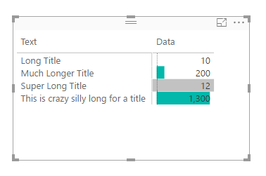
Grey Selector Highlighting Bar
When you compare all three items side by side you can see that the most condensed version is the Matrix visual with conditional formatting bars. This provides you much more control when dealing with data that contains long text labels.
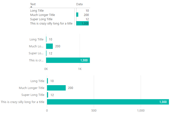
Comparison of Bar Charts
Note: There are many ways you can format your matrix to get the desired look. This tutorial is simply covering one type of look. Additionally, you could hide the text and grid completely by making the grid and column title colors of those match the color of your background, or use could choose one of the many of the grid type options to fit your style needs.
Thanks for following along, as always if you found this helpful please share it with someone who might find this helpful.