

This is part 2 in the 3 part series on developing super cool tables using some fancy measures. In part 1 we walked through how to build a table that uses an un-pivoted data source in the Query Editor. This technique allows you to change the types of categorical values in a table. If you missed part 1 and want to get caught up follow this link. Now, continuing with the series, Part 2, we will build the supporting materials (Selector Table, What If Slicers, and measures) for the report.
Once we are done the final product will look like the following:
Part 2… Go.
To make sure we are starting off on the correct step. We left off part 1 when we had completed a Pivoted Data Table and included an Attribute Slicer that would allow us to toggle between the Manager and Region Categories. Your table should look like the following diagram: (If you don’t have this you might want to start with Part 1 found here)
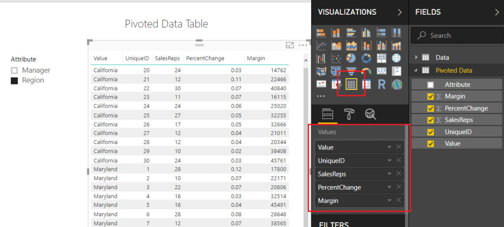
Note: I have also included a Slicer which is used with the Attribute field.
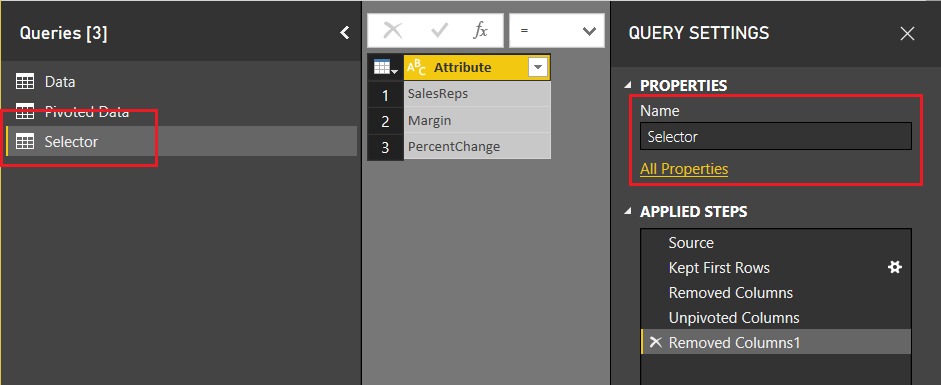
Next, we will need to add a table that will allow us to use the SalesReps, PercentChange, and Margin column headers in our report. On the Home ribbon click Edit Queries, then select New Source on the Home ribbon. In the Get Data window select Blank Query, click Connect to proceed. Open the advanced editor by clicking the Advanced Editor button found on the Home ribbon. Enter the following M code into the Advanced Editor:
let
   Source = #"Pivoted Data",
   #"Kept First Rows" = Table.FirstN(Source,1),
   #"Removed Columns" = Table.RemoveColumns(#"Kept First Rows",{"Attribute", "Value", "UniqueID"}),
   #"Unpivoted Columns" = Table.UnpivotOtherColumns(#"Removed Columns", {}, "Attribute", "Value"),
   #"Removed Columns1" = Table.RemoveColumns(#"Unpivoted Columns",{"Value"})
in
   #"Removed Columns1"
Click Done to close the Advanced Editor. Rename the table to Selector. When you are finished your table should look like the following:
Click Close & Apply on the Home ribbon to close the Query Editor. Add a slicer with the following selections:
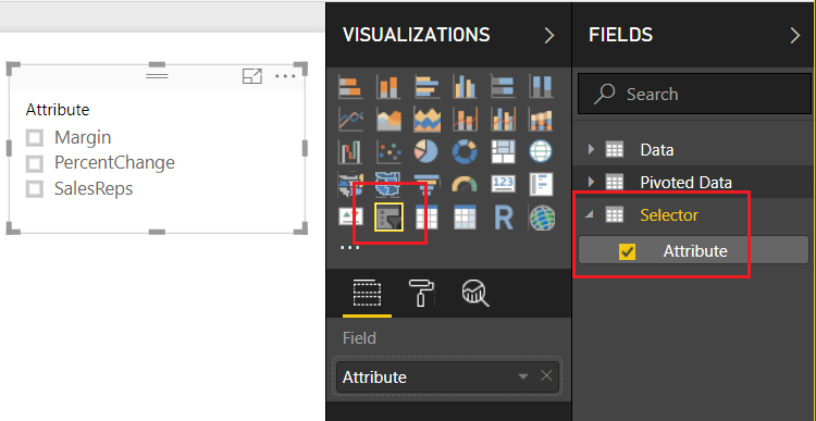
Now, we want to detect which of the Attributes have been selected from this table. We can accomplish this by creating a measure using the DAX function SELECTEDVALUE. Right Click on the table named Selector and from the drop down select New Measure. Enter the following DAX equation:
rankBy = SELECTEDVALUE(Selector[Attribute])
In addition to the knowledge of which column was selected from the selector table, we will also want to detect to make sure at least one categorical value has been selected. The categorical values we are talking about were generated earlier. The values could be either the Manager or Region values of the Attribute column in the Pivoted Data table. Using the ISFILTERED DAX function enables this section. Add the following measure to the Pivoted Data table:
Attribute Filtered = ISFILTERED('Pivoted Data'[Attribute])
Next, we need to gather some user input in the form of a number from 1 to 10. To input this information we need to produce a What If Parameter. On the Modeling ribbon click New Parameter in the What If section of the ribbon. Enter the following information into the What-if parameter dialog box:
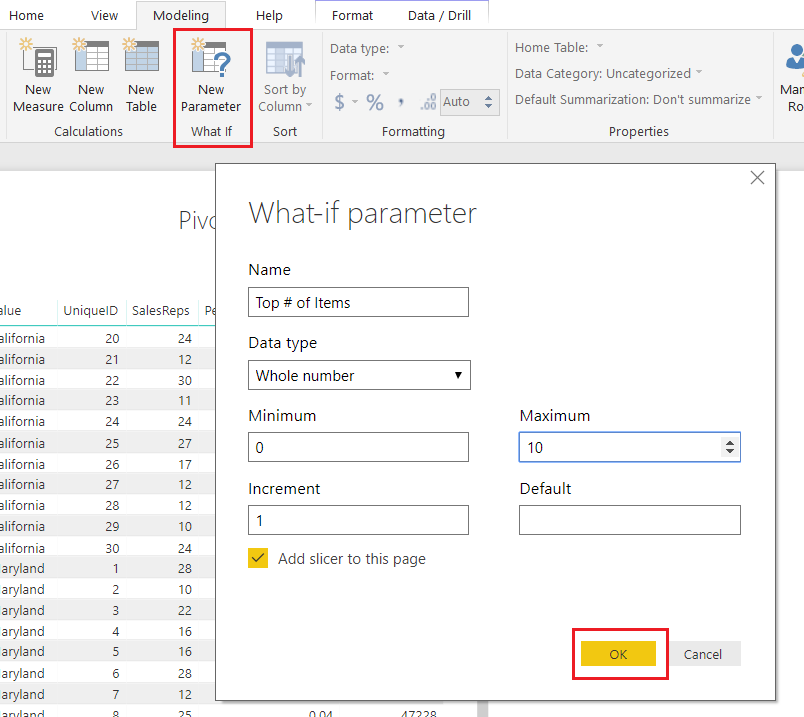
Note: Don’t forget to change the Name of the parameter.
Click OK to proceed. Power BI will automatically produce a measure table, a measure and a slicer on the report page.
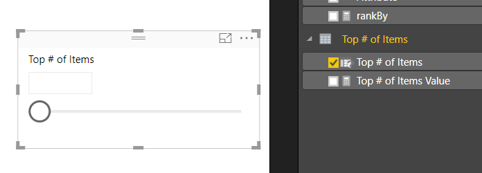
Note: By default there is nothing selected in the box. However, you can adjust the slicer and a number will appear within the value box. You can also type in a number between 1 and 10 to the box to adjust the value.
This is where we go crazy with DAX. This portion of DAX is where all the magic happens.
We start off by building our totals measures. Place all these measures in the Pivoted Data table.
Total % Change = MAX( 'Pivoted Data'[PercentChange] )
Total Margin = SUM( 'Pivoted Data'[Margin] )
Total SalesReps = SUM( 'Pivoted Data'[SalesReps] )
These will be used repeatedly in our next group of DAX formulas.
The following measures will produce a calculated ranking for each numerical column. OK, Pause, This part really excites me here because the next few measures are where the magic happens. Pay close attention to what is happening here. Un-Pause, by using the DAX Switch function we can dynamically tell Power BI to adjust which column we want to see ranked by the top items. For example, if we select SalesReps in our attribute slicer. The following measures will automatically rank all the items in the table by the column named SalesReps. Thus, the items with the highest counts of SalesReps will be listed first. When you select Margin, the table will automatically adjust and re-rank the items by the Margin column. This is being done in the switch statement. For each column we are calculating custom rankings and then hiding or replacing values with the Blank() DAX function to not show items we don’t want.
Enter the following three measures into the Pivoted Data Table:
Rank Margin = if( [Attribute Filtered],
    SWITCH( [rankBy]
        ,"Margin", CALCULATE( [Total Margin], FILTER('Pivoted Data', RANKX( ALLEXCEPT('Pivoted Data','Pivoted Data'[Value]), [Total Margin]) <= [Top # of Items Value]) )
        ,"PercentChange", CALCULATE( [Total Margin], FILTER('Pivoted Data', RANKX( ALLEXCEPT('Pivoted Data','Pivoted Data'[Value]), [Total % Change]) <= [Top # of Items Value]))
        ,"SalesReps", CALCULATE( [Total Margin], FILTER('Pivoted Data', RANKX( ALLEXCEPT('Pivoted Data','Pivoted Data'[Value]),[Total SalesReps]) <= [Top # of Items Value]))
    )
    , BLANK() )

Rank PercentChange = if( [Attribute Filtered],
     SWITCH( [rankBy],
       "PercentChange", CALCULATE( [Total % Change], FILTER('Pivoted Data', RANKX( ALLEXCEPT('Pivoted Data','Pivoted Data'[Value]), [Total % Change]) <= [Top # of Items Value]))
       ,"Margin", CALCULATE( [Total % Change], FILTER('Pivoted Data', RANKX( ALLEXCEPT('Pivoted Data','Pivoted Data'[Value]), [Total Margin]) <= [Top # of Items Value]))
       ,"SalesReps", CALCULATE( [Total % Change], FILTER('Pivoted Data', RANKX( ALLEXCEPT('Pivoted Data','Pivoted Data'[Value]), [Total SalesReps]) <= [Top # of Items Value]))
    )
    , BLANK() )

Rank SalesReps = if( [Attribute Filtered],
    SWITCH( [rankBy]
        ,"SalesReps", CALCULATE( [Total SalesReps], FILTER('Pivoted Data', RANKX( ALLEXCEPT('Pivoted Data','Pivoted Data'[Value]), [Total SalesReps]) <= [Top # of Items Value]))
        ,"Margin", CALCULATE( [Total SalesReps], FILTER('Pivoted Data', RANKX( ALLEXCEPT('Pivoted Data','Pivoted Data'[Value]), [Total Margin]) <= [Top # of Items Value]))
        ,"PercentChange", CALCULATE( [Total SalesReps], FILTER('Pivoted Data', RANKX( ALLEXCEPT('Pivoted Data','Pivoted Data'[Value]), [Total % Change]) <= [Top # of Items Value]))
    )
    , BLANK() )
Whew, that was a ton of measures. All the key components are complete now. In part 3 we will clean up our report page and make it shine. I hope you enjoyed this tutorial. Also, follow me on Twitter and Linkedin where I will post all the announcements for new tutorials and content.
 |
 |