PowerBI.tips

Make Custom Visuals – Create a Bar Chart
February 12, 2019 By Mike Carlo
Make Custom Visuals – Create a Bar Chart

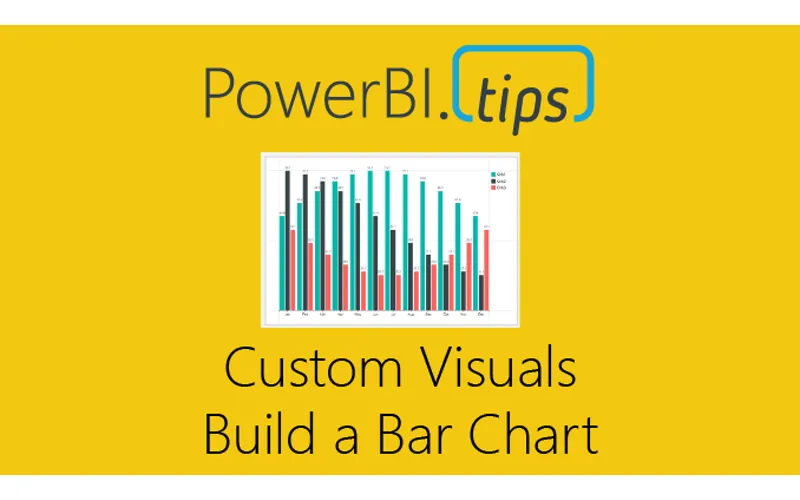
With the release of the custom visuals building tool Charts.PowerBI.Tips we received a number of comments requesting tutorials on how to build visuals.  Ask and you shall receive!  Below is a basic tutorial on how to create a Bar chart.  Within this tutorial we review a couple of the features of the chart tool and how to use them.

Video Tutorial on Building a Basic Bar Chart Custom Visual

Comment below on other topics you would like to see.

Previous

Temple of DAX – 3D

More Posts

Feb 13, 2026

Define the Problem Before Tools – Ep. 498

Mike and Tommy tackle a mailbag question about defining problems before choosing tools — and why goal setting matters more than ever in a world where AI lets you build anything. Plus, the January 2026 Fabric feature updates drop with 17 noteworthy items.

Feb 13, 2026

Trusting In Microsoft Fabric – Ep. 502

Mike and Tommy dive deep into whether Microsoft Fabric has earned our trust after two years. Plus, the SaaS apocalypse is here, AI intensifies work, and Semantic Link goes GA.