Month: December 2019

  • Introducing Scrims

    Introducing Scrims

    PowerBI.tips is excited to announce our new tool to help you build the best looking reports, Scrims.

    We’ve built out a fast and easy solution for snapping visualizations into place while giving your reports the extra special look and feel that allows your audiences to be impressed without losing focus on the important stuff. We developed Scrims to give you this shortcut to amazing looking reports
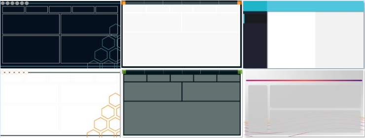
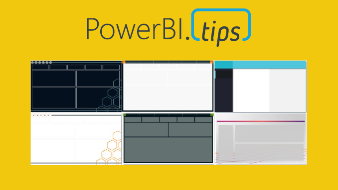
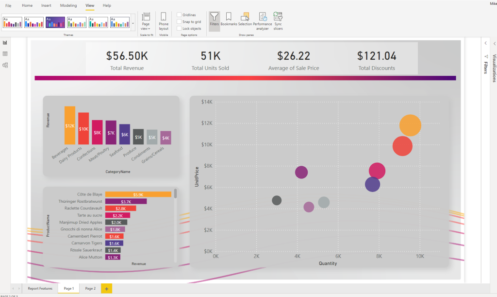
    16:9 (1280 x 720) examples

    What are Scrims?

    A Scrim is a background image that you would use on your Power BI Report pages. Why the name Scrim? The term scrim is used in theater productions. It is a backdrop that is placed on the stage behind the actors. It adds context & engages the audience with the production. We thought this idea crosses over well with Power BI.

    A scrim can change the mood of a theater just like a well designed background image in your report. Scrims were developed to be easily adaptable to different color themes and in each set of offerings we release we’ll be providing you with as many color options as possible.

    Why Do I need One?

    Scrims solve several problems.

    1. The most important problem it solves is time. As BI practitioners ourselves we know the demands that are placed on you. More often then not the visual look and feel gets the least amount of attention due to deadlines. We want all the time you invest in the data and building visuals to impress your audiences by being presented in a beautiful way.
    2. Scrims are designed the same way we developed Layouts. By emphasizing proper design focused on the Gestalt design principles to ensure the end users experience enjoyable and non-distracting reports.
    3. Using a Scrim you will reduce the number of objects on the page. Less elements means faster rendering reports. Here is a blog that tests this by adding more visuals to a page “More Visuals Mo Problems”. Scrims add the illusion of a very large number of objects without a negative impact.

    Scrims come in a Bundle

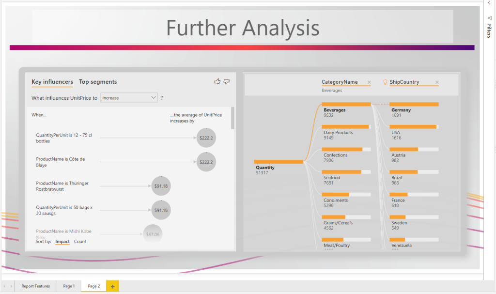
    A Scrim bundle contains a series of images that you can use in any way you want in your Power BI file. Each Scrim will have different page sizes to best suit your report needs. Every Scrim will contain a default 16 x 9 (1280 x 720) aspect ratio. Most Scrim bundles will have additional ratios such as 8 x 9 (1280 x 1440) or 4:3 (960 x 720). You will see the sizes prominently displayed for each bundle with the red tags.
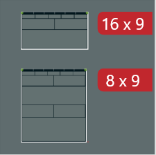
    8:9 (1280 x 1440) examples

    Each bundle contains 6 pages minimum for each size, which means on average you will receive at least 12 pages in each bundle. Each Scrim bundle also includes the color theme that corresponds with it in JSON format to easily upload into your Power BI Report.

    Theme Color example
  • Scrims Instructions

    Scrims Instructions

    Thanks for your interest in our product Scrims. For more details on what is a scrim click this link to Learn More.

    Download a scrim from the products page. You can access all the available scrims here.

    Instructions

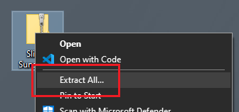
    After downloading, you will have a Zip file stored on your computer. Right Click on the zip file and Select the option Extract All from the drop down menu.

    Right click menu option Extract All

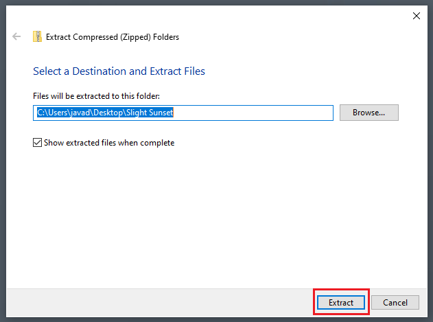
    The extract compressed folder menu will appear. Click on the Extract button found in the bottom right corner of the menu.

    Extract Compressed folder dialog box.

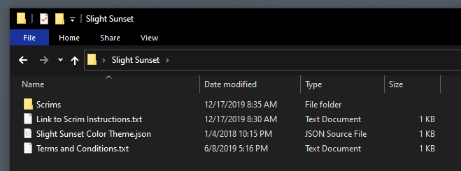
    A new folder will be extracted to the location noted in the previous menu screen. Open the newly created folder. Within this folder you will find all the images for the Scrims and a JSON theme file to use within your report.

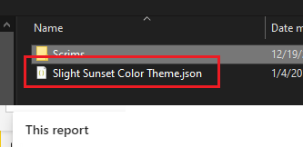
    Folder contents, Scrims images, links to instructions, terms & conditions, and color theme file.

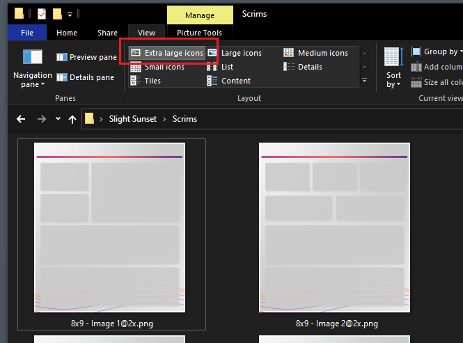
    When working with scrims it is helpful to see which image contains the the correct background layout for each of your pages. I find that it is helpful when reviewing images as Extra large icons. To turn this on, Open the View ribbon in the File Explorer. Then in the Layout window select the option titled Extra large icons.

    Change view of File Explorer to Extra Large Icons

    Add Scrims to Report

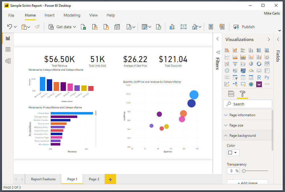
    Open a Power BI report in the Power BI Desktop application.

    Image of a Power BI report in Power bi desktop

    Note: Reports do not necessary have to be brand new. You can use scrims on existing reports. For illustration purposes an existing report was opened with only visuals. The remainder of this tutorial will show you how to add scrims to a pre-developed report.

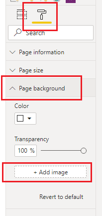
    Click on the Paint Roller button. Then Open up the Page background item in the menu options. Click on the option labeled Add image.

    Note: for these options to appear you have to have a report open and none of the visuals selected on the page.

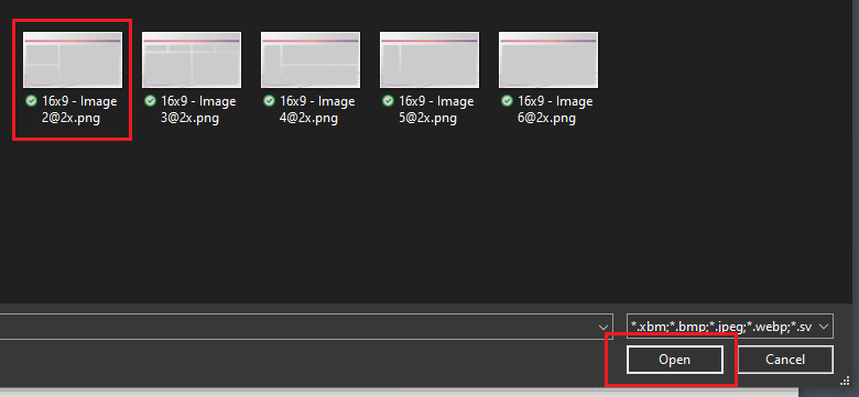
    In the open file selection dialog box pick the scrim that you want to load. Click on Open to load the image to the report page.

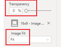
    The image will not initially appear. This is because the default settings for background are set incorrectly for this feature. Change the transparency to 0% and adjust the Image Fit to the drop down option of Fit.

    Note: Images provided in scrims are larger than the report page pixel size. This is because in order for the images to not look blurry we have to supply a larger image. The Fit feature then scales the image back down to the report canvas size but retains a crisp and clean look.

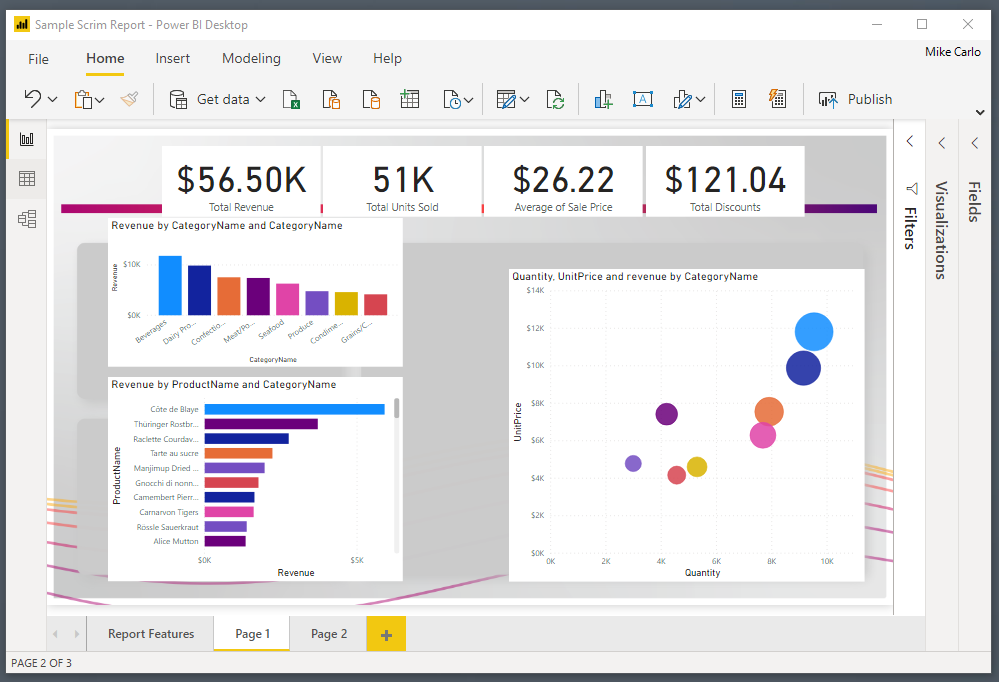
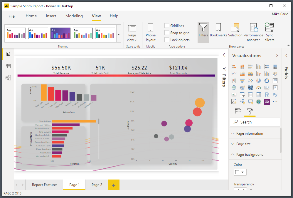
    Our report should now look similar to the following:

    Add JSON Themes

    Initially the visuals will not be formatted for the style of the report. We can control this by using a JSON theme file to pre-format some options for the visuals.

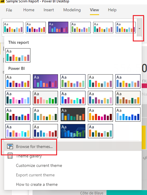
    On the View ribbon, select the Drop Down Arrow icon. Then Select the option at the bottom of the menu titled Browse for themes…

    Navigate to the scrims download folder and add the supplied theme with scrim download.

    This will apply formatting for the colors and some Visual style properties.

    Clean up Visuals

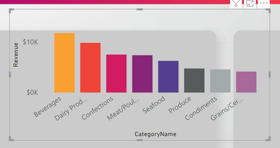
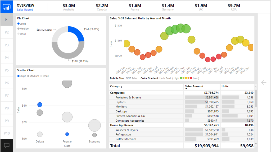
    Next Select individual visuals and Align them to the defined areas within the scrim.

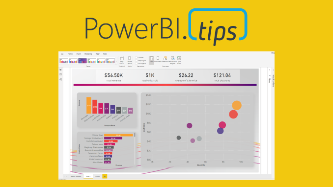
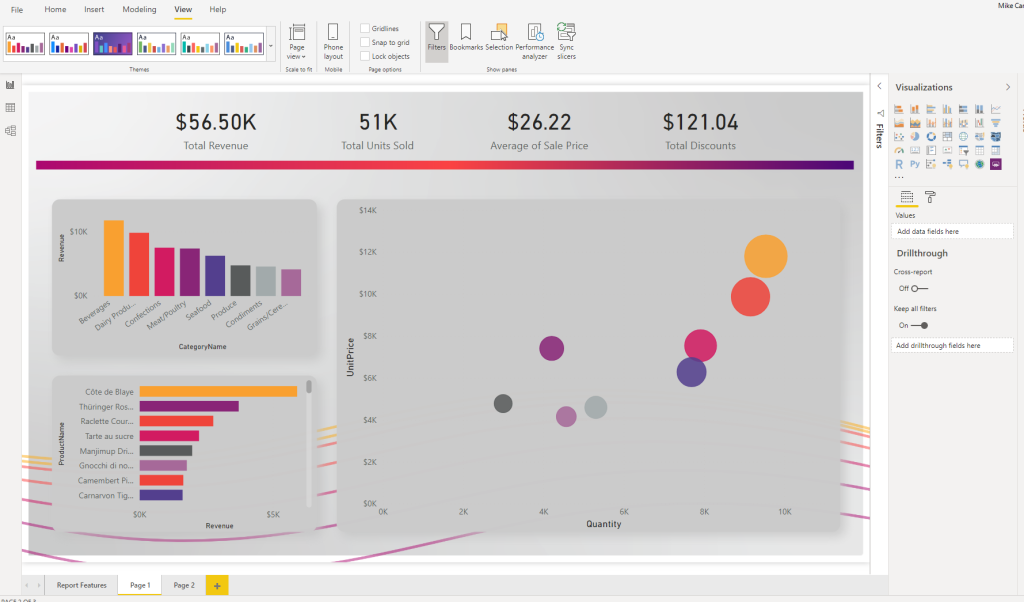
    See sample image below with visuals aligned to the scrim.

    Finalize Report

    Apply any additional style properties for your visuals. In the below image the following settings are added for reference:

    • The top 4 cards are grouped and the group
    • The Grouped cards were applied a background of white @ 40% transparency
    • Labels were added to the bar charts
    • Unneeded axis were removed from the bar charts for clarity
    • White lines were added to the scatter chart for x and y axis

    Then rinse wash and repeat for every other page you need to develop.

    Here is a completed sample of this report:

    Check out scrims today

  • More Visuals Mo Problems

    More Visuals Mo Problems

    In some recent conversations the notion of minimizing the number of required visuals came up as a topic. While I know from talking with the Microsoft development team more visuals on a report page increases load time. But I haven’t been able to find any substantial numbers on how performance is impacted by increasing the visual count on a page. Spoiler alert, adding a ton of visuals to a page slows it down.

    Test Set up

    To begin our test I started with a know report the Microsoft September 2018 Layout. This was a good sample as it already had a number of visuals and buttons on the page. I then proceeded to create a single text box with some text in it. Then copy the text box over one hundred times. All the text boxes are placed into a single group. Grouping the text boxes allows for the ability to toggle on and off all of the visuals with a single click.

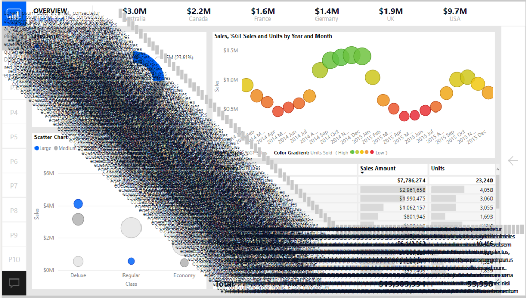
    Here is the before image of the report with the text boxes turned off:

    Now with all 100 text boxes turned on. Yes, not pretty I know, but it makes the point.

    Conducting the Test

    Now that the set up was complete we are able to use the performance analyzer to render all the visuals on the page.

    To open the performance analyzer with the new modern Power BI ribbon. Navigate to the View ribbon and click on the Performance analyzer button.

    With the Performance analyzer window open we Click the Start Recording button. This begins how the visuals perform when you interact with the report.

    There are two options at this point to start recording data.

    1. We can click on items on the report page
    2. Click the Refresh visuals button to refresh the entire page

    I chose option number two since I wanted a consistent method to record performance. This removes any human error by performing a sequence of clicks across the screen.

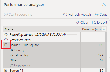
    After clicking the Refresh visuals the Performance analyzer generates a ton of data that we can sift through to understand performance of the report page. You can expand on one of the visual elements to understand how many milliseconds it takes for the visual to render by function.

    Note: For more details on each performance component read up on the Microsoft documentation found here: https://docs.microsoft.com/en-us/power-bi/desktop-performance-analyzer

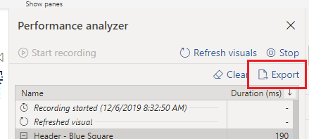
    We can now export the data from the recording by Clicking the Export button.

    For my test I ran 5 performance tests with the text boxes turned off and 5 tests with the text boxes turned off. The process was the following:

    1. Click Start Recording
    2. Click Refresh visuals
    3. Click Export to extract the data, name the file for future review
    4. Click Clear to remove all data
    5. Go back to step 2 to Refresh visuals
    6. Repeat process until 5 performance tests are complete
    7. Turn on the Text boxes and repeat the process for 5 performance tests

    The Test Results

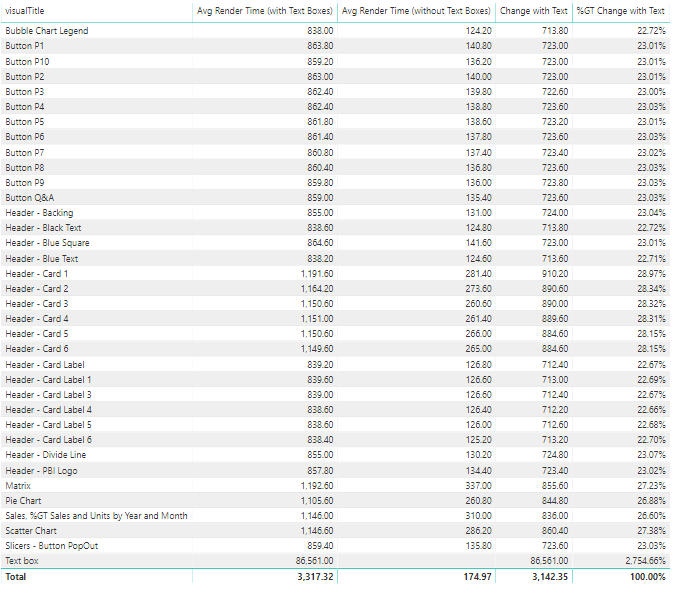
    Finally we can dig into the data and figure how much impact we incurred from all the visuals. After a bit of playing around with the datasets in Power Query we are able to come up with the following results.

    At a high level adding the 100 extra text boxes increased the load time from 174 ms up to 3,100 ms which is a approximately a staggering 1700 % increase in load time.

    Here is the detailed break down for average load times compared with and without text boxes.

    There are some interesting notes here. When we added the text boxes it caused all other visuals to increase load time from 22 up to 28 % percent longer per object. Clearly the text boxes took the longest to render.

    If you’d like to test this on your own, you can download these materials from this GitHub location: https://github.com/MikeCarlo/PBIReportVisualPerformanceTest

    Implications & Observations

    After completing this test there were a couple of observations that I felt would be best practices when building future reports.

    1. It is important to take time to clearly label your visual elements on the report canvas. Doing so makes it easy to identify each item in the performance analyzer.
    2. Increasing the number of visuals on a page hurts rendering performance. So think carefully about how many visuals you need to add to convey the data story you are trying to tell.
    3. When a visual is not shown it does not impact performance rendering of the page.
    4. A trend I am seeing is individuals are creating really long pages. Meaning the page is 1280 x 3000 or even 4000 pixels long. This is a nice feature that lets the report consumer scroll through multiple visuals. However, this has an unintended consequence adding all the extra visuals is slowing the time for the report to render. Instead of increasing the page length it would be better to control which visuals are being shown by using Bookmarks and Grouping. To learn more about bookmarks & grouping visuals visit:
    5. Limit adding style elements such as drop shadows and visual shading images as these will increase load speeds. Instead push those types of changes down to a background image that can be placed on the page. This is the technique used in creating PowerBI.Tips layouts.

    If you like the content from PowerBI.Tips please follow us on all the social outlets. Stay up to date on all the latest features and free tutorials.  Subscribe to our YouTube Channel.  Or follow us on the social channels, Twitter and LinkedIn where we will post all the announcements for new tutorials and content.

    Introducing our PowerBI.tips SWAG store. Check out all the fun PowerBI.tips clothing and products:

    Check out the new Merch!

    Hasta La Vista Data
    Go Ahead Make My Data
    PBIX Hat