In some recent conversations the notion of minimizing the number of required visuals came up as a topic. While I know from talking with the Microsoft development team more visuals on a report page increases load time. But I haven’t been able to find any substantial numbers on how performance is impacted by increasing the visual count on a page. Spoiler alert, adding a ton of visuals to a page slows it down.
Test Set up
To begin our test I started with a know report the Microsoft September 2018 Layout. This was a good sample as it already had a number of visuals and buttons on the page. I then proceeded to create a single text box with some text in it. Then copy the text box over one hundred times. All the text boxes are placed into a single group. Grouping the text boxes allows for the ability to toggle on and off all of the visuals with a single click.
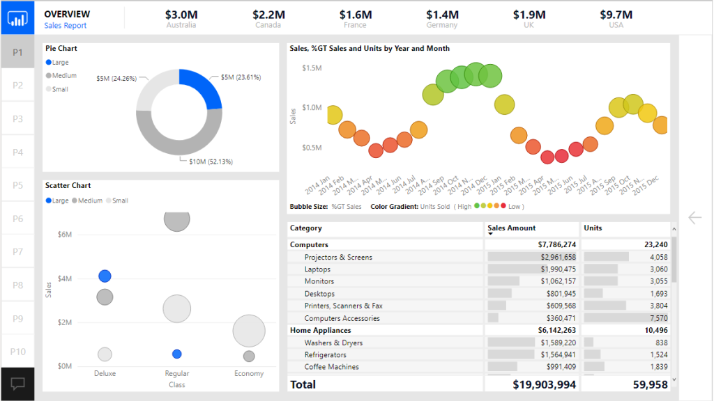
Here is the before image of the report with the text boxes turned off:
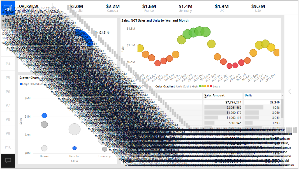
Now with all 100 text boxes turned on. Yes, not pretty I know, but it makes the point.
Conducting the Test
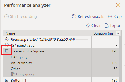
Now that the set up was complete we are able to use the performance analyzer to render all the visuals on the page.
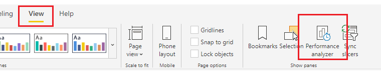
To open the performance analyzer with the new modern Power BI ribbon. Navigate to the View ribbon and click on the Performance analyzer button.
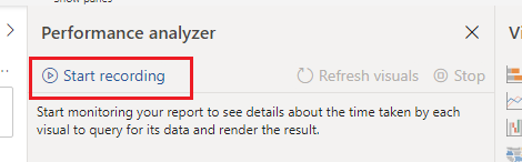
With the Performance analyzer window open we Click the Start Recording button. This begins how the visuals perform when you interact with the report.
There are two options at this point to start recording data.
- We can click on items on the report page
- Click the Refresh visuals button to refresh the entire page
I chose option number two since I wanted a consistent method to record performance. This removes any human error by performing a sequence of clicks across the screen.
After clicking the Refresh visuals the Performance analyzer generates a ton of data that we can sift through to understand performance of the report page. You can expand on one of the visual elements to understand how many milliseconds it takes for the visual to render by function.
Note: For more details on each performance component read up on the Microsoft documentation found here: https://docs.microsoft.com/en-us/power-bi/desktop-performance-analyzer
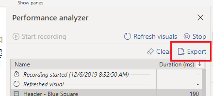
We can now export the data from the recording by Clicking the Export button.
For my test I ran 5 performance tests with the text boxes turned off and 5 tests with the text boxes turned off. The process was the following:
- Click Start Recording
- Click Refresh visuals
- Click Export to extract the data, name the file for future review
- Click Clear to remove all data
- Go back to step 2 to Refresh visuals
- Repeat process until 5 performance tests are complete
- Turn on the Text boxes and repeat the process for 5 performance tests
The Test Results
Finally we can dig into the data and figure how much impact we incurred from all the visuals. After a bit of playing around with the datasets in Power Query we are able to come up with the following results.
At a high level adding the 100 extra text boxes increased the load time from 174 ms up to 3,100 ms which is a approximately a staggering 1700 % increase in load time.
Here is the detailed break down for average load times compared with and without text boxes.
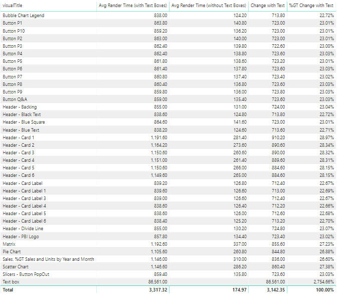
There are some interesting notes here. When we added the text boxes it caused all other visuals to increase load time from 22 up to 28 % percent longer per object. Clearly the text boxes took the longest to render.
If you’d like to test this on your own, you can download these materials from this GitHub location: https://github.com/MikeCarlo/PBIReportVisualPerformanceTest
Implications & Observations
After completing this test there were a couple of observations that I felt would be best practices when building future reports.
- It is important to take time to clearly label your visual elements on the report canvas. Doing so makes it easy to identify each item in the performance analyzer.
- Increasing the number of visuals on a page hurts rendering performance. So think carefully about how many visuals you need to add to convey the data story you are trying to tell.
- When a visual is not shown it does not impact performance rendering of the page.
- A trend I am seeing is individuals are creating really long pages. Meaning the page is 1280 x 3000 or even 4000 pixels long. This is a nice feature that lets the report consumer scroll through multiple visuals. However, this has an unintended consequence adding all the extra visuals is slowing the time for the report to render. Instead of increasing the page length it would be better to control which visuals are being shown by using Bookmarks and Grouping. To learn more about bookmarks & grouping visuals visit:
- https://powerbi.tips/2019/09/grouping-with-style/
- https://powerbi.tips/2016/11/grouping-and-improved-date-slicer/
- https://powerbi.tips/2019/11/scale-a-visual/
- https://powerbi.tips/2019/11/consolidate-report-pages-easily-with-visual-grouping/
- https://powerbi.tips/2019/08/dynamic-visuals-using-buttons/
- Limit adding style elements such as drop shadows and visual shading images as these will increase load speeds. Instead push those types of changes down to a background image that can be placed on the page. This is the technique used in creating PowerBI.Tips layouts.
If you like the content from PowerBI.Tips please follow us on all the social outlets. Stay up to date on all the latest features and free tutorials. Subscribe to our YouTube Channel. Or follow us on the social channels, Twitter and LinkedIn where we will post all the announcements for new tutorials and content.
Introducing our PowerBI.tips SWAG store. Check out all the fun PowerBI.tips clothing and products:
Check out the new Merch!