Tag: Bar Chart

  • Import Color Theme & Color Theme Generator

    Import Color Theme & Color Theme Generator

    March is an exciting month, and with this release of Power BI we have been given some long asked for features. One such feature is the ability to import a color theme. The color theme defines the starting colors for your visuals. Before the ability to import a theme one would have to first define each color that they want to use in a Power BI report by changing each visual to have the correct color scheme. Color themes are useful when trying to make a dashboard and you want to use colors that resemble a company’s product or logo. Alright, let’s get started and make and add our own color theme to a report.

    Begin by opening up Power BI Desktop. Make sure you have the latest version of Power BI Desktop, you can download the latest version here. The import color theme feature is available in the March 2017 release.

    On the Home ribbon click the Enter Data button.  Enter the following table of data and name the table Data.

      Product    Value
    Item120
    Item225
    Item315
    Item440

    The Create Table should look similar to the following.  Click the Load button to proceed.
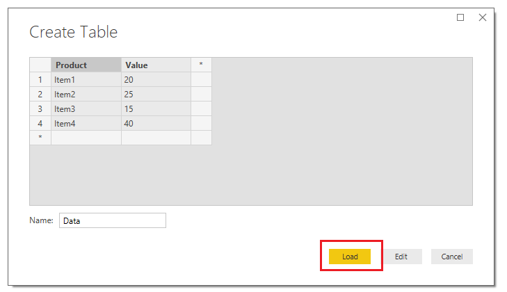
    Load Data Table
    Load Data Table

    Power BI will load the data to memory and the Fields pane will reveal our newly created columns. Add the Stacked Column Chart on the report page and appropriate fields shown in the image below.  You will notice that the default colors are automatically overlaid onto our visual when we add the Product to the Legend visual field.
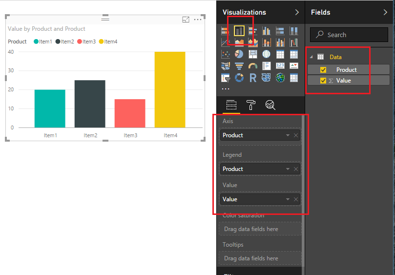
    Add Stacked Column Chart
    Add Stacked Column Chart

    Next, let’s take a peek at the standard colors that are offered by default from Power BI.  Click on the Paint Roller found in the Visualizationpane.  Then expand the data field labeled Data colors.  Under Item1 click the little triangle.  This will expose the current color scheme that is loaded.
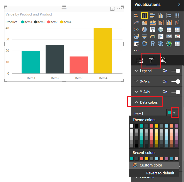
    Default Color Scheme
    Default Color Scheme

    Now we will load the new color theme.  But before we can load the color theme we have to generate the color theme first.  The color theme has some requirements.  First the color theme must be written as a JSON file and must adhere to the JSON format.  For developers this will be a very simple google search to accomplish this.  However, I know there are some out there that do not enjoy doing development work.  So, in a PowerBI.Tips first, I have developed a custom tool to make the color theme generation super simple.

    Introducing the PowerBI.Tips Color Theme Generator (CTG) to help Power BI users create quick and easy JSON code files to input into Power BI for the color themes. Not everyone has a coding background, and though there will be tutorials and examples of how to set up the JSON, if you aren’t familiar with the language a small typo could have you spending precious time troubleshooting the issue.

    update 3/15/17: The Advanced Theme Generator has been released.  Find the tool here.

    Click the following link to open up the PowerBI.Tips Color Theme Generator in a different Browser window.  Once the browser loads the Color Theme Generator follow the instructions listed at the top of the page to select your colors.  The only required fields are the Name, and at least one color.  For this tutorial I selected a number of nice pastel colors.  Click the Download Color Theme button to download the JSON file that we will use in Power BI.

    Note: The Generator was tested on Google Chrome.  Also, clicking the Download button will download the JSON file to your browser’s default location.  You will need to know this file location to load the file into Power BI Desktop. 
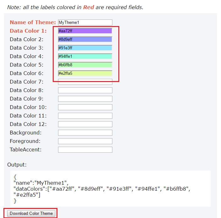
    PowerBI.Tips Color Theme Generator
    PowerBI.Tips Color Theme Generator

    Head back over to Power BI Desktop.  On the Home ribbon click the button labeled Switch Theme.  Then click Import Theme.
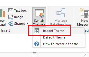
    Import Theme Button
    Import Theme Button

    Note: If you want to remove your custom theme you will click on the Switch Theme, then click on the Default Theme.  The normal power BI colors will be restored.

    Navigate to where your browser downloaded the file.  Select the file labeled PowerBI-Tips Color Theme.  Click Open to load the theme.
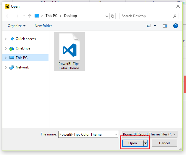
    Load Color Theme
    Load Color Theme

    PowerBI will prompt a message letting you know everything loaded correctly. Click Close to see the new theme applied to our visual.

    Theme Load Successful
    Theme Load Successful

    We can now see our custom theme by clicking on the Paint Roller found in the Visualizations pane.  Then expand the data field labeled Data colors.  Under Item1 click the little triangle.

    Tada, now we have a custom color scheme that we create and loaded.  Also, now that we the JSON file you can modify the file and keep it for future projects.
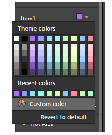
    Loaded Custom Color Theme
    Loaded Custom Color Theme

    Thanks for following along.  If you liked this tutorial please be sure to share.  Also if you want to know more about me you can visit my About page and follow me on twitter or Linkedin for updates.

  • Grouping and Improved Date Slicer

    Grouping and Improved Date Slicer

    In the October update of PowerBI Desktop we were given a number of really useful features, ranging from a new Date Slicer, Grid lines, Grouping, Binning, Top N Filters, and R-powered custom visuals.  For the full release on the October 2016 software release you can read more here.

    For those of you who have followed my site you already know that I absolutely love the ability to create R-visuals within PowerBI.  If you want to learn more you can read the R script tutorials here.

    As I’ve been exploring this October release of Power BI Desktop two features have really stood out.  First, the ability to use the Date Slicer and second the new feature of Grouping for Bar Charts.  In my daily work flow I have struggled in the past with solutions which are now solved.

    Welcome to my love & hate relationship with time bound data sets.  Inevitability at some point you will encounter a need to manipulate data over time.  Common business questions will come in the form of:  What was my percent change compared from this month compared to last month?  What is my sales performance for this year? Are we up or down compared to the same period last year?  While these questions are simple I have found that calculating measures and subsequently building visuals can get very complex in a hurry.  Enter the Date Slicer.  Let me be clear, the Date Slicer will not solve all your problems, it does present a very useful interface that will let report users quickly navigate through their time delineated data.

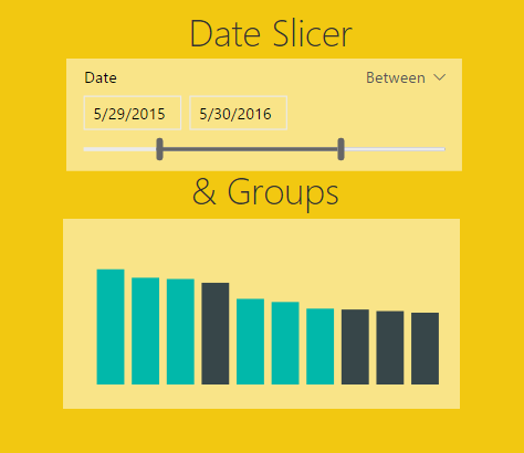
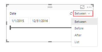
    What is the Date Slicer?  I’m glad you asked. Behold….

    Date Slicer
    Date Slicer

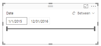
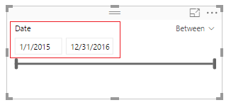
    Here are a couple of key items to point out.  On the left side of the visual you are given the ability to select the starting date, and ending date.

    Start and End Dates
    Start and End Dates

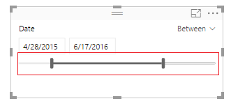
    The bottom of the Date Slicer has an adjustable time bar that allows quick time adjustments.

    Changed Timeline
    Changed Timeline

    On the right side of the visual you can toggle between different date selection modes, Between, Before, After, and List.

    Time Parameter Selector
    Time Parameter Selector

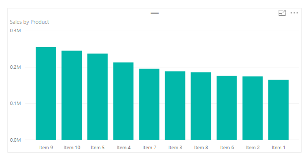
    Ok, enough about the Date Slicer, how about the Groupings feature.  Lets say you start off with a bar chart that looks similar to the following:

    Sample Bar Chart
    Sample Bar Chart

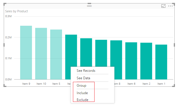
    Well, maybe you’re only interested in Items 9, 10, and 5.  Grouping now allows the selection of multiple bars and by right clicking you can Group, Include, or Exclude.

    Right Click on Selected Data Bars
    Right Click on Selected Data Bars

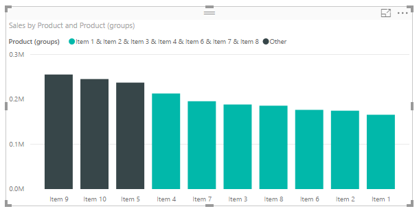
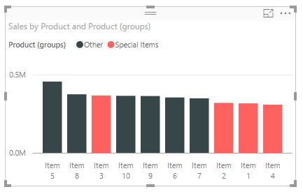
    Clicking group creates a new column in the Fields area that groups the items together and adds them to the chart legend.

    Grouped Items in Bar Chart
    Grouped Items in Bar Chart

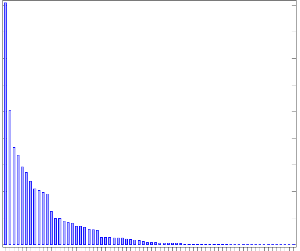
    Let me tell you this is helpful, especially when your bar chart looks like this:

    Ugly Bar Chart
    Ugly Bar Chart

    Be honest, you have published a report or two when there were just way to many bars.  The different between the largest bar and all the small bars barely tells you any information.  This is why grouping is helpful.  When you receive data and you need to focus your story to the important pieces then grouping is your friend.

    Enough babbling, let’s get to the tutorial.

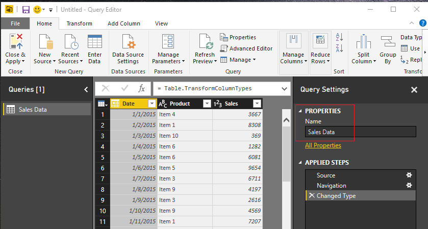
    Open up PowerBI Desktop, Click the Get Data button on the Home ribbon and select Blank Query.  Click Connect to open the Query Editor.  Click Advanced Editor on the View ribbon.  While in the Advanced Editor paste the following code into the editor window, click Done to complete the data load.

    Note: If you need some more help loading the data follow this tutorial about loading data using the Advanced Query Editor.  This tutorial teaches you how to copy and paste M code into the Advanced Editor.

    let
     Source = Excel.Workbook(Web.Contents("https://powerbitips03.blob.core.windows.net/blobpowerbitips03/wp-content/uploads/2016/11/Sales-Data-Two-Years.xlsx"), null, true),
     Sales_Table = Source{[Item="Sales",Kind="Table"]}[Data],
     #"Changed Type" = Table.TransformColumnTypes(Sales_Table,{{"Date", type date}, {"Product", type text}, {"Sales", Int64.Type}})
    in
     #"Changed Type"

    Rename the Query to Sales Data.  Once you’ve completed the data load your data should look like the following.

    Load Sales Data
    Load Sales Data

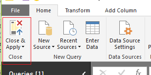
    On the Home ribbon click Close & Apply to complete the data load.

    Close and Apply
    Close and Apply

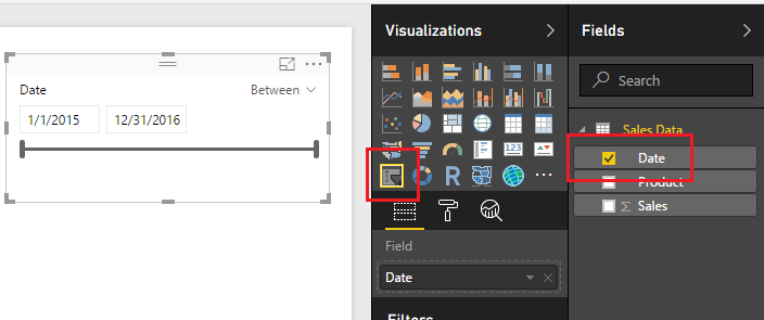
    Great, we are ready to start adding visuals now.  Add a Slicer visual from the Visualizations window and populate the visual with the Date field.  By default, the slicer will auto recognize that the field being added is a date and will automatically show the Date Slicer.

    Add Date Slicer
    Add Date Slicer

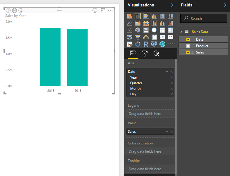
    Next, add a bar chart visualization.  The Date field will be the Axis, and the Sales will be the Value.

    Add Bar Chart
    Add Bar Chart

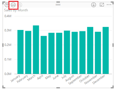
    Again by default the Date filed will be entered as a Hierarchy field.  Click the Drill Down button until you see a monthly view of the date.  This should require two clicks, the first drills down to quarters, then second click drills down to month level.  After doing this your visual should look like the following:

    Drill Down to Month
    Drill Down to Month

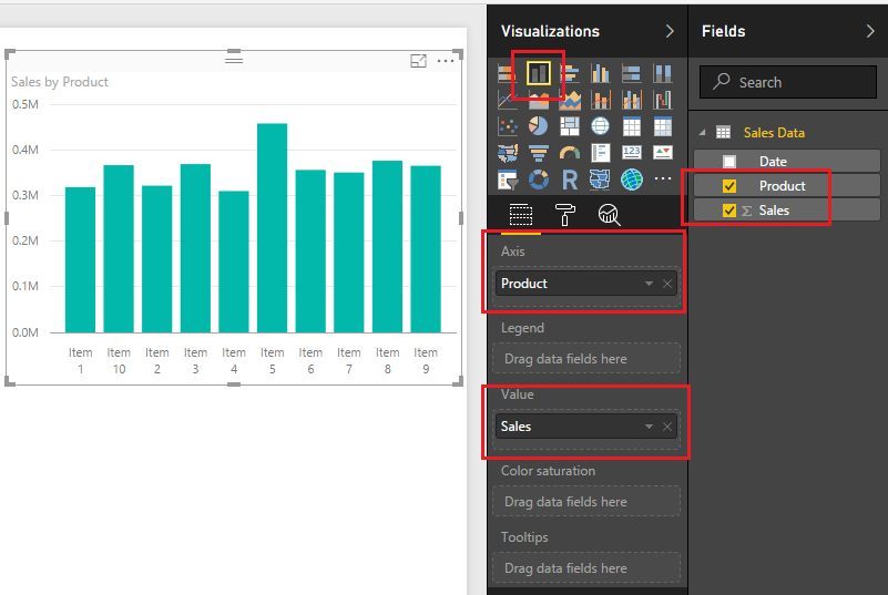
    Add a second bar chart with following fields selected.

    Second Bar Chart
    Second Bar Chart

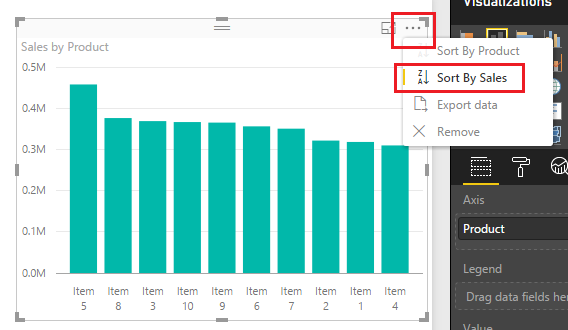
    Sort the Sales by Product bar chart in descending sale order by clicking the Ellipsis and when the drown down menu appears selecting Sort by Sales.
    Descending Sort by Sales
    Descending Sort by Sales

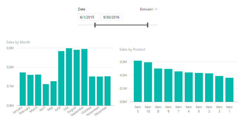
    Now that we have built a couple visuals and a Date Slicer, take some time to explore how the Date Slicer interacts with the bar charts.  In the example below I modified the starting date to 6/1/205 and the ending date to be 9/30/2015.
    Modify Date Slicer Properties
    Modify Date Slicer Properties

    To utilize the grouping feature we will group Items 1,2,3 and 4 together.  While holding the control button click Items 1,2,3 and 4 on the Sales by Product bar chart.

    Ctrl Click Items
    Ctrl Click Items

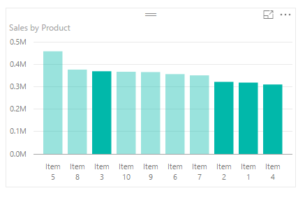
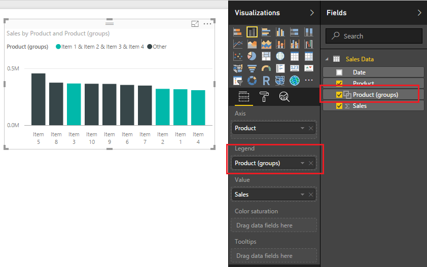
    Right click Item 3 an menu will appear, select Group.  Notice once you do this a new Product (Group) field appears in the field menu and the Product (Group) is automatically added to the legend of the bar chart visual.

    Grouping in Bar Chart
    Grouping in Bar Chart

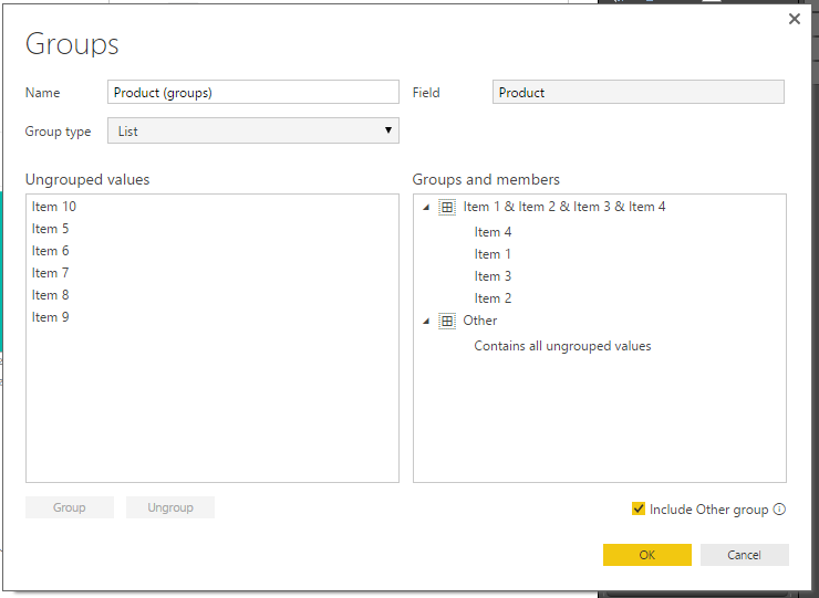
    To edit the grouping you can click on the Field labeled Product (groups) and select Edit Groups.  Doing this reveals the grouping dialog box.

    Grouping Dialog Box
    Grouping Dialog Box

    You can rename the created group by double clicking the name Item 1 & Item 2 & Item 3 & Item 4.  

    Rename Grouping
    Rename Grouping

    Change the name of the grouping to be titled Special Items.  Click OK to close the Groups dialog box. Notice how the bar chart updates the legend values to renamed grouping.

    Rename Group
    Rename Group

    Well, that wraps up this tutorial.  I hope you enjoyed it.  Below is a live demo of what we built today.

    Make sure you share the content if you liked this tutorial.

  • Measures – Intelligent Card Visual – Using DAX

    Measures – Intelligent Card Visual – Using DAX

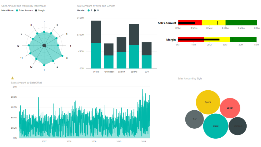
    As I have been exploring PowerBI and building dashboards I have noticed that often the visuals can obscure your data.  As you click on different visuals there is a need to highlight different pieces of data.  Take for example the following dashboard:

    Sample Visual Example
    Sample Visual Example

    Notice the different car types in the bar chart.  As you click on each vehicle type, Diesel, Hatchback, etc.. you expect the data to change accordingly.  In some cases it is helpful to present a card visual to show the user what you selected and any relevant data points you want to highlight.  For example if I select the Diesel vehicle type I may want to know the average sales amount, total sales in dollars, or number of units sold.  This is where we can build specific measures that will intelligently highlight selected data within your PowerBI visual.

    Here is a sample of what we will be building today:

    lets begin with starting with some data.  In honor of your news feed being bombarded with Pokemon Go articles lets enter some data on Pokemon characters.

    We will enter our data manually.  For a full tutorial on manually entering in data visit here.

    Click the Enter Data button on the Home ribbon and enter the following information into the displayed table.

    Pokemon XP
    Pikachu 1200
    Weedle 650
    Pidgey 800
    Golbat 300

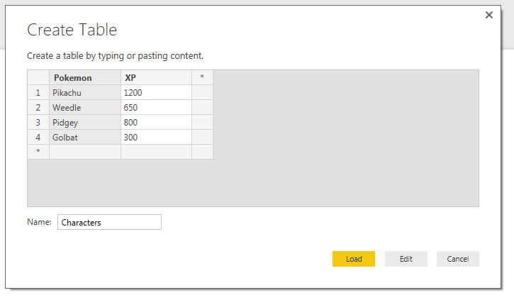
    Rename the table to Characters.  Once you are finished entering in the data it should look like the following:

    Create Table of Characters
    Create Table of Characters

    Click Load to continue.

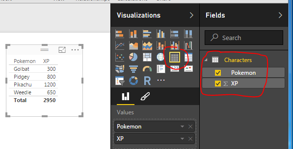
    Start to examine your data by building a table visual.

    Table Visual
    Table Visual

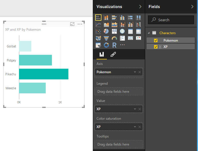
    Next add a Bar chart.

    Bar Chart
    Bar Chart

    Note: I added the XP column twice.  Once to the Value attribute and to the Color Saturation.  This enhances the look of your visual by coloring the bars with a gradient.  The largest bar will have the darkest color, and the smallest bar will have the lightest color.

    Next, we will begin building some measures.  The first measure will be a total of all the experience points (XP) for each character. Click the New Measure button on the Home ribbon and enter the following DAX expression:

    Total XP = Sum(Characters[XP])

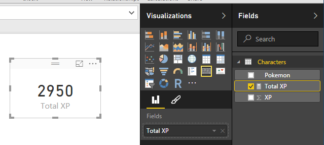
    Now, add a Card visual and add the new measure we created Total XP.

    Total XP Card Visual
    Total XP Card Visual

    This measure totals all the experience points for all the selected characters within the visual.  Since all characters are now selected the total XP for all characters is 2,950.

    The next, and final measure, will be the intelligent card.  For this measure we want to display the characters name when we select them in the bar chart.  Click the New Measure button on the Home ribbon and enter the following DAX expression:

    Character(s) = IF( DISTINCTCOUNT(Characters[Pokemon]) = 1 , FIRSTNONBLANK('Characters'[Pokemon],'Characters'[Pokemon]) , DISTINCTCOUNT('Characters'[Pokemon]) & " Selected")

    Update: As of Mid 2017 Microsoft introduced a new DAX expression called SELECTEDVALUE which greatly simplifies this equation.  Below is an example of how you would change the DAX equation to use SELECTEDVALUE.

    Selected = SELECTEDVALUE(  Characters[Pokemon],  DISTINCTCOUNT(  Characters[Pokemon]  )  &  " Selected" )

    Explanation of this measure:

    This measure first checks to see how many distinct items are in the column Pokemon of our dataset.  If there is only one selected character then we will display the FIRSTNONBLANK character, which will be the name of our selected character.  If there are more than one characters selected. The measure will count the number of characters selected and return a text string with the count and the word SelectedThus, showing us how many items have been selected.

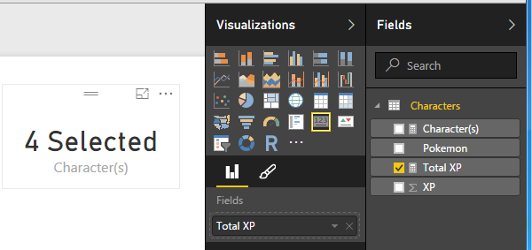
    Add the measure titled Character(s) to a card visual.

    Add Character Card Visual
    Add Character Card Visual

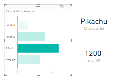
    We can now see that there are 4 characters selected.  Clicking on Pikachu in the bar chart resolves with the character’s name being displayed and the XP of Pikachu being displayed in the Total XP card visual.

    Selecting Pikachu
    Selecting Pikachu

    You can select multiple items by holding down Ctrl and clicking multiple items in the bar chart.

    Selecting Pikachu and Pidgey

    Well, that is it.  I hope you enjoyed this Pokemon themed tutorial.  Thanks for visiting.

    Want to learn more about PowerBI and Using DAX.  Check out this great book from Rob Collie talking the power of DAX.  The book covers topics applicable for both PowerBI and Power Pivot inside excel.  I’ve personally read it and Rob has a great way of interjecting some fun humor while teaching you the essentials of DAX.

  • Measures – Month to Month Percent Change

    Measures – Month to Month Percent Change

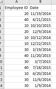
    I had an interesting comment come up in conversation about how to calculate a percent change within a time series data set.  For this instance we have data of employee badges that have been scanned into a building by date.  Thus, there is a list of Badge IDs and date fields.  See Example of data below:

    Employee ID and Dates
    Employee ID and Dates

    Looking at this data I may want to understand an which employees and when do they scan into a building over time.  Breaking this down further I may want to review Q1 of 2014 to Q1 of 2015 to see if the employee’s attendance increased or decreased.

    Here is the raw data we will be working with, Employee IDs Raw Data.  Our first step is to Load this data into PowerBI.  I have already generated the Advanced Editor query to load this file.  You can use the following code to load the Employee ID data:

    let
     Source = Csv.Document(File.Contents("C:\Users\Mike\Desktop\Employee IDs.csv"),[Delimiter=",", Columns=2, Encoding=1252, QuoteStyle=QuoteStyle.None]),
     #"Promoted Headers" = Table.PromoteHeaders(Source),
     #"Changed Type" = Table.TransformColumnTypes(#"Promoted Headers",{{"Employee ID", Int64.Type}, {"Date", type date}}),
     #"Sorted Rows1" = Table.Sort(#"Changed Type",{{"Date", Order.Ascending}}),
     #"Calculated Start of Month" = Table.TransformColumns(#"Sorted Rows1",{{"Date", Date.StartOfMonth, type date}}),
     #"Grouped Rows" = Table.Group(#"Calculated Start of Month", {"Date"}, {{"Scans", each List.Sum([Employee ID]), type number}})
    in
     #"Grouped Rows"

    Note: I have highlighted Mike in red because this is custom to my computer, thus, when you’re using this code you will want to change the file location for your computer.  For this example I extracted the Employee ID.csv file to my desktop. For more help on using the advanced editor reference this tutorial on how to open the advance editor and change the code, located here

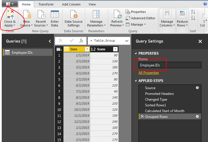
    Next name the query Employee IDs, then Close & Apply on the Home ribbon to load the data.

    Close and Apply
    Close and Apply

    Next we will build a series of measures that will calculate our time ranges which we will use to calculate our Percent Change (% Change) from month to month.


    Now build the following measures:

    Total Scans, sums up the total numbers of badge scans.

    Total Scans = SUM('Employee IDs'[Scans])

    Prior Month Scans, calculates the sum of all scans from the prior month.  Note we use the PreviousMonth() DAX formula.

    Prior Month Scans = CALCULATE([Total Scans], PREVIOUSMONTH('Employee IDs'[Date]))

    Finally we calculate the % change between the actual month, and the previous month with the % Change measure.

    % Change = DIVIDE([Total Scans], [Prior Month Scans], blank())-1

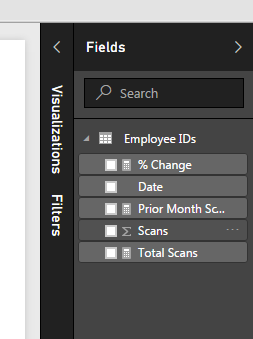
    Completing the new measures your Fields list should look like the following:

    New Measures Created
    New Measures Created

    Now we are ready to build some visuals.  First we will build a table like the following to show you how the data is being calculated in our measures.

    Table of Dates
    Table of Dates

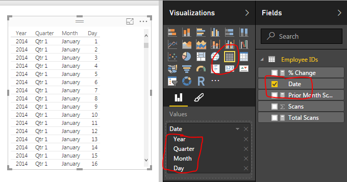
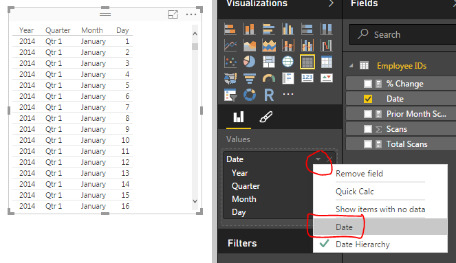
    When we first add the Date field to the chart we have a list of dates by Year, Quarter, Month, and Day.  This is not what we want.  Rather we would like to just see the actual date values.  To change this click the down arrow next to the field labeled Date and then select from the drop down the Date field.  This will change the date field to be viewed as an actual date and not a date hierarchy.

    Change from Date Hierarchy
    Change from Date Hierarchy

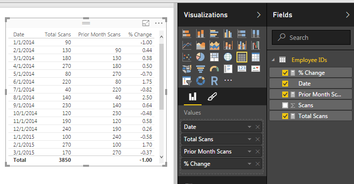
    Now add the Total Scans, Prior Month Scans, and % Change measures.  Your table should now look like the following:

    Date Table
    Date Table

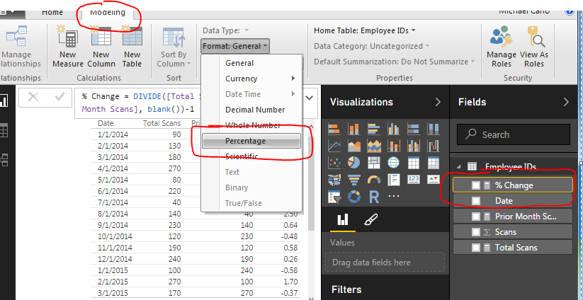
    The column that has % Change does not look right, so highlight the measure called % Change and on the Modeling ribbon change the Format to Percentage.

    Change Percentage Format
    Change Percentage Format

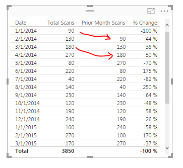
    Finally now note what is happening in the table with the counts totaled next to each other.

    Final Table
    Final Table

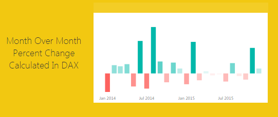
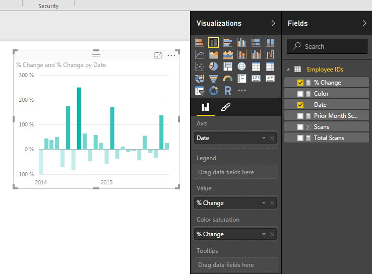
    Now adding a Bar chart will yield the following.  Add the proper fields to the visual.  When your done your chart should look like the following:

    Add Bar Chart
    Add Bar Chart

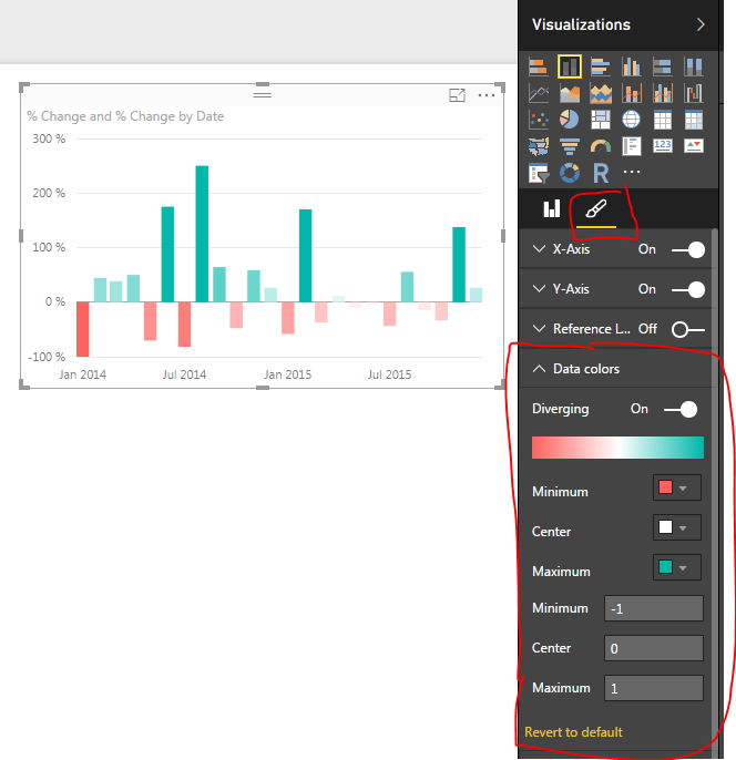
    To add a bit of flair to the chart you can select the Properties button on the Visualizations pane.  Open the Data Colors section change the minimum color to red, the maximum color to green and then type the numbers in the Min, Center and Max.

    Changing Bar Chart Colors
    Changing Bar Chart Colors

    Well, that is it, Thanks for stopping by.  Make sure to share if you like what you see.  Till next week.

    Want to learn more about PowerBI and Using DAX.  Check out this great book from Rob Collie talking the power of DAX.  The book covers topics applicable for both PowerBI and Power Pivot inside excel.  I’ve personally read it and Rob has a great way of interjecting some fun humor while teaching you the essentials of DAX.

  • Power BI Histogram with Bins – Includes DAX

    Power BI Histogram with Bins – Includes DAX

    Alright to start this Tutorial off right we are going to incorporate the new feature released this spring from Power BI, called publish to web.  Below you can view last weeks tutorial and interact with the data.  Feel free to click around to see how the visualization works (you can click the shaded states or on the state names at the bottom.

    For this tutorial we will build upon the last tutorial, From Wikipedia to Colorful Map.  If you want to follow along in this tutorial click on the link and complete the previous tutorial.

    Materials:

    • Power BI Desktop (I’m using the March 2016 version, 2.33.4337.281) download the latest version from Microsoft Here.
    • Mapping PBIX file from last tutorial download Maps Tutorial to get a jump start.

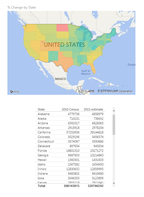
    Picking up where we left off we have data by state with data from the 2010 Census and 2015 Census.

    Data from Region Maps Tutorial
    Data from Region Maps Tutorial

    What we would like to identify is how many states are within a given population range.  Say I wanted to see on the map, or in a table all the states that had 4 million or less in population in 2010.

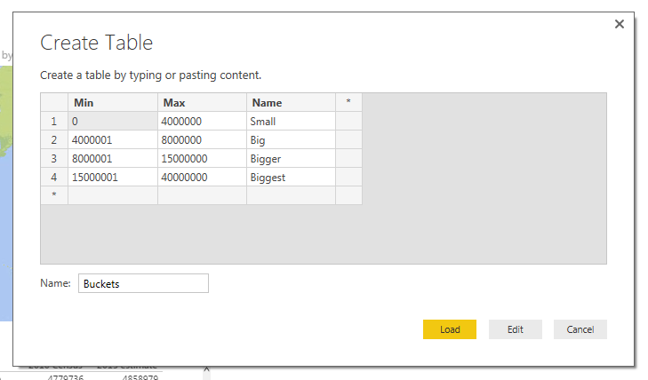
    To do this we will create bins for our data.  Enter custom data in this format.  For the tutorial on entering custom data into Power BI Desktop check out this tutorial on Manually Enter Data. Click on the Enter Data button on the Home ribbon.  Enter the data as following:

    Enter Bucket Data
    Enter Bucket Data

    Note: Make sure you name the new table Buckets as shown in the image above.

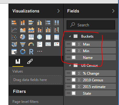
    Click Load to bring the data into the data model.  Notice we now have a new table in the Field column on the right.

    Buckets Table
    Buckets Table

    Next we will create a measure to evaluate the state level data into our newly created buckets.  This will be produced using DAX (Data Analysis Expressions).  DAX is an extremely powerful language which is used in SQL applications and Analysis Services.  More information can be found on DAX here.  Since DAX is so complex we won’t go into a full explanation here.  However, we will have many more topics in the future working on and building DAX equations.

    Click the Ellipsis next to the table labeled US Census. Then click the first item in the list labeled New Measure.

    Note: Ellipsis is the term used for those triple dots found in newer Microsoft applications.

    Example of Ellipsis
    Example of Ellipsis

    A formula bar opens up underneath the ribbons bar.  Here is where we will name and type in the new measure.  The equation we will need to add is the following.

    Bins = CALCULATE(COUNTROWS(FILTER('US Census',and([2010 Census] >= min(Buckets[Min]),[2010 Census] <= MAX(Buckets[Max])))))

    Press Enter to enter the measure into PowerBI.

    Explanation of Equation: All text before the equal sign is the name of the measure.  All the data behind the equal sign is the DAX expression.  Essentially this equation is calculating the number of rows where we have data between the Buckets “Min” value and Buckets “Max” value.  This is the magic that is DAX.  In this simple expression we can compare all our data against our buckets ranges we made earlier.

    Finally our new Bin measure should look like the following.

    Bin Measure Created
    Bin Measure Created

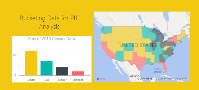
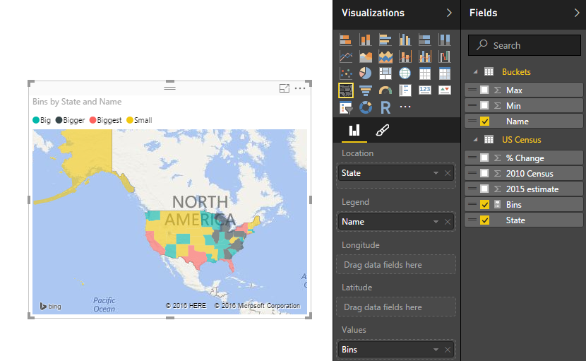
    Now lets modify our visuals to incorporate the new Bins measure.  Click on the existing map on the page.  Remove the % Change item from the Values selection.  Add the Bins Measure to the Values section.  Notice the map changes color.  Next, add the Name field from the table called Buckets into the Legend field.  Our map should look similar to the following:

    Map with Bins Added
    Map with Bins Added

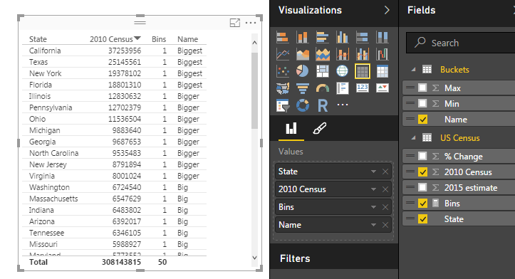
    Next Click on State, 2010 Census, Bins, and Name (from Buckets table) and make a table.  It should look like the following:

    Table of Bins Measure
    Table of Bins Measure

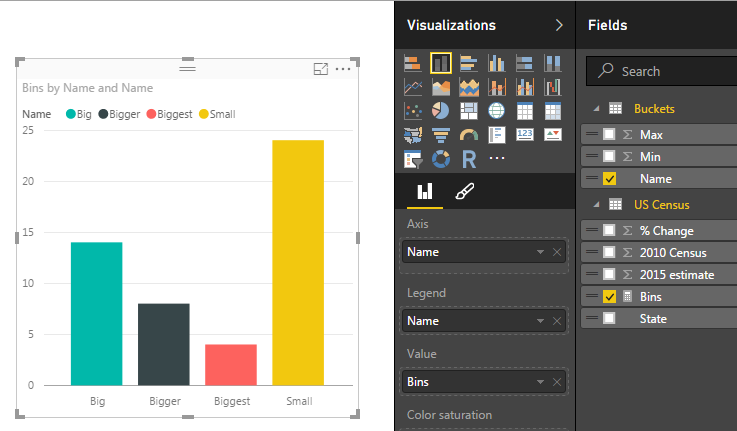
    Lastly, we will build a bar chart using our Bins Measure.  Click on the Stacked Column Chart Visual and add the following items to the corresponding categories:  Axis = Name (from the Buckets table), Legend = Name, and Value = Bins (from US Census table).  This will yield the following visual.

    Bins in Bar Chart
    Bins in Bar Chart

    Click on the Ellipsis of the bar chart and then click Sort By, finally click Bins. This will order the items in descending order by the count of the items found in each bin.

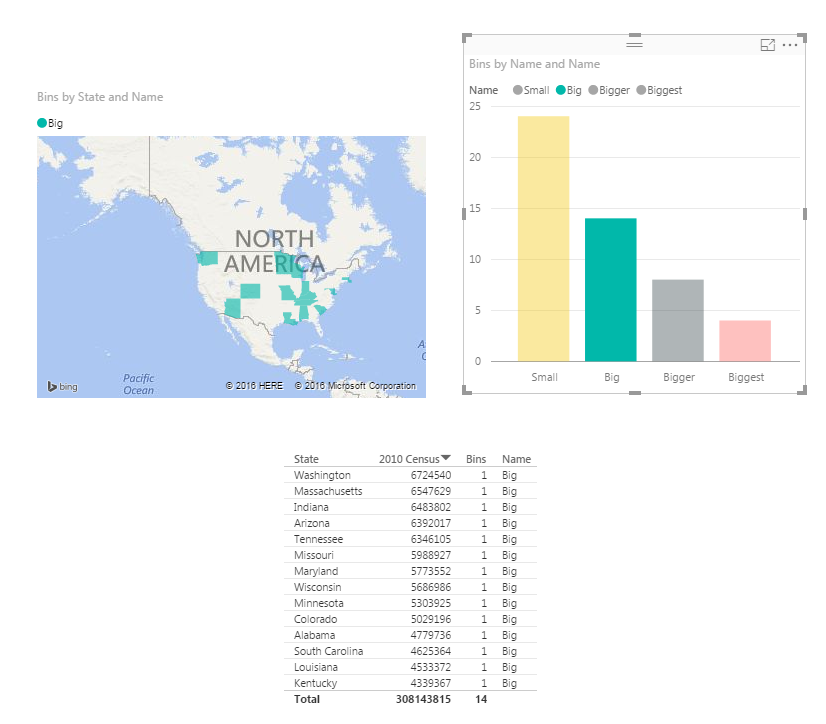
    Now have fun with your new data.  Click on each of the bars in the bar chart and watch your data transform between the table, and the map.

    Selection Big in the Bar Chart
    Selection Big in the Bar Chart

    Here is the final product if you want to engage with the data.

    I have to give credit where credit is due.  Below is the page from Power Pivot Pro that I used to create binning in the tutorial chart.  The binning shown on PowerPivotPro is for Power Pivot but the functionality is the same. Enjoy.

    http://www.powerpivotpro.com/2015/03/creating-a-histogram-with-a-user-defined-number-of-buckets/

    Want to learn more about PowerBI and Using DAX.  Check out this great book from Rob Collie talking the power of DAX.  The book covers topics applicable for both PowerBI and Power Pivot inside excel.  I’ve personally read it and Rob has a great way of interjecting some fun humor while teaching you the essentials of DAX.

  • Map it, Map it Real Good

    Map it, Map it Real Good

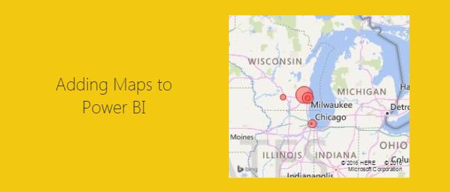
    This tutorial is a real simple mapping exercise.  I was talking with a colleague today about Power BI and I was challenged to map something using latitude and longitude.  I had played with mapping before but not using latitude or longitude.

    I’d have to say if you want to impress someone with your PowerBI skills adding a map is a good way to do so.  Typically this a functionality that you can’t add into excel, well at least not with out some serious effort.

    Alright, here we go..

    Resources for this project are:

    • Power BI Desktop (I’m using the March 2016 version, 2.33.4337.281) download the latest version from Microsoft Here.
    • Excel file with a table in it with our location information that can be downloaded here: Locations Data Set

    After downloading the Locations Data Set, Open up PowerBI and load the Excel file into Power BI.  If you need to learn how to load Excel files you can follow the loading excel tutorial.

    Click the Get Data on the Home ribbon.  Select the first option Excel and click Connect at the bottom of the Get Data window.

    Navigate to the downloaded file called Locations.xlsx and open the file by clicking Open in the bottom right hand corner.

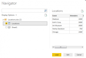
    Next, the navigator window will open.  Select the table (denoted with the grid with a blue top header) called Locations.  Then Click Load to load the data into the data model.

    Navigator Window
    Navigator Window Selection

    Note: there are two different icons in the Navigator window. One is called Locations which is a Table within the Excel document.  While the other is called Sheet1, which is simply the first sheet in the excel workbook.  For Future references it is much easier to make tables in excel and use them to load data in to PowerBI than using just a worksheet.  So whenever possible try to form your data in Excel into Tables.  When loading a table the headers of the table automatically load into the column names in the PowerBI data models.

    We now have loaded the data into a new Table in PowerBI called Locations.

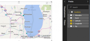
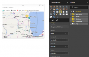
    To make the map check the boxes for Latitude and Longitude.  Power BI intelligently understands that latitude and Longitude are mapping functions and we are now presented with a map with tiny blue dots.

    Map from our Data
    Map from our Data

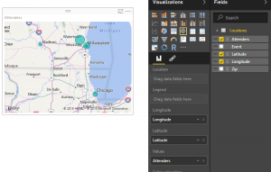
    Lets add some more data to enhance the map.  We can change the size of the circles at each location by dragging the column called Attenders over to the Values field for this visual.

    Change Bubble Size
    Change Bubble Size

    We have now changed the size of the circles relative to each other to show the number of people that we saw at each location.  To add color to the map drag the column called Event to the Legend option of the visual.  This yields a map that now has each circle with a different color according to the event name.

    Colored Bubble Map
    Colored Bubbles on a Map

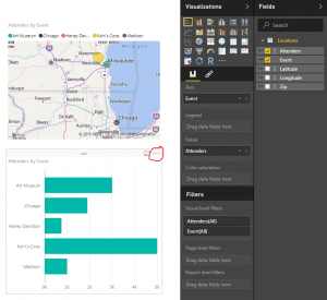
    To enhance our visual further we will add a bar chart with the total count of attenders per event.  To do this click any where on the visual page (this will de-select the map visual on the page).  Now click the Event column and then the Attenders column.  This will present you with a table list of events and the corresponding attendees.  Leaving the table visual highlighted click the Stacked Bar Chart which is in the upper left hand corner of the Visualizations window.

    Adding a Bar Chart
    Adding a Bar Chart

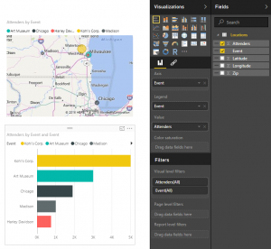
    I circled the triple dots on the bar chart.  Click the triple dots and a menu will appear. First click Sort By, then click Attenders.  This will sort the attenders in descending order from the largest amount at Kohl’s Corp. down to Harley Davidson.  Drag the column labeled Event to the visualization option called Legend.  This colors the bar chart.

    Colored Bar Chart
    Colored Bar Chart

    Note: The colors in the bar chart match the colors in the map we made earlier.  This build uniformity in your reports and when your filtering items colors across visuals make sense.

    Take some time to click on each of the bars on the bar chart.  Notice how the map re-draws with only the data for that selected item.  To select multiple bars on the bar chart hold the CTRL button and click on the multiple bars.

    Nice job.  We have finished the mapping tutorial.  Share if you liked it below.

  • Import CSV file to Power BI

    Import CSV file to Power BI

    This post is going to be similar to my previous post about Getting Data.  I figure we better cover some of the basics before going crazy with deeper topics.

    Materials for this tutorial:

    • CSV file with some random data, linked here: SampleData in CSV format
    • Power BI Desktop (I’m using the March 2016 version, 2.33.4337.281)

    After I read the previous version I thought it would be helpful to put the materials up at the top and what version I was using.  If you didn’t know Microsoft has been very active in the development of PowerBI.com and Power BI Desktop.  Right now there are weekly updates to PowerBI.com and monthly updates to Power BI Desktop.

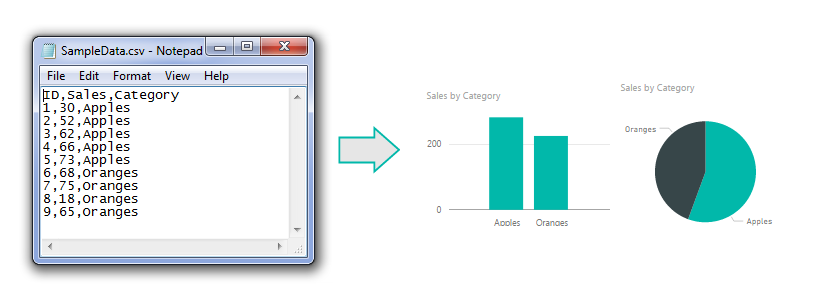
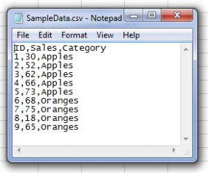
    Starting off like before here is a sample of the data from the csv file.  I’m showing the data in notepad to prove it is a comma separated value file (hence the CSV name).

    csvfile
    CSV File opened in Note Pad

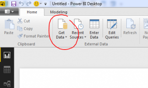
    Alright, lets go get some data.  Open up Power BI Desktop.  Click on the Home ribbon.  Select the Get Data icon.

    Get Data Button
    Button for Get Data

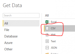
    Now the Get Data window will open.  Next, select the second item labeled CSV from the top of the list on the right.

    Get CSV selection
    CSV selection in the Get Data screen

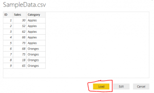
    Click the Connect button at the bottom right hand of the Get Data screen to proceed to the next screen.  Now the open window will let you navigate to the CSV file you would like to import.  Click the Open button at the right of Open window to load the CSV file.  Finally you’ll be presented with the data view of the contents contained inside your CSV file.

    View Of CSV Data
    View of CSV Data file

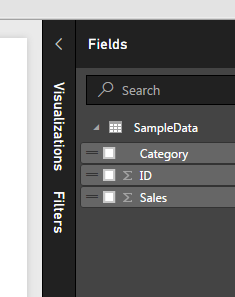
    Once loaded we now have our view of all the columns of data in the Fields viewing pane on the right.  From here we can build our visuals.

    Loaded CSV Columns
    Loaded Columns from CSV file load

    Now, lets throw together a quick visual of the data.

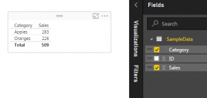
    Start by clicking the check box next to the label titled Category and then click the box next to the label titled Sales.  This will automatically populate a table with the categories in the first column and the sales for each category in the second column.

    Table Visual
    Table of Data

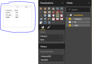
    To open up the Visualizations bar click on the word Visualizations.  This will present all the information relating to the visuals. Upon opening up the visualizations pane there is a small yellow square showing you which visual is selected.

    Selected Visual
    Showing the Selected Visual

    Note: The blue pen highlighting shows the selected visual on the page.  As you build more complex visuals there will be multiple visualizations on your page.  When you select a specific visual, all the properties in the Visualizations Bar show all the properties for the selected visual.  The Table visual is highlighted by the red highlight circle.

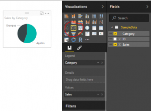
    To change our selected visual to a new visual we will simply select a new icon in the Visualizations bar. Click the icon that looks like a pie chart.

    Pie Chart
    Pie Chart Visualization

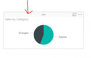
    Cool, but what if I want more awesomeness on my page.  No problem.  Let’s copy our visual.  You can do this by selecting the visual.  To know it is selected look for the slight grey bar at the top of the visual.

    Gray Bar on Visual
    Gray Bar denoting that visual is selected

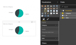
    Copy the visual by using Ctrl + C.  Click any where on the white space on the page.  This will deselect the current visual.  Then paste an identical version of the visual by using Ctrl + V.

    Two Visuals
    Copy and Paste of new Visual

    Ta-da! Now we are really getting somewhere.  Two Amazing visuals, well not quite.  Two identical visuals isn’t very compelling.  Lets change one of the visuals to a different visual.

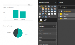
    Select the top visual by clicking on it.  Then select the Stacked Column Chart which is the second icon from the left in the top row.  Selecting this icon will change the visual.

    Bar Chart
    Bar Chart Visual

    And there you have it.  You’ve imported a CSV file and generated two visuals.  Nice job.

    Hope you enjoyed this tutorial.  Leave comments if you have questions or if you want to see something else in a tutorial. If you like what you see please share this post on your selected social network of choice below.