
Measures – Intelligent Card Visual – Using DAX
As I have been exploring PowerBI and building dashboards I have noticed that often the visuals can obscure your data. As you click on different visuals there is a need to highlight different pieces of data.
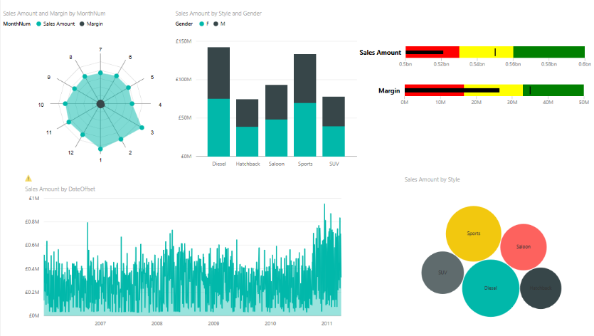
Notice the different car types in the bar chart. As you click on each vehicle type, Diesel, Hatchback, etc.. you expect the data to change accordingly. In some cases it is helpful to present a card visual to show the user what you selected and any relevant data points you want to highlight. For example if I select the Diesel vehicle type I may want to know the average sales amount, total sales in dollars, or number of units sold. This is where we can build specific measures that will intelligently highlight selected data within your PowerBI visual.
Entering the Sample Data
Let’s begin with starting with some data. In honor of your news feed being bombarded with Pokemon Go articles lets enter some data on Pokemon characters.
We will enter our data manually. For a full tutorial on manually entering in data visit here.
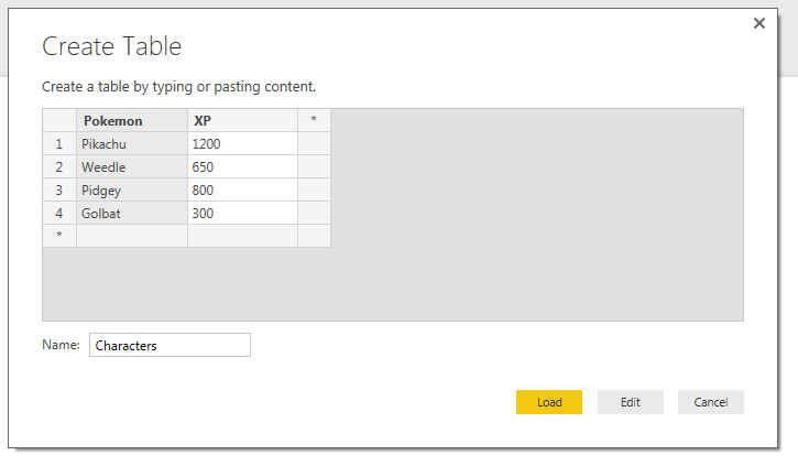
Click the Enter Data button on the Home ribbon and enter the following information into the displayed table.
| Pokemon | XP |
|---|---|
| Pikachu | 1200 |
| Weedle | 650 |
| Pidgey | 800 |
| Golbat | 300 |
Rename the table to Characters. Once you are finished entering in the data it should look like the following:
Click Load to continue.
Building the Basic Visuals
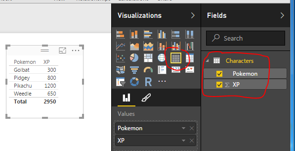
Start to examine your data by building a table visual.
Next add a Bar chart.
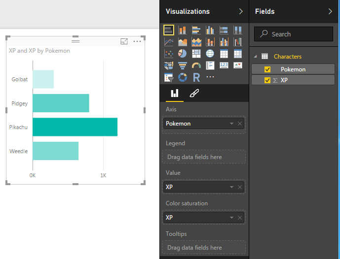
Note: I added the XP column twice. Once to the Value attribute and to the Color Saturation. This enhances the look of your visual by coloring the bars with a gradient. The largest bar will have the darkest color, and the smallest bar will have the lightest color.
Creating the Total XP Measure
Next, we will begin building some measures. The first measure will be a total of all the experience points (XP) for each character. Click the New Measure button on the Home ribbon and enter the following DAX expression:
Total XP = Sum(Characters[XP])Now, add a Card visual and add the new measure we created Total XP.
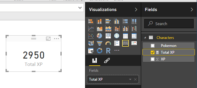
This measure totals all the experience points for all the selected characters within the visual. Since all characters are now selected the total XP for all characters is 2,950.
Creating the Intelligent Card Measure
The next, and final measure, will be the intelligent card. For this measure we want to display the character’s name when we select them in the bar chart. Click the New Measure button on the Home ribbon and enter the following DAX expression:
Character(s) = IF( DISTINCTCOUNT(Characters[Pokemon]) = 1 , FIRSTNONBLANK('Characters'[Pokemon],'Characters'[Pokemon]) , DISTINCTCOUNT('Characters'[Pokemon]) & " Selected")Update: As of Mid 2017 Microsoft introduced a new DAX expression called SELECTEDVALUE which greatly simplifies this equation. Below is an example of how you would change the DAX equation to use SELECTEDVALUE.
Selected = SELECTEDVALUE( Characters[Pokemon], DISTINCTCOUNT( Characters[Pokemon] ) & " Selected" )Explanation of this Measure
This measure first checks to see how many distinct items are in the column Pokemon of our dataset. If there is only one selected character then we will display the FIRSTNONBLANK character, which will be the name of our selected character. If there are more than one characters selected, the measure will count the number of characters selected and return a text string with the count and the word Selected. Thus, showing us how many items have been selected.
Testing the Intelligent Card
Add the measure titled Character(s) to a card visual.
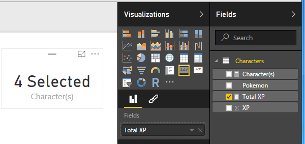
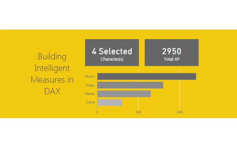
We can now see that there are 4 characters selected. Clicking on Pikachu in the bar chart resolves with the character’s name being displayed and the XP of Pikachu being displayed in the Total XP card visual.
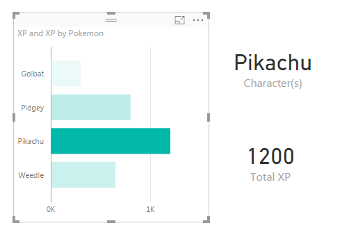
You can select multiple items by holding down Ctrl and clicking multiple items in the bar chart.

Well, that is it. I hope you enjoyed this Pokemon themed tutorial. Thanks for visiting.