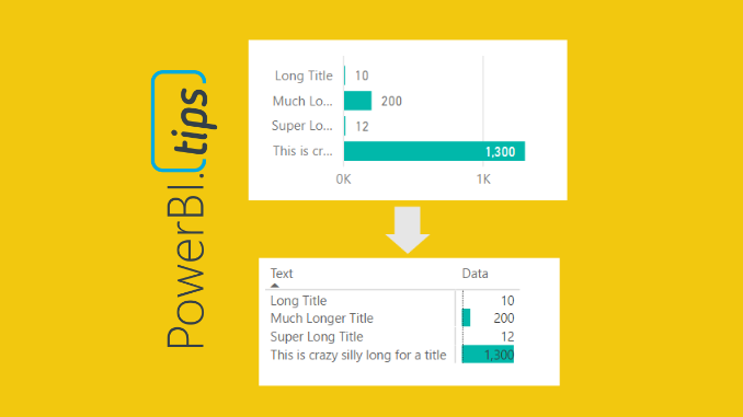
The more you work with Power BI Desktop it is more than likely you will find some tool limitations that impact your overall design pursuits. As I have worked with data visualization software, I find there is always a balance between what I want to make and what is possible. The more you become familiar with your visualization tool, the better you think of report designs that are both beautiful and feasible. One such design style that I use is to limit the use of slicers on the report page as much as possible. My solution for removing slicers is adding a stacked bar chart or a stacked column chart. The chart can be used as a slicer because you can click on the data bars and filter the page of data. One of the visualization limitations I’ve had to work around was the ability to make a stacked bar chart with long y-axis titles. In order to overcome this limitation we need to fire up our creativity to figure out another way to more accurately control the y-axis labels and the associated bar chart.
There are two main issues we will need to solve:
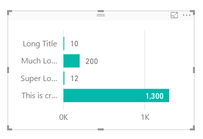
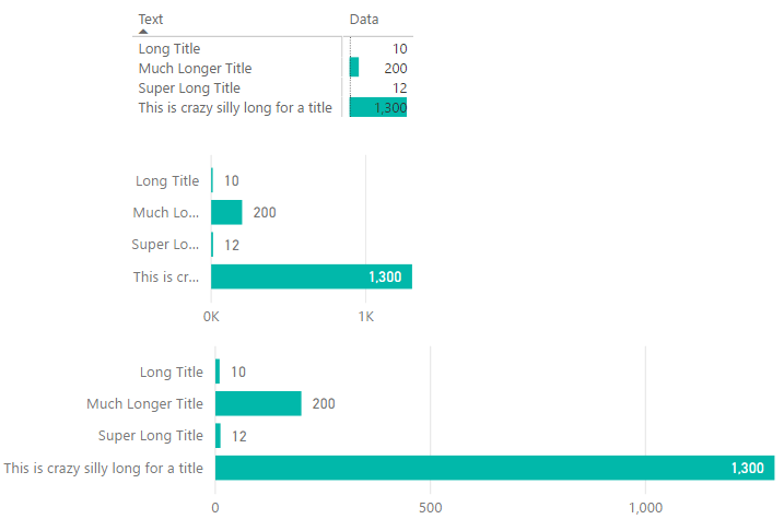
First issue, when you have text along the y-axis in the stacked bar chart, the text becomes truncated. See below.
Note: All the text next to each bar is truncated if the text is to long. This can be fixed by extending the visual to a ridiculous length, as illustrated by the following picture. While this solves the text issue, this totally defeats the purpose of this visual, provide a “slicer” that can be used to filter the report page with minimal space consumption.
Second issue, when there are super small values next to large values, it is almost nearly impossible to click on the bar to enable the filtering. In the example image above, it’s easy to click on the value of 1,300 but almost impossible to click on the value of 10. Womp, Womp, and clicking on the bar text value does not enable filtering, insert ridiculous horn sound, or other familiar but annoying horn sound (as recommended by one of our readers Terence).
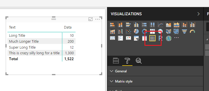
After some playing around with various visuals here is what I came up with. First, you must change the visual from a stacked bar chart to the matrix visual. On the Visualizations pane click on the Matrix visual.
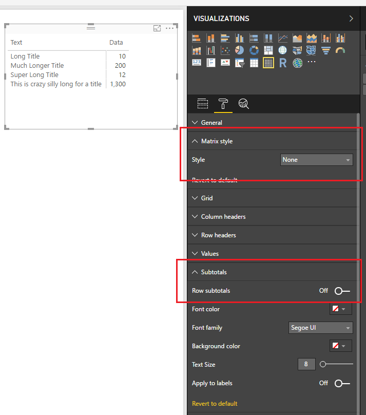
This will change the visual to a matrix. It’s a little busy so we will clean it up a bit. On the Visualizations pane change the Matrix style to None, then open up the Subtotals section and set Row subtotals to Off. Your visual should now look similar to the following:
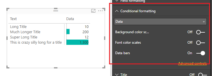
Next we will add the “bars” to the visual. Open the Conditional formatting section and turn Data bars to On.
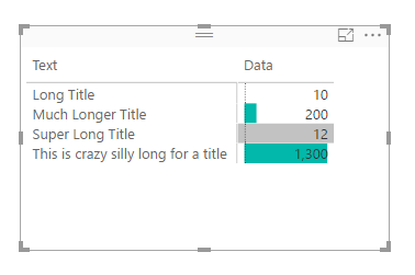
Short and sweet. Now we can properly resize the “text labels” of the y-axis and when we try to select small values such as 10, we are presented with a little grey selector bar, enabling us to select very small values.
When you compare all three items side by side you can see that the most condensed version is the Matrix visual with conditional formatting bars. This provides you much more control when dealing with data that contains long text labels.
Note: There are many ways you can format your matrix to get the desired look. This tutorial is simply covering one type of look. Additionally, you could hide the text and grid completely by making the grid and column title colors of those match the color of your background, or use could choose one of the many of the grid type options to fit your style needs.
Thanks for following along, as always if you found this helpful please share it with someone who might find this helpful.
Get Data – Power BI Connection Types: An Introduction
Hi, I’m Seth, I am very excited to be a contributing on PowerBI.tips. Mike has done an incredible job curating fantastic content for the PowerBI Community. In this first blog I will introduce you to the different types of connections that you can make using the Power BI Desktop. We will identify the various types of connections. In future posts we will dive into specific examples of usage and tips in tricks.
When I say “Types”, I don’t mean connecting to databases, Excel, SharePoint, etc. Those are just different data sources. I’m referring how Power BI ingests or interacts with data sources that you want to connect to. Believe it or not, Power BI doesn’t always have to pull all your data into the Power BI Desktop file. Depending on what sources of data you are connecting to, you could not even realize that there are more options, or be uncertain of what they do. In fact, depending on what type of connection you choose you are also altering how the Power BI Desktop functionality works! Now that I have your attention, let’s jump into the good stuff.
First things first. The only time you will be faced with an option to choose a type of connection, are when you connect to a data source that support multiple connection types. If all you connect to is Excel, you would never see an option in the dialogues because it only supports one type of connection.
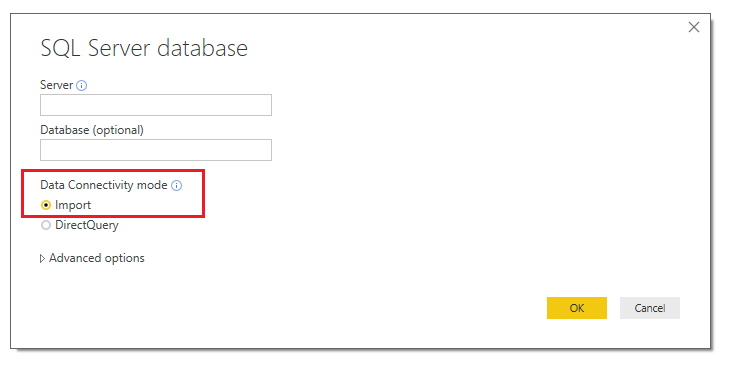
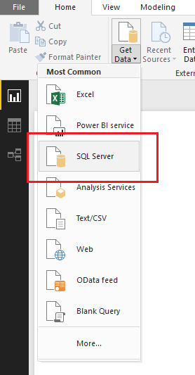
There are really 3 main types of connections. The first is the most widely used, and is the default when connecting to most data sources. It is Import. This connection will ingest or pull the data from the data source and become part of the PBI Desktop file. An example of where you would select import Is in the SQL Server dialog box.
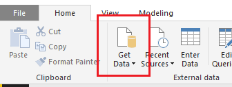
You can import data from a SQL Server by clicking Get Data on the Home ribbon.
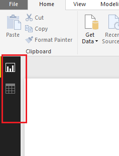
The import connection type allows you to use the full capabilities of the Power BI Desktop and you can manipulate it however you see fit. A way to validate this is by looking at the left-hand navigation and you will see three selections. The top selection which resembles a bar chart is the Report Page. This is where you would place all your visuals and develop your report pages. The second item from the top, which looks like a table is just that, the Data view in a table form. This lets you see all the data contained with a loaded data table. Finally, at the very bottom, the relationships selection. This is where you will see multiple tables and the connections between the tables. The relationships section feels like working SQL or in Microsoft Access.
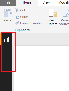
The 2nd connection type is Direct Query. Notice in direct query mode the third item, relationships has been removed. The direct query connection type is only available when you connect to certain data sources. The list of the data sources that are accessed using direct query can be found here. This connection is unique in that the data does not get loaded into the PBI Desktop. What happens, is that Power BI can communicate in the language of the data source and request information as you interact with your Power BI Visuals. The useful thing about this connection is that the data never leaves the data sources, it is only queried. Direct Query does limit what you can do from a data manipulation perspective. Power BI assumes you are already doing all the necessary data manipulations in your source. As a result, you don’t even have the option to mashup data and that selection is removed in the left-hand nav.
The 3rd type is Live Connection. There are only 3 data sources that support the live connection method at this time. All of them are a type of (SSAS) SQL Server Analysis Services. Those types are Multidimensional, Azure Tabular and Tabular on premises. The live connection type is the most unique in that it recognizes the full model or cube that you’ve created. Power BI Desktop turns off all data prep features. Thus, the user is given a bare minimum in formatting and report side calculations. All the heavy lifting is done on the server that supports the model and Power BI is only used as a reporting tool. This connection is used mainly by IT and enterprise implementations. If one looks at the left-hand navigation, you quickly realize that it is the most restrictive in terms of what can be done in the Desktop itself.
There is a fourth Live Connection that defaults to the connection type, and this occurs when you use the Power BI Service as a data source. This connection is using a SSAS connection, only the end users don’t need to set anything up other than having dataset to connect to in the Service.
Finally, there are two types of connections that dive a bit deeper than what comes with the Desktop out of the box. Those are Custom Data Connectors and API/Streaming. For the time being, we’ll leave these as just high-level points for now, and dive deeper into them in the specific articles in the future.
I hope you’ve found this initial primer useful. As this series continues we’ll dive into some of the reasons for using each of these types of connections, why you would want to, and the positives and negatives in choosing which one, provided you have a choice.
DAX (Database Access Expressions) can be quite complex. It is essential to being able to appropriately manipulate the Power BI data model for the visuals. The following information was discussed at the Power BI World Tour 2017 and if you’d like to review the content or learn more about DAX hit some of the links below. For all who were able to attend, you were a great audience and super fun! I hope you learn some fun facts and tricks.
I’ve been using Power BI since it was released back in 2015, and I’ve found that when talking with other PowerBI users there is always a little confusion about how to share Power BI reports. My experience has been that most people are first introduced to the service and go directly to PowerBI.com, login and start playing around. They explore a little and find a cool data source to connect to, such as a SQL database or some good old google analytics data. Typically they will begin making a dashboard and really get into making visuals on a report.
While this is an excellent way to get started because this removes the complexity of having to model your data, it does come with some challenges that leads to issues later on.
There comes a point in time that the user usually needs some additional data. The “this is good data but, if I could only join the data with another source….” question almost always comes up.
These reports are typically made in your personal workspace which is not a good solution for sharing a report with another user. I’ll explain later.
How do I source control this document? What if I want to go back in time and restore my changes?
In order to answer these questions, I’ll show you what I use to get around these issues.
To start off, and most importantly!, try to refrain from building your dashboards in the PowerBI.com service. Yes, you can do it, but it is not recommended. I don’t recommend this because any report created in your personal workspace can only be edited by you and no one else. Also, if your account is deleted or you loose access to your account no other PowerBI user can modify your original report. It’s the classic, win the lottery, or hit by a bus case, depending if your an optimist or pessimist. What you should do instead, is download and open up the PowerBI desktop application. This will save you ton’s of headache later when you want to join multiple data sources or want to have a saved copy of your Report.
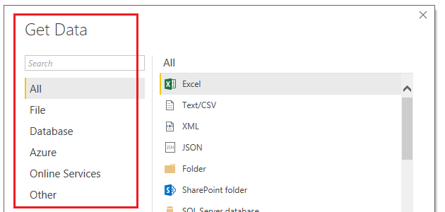
After you download the desktop application you will load the data using the Get Data button found on the Home ribbon.
Almost, all data sources found in the Get Data window are on the PowerBI.com service. You will notice this changes over time, with each monthly release of PowerBI desktop.
FYI, I have noticed that changes happen faster in the PowerBI.com service as it appears as though there are weekly or bi-weekly updates. But the Desktop version is slightly slower to get changes as builds are only released once a month.
Next you will load data into the Power BI desktop. If you want to learn more about modeling you can browse through these tutorials on data modeling. Modeling happens in the query editor with the M language, and on the report pages using DAX.
Now we will create a very simple PBIX file to publish to the PowerBI.com service.
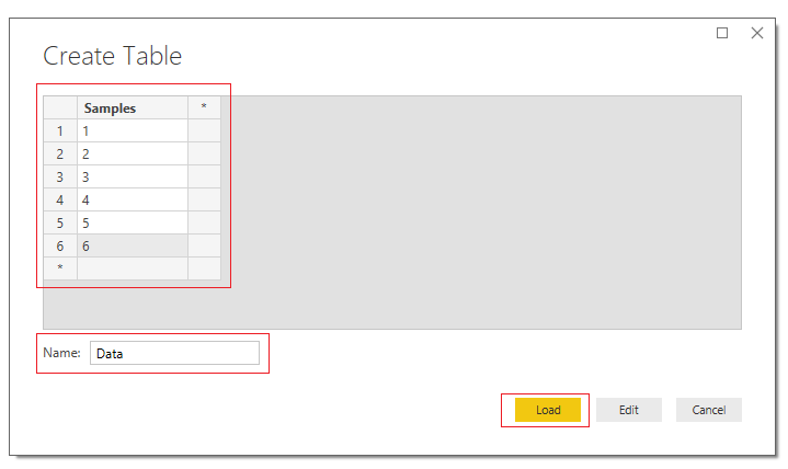
On the Home ribbon click the Enter Data button and enter the following:
This will create a simple data table. Click Load to bring the data into PowerBI Desktop.
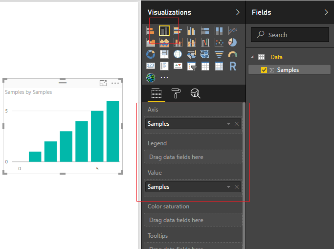
Create a visual by clicking on the Stacked ColumnChart and adding the following columns to the visual.
Congratulations, we have completed a very simple report and you have loaded data inside the desktop. In addition to loading data PowerBI is equipped with a robust modeling tool called the Query Editor. The very topic of modeling your data is a huge. It covers the Query Editor, making DAX expression and has been covered in numerous books. This this post will not address modeling your data. As a side note, here are some really good sources of information for learning more about DAX.
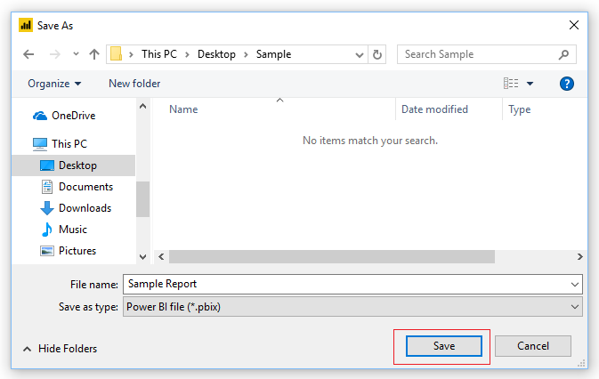
Alright, let publish this bad boy. First save the Report. Do this by clicking File then click Save. Enter a simple name such as Sample Report, click Save.
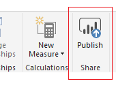
To publish the report to the PowerBI.com Service click the Publish button found on the Home ribbon.
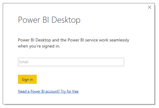
If you have not already signed into the PowerBI.com service you will be prompted to sign in.
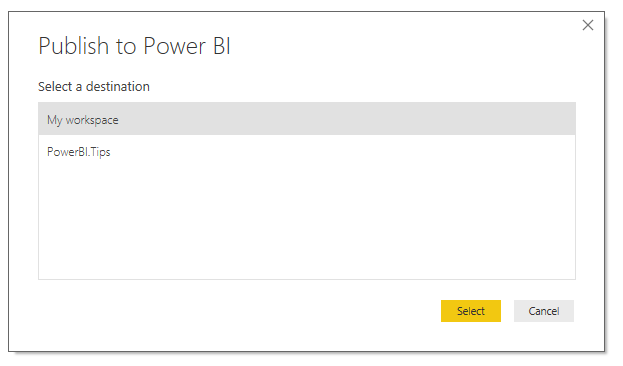
If you already have a more than one workspace in the PowerBI.com service a second window will pop up asking you to choose a workspace location. Choose a workspace location to publish the report.
Couple of important notes about workspaces.
A workspace can have admin users or members. The admin user can add and remove individuals to the workspace. A member can be configured to either, edit reports, or only view reports.
The workspace can have many admins if necessary which is helpful when collaboratively working on reports with a team.
I have found that when working on many different reporting projects a workspace helps target a specific audience or provides an organized method to share only reports that would be relevant.
You cannot create a workspace in this Publish to Power BI window. This has to be done from the service.
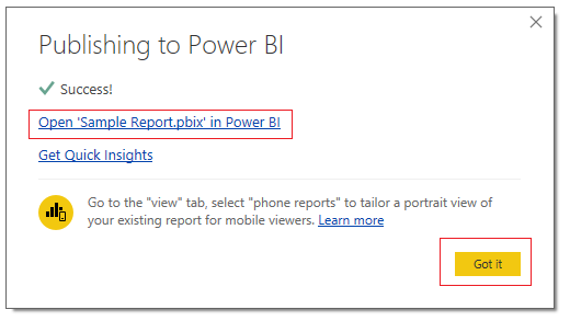
Since I am not sharing this report I will publish to My workspace. Click Select to complete the publishing. Once the report is done loading you will have a window that notifies you that the process has completed. A link is provided to check out your report directly on the service. You can dismiss the message by clicking Got it.
Click Got it to dismiss the pop-up window.
While remaining in PowerBI desktop, save the file one more time but use SAVE AS and save the file with the name of Sample Report V2.
Now we will create a new workspace for a report that we might want to share.
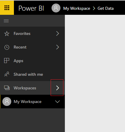
Go to PowerBI.com and login. On the left navigation bar click the arrow to expand the workspaces.
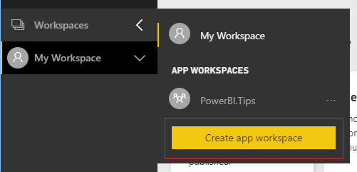
A fly-out menu will appear and you can click Create App Workspace.
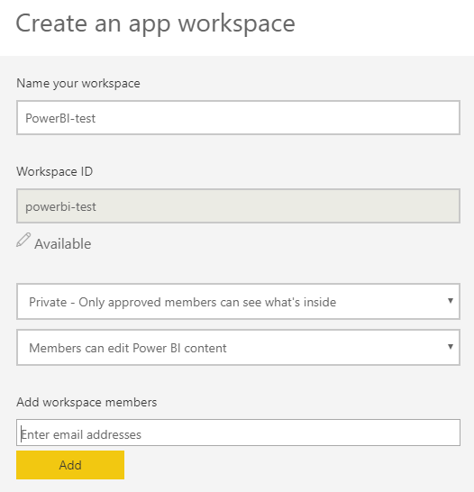
Fill out your workspace name and configure your settings. Be sure to enter your email address that you used to log into the PowerBI.com service in the workspace members area.
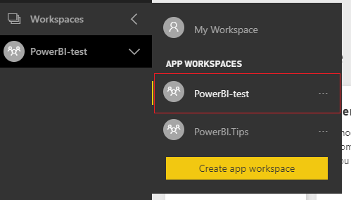
At the bottom of the menu click Save when you have completely configured the settings. Opening up the workspaces fly-out menu will now reveal your new workspace.
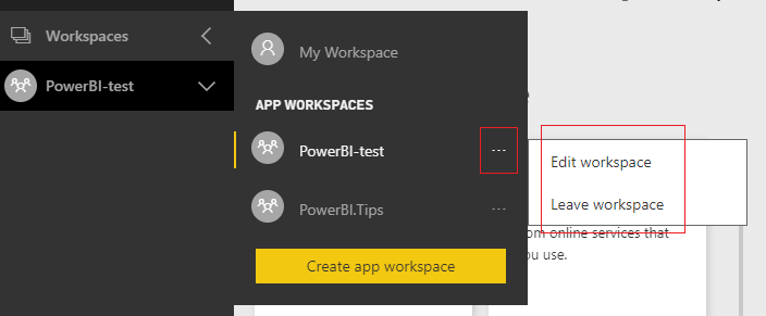
Click on the ellipsis of the new workspace PowerBI-test.
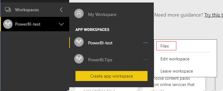
Notice when you click the ellipsis, that there are only two options, Edit and Leave. If you give it about 10 minutes or so, a third option will show up, Files. The reason we have to wait is because behind the scenes this workspace is tied to 0365 Groups. Thus, we have to wait for all the services to be fully provisioned before we can proceed. We will want to use the files option of our workspace. Now would be a good time to take a little potty break, pet your dog, get a snack… and come back in 5.
Yumm, I love Oreos…
Now that we have waited a bit, Refresh your browser page. This is important, if you don’t do this you won’t be able to observe the change. Click the ellipsis again and now we have a new item calledFiles.
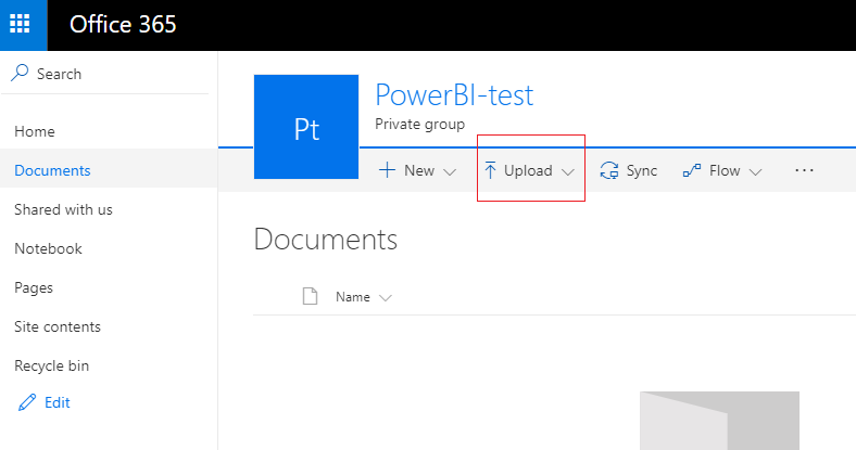
Click on Files and you will be re-directed to a custom SharePoint 0365 page for this workspace’s files.
Now we can upload the version two of our PBIX file. Click the upload button on the navigation bar.
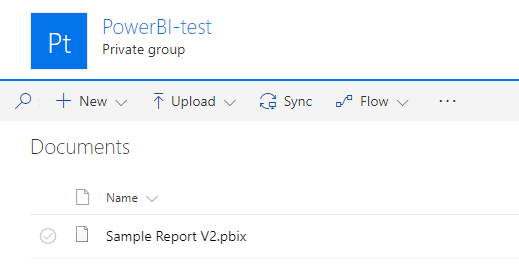
After uploading your file it should look like the following:
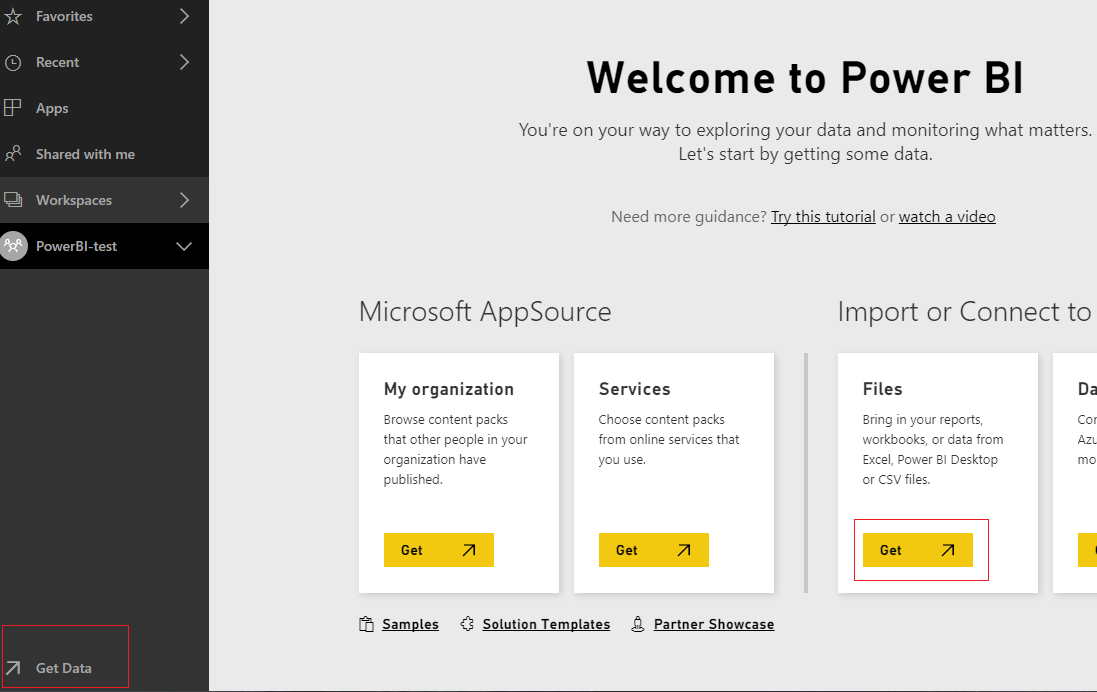
Go back to PowerBI.com, make sure you are still in the created workspace, then click Get Data at the bottom of the left navigation bar. Then click Get in the Files window.
Then a screen will pop-up showing you which source you can use to get data. Click the title labeled OneDrive.
Upon clicking this we are taken to the OneDrive location that we created with the workspace. In here we will have the Sample Report V2.pbix file. Click the name of the file Sample Report V2.pbix. Then click Connect to load the file.
Note: If you want to make changes to the pbix file you have to overwrite the file in the OneDrive location. Don’t worry, SharePoint does have version control on the files. This will keep the files location nice and clean. It also removes the need for you to version or date each and every file. To learn more about versioning files in SharePoint hit this link.
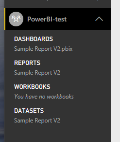
Now when we click on the workspace PowerBI-test we can see that the dataset, report, and dashboard has all loaded.
There are some advantages of loading your pbix file this way.
loading a file from OneDrive will automatically refresh the report every hour from the pbix file.
If any team members want to modify the original file the members of the workspace can access the file from the SharePoint page.
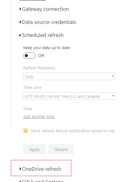
Click on the Ellipsis of the Sample Report V2 under the DATASETS section and select Schedule Refresh from the fly-out window. You will notice just under schedule refresh is a new setting called OneDrive refresh.
Click OneDrive Refresh, and now you can see there is a toggle for keeping the file refreshed every hour, which is enabled by default.
Whew, I think that about wraps it up, start with the desktop to make your files, be sure to create workspaces to share content, and use the workspace files to store and source control your pbix files.
I hope it was helpful.. Make sure you share this blog with another person if you found it valuable.
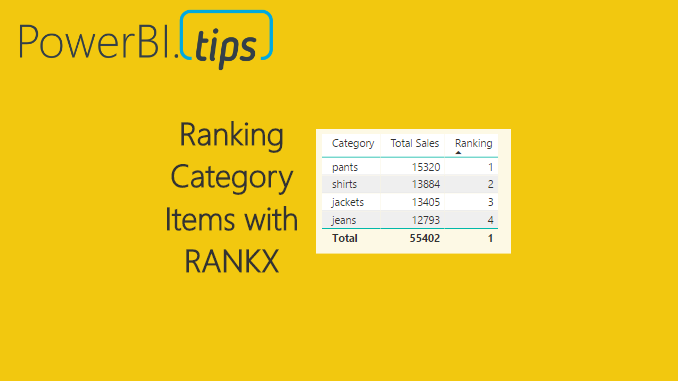
In many reports we produce we often need a method to score or rank data. For example, we may need to list the sales totals for the sales team and rank them from highest sales to lowest sales. Ranking can be done as a calculated column, or as a measure. When using a measure, the ranking becomes dynamic and takes on the filter context of the table, or visual, that is showing the data. Calculating a rank as a measure can be useful if you want to allow the user to select different categorical values such as product type and then have the report automatically rank the selected items. When the report filter context changes the items are automatically re-ranked.
Alright, let’s jump into the data!
Open PowerBI Desktop, Click the Get Data button on the Home ribbon and select Blank Query. Click Connect to open the Query Editor. On the View ribbon click the Advanced Editor button. While in the Advanced Editor paste the following code into the editor window, click Done to complete the data load.
Note: If you need some more help loading the data follow this tutorial about loading data using the Advanced Query Editor. This tutorial teaches you how to copy and paste M code into the Advanced Editor.
let
Source = Excel.Workbook(Web.Contents("https://powerbitips03.blob.core.windows.net/blobpowerbitips03/wp-content/uploads/2017/05/Clothing-Sales.xlsx"), null, true),
ClothingSales_Table = Source{[Item="ClothingSales",Kind="Table"]}[Data],
#"Changed Type" = Table.TransformColumnTypes(ClothingSales_Table,{{"Date", type date}, {"Category", type text}, {"Sales", Int64.Type}})
in
#"Changed Type"
Once you have copied the m code above into the query editor click Done.
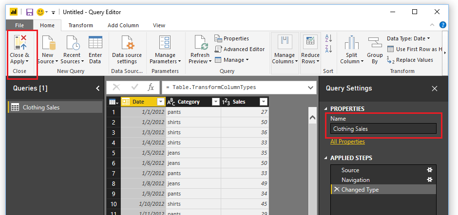
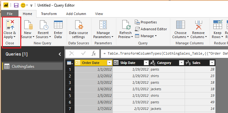
Be sure to name your query Clothing Sales. Then on the Home ribbon click Close & Apply to load the data into the data model.
To understand how the ranking will work we must first understand the DAX function ALLSELECTED. You can read more about the Microsoft documentation on this function here.
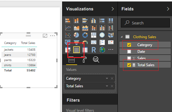
To illustrate how the ALLSELECTED() function works we will make two measures and place them in a simple table.
Begin by creating a sum of the Sales in the Clothing Sales table. Click New Measure on the Home ribbon. Enter in the following measure equation:
Total Sales = SUM ( ‘Clothing Sales'[Sales] )
Now, create a Table visual with the selected columns shown in the image below.
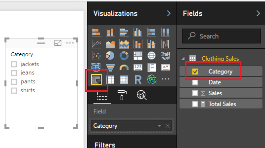
Sweet, we can see that all the categorical items have been added together forming totals. Add the Slicer visual for the Category column, see example below.
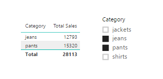
Once the slicer is added we can select various items and see our table filter correctly.
Note: if you want to select multiple items in the slicer, hold the ctrl key and click on the multiple items that you want to select. This is how I selected the multiple items in the image above.
Now, let us make a measure doing the same calculation but this time we will apply the ALLSELECTED() DAX function. Click on New Measure on the Home ribbon and enter the following DAX formula.
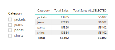
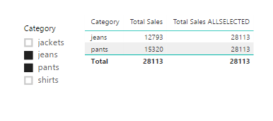
In this new formula we are calculating the sum of all the clothing sales but using the filter context of all the items selected from our filters. Notice with nothing selected in our slicers that the sum of all Total Sales 55k, is the same for each row of the table for the column Total Sales ALLSELECTED. This is due to the fact that we changed the filter context for the sum calculation.
Select Jeans and Pants from the slicer. Notice we have the same results but with different totals. The totals calculated using ALLSELECTED ignored the filter context of jeans and pants and calculated the total of all the selected sales.
Finally, we will now add the Ranking. To calculate the rank we use the DAX function RANKX(). More documentation can be found on RANKX here.
Add the new measure, Ranking, to the table visual. Ta Da, automatic ranking based on information that was selected from our slicer visual.
Note: when we used the RANKX function we called out a specific column the Category column from our Clothing Sales table. If you only specify the table name this measure will not work. We are using the filter context of the categories to conduct the ranking operation.
For those of you who work in supply chain management this tutorial will be right up your alley. In my previous job position I had a lot of interaction with our shipping department. We would look at when orders were placed from the customer, and conduct a comparison to what orders were actually shipped or cancelled prior to shipment. Our analytics team would produce reports and metrics to our customers about orders and shipment information.
In an ideal world, every product ordered on the purchase order would be shipped and some point in the future. But, as we know, in the real world this isn’t always the case. Orders get cancelled, products get re-ordered, challenges happen, and therefore we would need to track all these changes. In our shipping analytics group, the team would pull data from our shipping system with columns similar to the following:
Order Date, Ship date, Product type, and Shipped QTY
Sometimes you want to sum the data by the order date, and in other cases you want a total by the shipped date.
In this example, we will walk through making a measure that uses the DAX formula USERELATIONSHIP. To learn more about this function from the Microsoft documentation follow this link.
Open PowerBI Desktop, click the Get Data button on the Home ribbon and select Blank Query. Click Connect to open the Query Editor. On the View ribbon click the Advanced Editor button. While in the Advanced Editor paste the following code into the editor window, click Done to complete the data load.
Note: If you need some more help loading the data follow this tutorial about loading data using the Advanced Query Editor. This tutorial teaches you how to copy and paste M code into the Advanced Editor.
let
Source = Excel.Workbook(Web.Contents("https://powerbitips03.blob.core.windows.net/blobpowerbitips03/wp-content/uploads/2017/06/Clothing-Sales-Ship-Order-Dates.xlsx"), null, true),
ClothingSales_Table = Source{[Item="ClothingSales",Kind="Table"]}[Data],
#"Changed Type" = Table.TransformColumnTypes(ClothingSales_Table,{{"Order Date", type date}, {"Ship Date", type date}, {"Category", type text}, {"Sales", Int64.Type}})
in
#"Changed Type"
Your loaded data should look like the following:
Click Close & Apply on the Home ribbon to load the data into the data model.
We will want to create two measures, one that performs a calculation on the Order Date column, and one on the Ship Date. To do this we need a date table to populate all the dates needed for this data set.
We can do this by creating a DAX date table.
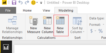
On the Modeling ribbon click New Table.
In the formula bar enter the following.
DateList =
GENERATE (
CALENDAR ( DATE ( 2012, 1, 1 ), DATE ( 2017, 12, 31 ) ),
VAR currentDay = [Date]
VAR startYear = 2012 // we know this by looking at our data
VAR month = MONTH ( currentDay )
VAR year = YEAR ( currentDay )
RETURN ROW (
“month”, month,
“year”, year,
“month index”, INT ( ( year – startYear ) * 12 + month ),
“YearMonth”, year * 100 + month )
)
Note: This DAX formula is building a date table, for each row we are building the columns, Month, Year, Month Index, and an integer for YearMonth index. This is a simple way to repeatedly create a date calendar based on your data.
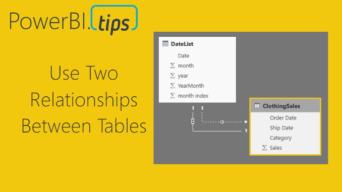
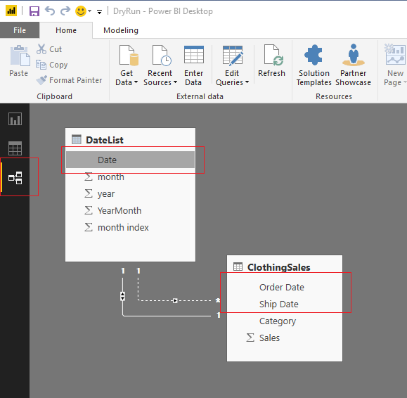
Great, we have completed the data loading. Now, we need to link the date table to the Clothing Sales data. To do this click on the Relationships button on the black navigation bar located on the left side of the screen. Then Click & Drag the Date column from the DateList table to the Order Date column of the ClothingSales table. This will create a one to one relationship link between the two tables. Note that the relationship is illustrated in a solid white line. This means it is an active relationship.
Next, drag the Date column from the DateList table to the Ship Date column of the ClothingSales table. We have made our second connection. Note that this connection has dotted white line. This means this connection is not active. Also, we can observe that the relationship between the two tables, DateList and ClothingSales is a one to many relationship. This is denoted by the * on the ClothingSales table, and the (1) one on the DateList table. The * means there are duplicate values found in the ClothingSales table. The (1) on the DateList table means in the Date column we only have unique values, no duplicates.
Note: You can edit the connections between tables by double clicking the connecting wires. This brings up the Edit Relationship dialog box which allows you to edit things like, the Cardinality, Cross Filter Direction and activating / deactivating the connection.
Once you’re done your relationships should look like the following:
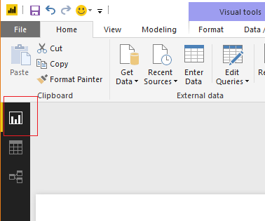
By default, Power BI will only allow one active connection between tables. Therefore, we have one connection active and the other has been inactivated by default. Return to the report view by clicking the Report icon on the left black navigation bar.
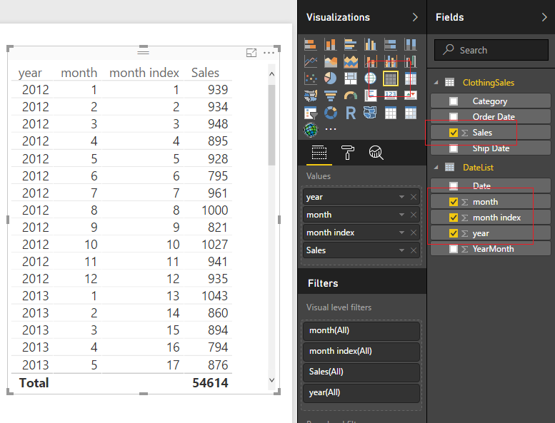
Now that we have completed the data modeling let’s make some visuals. We will start by making a simple table to see what the data is doing. Add the columns from the two tables, ClothingSales and DateList to a Table Visual.
Great! Now we have the total number of sales based on the order date. We know this because it is the primary connection that we established earlier when we linked our two tables together. But, what if I wanted to know the sales that were shipped based on the Ship Date. Earlier we made this connection but it is inactive.
Here is the awesomeness! We can create a measure that calculates different results between a user specified relationship.
First, we will re-calculate the sales number that we already have in our table. On the Home ribbon click the New Measure and enter the following in the DAX formula bar:
Order Date Sales =
CALCULATE (
SUM ( ClothingSales[Sales] ),
USERELATIONSHIP ( ‘DateList ‘[Date], ClothingSales[Order Date] )
)
Note: In this DAX formula we are creating a explicit measure, meaning we are specifically telling Power BI to sum a column. An implicit calculation is what we did earlier when we added the sales column to the table.
The USERELATIONSHIP filter within the calculation forces Power BI to calculate the sum based on the dates listed in the Order Date column. To see another demo on UseRelationship you can watch this video from Curbal.
Create another measure with the following DAX formula:
Ship Date Sales =
CALCULATE (
SUM ( ClothingSales[Sales] ),
USERELATIONSHIP ( ‘DateList ‘[Date], ClothingSales[Ship Date] )
)
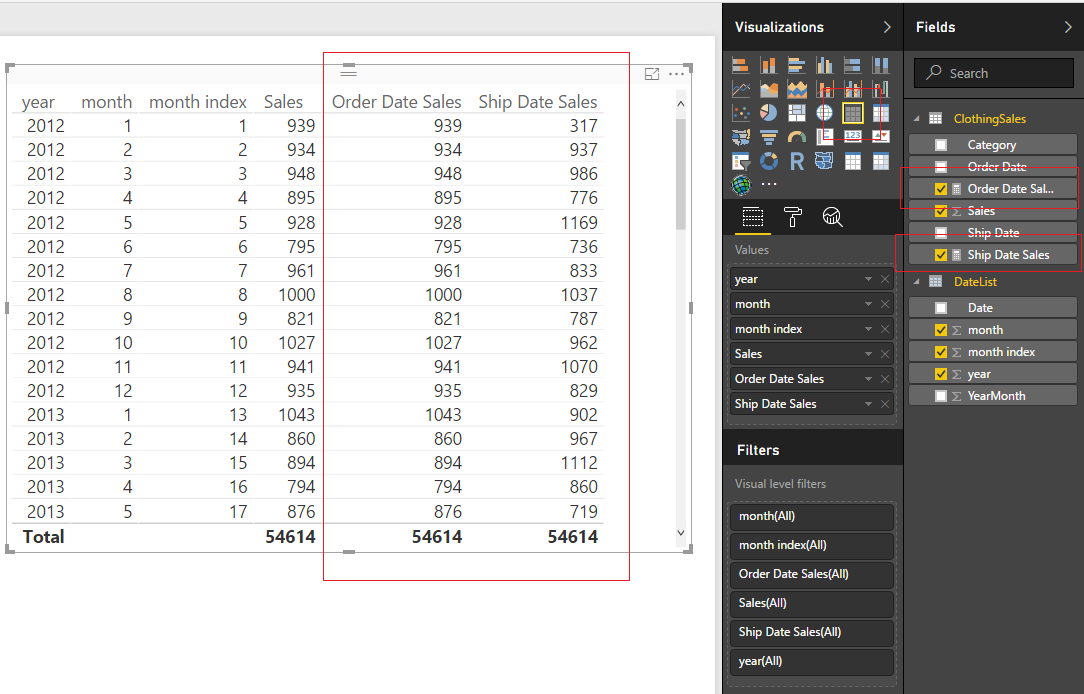
This time we are forcing Power BI to use the inactive relationship to calculate the sum of the sales by shipped date. Add the two new measures to our table and we now can see how the calculations differ.
The calculated sales for the order dates match our earlier column. This is expected, and we can confirm that this calculation is working properly. The shipped date sales are now calculating a different number. In some cases, the Shipped Date Sales is lower than the orders, because in that month you took in more orders than you shipped. In other months, the Shipped Date Sales is higher than the Order Date Sales, because there were likely large shipments ordered in the prior month and shipped in a different month.
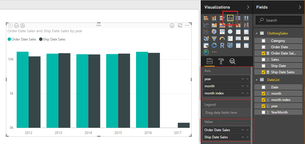
By adding a Bar Chart from the Visualizations pane, we can now see sales by order date and ship date.
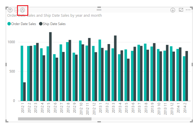
We can even dig deeper into the data. Click the Expand button to see the data by Year and Month.
Well that is about it. I hope you enjoyed this tutorial about using two relationships between data tables. If you want more information about DAX check out these books that I have found extremely helpful.
This week I had a number of team members tell me how difficult it was to share a PBIX file and the corresponding data between team members. The department hasn’t committed 100% to the idea of using PowerBI.com, and thus wanted to share the actual report. I pointed my team mates to my earlier tutorial about using variables for file locations. After reading the tutorial the team came back with a bunch of griping about how they didn’t want to go into the query editor, people name variables different things, and thus it’s hard to understand what another team member was doing, blah, blah, blah…
So, in order to make peace I took another look at trying to make the sharing of a PBIX file easier. This time I decided to use the Parameters feature within PowerBI. This feature within the Query Editor was released all the way back in April of 2016. I read about it, thought it was interesting but couldn’t find a really good use case. In my current predicament, the parameters feature is the perfect solution.
By using a parameter to store a folder and or file location you enhance the user experience by making it easier for a user to change the Query.
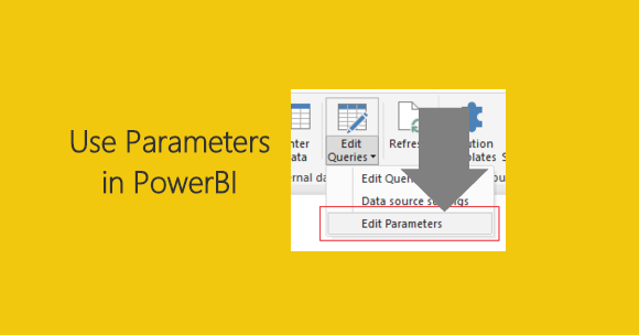
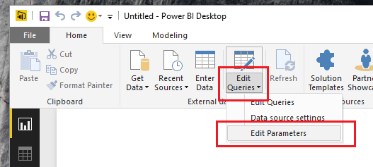
To modify a parameter after it has already been built click on the bottom half of the Edit Queries button, found on the Home ribbon. A menu will pop up and you can select Edit Parameters.
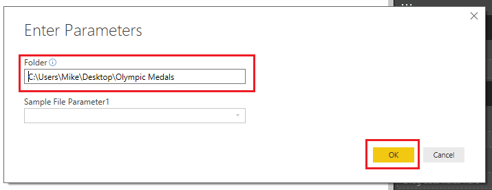
The Enter Parameters screen will pop up. This is where you would change the parameters for a query. In our example this is where we will enter a new folder location for our data.
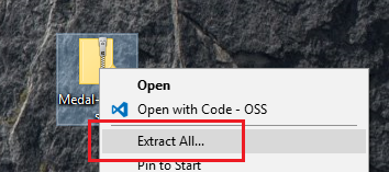
Let’s begin the tutorial. To start we will need to work with some data. In my earlier tutorial, I used the Olympic Medals Count. We will reuse this dataset. Start by downloading the zipped folder Olympic Metal Count files from the following location. Once you have downloaded the sample data, extract the folder and subsequent files from the zipped file. In windows 10, which I am using, you can right click on the downloaded file and select Extract All..
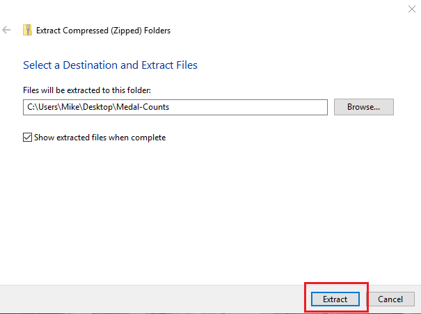
A pop-up window will appear to complete the extraction process. By leaving the default settings the folder will be extracted into the same location as the downloaded file. Click Extract to complete the extraction.
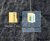
We now have a folder with all our data.
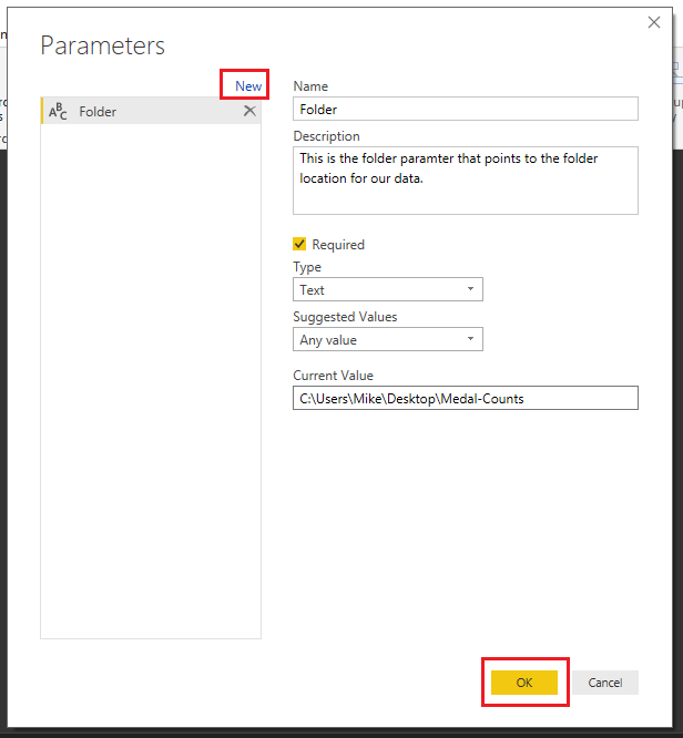
With the data prepared we can now make the parameters within PowerBI. Open PowerBI and click the top half of the Edit Queries button. The Query Editor will open. Click the Mange Parameters found on the Home ribbon. The Parameters screen will open. Click the blue New button at the top left. Enter the name Folder, and include a brief description of this parameter. Since the folder parameter is essential to the query we must leave the Required box checked. Change the Type to Text, and leave the Suggested Values to Any value. Finally enter the Folder Location where our Medal-Count file is located into the Current Value. Click OK to complete the parameter.
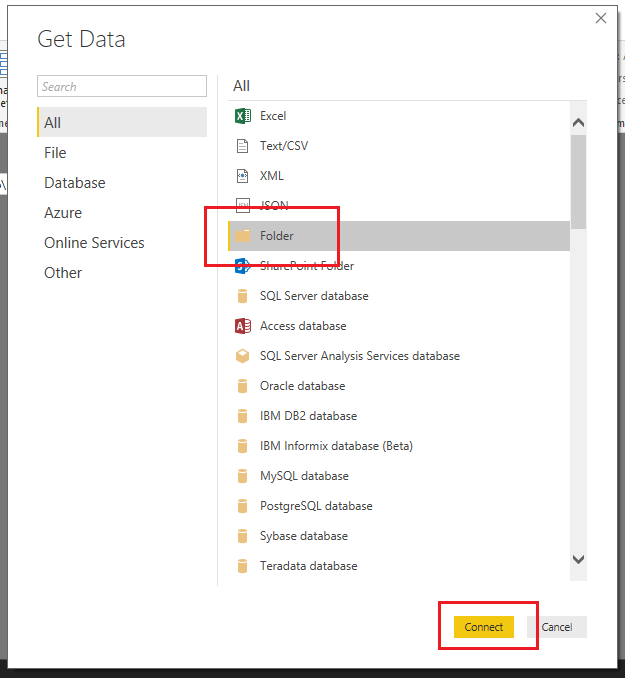
Next, we will create the actual query to load the folder containing our Metal Counts. Click on the New Source button. This will open the Get Data window. Select the Folder option located in the list on the right. Click Connect to complete the Get Data.
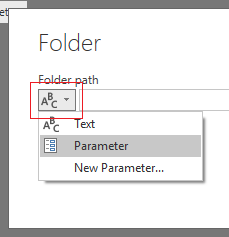
The Get Data window will close, then a new window asking for the folder location will open. This is where the parameter implementation is slick. Click the ABC button to the far right of the Folder Path bar. Change the selection to Parameter and select our newly created parameter labeled Folder. Click OK to load the Folder.
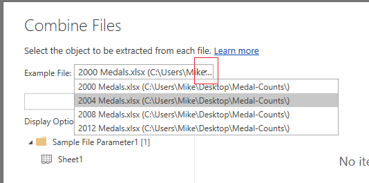
Next the folder prompt opens allowing us to accept or edit the query. Click Combine & Edit to proceed. The Combine Files window will open. Here we can interrogate each file to inspect what is in each file. Clicking the drop-down menu next to Example File: allows us to see the list of all files. Select the 2004 Medals.xlsx file.
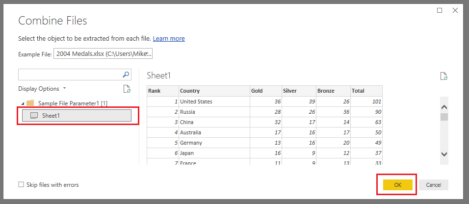
Click the Sheet1 item on the left side of the window. This exposes the data that is contained within this 2004 particular file. Click OK to proceed.
Note: For users that have been working with PowerBI for a while, this Combine Files screen flow is a newer feature. I feel that this greatly simplifies the process and makes it easier to detect issues when loading data.
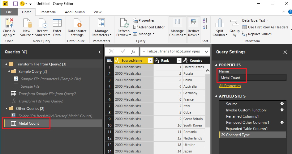
PowerBI now loads the files into the Query Editor. The Query that we want to use is labeled Query2, change the Query2 name to Metal Count.
What you’ll also notice is there is a lot more queries on the left side of the screen under Queries. These queries were auto generated when we navigated through the menu screens. Click Close & Apply to complete the data load.
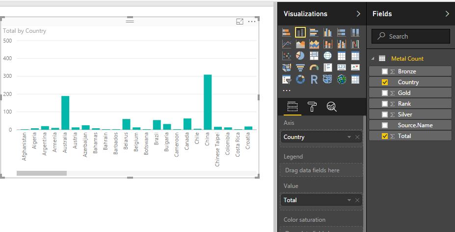
Build the following Stacked Column Chart:
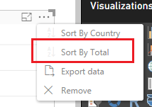
Click the Ellipsis on the upper right hand corner of the chart and select Sort By Total to sort all the items in the bar chart according to how many metals each country won.
Great we have made a parameter, loaded multiple excel files, and then made a visual of our data. Let’s test it out. Save your work and close the PowerBI desktop. (don’t forget to save your PBIX)
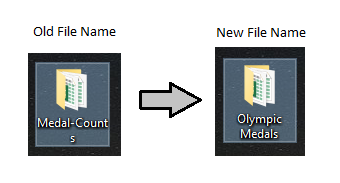
Next we rename the folder where all the excel files are contained. Change the name to Olympic Medals.
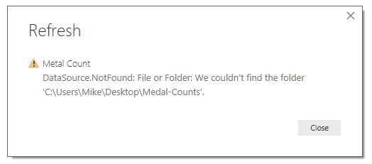
Reopen your PBIX file, on the Home ribbon click the Refresh button. Ooops, since we renamed the folder we now have an error.
To fix this click the bottom half of the Edit Queries button on the home ribbon, and select Edit Parameters. Then modify the Folder field to include the new name of the other folder Olympic Medals. Click OK to proceed.
A message bar will appear under the Home ribbon. Click Apply Changes to complete the data load. PowerBI will reload all your data using the context of the new folder.
Now this is an elegant solution for sharing PBIX files and their corresponding data files with coworkers. This is just a simple example of how you would use parameters. There are a multitude of other really good use cases for using parameters within your queries. Thanks for reading along, be sure to share if you like this tutorial.
March is an exciting month, and with this release of Power BI we have been given some long asked for features. One such feature is the ability to import a color theme. The color theme defines the starting colors for your visuals. Before the ability to import a theme one would have to first define each color that they want to use in a Power BI report by changing each visual to have the correct color scheme. Color themes are useful when trying to make a dashboard and you want to use colors that resemble a company’s product or logo. Alright, let’s get started and make and add our own color theme to a report.
Begin by opening up Power BI Desktop. Make sure you have the latest version of Power BI Desktop, you can download the latest version here. The import color theme feature is available in the March 2017 release.
On the Home ribbon click the Enter Data button. Enter the following table of data and name the table Data.
Product
Value
Item1
20
Item2
25
Item3
15
Item4
40
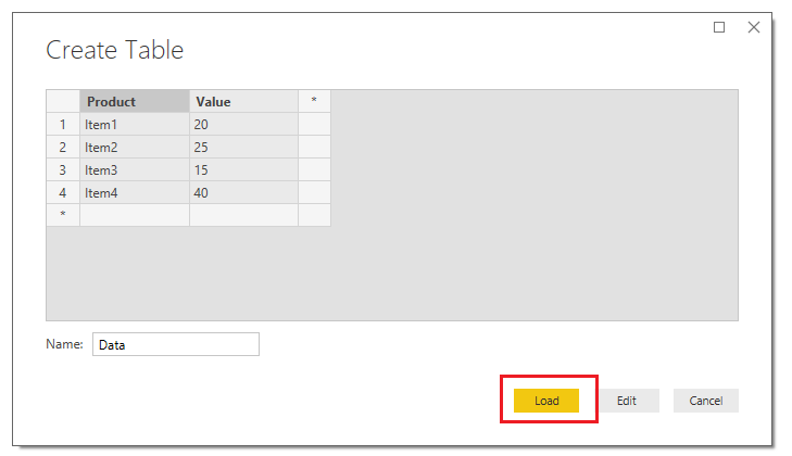
The Create Table should look similar to the following. Click the Load button to proceed.
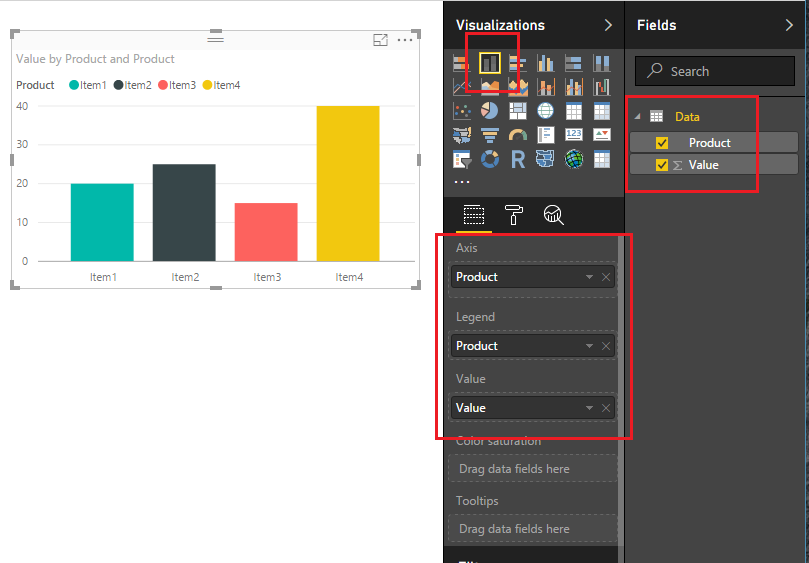
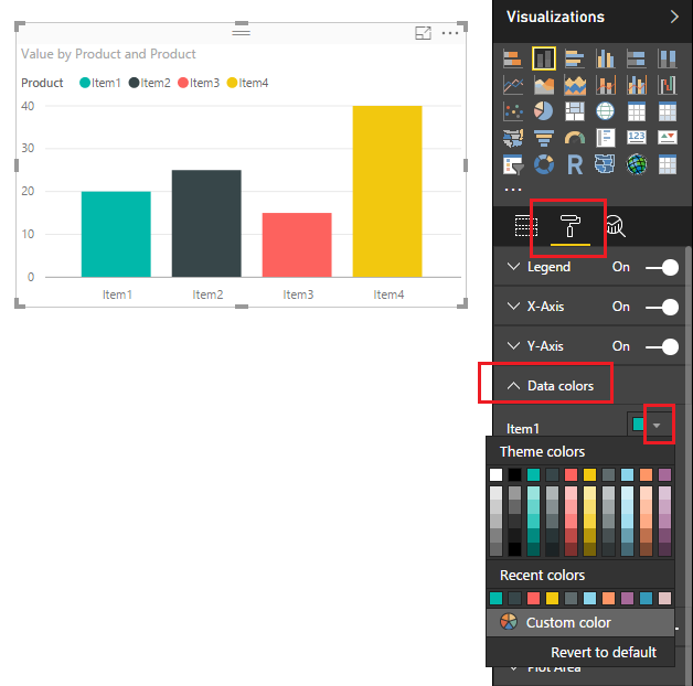
Power BI will load the data to memory and the Fields pane will reveal our newly created columns. Add the Stacked Column Chart on the report page and appropriate fields shown in the image below. You will notice that the default colors are automatically overlaid onto our visual when we add the Product to the Legend visual field.
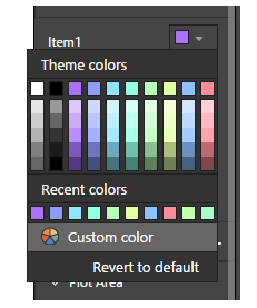
Next, let’s take a peek at the standard colors that are offered by default from Power BI. Click on the Paint Roller found in the Visualizations pane. Then expand the data field labeled Data colors. Under Item1 click the little triangle. This will expose the current color scheme that is loaded.
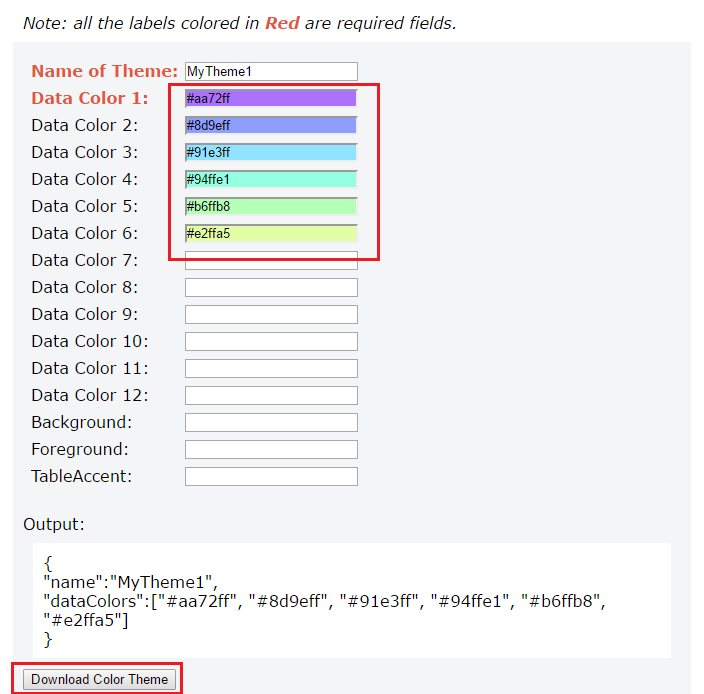
Now we will load the new color theme. But before we can load the color theme we have to generate the color theme first. The color theme has some requirements. First the color theme must be written as a JSON file and must adhere to the JSON format. For developers this will be a very simple google search to accomplish this. However, I know there are some out there that do not enjoy doing development work. So, in a PowerBI.Tips first, I have developed a custom tool to make the color theme generation super simple.
Introducing the PowerBI.Tips Color Theme Generator (CTG) to help Power BI users create quick and easy JSON code files to input into Power BI for the color themes. Not everyone has a coding background, and though there will be tutorials and examples of how to set up the JSON, if you aren’t familiar with the language a small typo could have you spending precious time troubleshooting the issue.
update 3/15/17: The Advanced Theme Generator has been released. Find the tool here.
Click the following link to open up the PowerBI.Tips Color Theme Generator in a different Browser window. Once the browser loads the Color Theme Generator follow the instructions listed at the top of the page to select your colors. The only required fields are the Name, and at least one color. For this tutorial I selected a number of nice pastel colors. Click the Download Color Theme button to download the JSON file that we will use in Power BI.
Note: The Generator was tested on Google Chrome. Also, clicking the Download button will download the JSON file to your browser’s default location. You will need to know this file location to load the file into Power BI Desktop.
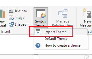
Head back over to Power BI Desktop. On the Home ribbon click the button labeled Switch Theme. Then click Import Theme.
Note: If you want to remove your custom theme you will click on the Switch Theme, then click on the Default Theme. The normal power BI colors will be restored.
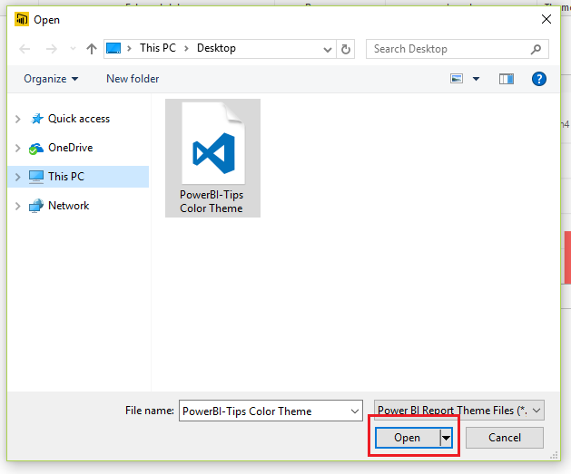
Navigate to where your browser downloaded the file. Select the file labeled PowerBI-Tips Color Theme. Click Open to load the theme.
PowerBI will prompt a message letting you know everything loaded correctly. Click Close to see the new theme applied to our visual.
We can now see our custom theme by clicking on the Paint Roller found in the Visualizations pane. Then expand the data field labeled Data colors. Under Item1 click the little triangle.
Tada, now we have a custom color scheme that we create and loaded. Also, now that we the JSON file you can modify the file and keep it for future projects.
Thanks for following along. If you liked this tutorial please be sure to share. Also if you want to know more about me you can visit my About page and follow me on twitter or Linkedin for updates.
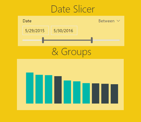
In the October update of PowerBI Desktop we were given a number of really useful features, ranging from a new Date Slicer, Grid lines, Grouping, Binning, Top N Filters, and R-powered custom visuals. For the full release on the October 2016 software release you can read more here.
For those of you who have followed my site you already know that I absolutely love the ability to create R-visuals within PowerBI. If you want to learn more you can read the R script tutorials here.
As I’ve been exploring this October release of Power BI Desktop two features have really stood out. First, the ability to use the Date Slicer and second the new feature of Grouping for Bar Charts. In my daily work flow I have struggled in the past with solutions which are now solved.
Welcome to my love & hate relationship with time bound data sets. Inevitability at some point you will encounter a need to manipulate data over time. Common business questions will come in the form of: What was my percent change compared from this month compared to last month? What is my sales performance for this year? Are we up or down compared to the same period last year? While these questions are simple I have found that calculating measures and subsequently building visuals can get very complex in a hurry. Enter the Date Slicer. Let me be clear, the Date Slicer will not solve all your problems, it does present a very useful interface that will let report users quickly navigate through their time delineated data.
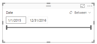
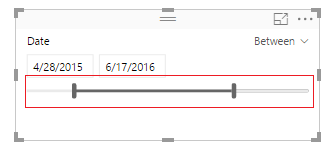
What is the Date Slicer? I’m glad you asked. Behold….
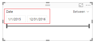
Here are a couple of key items to point out. On the left side of the visual you are given the ability to select the starting date, and ending date.
The bottom of the Date Slicer has an adjustable time bar that allows quick time adjustments.
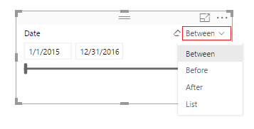
On the right side of the visual you can toggle between different date selection modes, Between, Before, After, and List.
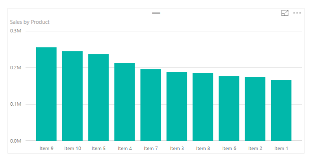
Ok, enough about the Date Slicer, how about the Groupings feature. Lets say you start off with a bar chart that looks similar to the following:
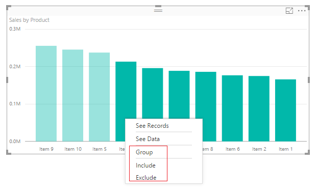
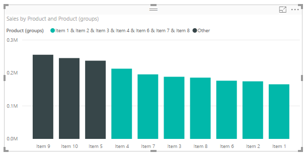
Well, maybe you’re only interested in Items 9, 10, and 5. Grouping now allows the selection of multiple bars and by right clicking you can Group, Include, or Exclude.
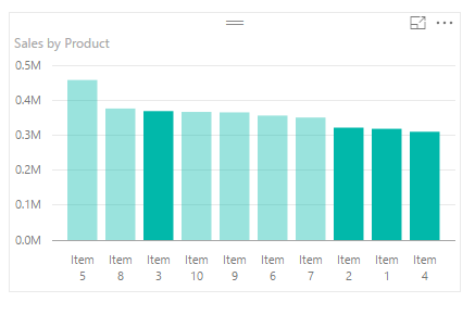
Clicking group creates a new column in the Fields area that groups the items together and adds them to the chart legend.
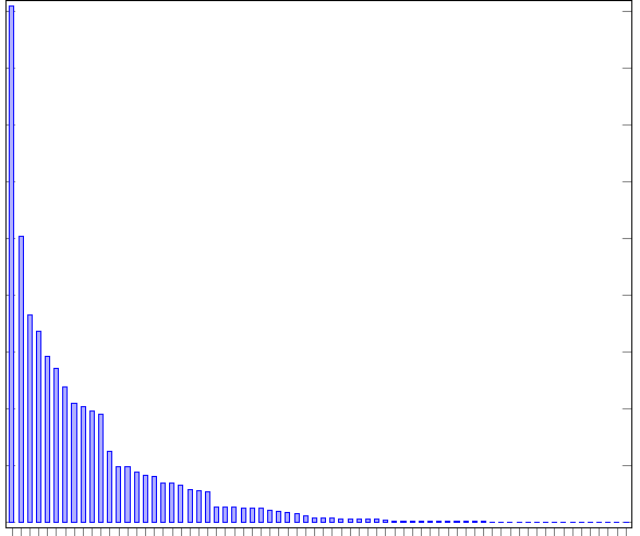
Let me tell you this is helpful, especially when your bar chart looks like this:
Be honest, you have published a report or two when there were just way to many bars. The different between the largest bar and all the small bars barely tells you any information. This is why grouping is helpful. When you receive data and you need to focus your story to the important pieces then grouping is your friend.
Enough babbling, let’s get to the tutorial.
Open up PowerBI Desktop, Click the Get Data button on the Home ribbon and select Blank Query. Click Connect to open the Query Editor. ClickAdvancedEditor on the View ribbon. While in the Advanced Editor paste the following code into the editor window, click Done to complete the data load.
Note: If you need some more help loading the data follow this tutorial about loading data using the Advanced Query Editor. This tutorial teaches you how to copy and paste M code into the Advanced Editor.
let
Source = Excel.Workbook(Web.Contents("https://powerbitips03.blob.core.windows.net/blobpowerbitips03/wp-content/uploads/2016/11/Sales-Data-Two-Years.xlsx"), null, true),
Sales_Table = Source{[Item="Sales",Kind="Table"]}[Data],
#"Changed Type" = Table.TransformColumnTypes(Sales_Table,{{"Date", type date}, {"Product", type text}, {"Sales", Int64.Type}})
in
#"Changed Type"
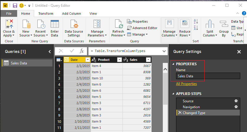
Rename the Query to Sales Data. Once you’ve completed the data load your data should look like the following.
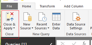
On the Home ribbon click Close & Apply to complete the data load.
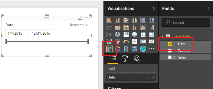
Great, we are ready to start adding visuals now. Add a Slicer visual from the Visualizations window and populate the visual with the Date field. By default, the slicer will auto recognize that the field being added is a date and will automatically show the Date Slicer.
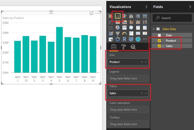
Next, add a bar chart visualization. The Date field will be the Axis, and the Sales will be the Value.
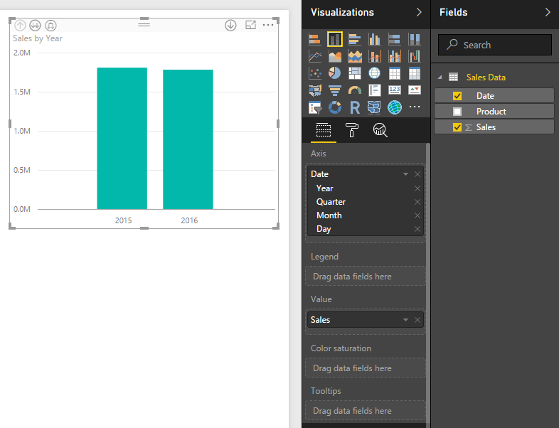
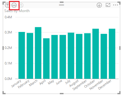
Again by default the Date filed will be entered as a Hierarchy field. Click the Drill Down button until you see a monthly view of the date. This should require two clicks, the first drills down to quarters, then second click drills down to month level. After doing this your visual should look like the following:
Add a second bar chart with following fields selected.
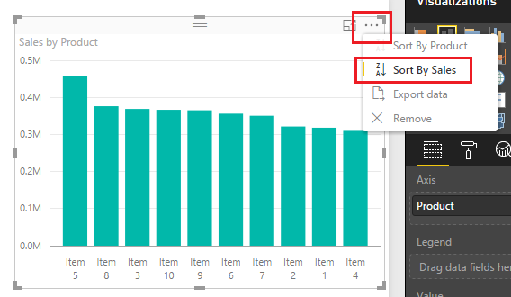
Sort the Sales by Product bar chart in descending sale order by clicking the Ellipsis and when the drown down menu appears selecting Sort by Sales.
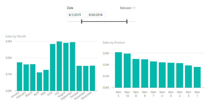
Now that we have built a couple visuals and a Date Slicer, take some time to explore how the Date Slicer interacts with the bar charts. In the example below I modified the starting date to 6/1/205 and the ending date to be 9/30/2015.
To utilize the grouping feature we will group Items 1,2,3 and 4 together. While holding the control button click Items 1,2,3 and 4 on the Sales by Product bar chart.
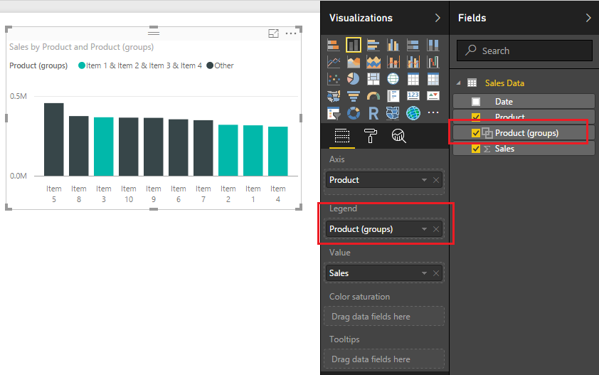
Right click Item 3 an menu will appear, select Group. Notice once you do this a new Product (Group) field appears in the field menu and the Product (Group) is automatically added to the legend of the bar chart visual.
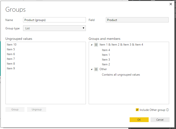
To edit the grouping you can click on the Field labeled Product (groups) and select Edit Groups. Doing this reveals the grouping dialog box.
You can rename the created group by double clicking the name Item 1 & Item 2 & Item 3 & Item 4.
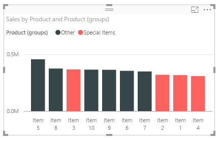
Change the name of the grouping to be titled Special Items. Click OK to close the Groups dialog box. Notice how the bar chart updates the legend values to renamed grouping.
Well, that wraps up this tutorial. I hope you enjoyed it. Below is a live demo of what we built today.
Make sure you share the content if you liked this tutorial.
This is a quick tutorial on how to load Excel files from a SharePoint page. SharePoint is a nice landing place for your data because it can be connected to the PowerBI.com service and thus can be used to schedule refreshes of data within your company (if you already have a SharePoint o365 account).
This tutorial will be a slightly different than my previous tutorials as I don’t have a publicly available SharePoint site that can be used to connect to. So you will have to slightly adapt what I’m presenting to you to fit your particular SharePoint needs.
First you must start off with a SharePoint with a document library that includes an Excel file.
The document library is titled SampleDocs, and the file we want to bring into PowerBI is called SampleData.
Clicking on the Home in the left navigation will take you to the home location of the SharePoint site. Copy down the HTML site address from your browser of this location it should look similar to the following:
https://partner.onmicrosoft.com/sites/[Your Site Name]/SitePages/Home.aspx
Open up PowerBI Desktop and on the home ribbon click Get Data. Highlight the SharePoint Folder and click Connect to continue.
Upon clicking connect you will be presented with another screen asking for the SharePoint folder location. In the URL window you will add the SharePoint site that we identified above. However, it is important to note that you don’t need the entire web address. Rather PowerBI only needs the specific site name, thus all that needs to be inserted into the URL field is highlighted below in Red.
https://partner.onmicrosoft.com/sites/[Your Site Name]/SitePages/Home.aspx
The ending “Sitepages/Home.aspx” can be removed.
Clicking ok will present a authentication screen. Depending on your company or SharePoint authentication you will need to enter the credentials to log into the SharePoint Site. You may have to try a couple different connection methods until you are able to properly connect to the SharePoint site. In my example I had to select Organization Account then click the Sign in. I signed in with my credentials given me via my I.T. group. Also, I had to use the drop down to select the proper level to apply the settings. I used the same address as listed above: https://partner.onmicrosoft.com/sites/[Your Site Name]/
After signing in click Connect to proceed. PowerBI Desktop will then load all the files from the SharePoint site in a preview window. Click Edit to modify the query.
We can now see our SampleData File and the folder path. Each document library will be a separate folder path, thus if you have multiple document libraries then you will have all the files in those different folder paths.
Next click the double down arrows to load the excel file.
Power BI Desktop will then go to the SharePoint site and download the information inside your excel file. For my data I have all the information retained in a table within my excel document. The table name is call MyDataTable. Thus, clicking on the Table link in the MyDataTable row I will be able to open all the data within this table.
Finally the data is loaded from the excel table. Click Close & Apply on the Home ribbon to load the data into PowerBI.
Note: It is always important to check your columns and verify that your data types are correct. Highlight each column and make sure you select the proper Data Type for each column. Data Type can be found on the Home ribbon.
Thanks for visiting. Make sure you stop by again for more great tutorials.
Manage Consent
To provide the best experiences, we use technologies like cookies to store and/or access device information. Consenting to these technologies will allow us to process data such as browsing behavior or unique IDs on this site. Not consenting or withdrawing consent, may adversely affect certain features and functions.
Functional
Always active
The technical storage or access is strictly necessary for the legitimate purpose of enabling the use of a specific service explicitly requested by the subscriber or user, or for the sole purpose of carrying out the transmission of a communication over an electronic communications network.
Preferences
The technical storage or access is necessary for the legitimate purpose of storing preferences that are not requested by the subscriber or user.
Statistics
The technical storage or access that is used exclusively for statistical purposes.The technical storage or access that is used exclusively for anonymous statistical purposes. Without a subpoena, voluntary compliance on the part of your Internet Service Provider, or additional records from a third party, information stored or retrieved for this purpose alone cannot usually be used to identify you.
Marketing
The technical storage or access is required to create user profiles to send advertising, or to track the user on a website or across several websites for similar marketing purposes.