Search results for: “% change”

  • Measures – Calculating % Change

    Measures – Calculating % Change

    In our last post we built our first measure to make calculated buckets for our data, found here.  For this tutorial we will explore the power making measures using Data Analysis Expressions (DAX).

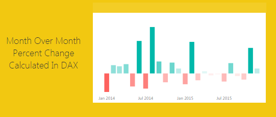
    When starting out in Power BI one area where I really struggled was how to created % change calculations.  This seems like a simple ask and it is if you know DAX.

    Alright lets go find some data.  We are going to go grab data from Wikipedia again.  I know, the data isn’t to reliable but it is fun to play with something that resembles real data.  Below is the source of data:

    https://en.wikipedia.org/wiki/Automotive_industry

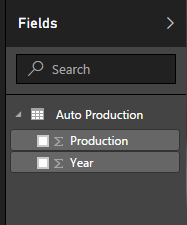
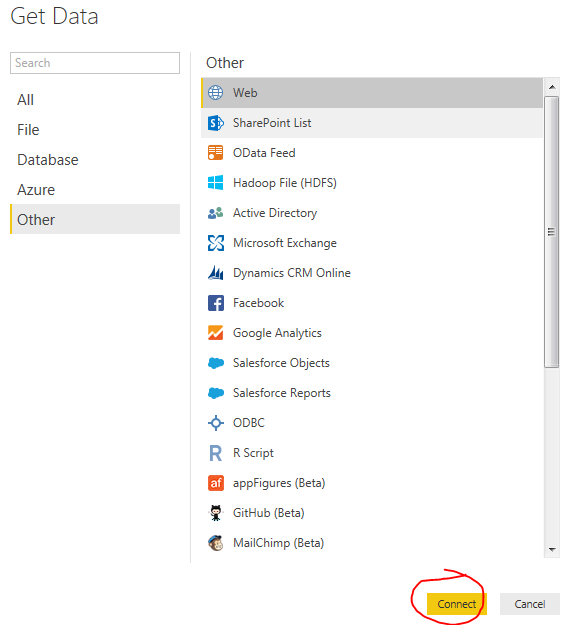
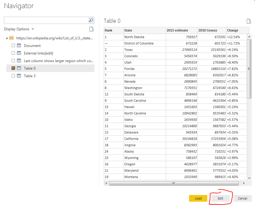
    To acquire the data from Wikipedia refer to this tutorial on the process.  Use the Get Data button, click on Other on the left, select the first item, Web. Enter the webpage provided above in the URL box.  Click OK to load the data from the webpage.  For our analysis we will be completing a year over year percent change.  Thus, select the table labeled By Year[edit].  Data should look like the following:

    Global Auto Production Wikipedia
    Global Auto Production Wikipedia

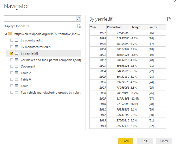
    This is the total number of automotive vehicles made each year globally from 1997 to 2014.  Click Edit to edit the data before it loads into the data model.  While in the Query Editor remove the two columns labeled % Change and Source.  Change the Name to be Global Production.  Your data will look like the following:

    Global Production Data
    Global Production Data

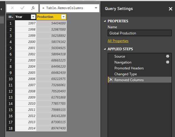
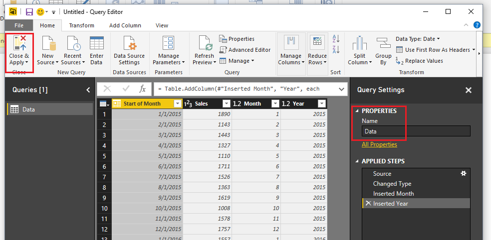
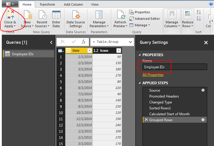
    Click Close & Apply on the Home ribbon to load the data into the Data Model.

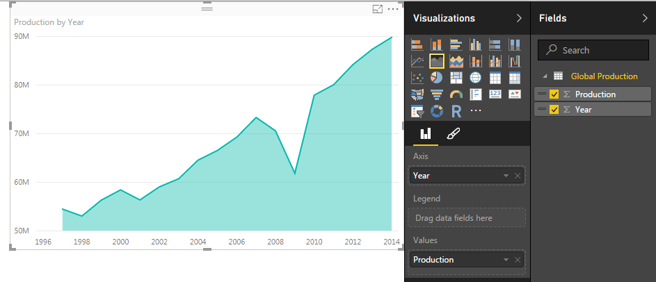
    Add a quick visual to see the global production.  Click the Area Chart icon, and add the following fields to the visual, Axis = Year, Values = Production.  Your visual should look something like this:

    Area Chart of Global Production
    Area Chart of Global Production

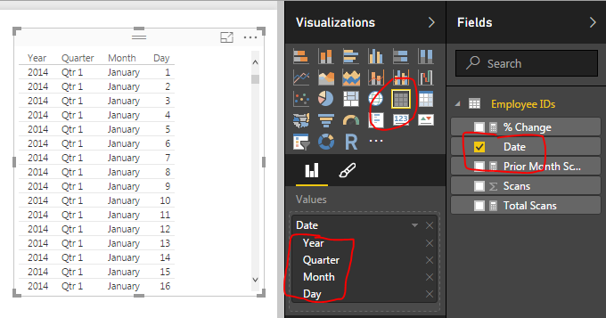
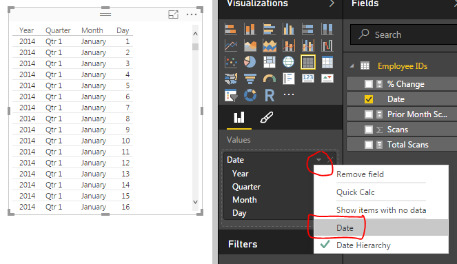
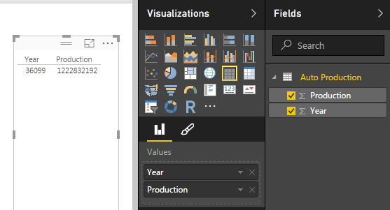
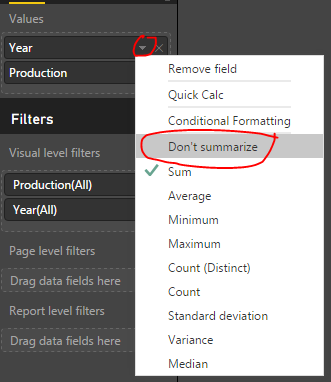
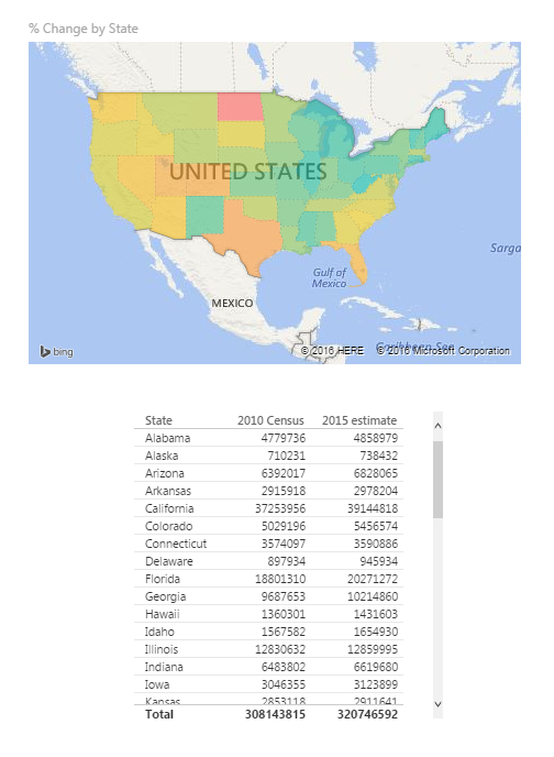
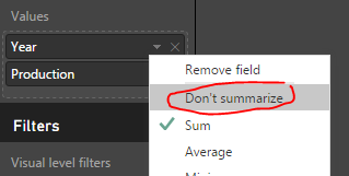
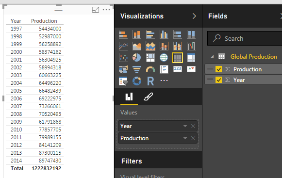
    Next we will add a table to see all the individual values for each year.  Click the Table visual to add a blank table to the page.  Add Both Year and Production to the Values field of the visual.  Notice how we have a total for both the year and production volumes.  Click the triangle next to Year and change the drop down to Don’t summarize. 

    Change to Don't Summarize
    Change to Don’t Summarize

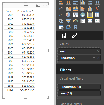
    This will remove the totaled amount in the year column and will now show each year with the total of Global Production for each year.  Your table visual should now look like the following:

    Table of Global Production
    Table of Global Production

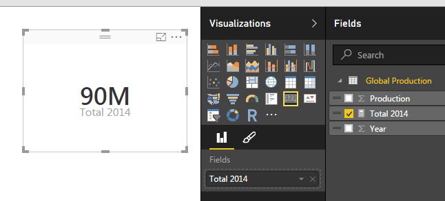
    Now that we have the set up lets calculate some measures with DAX.  Click on the button called New Measure on the Home ribbon.  The formula bar will appear.  We will first calculate the total production for 2014.  We will build on this equation to create the percent change.  Use the following equation to calculate the sum of all the items in the production column that have a year value of 2014.

    Total 2014 = CALCULATE(sum('Global Production'[Production]),FILTER('Global Production','Global Production'[Year] = 2014))

    Note: I know there is only one data point in our data but go alone with me according to the principle.  In larger data sets you’ll most likely have multiple numbers for each year, thus you’ll have to make a total for a period time, a year, the month, the week, etc..

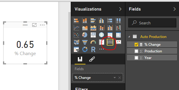
    This yields a measure that is calculating only the total global production in 2014.  Add a Card visual and add our new measure “Total 2014” to the Fields.  This shows the visual as follows, we have 90 million vehicles produced in 2014.

    2014 Production
    2014 Production

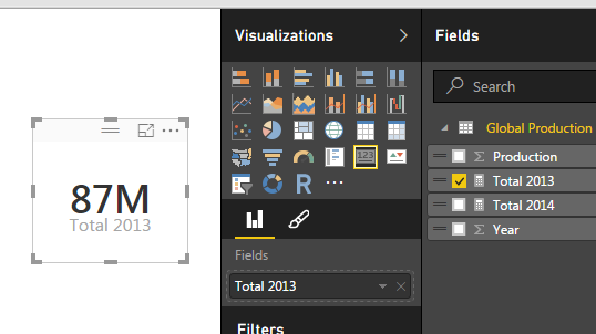
    Repeat the process above instead use 2013 in the Measure as follows:

    Total 2013 = CALCULATE(sum('Global Production'[Production]),FILTER('Global Production','Global Production'[Year] = 2013))

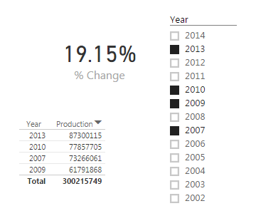
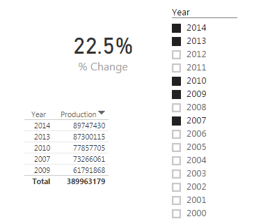
    This creates another measure for all the production in 2013.  Below is the Card for the 2013 Production total.

    2013 Production
    2013 Production

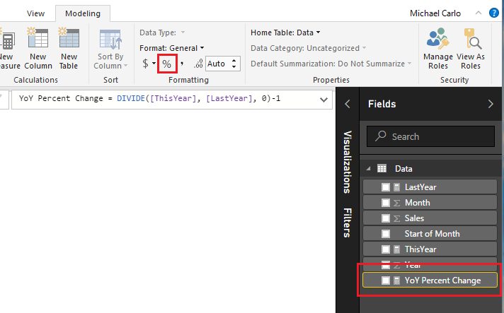
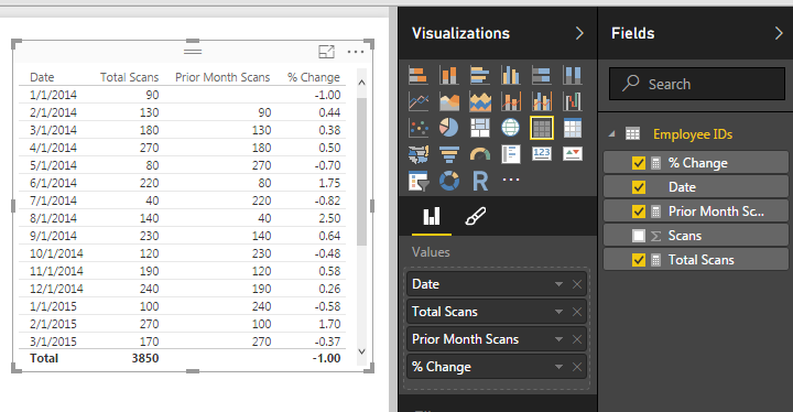
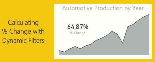
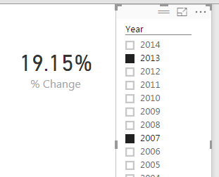
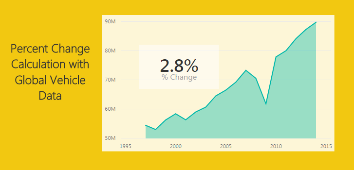
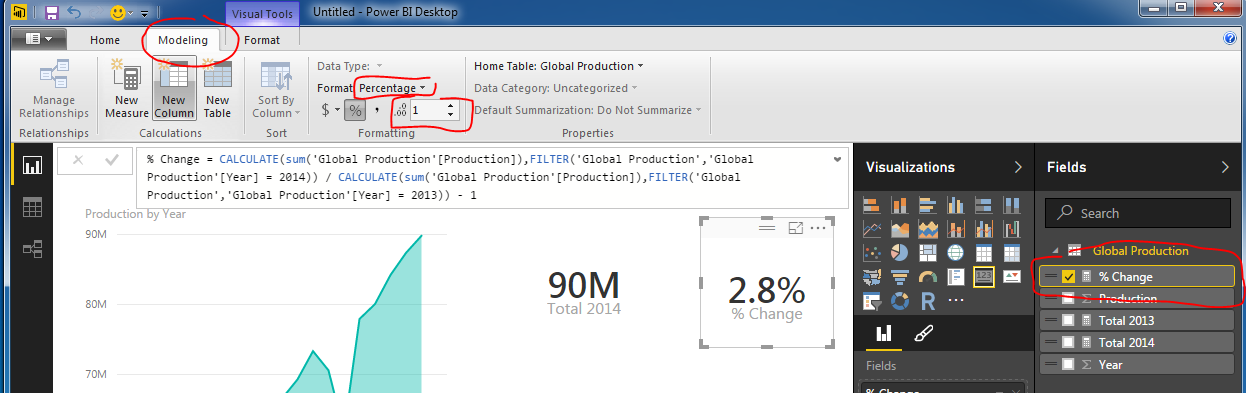
    And for my final trick of the evening I’ll calculate the percent change between 2014 and 2013.  To to this we will copy the portions of the two previously created measure to create the percent change calculation which follows the formula [(New Value) / (Old Value)]- 1.

    % Change = CALCULATE(sum('Global Production'[Production]),FILTER('Global Production','Global Production'[Year] = 2014)) / CALCULATE(sum('Global Production'[Production]),FILTER('Global Production','Global Production'[Year] = 2013)) - 1

    This makes for a long equation but now we have calculated % change between 2013 and 2014.

    Percent Change
    Percent Change

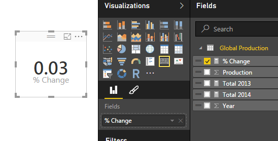
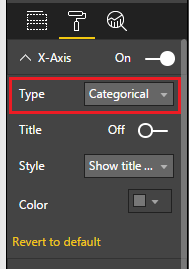
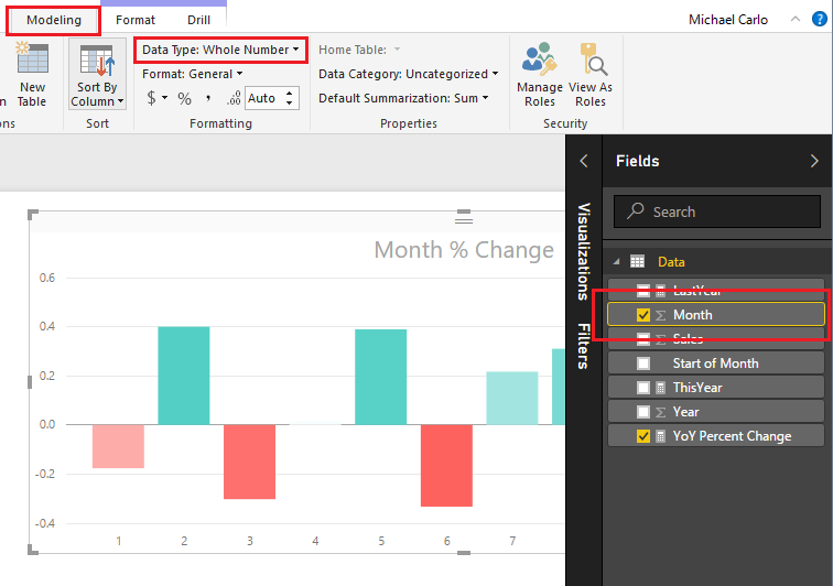
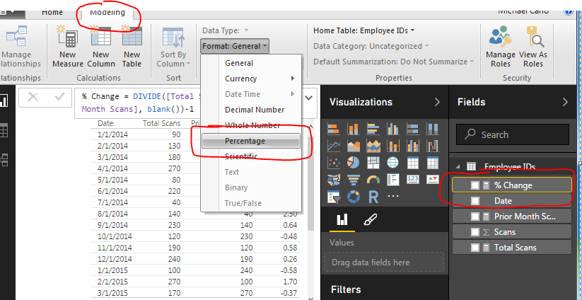
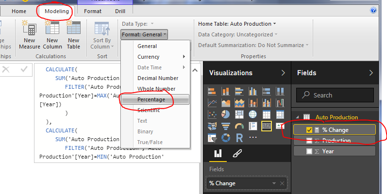
    Wait you say.  That seems really small, 0.03 % change is next to nothing.  Well, I applaud you for catching that.  This number is formatted as a decimal number and not a percentage, even though we labeled it as % change.  Click the measure labeled % Change and then Click on the Modeling ribbon.  Change the formatting from General to Percentage with one decimal.  Notice we now have a percentage.

    Change Format to Percentage
    Change Format to Percentage

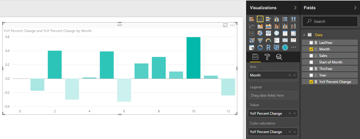
    Thanks for working along with me.  Stay tuned for more on percent change.  Next we will work on calculating the percent change dynamically instead of hard coding the year values into the measures.

    Want to learn more about PowerBI and Using DAX.  Check out this great book from Rob Collie talking the power of DAX.  The book covers topics applicable for both PowerBI and Power Pivot inside excel.  I’ve personally read it and Rob has a great way of interjecting some fun humor while teaching you the essentials of DAX.

    Please share if you liked this tutorial.

  • Measures – Year Over Year Percent Change

    Measures – Year Over Year Percent Change

    This tutorial is a variation on the month to month percent change tutorial.  This specific exploration in year over year performance was born out of reviewing my google analytics information.  The specific analysis question I am trying to answer is, how did this current month of website visitors compare to the same month last year.  For example I want to compare the number of visitors for November 2016 to November 2015.  Did I have more users this year in this month or last year?  What was my percent changed between the two months?

    Here is a sample of the analysis:

    let’s begin with loading our data and data transformations.  Open up PowerBI Desktop, Click the Get Data button on the Home ribbon and select Blank Query.  Click Connect to open the Query Editor.  Click Advanced Editor on the View ribbon.  While in the Advanced Editor paste the following code into the editor window, click Done to complete the data load.

    Note: If you need some more help loading the data follow this tutorial about loading data using the Advanced Query Editor.  This tutorial teaches you how to copy and paste M code into the Advanced Editor.

    let
     Source = Table.FromRows(Json.Document(Binary.Decompress(Binary.FromText("VdDBDcQwCETRXnyOFMAYcC1W+m9jV8BhfH1ygJ9zBr/8CvEaz+DYNL7nDAFjnWkTTNsUbIqnLfyWa56BOXOagy2xtMB5Vjs2mPFOYwIkikIsWd6IKb7qxH5o+bBNwIwIk622OCanTd2YXPNUMNnqFwomp0XvDTAPw+Q2uZL7QL+SC1Wv5Dpx/lO+Hw==", BinaryEncoding.Base64), Compression.Deflate)), let _t = ((type text) meta [Serialized.Text = true]) in type table [#"Start of Month" = _t, Sales = _t]),
     #"Changed Type" = Table.TransformColumnTypes(Source,{{"Start of Month", type date}, {"Sales", Int64.Type}}),
     #"Inserted Month" = Table.AddColumn(#"Changed Type", "Month", each Date.Month([Start of Month]), type number),
     #"Inserted Year" = Table.AddColumn(#"Inserted Month", "Year", each Date.Year([Start of Month]), type number)
    in
     #"Inserted Year"

    While still in the Query Editor rename the query to Data.  Then click Close & Apply to complete the data load into the data model.

    Load Monthly Data
    Load Monthly Data

    Next, make four measures.  On the Home ribbon click the New Measure button.  Enter the following to establish a reference date to the subsequent equations:

    Date Reference = DATE(2016,12,31)

    Enter in the following equation to calculate the last year monthly sales amount.

    LastYear = 
      VAR 
        CurrentDate = [Date Reference]
      RETURN
        CALCULATE( 
         SUM(Data[Sales]), 
         Data[Year] = YEAR(CurrentDate)-1
        )

    Note: Using the NOW() function calls the current time when the query was last run.  Thus, if you refresh your data next month the NOW() function wrapped in a YEAR() will return the current year from the date-time observed by PowerBI.

    Following the same process enter the following additional measures.  The ThisYear measure calculates the sales for the current month.

    ThisYear = 
      VAR 
       CurrentDate = [Date Reference] 
      RETURN
       CALCULATE(SUM(Data[Sales]),Data[Year] = YEAR(CurrentDate))

    Finally, add the calculation for the Year to Year comparison.

    YoY Percent Change = DIVIDE([ThisYear], [LastYear], 0)-1

    Since the YoY Percent Change is a real percentage we need to change the formatting to a percent.  Click on the YoY Percent Change measure then on the Modeling ribbon click the symbol in the formatting section of the ribbon.

    Change Measure Format
    Change Measure Format

    Next, add a Stacked Column Chart with the following columns selected.

    Add Stacked Column Chart
    Add Stacked Column Chart

    OK, we have a chart, but it is kinda awkward looking right now.  The x-axis is the month number but we don’t have a month 0.  That simply does not make sense.  Let’s change some of the chart properties.  While having the Stacked Column Chart selected click on the Paint Roller in the Visualizations pane.  First, click on the X-Axis and change the Type to Categorical.

    Change X-Axis
    Change X-Axis

    Then click on the Data Colors and turn on Diverging.  Change the Minimum color to Red and the Maximum color to Green.  Set the Center to a value of 0.

    Change Colors
    Change Colors

    Click on the Title change it something meaningful, Center the text and increase the font size.

    Change Title
    Change Title

    Our bar chart looks much better.  However, the month numbers do not look quite right.  Visually the month indicators would be cleaner if we didn’t have any decimals.  Click on the Month field and then on the Modeling ribbon change the Data Type to Whole Number.  There will be a warning letting you know that you are changing the Data Type of the Whole number.  Click OK to proceed with the change.

    Change Month to Whole Number
    Change Month to Whole Number

    Another successful percent change tutorial completed.  I hope you enjoyed this year over year month comparison example.  Make sure you share if you like what you see.

  • Measures – Month to Month Percent Change

    Measures – Month to Month Percent Change

    I had an interesting comment come up in conversation about how to calculate a percent change within a time series data set.  For this instance we have data of employee badges that have been scanned into a building by date.  Thus, there is a list of Badge IDs and date fields.  See Example of data below:

    Employee ID and Dates
    Employee ID and Dates

    Looking at this data I may want to understand an which employees and when do they scan into a building over time.  Breaking this down further I may want to review Q1 of 2014 to Q1 of 2015 to see if the employee’s attendance increased or decreased.

    Here is the raw data we will be working with, Employee IDs Raw Data.  Our first step is to Load this data into PowerBI.  I have already generated the Advanced Editor query to load this file.  You can use the following code to load the Employee ID data:

    let
     Source = Csv.Document(File.Contents("C:\Users\Mike\Desktop\Employee IDs.csv"),[Delimiter=",", Columns=2, Encoding=1252, QuoteStyle=QuoteStyle.None]),
     #"Promoted Headers" = Table.PromoteHeaders(Source),
     #"Changed Type" = Table.TransformColumnTypes(#"Promoted Headers",{{"Employee ID", Int64.Type}, {"Date", type date}}),
     #"Sorted Rows1" = Table.Sort(#"Changed Type",{{"Date", Order.Ascending}}),
     #"Calculated Start of Month" = Table.TransformColumns(#"Sorted Rows1",{{"Date", Date.StartOfMonth, type date}}),
     #"Grouped Rows" = Table.Group(#"Calculated Start of Month", {"Date"}, {{"Scans", each List.Sum([Employee ID]), type number}})
    in
     #"Grouped Rows"

    Note: I have highlighted Mike in red because this is custom to my computer, thus, when you’re using this code you will want to change the file location for your computer.  For this example I extracted the Employee ID.csv file to my desktop. For more help on using the advanced editor reference this tutorial on how to open the advance editor and change the code, located here

    Next name the query Employee IDs, then Close & Apply on the Home ribbon to load the data.

    Close and Apply
    Close and Apply

    Next we will build a series of measures that will calculate our time ranges which we will use to calculate our Percent Change (% Change) from month to month.


    Now build the following measures:

    Total Scans, sums up the total numbers of badge scans.

    Total Scans = SUM('Employee IDs'[Scans])

    Prior Month Scans, calculates the sum of all scans from the prior month.  Note we use the PreviousMonth() DAX formula.

    Prior Month Scans = CALCULATE([Total Scans], PREVIOUSMONTH('Employee IDs'[Date]))

    Finally we calculate the % change between the actual month, and the previous month with the % Change measure.

    % Change = DIVIDE([Total Scans], [Prior Month Scans], blank())-1

    Completing the new measures your Fields list should look like the following:

    New Measures Created
    New Measures Created

    Now we are ready to build some visuals.  First we will build a table like the following to show you how the data is being calculated in our measures.

    Table of Dates
    Table of Dates

    When we first add the Date field to the chart we have a list of dates by Year, Quarter, Month, and Day.  This is not what we want.  Rather we would like to just see the actual date values.  To change this click the down arrow next to the field labeled Date and then select from the drop down the Date field.  This will change the date field to be viewed as an actual date and not a date hierarchy.

    Change from Date Hierarchy
    Change from Date Hierarchy

    Now add the Total Scans, Prior Month Scans, and % Change measures.  Your table should now look like the following:

    Date Table
    Date Table

    The column that has % Change does not look right, so highlight the measure called % Change and on the Modeling ribbon change the Format to Percentage.

    Change Percentage Format
    Change Percentage Format

    Finally now note what is happening in the table with the counts totaled next to each other.

    Final Table
    Final Table

    Now adding a Bar chart will yield the following.  Add the proper fields to the visual.  When your done your chart should look like the following:

    Add Bar Chart
    Add Bar Chart

    To add a bit of flair to the chart you can select the Properties button on the Visualizations pane.  Open the Data Colors section change the minimum color to red, the maximum color to green and then type the numbers in the Min, Center and Max.

    Changing Bar Chart Colors
    Changing Bar Chart Colors

    Well, that is it, Thanks for stopping by.  Make sure to share if you like what you see.  Till next week.

    Want to learn more about PowerBI and Using DAX.  Check out this great book from Rob Collie talking the power of DAX.  The book covers topics applicable for both PowerBI and Power Pivot inside excel.  I’ve personally read it and Rob has a great way of interjecting some fun humor while teaching you the essentials of DAX.

  • Measures – Dynamic Percent Change – Using DAX

    Measures – Dynamic Percent Change – Using DAX

    This tutorial will produce a measure that will dynamically calculate a percent change every time an item is selected in a visual.  The previous tutorial can be found here.  In the previous tutorial we calculated the percent change between two time periods, 2014 and 2013.  In practice it is not always desirable to force your measure to only look at two time periods.  Rather it would be nice that your measure calculations change with changes in your selections on visuals.  Thus, for this tutorial we will add some dynamic intelligence to the measures. Below is an example of what we will be building:

    First here is the data we will be using.  This data is the same data source as used in the previous % change tutorial.  To make things easy I’ll give you the M code used to generate this query.  Name this query Auto Production.

    let
     Source = Web.Page(Web.Contents("https://en.wikipedia.org/wiki/Automotive_industry")),
     Data0 = Source{0}[Data],
     #"Removed Columns" = Table.RemoveColumns(Data0,{"Change", "Source"}),
     #"Changed Type" = Table.TransformColumnTypes(#"Removed Columns",{{"Production", Int64.Type}, {"Year", Int64.Type}})
    in
     #"Changed Type"

    Note: the code shown above should be added as a blank query into the query editor.  Add the code using the Advanced Editor.  Another tutorial showing you how to add advanced editor code is here

    Once you’ve loaded the query called Auto Production.  The Field list should look like the following:

    Production
    Auto Production

    Next add a Table with Production and Year.  this will allow us to see the data we are working with.  When you initially make the table the Year and Production columns are automatically summed, thus why there is one number under year and production.

    Table of Data
    Table of Data

    Rather we want to see every year and the production values for each of those years.  To change this view click on the triangle in the Values section of the Visualizations pane.  This will reveal a list, in this list it shows that our numbers are aggregated by Sum change this to Don’t Summarize.

    Change to Don't Summarize
    Change to Don’t Summarize

    Now we have a nice list of yearly production levels with a total production at the bottom of our table.

    Table of Production Values by Year
    Table of Production Values by Year

    Next we will build our measure using DAX to calculate the percent changes by year.  Our Calculation for % change is the following:

    % Change  =  ( New Value / Old Value ) - 1

    Below is the DAX statement we use as our measure.  Copy the below statement into a new measure.

    % Change = 
    DIVIDE(
     CALCULATE(
     SUM('Auto Production'[Production]), 
     FILTER('Auto Production','Auto Production'[Year]=MAX('Auto Production'[Year])
     )
     ), 
     CALCULATE(
     SUM('Auto Production'[Production]),
     FILTER('Auto Production','Auto Production'[Year]=MIN('Auto Production'[Year])))
    ,0) 
    - 1

    I color coded the DAX expression between the two equations to show which parts correlated.  Note we are using the DIVIDE function for division.  This is important because if we run into a case where we have a denominator = 0 then an error is returned.  Using DIVIDE allows us to return a zero instead of an error.

    Next add our newly created measure as a Card.

    Add Card
    Add Card

    Change the % Change measure format from General to Percentage, do this on the Modeling ribbon under Formatting.

    Change Measure Formatting
    Change Measure Formatting

    Next add a slicer for Year. 

    Slicer for Year
    Slicer for Year

    Now you can select different year and the % change will automatically change based on our selection.  The % change will always select the smallest year’s production and the largest year’s production to calculate the % Change.   By Selecting the Year 2013 and 2007, the percent change is 19.15%.  The smallest year is 2007 and the largest is 2013.

    Selecting Two Years
    Selecting Two Years

    If we select a year between 2013 and 2007 the measure will not change.

    Multiple Years Selected
    Multiple Years Selected

    The measure will only change when the starting and ending years are changed.  By selecting the year 2014, the measure finally changes.

    Selecting Additional Year
    Selecting Additional Year

    Pretty cool wouldn’t you say?  Thanks for taking the time to walk through another tutorial with me.

    Want to learn more about PowerBI and Using DAX.  Check out this great book from Rob Collie talking the power of DAX.  The book covers topics applicable for both PowerBI and Power Pivot inside excel.  I’ve personally read it and Rob has a great way of interjecting some fun humor while teaching you the essentials of DAX.

  • Crazy Table Gymnastics – Part 2 – Build Support Materials

    Crazy Table Gymnastics – Part 2 – Build Support Materials

    This is part 2 in the 3 part series on developing super cool tables using some fancy measures.  In part 1 we walked through how to build a table that uses an un-pivoted data source in the Query Editor.  This technique allows you to change the types of categorical values in a table.  If you missed part 1 and want to get caught up follow this link.  Now, continuing with the series, Part 2, we will build the supporting materials (Selector Table, What If Slicers, and measures) for the report.

    Once we are done the final product will look like the following:

    Part 2… Go.

    To make sure we are starting off on the correct step.  We left off part 1 when we had completed a Pivoted Data Table and included an Attribute Slicer that would allow us to toggle between the Manager and Region Categories.  Your table should look like the following diagram:  (If you don’t have this you might want to start with Part 1 found here)

    Pivoted Data Table
    Pivoted Data Table

    Note: I have also included a Slicer which is used with the Attribute field.

    Next, we will need to add a table that will allow us to use the SalesReps, PercentChange, and Margin column headers in our report.  On the Home ribbon click Edit Queries, then select New Source on the Home ribbon.  In the Get Data window select Blank Query, click Connect to proceed.  Open the advanced editor by clicking the Advanced Editor button found on the Home ribbon.  Enter the following M code into the Advanced Editor:

    let
       Source = #"Pivoted Data",
       #"Kept First Rows" = Table.FirstN(Source,1),
       #"Removed Columns" = Table.RemoveColumns(#"Kept First Rows",{"Attribute", "Value", "UniqueID"}),
       #"Unpivoted Columns" = Table.UnpivotOtherColumns(#"Removed Columns", {}, "Attribute", "Value"),
       #"Removed Columns1" = Table.RemoveColumns(#"Unpivoted Columns",{"Value"})
    in
       #"Removed Columns1"

    Click Done to close the Advanced Editor.  Rename the table to Selector.  When you are finished your table should look like the following:

    Create Selector Table
    Create Selector Table

    Click Close & Apply on the Home ribbon to close the Query Editor.  Add a slicer with the following selections:

    Add Selector Attribute Slicer
    Add Selector Attribute Slicer

    Now, we want to detect which of the Attributes have been selected from this table.  We can accomplish this by creating a measure using the DAX function SELECTEDVALUE.  Right Click on the table named Selector and from the drop down select New Measure.  Enter the following DAX equation:

    rankBy = SELECTEDVALUE(Selector[Attribute])

    In addition to the knowledge of which column was selected from the selector table, we will also want to detect to make sure at least one categorical value has been selected.  The categorical values we are talking about were generated earlier.  The values could be either the Manager or Region values of the Attribute column in the Pivoted Data table.  Using the ISFILTERED DAX function enables this section.  Add the following measure to the Pivoted Data table:

    Attribute Filtered = ISFILTERED('Pivoted Data'[Attribute])

    Next, we need to gather some user input in the form of a number from 1 to 10.  To input this information we need to produce a What If Parameter.  On the Modeling ribbon click New Parameter in the What If section of the ribbon.  Enter the following information into the What-if parameter dialog box:

    What If Parameter
    What If Parameter

    Note: Don’t forget to change the Name of the parameter.

    Click OK to proceed.  Power BI will automatically produce a measure table, a measure and a slicer on the report page.

    Slicer Produced by What-if
    Slicer Produced by What-if

    Note: By default there is nothing selected in the box.  However, you can adjust the slicer and a number will appear within the value box.  You can also type in a number between 1 and 10 to the box to adjust the value.

    This is where we go crazy with DAX.  This portion of DAX is where all the magic happens.

    We start off by building our totals measures.  Place all these measures in the Pivoted Data table.

    Total % Change = MAX( 'Pivoted Data'[PercentChange] )
    Total Margin = SUM( 'Pivoted Data'[Margin] )
    Total SalesReps = SUM( 'Pivoted Data'[SalesReps] )

    These will be used repeatedly in our next group of DAX formulas.

    The following measures will produce a calculated ranking for each numerical column.  OK, Pause, This part really excites me here because the next few measures are where the magic happens.  Pay close attention to what is happening here.  Un-Pause, by using the DAX Switch function we can dynamically tell Power BI to adjust which column we want to see ranked by the top items.  For example, if we select SalesReps in our attribute slicer.  The following measures will automatically rank all the items in the table by the column named SalesReps.  Thus, the items with the highest counts of SalesReps will be listed first.  When you select Margin, the table will automatically adjust and re-rank the items by the Margin column.  This is being done in the switch statement.  For each column we are calculating custom rankings and then hiding or replacing values with the Blank() DAX function to not show items we don’t want.

    Enter the following three measures into the Pivoted Data Table:

    Rank Margin = if( [Attribute Filtered],
        SWITCH( [rankBy]
            ,"Margin", CALCULATE( [Total Margin], FILTER('Pivoted Data', RANKX( ALLEXCEPT('Pivoted Data','Pivoted Data'[Value]), [Total Margin]) <= [Top # of Items Value]) )
            ,"PercentChange", CALCULATE( [Total Margin], FILTER('Pivoted Data', RANKX( ALLEXCEPT('Pivoted Data','Pivoted Data'[Value]), [Total % Change]) <= [Top # of Items Value]))
            ,"SalesReps", CALCULATE( [Total Margin], FILTER('Pivoted Data', RANKX( ALLEXCEPT('Pivoted Data','Pivoted Data'[Value]),[Total SalesReps]) <= [Top # of Items Value]))
        )
        , BLANK() )
    
    Rank PercentChange = if( [Attribute Filtered],
         SWITCH( [rankBy],
           "PercentChange", CALCULATE( [Total % Change], FILTER('Pivoted Data', RANKX( ALLEXCEPT('Pivoted Data','Pivoted Data'[Value]), [Total % Change]) <= [Top # of Items Value]))
           ,"Margin", CALCULATE( [Total % Change], FILTER('Pivoted Data', RANKX( ALLEXCEPT('Pivoted Data','Pivoted Data'[Value]), [Total Margin]) <= [Top # of Items Value]))
           ,"SalesReps", CALCULATE( [Total % Change], FILTER('Pivoted Data', RANKX( ALLEXCEPT('Pivoted Data','Pivoted Data'[Value]), [Total SalesReps]) <= [Top # of Items Value]))
        )
        , BLANK() )
    
    Rank SalesReps = if( [Attribute Filtered],
        SWITCH( [rankBy]
            ,"SalesReps", CALCULATE( [Total SalesReps], FILTER('Pivoted Data', RANKX( ALLEXCEPT('Pivoted Data','Pivoted Data'[Value]), [Total SalesReps]) <= [Top # of Items Value]))
            ,"Margin", CALCULATE( [Total SalesReps], FILTER('Pivoted Data', RANKX( ALLEXCEPT('Pivoted Data','Pivoted Data'[Value]), [Total Margin]) <= [Top # of Items Value]))
            ,"PercentChange", CALCULATE( [Total SalesReps], FILTER('Pivoted Data', RANKX( ALLEXCEPT('Pivoted Data','Pivoted Data'[Value]), [Total % Change]) <= [Top # of Items Value]))
        )
        , BLANK() )

    Whew, that was a ton of measures.  All the key components are complete now.  In part 3 we will clean up our report page and make it shine.  I hope you enjoyed this tutorial. Also, follow me on Twitter and Linkedin where I will post all the announcements for new tutorials and content.

    Linkedin Twitter
  • Power BI World Tour 2017 – Chicago – Intro to DAX

    Power BI World Tour 2017 – Chicago – Intro to DAX

    DAX (Database Access Expressions) can be quite complex.  It is essential to being able to appropriately manipulate the Power BI data model for the visuals.  The following information was discussed at the Power BI World Tour 2017 and if you’d like to review the content or learn more about DAX hit some of the links below.  For all who were able to attend, you were a great audience and super fun!  I hope you learn some fun facts and tricks.

    Thanks,

    Mike

    https://powerbi.tips/2016/10/fixing-measure-madness/

    https://powerbi.tips/2017/05/using-variables-within-dax/

    This tutorial uses the DAX function to create a date table:

    https://powerbi.tips/2017/07/use-multiple-connections-between-tables/

    https://powerbi.tips/2016/08/make-calendars-using-dax-curbal/

    There are some many tutorials on % Change hit this link to read through the tutorials.

  • Power BI Histogram with Bins – Includes DAX

    Power BI Histogram with Bins – Includes DAX

    Alright to start this Tutorial off right we are going to incorporate the new feature released this spring from Power BI, called publish to web.  Below you can view last weeks tutorial and interact with the data.  Feel free to click around to see how the visualization works (you can click the shaded states or on the state names at the bottom.

    For this tutorial we will build upon the last tutorial, From Wikipedia to Colorful Map.  If you want to follow along in this tutorial click on the link and complete the previous tutorial.

    Materials:

    • Power BI Desktop (I’m using the March 2016 version, 2.33.4337.281) download the latest version from Microsoft Here.
    • Mapping PBIX file from last tutorial download Maps Tutorial to get a jump start.

    Picking up where we left off we have data by state with data from the 2010 Census and 2015 Census.

    Data from Region Maps Tutorial
    Data from Region Maps Tutorial

    What we would like to identify is how many states are within a given population range.  Say I wanted to see on the map, or in a table all the states that had 4 million or less in population in 2010.

    To do this we will create bins for our data.  Enter custom data in this format.  For the tutorial on entering custom data into Power BI Desktop check out this tutorial on Manually Enter Data. Click on the Enter Data button on the Home ribbon.  Enter the data as following:

    Enter Bucket Data
    Enter Bucket Data

    Note: Make sure you name the new table Buckets as shown in the image above.

    Click Load to bring the data into the data model.  Notice we now have a new table in the Field column on the right.

    Buckets Table
    Buckets Table

    Next we will create a measure to evaluate the state level data into our newly created buckets.  This will be produced using DAX (Data Analysis Expressions).  DAX is an extremely powerful language which is used in SQL applications and Analysis Services.  More information can be found on DAX here.  Since DAX is so complex we won’t go into a full explanation here.  However, we will have many more topics in the future working on and building DAX equations.

    Click the Ellipsis next to the table labeled US Census. Then click the first item in the list labeled New Measure.

    Note: Ellipsis is the term used for those triple dots found in newer Microsoft applications.

    Example of Ellipsis
    Example of Ellipsis

    A formula bar opens up underneath the ribbons bar.  Here is where we will name and type in the new measure.  The equation we will need to add is the following.

    Bins = CALCULATE(COUNTROWS(FILTER('US Census',and([2010 Census] >= min(Buckets[Min]),[2010 Census] <= MAX(Buckets[Max])))))

    Press Enter to enter the measure into PowerBI.

    Explanation of Equation: All text before the equal sign is the name of the measure.  All the data behind the equal sign is the DAX expression.  Essentially this equation is calculating the number of rows where we have data between the Buckets “Min” value and Buckets “Max” value.  This is the magic that is DAX.  In this simple expression we can compare all our data against our buckets ranges we made earlier.

    Finally our new Bin measure should look like the following.

    Bin Measure Created
    Bin Measure Created

    Now lets modify our visuals to incorporate the new Bins measure.  Click on the existing map on the page.  Remove the % Change item from the Values selection.  Add the Bins Measure to the Values section.  Notice the map changes color.  Next, add the Name field from the table called Buckets into the Legend field.  Our map should look similar to the following:

    Map with Bins Added
    Map with Bins Added

    Next Click on State, 2010 Census, Bins, and Name (from Buckets table) and make a table.  It should look like the following:

    Table of Bins Measure
    Table of Bins Measure

    Lastly, we will build a bar chart using our Bins Measure.  Click on the Stacked Column Chart Visual and add the following items to the corresponding categories:  Axis = Name (from the Buckets table), Legend = Name, and Value = Bins (from US Census table).  This will yield the following visual.

    Bins in Bar Chart
    Bins in Bar Chart

    Click on the Ellipsis of the bar chart and then click Sort By, finally click Bins. This will order the items in descending order by the count of the items found in each bin.

    Now have fun with your new data.  Click on each of the bars in the bar chart and watch your data transform between the table, and the map.

    Selection Big in the Bar Chart
    Selection Big in the Bar Chart

    Here is the final product if you want to engage with the data.

    I have to give credit where credit is due.  Below is the page from Power Pivot Pro that I used to create binning in the tutorial chart.  The binning shown on PowerPivotPro is for Power Pivot but the functionality is the same. Enjoy.

    http://www.powerpivotpro.com/2015/03/creating-a-histogram-with-a-user-defined-number-of-buckets/

    Want to learn more about PowerBI and Using DAX.  Check out this great book from Rob Collie talking the power of DAX.  The book covers topics applicable for both PowerBI and Power Pivot inside excel.  I’ve personally read it and Rob has a great way of interjecting some fun humor while teaching you the essentials of DAX.

  • From Wikipedia to a Colorful Map

    From Wikipedia to a Colorful Map

    For this tutorial we are going to get some real data from the web.  One of the easiest sources to acquire information from is Wikipedia.  I will caveat this by saying, it is easy to get data from Wikipedia, but I don’t know if you can always trust the reliability.  That being said, we are going to acquire the U.S. population and growth rate from 2010 to 2015 from the Wikipedia Web page.

    Materials:

    • Power BI Desktop (I’m using the March 2016 version, 2.33.4337.281) download the latest version from Microsoft Here.
    • Link to the data from Wikipedia, Here.  ( https://en.wikipedia.org/wiki/List_of_U.S._states_by_population_growth_rate )

    Let’s begin.

    Open up Power BI Desktop.  Click on the Get Data button.  On the left of the Get Data menu click Other then select the first item titled Web.  Click Connect to continue.

    Get Data from Web
    Get Data from Web

    In the From Web window enter in the following web address.  You can copy and paste it from below.

    https://en.wikipedia.org/wiki/List_of_U.S._states_by_population_growth_rate

    Click OK to move to the next menu.  After a bit of thinking the Power BI will present the Navigator window.  This is what Power BI has found at that specific web address.  On the left side of the screen there is a folder.  This is the web page folder location that we loaded earlier.  Power BI then intelligently looks through the website code for tables it can distinguish.  By clicking on each table you can see a preview of the data returned on the right side of the window.

    Try clicking on the various tables such as Document, External links, or Table 0.  For our example lets click on Table 0.  Click on the button at the right hand corner labeled Edit.  We are going to slightly modify this data before we load it to the data model.

    Navigator Window
    Navigator Window

    You’ll notice once we load the data there are some items we’d like to remove.  In row #2 the label is District of Columbia, which technically isn’t a state.  Also further down we see in row #25, the entire U.S. population is shown.  Again, we don’t want these values to show, we only want the 50 states.  To remove this data we will use a text filter to remove any item in the Rank column that has a “–” (which is called an em-dash, see note below for more details on how to select this text character).

    Note: There are two kinds of dashes that your computer uses.  One is called the en-dash(-), the second being the em-dash(–).  It is very hard to distinguish the difference between the two dashes.  The image below shows a better contrast when used in Microsoft Word.

    Em-Dash vs. En-Dash
    Em-Dash vs. En-Dash

    The en-dash is shorter than the Em-dash. The Key for the en-dash is next to the number 0 on your keyboard.  To select the em-dash you need to use a bit of Microsoft trickery.  The Em-dash will be presented when you hold the Alt key and type 0151 on a keypad.  This selects the specific ASCII character for the em-dash.  For more information on selecting the em-dash visit here.

    Click the drown down button in the column labeled Rank.  Select the item labeled Text Filters, and then Click Does Not Contain…

    Text Filter on Rank Column
    Text Filter on Rank Column

    Enter in the em-dash code by using Alt 0151 to enter in the correct dash into the Filter Rows dialog box.  Click OK to proceed.

    Enter EM-Dash in Filter Rows Dialog
    Enter EM-Dash in Filter Rows Dialog

    If we entered the correct em-dash we will now be presented with a cleaned list of U.S. states with only numbered items in the Rank column.

    Next we will clean up the query slightly to make it easier to deal with.  Delete the column labeled Rank, and Change.  Rename the query to something a little more meaning full such as US Census.

    Remove Columns
    Remove Columns & Rename Query

    Note:  You can delete a column by pressing the Remove Columns button on the Home ribbon.  A second method is to right click with your mouse on the column you want to remove and selecting Remove.

    Next we will add our own calculated column which will calculate the 2010 to 2015 percent change.  Click the ribbon labeled Add Column and select the first icon on the far left labeled Add Custom Column.  The Add Custom Column dialog box will open. Enter the name for the new column, then by clicking on the columns in the available columns on the right you can build an equation.  For this example we are using the percent change calculation which is the following:

    Percent Change = [New Value / Old Value ]- 1

    Using the columns we imported from Wikipedia we will have the following equation:

    = [2015 estimate] / [2010 Census] - 1
    
    Update: this formula has now changed to 2016 estimate as time has progressed since this first tutorial was posted.
    The new column should have this following formula: = [2016 estimate] / [2010 Census] - 1


    This inserts a new column with the calculated percent change between the 2010 census and the 2015 census.  Click OK to proceed.

    Add Custom Column
    Add Custom Column

    Finally we want to change the type of data in the % Change column so our data model will operate as expected when producing visuals.  Click the Home ribbon, then click the % Change column.  Change the Data Type: from Any to Decimal Number.  This informs the data Model how to treat the data held the % Change column.  We are finished data modeling and now click Close & Apply on the Home ribbon.

    Now we have all our data loaded into the data model ready to build a map.

    Click the Column labeled State and then click % Change.  This yields a map with circles on it.  Change the visual to a filled map by selecting a different visual, the Filled Map icon (circled in red below).  Doing so produces a shaded map of the US, where each state is colored according to the % Change.

    Filled Map Selection
    Filled Map Selection

    Finally lets add some color to the data. Click the visual’s Format properties (the little paint brush in the visuals window). Expand the Data Colors section by clicking on the title Data colors. Diverging is set to off.  Change it to On. Change the Minimum color to Green, the Center color to Yellow, and the Maximum color to Red.

    Colored Map
    Colored Map

    The states with the largest population change are in Red, while all the states with the smallest population change.

    Please share if you liked this tutorial.  Thanks.

  • Unlock Effortless Power BI Theming with the New Gallery Feature

    Unlock Effortless Power BI Theming with the New Gallery Feature

    The Power BI Tips Theme Generator tool already allows you to easily interact with, and adjust, all the visual properties, wireframes, etc… How could we possibly make Power BI Theme building an effortless experience? We start with building it all for you, then letting you adjust it!
    The all new Gallery feature represents a significant leap forward in simplifying the theming process for all. This feature is especially for the business users! But, it also opens up exciting opportunities for the Power BI community to contribute in the future as well.

    With the introduction of the Gallery feature, the Tips Theme Generator has reached a new pinnacle of usability and accessibility. This feature combines all the technology and expertise that has made the Tips Theme Generator the best in the business. The primary aim of this feature is to cater to business users who might not have the time, inclination, or design expertise to build their themes from scratch.

    The Gallery feature simplifies theming to the point where you don’t need to be a design expert to make your reports look fantastic. It offers a curated selection of the best themes, ready for you to use. The process is as easy as browsing through the Gallery, picking your favorite masterpiece, and applying it to your Power BI reports.

    Browse

    Preview

    Download
    With Tips+ you can save a copy to your Files, customize it, and use it indefinitely as your own!

    Benefits for Business Users

    • Time Savings: Business users can now skip the intricate theming process, saving valuable time that can be better spent on data analysis and decision-making.
    • Professional Results: Even without design skills, business users can achieve professional-quality themes that make their reports stand out.

    Empowering the Power BI Community

    The Gallery feature not only benefits business users but also opens doors for future contributors within the Power BI community. Our goal is to have experts and enthusiasts have a platform to showcase their visualization skills and offer their projects to a wider audience. This collaborative approach fosters a sense of community and support among Power BI users. If you are interested in being part of the Power BI Tips Gallery contributor program please fill out this form.

    To access the Gallery feature, simply visit the Power BI Tips Theme Generator and navigate to the Gallery section. Browse through the projects, preview them, download the .pbip project file and apply your data effortlessly. It’s as simple as that. (The number of Themes to choose from will just continue to expand and grow).

    Wrapping Up

    The Gallery feature in the Power BI Tips Theme Generator is a game-changer for business users and the Power BI community alike. It simplifies theming to an unprecedented level, empowering users to create stunning reports with minimal effort, while still maintaining the ability to fully customize them. At the same time, we invite experts from the community to contribute and share their theming expertise with us. This is an exciting step forward in the world of Power BI theming, and we can’t wait to see the incredible reports that will result from it. Happy theming!

    Check out our Introduction Video for a Quick Demo!

  • Power BI Hack: Download Report Authored in Browser as PBIX

    Power BI Hack: Download Report Authored in Browser as PBIX

    The Problem

    Most of you have probably run into a situation where someone in your organization has authored a report in the Power BI web service, and now they want to make changes that can only be done with Power BI Desktop. So, you try to download the PBIX file from the Power BI web service, only to discover that you can’t, because if it wasn’t created as a PBIX, it can’t be downloaded as a PBIX. Infuriating!

    :rage:

    The Solution (sorta…)

    There’s actually a way to get around this problem. If you publish a blank PBIX file to the Power BI web service, you can copy the contents of the report that was originally authored in the browser into that blank report. And since that report was originally a PBIX file, you can download that instead!

    Unfortunately, the only way to do this right now is to use the Power BI REST API and hit the Update Report Content In Group endpoint, and this process is just about as straightforward as Lombard Avenue in San Francisco. (Actually, probably even less so.)

    File:Lombard Street SFA.jpg - Wikimedia Commons
    Lombard Avenue in San Francisco: Famously bendy, but still more straightforward than manually hitting Power BI APIs.

    PowerShell to the Rescue!

    :powershell:
    Hooray for PowerShell!

    So, I wrote a PowerShell function to simplify and streamline this process, and its only prerequisite is the MicrosoftPowerBIMgmt.Profile module for PowerShell. Just run the script file (linked below) in your PowerShell terminal, and then call the Copy-PowerBIReportContentToBlankPBIXFile function directly from that same window. The expected parameters are:

    • sourceReportId: The ID of the report to copy from
    • sourceWorkspaceId: The ID of the workspace to copy from
    • targetReportId: The ID of the report to copy to
    • targetWorkspaceId: The ID of the workspace to copy to (this one is optional – if you leave it blank, the function will assume both source and target are in the same workspace)

    Download the Copy-PowerBIReportContentToBlankPBIXFile.ps1 PowerShell script file here.

    As always, feedback and suggestions are 100% welcome and encouraged. 

    :sunglasses:

    Cheers!

    ~ James


    Acknowledgements:
    This PS function was inspired by a blog article written by one of the top minds in the Power BI space, Mathias Thierbach. Check out his article here. And if you’re not already using his pbi-tools for Power BI version control, you should check that out too.

    If you like the content from PowerBI.Tips, please follow us on all the social outlets. Stay up to date on all the latest features and free tutorials.  Subscribe to our YouTube Channel.  Or follow us on the social channels, Twitter and LinkedIn, where we post all the announcements for new tutorials and content.

    Introducing our PowerBI.tips SWAG store! Check out all the fun PowerBI.tips clothing and products:

    Hasta La Vista Data
    Go Ahead Make My Data
    PBIX Hat