Search results for: “% change”

  • The Dynamic Time Matrix

    The Dynamic Time Matrix

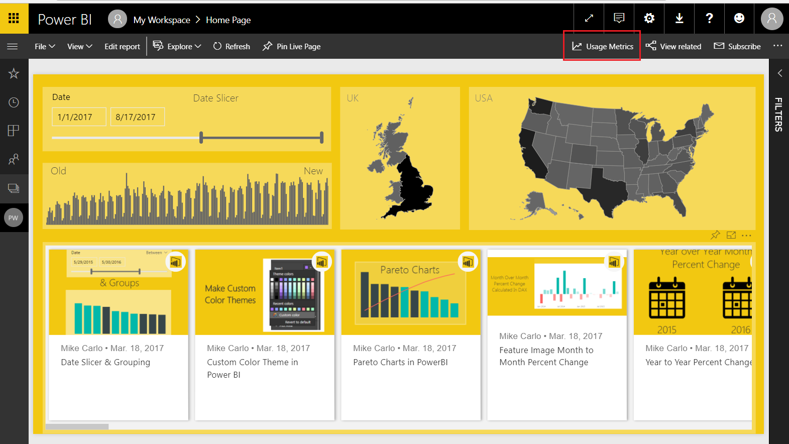
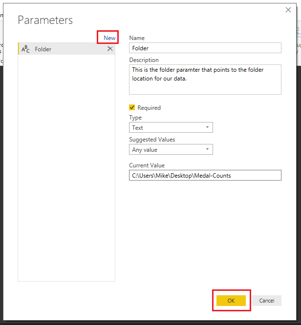
    Time and time again when I begin talking with Excel users and ask to see what current reports they are using, they usually show me a table with a mixed bag of columns split by different time ranges. A comparison of month over month, or year over year, mixed in with a few daily totals or cumulative totals all rolled up from values on other tabs to produce their preferred view (or dashboard). Typically, the first approach I take is to describe how we can break up this single table view of things and start looking at the aggregations of these values in easily digestible pieces and slice and dice them in different times ranges. I’ve explained that the goal should be to produce easy to consume visuals for comparison using measures and plotting these out in different ways to glean insights quicker. Most of the time, this works, but other times… it is second best to what the analyst or uber Excel user wants to see… they want to see their numbers, and they want to see them the same way they have them in Excel.

    The Challenge:

    Recently, I encountered this all too familiar scenario (Time Ranges in a table/matrix) except this time, I wanted to see if I could reproduce the output exactly as the end user wanted it rather than move them in a different direction.

    The first group of columns showed the days in the current week, the second group showed the weeks in the current month, followed by the Months to date, a year to date column and static columns of a Goal and Forecast.

    I’ll spare you the details of researching a better way than producing these as individual measures,  and suffice to say that I was able to come up with a solution based on a few calculated columns, a disassociated table, and a single measure to produce the output I was searching for.

    The Solution:

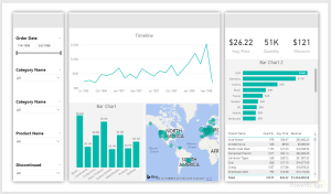
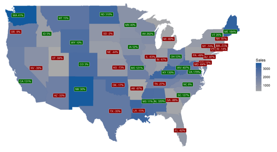
    The above screenshot is of the dynamic matrix that you can download from the link at the end of this blog. As I developed this solution it came to my attention that there are actually a couple ways we could build this solution. The first of those would be to have a time slicer drive all the different time ranges, this would be useful for analyzing older datasets in the different ranges, but my goal was to create a solution that follows the “Set it and forget it” train of thought. This solution will restrict the view of data to never exceed the current day, the neat thing is, the current day is when you read this blog, not a static point in time. I’ve pre-loaded data out to the end of 2020, so the sample should continue to work and change each time the file is opened.

    Before we dig into things, I want to convey that the DAX dove a bit deeper into the weeds than I initially expected, and I’ll do my best to describe what I did and why.
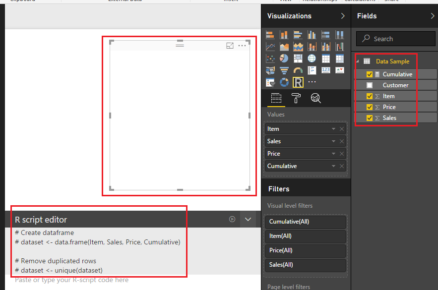
    The Data

    Sample Data

    I’ve modified my original solution to use a sample of Adventure works data that I created, this simple dataset consists of a column to group things by (ModelName), a date (StartDate) and the value to aggregate (ListPrice). This solution should cover a wide range of different use cases so don’t get hung up on the exact columns here. A grouping column, a date column and a value column are all you need.

    Here are the steps I took after creating the dataset and loading it into Excel:

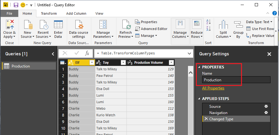
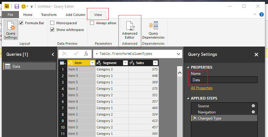
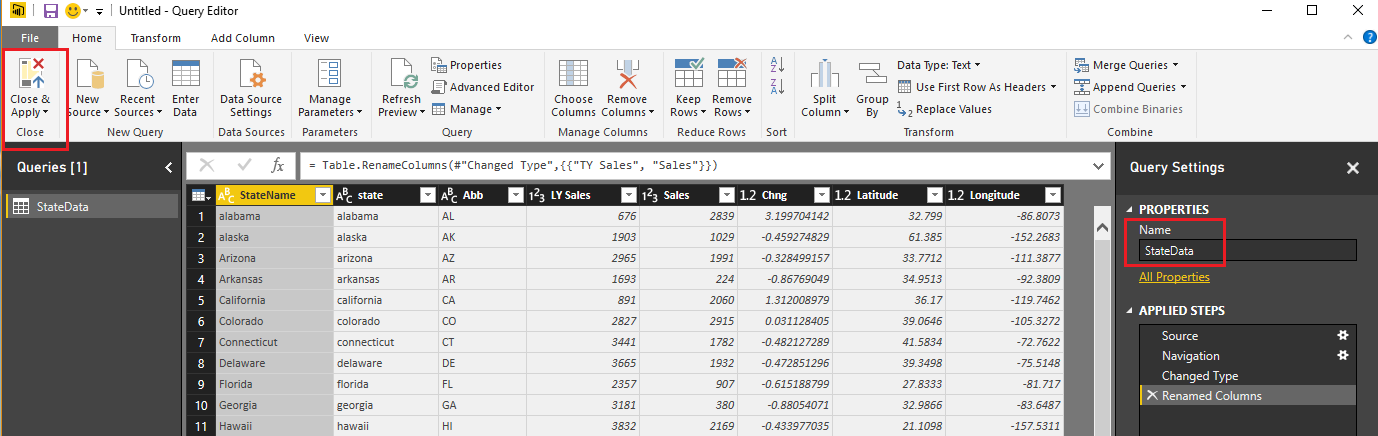
    Load Data table from Excel into Power Query, Close & Apply

    Create a calculated date table (DAX):

    Date = 
    VAR MinYear = 2018
    VAR MaxYear = 2020
    RETURN
    ADDCOLUMNS (
        FILTER (
            CALENDARAUTO( ), 
            AND ( YEAR ( [Date] ) >= MinYear, YEAR ( [Date] ) <= MaxYear )
        ),
        "Calendar Year", YEAR ( [Date] ),
        "Month Name", FORMAT ( [Date], "mmmm" ),
        "Month Number", MONTH ( [Date] ),
        "Weekday", FORMAT ( [Date], "dddd" ),
        "Week Number", WEEKNUM([Date]),
        "Weekday number", WEEKDAY( [Date] ),
        "Quarter", "Q" & TRUNC ( ( MONTH ( [Date] ) - 1 ) / 3 ) + 1
    )

    Your MinYear / MaxYear will obviously be different, but the core columns for what we need are in this output.

    Add Calculated Columns

    Now we need to add some filter columns to the date table we just created in order to get the current time frames we care about.

    IsInCurrentYear = if(YEAR(NOW())= [Calendar Year],1,0)
    IsInCurrentMonth = if([isInCurrentYear] && MONTH(NOW())=[Month Number],1,0)
    IsInCurrentWeek = if([isInCurrentYear] && WEEKNUM(NOW())=[Week Number],1,0)
    

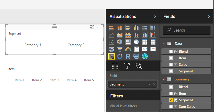
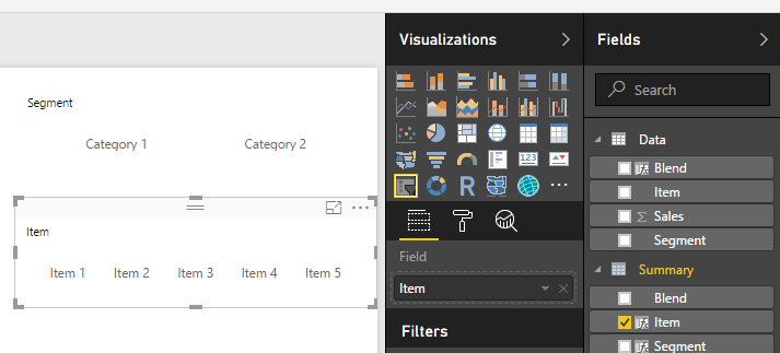
    Create a Disassociated table (Dax Table)

    This is our grouping table, this is the first key element in which we create a series of different DAX calculated tables to create the different time range groups we want to roll up our aggregate amount by. In each case, we are pulling all current and previous years, the current months in this year to date, the current weeks in the current month and the current days in the week. Then we union those values together where the “Group” is the top level time range, and the value is the specific time range values. Then we add an index column so that we can order the values in the way that we want.

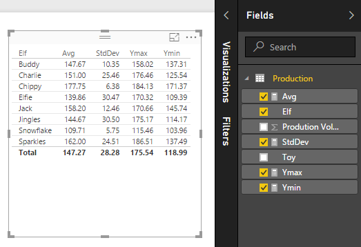
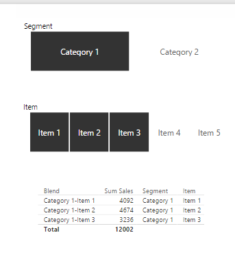
    The final output should look something like this:

    This is the DAX code to create the calculated table. Each “Summarize” creates the time groups and values rolled up for the particular time range we are interested in. This is wrapped in the “AddColumns” function to add in a workable index that allows us to order all the values in the correct order dynamically. Initially, the static Index column works to sort the Group column, but the dates won’t sort as Calendar dates so I added the second way to dynamically generate an index to sort the values by. I retain the original Index value and ensure the counts returned from the date table align in sequential order. Essentially retaining the Group/Value index to sort by. Then we wrap all that in “SelectColumns” so that we can specify the column names. If we didn’t do this, the first column name would be “Calendar Year”.

    TimeRange = 
    SELECTCOLUMNS(
    UNION(
        ADDCOLUMNS(
        SUMMARIZE(FILTER('Date', 'Date'[Calendar Year] <= YEAR(NOW())), 'Date'[Calendar Year], "Group", "By Year", "Index", 4),
            "DayIndex", CONCATENATE(4, FORMAT(CALCULATE(COUNT('Date'[Date]), ALL('Date'), FILTER('Date', 'Date'[Calendar Year]<=EARLIER('Date'[Calendar Year]))),"000"))
                ),
        ADDCOLUMNS(
                   SUMMARIZE(FILTER('Date', 'Date'[Month Number] <= MONTH(NOW()) && 'Date'[Calendar Year] = YEAR(NOW())), 'Date'[Month Number], "Group", "By Month", "Index", 3),
            "DayIndex", CONCATENATE(3, FORMAT(CALCULATE(COUNT('Date'[Date]), ALL('Date'), FILTER('Date', 'Date'[Month Number]<=EARLIER('Date'[Month Number]))),"000"))
                ),
        ADDCOLUMNS(
                   SUMMARIZE(FILTER('Date', 'Date'[IsInCurrentMOnth] = 1 && 'Date'[Week Number] <= WEEKNUM(NOW()) && 'Date'[Calendar Year] = YEAR(NOW())), 'Date'[Week Number], "Group", "By Week", "Index", 2),
            "DayIndex", CONCATENATE(2, FORMAT(CALCULATE(COUNT('Date'[Date]), ALL('Date'), FILTER('Date', 'Date'[Week Number]<=EARLIER('Date'[Week Number]))),"000"))
                ),
        ADDCOLUMNS(
            SUMMARIZE(FILTER('Date', 'Date'[IsInCurrentWeek] = 1 && 'Date'[Date] <= NOW()), 'Date'[Date], "Group", "By Day", "Index", 1),
            "DayIndex", CONCATENATE(1, FORMAT(CALCULATE(COUNT('Date'[Date]), ALL('Date'), FILTER('Date', 'Date'[Date]<=EARLIER('Date'[Date]))),"000"))
                ),
                   DATATABLE("Header", STRING, "Group", STRING, "Index", INTEGER, "DayIndex", INTEGER,
                       {{"Goal", "Overall", 5,0}, {"Forecast", "Overall", 5,0}})),
        "Value", 'Date'[Calendar Year], "Group", [Group], "Index", [Index], "DayIndex", [DayIndex]
    )
    

    Create a relationship between the Date table and the Data Table

    This would be on ‘Date’[Date] and ‘Data’[StartDate]
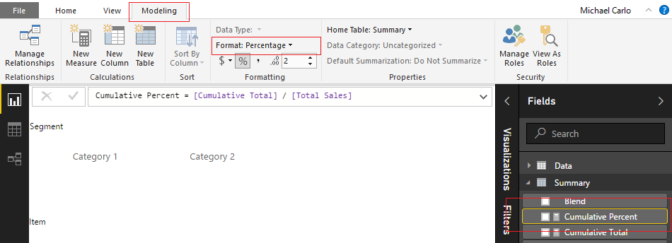
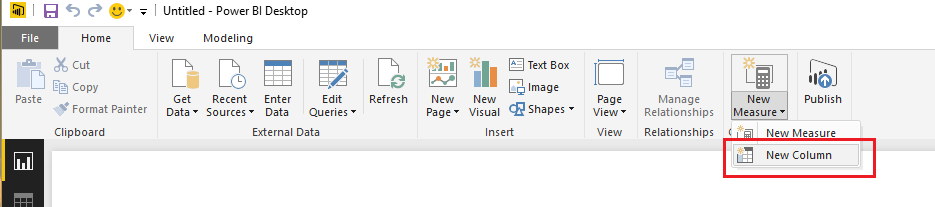
    Create our Measures

    Now we need to take the grouping table and merge it with the aggregated value via our measures. In the Data table we want to create the following measures.

    First Measure:
    List Price = SUM(Data[ListPrice])
    
    Second Measure:
    TimeValue = 
        VAR Val =
        SWITCH(SELECTEDVALUE('TimeRange'[Group]),
            "By Year", CALCULATE(TOTALYTD([List Price], 'Date'[Date], FILTER('Date', 'Date'[Date]<= TODAY())), FILTER('Date', 'Date'[Calendar Year] = VALUE(MAX('TimeRange'[Value])))),
            "By Month", CALCULATE(TOTALMTD([List Price], 'Date'[Date], FILTER('Date', 'Date'[Date]<= TODAY())), FILTER('Date', 'Date'[Month Number] = VALUE(MAX('TimeRange'[Value])) && 'Date'[Calendar Year] = YEAR(NOW()))),
            "By Week", CALCULATE(SUM(Data[ListPrice]), FILTER('Date', 'Date'[Week Number] = VALUE(MAX('TimeRange'[Value])) && 'Date'[Calendar Year] = YEAR(NOW()) && 'Date'[Date]<= TODAY())),
            "By Day", CALCULATE(SUM(Data[ListPrice]), FILTER('Date', 'Date'[Date] = DATEVALUE(MAX('TimeRange'[Value])))),
            --Remove SWITCH below if you only want time range
            SWITCH(SELECTEDVALUE(TimeRange[Value]),
               "Goal", [List Price] * 1.2,
               "Forecast", [List Price] * RAND() 
                )
        )
        RETURN
            FORMAT(Val, "CURRENCY")

    Create the Matrix

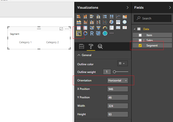
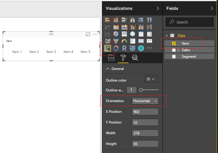
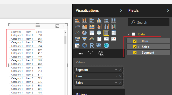
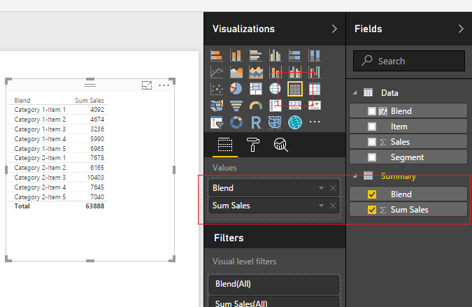
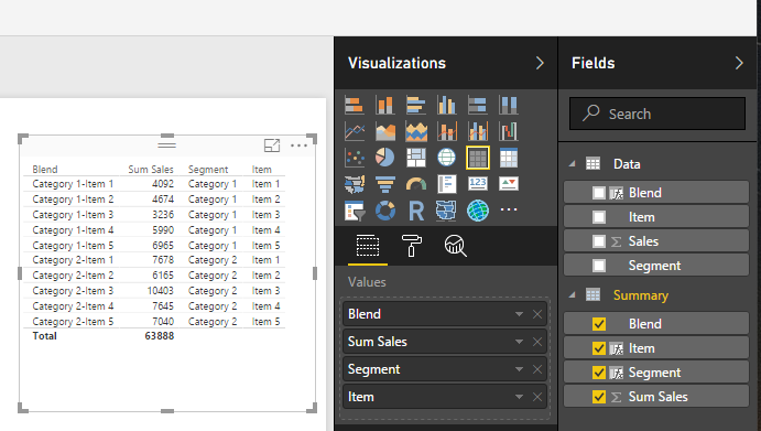
    Create a Matrix visual and drop the columns into the following rows and columns:

    You will have something that looks like this:

    Dynamic Time Matrix First Level

    Are you ready for the magic? Head over to the far right of the visual and click down on the “Expand all down one level in the Hierarchy” button ->  and BOOM!

    Dynamic Time Matrix Complete

    We have our fully functional time range matrix that will adjust dynamically based on the current day. No need to update, change or alter anything! I hope you enjoyed this tip, I certainly was excited to put this solution together. There are so many different ways you could alter this solution, using different dates (swap in fiscal calendar dates), add different final total or percentage columns at the end, my mind keeps coming up with new solutions, and I hope you can use this as well!

    You can find the full solution in this PBIX download which includes the sample data set.

    If you like the content from PowerBI.Tips, please follow us on all the social outlets to stay up to date on all the latest features and free tutorials.  Subscribe to our YouTube Channel, and follow us on Twitter where we will post all the announcements for new tutorials and content. Alternatively, you can catch us on LinkedIn (Seth) LinkedIn (Mike) where we will post all the announcements for new tutorials and content.

    As always, you’ll find the coolest PowerBI.tips SWAG in our store. Check out all the fun PowerBI.tips clothing and products:
    Store Merchandise

    After many requests, we are now selling out layouts unbranded so that you can use them in all your business applications. Be sure to check out our first offerings and stay tuned for more to come in the future. Learn more about Layouts.

  • Introducing Layouts

    Introducing Layouts

    PowerBI.tips is extremely happy to be part of, and contribute to, the Power BI Community. We’re constantly trying to think of new and interesting ways we can enhance the Power BI experience for everyone by providing helpful tips & tools. Some examples of what we’ve done so far are Power BI Desktop Theme generator, and the Power BI toolbox:


    Image Link to Advanced Color Theme Generator V3

    Image Link to Advanced Color Theme Generator V3

    Today we’re happy to announce another tool that we hope you will get an immense amount of use from.

    Introducing:

    Layouts

    Layouts are Power BI Template (PBIT) files that will contain layouts with visualizations already in place and only require your data to light up. We have, and will be, using as many of the visualization techniques.  We are taking some of the best layouts we’ve seen, and those we’ve developed to create these files for you. This means that you don’t have to spend any time worrying about the vast number of design techniques.  Additionally, it will save you time placing or moving things around on the report page.  All that is required of you, is to download the PBIT file, load your data, and start selecting the pre-placed visualizations.  With each layout template there will be a sample file (demo) that will show you the look and feel of each layout so you can easily choose the layout you want on each report page. You can always change the visual type with the click of a button.

    Today, we’re releasing the first of our efforts with a 3 tab layout focused on the business analyst. These layouts are designed with maximum flexibility in mind, to let you alter color themes, easily change the visualization type, and provide enough visualizations to give you a huge initial benefit. One of the best parts about the Layout is that you are not limited by our designs, they are just the starting point, you can fully customize them however you would like. We just provide you with a solid foundation to build from.

    Layouts - Basic
    Click Image to Download Layout Files

    Demo of Layouts:

    In addition to the first analyst layout, we’re releasing an Info-graphic style layout that contains some deeper interactions using Bookmarks.  However, these Layouts will be a bit more restrictive in terms of how much you can change visually.  This is due to the need to rely more heavily on other tools to create the look & feel.  Thus, you will have limits in just how much you can change. Our hope with these is to build more stunning report layouts that will maximize presentation, or help wow an audience.

    Layout - Sunset
    Click Image to Download Layout

    We are releasing layouts for the analyst, executives and still have some fun with highly stylized files. We hope you get as much use out of these new Layouts as we know we will! Over time, we will continue to develop and produce an entire library of the selections. Thanks to all of you who make this such a fun and great Community to be a part of.

  • Custom Usage Metrics Reporting

    Custom Usage Metrics Reporting

    One of the really cool features contained within the PowerBI.com service is the ability to monitor how often your dashboard or report is being viewed.  You’ll find this feature by opening up either a Dashboard or a Report, then clicking the button called Usage Metrics.  Clicking this button will generate a custom usage report.  For more details on Report Usage Metrics see the following article from Microsoft.

    Note: In order to see the usage metrics report you must be able to edit the report and have a minimum of a Power BI Pro license.  Also, the usage metric report only captures the last 90 days of report usage.

    Usage Metrics on Menu Bar

    The sad thing is that this report is only the usage metrics for the Dashboard or Report that you opened.  This report is also read only and cannot be modified.  However, there is a way to fix this, and see all the usage on all the Dashboards or Reports within a workspace.

    Let us begin.

    You will first need to log into PowerBI.com, once you have logged in navigate to either a Dashboard or Report.  To open a dashboard or report start by opening a workspace in the left navigation bar.  If you are already in a workspace you can open a Report or Dashboard by clicking on the Dashboards or Reports headers in the main selection area of the workspace.

    Navigate to a Dashboard or Report
    Navigate to a Dashboard or Report

    For this tutorial I will use a report but the same steps will work for both the Dashboard and Report usage metric reports.  Open up the report that your interested in viewing the metrics.  I am using my report called Home for this example, this report is used on PowerBI.Tips, and you can view the report here if your interested.  Now that we have opened the report, click on the Usage Metrics link on the top navigation bar.  This will open up a usage metrics report.   This report is read only and does not allow changes.

    Link to Report Metrics
    Link to Report Metrics

    Here is where we get sneaky… If you observe the URL for the usage metrics report it looks like the following:

    https://app.powerbi.com/groups/me/reports/c6....26/ReportSection?filter=Reports~2FReportGuid%20eq%20%27....ca%27

    Notice the middle of the report where it states “?filter=Reports” this means the Usage Metrics report has been filtered for only one report in the workspace.  The report filter context is passing the Globally Unique Identifier (GUID) of the selected report down to the Report Metrics.  This is good news because knowing this we can modify the report and remove the filter, thus allowing visibility to all the reports in a workspace.

    First we will need to save a copy of the report so we can make changes.  With the Usage Metrics report open click File then in the drop down click Save As.

    Save Report As
    Save Report As

    This will save a copy of the report into the workspace.  Notice we now see in the Power BI header bar that the report has been named Report Usage Metrics Report – Copy.  Also we can now see an Edit report button.

    Usage Metrics Report - Copy
    Usage Metrics Report – Copy

    Click on Edit report to start changing the report.  As soon as you open the report you can see in the visualizations pane that there is a Report filter applied.  Remove this filter by Clicking the little Grey X for the ReportGUID in the Report level filters section of the visualizations pane.

    Report Filters
    Report Filters

    After removing the report filters, we can see all the data from all reports.

    Let the modifications begin.

    On the left of the report we have a report page slicer.  This allows you to see the activity on one page of a report.  Now that we can see all the reports across the workspace filtering only pages of each report doesn’t make sense.  We need to add an additional slicer to select reports we are interested in.

    Report Page Slicer
    Report Page Slicer

    Select the Report Page Slicer the using Ctrl C copy the slicer, then paste it using Ctrl V.  We should now have two slicers on the page.  Select the top slicer named Report page.  Change the field of the top slicer from ReportPage to DisplayName. The DisplayName is found under the Reports table in the Fields pane.

    Link Report Display Name
    Link Report Display Name

    Notice even though we changed the slicer information that the slicer title did not change.  We have to manually change the title description in the display settings.  Click the Paint Roller to open the display settings.  Expand the Title section and change the Title Text to Report Name.

    Change Slicer to Report Name
    Change Slicer to Report Name

    The title of the slicer visuals is now changed. Sweet!

    Let’s move on to modify some of the standard visuals.  Select the report titled Views per day and change it to the following settings:

    Views Per Day Change
    Views Per Day Change

    Note: We changed the Axis Date column field.  We removed the date field from the views table and added the date from the Dates table. 

    This allows us to see over time the number of views per report.  Lets clean this up a bit.  Change the settings of this visual by Clicking on the Paint Roller ribbon.  Start by Turning Off the Legend, then open up the Data Colors, and Click the Revert to default to return the visual to it’s normal colors.

    Change Visual Settings
    Change Visual Settings

    Now, lets modify the Unique viewers per day.

    Change Unique Viewers per Day
    Change Unique Viewers per Day

    Again, the formatting of this visual isn’t great so let’s modify it.  Click on the Paint Roller again and Turning Off the Legend, then open up the Data ColorsClick the Revert to default to return the visual to it’s normal colors.  Finally, change the visual type from Stacked Column Chart to the Ribbon Chart.  Your visual should look like the following:

    Change Visual
    Change Visual

    This visual will show you which report has largest viewing audience.

    You might have noticed that in both of these visuals I’ve been removing the legends.  Which means, you don’t know which report is represented by each color.  We will fix that by adding a final visual.  Add the Bar Chart visual from the visualization pane.  Add the following field names to the visual, as shown below:

    Add Bar Chart
    Add Bar Chart

    Next, we will format the visual to clean it up.  Make the following changes, Toggle the Legend to OffToggle the X-Axis to Off, Toggle the Data labels to OnToggle the Title to On and change the Title Text to Report Views, finally change the Font color to Black and Text Size to 14.

    Formatting the Bar Chart
    Formatting the Bar Chart

    We want to sort the reports not by name but by how often they are viewed.  To do this, Click on the ellipsis and from the drop down Select sort by ViewsCount.

    Now we have a custom Usage Metrics Report.

    Final Report
    Final Report

    Be sure to save the file.  Click on File then in the drop down Click the Save button.

    Save Changed Report
    Save Changed Report

    You will notice that our modified Usage Metrics Report will be saved in the Workspace.

    Thanks for following along.  If you found this tutorial helpful please share it with someone who will find this valuable.

  • Using Parameters to Enable Sharing

    Using Parameters to Enable Sharing

    This week I had a number of team members tell me how difficult it was to share a PBIX file and the corresponding data between team members.  The department hasn’t committed 100% to the idea of using PowerBI.com, and thus wanted to share the actual report.  I pointed my team mates to my earlier tutorial about using variables for file locations.  After reading the tutorial the team came back with a bunch of griping about how they didn’t want to go into the query editor, people name variables different things, and thus it’s hard to understand what another team member was doing, blah, blah, blah…

    So, in order to make peace I took another look at trying to make the sharing of a PBIX file easier.  This time I decided to use the Parameters feature within PowerBI.  This feature within the Query Editor was released all the way back in April of 2016.  I read about it, thought it was interesting but couldn’t find a really good use case.  In my current predicament, the parameters feature is the perfect solution.

    By using a parameter to store a folder and or file location you enhance the user experience by making it easier for a user to change the Query.

    To modify a parameter after it has already been built click on the bottom half  of the Edit Queries button, found on the Home ribbon.  A menu will pop up and you can select Edit Parameters.

    Edit Queries
    Edit Queries

    The Enter Parameters screen will pop up.  This is where you would change the parameters for a query.  In our example this is where we will enter a new folder location for our data.

    Enter Parameters Screen
    Enter Parameters Screen

    Let’s begin the tutorial.  To start we will need to work with some data.  In my earlier tutorial, I used the Olympic Medals Count.  We will reuse this dataset.  Start by downloading the zipped folder Olympic Metal Count files from the following location.  Once you have downloaded the sample data, extract the folder and subsequent files from the zipped file.  In windows 10, which I am using, you can right click on the downloaded file and select Extract All..

    Extract All from Zipped Folder
    Extract All from Zipped Folder

    A pop-up window will appear to complete the extraction process. By leaving the default settings the folder will be extracted into the same location as the downloaded file. Click Extract to complete the extraction.

    Complete Extraction
    Complete Extraction

    We now have a folder with all our data.

    Extracted Folder
    Extracted Folder

    With the data prepared we can now make the parameters within PowerBI.  Open PowerBI and click the top half of the Edit Queries button.  The Query Editor will open.  Click the Mange Parameters found on the Home ribbon.  The Parameters screen will open.  Click the blue New button at the top left.  Enter the name Folder, and include a brief description of this parameter.  Since the folder parameter is essential to the query we must leave the Required box checked.  Change the Type to Text, and leave the Suggested Values to Any value.  Finally enter the Folder Location where our Medal-Count file is located into the Current Value.  Click OK to complete the parameter.

    Make Parameter
    Make Parameter

    Next, we will create the actual query to load the folder containing our Metal Counts.  Click on the New Source button.  This will open the Get Data window.  Select the Folder option located in the list on the right.  Click Connect to complete the Get Data.

    Connect to Folder
    Connect to Folder

    The Get Data window will close, then a new window asking for the folder location will open.  This is where the parameter implementation is slick.  Click the ABC button to the far right of the Folder Path bar.  Change the selection to Parameter and select our newly created parameter labeled Folder.  Click OK to load the Folder.

    Change to Parameter
    Change to Parameter


    Select Folder
    Select Folder

    Next the folder prompt opens allowing us to accept or edit the query.  Click Combine & Edit to proceed.  The Combine Files window will open.  Here we can interrogate each file to inspect what is in each file.  Clicking the drop-down menu next to Example File: allows us to see the list of all files.  Select the 2004 Medals.xlsx file.

    Select Drop Down
    Select Drop Down


    Click the Sheet1 item on the left side of the window.  This exposes the data that is contained within this 2004 particular file.  Click OK to proceed.

    Select Sheet1
    Select Sheet1

    Note: For users that have been working with PowerBI for a while, this Combine Files screen flow is a newer feature.  I feel that this greatly simplifies the process and makes it easier to detect issues when loading data. 

    PowerBI now loads the files into the Query Editor.  The Query that we want to use is labeled Query2, change the Query2 name to Metal Count.

    Metal Count
    Metal Count

    What you’ll also notice is there is a lot more queries on the left side of the screen under Queries.  These queries were auto generated when we navigated through the menu screens. Click Close & Apply to complete the data load.

    Build the following Stacked Column Chart:

    Stacked Column Chart
    Stacked Column Chart

    Click the Ellipsis on the upper right hand corner of the chart and select Sort By Total to sort all the items in the bar chart according to how many metals each country won.

    Sort by Total
    Sort by Total

    Great we have made a parameter, loaded multiple excel files, and then made a visual of our data.  Let’s test it out. Save your work and close the PowerBI desktop.  (don’t forget to save your PBIX)

    Next we rename the folder where all the excel files are contained.  Change the name to Olympic Medals.

    Rename File Folder
    Rename File Folder

    Reopen your PBIX file, on the Home ribbon click the Refresh button.  Ooops, since we renamed the folder we now have an error.

    Error Screen
    Error Screen

    To fix this click the bottom half of the Edit Queries button on the home ribbon, and select Edit Parameters.  Then modify the Folder field to include the new name of the other folder Olympic Medals. Click OK to proceed.

    Edit Folder Location
    Edit Folder Location

    A message bar will appear under the Home ribbon.  Click Apply Changes to complete the data load.  PowerBI will reload all your data using the context of the new folder.

    Now this is an elegant solution for sharing PBIX files and their corresponding data files with coworkers.  This is just a simple example of how you would use parameters.  There are a multitude of other really good use cases for using parameters within your queries.  Thanks for reading along, be sure to share if you like this tutorial.

  • Santa Loves Power BI and R

    Santa Loves Power BI and R

    This past week I was talking with the big guy up north, jolly old fella, and the discussion came up about his toy production levels.  Santa was complaining about how hard it was to measure the performance of all his elves.  Naturally I started babbling about how much I enjoy Power BI and that I use it on all kinds of sources of data, google analytics, excel sheets, sharepoint, and SQL data warehouses just to name a few.  Now by this point most people would have wandered off looking for another conversation, but I must have struck a chord with Santa.  He jumped right in the conversation and told me how he had just moved all his local data centers into Azure and more specifically SQL data warehouses.  It was saving him loads of money in addition it has freed up all his I.T. elves to move to more important tasks, building the NES Classic for Nintendo, they are way behind in production.  To make a long story longer, I was able to convince Santa to give me a small sample of data so I could show him how to use R to visualize his data in PowerBI.  Here is what I came up with:

    Santa Production Levels
    Santa Production Levels

    Needless to say he was very pleased.  I explained the chart to Santa, each bar represents the average production volume for each elf.  Then the whiskers at the end of the bar represent the +1 and -1 standard deviation away from that mean.  It essentially tells you how consistent each elf is able to produce products and what is the average production rate.  For example, Buddy the Elf can produce an average 148 items in a day, he has a daily variance of 10 items.  Charlie can produce on average more items but has a wider daily variance.  Snowflake has the lowest average production level but is one of the more consistent producers.  Santa gave me a big smile and said “nice job.”

    Let’s walk through how I did this.

    Open up PowerBI Desktop, Click the Get Data button on the Home ribbon and select Blank Query.  Click Connect to open the Query Editor.  Click Advanced Editor on the View ribbon.  While in the Advanced Editor paste the following code into the editor window, click Done to complete the data load.

    Note: If you need some more help loading the data follow this tutorial about loading data using the Advanced Query Editor.  This tutorial teaches you how to copy and paste M code into the Advanced Editor.

    let
        Source = Excel.Workbook(Web.Contents("https://powerbitips03.blob.core.windows.net/blobpowerbitips03/wp-content/uploads/2016/12/Santa-Production.xlsx"), null, true),
        Production_Table = Source{[Item="Production",Kind="Table"]}[Data],
        #"Changed Type" = Table.TransformColumnTypes(Production_Table,{{"Elf", type text}, {"Toy", type text}, {"Prodution Volume", Int64.Type}})
    in
        #"Changed Type"

    Before you exit the query editor Rename the query to Production. It should look similar to the following:

    Production Query
    Production Query

    Click Close & Apply on the home ribbon.

    Add the following measures by click on the New Measure button on the Home ribbon.

    Avg = AVERAGE(Production[Prodution Volume])

    The Avg measure will determine the height of each bar in the bar chart.

    StdDev = STDEV.P('Production'[Prodution Volume])

    The StdDev will calculate the standard deviation for each elf.

    Ymax = [Avg]+ [StdDev]

    The Ymax calculation adds the Avg measure value to the standard deviation for production.  This produces the upper arm of the whisker.

    Ymin = [Avg]-[StdDev]

    The Ymin calculation is subtracts the standard deviation from the Avg measure value.  This produces the lower arm of the whisker.

    Once you have completed making all the measures you should have a Production table with the following fields:

    Added Measures
    Added Measures

    Add the table visual by click on the Table visual in the Visualizations pane.  Add the Fields which are shown below.  Your table should look identical to this:

    Production Table
    Production Table

    Next, add the R Visual from the visualization Pane.  When you click on this you will get a message stating “Enable Script Visuals” click Enable to proceed.

    Note: If you have not installed R or enabled the preview features of R in Power BI you should follow this tutorial which helps you get everything set up.  For this particular visual we are using ggplot2.  This is a package for R and should be installed in the R environment.  You can follow this tutorial on how to install ggplot2.

    Add the following fields into the R visual:

    Add Fields to R Visual
    Add Fields to R Visual

    Next in the R Script Editor add the following code to generate the R Script.

    library (ggplot2) # Load ggplot to run visuals

    # Set up graph
    ggplot(dataset, aes(x = Elf, y = Avg) ) +

    # Insert the bar chart using acutal values passed to visual
    # Stat = “identity” does not count items uses actual values
    # set up transparency to 70% with Alpha
    geom_bar( stat = “identity”, aes( alpha= 0.7, fill = Elf ) ) +
    # draw the error bars, use pass Ymin & Ymax from PBI
    geom_errorbar(aes(width = .5, colour = Elf , ymin = Ymin, ymax = Ymax)) +

    # Change the Labels
    labs(x = “Elf Name”, y = “Production Vol.” ) +

    # Make the theme simple and remove gridlines
    # Change the font size to 14
    theme_classic( base_size = 18 ) +

    # Remove the legend
    theme( legend.position = “none”) +

    # Change elements of the Axis, Angle, horizontal & Vertical position
    theme( axis.text.x = element_text(angle = 90, hjust = 1, vjust = 0.3),
    axis.text = element_text(colour = “black”),
    axis.ticks = element_line(colour = “black”),
    axis.title = element_text(colour = “black”),
    plot.background = element_rect(colour = NA) )

    Note: This code uses the R package ggplot2.  It will error out if you don’t have ggplot2 installed. 

    Click the run icon to execute the R script.

    Add R Script
    Add R Script & Run Script

    When the script runs you will have a beautiful production chart.

    R Chart
    R Chart

    Thanks for following along.  Like always be sure to share if you liked this content.  I am always, looking for feedback and possible topics so make sure you leave a comment below.

    If you want to download a similar example already completed you can download this example from the R Script Showcase (don’t forget to give me a thumbs up).

    Merry Christmas!

  • Pareto Charting in PowerBI

    Pareto Charting in PowerBI

    The Pareto chart is a handy visual, but is not so easy to build in either excel or PowerBI.  In a Pareto chart, information is provided about an individual product or category as a bar, and a cumulative scale as a line which compairs all bars.  This type of visual can be extremely helpful when conducting failure mode analysis, causes of a problem, or even product portfolio balances.  For some more information on Pareto charts you can learn more here or here.  If you’re interested in building a Pareto chart in excel, I have found this post from Excel Easy to be helpful.

    To give you a little teaser of what we will be building today, below you will see an image of the final Pareto chart.  On the left side we have sales of units, and on the right is the cumulative percent of all sales.  Using the Pareto chart a user has the ability to see which products comprise the majority of your sales.  For example, the first 4 bars total approximately 50% of all sales.

    Pareto Final Product
    Pareto Final Product

    Alright, let’s get started.

    Open up PowerBI Desktop, Click the Get Data button on the Home ribbon and select Blank Query.  Click Connect to open the Query Editor.  Click Advanced Editor on the View ribbon.  While in the Advanced Editor paste the following code into the editor window.

    Note: If you need some more help loading the data follow this tutorial about loading data using the Advanced Query Editor.  This tutorial teaches you how to copy and paste M code into the Advanced Editor.

    let
     Source = Excel.Workbook(Web.Contents("https://powerbitips03.blob.core.windows.net/blobpowerbitips03/wp-content/uploads/2016/10/Sample-Data.xlsx"), null, true),
     Table1_Table = Source{[Item="Table1",Kind="Table"]}[Data],
     #"Changed Type" = Table.TransformColumnTypes(Table1_Table,{{"Item", type text}, {"Sales", Int64.Type}, {"Segment", type text}})
    in
     #"Changed Type"

    Rename the Query to Data.  Once you’ve completed the data load your data should look like the following.

    Load Data to Query Editor
    Load Data to Query Editor

    On the Home ribbon click Close & Apply to complete the data load.

    Close and Apply
    Close and Apply

    Let’s begin with a little exploration of our data.

    Pro Tip: When I am building reports I often load the data and then immediately start building a couple of tables and slicers.  It helps me understand how my data reacts to the slicers and helps me determine how to shape the data so that the visuals will work properly.  For this example, we only have one table, but when loading data things can get rather complex due to loading multiple tables with multiple relationships.

    Add a Slicer for the Segment.  Enhance the look of the slicer by changing it from a vertical to a horizontal slicer.  While the slicer is highlighted, click the Paint Roller expand the General section and change the orientation from vertical to Horizontal.

    Segment Slicer
    Segment Slicer

    Repeat the same process to add a Slicer for the item field.

    Item Slicer
    Item Slicer

    Next, add a table view of all the fields.  Start with Segment, then Item and finally add Sales to the Table Visual.

    Data Table
    Data Table

    Notice, now that we added all the Fields, there are a number of repeating values.  We have Category 1 and Item 1 repeated 9 times.  In some cases, it will be necessary to have this level of data brought into the data model within PowerBI.  A common reason is that this level of granularity is required for other report pages, or visuals.  It is OK to bring large amounts of data, but as a method of best practice it is recommended that you bring in the data required to support the visuals.

    Now, to address these multiple items that we see in our data.  In the sample Pareto image provided at the beginning of this Tutorial we only had one bar for Category 2 Item 3.  Thus, we need to summarize each grouping of every Category and Item combination.  To do this we will construct a summary table.

    First, we will create a unique Key that will be used to summarize each combination of Category and Item pair.  Click the bottom half of the New Measure button located on the Home ribbon.

    Calculated Column
    Calculated Column

    Enter the following DAX expression.  This new column titled Blend will be the unique Key that is utilized to summarize the data.

    Blend = Data[Segment]  &  "-"  &  Data[Item]

    Select the Modeling ribbon and then click on the New Table button.  Enter the following DAX expression.

    Summary = SUMMARIZE('Data', Data[Blend], "Sum Sales", SUM(Data[Sales]) )

    For more information on the SUMMARIZE function you can visit the Mircosoft Summarize documentation page.  In this equation we first select the table and in this case it is ‘Data’.  Then the column we want to summarize or group by is the Segment column noted as Data[Blend].  The next field is the title of the summarized field column, noted as “Sum Sales”.  Then DAX function that calculates the Sum of the column labeled Data[Sales], noted as SUM(Data[Sales]).  It is relevant to point out here that the SUMMARIZE function will only work with building a new table and not as a calculated column or measure.

    Add a new Table visual to the report and include the two newly created fields from the Summary table.

    Summary Table Visual
    Summary Table Visual

    We have a field titled Blend which is our Key for all the summarized groupings.  Next, we will want to parse out the Segments and Items from this blend column.  We will want to use Category 1 & 2 in a slicer and the same for Items 1 to 5.  Highlight the summary table by clicking the grey space next to the word Summary.  Click the New Column button on the Modeling ribbon and enter the following DAX expression.

    Segment = PATHITEM(
       SUBSTITUTE(Summary[Blend], "-" , "|" ),
       1 )

    In this expression the Substitute function replaced the dash “-” with a “|” character.  Then the PATHITEM function can then parse the text into segments.  By entering a 1 we select the first item in the sequence.  For our example we only have two items, but when you’re working with file paths you can have multiple items in the path such as “\users\mike\my documents\my folder\”, which would equate to users = position 1, mike = position 2, my documents = position 3, etc..

    Add another new column with the following DAX expression for the item column.

    Item = PATHITEM( 
      SUBSTITUTE(Summary[Blend], "-" , "|" ),
      2 )

    Note: We changed the PATHITEM position from 1 to 2.

    Next add the newly created Segment and Item columns to our summary table visual that we created earlier.

    Add New Fields
    Add New Fields

    Nice job so far.  Now we have to modify our slicers to point to the new Item and Segment fields we created in the Summary table.  Select the Segment Slicer Visual and add the Segment Field from the Summary table.

    Update Segment Slicer
    Update Segment Slicer

    Update Item Slicer
    Update Item Slicer

    Now that we have updated the slicers, we can now can control the table visual made from the Summary table.

    Select Category 1 and Items 1 to 3
    Select Category 1 and Items 1 to 3

    Pro Tip: To select multiple items in a slicer you can hold down the Ctrl button on the key board and click multiple slicer items.  This is how I was able to select Items 1 to 3.

    Now we are ready to build the measures that will support the Pareto chart.  Click on the bottom half of the New Measure button on the Home ribbon and select New Column.  Add the following DAX expression to rank all the items in the Summary table.

    Ranking = RANKX(  'Summary',   'Summary'[Sum Sales])

    Add a measure for the Cumulative total according to the new ranking column we created.  Click the top half of the New Measure button on the Home ribbon.  Add the following DAX expression.

    Cumulative Total = CALCULATE(
        SUM( Summary[Sum Sales] ),
        FILTER( ALLSELECTED( Summary ),
            Summary[Ranking] <= MAX( Summary[Ranking] )
        ))

    Repeat the add measure process and add a Total measure which will total only the items from the summary table that have been selected in the report view.  Add the following DAX expression.

    Total Sales = CALCULATE(
     SUM( Summary[Sum Sales] ) ,
     ALLSELECTED( Summary )
     )

    For the last measure, repeat the process to add another measure.  Enter the following DAX expression as a measure.

    Cumulative Percent = [Cumulative Total] / [Total Sales]

    The Cumulative Percent measure is a calculated as a percentage, thus we need to change this measure’s formatting to percentage.  Click the measure labeled Cumulative Percent then change the Format to Percentage which is found on the Modeling ribbon.

    Change Formatting
    Change Formatting

    Your Summary table should now look like the following.

    Updated Fields List
    Updated Fields List

    To see all the calculations that we just created add all the fields from the Summary table to the Summary table visual we created earlier.

    Full Summary Table Visual
    Full Summary Table Visual

    At last, we are ready to add the Pareto chart.  Add the following fields to the line and stacked column chart.

    Add Line and Stacked Bar Chart
    Add Line and Stacked Bar Chart

    Order the data in descending order by the number of sales by click the visual’s Ellipsis and selecting Sort By Sum Sales.

    Sort by Sales
    Sort by Sales

    This changes the order of the items to make a Pareto chart.

    Final Pareto Chart
    Final Pareto Chart

    Thanks for following along.  Share if you enjoyed this tutorial.

  • Map with Data Labels in R

    Map with Data Labels in R

    Mapping is one of the better features of PowerBI.  It is one of the more distinguishing feature differences between Excel and PowerBI.  You can produce a map inside an excel document using Bing maps, however, the experience has always felt a little like an after-thought.  Mapping within PowerBI has a planned, and thoughtful integration.  While the mapping functionalities within PowerBI Desktop are far improved when compared to excel, there are still some limitations to the mapping visuals.  This past week I encountered such an example.  We wanted to draw a map of the United States, add state name labels and some dimensional property like year over year percent change.

    I started with the standard map visual, but this didn’t work because there is no ability to shade each state individually.  This just looked like a bubbled mess.

    Globe Map Visual
    Globe Map Visual

    Next, I tried the Filled Map visual.  While this mapping visual provides the colored states it lacks the ability to add data labels onto the map.  Clicking on the map would filter down to the selected state, which could show a numerical value.  Alternatively, you can place your mouse over a state and the resulting tag will show the details of the state (hovering example provided below).

    Filled Map Visual
    Filled Map Visual

    Still this did not quite meet my visual requirements.  I finally decided to build the visual in R which provided the correct amount of flexibility. See below for final result.  You can download the pbix file from the Microsoft R Script Showcase.

    R Map Visual
    R Map Visual

    In this visual, each state is shaded with a gradient color scale.  The states with the lowest sales are grey and the states with higher sales numbers transition to dark blue.  The darker the blue the more sales the state saw.  Each state has an applied label.  The color of the label denotes the percent change in sales.  If the color is green then the sales this year were higher than last year, red means that the state sales were lower this year.  The state name is listed in the label as well as the calculation for the year over year percent change.

    Alright, let’s start the tutorial.

    First, before we open PowerBI we need to load the appropriate packages for R.  For this visual you will need to load both the maps and the ggplot2 packages from Microsoft R Open.

    Open the R console and use the following code to install maps.

    install.packages('maps')

    Install Maps Package
    Install Maps Package

    Repeat this process for installing ggplot2.

    install.packages('ggplot2')

    After installing the R packages we are ready to work in PowerBI Desktop.  First, we need to load our sample data.  Open up PowerBI Desktop and start a blank query.  On the View ribbon in the query editor open the Advanced Editor and enter the following M code.

    Note: If you need some more help loading the data follow this tutorial about loading data using the Advanced Query Editor.  This tutorial teaches you how to copy and paste M code into the Advanced Editor.

    let
      Source = Excel.Workbook(Web.Contents("https://powerbitips03.blob.core.windows.net/blobpowerbitips03/wp-content/uploads/2016/10/State-Data.xlsx"), null, true),
      StateData_Table = Source{[Item="StateData",Kind="Table"]}[Data],
      #"Changed Type" = Table.TransformColumnTypes(StateData_Table,{{"StateName", type text}, {"Abb", type text}, {"TY Sales", Int64.Type}, {"state", type text}, {"Latitude", type number}, {"Longitude", type number}, {"LY Sales", Int64.Type}, {"Chng", type number}}),
      #"Renamed Columns" = Table.RenameColumns(#"Changed Type",{{"TY Sales", "Sales"}})
    in
      #"Renamed Columns"

    After pasting the code into the Advanced Editor click Done to load the data.  While in the Query Editor, rename the query to be StateData, then click Close & Apply on the Home ribbon.

    Load Mapping Data
    Load Mapping Data

    We still need to prepare the data further by adding two calculated columns.  Click the bottom half of the New Measure button on the Home ribbon and select New Column.

    Add New Column
    Add New Column

    Enter the following code into the formula bar that appears after clicking New Column.

    Change = StateData[Abb] & " " & ROUND(100*StateData[Chng],0) & "%"

    Change Column Measure
    Change Column Measure

    Again, click on the New Column button found on the Home ribbon and add the code for a color column.

    Color = if(StateData[Chng] > 0 , "Dark Green", "Dark Red")

    Color Column Measure
    Color Column Measure

    The Fields list should now look like the following.

    Fields List
    Fields List

    Add the R visual with the following fields.

    R Visual Fields
    R Visual Fields

    Add the following R script into the R Script Editor.

    # Load the ggplot2 and maps packages
     library(ggplot2)
     library(maps)
    
    # Load the mapping data into a dataframe called states_map
     states_map <- map_data("state")
    
    # Start ggplot2 by sending it the dataset and setting the map_id variable to state
     ggplot(dataset, aes(map_id = state)) +
    
    # Add the map layer, define the map as our data frame defined earlier
     # as states_map, and define the fill for those states as the Sales data
     geom_map(map = states_map, aes(fill=Sales)) +
    
    # Add the data for the labels
     # the aes defines the x and y cordinates for longitude and latitude
     # colour = white defines the text color of the labels
     # fill = dataset$Color defines the label color according to the column labeled Color
     # label = dataset$Change defines the text wording of the label
     # size = 3 defines the size of the label text
     geom_label( aes(x=Longitude, y=Latitude), 
      colour="white", 
      fill=dataset$Color, 
      label=dataset$Change, size=3
      ) +
    
    # define the x and y limits for the map
     expand_limits(x = states_map$long, y = states_map$lat) +
    
    # define the color gradient for the state images
     scale_fill_gradient( low = "dark grey", high = "#115a9e") +
    
    # remove all x and y axis labels
     labs(x=NULL, y=NULL) +
    
    # remove all grid lines
     theme_classic() +
    
    # remove other elements of the graph
     theme(
      panel.border = element_blank(),
      panel.background = element_blank(),
      axis.ticks = element_blank(),
      axis.text = element_blank()
      )

    After adding the R script press the execute button to reveal the map.

    Paste R Script
    Paste R Script

    Final Map Product
    Final Map Product

    Notice how we have data included for Alaska and Hawaii but those states are not drawn.  We want to remove the Alaska and Hawaii data points.  Add the StateName field to the Page Level Filters and then click Select All.  Now, un-check the boxes next to Alaska and Hawaii.  The data is now clean and the map correctly displays only the continental United States.

    Page Level Filters
    Page Level Filters

    Here is the filtered final map product.

    Filtered Final Map
    Filtered Final Map

    Thanks for following along.  I hope you enjoyed this tutorial.  Please share if you liked this content.  See you next week.


  • Digging Deeper with R Visuals for PowerBI

    Digging Deeper with R Visuals for PowerBI

    Back by popular demand, we have another great tutorial on using R visuals.  There are a number of amazing visuals that have been supplied with the PowerBI desktop tool.  However, there are some limitations.  For example you can’t merge a scatter plot with a bar chart or with a area chart.  In some cases it may be applicable to display one graph with multiple plot types.  Now, to be fair Power BI desktop does supply you with a bar chart and line chart, Kudos Microsoft, #Winning…. but, I want more.

    This brings me to the need to learn R Visuals in PowerBI.  I’ve been interested in learning R and working on understanding how to leverage the drawing capabilities of R inside PowerBI.  Microsoft recently deployed the R Script Showcase, which has excellent examples of R scripts.  I took it upon myself to start learning.  Here is what I came up with.

    R Plot in PowerBI Desktop
    R Plot in PowerBI Desktop

    This is an area plot in the background, a bar chart as a middle layer and dots for each bar.  The use case for this type of plot would be to plot sales by item number,  sales are in the dark blue bars, and the price is shown as the light blue dots.  The area behind the bars represent a running total of all sales for all items.  Thus, when you reach item number 10, the area represents 100% of all sales for all items listed.

    If you want to download my R visual script included in the sample pbix file you can do so here.

    Great, lets start the tutorial.

    First you will need to make sure you have installed R on your computer.  To see how to do this you can follow my earlier post about installing R from Microsoft Open R project.  Once you’ve installed R open up the R console and enter the following code to install the ggplot2 package.

    install.packages("ggplot2")

    Install ggplot2 Code
    Install ggplot2 Code

    Once complete you can close the R console and enter PowerBI Desktop.  First, we will acquire some data to work with.  Click on the Home ribbon and then  select Enter Data.  You will be presented with the Create Table dialog box.  Copy and paste the following table of information into the dialog box.

    Item Sales Price Customer
    1 100 20 Customer A
    2 75 25 Customer A
    3 20 30 Customer A
    4 18 15 Customer A
    5 34 26 Customer A
    6 12 23 Customer A
    7 20 22 Customer A
    8 15 19 Customer A
    9 10 17 Customer A
    10 8 26 Customer A
    1 120 21 Customer B
    2 80 24 Customer B
    3 62 33 Customer B
    4 10 15 Customer B
    5 12 26 Customer B
    6 60 24 Customer B
    7 20 23 Customer B
    8 10 20 Customer B
    9 8 16 Customer B
    10 7 20 Customer B

    Rename your table to be titled Data Sample.

    datatable
    Data Sample Table

    Click Load to bring in the data into PowerBI.

    Next, we will need to create a cumulative calculated column measure using DAX.  On the home ribbon click the New Measure button and enter the following DAX expression.

    Cumulative = CALCULATE(  sum('Data Sample'[Sales] ) ,   FILTERS(  'Data Sample'[Customer] ) ,  FILTER( all( 'Data Sample' )  ,  'Data Sample'[Item] <= MAX( 'Data Sample'[Item] ) ) )

    This creates column value that adds all the sales of the items below the selected row.  For example if I’m calculating the cumulative total for item three, the sum() will add every item that is three and lower.

    Now, add the R visual by clicking on the R icon in the Visualizations window.

    Note: There will be an approval window that will require you to enable the R script visuals.  Click Enable to proceed.

    Enable R Visuals
    Enable R Visuals

    While selecting the R visual add the following columns to the Values field in the Visualization window.

    Add Column Data
    Add Column Data

    Note: After you add the columns to the Values the R visual renders a blank image.  Additionally, there is automatic comments entered into the R Script Editor (the # sign is a designation that denotes a text phrase).

    Next, enter the following R code into the script editor.

    library(ggplot2)   # include this package to use Graphing functions below
    
    ggplot(dataset, aes(xmin=1, x=Item)) +    # Initialize ggplot function, define the x axis with Item data
     geom_ribbon(fill=c("#D7DDE2"),           # Set the color of the Area Plot,
     aes( ymin=0, ymax=Cumulative )) +        # Define the Y-Axis data
     geom_bar(fill=c("#21406D") ,             # Define the color of the Bars
     stat = "identity" ,      # Define the Statatics property of the bars - This is a required field
     width=.6 ,               # Change the bar width to 60% - 1 would be full bar width
     aes( x=Item, y=Sales )) +          # Define the X and Y axis for bars
     geom_point( color=c("#809FFF"),    # Define the color of the dots
     size=4,                  # Define the dot size
     aes( x=Item, y=Price )) +          # Define the X and Y axis values
     theme_classic(base_size=18) +      # Remove unwanted items from plot area such as grid lines and X and Y axis lines, Change font size to 18
     theme( axis.title.x = element_text(colour = "dark grey"),     # Define the X axis text color
     axis.title.y = element_text(colour = "dark grey")) +          # Define the Y axis text color
     labs( x="Item Number", y="Sales")                             # Define the labels of the X and Y Axis

    Press the execute R Script button which is located on the right side of the R Script Editor bar.

    Execute R Script Editor Button
    Execute R Script Editor Button

    The R Script will execute and the plot will be generated.

    R Plot Generation
    R Plot Generation


    Great, we have completed a R visual.  So what, why is this such a big deal.  Well, it is because the R Script will execute every time a filter is applied or changed.  Lets see it in action.

    Add a slicer with the Customer column.

    Add Customer Slicer
    Add Customer Slicer

    Notice when you select the different customers, either A or B the R script Visual will change to reflect the selected customer.

    Customer B Selected
    Customer B Selected

    Now you can write the R script code once and use the filtering that is native in PowerBI to quickly change the data frame supporting the R Visuals.

    As always, thanks for following along.  Don’t forget to share if you liked this tutorial.

    Want to learn more about PowerBI and Using DAX.  Check out this great book from Rob Collie talking the power of DAX.  The book covers topics applicable for both PowerBI and Power Pivot inside excel.  I’ve personally read it and Rob has a great way of interjecting some fun humor while teaching you the essentials of DAX.