October 10, 2016
Map with Data Labels in R
Create a US map in Power BI with state labels and year-over-year change indicators using R and ggplot2. Color-coded labels show positive and negative trends.
Tag
2 posts
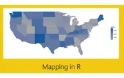
October 10, 2016
Create a US map in Power BI with state labels and year-over-year change indicators using R and ggplot2. Color-coded labels show positive and negative trends.
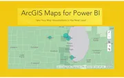
September 30, 2016
Explore the ArcGIS Maps visual in Power BI with heat maps, reference layers, and advanced selection tools. Add demographic overlays like household income.