
December 9, 2023
Revolutionizing Power BI Theme Building with New AI Capabilities in Tips+
Introducing cutting-edge AI capabilities to simplify the Theme Building experience. We recognize the value of time in the fast-paced realm of analytics.
Tag
10 posts
December 9, 2023
Introducing cutting-edge AI capabilities to simplify the Theme Building experience. We recognize the value of time in the fast-paced realm of analytics.

August 18, 2023
In Ep. 242, Mike, Tommy, and Seth break down a sneaky performance lesson: you can cut render time dramatically without rewriting DAX by rethinking the visual and using constant lines from the Analytics pane.

May 17, 2023
Ep. 215 dives into the March 2023 visual container upgrades—subtitle, divider, and padding—and how they unlock cleaner report layouts. The team also explores viewing PBIX reports directly from SharePoint/OneDrive and what it means for versioning and governance.
October 17, 2016
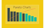
Build a Pareto chart in Power BI using DAX measures for cumulative totals and percentages. Identify which products comprise the majority of your sales.
October 10, 2016
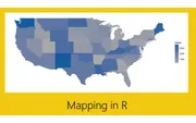
Create a US map in Power BI with state labels and year-over-year change indicators using R and ggplot2. Color-coded labels show positive and negative trends.
September 30, 2016
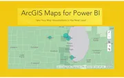
Explore the ArcGIS Maps visual in Power BI with heat maps, reference layers, and advanced selection tools. Add demographic overlays like household income.
September 27, 2016
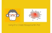
Create beautiful hexagonal bin plots in Power BI using R and ggplot2. Visualize data density with heat map style honeycomb patterns.
September 21, 2016
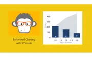
Create advanced R visuals in Power BI combining area plots, bar charts, and scatter points using ggplot2. Learn how R scripts respond to slicer selections.

September 15, 2016
Get started with R visuals in Power BI Desktop. Install Microsoft R Open, configure Power BI, and create your first correlation plot using the corrplot package.
July 28, 2016
Create a smart card visual in Power BI that displays the selected item name when one item is chosen, or shows the count when multiple items are selected.