Pareto Charting in PowerBI
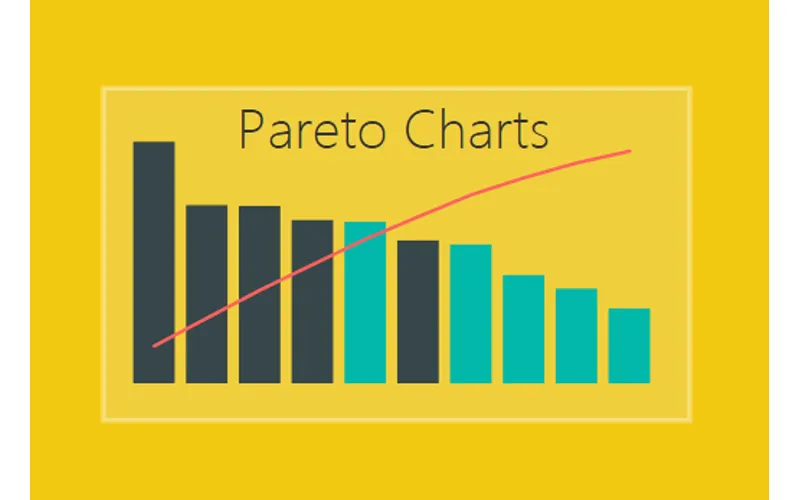
The Pareto chart is a handy visual, but is not so easy to build in either Excel or PowerBI. In a Pareto chart, information is provided about an individual product or category as a bar, and a cumulative scale as a line which compares all bars. This type of visual can be extremely helpful when conducting failure mode analysis, causes of a problem, or even product portfolio balances.
For some more information on Pareto charts you can learn more here or here. If you’re interested in building a Pareto chart in Excel, I have found this post from Excel Easy to be helpful.
What We’re Building
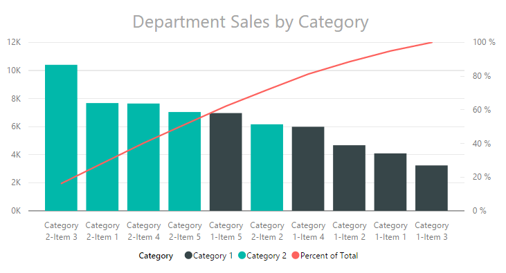
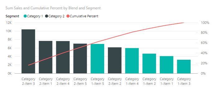
Below you will see an image of the final Pareto chart. On the left side we have sales of units, and on the right is the cumulative percent of all sales. Using the Pareto chart a user has the ability to see which products comprise the majority of your sales. For example, the first 4 bars total approximately 50% of all sales.
Loading the Data
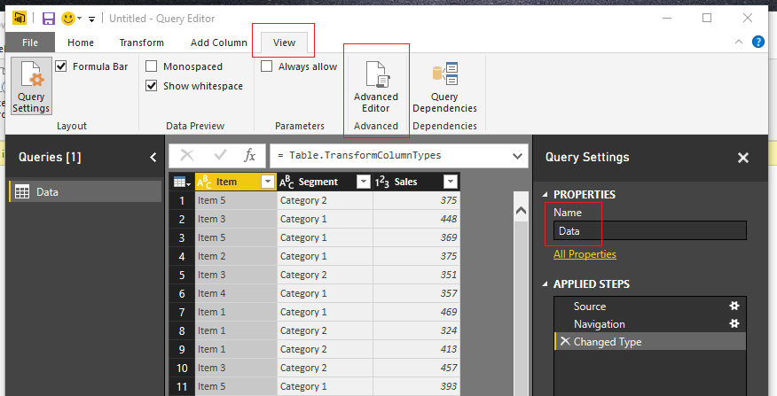
Open up PowerBI Desktop, Click the Get Data button on the Home ribbon and select Blank Query. Click Connect to open the Query Editor. Click Advanced Editor on the View ribbon. While in the Advanced Editor paste the following code into the editor window.
Note: If you need some more help loading the data follow this tutorial about loading data using the Advanced Query Editor.
let
 Source = Excel.Workbook(Web.Contents("https://powerbitips03.blob.core.windows.net/blobpowerbitips03/wp-content/uploads/2016/10/Sample-Data.xlsx"), null, true),
 Table1_Table = Source{[Item="Table1",Kind="Table"]}[Data],
 #"Changed Type" = Table.TransformColumnTypes(Table1_Table,{{"Item", type text}, {"Sales", Int64.Type}, {"Segment", type text}})
in
 #"Changed Type"
Rename the Query to Data. Once you’ve completed the data load your data should look like the following.
On the Home ribbon click Close & Apply to complete the data load.
Exploring the Data
Pro Tip: When I am building reports I often load the data and then immediately start building a couple of tables and slicers. It helps me understand how my data reacts to the slicers and helps me determine how to shape the data so that the visuals will work properly.
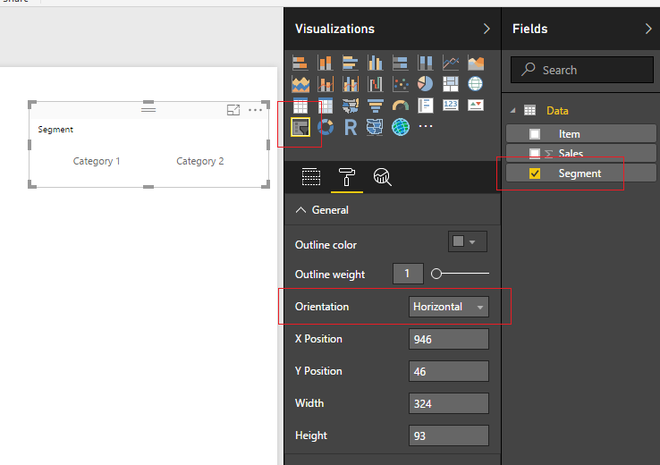
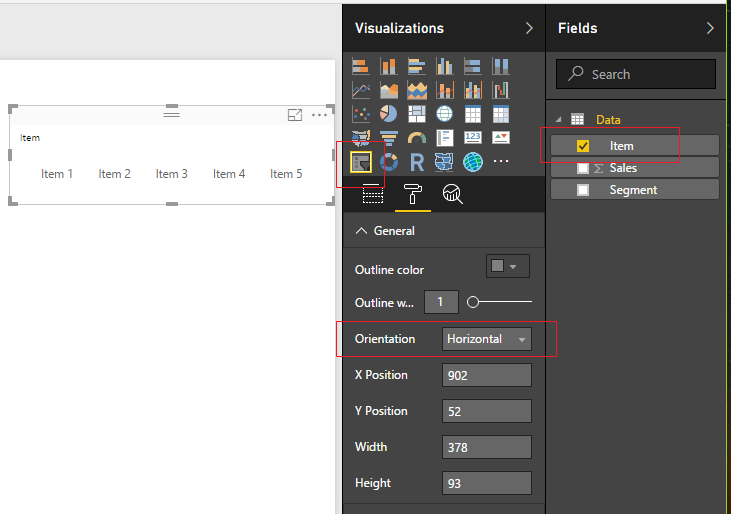
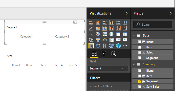
Add a Slicer for the Segment. Enhance the look of the slicer by changing it from a vertical to a horizontal slicer.
Repeat the same process to add a Slicer for the item field.
Next, add a table view of all the fields. Start with Segment, then Item and finally add Sales to the Table Visual.
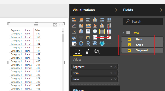
Notice there are a number of repeating values. We have Category 1 and Item 1 repeated 9 times. We need to summarize each grouping.
Creating the Summary Table
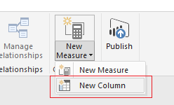
First, we will create a unique Key that will be used to summarize each combination of Category and Item pair. Click the bottom half of the New Measure button located on the Home ribbon, then select New Column.
Enter the following DAX expression:
Blend = Data[Segment] & "-" & Data[Item]Select the Modeling ribbon and then click on the New Table button. Enter the following DAX expression.
Summary = SUMMARIZE('Data', Data[Blend], "Sum Sales", SUM(Data[Sales]) )For more information on the SUMMARIZE function you can visit the Microsoft Summarize documentation page.
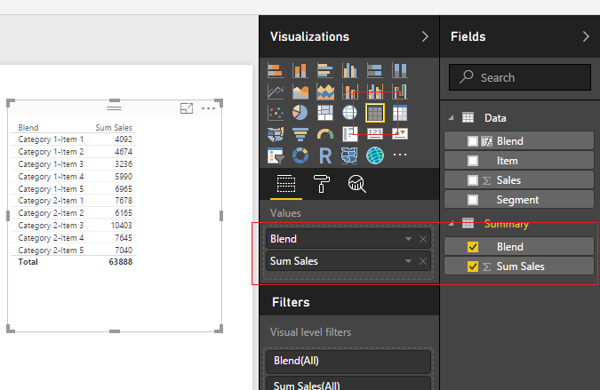
Add a new Table visual to the report and include the two newly created fields from the Summary table.
Parsing the Blend Column
We need to parse out the Segments and Items from this blend column. Highlight the summary table by clicking the grey space next to the word Summary. Click the New Column button on the Modeling ribbon and enter the following DAX expression.
Segment = PATHITEM(
   SUBSTITUTE(Summary[Blend], "-" , "|" ),
   1 )
Add another new column with the following DAX expression for the item column.
Item = PATHITEM(
SUBSTITUTE(Summary[Blend], "-" , "|" ),
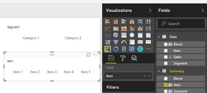
2 )Updating the Slicers
Now modify our slicers to point to the new Item and Segment fields we created in the Summary table.
Pro Tip: To select multiple items in a slicer you can hold down the Ctrl button on the keyboard and click multiple slicer items.
Creating the Pareto Measures
Now we are ready to build the measures that will support the Pareto chart.
Ranking measure:
Ranking = RANKX( 'Summary', 'Summary'[Sum Sales])Cumulative Total measure:
Cumulative Total = CALCULATE(
    SUM( Summary[Sum Sales] ),
    FILTER( ALLSELECTED( Summary ),
        Summary[Ranking] <= MAX( Summary[Ranking] )
    ))
Total Sales measure:
Total Sales = CALCULATE(
SUM( Summary[Sum Sales] ) ,
ALLSELECTED( Summary )
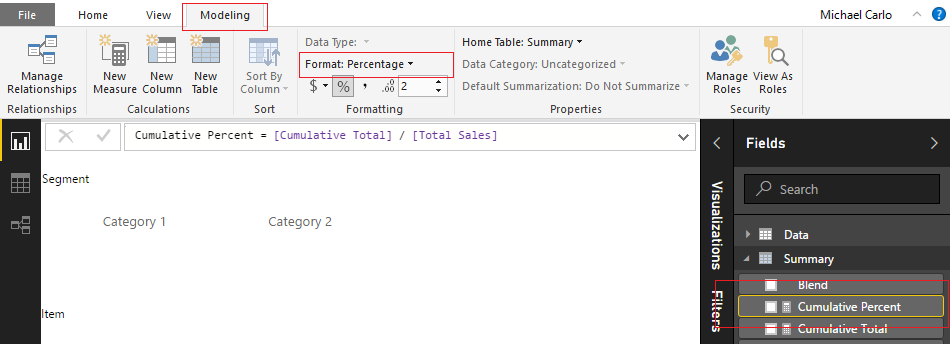
)Cumulative Percent measure:
Cumulative Percent = [Cumulative Total] / [Total Sales]The Cumulative Percent measure is calculated as a percentage, thus we need to change this measure’s formatting to percentage. Click the measure labeled Cumulative Percent then change the Format to Percentage which is found on the Modeling ribbon.
Building the Pareto Chart
Add the following fields to the Line and Stacked Column Chart:
- Shared Axis: Blend
- Column values: Sum Sales
- Line values: Cumulative Percent
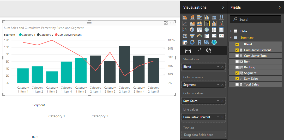
Order the data in descending order by the number of sales by clicking the visual’s Ellipsis and selecting Sort By Sum Sales.
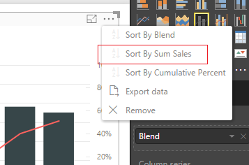
This changes the order of the items to make a Pareto chart.
Thanks for following along. Share if you enjoyed this tutorial.