Grouping and Improved Date Slicer
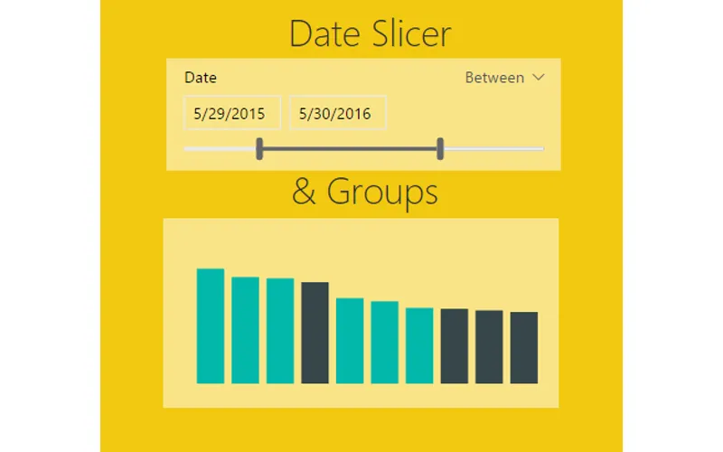
In the October update of PowerBI Desktop we were given a number of really useful features, ranging from a new Date Slicer, Grid lines, Grouping, Binning, Top N Filters, and R-powered custom visuals. For the full release on the October 2016 software release you can read more here.
For those of you who have followed my site you already know that I absolutely love the ability to create R-visuals within PowerBI. If you want to learn more you can read the R script tutorials here.
As I’ve been exploring this October release of Power BI Desktop two features have really stood out. First, the ability to use the Date Slicer and second the new feature of Grouping for Bar Charts. In my daily work flow I have struggled in the past with solutions which are now solved.
Welcome to my love & hate relationship with time bound data sets. Inevitability at some point you will encounter a need to manipulate data over time. Common business questions will come in the form of: What was my percent change compared from this month compared to last month? What is my sales performance for this year? Are we up or down compared to the same period last year? While these questions are simple I have found that calculating measures and subsequently building visuals can get very complex in a hurry. Enter the Date Slicer. Let me be clear, the Date Slicer will not solve all your problems, it does present a very useful interface that will let report users quickly navigate through their time delineated data.
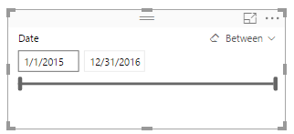
What is the Date Slicer? I’m glad you asked. Behold….
Date Slicer
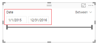
Here are a couple of key items to point out. On the left side of the visual you are given the ability to select the starting date, and ending date.
Start and End Dates
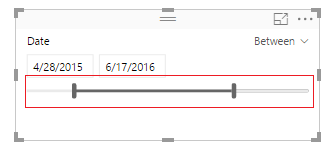
The bottom of the Date Slicer has an adjustable time bar that allows quick time adjustments.
Changed Timeline
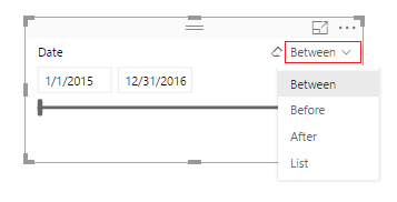
On the right side of the visual you can toggle between different date selection modes, Between, Before, After, and List.
Time Parameter Selector
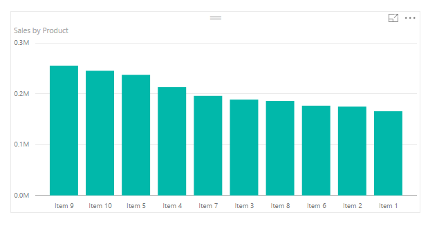
Ok, enough about the Date Slicer, how about the Groupings feature. Lets say you start off with a bar chart that looks similar to the following:
Sample Bar Chart
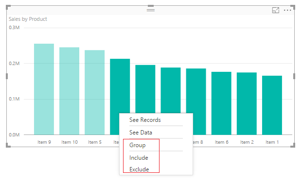
Well, maybe you’re only interested in Items 9, 10, and 5. Grouping now allows the selection of multiple bars and by right clicking you can Group, Include, or Exclude.
Right Click on Selected Data Bars
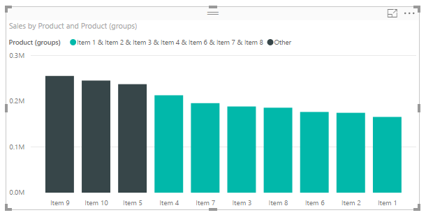
Clicking group creates a new column in the Fields area that groups the items together and adds them to the chart legend.
Grouped Items in Bar Chart
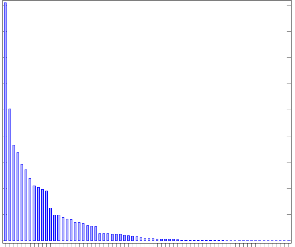
Let me tell you this is helpful, especially when your bar chart looks like this:
Ugly Bar Chart
Be honest, you have published a report or two when there were just way to many bars. The different between the largest bar and all the small bars barely tells you any information. This is why grouping is helpful. When you receive data and you need to focus your story to the important pieces then grouping is your friend.
Enough babbling, let’s get to the tutorial.
Open up PowerBI Desktop, Click the Get Data button on the Home ribbon and select Blank Query**.** Click Connect to open the Query Editor. Click Advanced Editor on the View ribbon. While in the Advanced Editor paste the following code into the editor window, click Done to complete the data load.
Note: If you need some more help loading the data follow this tutorial about loading data using the Advanced Query Editor. This tutorial teaches you how to copy and paste M code into the Advanced Editor.
let
 Source = Excel.Workbook(Web.Contents("https://powerbitips03.blob.core.windows.net/blobpowerbitips03/wp-content/uploads/2016/11/Sales-Data-Two-Years.xlsx"), null, true),
 Sales_Table = Source{[Item="Sales",Kind="Table"]}[Data],
 #"Changed Type" = Table.TransformColumnTypes(Sales_Table,{{"Date", type date}, {"Product", type text}, {"Sales", Int64.Type}})
in
 #"Changed Type"
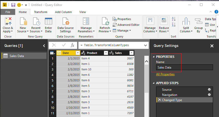
Rename the Query to Sales Data. Once you’ve completed the data load your data should look like the following.
Load Sales Data
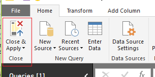
On the Home ribbon click Close & Apply to complete the data load.
Close and Apply
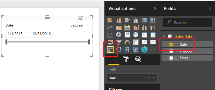
Great, we are ready to start adding visuals now. Add a Slicer visual from the Visualizations window and populate the visual with the Date field. By default, the slicer will auto recognize that the field being added is a date and will automatically show the Date Slicer.
Add Date Slicer
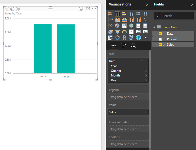
Next, add a bar chart visualization. The Date field will be the Axis, and the Sales will be the Value.
Add Bar Chart
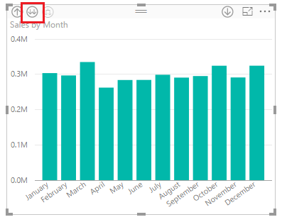
Again by default the Date filed will be entered as a Hierarchy field. Click the Drill Down button until you see a monthly view of the date. This should require two clicks, the first drills down to quarters, then second click drills down to month level. After doing this your visual should look like the following:
Drill Down to Month
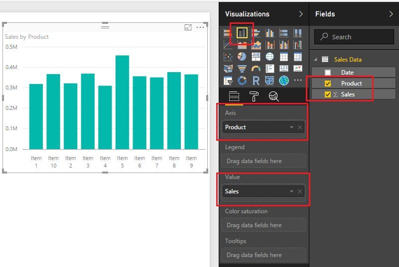
Add a second bar chart with following fields selected.
Second Bar Chart
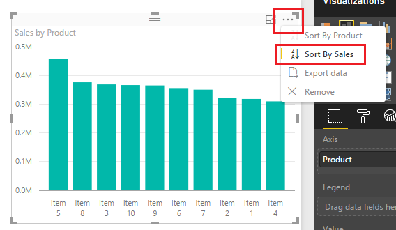
Sort the Sales by Product bar chart in descending sale order by clicking the Ellipsis and when the drown down menu appears selecting Sort by Sales.
Descending Sort by Sales
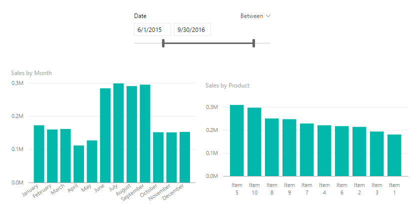
Now that we have built a couple visuals and a Date Slicer, take some time to explore how the Date Slicer interacts with the bar charts. In the example below I modified the starting date to 6/1/205 and the ending date to be 9/30/2015.
Modify Date Slicer Properties
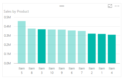
To utilize the grouping feature we will group Items 1,2,3 and 4 together. While holding the control button click Items 1,2,3 and 4 on the Sales by Product bar chart.
Ctrl Click Items
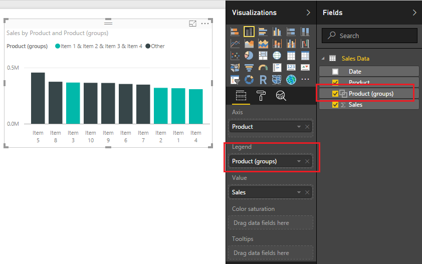
Right click Item 3 an menu will appear, select Group. Notice once you do this a new Product (Group) field appears in the field menu and the Product (Group) is automatically added to the legend of the bar chart visual.
Grouping in Bar Chart
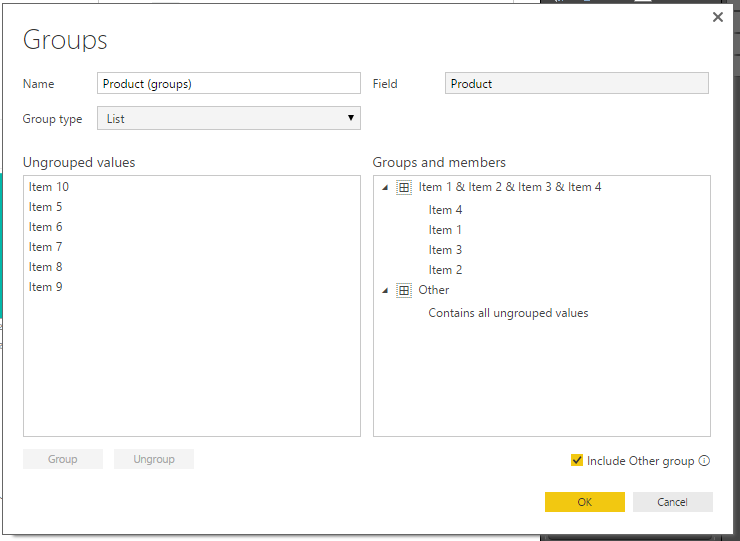
To edit the grouping you can click on the Field labeled Product (groups) and select Edit Groups. Doing this reveals the grouping dialog box.
Grouping Dialog Box
You can rename the created group by double clicking the name Item 1 & Item 2 & Item 3 & Item 4.
Rename Grouping
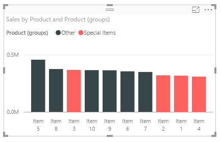
Change the name of the grouping to be titled Special Items. Click OK to close the Groups dialog box. Notice how the bar chart updates the legend values to renamed grouping.
Rename Group
Well, that wraps up this tutorial. I hope you enjoyed it. Below is a live demo of what we built today.
Make sure you share the content if you liked this tutorial.

