No more Chartjunk ! – Ep. 237
Chartjunk isn’t just “ugly charts”—it’s anything that makes the viewer work harder to understand what the data is saying. And in Power BI, a little extra decoration can quickly snowball into a page that feels busy, confusing, and harder to trust.
In Episode 237, Mike, Tommy, and Seth break down the classic chartjunk debate and land on a practical rule for real-world reporting: keep what reinforces the message, remove what distracts, and design the optional details (like tooltips) so they help instead of cluttering the canvas.
News & Announcements
-
A Data Storyteller’s Guide To Avoiding Clutter — A quick tour of the classic chartjunk debate (Tufte vs. Holmes) plus a pragmatic middle-ground: non-data ink is only “junk” when it doesn’t reinforce the message, focus attention, or make the insight memorable.
-
Submit a topic idea — Got a scenario you want reviewed (layout, clutter, modeling tradeoffs, Fabric vs. semantic models)? Drop it here and the team may cover it on a future episode.
-
Subscribe to the Explicit Measures podcast — Bookmark the archive and share an episode with a teammate when you want an excuse to talk reporting patterns.
-
Tips+ Theme Generator — Generate theme files the fast way: consistent colors/typography across reports without hand-editing JSON.
-
Mike Carlo on LinkedIn — Weekly patterns and real-world lessons from Power BI + Fabric delivery work.
-
Seth Bauer on LinkedIn — Practical engineering and delivery-minded takes on what actually works in analytics projects.
-
Tommy Puglia on LinkedIn — Adoption-focused BI leadership perspectives—how to get reporting used, trusted, and maintained.
Main Discussion
Clutter isn’t always caused by more visuals—it’s often caused by unclear intent. If the viewer can’t tell what decision a page is trying to drive, everything starts to feel like noise (even if each element is “technically correct”).
Key takeaways:
- Define “junk” by purpose: if a design element doesn’t help the audience understand, notice, or remember the point, it’s a candidate for removal.
- Clutter is a trust killer: overly decorated visuals make people second-guess the numbers and the author’s intent.
- Minimalism isn’t the goal—clarity is. A small amount of redundant context can be the difference between a chart that’s “accurate” and a chart that’s useful.
- Make context optional: use tooltips to provide extra detail without forcing every user to process it all the time.
- Use report-page tooltips when you need richer context (like a tiny trend line) tied to a hovered category without adding a full extra chart to the page.
- Treat conditional formatting as guidance, not decoration: gradients and emphasis should reduce scanning time, not create a rainbow.
- Standardize the basics (spacing, fonts, colors, legends) so the audience spends their attention on the data—not decoding the layout.
Looking Forward
Take one high-traffic report page and run a 15-minute clutter audit: keep only the elements that support the page’s decision and push everything else into optional context (tooltips, drillthrough, or a detail page).
Episode Transcript
0:27 good morning and welcome back to the explicit measures podcast with Tommy Seth and Mike hello everyone swing anything hello and a happy Tuesday gentlemen there we go no I was just waiting because last time you have such a great intro it’s like I feel like we need sometimes there’s more hi Seth I should be like doing something yeah and then Tommy and I were talking over each other to share extend our morning ingredients last time so I got a student some space for Tommy well I know
0:58 student some space for Tommy well I know what to do until we botched it like we do yeah listen I think 237 episodes and now I know on Tuesdays I know August 2nd we got that oh yeah well you were doing some Brandon I get it clear I get the clear path get the clear go ahead second to ownership of local of local spewing on Tuesdays got it that means Tommy’s got to figure out something for Thursdays then okay we can’t force it man I know it’s just gonna happen naturally evolve you’ve only had 237 tries to get it right time
1:30 only had 237 tries to get it right time you’ve been trying to think of names for us for like about 50 episodes you’re like data mic and still not still not working I’m not going anywhere it’s not going anywhere let’s jump in right into our main topic for today this might be a little bit of a shorter episode for those of you who are watching live this is a pre-recorded episode so we’re going through people are traveling so we’re there for having to record a couple episodes a bit early so today our article will be in the description but it’s talking
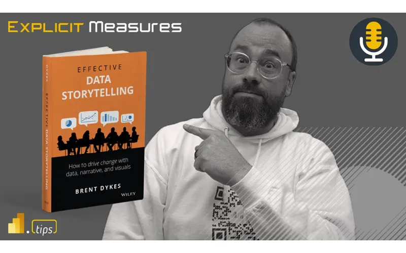
2:00 in the description but it’s talking about effective data storytelling and this article comes from Brent I think it’s Brent Dykes in his book in effective data storytelling it’s the the book that’s off of Amazon as well so you can go pick up the book if you want to learn more about effective data storytelling so just kicking things off I think the gist of this article is really talking about how do you remove the right amount of clutter from a chart but yet keep enough that it’s informative right it’s and he has this
2:31 informative right it’s and he has this term that he introduces very early in the article around chart junk things that are on the chart that are not really adding or enhancing the chart but yet they’re they’re part of that chart let’s read between the lines here and this is where details are important okay so the summarization I think it does a great job he’s he’s bringing to light the two approaches that the some of the the heaviest hitters in visualization like right tuft and few right even few
3:03 right tuft and few right even few just tuft was the chart chunk guy right eliminate it all because all it’s going to do is distract an end user and if he was like well there it depends but there there’s a little you can add here and there overall and we can we’ll dive into it I I love Brent’s approach I I think this is Bar None one of the best most concise articles I’ve I’ve read in a long time that that take a lot of the visualization conversation that we’ve pontificated
3:35 conversation that we’ve pontificated about and we will again today and in just as like a summary and if you were gonna use something to change fundamentally how you build visualizations in power bi go to use this article understand it really well he lays out some charts which we’ll go through but I I love it I don’t think I I don’t think I disagree with anything in here in here what maybe a first but we’ll see we we still sometimes I’m sure there’s something we can find you to disagree with here Seth
4:05 with here Seth so here’s the thing there’s actually something here I I feel like I’ve been saying for a while on and something that I’ve brought to attention to other people that are training like the idea of a perfect report and one thing that I call it a hot take but I that reports are subjective in their quality quality there’s an element here to that because you can either one of the things that he talks about is there is no such thing as a perfect report and I love that idea because Mike I
4:35 and I love that idea because Mike I still use in training today the idea of the data to Ink ratio when I’m telling people about I do as well yep directly from the podcast and for those who have not seen that episode dated Inc ratio is and it’s an older Theory but it’s basically basically that talking about only has much ink that’s not data as you need so text labels descriptions correct and just to be clear this is a tough so in this article it talks about tuft as one of the founders of data visualizations talking
5:06 founders of data visualizations talking about that and tuft this is his argument right every bit of ink you spend should be used towards educating the user on your data element your data point if it’s not or if and you could literally go through and I think I think this is a great test if there’s ink quote unquote ink as if you’re printing it right if there’s ink being used to put something on the page is it absolutely required and you can literally go through for every single object on the page and say does this add additional story or value to that chart if it doesn’t take it away
5:37 to that chart if it doesn’t take it away is it supporting the visual and it’s trying to communicate and this is I think where Brent is jumping in here and saying okay we hear you tufty like that that makes sense but then when you look at at Steven few he Stephen maybe provides a little bit more of a balanced perspective and and not so hard or rigorous against removing all objects from the report maybe focusing on the key or most important objects to help you build things inside your turning
6:08 you build things inside your turning well the the key the three points that he makes that that come out of Steve if you are like are are you including extra stuff to engage the interest of the audience yep draw attention to certain things and or make the message more memorable and if you if you think about it that that it is a Nuance between yeah because if I was going to follow tuft and and just only the ink on the page right right I’m removing access I’m I’m like it’s only
6:38 removing access I’m I’m like it’s only the bar chart and that’s it well a lot of times we’ve talked about the complexity of some of the the data behind something like so are you going to add a visual indicator or an icon or something else that is going to enhance up an external person’s understanding of the data that they’re looking at in the visual right and I think that’s where there’s this middle ground that Stephen Pugh in his approach makes a lot of sense and overall right like we’re still talking doubt this spectrum
7:10 we’re still talking doubt this spectrum of of data journalism where you might throw in a lot more art or a lot more effects outside of a visualization versus just a straight report where you’re producing just visual visuals for data consumption and I I think within here is he’s looking for a happy medium But ultimately I think airs more on the well maybe it’s not air it’s it’s a good
7:40 well maybe it’s not air it’s it’s a good middle ground I think so I agree I think again it’s a balance right to your point Tommy earlier I don’t think there’s a perfect report there’s not a perfect chart people are gonna have opinions of what they would want to see or not want to see so you’re always trying to if you try to appease everyone you appease no one I guess it’s the phrase right is if you try and make everyone happy happy at the end of the day you’re not really making anyone happy because we’re not really so sometimes it’s you do have to make some compromises some places and
8:10 make some compromises some places and everyone has to figure out okay we have to meet in the middle about okay what is the value of the report and there’s some oh God in my oh go ahead no I guess the the question I have is we we didn’t all just land here right correct we we didn’t all just like start building reports and we’re like oh yeah we’re like we we read these books long ago and we were data people like in your how have your backgrounds like where did you guys start do you if you recall like
8:41 you guys start do you if you recall like in how you developed a report page in terms of like look and feel and and where where do you fall as far as like which one of these theories you typically follow as far as an influencer and how you build your reports that’s a great question that’s a good question I learned everything I know from Seth I was trying to take a bit take there on his oh well done used to hold in your hand [Laughter]
9:12 [Laughter] so for those of you who are listening to the podcast stuff I was about to take a drink of his cup and I said it right as he was taking a drink so so again what I’ll lean on is I did some formal training around using Delta Associates I was in category management at the time I was looking at lots of data and trying to really pull out what are the key insights that help
9:33 out what are the key insights that help you understand what is driving Revenue up or down for a particular category and category management teams have a pretty daunting challenge in front of them there’s a lot of data they have to deal with with there’s potentially a lot of products on you could be up to the hundreds of products and so which product out the out of the hundreds of things that you do is producing the most Revenue which one is losing the most and then we talked a lot about like market share and market share analysis so from there there was just a very good portion of
10:04 there was just a very good portion of the class talking about basic visualization development and the gentleman who taught the class was a PhD a very sharp individual studied this stuff for a long time so I learned a lot from him to really start my fundamental background and then I’ve I’ve read excerpts from Steven few I’ve read excerpts from tuft and and Incorporated okay what of the things I’ve heard from these other authors which ones do I resonate with and I’m I think I’m
10:34 resonate with and I’m I think I’m probably if I had to put myself in a bucket I’m probably more of a toughed type designer I like a lot less stuff I I’m a very distracted person I get very excited about things so having a lot of extra things on the page is distracting to me so I really like a clean not a lot of labels very clean designation of reports and just really picking on okay now that you understand like visualization things
11:04 like visualization things to me I had to start figuring out okay how do I Implement what these members of the community are saying about visualization but how do I overlay them into okay what can power bi do right should I turn on this thing I can’t necessarily do minor and major axes labels on a an x-axis or y-axis on a chart right where we are physically limited right now by the the capabilities of that chart and so this is one of the reasons why I really like deneb as a custom visual because I have
11:35 deneb as a custom visual because I have the ability I have the capability to be able to create really custom things and really dial in stuff the way I want so so that’s where I think I came from Tommy where did you come from where was your background what was your study again hold on before we go to Tommy all right you you always start at Delta Associates are you saying that you’ve you never created or prior to that I was building Excel stuff that was this is this is really old this is this is when I started learning power like I learned power query at around this time okay
12:07 power query at around this time okay and I was building charts so at the time I was building charts in Excel with data engineering and all in Excel so I wasn’t at this time this was before I even touched power bi at this point really old so I come from a very very different background I and I wouldn’t be lying if my ADHD Tendencies come to play a little with visualizations but it’s really more I started from a digital marketing background where there are so many elements in digital advertising that you can directly influence keywords ads
12:39 can directly influence keywords ads where you place it time of day and all those things matter how much you actually spend which was a huge part of what we did so I I was tasked with not just building the visualizations for looking at where the ad spends coming from what ad but also all the other things going to a digital marketing campaign the organic stuff the traffic to the site the actual purchases so and all those things from a marketing point of view you can influence I can directly tweak so there’s a lot that you wanted to see and that was a
13:10 that you wanted to see and that was a lot of things that you needed to know to go okay this ads not working this headline is not working and that was really my influence to kind and that was really my influence to look at all the variables so to speak of look at all the variables so to speak in one place to say if I do this and if I mix it with this what could happen that changed very drastically as I transitioned to a more Global reporter and I was working with sales first report for them like no no no no no no no no no can you just show me if I’m going to
13:40 can you just show me if I’m going to make my target for this quarter that’s it and it was it was a hard hard transition initially because I’m like but there’s so many other things don’t you want to know what what states that it’s working out or what companies potentially like no I need to see this and that was probably the first few years into it as I started transitioning and really realized I had to make a transition on my concept of building reports because it goes back to two you
14:10 reports because it goes back to two you put all 80 of your times in modeling visual in the calculations and you want it in a sense show for it like there’s so much in here but I think part of our discussions but really going into objectives and key results and really trying to focus on that as the Forefront first has been the biggest influence transitioning to how I see what clutter is now and how I see what Clarity is so one of the things I think Seth was asking also though was who was your inspiration and we’ll do maybe you align with was there a book
14:41 maybe you align with was there a book that you I know you read a lot of books and you’ve got a lot of things that you’re always consuming any particular books that you read or consumed that you felt I’m going to take away some key points from this book what people should be reading the storytelling with data are the Steven few book was incredible that was probably the one of the catalysts when I when I first read that and if you looked at the highlights that have in there and I literally have notes on there and because I would just refer back to it because again it just takes those elements of let’s start with a random project how do you go about it forget
15:12 project how do you go about it forget the visual side it was the in a sense the initial conception of what you’re trying to build or what the point of it is this is a lot of the Insight development right what am I trying to do at the end of this report by what show by this thing and it really helped that helped in a sense categorize or couldn’t put things into the right boxes for me Seth how about you what a artist an artist what
15:42 books or authors drove some of your inspiration yeah you learned everything from Mike right I learned everything from my Carlo yeah before all this like the reports were SSRS and I rarely built any charts charts I think I think when poverty I first came out in SharePoint right as like this interface where you could just do everything it was a little daunting and you just start throwing
16:14 daunting and you just start throwing things on the page and it was probably to Tommy’s Point way over cluttered like just to put as much information on there as possible but because I didn’t have an idea of how I would want this is where I started reading reading and that’s where I think also the the interest that that you and I had in the this blank canvas right where we could just do anything we wanted was really important to engage data people in this journey of understanding like what is the best way to present information
16:46 the best way to present information I’ve read them all right so not all but but information dashboard designed by Steven few Alberto Cairo Scott Bernardo good charts it was a good one Cole naflak who wrote the storytelling with Theta yes and I think she’s got a second book out too I don’t know if I fall into all like any of these I’m I’m sure all of them influenced with an art background I like a little bit more but I I would say I
17:17 little bit more but I I would say I probably agree with you I start at Toft I start at stripping down everything I possibly can to the point where I’m I’m confident that I’ve I’ve provided the information that’s important and relevant related to axis title like do I need a legend where how many Etc like strip it all the way down and then I start to apply some of the principles I’ve learned right color alignment sizing do I do I want to
17:49 sizing do I do I want to embellish a little bit with an element in the background I think even within here Brent makes a good point of background versus foreground right like popping visuals because one of the one of the things that’s a real challenge if you’re not used to it is if you throw five visuals on a page and they’re all the same color it’s all white right everything’s this one Bob whereas if there is a little bit of a frame whether that’s done by the background or the an
18:21 background or the an effect on the visual itself it pops that image and focuses your attention right so we’ve all underlined all of these things is that we change in as it relates to properties are a lot of the visualization interactions right that we as humans like like what is the word I’m looking for there’s a lot of theories in study that has been done about psychologically how people
18:52 done about psychologically how people ingest visual visuals data and this is where all this comes from so I like the fact that in here Brent is just like hey here’s things we want to do to make your visualizations better but underlying
19:05 visualizations better but underlying that all are the the vast amounts of study and testing that people have done to ensure that this is why we do things because as end users who have no concept whatsoever of oh my gosh like that number I just I I know what you’re I know what you’re looking at right away yes don’t realize that it there were five very conscious choices of like highlighting a certain area or doing
19:35 highlighting a certain area or doing certain things to make sure that that data popped out for you yes to reduce your cognitive load which is what this is all about it’s all about like how fast can you get people to ingest information and marrying all these ideas in the ebooks and everything together is I I think the approach I’m at now so I start with very minimalistic very tough tough to esque right typically and then then I’ll apply from there to a point where I’m not over
20:05 where I’m not over trying not to over overcrow look and feel two things you did hit very close to home I remember reading too about the white background on white and like the things popping out and I remember the first time I read that I’m like I don’t get it because it was such I’m like I don’t know if I’m going to understand this it was a different concept and I’m I may not be the most artistic person but when we started reading one other shout out I want to do is Enrico patini about the
20:35 want to do is Enrico patini about the cognitive load and that ability to kind cognitive load and that ability to process and that I think of process and that I think finally married the two together like getting that idea together Mike one thing that you said on the podcast a while ago too I think plays into this nicely is you build a visual for a client and it was pretty direct only like the cumulative sales made a lot of sense but for them they didn’t get it and there’s also there’s also things too like I think as as report designers I want to just jump on your point right
21:05 want to just jump on your point right there yeah sometimes we’re a bit more comfortable with what visuals and more advanced calculations to get to an answer I think we are we can if the more time you spend looking at visuals the more time you spend information transferring so there’s a there’s also the ibcs standard which also has something else I really like it does a very good job of communicating common patterns in data and helps you identify the highs versus the loads what’s the difference there and one of the concepts
21:36 difference there and one of the concepts that I talked a lot about in that I was taught was position and direction right position is where I’m at right now direction is where we’re going are we are we increasing or are we decreasing those are two things that are beat into your head when you start thinking about these different charts and visuals so to your point though Tommy we may be comfortable with looking at that cumulative total of information and really identifying oh these three customers or these products are really making up 90 or 80 percent of our total sales we should focus our
22:06 total sales we should focus our attention here right it’s a matter of sometimes we we lose sometimes we lose the the details by falling into the weeds too fast and so I think a lot of the times is is we we focus so much on the details we focus so much on these little things oh we lost 700 of our sales yeah on a part or a product that was like less than one percent of our total sales volume so should we focus our attention or a lot of time or effort to make sure that sales go up on that one tiny little part
22:37 sales go up on that one tiny little part no we shouldn’t we should focus on the one percent sales loss we had on our largest product and our largest offering that’s driving the most revenue and I think a lot of people appropriate stuff it’s it’s really making sure like yeah the way you present data the way you look at information we really are talking to other people via a chart and so all we’re doing is we’re learning how to communicate these techniques and particularly I really love this idea of like the frame talking about the graphical objects how do you
23:08 about the graphical objects how do you convey the axes or the labels right all these things are attributing to our graphical communication around data and labeling and so when you communicate I’m literally this is probably someone else let me figure this out I’m just now having the Light Pop moment after what Tommy said but if I’m communicating with people both people need to understand the same language both people so if I’m talking to Tommy in Italian Tommy’s gonna have a blast he’s gonna laugh at me because I don’t know what I’m doing because my
23:39 don’t know what I’m doing because my Italian’s horrible and I don’t know any words so I’ll just be saying linguine or spaghetti and like things that I know how to like say and I’ll use half of those things I’ll probably even be messing up so but when when people talk in the same like a language that I know English like I can we can communicate we can convey ideas and when you learn about like to your point Seth earlier the psych the psychology of like communication we’re literally trying to make each other have the same wavelength like we’re trying to get our Braves to think the same way and
24:10 get our Braves to think the same way and it’s so it’s the same concept except now we’re focusing on visualizations can I get the visual to invoke the same analysis and or emotion and I think that to this point and especially what Brian’s or Brent is saying here is Brent is saying sometimes in order to get those key points to focus on the same key information that you’re trying to storytell you might need an arrow you might need a chat bubble you might need a little bit of extra information on the page that helps the story or the
24:42 page that helps the story or the communication of what I think is important be the same that the other person can read on their side as well love all those points and I think I I think I’m gonna dovetail and tip a little bit onto here as well even though it’s more visual is like choosing a visual case I think it also applies to this as well right like a while ago we talked about there’s this propensity as data folks to to look for the next new visual right oh I want to build something really cool and like all of a sudden you’re
25:14 and like all of a sudden you’re introducing a very complex visuals and and users don’t know how to consume it so you’re confusing or you’re or you’re overburdening them because they don’t get what it is you’re presenting to them I think in so there’s this yeah I think there’s a principle in here too where it’s like if they’re not used to something yes people it’s very hard for people to like understand what you’re presenting to them and to me I think you you also have to be cognizant of this as you’re developing whatever
25:44 you’re developing whatever background whatever like the experience of Digest information by using a lot of these visualization techniques to make sure you’re highlighting things you also want to make sure that you’re not throwing like the super cool oh latest thing and like all of a sudden your background has all these stripes and it’s super distracting or whatever the case may be it’s just a dumb example but I found it interesting that that I think also ties into here into here one question I have is what is what
26:16 one question I have is what is what do you think is the biggest chart junk mistake that people have like we’re talking about like we’ll get into like how do you how do you clean stuff up but like what is the biggest chart junk thing you guys have fallen into or that like you see people make a lot of what oh man that’s that brings up directly of some past experiences when first started a big thing was I I would put a lot of the labels and a lot
26:47 would put a lot of the labels and a lot of the additional metrics in there so like a lot of supporting metrics into the visual side of it whether it’s tool tips or as smaller visuals and people go we don’t need that or like that’s too much and I remember getting angry at first people like I’m giving you the keys to the kingdom here you can literally I wish I had your job because now I could I can see all those different elements and tweak everything and at least for me that was one of the big transitions what I still see in a lot of reports out there
27:17 lot of reports out there working with clients and it’s a lot of the labels and still a lot of the whole story what I’m trying to tell even if it is standard visuals it’s a bar chart in general too much on the page too many visuals on the page not so much too many visuals it’s things that are all the same color so like it’s not so much what pops out so if I were trying to get that high overview glance it’s just trying to solve all your problems with text or no it’s like four visuals that you can’t tell what each one’s doing because they’re all the same
27:48 doing because they’re all the same colors colors so I’m gonna go one of the visual dunks that I think I bind this is probably one where I’m now probably more adapting my theme files to absorb some of this correction every time you build a visual this is a default thing that comes out of desktop and I think this is just the defaults that Microsoft puts forward towards you are how the report will somewhat style initially so I’m going to emphasize here to some degree right one read up and study up on what you guys
28:19 read up and study up on what you guys what you what you think as a community what you think is good visual design for your company for you then two think about what those patterns look like and go build common theme files because those really do set a lot of the tone around what is in the reports let me give you
28:36 what is in the reports let me give you an example whenever you create a bar chart the bar chart always comes with a legend if you draw a bar chart by itself it should come with a legend that does make sense it also if you draw a single bar chart there’s a x-axis title and a y-axis title initially that was not there but now it’s on there by default so you now have potentially a title on the chart which always is there you now have the title on the X and Y axis and there are certain things that I think are self-evident right that the when I was
29:06 self-evident right that the when I was in engineering school I was always taught label everything I have everyone labeled like clearly what you’re looking at label all the axes right so everyone needs to know what you’re looking at but that does make sense when you’re talking about a single data chart but over time you’re I’m hoping that the people are saying oh May 20 May 23 May 24 like okay obviously that’s a date there is some implied things I could then remove so instead of having date or calendar date listed as my access on the title that’s just one more
29:36 access on the title that’s just one more thing the user has to read I’d rather have them think about what do these data points mean on the x-axis and then internalize that forcing them to not just read it but actually saying oh these are dates on the bottom of the of the calendar so I’m so I’m you asked what are the junk things that are created I think one it is Legends because if you have the same chart with different categories across different things you’ll have the colored bars make a color plus the legend make some colors plus if you have another visual on the page that may also be representing those
30:08 page that may also be representing those colors so I like to think about making a single bar chart they call it like a rainbow chart where each bar is represented by a single color so we have the name of the bar you have the bar on the page and then the color of the bar links to the x or y axis on the bar chart and then anywhere else you use that color don’t you don’t need a legend anymore you’ve already defined it on the page essentially you’ve built a bar chart that is a legend or the rest of the page and then when you click on things or objects you don’t have to reuse those
30:38 objects you don’t have to reuse those things so I think Legends are a cluster a noise that is added a clutter and I would also say potentially too many X and Y axes are also clutter that is also not needed on the report page hey you forget a big part of that too is from the data and ink ratio it’s like if you already have a title that says sales by correct category yes you don’t need to show the category exactly exactly right and I and I also of the of the of the opinion is I don’t want the Clutter but I do want people to understand what is
31:09 I do want people to understand what is this chart for like how do I interpret this chart so a lot of times I like to use those little icons that Microsoft provides again they’re not incredibly discoverable I wish they were a bit more a parent to users but I do like using the information button on the visual and typing up and there’s a little text box you can type up use this visual to do these things here’s how you read the data if the you can give a little bit of text around what that is now I would agree if I build a report for myself I don’t do that right if I’m building ports for an audience or for a
31:40 building ports for an audience or for a team of people I am thinking I think more about how will other people use and consume this report and I’m more you consume this report and I’m more for me I’m building complex visuals know for me I’m building complex visuals weird stuff right stuff that makes sense to me to me however if I’m building for an audience I really do have to assess the audience of those reports and say what are the skills of that team what can they handle and have them talk to me about what is important to them what what how do they want to see representations of data and I I do like it right so a lot of times we’ll be given an Excel sheet
32:11 we’ll be given an Excel sheet here you go this is what my port should look like these are the things that I care about right at least it gives me a better language you’re communicating to me about the language you understand how to speak I can then pair it back to you a report that has that same a similar language language I will I will say Mike this is one of those where I think you held my hand maybe this was a Delta Associates thing I think this is a double thing for me for sure mine was Legends as well like and I know you brought this to me because for sure first it’s probably one of the hardest things
32:42 it’s probably one of the hardest things to see because you’re just like oh yeah it’s a this I I have a line chart there’s multiple different lines you have to see them and then to think about it in terms of well yeah but if you’re looking at this category across four different visuals on the page you only need to see those category colors defined as something one time agreed H correct are there always going to be exceptions yes like someone that blue like just recently I encountered was the individual going yeah but I want to blow
33:12 individual going yeah but I want to blow up just that image well and this is the big pet pee I just want to blow up that image and snapshot it like if the Legend’s not there I can’t I’m like okay fine yeah slide one of the things I do want to point out in this that you is is something I I didn’t correlate which I probably should have because I had an art background so an art like you’re working very closely on areas especially on large things if you’re painting painting or drawing whatever and what what you have to do sometimes to get your perspective is
33:43 sometimes to get your perspective is take a step back walk away from your piece look at it from a distance to understand like okay like am I is what I’m doing making sense Etc one of the best things I I’ve done is apply that I don’t know if this was also a Delta thing like but apply that where if you actually step back from your computer and like at a distance and look at a report page a lot of these chart junk things or challenge areas visually start to pop out to you like wow there’s a lot of
34:14 out to you like wow there’s a lot of color over here or there’s a lot of text that’s just like like that dark section of the report yeah go in take a look do you need it all or and this was one of those where Legends is just like oh my goodness like this they’re they’re everywhere loud yeah so much going on yep and it compresses the actual space that I’m I’m providing informational data that people would want to look at so that that was just a method that I wanted to share outside of that
34:44 wanted to share outside of that we we’ve talked a lot I think about our backgrounds and the the challenges within here do we get stuck a little bit into some of the suggestions that Brent has here as far as like I do I’m doing categories and just before we move on I I think we definitely move into that one instead I just want to tag one more thought on the end of your note here Legends I think are indicative also of color overuse of color yeah I think you’re right there so a lot of new users that I see in power bi they will
35:14 users that I see in power bi they will bring a lot of charts together and if I think about a page of a report there’s usually this concept of there’s not not I’ll call it congruency between visuals and the colors of those different visuals right so and what by that is if I have a a certain category of product name right and if if this page is going to focus a little bit on product name and we are going to say okay each product name is going to be part of the theme colors that go along with this report
35:44 colors that go along with this report well okay now what I’ve done is I’ve locked in every single object on that page to be that product whatever that product is is now I’m gonna should have the same color across all the entire page what I’ll see people doing a lot is they’ll transition to a different category like maybe sales region or something else so there’s another there’s another definition and so what you’re finding is we’re now trying to Anchor the color blue to the iPhone product and we’re anchoring the
36:15 iPhone product and we’re anchoring the color blue to North America right so so now the color so now when I look I’m actually adding ambiguity to the report page where I make mixing and matching particular data colors to relating to different things and so again in the context of one visual yeah makes total sense colors visuals no problem but when you start looking at multiple visuals on the same page and I think I find this particularly confusing to people on the overview page of reports right when you build a report you typically have an overview page that summarizes a lot of kpis and you build specific Pages for
36:46 kpis and you build specific Pages for products regions of sales whatever right you start focusing in a particular topic it’s easier to give colors on that page but I think the Miss for me is having having people change the definition of a color mid page and that confuses people so I’d also Echo there if a lot of times I’ll pick on people and be like hey hey you’ve made categories colors great everything in this page should be based on the colors of those categories that’s that’s what it should be doing anything else you do it should be like
37:16 anything else you do it should be like Shades of Gray Shades of Black shades of a single color right so so start focusing on a different shade of color there and and having that one as well yeah groups help with that too though or bucketing yeah totally and yes combine a whole bunch of products together I love that one too category or something like that because yeah that is it’s a challenge when you you have a hundred different products and you want 100 different colors and then you’re going to reuse something else yeah but yeah color confusion across the the report
37:47 color confusion across the the report page is also a good the most impactful thing I’ve done to really influence that is if you have a bar chart with categories and it’s like they’re all the same colored great especially if they’re all just a dark blue or whatever it is but having shading or conditional formatting just to show a range a gradient is absolutely huge word then
38:08 gradient is absolutely huge word then you don’t have to add in that other element piece in there and it’s honestly now on my summary Pages it’s very hard for me not to have that feature because that’s such a big Catalyst if you’re showing a rate or if you’re showing some kpi to give a little more context to it excellent sorry Seth I want to go back to your point though your question like let’s go back to the article now and start talking through some of the points here inside the the article was there any particular area you wanted to point so it oh I think yeah I think just leaning into the five
38:39 yeah I think just leaning into the five main categories like where Brent I think okay okay takes all of the conversation we’ve been having right which is really just the initial the authors where we’ve been digesting visualization like all the different things and he does a fantastic job and he even says as I was researching what contributes to clutter and data charts I couldn’t find any comprehensive resources on the topic which it’s true like there’s some fantastic books but like to consolidate it all into a recommendation engine
39:09 it all into a recommendation engine thing where people may not want to read the five books yes or don’t don’t like want to dive that deeply he built this to assist other people in identifying what issues can lead to clutter and data visualizations he’s assembled a collection of potential clutter elements and organized them into five main categories I like these the categories make a lot of sense let’s go through let’s go through a chart is decompressed into multiple categories the frame literally the line that encapsulates the chart or the background image of that yeah there’s
39:40 background image of that yeah there’s the graphical objects like the bars themselves on the page there’s the axes just literally drawing the lines the X and the y-axis and then potentially any of the sub I guess it would be what do you call the lines that are across the page the grid lines I guess would be the grid lines as well and then labeling labeling the legend labeling the x or y axis the title of the chart those are all label elements and then there he’s calling this last last area overlay objects things that appear as like an arrow pointing at some data or a chat bubble or as particular a
40:12 data or a chat bubble or as particular a tool tip right a tool tip would fall into that overlay object area so how do you want to tackle this part of the conversation Seth you want to go through one by one or just pick out a couple of key highlights here I think we’re far enough along maybe we pick a few that stand out to us or what do you get I don’t it’s not my show collectively Chef what do you want to do on this show today yeah no what I was thinking guys is we should not talk about what you want to talk about you should do what I want let me show you a collection of
40:42 want let me show you a collection of wines that I have now so but probably what do you think is the most impactful I think well at the same I think each one can be yeah right so so I think he calls it out like if we just talk about framing right how do you how do you what is the key key thing you want to keep in mind he calls out chart background chart margins chart borders yep dangers around his around this your chart borders they don’t need to be super thick lines they don’t need to be black right they don’t need to pop that hard especially if your
41:14 need to pop that hard especially if your background color is really subtle yes right so just because you’re gonna frame something doesn’t meet like you can actually make it much more distracting if you if that border it’s so hard is too too heavy right chart backgrounds pick pick colors unless you’re at this for a really long time and you have some ideas of like okay I have a symbol or something off to the side that’s not going that’s going to be part of the background right but it’s not in any way shape or form going
41:44 it’s not in any way shape or form going to in it’s it’s the difference between background and foreground you want the visuals to be the thing people look at and as an ancillary thing if they’re like oh that looks pretty right but it in no way shape or form should you like when we’ve seen them in the past like you stick an amusement park scene with like thousands of people as a photo behind an image like behind the visuals and then it’s almost like yes you’re overloaded with all of the visual aspects of the background that you’re like you’re you’re having to like try to
42:15 like you’re you’re having to like try to focus in on a visual right I think those are the two biggest mistakes that are easy to make when you’re like oh background foreground I can totally do this this stick subtle right at first and and don’t look to like really nail things forward it’s just it all you need is a subtle eye movement thing to lock in into a particular visual those would be my like Pilots yeah I like that one too and I’d say another another one around frame another observation I think with particularly with power bi is
42:46 with power bi is when you’re talking about two or three charts together multiple charts right so if the two charts make sense to be if the data is related across the two charts make a border around the two charts together as a whole item combin bundle them together right right yeah yeah and then that makes sense there from that perspective I really like that one and then I do I one of the things that I’ve been working on some things with Megan Longoria which was she’s very Pro
43:19 Longoria which was she’s very Pro like making sure that’s accessible and things like that as well so I’m paying more attention to like the contrast ratio of colors and to your point here Seth the trim or the border around the visuals should be should be more more how do you say this the term individuals can be more less accessible they can they don’t have to be as hard edged the colors don’t have to be as drastic of a change as you do like the bars against the background of the bars information right so the bars themselves on the page needs to have a higher
43:50 on the page needs to have a higher contrast ratio B10 between the background and the bar color versus The Border or the frame that’s going to be much more subtle so as there are different objects that I think that are in the report that become more accessible or need to be thought of as more accessible than other objects on the page and right now Microsoft has tried to do a good job on this but there is no accessibility Checker there is no eyedropper there is nothing inside the power bi report page that would say this part of the page these pixels are not
44:20 part of the page these pixels are not different enough in contrast now there is some things like high contrast mode there I think another design technique for high accessibility is not using Color at all and going like hatching hatching of visuals and doing like black and white on everything so everything just becomes a black and white type report page so it becomes much more Stark but then you have that high contrast wherever you’re you’re building things so you can simplify and increase the contrast I don’t know how I’m still maybe trying to formulate the
44:51 I’m still maybe trying to formulate the best things I would think here again it’s it’s the tooling the way it is today is not very easy for me just to quickly identify when I build something that it is not accessible right right you have to like build it and then test it after the fact which I think is not I would be more apt to build accessible based reporting if it was built into the tool if it was easier for me to get to I wonder if that’s one of the challenge and maybe you just found the one thing I like hmm maybe there is something
45:21 like hmm maybe there is something lacking in there like but it’s not just the article right like in I don’t recall like huge sections about visualization with accessible changes accessibility changes and maybe I I’m almost I wonder while I’m saying that it’s like not meant to be critical of these people who are spending a ton of time teaching us about visualization in ingest but is it is it that especially with color these accessible adjustments we need to make actually break what what
45:54 need to make actually break what what would would the the larger audience like the the not the principles right yeah do they do they do they completely shred like yeah it’s not going to look good for everybody else because it has to be in these color tones or they’re not going to understand or visually see these elements and it and in order for that report to look the same or in be digested in in a similar way those those things don’t conform to the
46:24 those those things don’t conform to the normal way in which we would build build out and we can’t like it’s hard to switch that I don’t know I don’t I don’t know all the intricacies but I would imagine it’s got to be especially around color something the effect of it just it doesn’t follow the same principles that all these the historical body of work has been done against I think what you point there I think this makes sense on the next section he talks about with graphical items right in graphical items he talks about like shading on the bar and is there no
46:54 shading on the bar and is there no formatting on the bar or is there a rounded top on the edge or does the bar get a shade or a drop shadow behind it I think a lot of these things are traps we fall into the number of times I’ve seen people making fun of the Excel 3D graph things where you’re like yeah I see that there’s data in there and I can see there’s some relative information height differences between stuff but now that is a 3D graph I really don’t know where the bar ends it could end in two different places so like I think there’s definitely some clutter that where and
47:25 definitely some clutter that where and another one that comes to mind right now is this whole Trend around the frosted glass look of a report right there’s this very like yeah cool toned background image and then we put like a
47:38 background image and then we put like a white scrim or a screen on it and in that white screen it’s like somewhat transparent so things can bleed through one I think it looks freaking amazing it’s like designed very well but every time I look at these reports I’m like that looks cool and then I’m like okay now I gotta step back and say what are they actually trying to say with this data and so I’m so distracted by the background and the frostiness I lose that’s like that’s the thing right now correct but but it it
48:08 right now correct but but it it absolutely would not be bold enough for somebody who had visuals correct yeah exactly into one yeah exactly right yeah so the biggest thing is I contrast color yes right are are probably those but even one of the like the data spacing too right like that that alone is is I think Universal right it’s too close but probably probably to some degree more challenging for individuals who have sight problems what I do love that they did add
48:39 what I do love that they did add though is like the The Scroll of bar charts or or things into because it used not to be that way correct and I think one one feature that I’m looking for more enhancements around is how you have the the dynamic axes now you can actually have a dynamic access where you you zoom out and then you can see all the data and you can zoom in to see smarter and you can then drag across to see things I really like the Zoom axes I think this is a lot of potential for some enhancements that could really make that feature much richer so we can still get so
49:11 much richer so we can still get so that’s my challenge right if I’m looking at 10 years of data I want to see every month by 10 years but I may also want to zoom into the last three three years or the last year and and look at that information so I’m looking at trending at a wider time range but I also may want to look at the same Small Time range and yes we can build bookmarks yes we can hide different charts yes we could build different measures to to hide or show different values but that’s those are all features that get you have to build more stuff to get that to work and so that’s
49:44 stuff to get that to work and so that’s where a lot of the stuff that goes in my mind I’m going okay this is really cool there’s a ton of really interesting things that we can be building but I don’t know if it’s really worth my time to invest all this effort to build these fancy things it there comes with two problems I have to maintain it I had to like make sure it works correctly to begin with so those are just adding additional effort to me to Slow Me Down well this goes to I think the heart of this is a huge thing here has to do with the audience and the
50:16 has to do with the audience and the people we are actually building for because with the categories or the grouping or even the graphical objects if they’re very raw or very new to all of this they’re not going to understand like there’s has to be a lot of extra context there or maybe you have some reference material on the page or you keep it as simple as possible if you keep it as simple as possible if the audience and you build reports know the audience and you build reports for them then that’s when you can add a little some a little more spacing or have the conversation with them can we group this by anything
50:50 any other so we’re getting close here on time maybe we do like one more or two other things here do you want to talk about like is there anything any observations around axes or labels or maybe overlay objects maybe one of those would stick out to you I think we covered a lot of the label label things I think I agreed that one I do I do like the call outs around overlay objects obviously with images on top of a visual or to just be I would say the one that that would trip me up sometimes is
51:20 if I want to include like a number over as an overlay on top of a visualization just make sure it works with all the data right where it it may fit perfectly when you have a certain filter setting or context yeah going on but then if you don’t test it out like there have been cases where I’m like oh my gosh like my I this line now all of a sudden appeared and it you can clearly see that I like I this overlaid object is now getting in the way of Yes actually communicating
51:50 the way of Yes actually communicating data so I think he calls that out as far as like where do you put position these things let’s make sure that you’re not over cluttering the page but if you do need them and you do need to call them out like make sure that they’re in an area where they fit right I think compositionally speaking overall like looking at a report page should be done in that composition way when you think you’re done right like in making you want to it’s all about how quickly the end user can consume data
52:20 end user can consume data and all of these these techniques play a part in having the end user not have to realize any of this ultimately right like they go in and they go this looks good oh wow right like or oh yes things are perfectly on track that’s what I need to know yep and they’re they’re out in 30 seconds but two points previous points as well right you’re not going to please everybody like somebody’s gonna come in and be like what you didn’t add our
52:50 like what you didn’t add our company colors and and the responsibility there’s no company logo the colors are terrible because their company colors are bright red and bright yellow you’re right I didn’t McDonald’s those are colors that are like visually going to peel you away from where I want you to focus your time yes correct hence why you’ve seen Microsoft moving power bi away from bright yellow to Green now apparently that’s a new thing anyways yes I do agree with that one and I I also like the idea of overlay I think overlay objects are very
53:21 think overlay objects are very challenging even when you try to highlight which data points are important and which ones are not it’s actually I feel like there’s quite a bit of math and statistics that need to be going on there’s really like you’re highlighting the maximum point or the minimum points which that’s not a lot of Statistics that’s just like observationally but there are other things like there’s there is a chart called the anomaly detection chart which does a does a really good job I think highlighting hey here’s the pattern that we see here’s a little bubble that tells you why this may have happened and that
53:51 you why this may have happened and that gives you additional context which it conveys an overlay and adds a tool tip all inside the same visual which I think is really cool and very helpful I don’t know if people utilize it yet or find Value from it enough that they put it in every report but that’s another one that I think is very interesting here as well I think that probably pretty much wraps it up we’ve pretty much burned through a perfectly good hour here any final thoughts
54:24 all right looks like we’re pretty good there I I do I love the article go check it out Brent does a fantastic job and if his article is anything like his book I’ll probably go pick that up as well well so yeah definitely a great visual infographic or graphical layout of things to include or avoid to make the end user experience a better one would will you buy the paperback or you buy the digital version stuff I have a long backlog of digital
54:56 I have a long backlog of digital versions that I can use probably be that one but I am a book guy so okay I didn’t know if you were like well I don’t know if you’re I’d answer your question yeah yeah I was like you go either way yeah I agree I have like a whole collection of like digital books that I have like gotten halfway through so apparently having a digital book or a regular book doesn’t really help me at all it’s still just I like I like the paper book especially with with the like I have good charts and or visuals yeah provisionals it
55:27 and or visuals yeah provisionals it because as you go through them they’re like they’re a couple Pages where it’s like oh man that’s gold and I put a tab in it right so then I can go reference it later on which is so hard to do in Kindle or anything oh yeah you’re right you do know that there’s a Kindle Windows app so I constantly can reference on another screen the book while I’m on my computer what no no Tommy I did I don’t need to know that because I have my old way of doing things and doing paper yeah anything new to this conversation so I I use
55:59 to this conversation so I I use the internet for everything else it’s true it’s true if it’s if it’s not if it’s not in my old way it’s in the internet so we’ll go from there excellent well thank you all very much for participating we we appreciate the chat if you were talking through this one we hope you were finding a good conversation amongst yourselves we were not here to live chat with you throughout this episode but we thank you very much for your listenership we appreciate your ears we know your time is valuable and if you if you don’t mind if you like what you’re hearing here please recommend it to somebody else let somebody else know that you
56:29 else let somebody else know that you also distaste the Legends and would like to remove them from your reports and and here’s why and you learn these amazing things from Seth and Mike and Tommy or or mediocre things from Seth and Mike and Tommy who actually learned from real experts who know what they’re doing here so where else can you find the podcast Tommy you can find it any words available apple and Spotify make sure to subscribe if you have a topic a question or a thought that you want us to talk about you can do so at the powerbi. tips Slash the podcast site leave a whatever you want us to talk
57:00 leave a whatever you want us to talk about and finally join us live Tuesdays and Thursdays the community that we have has been great 7 30 a. m Central thank you very much and we’ll see you next time
Thank You
Want to catch us live? Join every Tuesday and Thursday at 7:30 AM Central on YouTube and LinkedIn.
Got a question? Head to powerbi.tips/empodcast and submit your topic ideas.
Listen on Spotify, Apple Podcasts, or wherever you get your podcasts.