Core Visuals Revisited! – Ep. 387
Mike and Tommy revisit Power BI’s core visuals and share practical design and interaction tips that make everyday reports clearer and more trustworthy. They also touch on a Fabric pipeline pattern (pipeline calling pipeline) and how small workflow tweaks can scale your delivery.
News & Announcements
This episode’s news focuses on developer productivity and governance inside Fabric—how teams can work faster without losing track of versions and changes.
-
Release of Fabric Studio v1.0 — Fabric Studio is a VS Code extension for managing Fabric workspaces and editing Fabric items (like semantic models, reports, pipelines, and notebooks) in a more developer-centric environment. The big win is tighter workflow integration: browse and manage items, edit definitions like local files, and push changes back without constantly bouncing between tooling.
-
Notebook Live Versioning — Notebook Live Versioning adds built-in version history for Fabric notebooks with automatic checkpoints (every ~5 minutes) plus manual checkpoints when you want to capture milestones. This makes collaboration and recovery much easier—especially when multiple people are iterating on the same notebook or when you need to audit what changed and when.
Main Discussion: Core visuals — the fastest way to improve your reports
Power BI has an ever-growing universe of custom visuals and advanced chart types, but most business questions are still answered best with the core visuals: bar/column, line, combo, table/matrix, cards, and slicers. Mike and Tommy’s theme is simple: if you can make the basics excellent, your reports become easier to read, easier to trust, and easier to maintain.
Choosing the right “default” visual (and why boring is sometimes best)
They walk through when the fundamentals are the right call:
- Use bar/column charts to compare categories quickly (and keep the number of categories reasonable so the chart stays readable).
- Use line charts for trends over time, and be intentional about granularity (daily vs weekly vs monthly).
- Use tables/matrices when the question is inherently detail-oriented—but don’t turn every page into a spreadsheet.
The takeaway: picking a core visual isn’t a lack of creativity—it’s usually a sign you’re prioritizing comprehension.
Make interactions intentional: sort order, drill, and tooltips
A “good” core visual is often defined by its interactions:
- Sort order should match the user’s mental model (value, alphabetical, or a business-defined ordering).
- Drill-down / drill-through should be offered when it reduces clutter, not as a default gimmick.
- Tooltips are a great place to add supporting metrics without overwhelming the main view.
If users have to fight the report to answer a question, the model is rarely the problem—the page design usually is.
Beat from the Street: Pipelines calling pipelines
In the “Beat from the Street” segment, they highlight a practical pattern: using a pipeline to call another pipeline. This is a useful way to modularize orchestration—breaking large end-to-end processes into reusable building blocks that can be shared across projects.
The practical advice: keep pipeline responsibilities clear (ingest vs transform vs publish), and use orchestration to compose repeatable flows instead of duplicating logic.
Looking Forward
Core visuals aren’t going away—they’re the language of business reporting. If you invest in the fundamentals (clear visual choice, intentional interactions, and consistent formatting), you’ll ship reports that scale across teams and are easier to extend over time. Combine that with small workflow improvements in Fabric (like versioning and better pipeline orchestration), and you get a report + data product lifecycle that’s both faster and safer.
Episode Transcript
0:33 good morning and welcome back to the explicit measures podcast with Tommy and Mike good morning everyone welcome back to the to the podcast good morning and it’s maybe maybe it’s a happy Tuesday you can’t you can’t steal his thing I know I know I just realized that this is our first not happy happy Tuesday have a welcome to Tuesday everyone guess we should just say that jumping in today our main today is we’re actually going to revisit a topic that we talked about I think it was
1:03 that we talked about I think it was around we Tommy I think you called it here about 10 episodes ago we discussed the core visuals powerbi core visuals and just talk through what they were where we use them do we like to use them are they going to be part of the design process that we’re going to build into when we build reports and we had a very interesting call or not call basically a message come back from Miguel Myers the gentleman who’s running the whole core visuals program so just want to make a a very clear call out we Mis not
1:33 a very clear call out we Mis not misstated but we didn’t know we just said what we we thought was happening in the core visual space and we got feedback directly from Microsoft on the direction of core visuals so we’re going to be happy to share some more core Direction and core vision from the core visuals team and we’re going to unpack that and discuss that as well and see if that changes some of our minds around how we interact and what we use in and out of the core visuals portion all right that being said let’s go through some news here Tommy you found a couple news articles today we should discuss yeah so there’s two
2:05 we should discuss yeah so there’s two two ones that one isn’t just the fabric blog so I don’t know about you I’m a big vs code cursor Guy and just because of the extensions and what you can do with it co-pilot and Gerald buckl I I believe how to say the name he’s been the owner Gard I think that’s what how you would say Gard Gard Brey ble Brey Brey
2:36 Brey ble Brey Brey it popular because he actually has this extension so in vs code you can basically install extensions and it’s called fabric Studio it’s officially the one and simply what allows you to do is go through your workpace see all of your items and you can even do API actions on them even can edit directly items from vs code in your file system provider you can look at deployment
3:07 provider you can look at deployment pipelines even look at G integration as well which is crazy yeah and this is this is almost feeling like like a a a file browser or command line for your fabric environment Gart has also done an amazing job on another tool that I actually like and I have installed in my V code as well there’s a powerbi version of this a powerbi studio which is a very similar experience what what G has done
3:38 experience what what G has done though is he’s not only made an extension for VSS code but you sign in with your Microsoft account into vs code whatever that may be your Microsoft tenant and what that gives you access to is geart is able to then allow his code library to run a whole bunch of apis against the fabric and powerbi powerbi experience very easily so that is very easy for us to figure out and and now we can then run a bunch of
4:08 and and now we can then run a bunch of apis directly against the The Experience there what other things Tommy here do you think is fun yeah so you can edit in the vs code semantic models using timle reports using p PBR notebooks and python spark jobs and definitions you can easily copy a semantic model from one workspace to another or upload our local PBI project to fabric without always having to publish it the fabric get integration you can actually now manage it as it was
4:39 you can actually now manage it as it was a local a local repository so another awesome thing and then there’s this really cool thing called fabric API notebooks he actually created this notebook language when makes it really easy if you’re not familiar with semantic link Labs or don’t know where I get started he has all the apis that are available for fabric and basically created this notebook to say hey I want to get everything in my workspace and I want to see what it is so it’s also a great way an awesome way to get started with the
5:10 an awesome way to get started with the apis as apis as well yeah I really like this tool the experience of having multiple folders one for each workspace and then being able to see The Lakehouse the page reports the powerbi reports all these things that are oh dude I’m just telling you like navigating around the parbi ecosystem as an admin this is the way to go man anytime you want to do admin level things or like high Lev modifications also the other thing
5:40 modifications also the other thing here to note as well is if you are using the new formats of the timle editor as well has also integrated all the timle formatting that is an open Library I believe as well and so all the timle formats are already Incorporated inside the tool so imagine mult multiple workspaces multiple semantic models where you’re now publishing them using the PB format or the new PB format and using timle at the same time you can now Breeze through any semantic model
6:11 Breeze through any semantic model anywhere in the in the in your entire parb environment for that matter and go look at the Expressions the database the tables the measures you can go search for things across the entire expans of your library like this is huge the the the ease of which this allows you to manipulate and get through the system is really really impressive here so anyways I have shared the link the link is in the chat window as well it’s also in the description of this video If you haven’t tried this out
6:41 this video If you haven’t tried this out if you are a visual studio code user I highly recommend you check this out there’s a whole bunch of really cool features here and I’m sure you’re going to need to follow Gart a little bit more he’s probably going to blog a lot more about this one he’s also a Microsoft MVP so he’s a fellow MVP so I got to give him a big shout out there as wellard thank thank you very much for the tool this is awesome we really love it keep up the work the good work on this this one any other topics Tomy that you thought oh yeah so fabric has there I
7:12 thought oh yeah so fabric has there I guess we missed it it was in December but notebooks version history which actually a live version history has launched so we had it before to actually see if you made changes to the notebook but it was not the easy experience to see what those changes were in the user interface let’s let’s be honest here this is a this is a direct play from copying what data bricks is doing today or data bricks you go in there you can see every time someone edits a notebook someone is seeing those live version
7:42 someone is seeing those live version changes as someone is editing the code I can’t tell you the number of times I’ve accidentally like deleted a cell and I was like oh shoot I didn’t really want I didn’t really want to delete that but now this live versioning allows you to go back and walk through and see what those changes are done I’ve also had instances where something broke in production someone wasn’t supposed to edit a production notebook and for whatever reason someone was changing something or or production was running someone went in to go discover or look
8:12 someone went in to go discover or look at something and turned something on or added some code they shouldn’t have or deleted a sell or change something thinking that it was okay and then all of a sudden I get like every day I start getting failures on notebooks running so in the past I’ve also done some debugging in the past of hey we we mve some changes into these notebooks into production what happened at that time and how do we go backwards in time to figure out what that ver who made the change then how do we fix it so I’ve also found this to be very useful in the data brick space I haven’t played with this feature as much
8:42 haven’t played with this feature as much as I would would like to inside fabric yet but I know I really like this feature that I use from data brecks and it seems very similar in nature so I’m very excited to see this like level the playing field in the notebook space as well have you played this one with this feature at all Tommy yet not with the live history yet but it’s definitely something that was going to bring it up today going oh yeah that would be great for a few things that I’ve been working on so yeah I like the I like the it’s basically a new I I like the it’s basically a new there’s like a button you press and
9:12 mean there’s like a button you press and then the version history on the far right hand side of the panel like pops out and you can see what cell was changed what was made and then there’s like a little name next to like who is making changes or or editing things at that time which again I think is really useful especially when you’re doing like multiple people in the same workspace in the same notebook making changes to stuff very helpful to see those those changes there this is let me be clear this is a different experience than working with Git so this
9:40 experience than working with Git so this is not a git level experience this is something that’s separate it’s just tracking changes in the notebook as you’re editing the notebook get requires a commit and a check-in to get those changes directly into the G repo so this is this is a sometimes people are like oh yeah version history I have get that takes care of it well it’s different a little bit different there any other thoughts Tommy on this one nope I’m pretty good all right we’ll check that one out this was made by I think it’s Jenny Jenny was pushing
10:11 think it’s Jenny Jenny was pushing this one out on a Blog feature this is also in the description below and I will also drop a a link to this post out as well you can see that on the Microsoft learn documentation as well all right with that let’s jump into our main topic today Tommy give us a quick summary of what we were talking about previously on core visuals and then let’s incorporate some of our lessons learned or learnings from Microsoft Microsoft gave us some feedback on our prior podcast yeah so we visited the core visuals and we really were talking about
10:42 visuals and we really were talking about the core visuals LinkedIn page that they have going through all the posts that they’ve been doing and we had some major questions where are we with core visuals they’re really cool but right now every core visual is in a sense a separate visual than the standard there’s a card visual there’s a slicer visual we kind visual there’s a slicer visual we have some issue with this we’re like of have some issue with this we’re like okay what happens to the old visual why is there a new one how long will those live together are they always going to stay there together that was one of kind stay there together that was one of our initial questions and so we
11:14 of our initial questions and so we basically wanted to ask like do we need to be an expert in these new core visuals because they are in preview they’re not necessarily outli so it’s like okay is this something that we want to be spending a ton of time on even though there’s a ton of new features the biggest question we asked ourselves that we commonly do is are you going to use it in production to with your clients or with your production reports are you going to replace the standard visuals am I always going to use the new
11:44 visuals am I always going to use the new card core visual rather than the standard card Visual and try to rep migrate everything over or create what I’m creating new so those were kind what I’m creating new so those were where we were stuck on where does of where we were stuck on where does this replace the standard visuals and should I be doing that now and what do we need to wait for in order for us to incorpor that incorporate this in our workflow so let’s talk about those kind workflow so let’s talk about those those two initial features here right of those two initial features here right so one of oural initial concerns was
12:14 so one of oural initial concerns was there’s two of them it’s in preview so unprompted by Microsoft like we didn’t reach out for this help Miguel reached out to us directly so Kudos Miguel thanks for reaching out directly and and helping us clear the air on like the vision of some of the things for core visuals so to be H this actually alleviates a lot of my not angst but just like I had some gripes around what we were doing with core visuals so the first comment here really is just a general processing standpoint right so why why are we having two card visuals what’s
12:44 are we having two card visuals what’s what’s the deal with card one and the new card visual that we’re actually using here I believe the direction here is all those cards will be eventually the new card visuals will will replace the old card visuals mhm and Microsoft is going to allow the the new card visual to then support things moving forward but if you think about Microsoft development pattern right going back to a previous any code whatever
13:14 a previous any code whatever you’re building anytime you’re building code and you’re building a new version of that code or you’re learning things or you’ve built new stuff if you try to always have backwards compatibility the old visual or line of lines of code required a lot of support to retain all those old existing features because you can’t break something you can’t just switch it one day and all of a sudden all these old visuals now are broken and no longer working so it’s it sounds to me like What’s Happening Here is in order to shortcut some of that
13:45 is in order to shortcut some of that or or or how to how do we move fast right how do we get you a new visual without incurring all the technical debt of retaining old code so the solution was and this is where I think why we have two card visuals now is the old visual is the traditional code the new card visual allows them to build all things new thinking thinking rearching the visual how the data comes into the visual and this is true because the new card visual can take
14:16 because the new card visual can take multiple measures as opposed to the old card visual that can only handle one so there’s already some if you think about like visual development there’s some core fundamental data changes that they’ve been doing to support multiple kpis and then being able to divide those kpis across multiple cards if needed on the on the new card the multi- card and I think that’s yeah so that’s the biggest thing to me where when we saw the new core visuals coming out like it’s great it’s cool but you’re creating a new one and
14:46 cool but you’re creating a new one and you’re putting all the features in this new Visual and just like I think this was leading up right into our killit or completed with talking about preview features like okay I don’t need more preview features in my life okay well Microsoft let us know that these are going they’re released with the card visual this is going to replace the current card multi card and kpi card visuals and simply put to try to overwrite right now and just make
15:17 to overwrite right now and just make those significant or or marginal updates to the current visuals would be impossible well just would take longer right so the idea is like do you want something today or do you want something in like six months like what would you what would you want to do so I think the I think the right choice here is hey here’s a new visual you can start using it right now one it adds value immediately with minimal effort and then they can back fill in the features of the old visual so darring
15:47 features of the old visual so darring you’re asking a great question so does Microsoft have RBI code to support the old and the new visuals this is also a response that Miguel gave back to us as well and he also said for the new card visual let’s just talk about just the card visual for a moment here what’s going to happen is the new card visual will be eventually released to GA so it’s very committed that the Microsoft team is behind getting these new visuals out into GA having a statement from the guy who owns
16:18 having a statement from the guy who owns the feature really adds a lot of confidence to me to say I’m much more comfortable now saying yeah this is this is going to go ga this is something that the Microsoft is standing behind and the fact that they’re continually building new card visuals and other they’re finishing those visuals is very promising so very excited to see that another note here is too if you think about what the old card visual does and what the new visual can do the new card visual pretty much can do everything the old one could you had one measure before
16:48 old one could you had one measure before now you can have multiple measures the previous one was just a single pan or single card of information the new visual can now support multiple cards of information and makes it more efficient for you to build a query to go back to the engine and and return data so it if you have a old visual Miguel says we’re looking at a feature that’s going to allow you to do like an auto migrate hey this this card visual is old or I would if I’m if I’m giving some advice here right it’ be nice if you opened your report and it
17:19 be nice if you opened your report and it said hey we found all these old card visuals that you have would you like us to upgrade them for you throughout the the entirety of the report something along those lines right and then what it would do is it would take the old properties of the old visual remap it to the new Visual and then apply the as best it could new properties to the new visual I understand this probably can’t be like an easy one to one all the time and you’re going to get a little bit of like weird Behavior between the old Visual and the new ones but just the fact that Microsoft is even thinking about giving you like an upgrade feature
17:50 about giving you like an upgrade feature to upgrade that Fe that element super super big win big win in my point and to me with the one Click Change with also one of the things that Miguel also said is the new card visuals designed to suppress all the other visuals that we support it’s the foundation for all new core visuals yes so it’s it’s like this is going to be a rolling wave effect of like more visuals will continue to show up they’ll show up as new visuals and eventually
18:21 show up as new visuals and eventually they’re going to roll into what will now be the new card visual moving forward it’s it’s going to be the card Visual and you’ll mightree migrate all your old card visuals up to the new one which is good I think that makes a lot of sense one note here Tommy as we’re talking about this I’m thinking about our news articles this may this happened in without being planned here but gard’s tool about looking at timle and being able to look at the individual visual so timle and
18:51 individual visual so timle and particularly the PB format is really what gives you the ability to see individually what are the properties of a single VIs visual there’s nothing to say that if you don’t want to wait for Microsoft to migrate you to the new card visual when it goes GA let’s let’s assume that we’ve already gone GA here you could actually write a little simple python script or some code or you could pull down the the PB format of your reports using vs code and you could go
19:21 reports using vs code and you could go through and you could programmatically replace the old visual with the new Visual and figure out how to map things together so so this could be a community based tool that might be will be in there eventually Gart if you’re bored on weekends and you have nothing else to do you may want to consider a visual mapping experience maybe you could pick a visual and say replace with new Visual and then you just map the properties to the new visual you could do all that with like a a command prompt or that now that we have the code that actually generates a visual right
19:51 that actually generates a visual right we we can programmatically swap things out without having any major effort there one thing I know that Alex Powers really gets bent on is the prolifer use of pie charts across everything so why not open a report in vs Visual Studio run fabric the fabric tool and rip out all the pie charts and replace them with a bar chart like there’s not there’s no reason why we couldn’t do this this this is a very possible thing or k ber has an article
20:21 possible thing or k ber has an article on how to actually edit your report file using semantic link Labs so again the PBR format is really rich semantic link Labs there’s an API that semantic link Labs talks to which gets the definition of the report and just returns it as text or code back to you so you can you can do all these extra so this is where I think things get really really interesting we’re we’re at a let to me right from a programmatic standpoint microsofts
20:52 a programmatic standpoint microsofts really hardening the the layer the report layer and making sure the report layer has what it needs and they’re documenting it there’s actually a spec involved with the report layer and I think this is a very Mo large turning point for Microsoft this is really really smart I really like the fact that they’re changing the direction here they’re actually giving us standards and things to go by that’ll make it much easier for us to really work with the report format anyways really cool features there as
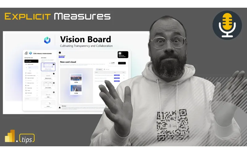
21:22 really cool features there as well so a as we continue to move forward and I don’t know if we’ve talked about the vision board yet but I we haven’t this is another good place to bring in so I’m going to bring the link up here on this one Tommy keep going about the vision board this is another feature that was brought out by the Microsoft team my goodness so the the core visual team Miguel launched what’s called a vision board it’s basically a public powerbi report report on the web and it it’s awesome because they
21:52 web and it it’s awesome because they designed it and what it’s actually showing is really all the ideas on the sections on what they’re documenting and detail every visual that they’re working on the ideas that they have and what’s aligned with documentation this is important because as they continue to try to expand and I don’t want to say divert from the standard visuals well what about okay how do you use them because is going to be a new experience so they’re Miguel and the team have done
22:23 so they’re Miguel and the team have done a really conscious effort towards what we’re building features we’re releasing what we’re wanting to work on aligning with documentation but the navigation of or this core visuals board is awesome because this board really shows you every Visual and it shows you like for the new card visual what’s completed what ideas do people have for example I can look in here and see small multiples for cards things that have just been completed if there’s a link to
22:55 just been completed if there’s a link to the documentation Microsoft learn cards with trend lines I want that spark gen lines generally available under development that’s okay so and everything else is pending and then even something called actionable cards but you can see all the different visuals they’re working on and this is pretty awesome I don’t know about you yeah one thing is for certain Miguel is an expert of doing things that are incredible and so his report building is second to
23:25 and so his report building is second to none it’s absolutely phenomenal one of the reason why I think this is very impressive is Miguel is using a PowerBar report and this is the link this is the link that we’re talking about right now is actually in the chat window so if you’re on a computer something like that and you want to go look at this publish to web version of the report it’s incredible it it’s absolutely a phenomenal embedded report that they’ve been developing here and it’s so cool and in this report there’s actually click to vote and you have all the
23:56 click to vote and you have all the different features and there’s cartisian and so all the different visual types that you’re looking for Miguel has done an amazing job of linking what is the feature is there a status to it and then where is the learn documentation to learn more about this this particular feature inside that Visual and there’s a ton like this thing is super deep it goes through the feature list it goes through the fabric ideas page it goes he’s done an incredible job of like pulling all this great information together and one the vision board looks
24:27 together and one the vision board looks beautiful it’s absolutely a beautiful vision board it’s very easy to understand the navigations on the left this is just an application at this point it’s so good anyways go out there go check out the vision board if there are certain visuals that you wish you saw more about like call out visuals or more of your table and matrixes what kind of your table and matrixes what things are you interested in seeing of things are you interested in seeing being built and developed you can actually go look at this and we want
24:57 actually go look at this and we want to hear from you part of the idea here is Miguel wants you to go vote on these ideas so there is a click to vote option on all these different features and you can go click on these different ideas at fabric ideas. I think it’s ideas. power. com or fabric ideas go vote on the things that you want and let Microsoft know which features are you most interested in and that’ll help them design and build out the workflows for the right the Right audience anyways incredible
25:28 audience anyways incredible by the way they’re also working on some more theme things so which is pretty cool you can a better way to create themes I know we have the best theme tool in the world that PPI tips but I think a lot of people just want to make some quick edits and they’re even adding more things you can actually do to controls I think this is so important for where we’re at from a report building my all the focus has been right now on fabric and fabric integration and fabric development
25:58 fabric development and powerbi developers but what’s not got love is the designers at all even close the only thing the designers have gotten in the last few months or in terms of feat you’re talking about like report authors or or report Builder people or exactly creators of report content exactly the only thing that they’ve gotten is now that that report designers can use git and which is not what they want they’ have had some of the core visuals but in
26:28 have had some of the core visuals but in terms of being able to design really that enhancements this is great that there’s all these things coming now for the designers and also the road map too for I actually want I want to start using these new core core visuals well I I think this is again going through a couple more points that that Miguel has pointed out here right Miguel’s team is also not only are they building these features and they’re doing the feature builds themselves they’re also spending a lot more time about building documentation and sharing
27:00 about building documentation and sharing information and assets and they’re going to be doing so over the next couple months so the commit the team has a strong commitment and this is what I think I really stand behind here and this is what gives me really good confidence that Microsoft is investing in these new visuals to really modernize them me we’ve had these same standard visuals for what 10 years now that’s when we started so 10 years of visuals and now we’re we’re getting like a little bit of a Refresh on some of these this is this is the right time to do that but is also committing here the Microsoft team is assigning
27:33 the Microsoft team is assigning people and team members to update the documentation provide more assets and examples to be honest Microsoft builds the tools they don’t necessarily do a great job of always showing you how to use their tools they rely a bit more on the community because if you’re building if you think about this Microsoft only has so many people and resources they they are big but they’re doing so many different things right they’re building all the things in Fabric and all the things in reports reports so they have to spend their time wisely on what they create but having the
28:04 on what they create but having the community jump in and stand behind some of these new core visuals and actually provide examples that’s where I do a lot of learning I’m always on Twitter or LinkedIn looking at things and watching what settings people have adjusted on other visuals to get ideas of oh that’s an interesting way of displaying that visual or that report one thing that I wish justop did a little bit more of was making this more easy for you to discover and this is something that we’re working on at parbi tips around our power designer we’re
28:35 tips around our power designer we’re trying to think about what what is the common styled things that you’re going to build on a visual and how do we capture that like I’ve already spent all this time on stylizing a card visual what if I want to reuse that style on other reports or make it part of my normal corporate template or maybe I just want to save that styled property as some one of my favorites and come back to it later on that you don’t have to do that same style over and over
28:59 to do that same style over and over again on every single card or visuals in a report so I think with the if I if I had to put my thinking cap here on a bit with what gard’s building in vs code with the new PB format with the ability for us to use API calls and get the definition of report out there’s a lot more possibility here for us to build or the community to build tooling that really aids with what Miguel’s trying to produce here is hey by the way we’ve made the tool here’s a lot of good examples of visuals or other styles
29:30 examples of visuals or other styles of visuals you can easily incorporate which would be really cool to do that as well so obviously if you looked at the vision board you would see I don’t know probably over 60 60 different features they’re working on right now or ideas not all of them have been worked on but a good amount of them are either like pending in progress and a good amount are even completed too if you were to try to go through this and again let’s say you went through a
30:01 and again let’s say you went through a coma you you you were in a coma for the last I don’t know three four months and all of a sudden these core visual updates came out would you feel behind so and I’m trying to think about this as I’ve known this core visuals through and through last nine years and now all of a sudden there’s probably like I said probably 60 50 to 60 features that are being actively worked on are you worried about the being users being overwhelmed no you always ask that
30:33 being overwhelmed no you always ask that question I’m never I’m never no no no I’m never I’m never bothered by this question it’s it’s the effect of harbi already has a a certain level of knowledge you need to to get to to get competent just building a visual right I think it’s very approachable from a I just need to build a visual stylize some very basic things there is on visual editing now which matches a lot more of what you doing in Excel and get you to some of the visual properties very easily but to your point Tommy like you need a tool that
31:05 point Tommy like you need a tool that can start simple but then go deep right it can be a mile wide but we can’t have an inch deep of of capability on the tool we need the the tool to be really wide and really deep and I think what this is giving us is this is giving us the ability to go really deep on designing a particular Visual and give us when you get to the expert level of all the features that you need to be building and styling in I get really excited about this so I would also I would argue here I’m probably really changing my tune a lot on these core
31:35 changing my tune a lot on these core visuals after hearing a lot more directly from Microsoft around this as well one other thing I’ll just point out here as well in addition to the vision board that Miguel has published I also want to be very clear Miguel has also published a series of blog posts on LinkedIn from their LinkedIn profile so there is a LinkedIn profile that is called I think it’s called powerbi core visuals it’s on LinkedIn and Miguel has been blogging on the LinkedIn core visuals area where you can see introducing the new text slicer
32:07 introducing the new text slicer here’s enhancements to the small multiples and what’s Happening Here is these blog posts are detailed instructions on what is happening on these particular new features that they’re releasing I just want to be very clear about this one where M Miguel’s putting a lot of the content has been on LinkedIn which I think is actually very appropriate most users I think of the powerbi products would have some presence on LinkedIn anyways and I think this is a very business Centric place to put those posts so I just I also want to
32:37 put those posts so I just I also want to just directly link you to the page if you’re looking for more information around the visuals how to use them what features can you turn on to to change the style of these new core visuals you definitely need to read the powerbi core visuals on LinkedIn that’s where a lot of this information is coming from and again one of the important things is learning especially with something that’s wrapped ly happening right now I think right now the only Channel they have also is just the LinkedIn Channel right now they don’t have a Twitter or really any other kind
33:08 have a Twitter or really any other kind have a Twitter or really any other announcements I would argue if of announcements I would argue if you’re really trying to F figure out like let’s let’s be real about like the metrics of things like when we look at our channels and things like that when you’re when you’re talking about people who are using powerbi desktop or on a desktop computer yes you can get to Twitter yes you can get to like Instagram all of things but those most of those apps are on your mobile device you’re not browsing our metrics show that most users on desktop are in YouTube well not YouTube actually it’s more like the LinkedIn space the LinkedIn space is very much a desktop
33:39 LinkedIn space is very much a desktop application so I think Miguel is putting the tutorials in the right place but it doesn’t fit your normal Twitter feed of things as well so just be aware it’s there I would highly recommend you go follow the PBI core visuals Community that’s on LinkedIn highly recommend it it it’s definitely worthwhile time to follow that they only have here does it say how many people follow them 20, 000 follow 20, 000 follow followers so I think it’s very
34:09 followers so I think it’s very underrated at this point so let’s let’s bump that number up a bit and get some more interactions and pushing and Publishing the nice thing about LinkedIn as well is if you go in and you comment on the features you like on either the vision board posts that they have or the PBI core visuals posts that actually helps Miguel push that information out water to a larger audience LinkedIn will then promote more of that content to other people if they all like and favorite and comment on those things so make sure you definitely go in there add comments repost it like the content that
34:39 comments repost it like the content that you that you see there as well all right so as we gone through I think most of the major features are we missing anything in terms of just from the revisiting the news the updates here if someone wanted to get started no I I think I think this cover many of my main earlier concerns when we talked about this topic to begin with I think when we started here around core visuals we were a bit hesitant just because maybe this wasn’t articulated as well the vision board wasn’t as clear in
35:10 well the vision board wasn’t as clear in our minds so I think it’s it’s worthwhile even though we weren’t paying attention as much to give a lot of credit due to the Microsoft team and particularly the core visuals team as they’re really picking out some good stuff here and I feel a lot more confident now moving into utilizing these core visuals as part of my daily workflows so I think that’s what I’m going to do the takeaway for me Tommy on this one is I’m going to use core visuals a lot more what about you Tommy are you gonna jump more especially that the transition I think that was the
35:41 that the transition I think that was the biggest thing is I want obviously want to test things out I there’s a few people on online that are doing a great job with these core visuals but again the biggest problem is this am I going to send this to a client and now if I’m doing a handoff does the client understand at all these new visuals or the person’s going to be doing that even as a from a trainer’s point of view we already deal with the basics and one of the things with dashb day with our standard beginner intermedia and
36:13 our standard beginner intermedia and Advance training on building power Bea reports where does this come into it I think the two big things I’m asking right now is obviously this going to always be in work in progress but will we have a ga or complete but we’ll keep working on things in in terms of the most of the visuals like for the card the theme all these features or are some things going to be GA and Something’s Gonna Be preview at the same time because that’s going to dictate a lot from a training and also handoff point of view and then the other part is
36:45 of view and then the other part is honestly how easy that migration button is once they deliver that so there yeah I would agree and I think there’s going to be it’s it’s it’s going to be it’s not going to happen all day tomorrow right so this is one of these things where we’re not going to be able to get landed all the visuals directly in out of preview into GA immediately but I think if we if I had to put my thinking cap on here for a little bit right I would
37:15 here for a little bit right I would argue that the best way to communicate this to us is really looking at that vision board I think the vision board will be the direction of where we want to watch these features get pushed out and I think like let’s let’s take one for example if you look at like the call out visuals and the cards there’s a feature list on the card Visual and then there’s like like a gauge right if you look at all the features list that has been produced that Microsoft has pushing out here
37:45 that Microsoft has pushing out here there’s three features for the new card visual that are all completed so there may be some work on the backlog to migrate you from the old card visual to the new card visual so to me I would argue that the new card visual that has been released for a while now actually is probably going to get closer to be being coming complete here and also if you look down the on the different epic ideas of card visuals they had things for like multiple rows for cards cards with trend lines right there’s features that are currently
38:15 features that are currently under development and Microsoft is already communicating to us that hey look the small multiples for cards isn’t complete yet but we’re already working on those features and I I I hope what we do is we work through the various epic ideas and when you’re talking about planning of projects epics are like really big bodies of work it would be really nice to have all the Epic ideas completed and then at that time we would know okay we’re very close to going GA
38:40 know okay we’re very close to going GA let’s migrate over to the new visuals so I I think again reading between the lines here a little bit the vision board is going to be where we’re going to want to look for when features are going to go ga based on their completion of the expected features yeah I think I’m going to go through the documentation I didn’t even realize too the LinkedIn page has a ton of tutorials there’s actually a lot more Microsoft learn documentation pages on this than I realized that’s my point though like
39:11 realized that’s my point though like yeah this is we’re experts in this area and maybe we saw them but we didn’t click into them we didn’t engage with them we didn’t promote them like so I think this is our like whoops we missed this yeah whoopsies right this is but this is also potentially one of the things to Tommy our our workloads are shifting more towards fabric right we’re we’re building things in fabric as well so this is one of the downsides of having a team that’s building so many different things now it’s hard to focus people’s attention on
39:41 it’s hard to focus people’s attention on specific things now so like we’re not focusing our attention on just card visuals anymore we’re focusing on pipelines and notebooks and python notebooks and lake houses and all these other Medallion architectures or is it a data mesh architecture there’s so many more possibilities to do inside fabric now I think this has distracted us potentially away from a lot of other really great features and I wanted to step back and say whoa whoa time out for visuals is really awesome Miguel gives us great assertion that this is coming out in G eventually and
40:11 coming out in G eventually and it’ll be really it’ll be the path forward moving with all the core visuals so just want to congratulate the team on the hard work there and very much more excited to get involved and dive in deeper with a lot of the core visuals I look forward to seeing your presentation on all the new new core visuals well this is this is where I come into this I I like learning things this is maybe going to change the conversation here slightly Tommy I like teaching things because it helps me learn them so I it it forces me when I start sitting back and saying let’s look
40:42 start sitting back and saying let’s look at this new visual let’s talk to people about what you can and cannot do with a particular visual it really helps me it I know how to do the things but when I step back and say okay let’s let’s start with someone who has no experience let’s start with ground zero What would we want to communicate or talk to them about this what’s the right process to that’s where I feel like for me personally is where the real learning happens is when you teach somebody else what you are trying to develop or build interesting do you feel like that’s the same thing in in your world as well yeah
41:14 same thing in in your world as well yeah I I would like you to actually elaborate on that too because I like where you’re going with that well you can know how to do something right so I could could go into PBI desktop and I could know how to make a visual right but solidify the idea in your mind of the sequence of steps or really critically evaluate well maybe I shouldn’t have made six visuals at once maybe I should have made one visual stylized it and then copied it multiple times right if you think about the process of you building things and then
41:45 process of you building things and then I think teaching for me causes me to be introspective on what I’m doing inside the application and so it really helps me step back and say well this doesn’t make sense if I drop drop down a a visual on the page and then I immediately start going into like talking about all the very nuanced properties of let’s say it’s a line chart right it doesn’t make sense to drop a line chart on the page and then immediately start talking about all the analytical properties of a trend line and anomaly detection like those are
42:15 and anomaly detection like those are features of the line chart but they’re not useful until you understand the course concepts of okay where do we modify the titles how do we adjust the x and y axis and we turn them on and off what other style properties so there’s a progression where you have to think through how do I bring someone along in the journey to bring them up to the knowledge level that we have as we’ve studied and worked hard on knowing how to build things another example here that I think about is helping people
42:45 that I think about is helping people think through adding bookmarks to reports like you can do a lot with a bookmark and back in the day I abused a lot of bookmarks by making things I shouldn’t have made so I’ve learned from those and actually in that what I’ve done now is I’ve changed my training to say look here are things that you can do with bookmarks here’s an example of something elaborate you could build but in reality we really probably shouldn’t be building all that because of all the maintenance issues and other things you’ve learned over time that it really causes it it’s hard to maintain those things so in doing that I’ve
43:17 things so in doing that I’ve changed a bit more of how I think about bookmarks where I use them and where I apply them and I actually use them much more sparingly in reports than previously that I have previously done done interesting yeah and I think the biggest thing too is just looking at the card visual there’s a ton of scenarios here and I think it’s just the same way with I’m trying to do X can I do with this new feature and I love samples I love downloading sample files that people have done yes me too the good
43:47 people have done yes me too the good news is too I think one of the links and we’ll make sure it’s in the podcast they also have a link directly to a sample to download so I think these are a few actual PX that you will be able to download you’re talking from the the new card visuals visual team is what they’re building okay so and I think that’s going to be huge too because without that just for example looking at the card visual here adding all the reference labels looks awesome maybe there’s got to be a way to automate that and just again even looking at the
44:19 and just again even looking at the filters and slicers it’s like I can get started myself or I can go through that see how does someone do that because obviously a lot of these two are more than just color and design right it’s more than just a feature you do need to have some color ideas you do need to have some pallets saved and you’re probably G to need some images too because a lot of these are utilizing again more more user interface more design design features and again these these tutorials
44:49 features and again these these tutorials again let’s I’ll take an example here I’m going to actually pull one of these in here this is one of the U updates for p the top of the article this one this is an update for for the reference labels inside cards this is really powerful like and the neat part about this is sometimes the features exist but you don’t get to see them you don’t get to like see designs with these new features implied and I think one of the really rich features of this PBI core visuals group here is you get to see Miguel building Out versions of what
45:20 Miguel building Out versions of what these core kpi card things look like and why would you add background color and how would it look with adding a background color on this portion versus that portion so there’s a lot more design and one thing that I really enjoy about these documentation pieces is I reading through them more now as I’ve been studying up for this this episode is Miguel does a really good job or the team has done a really good job of highlighting here’s the setting inside the property panel when you adjust these settings these are how you adjust these properties on the various cards or
45:51 properties on the various cards or things that are in the visual so it’s giving you like really good linking between this is the button you press and here’s what it does one of the features I think that’s been lacking a lot in desktop and a question I get very often from people is I don’t know what all these settings do there there’s not an easy there’s not clear documentation in the tool that if I click on this button it does this if I click on that button it does this how do I learn what all the features do and to be honest there’s too
46:21 features do and to be honest there’s too many features to learn them all frankly crazy to sit down and go through a card Visual and turn on every single feature that’s that’s some substantial time for you the developer just to learn all that stuff so there’s got to be a shortcut path here there’s got to be a condensed way of figuring out how to do this and let’s think let’s let’s take this back to governance and your team right Tom we talk about this a lot on the on the Channel Once you find a style that you think is good or if
46:51 a style that you think is good or if there is a style or a designer on your company company team should we really be changing the style of a lot of our cards and kpis and visuals over and over like I think there’s also something to say for here like great all these features exist but I I really think I’m I’m becoming more and more convinced as I see this over time we really need just company standards that we could apply to all our reports and say start here this is let’s spend all the time with one person
47:21 spend all the time with one person picking the properties and styles and designs that we’re going to use as the language of our company and this is what we’re going to leverage inside the reports because I can’t tell you the number of times I’ve gone into reports where customers are producing reports that are going like a company is producing reports for their customers like an embedded share thing and there’s no consistency across the reports and there’s no QA across those reports so one report will have different size fonts different layouts different images and then another report will be an entirely different experience
47:53 will be an entirely different experience and it’ll be disjointed so especially if you’re giving reports to external users there is this idea of like visual language what is that language of your company and does everyone know how to use it I think there’s a bigger concept here that yes powerbi is giving us more knobs to dial in but we’re that causes another problem which is now that we have all these knobs everyone’s building something slightly different so how do we evaluate
48:21 slightly different so how do we evaluate Tommy you built a line chart your line chart will likely look different than mine you’re going to make different design choices around what you’re going to put on there versus me which is okay but how do we know which way which one is closest to what we would say is our company standard how can we how can we at least ensure with the mo with the least amount of difference that we’re going to design something similar whether using the template file we’ve gone through learning there’s a certain style already in place yeah we may have some creative
48:51 in place yeah we may have some creative differences but I know exactly what you’re saying and honestly the last thing I want and as much as I’m GNA personally start using these core visuals the last thing I would want in an app or for user experience is one report with normal card another Report with the core visual card and all these features and updates the other one looks like it’s from 2016 again right so there is something to be said too about not just your data goes through that process of
49:23 your data goes through that process of we want to vet it out but this is something actually use with the app audiences Mike I actually will create an app audience for beta or in testing out a new design for a report rather than completely overwriting it and that way for people too it’s available for everyone already in that app but it’s not all a sudden one day I’m looking at it I know where all my buttons are the next day we have this new pretty design but I don’t know how to use it so I would put any especially
49:56 to use it so I would put any especially major updates or new visuals I use that app audiences and we basically are work on their design there that makes a lot of sense because then you could publish a a version of that report and not give it to everyone you can you can give it to a narrow window of Team people of people on the team and and say Here’s here’s the early version of what you’re looking at does this make sense or you can give it to everyone but it’s a separate tab it only shows up in that audience right so yes it’s like that hear no evil see no evil thing and I want people to see it I want
50:26 thing and I want people to see it I want people to I like this but I don’t want to take place especially when man I’ve been burned too many times my friend in terms of like I’m gonna update the new filter pain to the new enhanced filter pain yes people lost it so just things like that you gotta be careful yeah Darion you make another good point here in the chat I’m gonna bring up this point here as well Darion makes a point of from a training point of view all of these new changes we’re talking about with core visuals and again to be clear the core visuals
50:57 and again to be clear the core visuals have not changed very much we’re actually introducing new visuals but this will these changes are going to require existing training updates hey here’s a here’s a core visual visual documentation oh and by the way there’s a new visual here’s what here’s what you can do now in this new Visual and again I think my my point to this is if you had to learn five things before for the core visual now you can learn 15 things for the new visual because there’s so many more options it’s being so much more diverse it’s
51:29 it’s being so much more diverse it’s giving that really refined Pro tooling that we need as if we’re going to really stylize and and build visuals that are absolutely amazing and beautiful and got to be honest though I’ve built custom visuals we’ve worked on denb projects before building visuals is hard users want all kinds of weird things and you’re like what you ask for isn’t even possible in the visual so like I know this is a challenge for Microsoft to figure out what is what are the right level of features and how
51:59 level of features and how can you rebuild visuals in a way that is going to be extensible for everyone to use them it it just gets challenging so I I get the teams working really hard on this one and I do want to give them mad credit and kudos for all the documentation that’s coming out and how rich it’s going to become I think in the future here so what are your takeaways from this Tommy how are you going what are your what are you g to do like next week tomorrow this month to help you learn this how how what’s your what’s your plan of attack here first
52:29 what’s your plan of attack here first thing is I’m to be ready so am I replacing all my current visuals or my current reports especially if they’re client facing or production facing no but while I have this on probably a Dev page for each of these or working on a different design utilizing this obviously once we get more features I can really create an entire new report with this but I am absolutely using some of my most popular reports and creating a Dev verion just to get familiar to get comfortable to to get mastered at
53:01 comfortable to to get mastered at this yeah and then as things go through obviously the LinkedIn page right now is that standard place but I’m G to be waiting for that day for the one button migrate one button upgrade so exactly that’s what I cannot wait for so let me let me ask you just one last question here Tom as we wrap here what is your what is your preferred method for learning new things do you learn them do you learn them throughout the week like whenever you find them and you spend some time to learn them or do you stay up late at
53:31 learn them or do you stay up late at night and do it on weekend like in the nights and evenings or do you block out some time like on a Friday or a Monday to actually learn new things like what is your pattern and have you found anything that works well for you because I’m again being busy doing things like oh yeah when do you find time to learn this stuff the the joke I’ve always had is whatever I find interesting at the time I only can pray it’s productive so there are some there are some things that that strike me that I may go on GitHub and I’m like huh crew AI oh oh
54:01 GitHub and I’m like huh crew AI oh oh autogen GPT okay and then I I have to go down that rabbit hole but honestly I think because of our job and just the industry we’re in when people say like well what are the skills I’m like I’m just really good at learning how to learn like there’s the the process of samples that I that I take away find any articles I can so samples and articles are the first thing I start with just get an idea I’m not a video person at all like I I don’t do a
54:31 video person at all like I I don’t do a how-to or self-help videos they unless no I don’t really but then it’s like once I have the samples I I can I need to a reverse engineer do you like having like hard copies of so I guess to your point earlier PBX file examples in front of you is where you do your most your learning grab those things look at how they set it up look at the settings that are there okay what about you I have found for me if I need to learn new things I if I don’t dedicate a period of
55:01 things I if I don’t dedicate a period of time throughout my calendar throughout the week I don’t do a good job of actually following through and learning the things so what I typically do is I will block out on my calendar an hour two hours a period of time when I know that I’m not working on something else and I’ll put a chunk of time and I typically like to explore those things earlier in the week and then I incorporate what I’ve learned throughout the rest of the week as I’ve learned those things so Mondays typically are slower for people sometimes you’re getting just in the office warming nut to stuff so I try and keep my Mondays pretty open and available
55:32 my Mondays pretty open and available and that’s where I do a lot of my creative thinking I do some so I have found for me it’s better to schedule on my calendar some time away from like my normal workflow to to dedicate some time to figuring out things because then when I go back into work mode I’ve got all these things to do and most of them aren’t even touching powerbi desktop anymore it’s a lot of other things that I’m working on in building and architecting so I spend a lot of time in figma doing designs and working with customers explaining diagrams architecting things so when my time’s being spent so much there I like to come
56:03 being spent so much there I like to come back and carve out dedicated time to explore and learn new things anyways well that being said you’ve burned through a perfectly good hour with us we appreciate the conversation today Tommy thank you so much for bringing up these articles Miguel thank you so much for reaching out to us around all the core visuals I think you’ve added a lot more confidence to us as we unpack what these mean to us and how we’re going to incorporate them and or learn them as we build new visuals moving forward all that being said these podcasts are
56:33 all that being said these podcasts are free we don’t charge anyone for them we really appreciate everyone jumping in and watching the videos with us and or listening to this on YouTube Twitter and all the social media things so thank you so much for joining us our only request to you is if you found this conversation engaging or if the content we’re sharing with you is helpful for example the LinkedIn posts the core visuals oh shoot what’s it called Vision map or the vision report so the vision board if the vision board is something you’re interested in please go share that go find the post on LinkedIn
57:04 share that go find the post on LinkedIn and make sure you share those right away and let everyone else know that these are things that you’re interested in and let’s really DM up some Community interest around these things as we Microsoft will build things the community is interested in so if we add some more effort and noise around these are the things that we like to do Microsoft will continue developing in that direction so with that Tommy where else can you find the podcast you can find us on Apple Spotify or wherever your podcast make sure to subscribe and leave a rating helps us out a ton you have a question idea or topic that you
57:35 have a question idea or topic that you want us to talk about in a future episode head over to power. tisp podcast that leave your name and a great question and finally join us live every Tuesday and Thursday a. m. Central and join the conversation all powerbi tips social media channels thank you all for joining us we really appreciate your ears for to this hour have a great morning evening day wherever you are we appreciate you and we’ll see you next time time [Music]
Thank You
Want to catch us live? Join every Tuesday and Thursday at 7:30 AM Central on YouTube and LinkedIn.
Got a question? Head to powerbi.tips/empodcast and submit your topic ideas.
Listen on Spotify, Apple Podcasts, or wherever you get your podcasts.