This week Philip Seamark, an avid Power BI developer has released a joint project with PowerBI.Tips, a full Sudoku game in Power BI. To be totally honest with you Phil did all the hard work, I just contributed the pretty background and provided some suggestions. To learn more about how Phil build this amazing game within Power BI check out his blog post about it here.
The Game
If you want to play this Power BI file you can do so below:
If you are interested in looking at this file to see how it works you can download the file using the link below.
[product id=”18054″ ]
Be sure to follow:
If you like the content generated from PowerBI.Tips please follow me on all the social outlets to stay up to date on all the latest features and free tutorials. Subscribe to me on YouTube. Or follow me on the social channels, Twitter and LinkedIn where I will post all the announcements for new tutorials and content.
This weeks tutorial focuses on the need to control groups of visuals independently. This recently came up in a project where I needed to adjust all the items on the left side of the screen independently from the right side. By using the Edit Interactions button found on the Format ribbon you are able to adjust how different visuals interact with each other. Finally, adding multiple Slicers to the page for controls finishes out the report. I hope you enjoy this weeks tutorial.
Followup:
On the demo page of the report you’ll notice that when various items are selected, some of the non-selected items dis-appear. This is handled by using some formatting within the measures for the visuals. All the measures used in this tutorial are listed below:
Taking an Average of a Numerical Column:
Average of Values =
VAR calc = AVERAGE( Data[Value] )
RETURN if( calc = BLANK(), "", calc )
Making Dynamic Titles off of a list of items in a table:
Title =
VAR title = CONCATENATEX( VALUES( Data[Customer] ), Data[Customer], " & " )
RETURN if( title = BLANK(), "", title )
Producing a sum of values:
Total of Values =
VAR calc = SUM( Data[Value] )
RETURN if( calc = BLANK(), "", calc )
Want the file:
Need a little more help? Like the content from PowerBI.Tips. Please consider purchasing the demo PBIX file to support more great content.
[product id=”17894″ ]
Be sure to follow:
If you like the content generated from PowerBI.Tips please follow me on all the social outlets to stay up to date on all the latest features and free tutorials. Subscribe to me on YouTube. Or follow me on the social channels, Twitter and LinkedIn where I will post all the announcements for new tutorials and content.
Hands down best feature this year to date, Data Table Filtering! In the June 2018 Power BI Desktop Microsoft released the ability for you to navigate to the Data Table view. While on this view drop down icons now appear which enable filtering of the Data Table. This is super helpful when looking at the raw data that has been loaded into your data model. Check out the video below to see how the feature works.
Other Thoughts:
For those of you who like Excel, and data tables in Excel, this feature will make you feel right at home within a pivot table type feel. I hope you enjoy this month’s update as much as I did. Thanks for stopping by.
For the official documentation from Microsoft follow this link to the blog announcement.
If you like the content generated from PowerBI.Tips please follow me on all the social outlets to stay up to date on all the latest features and free tutorials.
Subscribe to me on YouTube. Or follow me on the social channels, Twitter and LinkedIn where I will post all the announcements for new tutorials and content.
Often when working with a Power BI report you will add a slicer that has a “Blank” item in the selection criteria. From a usability standpoint you might not want this item shown. Or maybe you have multiple items in the slicer that you would like to hide from the report consumers. The video, linked below, walks you through why the “Blank” item is shown and how to remove it.
Video on Adding Filters to a Slicer
Additional Slicer Materials
If you want to read more about syncing slicers check the official documentation release from the Microsoft Power BI Blog. This feature was originally released in February of 2018 and was announced here in the Power BI Blog.
Thanks for watching. If you like this content be sure to subscribe and follow along for more content.
Subscribe to me on YouTube. Or follow me on the social channels, Twitter and LinkedIn where I will post all the announcements for new tutorials and content.
Update: This tool has been deprecated as of 2024-11-27. You can now find this as a downloadable HTML file at the following Github page.
In April of 2018 the Microsoft team released the ability to edit the Linguistic schema in Power BI desktop. For those who are not aware of the linguistics, essentially, this is the code that drives how Power BI can interpret your data model when you use Q & A. The linguistic schema is defining how the computer is able to figure out the best visual relating to your question. In Power BI desktop you can double click on the white space of a report page and then the Q & A prompt appears. Then type a statement into the Q & A box, this in turn generates a visual.
In both the Desktop program and in the PowerBI.com service, Q & A is an impressive feature. By default the Power BI desktop creates a linguistics schema about the data model. However, there are some details that the linguistics schema can’t detect. This is where you come in. In the Power BI Desktop you can download the Linguistics file, make any number of changes or additions to the file and then re-upload the file back to Power BI Desktop. But, there is a slight catch. The downloaded files can be quite large and a little difficult to navigate. PowerBI.Tips to the rescue.
Lingo is a web app that allows you to upload your linguistics schema into an easy to use editor. It includes search, code validation, and code blocks that you can use to make writing code easier. Check out the video below to see how it works:
For the full details on the linguistics schema visit the following article from Microsoft. A sample Power BI file, Linguistics model, and Linguistics Spec can be downloaded here. Well that about wraps it up, thanks for reading and happy coding.
If you like what you learned about today and want to stay updated, please follow me on Twitter, Linkedin, and YouTube for the latest updates.
This is part 2 in the 3 part series on developing super cool tables using some fancy measures. In part 1 we walked through how to build a table that uses an un-pivoted data source in the Query Editor. This technique allows you to change the types of categorical values in a table. If you missed part 1 and want to get caught up follow this link. Now, continuing with the series, Part 2, we will build the supporting materials (Selector Table, What If Slicers, and measures) for the report.
Once we are done the final product will look like the following:
Part 2… Go.
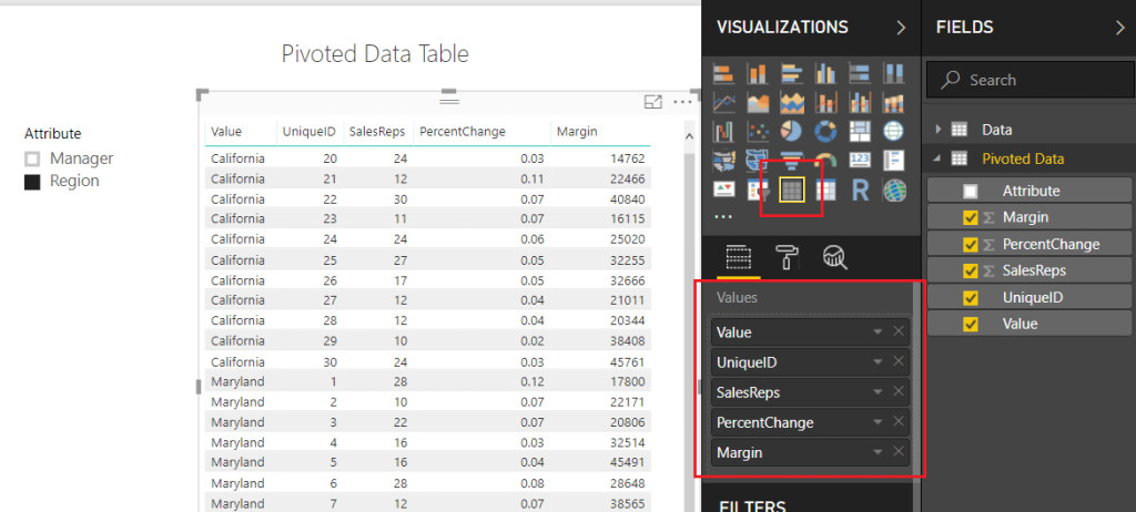
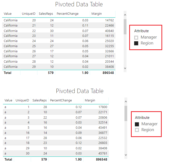
To make sure we are starting off on the correct step. We left off part 1 when we had completed a Pivoted Data Table and included an Attribute Slicer that would allow us to toggle between the Manager and Region Categories. Your table should look like the following diagram: (If you don’t have this you might want to start with Part 1 found here)
Pivoted Data Table
Note: I have also included a Slicer which is used with the Attribute field.
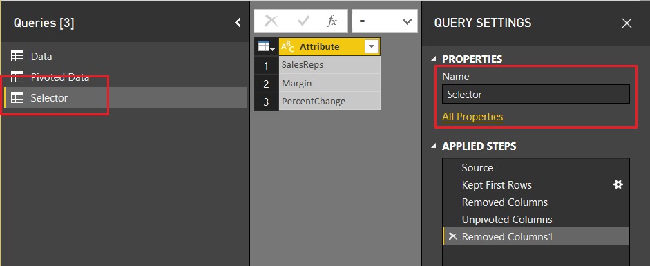
Next, we will need to add a table that will allow us to use the SalesReps, PercentChange, and Margin column headers in our report. On the Home ribbon click Edit Queries, then select New Source on the Home ribbon. In the Get Data window select Blank Query, click Connect to proceed. Open the advanced editor by clicking the Advanced Editor button found on the Home ribbon. Enter the following M code into the Advanced Editor:
let
   Source = #"Pivoted Data",
   #"Kept First Rows" = Table.FirstN(Source,1),
   #"Removed Columns" = Table.RemoveColumns(#"Kept First Rows",{"Attribute", "Value", "UniqueID"}),
   #"Unpivoted Columns" = Table.UnpivotOtherColumns(#"Removed Columns", {}, "Attribute", "Value"),
   #"Removed Columns1" = Table.RemoveColumns(#"Unpivoted Columns",{"Value"})
in
   #"Removed Columns1"
Click Done to close the Advanced Editor. Rename the table to Selector. When you are finished your table should look like the following:
Create Selector Table
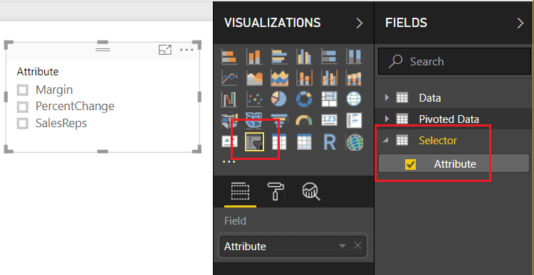
Click Close & Apply on the Home ribbon to close the Query Editor. Add a slicer with the following selections:
Add Selector Attribute Slicer
Now, we want to detect which of the Attributes have been selected from this table. We can accomplish this by creating a measure using the DAX function SELECTEDVALUE. Right Click on the table named Selector and from the drop down select New Measure. Enter the following DAX equation:
rankBy = SELECTEDVALUE(Selector[Attribute])
In addition to the knowledge of which column was selected from the selector table, we will also want to detect to make sure at least one categorical value has been selected. The categorical values we are talking about were generated earlier. The values could be either the Manager or Region values of the Attribute column in the Pivoted Data table. Using the ISFILTERED DAX function enables this section. Add the following measure to the Pivoted Data table:
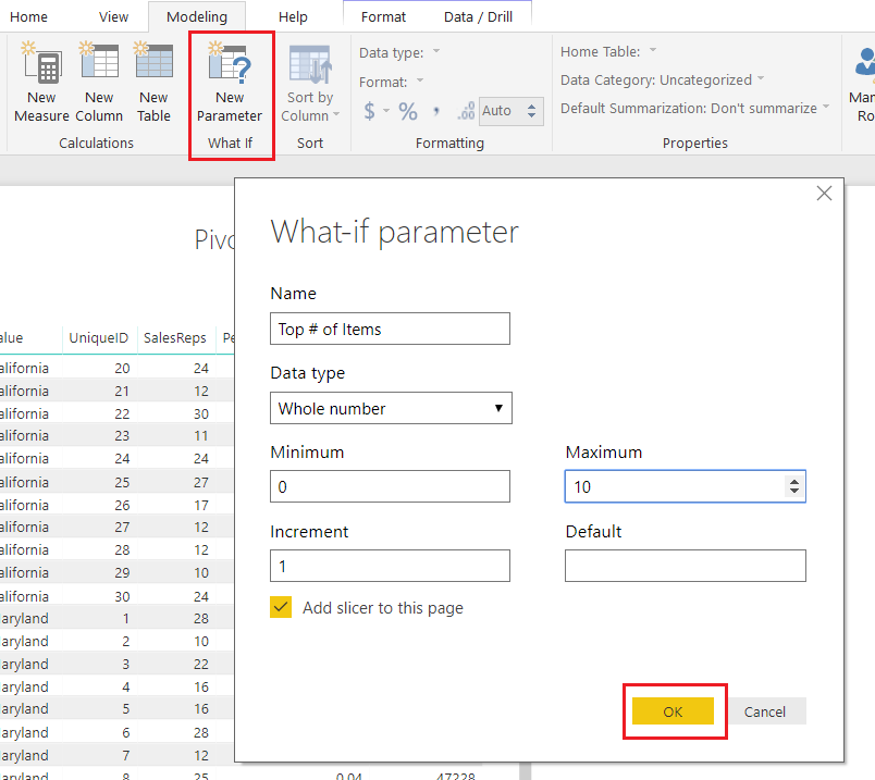
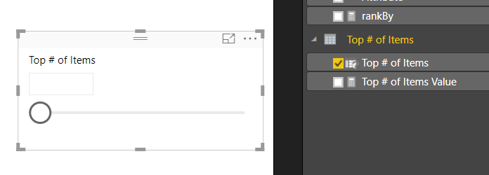
Next, we need to gather some user input in the form of a number from 1 to 10. To input this information we need to produce a What If Parameter. On the Modeling ribbon click New Parameter in the What If section of the ribbon. Enter the following information into the What-if parameter dialog box:
What If Parameter
Note: Don’t forget to change the Name of the parameter.
Click OK to proceed. Power BI will automatically produce a measure table, a measure and a slicer on the report page.
Slicer Produced by What-if
Note: By default there is nothing selected in the box. However, you can adjust the slicer and a number will appear within the value box. You can also type in a number between 1 and 10 to the box to adjust the value.
This is where we go crazy with DAX. This portion of DAX is where all the magic happens.
We start off by building our totals measures. Place all these measures in the Pivoted Data table.
Total % Change = MAX( 'Pivoted Data'[PercentChange] )
Total Margin = SUM( 'Pivoted Data'[Margin] )
Total SalesReps = SUM( 'Pivoted Data'[SalesReps] )
These will be used repeatedly in our next group of DAX formulas.
The following measures will produce a calculated ranking for each numerical column. OK, Pause, This part really excites me here because the next few measures are where the magic happens. Pay close attention to what is happening here. Un-Pause, by using the DAX Switch function we can dynamically tell Power BI to adjust which column we want to see ranked by the top items. For example, if we select SalesReps in our attribute slicer. The following measures will automatically rank all the items in the table by the column named SalesReps. Thus, the items with the highest counts of SalesReps will be listed first. When you select Margin, the table will automatically adjust and re-rank the items by the Margin column. This is being done in the switch statement. For each column we are calculating custom rankings and then hiding or replacing values with the Blank() DAX function to not show items we don’t want.
Enter the following three measures into the Pivoted Data Table:
Whew, that was a ton of measures. All the key components are complete now. In part 3 we will clean up our report page and make it shine. I hope you enjoyed this tutorial. Also, follow me on Twitter and Linkedin where I will post all the announcements for new tutorials and content.
When I teach Power BI to new users, there are typically questions about how to get Power BI to act more like Pivot Tables in Excel. Through my discussions, two key pieces of functionality stand out to me that people want.
They would like to select a categorical property to adjust the table. In this scenario a user would want to select the State, Sales Territory, or something else that describes a breakdown of the data. This is similar to adding a field of data into the Rows selection for Pivot Tables.
They want the ability to rank a column and select only the top N number of items in a given column. Imagine that you have Sales Units, Revenue, or some other numerical column. Then based on a selected column such as Sales Units, I want to see the top 3 or 4 sales items. This would be a similar in the excel experience when you modify the filters for a given pivot table column.
Disclaimer: This is quite a large topic and therefore I have broken this up into three segments for read-ability. Thus, to poke your curiosity below is the final example of the report. We will walk through reach phase of this report, so you can produce this dynamic table.
This series of blogs will be broken up into three parts.
Part 1: Build a Table or Matrix visual that can dynamically change based on a slicer
Part 2: Build supporting tables & measures
Part 3: Bring it all together for the final report
OK, hold on tight, here we go!
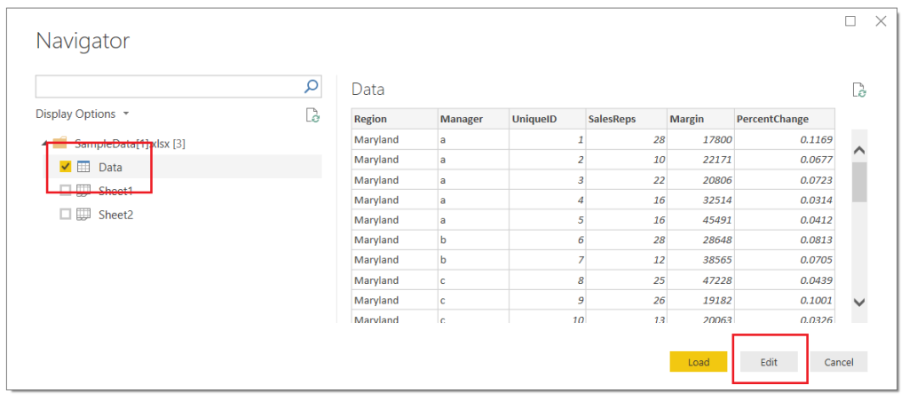
Let’s begin with acquiring our data. Open Power BI Desktop. Click Get Data on the Home ribbon and select Excel. When the Open dialog box opens enter the following file name, and click Open:
The Navigator window will open showing you the contents of the file. Select the Data Table by clicking in the square next to the word labeled Data, click Edit to load the data and enter the Query Editor.
Load Data from Excel
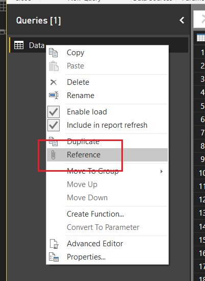
Next, Right Click on the table labeled Data in the Queries pane, from the drop-down menu select Reference.
Create Reference Query
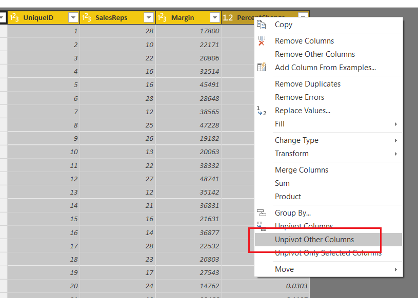
This will produce a second table labeled Data (2). In the Properties pane on the right side of the screen edit the name of the query to Pivoted Data. Select the columns UniqueID, SalesReps, Margin, and PercentChange by holding Ctrl and clicking on each column. While keeping all four (4) columns selected right click on the last column and select UnpivotOther Columns.
Unpivot Columns
Note: It is important to notice that we selected Unpivot Other Columns instead of selecting the Region and Manager columns and selected Unpivot Columns. Selecting Region and Manager and selecting Unpivot Columns will achieve the same results, but if our excel file or underlying data set adds more Categorical columns our query will break. Using this technique creates a flexible query that can handle any number of new categorical columns. You know your data the best, and how it will change over time. It is important to consider these aspects when loading data via the Query Editor.
We have completed our data load. On the Home ribbon click Close & Apply to complete the data load for our two tables, Data and Pivoted Data.
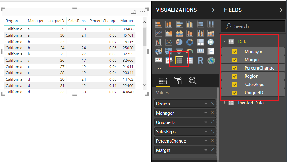
Load the Fields from the Data table into a Table Visual, as shown below:
Data Fields Loaded Into Table
For the following fields SalesReps, PercentChange, and Margin change the Fields to SUM by clicking on the Triangle next to each field’s name. We will use this information to confirm that our Pivoted table is providing the correct data.
Change Fields to Sum
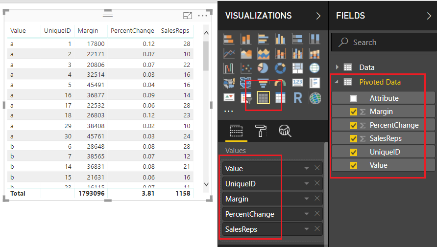
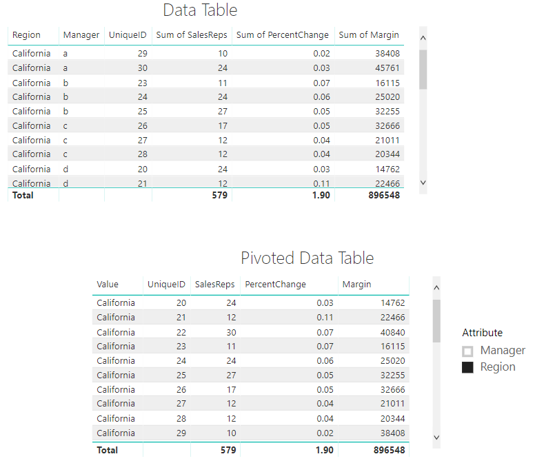
Add a second Table visual and bring over the fields from the second data set, our Pivoted Data table. Be sure to leave off the Attribute column as this will not be needed in this second table.
Table for Pivoted Data
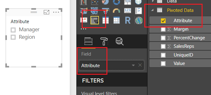
Add a Slicer to the report layout and add the column labeled Attribute from the Pivoted Data table.
Add Slicer
Notice we now have the ability to select either the Manager Column or the Region column. By doing so, we are able to change the columns within our table to only show the items relevant to our slicer selection. Pretty cool.
Using The Slicer
It’s also important to note here that in our Pivoted Data Table, we can only acquire the correct totals with a single attribute selected. When the slicer has no selection our totals for SalesReps, PercentChange and Margin are all twice the amount they should be. Later on, in part 2 of this tutorial, we will fix this using measures.
Data In Both Tables Match
Thanks for reading along. Stay tuned for part 2 where we will build supporting data tables to aid the user experience on the report page. If you like what you learned, please forward this on to someone else who would enjoy these free tutorials. Also, follow me on Twitter and Linkedin where I will post all the announcements for new tutorials and content.
If you have spent any time working in Power BI, your very first step is to, wait for it… Get Data. Using Get Data will start loading your data into the Query Editor for Extracting, Transforming and Loading (ETL). When you start out in Power BI it is likely that you don’t spend much time in the Query Editor. However, the longer you use Power BI desktop, and the more you learn, you find that the Query Editor is highly under-rated. There are so many amazing transformations that you can perform on your data. After some time getting comfortable you’ll be building larger queries with many, many, steps. Eventually, it may look something like this:
Multiple Query Transformations
Perhaps your queries are already long, or may be even longer. Wouldn’t it be nice to shorten the number of steps? It would make it easier to read. In this tutorial we are going to talk through how we can combine several steps when you create a new column. This is achieved by modifying the M scripts or equations slightly when new columns are created.
While doing this won’t cut down every query in half, but it will remove a couple of additional steps per query. This makes your queries easier to read and maintain. Also, using this best practice, will save you headaches in the future. At some point you will run into a data type error. This is seen when you try to join multiple tables on columns with different data types, or when you need a measure to create a SUM but the column data type is still text.
Let’s get to the tutorial.
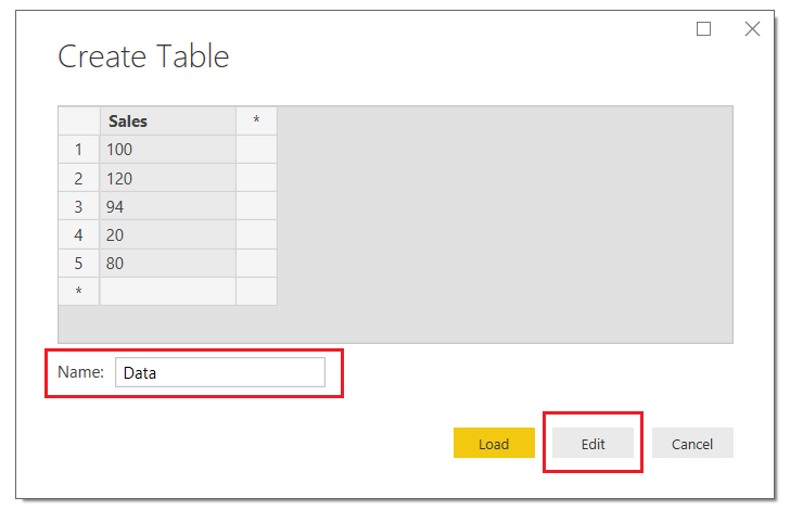
Open up your Power BI Desktop program and on the Home ribbon click Enter Data. Using the dialog box for entering data enter the following table of data:
Sales
100
120
94
20
80
Once you’ve entered your data the Create Table screen should look like the following. Be sure to name your table, in this case I named my data table Data…. yea, feeling a lack of creativity today. Next, click Edit to modify the query before loading the data into Power BI.
Create Table
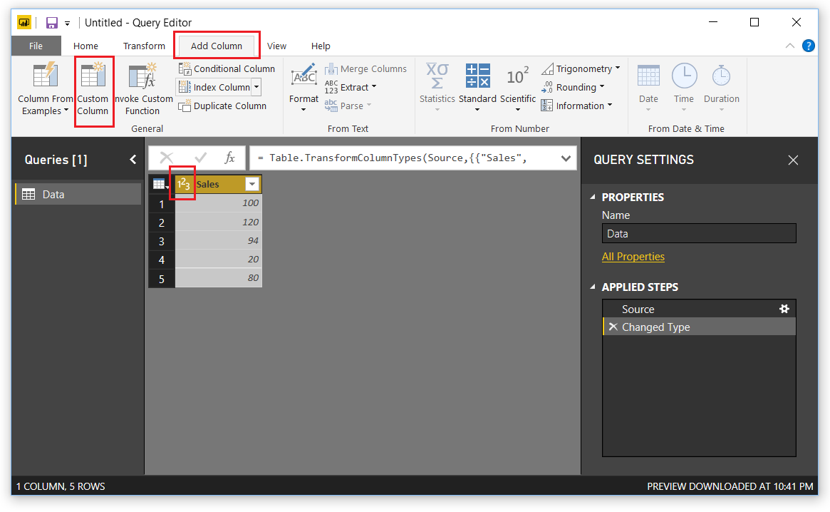
This will open the query editor. Click on the Add Column ribbon, then select Custom Column. The Custom Column dialog box will open.
Note: When you bring in the created table that the Sales column already has the data transformed into a whole number. Also note in the right under Applied steps we have two steps, one for the source and one for Changed Type. This is because not every M equation (M language is the language used to perform the ETL in the query editor) can handle data types.
Add Custom Column
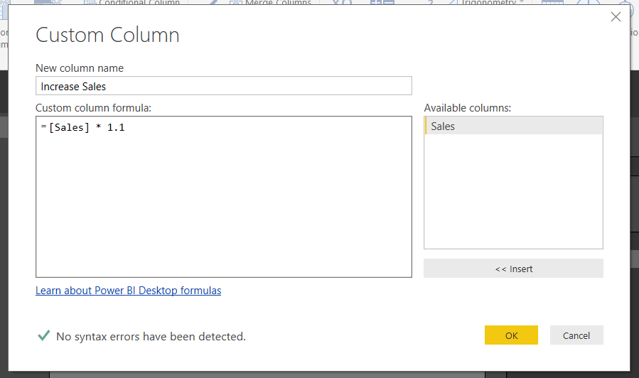
In the Custom Column dialog box enter the following, the column name, the equation below. Click OK to add the column.
Insert Custom Column
Note: It is good practice to name the new column something meaningful. This helps when you are working in the query editor. When you come back to your query months later and wondered what you were creating, the column names will help! Trust me I learned this lesson the hard way…
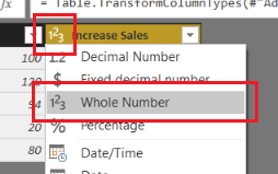
Great, now we have our new column. Notice the image in front of our column named Increase Sales. This means Power BI thinks that the data type of this column could be Text or a Number. Let’s change it. Click on the ABC123 icon and select Whole Number. Now the column data type has changed to numbers only.
Change Column Type to Whole Number
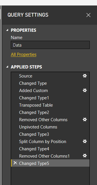
If we glance at the Query Setting under the Applied Steps, we now have 4 steps. Two were added, one for the added column and the second for the data type of the column. This is not what we want. Instead we would like the column to be added with the appropriate data type right from the beginning.
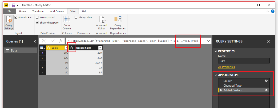
Let’s remove the very last step labeled Changed Type1. To do this we will click on the little X next to the step. This will remove the step. While highlighting the Added Custom step click in the formula bar and modify the equation to include the following statement in RED. Press the Enter to execute the new formula.
= Table.AddColumn(#"Changed Type", "Increase Sales", each [Sales] * 1.1, Int64.Type)
Note: if you don’t see the formula bar it can be toggled on or off in the View ribbon in the check box titled Formula Bar.
The query editor should now look like the following:
Desired Data Type
Without adding an extra step on the Query Settings, we have changed the data type. I know this might seem trivial, but when you are creating large queries, they can get difficult to read. For me, I find this technique quite useful, and it doesn’t only support whole numbers. This technique also supports the following data types:
Data Type
Syntax
Whole Number
Int64.Type
Decimal Number
Number.Type
Dates
Date.Type
Text
Text.Type
Thanks for following along. If you liked this tutorial, please share it with someone else who might find this valuable. Be sure to follow me in LinkedIn an Twitter for posts about new tutorials and great content from PowerBI.Tips
First off, let me say WOW! The announcement of Layouts was well received by the Power BI Community. Thank you so much for the positive feedback. So much so, that I got excited and developed another Layout, Splash o Red.
This new layout is called contains two pages. It uses the drill through feature to navigate from the main page to the sub page. The demo below shows you how it works. I hope you enjoy this new layout, you can download it here.
To see how to load data into the Layouts check out the following video below. It will guide you through the process. Additionally, each layout download will contain an instructions sheet just in case.
PowerBI.tips is extremely happy to be part of, and contribute to, the Power BI Community. We’re constantly trying to think of new and interesting ways we can enhance the Power BI experience for everyone by providing helpful tips & tools. Some examples of what we’ve done so far are Power BI Desktop Theme generator, and the Power BI toolbox:
Today we’re happy to announce another tool that we hope you will get an immense amount of use from.
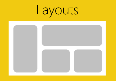
Introducing:
Layouts are Power BI Template (PBIT) files that will contain layouts with visualizations already in place and only require your data to light up. We have, and will be, using as many of the visualization techniques. We are taking some of the best layouts we’ve seen, and those we’ve developed to create these files for you. This means that you don’t have to spend any time worrying about the vast number of design techniques. Additionally, it will save you time placing or moving things around on the report page. All that is required of you, is to download the PBIT file, load your data, and start selecting the pre-placed visualizations. With each layout template there will be a sample file (demo) that will show you the look and feel of each layout so you can easily choose the layout you want on each report page. You can always change the visual type with the click of a button.
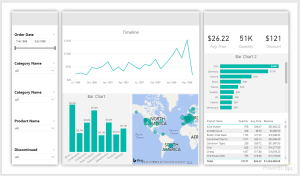
Today, we’re releasing the first of our efforts with a 3 tab layout focused on the business analyst. These layouts are designed with maximum flexibility in mind, to let you alter color themes, easily change the visualization type, and provide enough visualizations to give you a huge initial benefit. One of the best parts about the Layout is that you are not limited by our designs, they are just the starting point, you can fully customize them however you would like. We just provide you with a solid foundation to build from.
Click Image to Download Layout Files
Demo of Layouts:
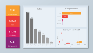
In addition to the first analyst layout, we’re releasing an Info-graphic style layout that contains some deeper interactions using Bookmarks. However, these Layouts will be a bit more restrictive in terms of how much you can change visually. This is due to the need to rely more heavily on other tools to create the look & feel. Thus, you will have limits in just how much you can change. Our hope with these is to build more stunning report layouts that will maximize presentation, or help wow an audience.
Click Image to Download Layout
We are releasing layouts for the analyst, executives and still have some fun with highly stylized files. We hope you get as much use out of these new Layouts as we know we will! Over time, we will continue to develop and produce an entire library of the selections. Thanks to all of you who make this such a fun and great Community to be a part of.
Manage Consent
To provide the best experiences, we use technologies like cookies to store and/or access device information. Consenting to these technologies will allow us to process data such as browsing behavior or unique IDs on this site. Not consenting or withdrawing consent, may adversely affect certain features and functions.
Functional
Always active
The technical storage or access is strictly necessary for the legitimate purpose of enabling the use of a specific service explicitly requested by the subscriber or user, or for the sole purpose of carrying out the transmission of a communication over an electronic communications network.
Preferences
The technical storage or access is necessary for the legitimate purpose of storing preferences that are not requested by the subscriber or user.
Statistics
The technical storage or access that is used exclusively for statistical purposes.The technical storage or access that is used exclusively for anonymous statistical purposes. Without a subpoena, voluntary compliance on the part of your Internet Service Provider, or additional records from a third party, information stored or retrieved for this purpose alone cannot usually be used to identify you.
Marketing
The technical storage or access is required to create user profiles to send advertising, or to track the user on a website or across several websites for similar marketing purposes.