In the September 2018 blog post the Microsoft team released a new layout. This layout has a number of really nice design elements. However, upon reviewing the file used for this demo found here. Upon downloading we noticed that the new style of the layout was only one page deep. As an enhancement to this file we added all the pages, renamed all the elements and created a full PowerBI.Tips layout from this page. We’d love to share our work with you and hope you enjoy this new layout from PowerBI.tips.
If you like the content generated from PowerBI.Tips please follow me on all the social outlets to stay up to date on all the latest features and free tutorials. Subscribe to me on YouTube. Or follow me on the social channels, Twitter and LinkedIn where I will post all the announcements for new tutorials and content.
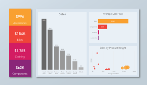
In honor of the 2018 Business Applications Summit, PowerBI.Tips has published a new layout, Purple Haze. Purple Haze is the brain child of Seth Bauer, and utilizes the latest features of the July 2018 Power BI Desktop.
In the previous versions of Power BI desktop there was always a header present at the top of a visual. Now, the header is no longer needed, and design elements within the report can extend all the way to the very top of the report page. This is great news for report designers and new possibilities for Layouts.
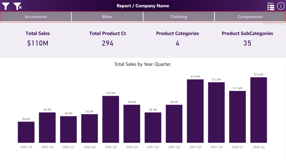
The report comes with four (4) pages. In the example the are listed as Accessories, Bikes, Clothing, and Components. By Clicking on these buttons the report navigates to a new page where all the visuals for these topics exist.
Purple Haze Menu Bar
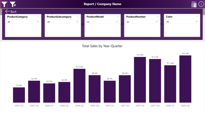
The filters across the top of the report are using an upper third filter context window. This window is exposed when clicking on the filter icon, which is found in the upper left hand corner of the report:
Purple Haze Filter Menu
We hope you enjoy this new free layout.
Be sure to follow:
If you like the content generated from PowerBI.Tips please follow me on all the social outlets to stay up to date on all the latest features and free tutorials. Subscribe to me on YouTube. Or follow me on the social channels, Twitter and LinkedIn where I will post all the announcements for new tutorials and content.
Update: This tool has been deprecated as of 2024-11-27. You can now find this as a downloadable HTML file at the following Github page.
In April of 2018 the Microsoft team released the ability to edit the Linguistic schema in Power BI desktop. For those who are not aware of the linguistics, essentially, this is the code that drives how Power BI can interpret your data model when you use Q & A. The linguistic schema is defining how the computer is able to figure out the best visual relating to your question. In Power BI desktop you can double click on the white space of a report page and then the Q & A prompt appears. Then type a statement into the Q & A box, this in turn generates a visual.
In both the Desktop program and in the PowerBI.com service, Q & A is an impressive feature. By default the Power BI desktop creates a linguistics schema about the data model. However, there are some details that the linguistics schema can’t detect. This is where you come in. In the Power BI Desktop you can download the Linguistics file, make any number of changes or additions to the file and then re-upload the file back to Power BI Desktop. But, there is a slight catch. The downloaded files can be quite large and a little difficult to navigate. PowerBI.Tips to the rescue.
Lingo is a web app that allows you to upload your linguistics schema into an easy to use editor. It includes search, code validation, and code blocks that you can use to make writing code easier. Check out the video below to see how it works:
For the full details on the linguistics schema visit the following article from Microsoft. A sample Power BI file, Linguistics model, and Linguistics Spec can be downloaded here. Well that about wraps it up, thanks for reading and happy coding.
If you like what you learned about today and want to stay updated, please follow me on Twitter, Linkedin, and YouTube for the latest updates.
First off, let me say WOW! The announcement of Layouts was well received by the Power BI Community. Thank you so much for the positive feedback. So much so, that I got excited and developed another Layout, Splash o Red.
This new layout is called contains two pages. It uses the drill through feature to navigate from the main page to the sub page. The demo below shows you how it works. I hope you enjoy this new layout, you can download it here.
To see how to load data into the Layouts check out the following video below. It will guide you through the process. Additionally, each layout download will contain an instructions sheet just in case.
PowerBI.tips is extremely happy to be part of, and contribute to, the Power BI Community. We’re constantly trying to think of new and interesting ways we can enhance the Power BI experience for everyone by providing helpful tips & tools. Some examples of what we’ve done so far are Power BI Desktop Theme generator, and the Power BI toolbox:
Today we’re happy to announce another tool that we hope you will get an immense amount of use from.
Introducing:
Layouts are Power BI Template (PBIT) files that will contain layouts with visualizations already in place and only require your data to light up. We have, and will be, using as many of the visualization techniques. We are taking some of the best layouts we’ve seen, and those we’ve developed to create these files for you. This means that you don’t have to spend any time worrying about the vast number of design techniques. Additionally, it will save you time placing or moving things around on the report page. All that is required of you, is to download the PBIT file, load your data, and start selecting the pre-placed visualizations. With each layout template there will be a sample file (demo) that will show you the look and feel of each layout so you can easily choose the layout you want on each report page. You can always change the visual type with the click of a button.
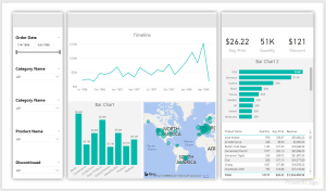
Today, we’re releasing the first of our efforts with a 3 tab layout focused on the business analyst. These layouts are designed with maximum flexibility in mind, to let you alter color themes, easily change the visualization type, and provide enough visualizations to give you a huge initial benefit. One of the best parts about the Layout is that you are not limited by our designs, they are just the starting point, you can fully customize them however you would like. We just provide you with a solid foundation to build from.
Click Image to Download Layout Files
Demo of Layouts:
In addition to the first analyst layout, we’re releasing an Info-graphic style layout that contains some deeper interactions using Bookmarks. However, these Layouts will be a bit more restrictive in terms of how much you can change visually. This is due to the need to rely more heavily on other tools to create the look & feel. Thus, you will have limits in just how much you can change. Our hope with these is to build more stunning report layouts that will maximize presentation, or help wow an audience.
Click Image to Download Layout
We are releasing layouts for the analyst, executives and still have some fun with highly stylized files. We hope you get as much use out of these new Layouts as we know we will! Over time, we will continue to develop and produce an entire library of the selections. Thanks to all of you who make this such a fun and great Community to be a part of.
March is an exciting month, and with this release of Power BI we have been given some long asked for features. One such feature is the ability to import a color theme. The color theme defines the starting colors for your visuals. Before the ability to import a theme one would have to first define each color that they want to use in a Power BI report by changing each visual to have the correct color scheme. Color themes are useful when trying to make a dashboard and you want to use colors that resemble a company’s product or logo. Alright, let’s get started and make and add our own color theme to a report.
Begin by opening up Power BI Desktop. Make sure you have the latest version of Power BI Desktop, you can download the latest version here. The import color theme feature is available in the March 2017 release.
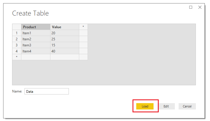
On the Home ribbon click the Enter Data button. Enter the following table of data and name the table Data.
Product
Value
Item1
20
Item2
25
Item3
15
Item4
40
The Create Table should look similar to the following. Click the Load button to proceed.
Load Data Table
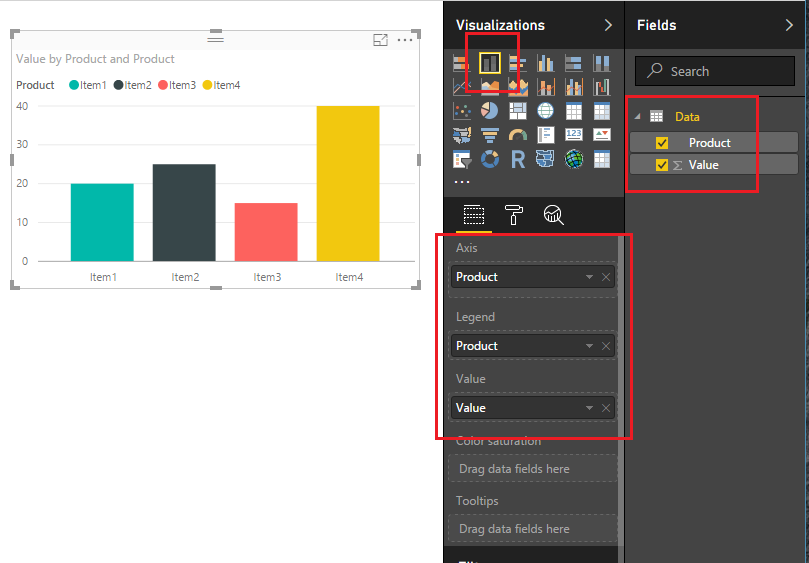
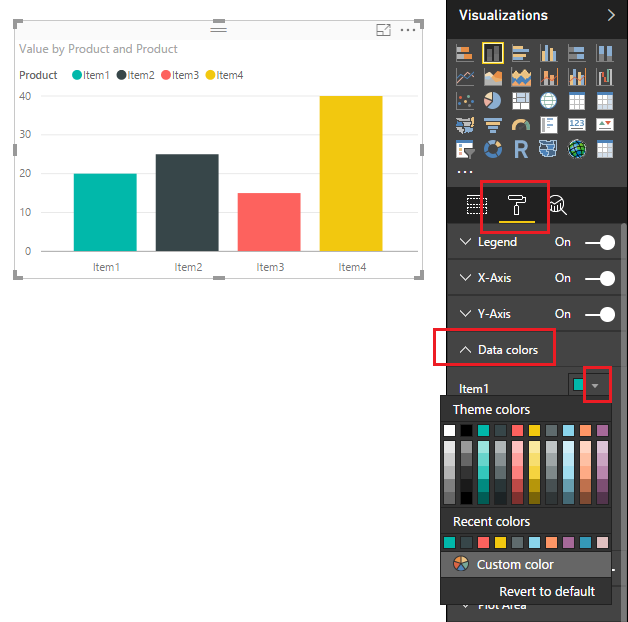
Power BI will load the data to memory and the Fields pane will reveal our newly created columns. Add the Stacked Column Chart on the report page and appropriate fields shown in the image below. You will notice that the default colors are automatically overlaid onto our visual when we add the Product to the Legend visual field.
Add Stacked Column Chart
Next, let’s take a peek at the standard colors that are offered by default from Power BI. Click on the Paint Roller found in the Visualizations pane. Then expand the data field labeled Data colors. Under Item1 click the little triangle. This will expose the current color scheme that is loaded.
Default Color Scheme
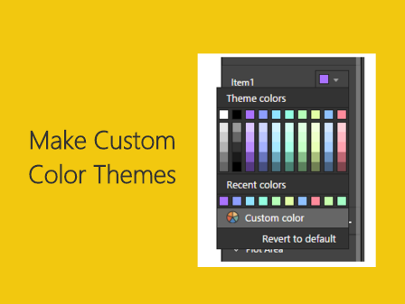
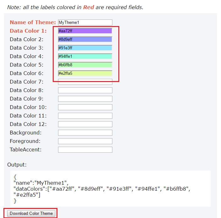
Now we will load the new color theme. But before we can load the color theme we have to generate the color theme first. The color theme has some requirements. First the color theme must be written as a JSON file and must adhere to the JSON format. For developers this will be a very simple google search to accomplish this. However, I know there are some out there that do not enjoy doing development work. So, in a PowerBI.Tips first, I have developed a custom tool to make the color theme generation super simple.
Introducing the PowerBI.Tips Color Theme Generator (CTG) to help Power BI users create quick and easy JSON code files to input into Power BI for the color themes. Not everyone has a coding background, and though there will be tutorials and examples of how to set up the JSON, if you aren’t familiar with the language a small typo could have you spending precious time troubleshooting the issue.
update 3/15/17: The Advanced Theme Generator has been released. Find the tool here.
Click the following link to open up the PowerBI.Tips Color Theme Generator in a different Browser window. Once the browser loads the Color Theme Generator follow the instructions listed at the top of the page to select your colors. The only required fields are the Name, and at least one color. For this tutorial I selected a number of nice pastel colors. Click the Download Color Theme button to download the JSON file that we will use in Power BI.
Note: The Generator was tested on Google Chrome. Also, clicking the Download button will download the JSON file to your browser’s default location. You will need to know this file location to load the file into Power BI Desktop.
PowerBI.Tips Color Theme Generator
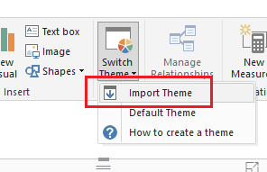
Head back over to Power BI Desktop. On the Home ribbon click the button labeled Switch Theme. Then click Import Theme.
Import Theme Button
Note: If you want to remove your custom theme you will click on the Switch Theme, then click on the Default Theme. The normal power BI colors will be restored.
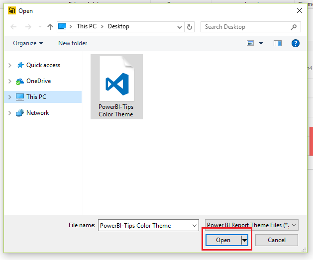
Navigate to where your browser downloaded the file. Select the file labeled PowerBI-Tips Color Theme. Click Open to load the theme.
Load Color Theme
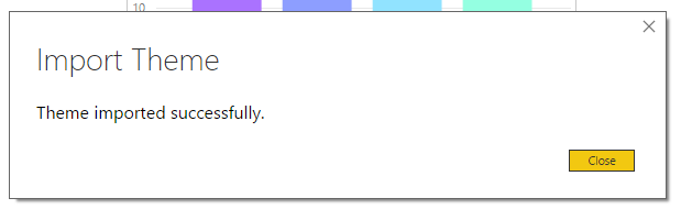
PowerBI will prompt a message letting you know everything loaded correctly. Click Close to see the new theme applied to our visual.
Theme Load Successful
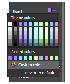
We can now see our custom theme by clicking on the Paint Roller found in the Visualizations pane. Then expand the data field labeled Data colors. Under Item1 click the little triangle.
Tada, now we have a custom color scheme that we create and loaded. Also, now that we the JSON file you can modify the file and keep it for future projects.
Loaded Custom Color Theme
Thanks for following along. If you liked this tutorial please be sure to share. Also if you want to know more about me you can visit my About page and follow me on twitter or Linkedin for updates.
Manage Consent
To provide the best experiences, we use technologies like cookies to store and/or access device information. Consenting to these technologies will allow us to process data such as browsing behavior or unique IDs on this site. Not consenting or withdrawing consent, may adversely affect certain features and functions.
Functional
Always active
The technical storage or access is strictly necessary for the legitimate purpose of enabling the use of a specific service explicitly requested by the subscriber or user, or for the sole purpose of carrying out the transmission of a communication over an electronic communications network.
Preferences
The technical storage or access is necessary for the legitimate purpose of storing preferences that are not requested by the subscriber or user.
Statistics
The technical storage or access that is used exclusively for statistical purposes.The technical storage or access that is used exclusively for anonymous statistical purposes. Without a subpoena, voluntary compliance on the part of your Internet Service Provider, or additional records from a third party, information stored or retrieved for this purpose alone cannot usually be used to identify you.
Marketing
The technical storage or access is required to create user profiles to send advertising, or to track the user on a website or across several websites for similar marketing purposes.